Login
LoginHailing the Ferry
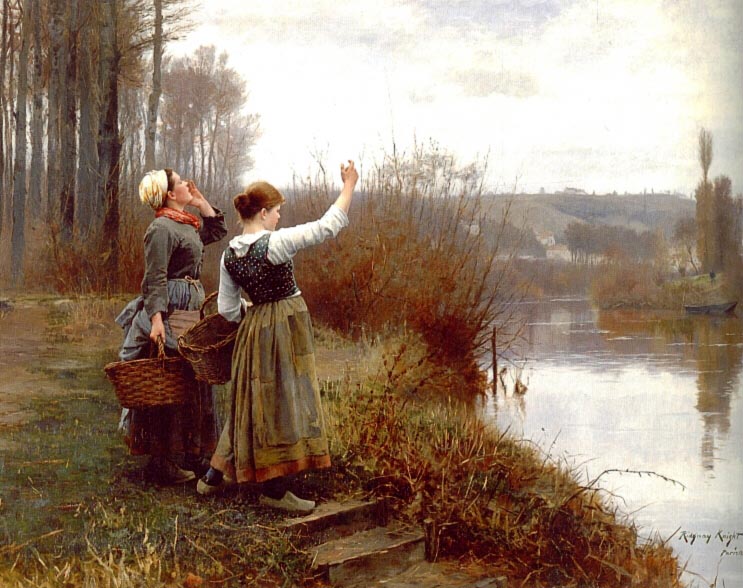
Hailing the Ferry, oil on canvas painting by Daniel Ridgway Knight, 1888, Pennsylvania Academy of the Fine Arts.

Hailing the Ferry, oil on canvas painting by Daniel Ridgway Knight, 1888, Pennsylvania Academy of the Fine Arts.
Medieval manuscripts resisted obsolescence. Made by highly specialised craftspeople (scribes, illuminators, book binders) with labour-intensive processes using exclusive and sometimes exotic materials (parchment made from dozens or hundreds of skins, inks and paints made from prized minerals, animals and plants), books were expensive and built to last. They usually outlived their owners. Rather than discard them when they were superseded, book owners found ways to update, amend and upcycle books or book parts.
These activities accelerated in the fifteenth century. Most manuscripts made before 1390 were bespoke and made for a particular client, but those made after 1390 (especially books of hours) were increasingly made for an open market, in which the producer was not in direct contact with the buyer. Increased efficiency led to more generic products, which owners were motivated to personalise. It also led to more blank parchment in the book, for example, the backs of inserted miniatures and the blanks ends of textual components. Book buyers of the late fourteenth and throughout the fifteenth century still held onto the old connotations of manuscripts—that they were custom-made luxury items—even when the production had become impersonal.
Owners consequently purchased books made for an open market and then personalised them, filling in the blank spaces, and even adding more components later. This would give them an affordable product, but one that still smacked of luxury and met their individual needs. They kept older books in circulation by amending them, attached items to generic books to make them more relevant and valuable, and added new prayers with escalating indulgences as the culture of salvation shifted.
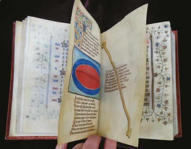
Image: Parchment diptych with the measurements of Christ’s length and side wound, inserted into a French book of hours. Paisley, Renfrew District Museum and Art Gallery, Ms. 1, fol. 13–14 forming a diptych. Photo © Author, CC BY 4.0.

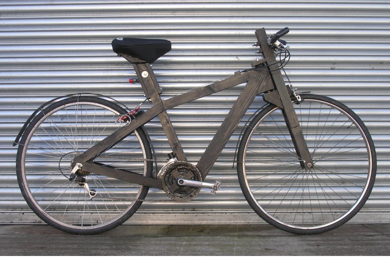
The Ironwood bicycle is a wooden framed bike that people could make themselves with commonly available materials. It has a laminated wooden frame and fork to which standard bicycle components are bolted. The frame can be made with basic carpentry and metalwork skills, without the need for welding or soldering. The design is intended for small scale bicycle production that would support local employment as an alternative to importing bicycles from around the world. More: http://www.ironwoodbicycle.com.
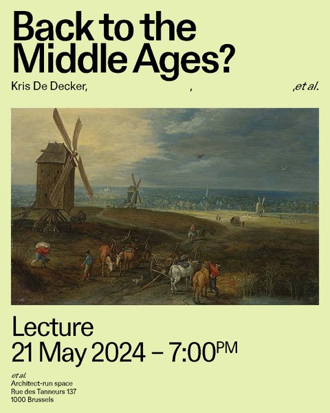
Next week 21 May LTM does a talk in Brussels, reflecting on the work of architect Louise Morin in gallery “et al.” It is the last day you can see her exhibition.
You may have noticed that it's been quiet here on Opensource.com lately. That's because there's a new project in the works, and while there aren't many specific details to announce yet, there's plenty to talk about. What better way to start than with the entire internet?
You may know that the internet is a network. A network, by definition, is a group of connections. The term "internet" is in fact a portmanteau of "interconnected" and "network". The internet is a network of interconnected networks, and originally it consisted of two: The military network and the academic network. Once the internet got popular outside those two groups, it became apparent that different designations were needed to differentiate, say, a commercial entity from a charitable organization from a university or a governmental department.
These designations are called top-level domains (TLD). There are many available today, but for a long time there were only a handful. The original TLDs remain popular, and you probably know that when you go to, for instance, a .com address, you're visiting a commercial site, but when you visit a .org address you're going to a non-profit website.
Open source can be many things. It can be commercial, it can be non-profit, it can be academic, it can be cultural. No matter what form it takes, though, it's always a network. Sometimes (but not always) it's a network of computers, but most importantly it's a network of people. Whether people are gathering at a conference or a pub or in an online chat room, open source is a community of people.
The website Opensource.com has been supported by a commercial entity for 12 years. But the people (that's you and me) that make up the Opensource.com community aren't commercial entities, we're people.
In one month, Opensource.com is going to resolve that bug. Stay tuned!
The community is hard at work on something new.

Image by Camylla Battani
This work is licensed under a Creative Commons Attribution-Share Alike 4.0 International License.Over the past few years, virtual events have thrived. In-person events are back now, but it's important to keep in mind that virtual events didn't just come out of nowhere. Many of us were actually doing a lot of different online events even before they became popular. Many communities held hackathons, bug and issue triaging, webinars, and so on, as virtual events. They brought community members together for collaboration and education. Virtual events have improved since then, largely out of necessity, and I think we've all learned a lot. In this article, I consider how virtual and physical events can co-exist to render an improved event experience for everyone.
I don't think anyone wants to go back to the days when all events were happening on screens. But virtual events do have important advantages compared to in-person events. To begin with, it is relatively easy to start a virtual event as you often don't need much beyond meeting and streaming platforms. It can be as basic as live streaming from a video chat platform. This is especially useful for small communities that don't have a large events budget. In fact, a virtual event platform provides an opportunity to build an audience before you start making significant investments in in-person events.
The lower cost and logistical hurdles of virtual meetings don't just apply to the event organizer. It matters to attendees and community members too. A typical meetup is likely to last for 60 to 90 minutes. Is everyone always happy to commute 30 minutes each way to get to the meeting venue? A meetup in a virtual format can lower the participation barrier for attendees. I think this is one of the reasons that many meetups are continuing in virtual formats today.
The cost of doing virtual events is much lower, so there's low-risk of experimenting with different content, format, target audiences, and so on. Even if a new event isn't a huge success, you won't have to invest a large budget on the venue, equipment, people, travel, and so on. And you're able to get some valuable learning from the event no matter what.
In addition, there are some activities that are just well-suited for virtual events. Things like documentation and bug triaging are crucial in open source communities. Despite this most people see them more like chores that they'd rather avoid. Why not have a short one to two day window where community members come together online so they can work on these chores together while supporting each other?
Many events are going hybrid now, with both in-person and virtual components. By hybrid, I don't mean just broadcasting in-person sessions from conference facilities. Many have separate tracks for in-person and virtual participants. FOSDEM 2023 is a great example of a hybrid event, with separate online rooms.
Some utilize virtual tracks for "Day 0" events (orientation, project team meetings, meetups, and so on). This way, people who aren't able to travel to the in-person conference can still participate in the earliest events. By having a separate virtual track, you can potentially reduce the total length of the in-person conference. This means people don't have to be away from home as long as a 100% in-person event.
Here are some tips based on my experience of attending and organizing virtual events.
DON'T have the same structure as in-person events. When you have an event online, you wouldn't want to ask the audience to sit through a full day of presentations. It's difficult for most people to stare at their screens for a long period of time. If you have more than four hours of content, consider spreading the event over a few days so that attendees only need to sit through a maximum of a couple of hours of presentations each day. You also don't always need to add breaks between sessions in virtual events because people aren't moving to different rooms. As a matter of fact, by hot switching to the next session, you're less likely to lose attendees between presentations.
DON'T put a wall around the content after the event. I recently registered and attended an event and was told that slides and recordings would be available a few weeks after the event. When I returned to the event page a few weeks later, it asked me to register with my email address to get access to the content! I understand people's desire to collect leads. But if people had to register for the event already, or the event was live-streamed, it's not appropriate to ask them to share their contact information. Instead, make the content accessible to anyone.
DON'T force synchronous participation from attendees. One of the key benefits of virtual events is that it's easier for everyone to attend or participate. If a person cannot watch a presentation live, provide ways for them to interact with presenters and other attendees asynchronously.
DO make content available prior to events. Online events make it easier for community members to participate asynchronously. Things like publishing slides or Q&A pages ahead of time allow attendees to review content and post questions that presenters can address during and after the session. Also, if you're doing a hands-on workshop, publishing a prep guide before the event allows attendees to set up their environment so that it's easier to follow along during the presentation and play around in their sandbox.
DO have presenters available for asynchronous Q&A sessions. Some of the virtual events I enjoyed had dedicated Q&A channels (Mattermost or Discourse are great open source options) where you could interact with presenters well after their session ended. At an in-person conference, you're often limited to a 10 or 15 minute break after a session to talk to the presenter. Virtual events allow you to have a Q&A channel available for a few days after the event. This let's both synchronous and asynchronous attendees communicate with presenters.
I'm definitely glad that in-person events are back and I'm able to see my open source friends again in real life. However, I don't think we need to completely put virtual events behind us. In particular, hybrid events with "virtual tracks" can make events accessible to more community members and help you reach a wider audience. I think society has learned some important lessons, so let's put them to good use.
Create the perfect blend of virtual and in-person events.
Opensource.com
This work is licensed under a Creative Commons Attribution-Share Alike 4.0 International License.Are you interested in leveraging Markdown for online content without any website setup or build process? How about seamlessly embedding constraint-free Markdown or HTML into multiple platforms (such as a content management system or learning management system)? The open source project Docsify-This, built with Docsify.js, provides an easy way to publish, share, and reuse Markdown content.
[ Get the Markdown cheat sheet ]
With Docsify-This, you can instantly turn any publicly available Markdown file into a responsive standalone web page. You can also link multiple Markdown files to create a simple website. Designers can alter the visual appearance of displayed pages with the point-and-click Web Page Builder interface or URL parameters. You can also use a set of provided Markdown CSS classes when creating your own Markdown content. In addition, if you use Codeberg or GitHub to store your Markdown files, an Edit this Page link can be automatically provided for each page to support collaborative authoring.
It's open source, so you can host a Docsify-This instance using your own custom domain without the risk of platform lock-in.
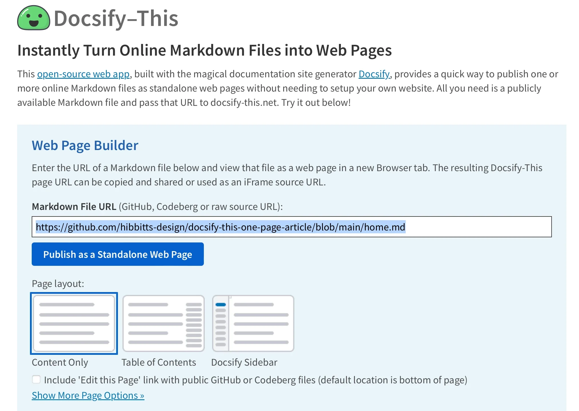
To use the Web Page Builder, open a browser and navigate to the Docsify-This website or your local instance. In the Web Page Builder section, enter the URL of a Markdown file in a public repo of Codeberg or GitHub (other Git hosts can also be used via Docsify-This URL parameters but not in the Web Page Builder), and then click the Publish as Standalone Web Page button.
(Paul Hibbitts, CC BY-A 4.0)
The Markdown file is rendered as a standalone web page with a URL you can copy and share. Here's an example URL:
https://docsify-this.net/?basePath=https://raw.githubusercontent.com/hibbitts-design/docsify-this-one-page-article/main&homepage=home.mdDocsify-This rendered web pages are perfect for embedding, with the ability to visually style Docsify-This pages to the destination platform.
(Paul Hibbitts, CC BY-A 4.0)
You can render other Markdown files in the same repository by directly editing the Docsify-This URL parameter homepage. For example:
https://docsify-this.net/?basePath=https://raw.githubusercontent.com/hibbitts-design/docsify-this-one-page-article/main&homepage=anotherfile.mdYou can change the appearance of any Markdown file displayed in Docsify-This by using URL parameters. For example, font-family, font-size, link-color, and line-height are all common CSS attributes and are valid parameters for Docsify-This:
https://docsify-this.net/?basePath=https://raw.githubusercontent.com/hibbitts-design/docsify-this-one-page-article/main&homepage=home.md&font-family=Open%20Sans,sans-serifYou can also alter the visual appearance using a set of special Markdown CSS classes. For example, you can add the button class to a link:
[Required Reading Quiz due Jun 4th](https://canvas.sfu.ca/courses/44038/quizzes/166553 ':class=button') This produces a button image instead of just a text link:
(Paul Hibbitts, CC BY-A 4.0)
In addition to the Markdown CSS classes supported by Docsify-This, you can define your own custom classes within your displayed Markdown files. For example:
<style>
.markdown-section .mybutton, .markdown-section .mybutton:hover {
  cursor: pointer;
  color: #CC0000;
  height: auto;
  display: inline-block;
  border: 2px solid #CC0000;
  border-radius: 4rem;
  margin: 2px 0px 2px 0px;
  padding: 8px 18px 8px 18px;
  line-height: 1.2rem;
  background-color: white;
  font-family: -apple-system, "Segoe UI", "Helvetica Neue", sans-serif;
  font-weight: bold;
  text-decoration: none;
}
</style>

[Custom CSS Class Button](# ':class=mybutton')
Produces this:
(Paul Hibbitts, CC BY-A 4.0)
As supported by standard Markdown, you can include HTML snippets. This allows you to add layout elements to your HTML render. For example:
<div class="row">
<div class="column">

Lorem ipsum dolor sit amet, consectetur adipiscing elit.

</div>
<div class="column">

Lorem ipsum dolor sit amet, consectetur adipiscing elit.

</div>
</div>You can embed Docsify-This web pages using an iFrame in almost any platform. You can also use URL parameters to ensure your embedded content matches your destination platform:
<p><iframe style="overflow: hidden; border: 0px #ffffff none; margin-top: -26px; background: #ffffff;" src="https://docsify-this.net/?basePath=https://raw.githubusercontent.com/paulhibbitts/cmpt-363-222-pages/main&homepage=home.md&font-family=Lato%20Extended,Lato,Helvetica%20Neue,Helvetica,Arial,sans-serif&font-size=1&hide-credits=true" width="800px" height="950px" allowfullscreen="allowfullscreen"></iframe></p>
(Paul Hibbitts, CC BY-A 4.0)
In certain learning management systems (LMS), including the open source Moodle and even the proprietary Canvas, you can link external web pages to a course navigation menu and sometimes more. For example, you can use the Redirect Tool in Canvas to display Docsify-This web pages.
url=https://docsify-this.net/?basePath=https://raw.githubusercontent.com/paulhibbitts/cmpt-363-222-pages/main&homepage=resources.md&edit-link=https://github.com/paulhibbitts/cmpt-363-222-pages/blob/main/resources.md&font-family=Lato%20Extended,Lato,Helvetica%20Neue, Helvetica,Arial,sans-serif&font-size=1&hide-credits=trueTo fully leverage the benefits of version control and potentially collaboration using an optional Edit this Page link, store your Docsify-This Markdown pages in a Git repository on either Codeberg or GitHub. Several open source tools provide a graphical interface for Git, including GitHub Desktop (recently released as open source), Git-Cola, and SparkleShare. The text editors VSCode and Pulsar Edit (formerly Atom.io) both feature Git integration, too.
[ Get the Git tips and tricks eBook ]
The benefits of Markdown-based publishing are available to everyone, thanks to Docsify. And thanks to Docsify-This, it's easier than ever. Try it out at the Docsify-This website.
This open source tool makes it easier than ever to convert Markdown to web pages.
This work is licensed under a Creative Commons Attribution-Share Alike 4.0 International License.Recently, I was asked by a friend and colleague if I were interested in speaking together at a conference. I was pleasantly surprised because I hadn't contributed much to the project they were presenting, but I expressed interest. We met to discuss the presentation, and that's when I learned the real reason I was asked to participate: The conference's diversity, equity, and inclusion (DEI) initiatives required there to be at least one speaker that does not identify as a man. I was offended; it felt like I was approached only because of my gender, not based on merit.
My friend assured me that wasn't the only reason I'd been asked. They needed new contributors to the project because there was a lot of work to be done, and they were hoping I could help fill that gap.
[ Want to create your own event? Read the 10-step guide for a successful hackathon ]
I gave it some thought and tried to understand why the DEI initiatives were in place. I also thought about the other side of the coin, where the people who wanted to present couldn't, unless they found someone from a minority group to present alongside them.
As I thought about the bigger picture and the benefits this opportunity would bring to me, I decided to forego my ego being hurt. Once I let go of feeling offended, I realized that I was also feeling very uncomfortable presenting something that I hadn't contributed directly to. My ethics didn't agree with that. How could I possibly step onto a stage and act as the face of something I hadn't worked on?
I did some research on the project. The technology was not totally alien to me, and I had a good grasp of the fundamentals it was trying to achieve. In fact, its overall goal made me feel excited to contribute. If done well, it would be super useful to users.
I made a resolution that I would go ahead with this speaking opportunity only if I got the opportunity to give back to the community tenfold and become a key contributor. My friend was more than willing to help me on that journey.
With that resolve, we submitted our talk. My co-presenters were supportive and made me feel welcome. They said that as long as I was interested and had a passion for the project, nothing else mattered.
[ Also read How I returned to open source after facing grief ]
Participating in the conference was a huge opportunity, and it had such a positive impact on me. I met a lot of experienced people across the open source community and I felt inspired! I learned a lot of new things from the people and the various panels, sessions, and discussions at the conference. Our presentation went well, and I consider giving a talk at such a big conference quite an achievement.
However, once the conference was over the guilt started kicking in.
I felt like I owed the community and the people who had given me this chance. I wanted to focus on the promise I'd made, but it was hard with other higher-priority things getting in the way. Whenever I deviated from my plan, the guilt kept me on track. It reminded me that I had to give back to the community that had given me such a good opportunity. After a few months of struggling and juggling, I can proudly say that I didn't give up. Today, I'm an active contributor to that project.
I love the challenges it presents, and I enjoy solving some of the key issues in the project's area. I also have been able to take the lead in implementing this upstream project in our downstream ecosystem. As icing on the cake, I was again invited to present with the team and give the community updates for the project. This time, it was not because of a DEI initiative, as the ratio was already balanced.
Feeling guilt isn't so bad after all!
I'm glad that I took the opportunity, and I'm glad it turned out to be a win-win situation for everyone involved. If I hadn't been approached about being a co-presenter, I probably would have never gotten involved in this project, and that would have been such a miss! I'm grateful to the people who gave me this chance and supported me.
I'm probably not the only woman who has faced this. I want to tell all the women out there if such an opportunity presents itself, there's no need to feel guilt, or that you "owe" anyone or any kind of pressure. If you feel such pressure, turn that emotion into a weapon and do good with it! I encourage you to take the opportunity if it will benefit you and make the most out of it. Later on, if you can do the same for another person and uplift them, that’s how you can really pay back to the community. After all, this is what open source community is all about. It's as much about the people as is about the technology being built!
[ Ready to level up your communication skills? Get advice from IT leaders. Download 10 resources to make you a better communicator. ]
Guilt is usually considered a negative emotion, but by steering it well, you can achieve surprising success.
This work is licensed under a Creative Commons Attribution-Share Alike 4.0 International License.Your open source project's documentation is essential to your customers. Your target audience must understand the purpose of your project and how to use it, and documentation is what bridges that gap. A project is rarely ever truly done, so it's equally important for resources to be maintained and updated with your project's continuous improvement.
But what happens when you have lots of documentation to maintain but lack the resources to keep it current? The answer is pretty simple: Host a docathon!
A docathon is like a hackathon. A hackathon is an event where engineers and community leaders gather to improve or add new features to an existing application. In a docathon, the same kind of collaboration focuses on improving documentation.
[ Learn about writing Docs as Code. ]
A docathon can fill gaps within content, restructure large documentation sets, fix broken links, or just correct typos. The intent behind hosting a docathon is to improve a large amount of documentation in a relatively brief timeframe.
Some examples of product documentation include:
At my organization, our documentation team hosted a docathon and successfully revamped a 102-page installation guide. The docathon enabled us to focus on the project's scope, which was reorganizing for simplicity, removing duplicate content, and following the customer journey. Hosting a docathon left a lasting impression on my team and improved customer success.
[ Read Write documentation that actually works for your community ]
Here are my top three reasons to host a docathon:
Most documentation must evolve along with the product it supports. As the product changes or updates, so must the documentation. In some cases, documentation teams release new versions of their documentation alongside the engineering team's release cycle. As priorities within a team change and GA releases continue, documentation teams face the challenge of keeping up with new features, bug fixes, and tasks to complete. The changes that get left behind become part of a backlog—an accumulation of work that needs to be completed at a later time.
Docathon tip: During a docathon, participants can triage backlog items and complete them as they progress through the list. Non-technical participants can work on fixes related to typos, broken links, and other text-related issues.
By the time your documentation team realizes it's time to revamp a guide, it's probably several chapters in and hundreds of pages deep. Once the content plan has been developed, the complexity of restructuring begins. Restructuring a large amount of documentation is not for the faint of heart.
Docathon tip: Assemble a team to lead the docathon and provide incentives for organization-wide participation from different teams or departments. Depending on the scope of work and time constraints, your team can successfully restructure an entire guide in less time than you probably expect.
It is common for different groups within an organization to work in isolation. Engineering, product, customer support, marketing, and documentation teams may not collaborate on projects as often as they should.
Imagine hosting an event where each team member can use their expertise to improve product documentation. Docathons foster subject matter expert (SME) diversity, real-time collaboration, and communication. They also allow for an inclusive environment where individuals residing in different geographical locations can participate in person or remotely. Your documentation receives the undivided attention of experts with different viewpoints and specializations, minimizing isolated siloes, unconscious bias, and burnout.
Docathon tip: Enable cross-functional teams to come together for a common cause.
[ Learn what it takes to build a resilient IT culture ]
The next time your team has a seemingly insurmountable backlog or is tasked with restructuring a huge documentation project, consider hosting a docathon. It's easy, and its productivity may surprise you. For more information on hosting an event like this, read Tiffany Long's excellent 10-step guide to hosting a hackathon.
A marathon for documentation is a great way to produce or improve the docs for your open source project.
This work is licensed under a Creative Commons Attribution-Share Alike 4.0 International License.The Fedora Design Team discovered that using open source tools to run a virtual conference can be quite effective by hosting the first Creative Freedom Summit in January 2023.
In this article, I'll share some background on the conference, why using open source tools to run it was important to us, and the specific tools and configurations our team used to make it all work. I'll also talk about what worked well and what will need improvement at our next summit in 2024.
The Creative Freedom Summit was an idea Marie Nordin came up with after reviewing talk submissions for Flock, the annual Fedora users and contributors conference. She received many talk submissions for the August 2022 Flock relating to design and creativity in open source—far more than we could possibly accept. With so many great ideas for open source design-related talks out there, she wondered if there would be space for a separate open source creativity conference focused on creatives who use open source tools to produce their work.
Marie brought this idea to the Fedora Design Team in the fall of 2022, and we started planning the conference, which took place January 17-19, 2023. Since it was our first time running a new conference like this, we decided to start with invited speakers based on some of the Flock submissions and our own personal network of open source creatives. Almost every speaker we asked gave a talk, so we didn't have room to accept submissions. We will need to figure out this next year, so we don't have an open source CFP (Call for Papers) management tool for that to tell you about yet.
Since the initial COVID pandemic lockdowns, Fedora's Flock conference has been run virtually using Hopin, an online conference platform that isn't open source but is friendly to open source tools. Fedora started using it some years ago, and it definitely provides a professional conference feel, with a built-in sponsor booth/expo hall, tracks, hallway chat conversations, and moderation tools. Running the Creative Freedom Summit using Hopin was an option for us because, as a Fedora-sponsored event, we could access Fedora's Hopin setup. Again, Hopin is not open source.
Now, as a long-term (~20 years) open source contributor, I can tell you that this kind of decision is always tough. If your conference focuses on open source, using a proprietary platform to host your event feels a little strange. However, as the scale and complexity of our communities and events have grown, the ability to produce an integrated open source conference system has become more challenging.
There is no right or wrong answer. You have to weigh a lot of things when making this decision:
We didn't have any budget for this event. We did have a team of volunteers who could put some work hours into it. We had the Fedora Matrix Server as a piece of supported infrastructure we could bring into the mix and access to a hosted WordPress system for the website. Teammate Madeline Peck and I had the technical capability/experience of running the live, weekly Fedora Design Team video calls using PeerTube. We wanted the event to be low-key, single-track, and informal, so we had some tolerance for glitches or rough edges. We also all had a lot of passion for trying an open source stack.
Now you know a little about our considerations when making this decision, which might help when making decisions for your event.
Here is how the conference tech stack worked.
Live components
I'll cover some details next.
(Máirín Duffy, CC BY-SA 4.0)
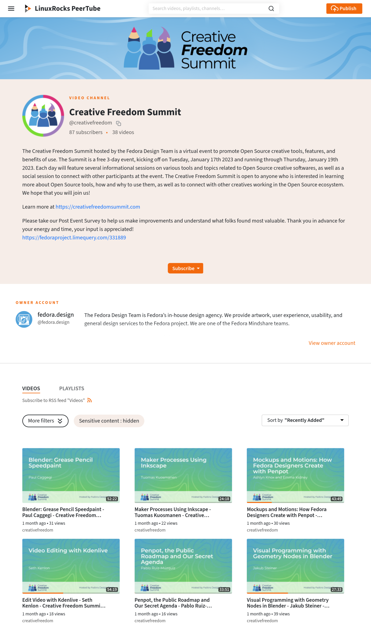
We used the LinuxRocks PeerTube platform generously hosted by LinuxRocks.online for the Creative Freedom Summit's livestream. PeerTube is a free and open source decentralized video platform that is also part of the Fediverse.
One of the best features of PeerTube (that other platforms I am aware of don't have) is that after your livestream ends, you get a near-instant replay recording posted to your channel on PeerTube. Users in our chatroom cited this as a major advantage of the platform. If an attendee missed a session they were really interested in, they could watch it within minutes of that talk's end. It took no manual intervention, uploading, or coordination on the part of the volunteer organizing team to make this happen; PeerTube automated it for us.
Here is how livestreaming with PeerTube works: You create a new livestream on your channel, and it gives you a livestreaming URL + a key to authorize streaming to the URL. This URL + key can be reused over and over. We configured it so that the recording would be posted to the channel where we created the livestreaming URL as soon as a livestream ended. Next, copy/paste this into Jitsi when you start the livestream. This means that you don't have to generate a new URL + key for each talk during the conference—the overhead of managing that for organizers would have been pretty significant. Instead, we could reuse the same URL + key shared in a common document among conference organizers (we each had different shifts hosting talks). Anyone on the team with access to that document could start the livestream.
The following section covers generating the livestream URL + key in PeerTube, step-by-step.
1. Create stream video on PeerTube
Log into PeerTube, and click the Publish button in the upper right corner:
(Máirín Duffy, CC BY-SA 4.0)
2. Set options
Click on the Go live tab (fourth from the left) and set the following options:
Then, select Go Live. (Don't worry, you won't really be going live quite yet, there is more data to fill in.)
(Máirín Duffy, CC BY-SA 4.0)
3. Basic info (don't click update yet)
First, fill out the Basic Info tab, then choose the Advanced Settings tab in the next step. Fill out the name of the livestream, description, add tags, categories, license, etc. Remember to publish after the transcoding checkbox is turned on.
This ensures once your livestream ends, the recording will automatically post to your channel.
4. Advanced settings
You can upload a "standby" image that appears while everyone is watching the stream URL and waiting for things to start.
(Máirín Duffy, CC BY-SA 4.0)
This is the standby image we used for the Creative Freedom Summit:
(Máirín Duffy, CC BY-SA 4.0)
5. Start livestream on PeerTube
Select the Update button in the lower right corner. The stream will appear like this—it's in a holding pattern until you start streaming from Jitsi:
(Máirín Duffy, CC BY-SA 4.0)
6. Copy/paste the livestream URL for Jitsi
This is the final step in PeerTube. Once the livestream is up, click on the … icon under the video and towards the right:
(Máirín Duffy, CC BY-SA 4.0)
Select Display live information. You'll get a dialog like this:
(Máirín Duffy, CC BY-SA 4.0)
You must copy both the live RTMP URL and the livestream key. Combine them into one URL and then copy/paste that into Jitsi.
The following are examples from my test run of these two text blocks to copy:
What you'll need to paste into Jitsi is these two text blocks combined with a / between them, like so:
rtmp://peertube.linuxrocks.online:1935/live/8b940f96-c46d-46aa-81a0-701de3c43c8f
We used the free and open source hosted Jitsi Meet video conferencing platform for our "live stage." We created a Jitsi meeting room with a custom URL at https://meet.jit.si and only shared this URL with speakers and meeting organizers.
We configured the meeting with a lobby (this feature is available in meeting settings once you join your newly-created meeting room) so speakers could join a few minutes before their talk without fear of interrupting the presentation before theirs. (Our host volunteers let them in when the previous session finished.) Another option is to add a password to the room. We got by just by having a lobby configured. It did seem, upon testing, that the moderation status in the room wasn't persistent. If a moderator left the room, they appeared to lose moderator status and settings, such as the lobby setup. I kept the Jitsi room available and active for the entire conference by leaving it open on my computer. (Your mileage may vary on this aspect.)
Jitsi has a built-in livestreaming option, where you can post a URL to a video service, and it will stream your video to that service. We had confidence in this approach because it is how we host and livestream weekly Fedora Design Team meetings. For the Creative Freedom Summit, we connected our Jitsi Live Stage (for speakers and hosts) to a channel on the Linux Rocks PeerTube.
Jitsi lets speakers share their screens to drive their own slides or live demos.
1. Join the meeting and click the … icon next to the red hangup button at the bottom of the screen.
(Máirín Duffy, CC BY-SA 4.0)
2. Select Start live stream from the pop-up menu.
(Máirín Duffy, CC BY-SA 4.0)
3. Copy/paste the PeerTube URL + key text
(Máirín Duffy, CC BY-SA 4.0)
4. Listen for your Jitsi Robot friend
A feminine voice will come on in a few seconds to tell you, "Live streaming is on." Once she sounds, smile! You're livestreaming.
5. Stop the livestream
This stops the PeerTube URL you set up from working, so repeat these steps to start things back up.
Managing Recordings by turning the Jitsi stream on and off
We learned during the conference that it is better to turn the Jitsi stream off between talks so that you will have one raw recording file per talk posted to PeerTube. We let it run as long as it would the first day, so some recordings have multiple presentations in the same video, which made using the instant replay function harder for folks trying to catch up. They needed to seek inside the video to find the talk they wanted to watch or wait for us to post the edited version days or weeks later.
Preventing audio feedback
Another issue we figured out live during the event that didn't crop up during our tests was audio feedback loops. These were entirely my fault (sorry to everyone who attended). I was setting up the Jitsi/PeerTube links, monitoring the streams, and helping host and emcee the event. Even though I knew that once we went live, I needed to mute any PeerTube browser tabs I had open, I either had more PeerTube tabs open than I thought and missed one, or the livestream would autostart in my Element client (which I had available to monitor the chat). I didn't have an easy way to mute Element. In some of the speaker introductions I made, you'll see that I knew I had about 30 seconds before the audio feedback would start, so I gave very rushed/hurried intros.
I think there are simpler ways to avoid this situation:
This is something worth practicing and refining ahead of time.
(Máirín Duffy, CC BY-SA 4.0)
We set up a "Backstage" invite-only chat room a week or so before the conference started and invited all our speakers to it. This helped us ensure a couple of things:
The channel served as a useful place during the event to coordinate transitions between speakers, give heads up about whether the schedule was running late, and in one instance, quickly reschedule a talk when one of our speakers had an emergency and couldn't make their original scheduled time.
We also set up a room for hosts, but in our case, it was extraneous. We just used the backstage channel to coordinate. We found two channels were easy to monitor, but three were too many to be convenient.
(Máirín Duffy, CC BY-SA 4.0)
We set up a pinned widget in our main Element channel with general information about the event, including the daily schedule, code of conduct, etc. We also had a section per talk of the day for attendees to drop questions for Q&A, which the host read out loud for the speaker.
We found over the first day or two that some attendees were having issues with the Etherpad widget not loading, so we switched to an embedded hackmd.io document pinned to the channel as a widget, and that seemed to work a little better. We're not 100% sure what was going on with the widget loading issues, but we were able to post a link to the raw (non-embedded) link in the channel topic, so folks could get around any problems accessing it via the widget.
(Máirín Duffy, CC BY-SA 4.0)
Matrix via Fedora's Element server was the single key place to go to attend the conference. Matrix chat rooms in Element have a widget system that allows you to embed websites into the chat room as part of the experience. That functionality was important for having our Matrix chat room serve as the central place to attend.
We embedded the PeerTube livestream into the channel—you can see it in the screenshot above in the upper left. Once the conference was over, we could share a playlist of the unedited video replays playlist. Now that our volunteer project for editing the videos is complete, the channel has the playlist of edited talks in order.
As discussed in the previous section, we embedded a hackmd.io note in the upper right corner to post the day's schedule, post announcements, and an area for Q&A right in the pad. I had wanted to set up a Matrix bot to handle Q&A, but I struggled to get one running. It might make for a cool project for next year, though.
Conversations during the conference occurred right in the main chat under these widgets.
There are a couple of considerations to make when using a Matrix/Element chat room as the central place for an online conference, such as:
(Máirín Duffy, CC BY-SA 4.0)
Ryan Gorley developed the Creative Freedom Summit website using WordPress. It is hosted by WPengine and is a one-pager with the conference schedule embedded from sched.org.
We used the open source survey tool LimeSurvey. We sent it out within a week or two to attendees via the Element Chat channel and our PeerTube video channel to learn more about how we handled the event. The event organizers continue to meet regularly. One topic we focus on during these post-event meetings is developing the questions for the survey in a shared hackmd.io document. The following are some things we learned from the event that might be of interest to you in planning your own open source powered online conference:
During the event, we received positive feedback from participants who appreciated when another attendee live-captioned the talk in the chat and wished out loud for live captioning for better accessibility. While the stack outlined here did not include live captioning, there are open source solutions for it. One such tool is Live Captions, and Seth Kenlon covered it in an opensource.com article, Open source video captioning on Linux. While this tool is meant for the attendee consuming the video content locally, we could potentially have a conference host running it and sharing it to the livestream in Jitsi. One way to do this is using the open source broadcasting tool OBS so everyone watching the livestream could benefit from the captions.
While editing the videos post-event, we discovered a tool built into Kdenlive, our open source video editor of choice, that generates and automatically places subtitles in the videos. There are basic instructions on how to do this in the Kdenlive manual. Fedora Design Team member Kyle Conway, who helped with the post-event video editing, put together a comprehensive tutorial (including video instruction) on automatically generating and adding subtitles to videos in Kdenlive. It is well worth the read and watch if you are interested in this feature.
When the event was over, we rallied a group of volunteers from the conference Element channel to work together on editing the videos, including title cards and intro/outro music, and general cleanup. Some of our automatic replay recordings were split across two files or combined in one file with multiple other talks and needed to be reassembled or cropped down.
We used a GitLab epic to organize the work, with an FAQ and call for volunteer help organized by skillset, with issues attached for each video needed. We had a series of custom labels we would set on each video so it was clear what state the video was in and what kind of help was needed. All the videos have been edited, and some need content written for their description area on the Creative Freedom Summit channel. Many have auto-generated subtitles that have not been edited for spelling mistakes and other corrections common with auto-generated text.
(Máirín Duffy, CC BY-SA 4.0)
We passed the videos around—the files could be quite large—by having volunteers download the raw video from the unedited recording on the main PeerTube channel for the Creative Freedom Summit. When they had an edited video ready to share, we had a private PeerTube account where they could upload it. Admins with access to the main channel's account periodically grabbed videos from the private account and uploaded them to the main account. Note that PeerTube doesn't have a system where multiple accounts have access to the same channel, so we had to engage in a bit of password sharing, which can be nerve-wracking. We felt this was a reasonable compromise to limit how many people had the main password but still enable volunteers to submit edited videos without too much hassle.
I hope this comprehensive description of how we ran the Creative Freedom Summit conference using an open source stack of tools inspires you to try it for your open source event. Let us know how it goes, and feel free to reach out if you have questions or suggestions for improvement! Our channel is at: https://matrix.to/#/#creativefreedom:fedora.im
This article is adapted from Run an open source-powered virtual conference and is republished with permission.
Here's how to use open source tools to run your next virtual event.
Opensource.com
This work is licensed under a Creative Commons Attribution-Share Alike 4.0 International License.When I go back home and talk to people in the tech industry, or any other industry for that matter, about what I do and the topics I'm involved in daily, I'm usually met with bemusement at the idea of an Open Source Programs Office (OSPO). The concept of a company contributing to an open source project without obvious immediate financial benefit can be culturally strange to understand or explain.
As someone born and raised in a country that has been trying to develop for quite some time, I understand and relate to that. There was a point in time when my only understanding of open source was that it was software that I could use without paying and without needing to wait for a specific issue or additional feature to be released. I could just do whatever I needed myself, locally.
Open source faces many struggles in developing countries that make how it's perceived and its associations inaccurate and out of touch. I will discuss these struggles in this article.
The challenges that open source faces in these regions can be divided into three main areas:
It's no secret that the culture of tech in general, and specifically the open source part of it, feeds off the culture of the society where it exists. That's why, in today's world, open source has a better chance of being sustained and maintained in the more developed parts of the world.
But imagine a perfect society, optimal for open source to grow, be sustained, and maintained. What does the culture of that society look like? What are its main characteristics?
For open source to thrive, the society's culture must be as open and transparent as possible. Information must be freely and publicly accessible, which is a huge issue in many underdeveloped regions. Information is often red-taped and is unavailable to the average citizen, let alone someone who's trying to contribute to open source.
[ Related read Global communication in open source projects ]
The word "free" has many different meanings and implications. There's freedom of speech, expression, choice, belief, religion, and many others. The aspect of freedom I'm most concerned with in this context is the ability to start new communities and organizations without a higher authority intervening. That's the essence of open source. Distributed modes of collaboration, in which large groups work together without a strong centralized authority directing them, are highly effective. This is another major challenge in most of these regions. New communities and organizations are often questioned, closely monitored, and unfortunately, in some cases, even prosecuted and eventually shut down for fear of the new ideas that may emerge or other reasons.
A dynamic culture is essential for the growth of open source. A culture that's ready to accept and implement new ideas is the perfect place for open source to grow. Being resistant to change and preferring to stick with traditional approaches can limit society's willingness to adopt new technologies and solutions, which is a major issue in most underdeveloped countries.
The greatest and most common reason behind resistance to change in these regions is the fear of the unknown. It would be unfair to discuss fear of the unknown as a "developing countries" problem. It's a common issue everywhere, even in the developed world. But some reasons behind this fear are specific to underdeveloped regions. The two main reasons are a lack of trust in the competence of the tech industry and a lack of accountability. Businesses and individuals do not trust the capabilities of the software solutions on offer, let alone open source solutions. There's an idea that open source software is unsafe and insecure. This concern is magnified when people do not trust the competence of the software developers. Second, people do not trust the system to hold anyone accountable for any possible mistakes or issues arising from using the software or in legal conflicts.
Economic challenges are the most obvious struggle for open source in developing countries, impacting open source developers and communities in these regions.
Open source developers struggle with issues of accessibility in developing countries. Whether it's access to the internet or equipment, it can be difficult to become a regular open source contributor when you struggle to reach resources daily. The digital divide in these regions is huge. There are still many areas without regular, stable, and high-speed internet connections. There's also a market gap between these regions and the rest of the world when it comes to equipment. There's always the challenge of not having enough funds to buy the latest, most powerful machines, but there's also an availability problem. The modern, powerful tech equipment needed to build and run the biggest open source projects isn't always available in these regions.
These concerns make self-education and learning challenging. It's difficult for an open source developer to pick an open source project, learn all about it on their own, and start contributing to it due to these access issues.
And how do you build an open source community under these circumstances? Projects would end up being maintained by the privileged few with access to stable high-speed internet connections and the latest equipment. The rest would be spotty, occasional contributions from others that can hardly be considered a community. And even those would disappear once the chance of paid work appears. I've personally seen it multiple times. Someone would start learning about an open source project to research a specific stack or improve their skills and begin contributing to it. But once the opportunity of paid work appeared, even as a second job, they dropped the open source project completely. It makes sense. Any individual must prioritize a means of survival for themselves and their family.
This lack of resources and dependence on a privileged few would also make it almost impossible to fund marketing campaigns, community-building events, and, last but not least, documentation localization attempts.
English is the language of the internet, but not for many these countries. While almost all developers speak English at a basic level, not everyone has the ability to comprehend and understand documentation, architecture resources, and technical specifications to the level that enables them to meaningfully contribute to an open source project. The non-existence of adapted documentation makes it difficult for developers in developing countries to find an entry point into open source projects. The time and resources required to do that usually discourage potential contributors from these regions.
[ Also read How open source weaves connections between countries ]
Almost all software employee contracts are designed to monetize every single line of code, contribution, or thought the developer might have. Any participation in external projects can be a cause for questioning by the employing company, which all too often discourages developers from contributing to open source to avoid legal issues. Laws favor corporations and organizations and prevent software developers from making external contributions.
Legal frameworks in developing countries are often ill-equipped to handle the nuances of intellectual property rights and open source licensing. Intellectual property laws in developing countries may be weaker or less comprehensive than those in developed countries, and enforcement may be less effective. This can make it difficult for creators and contributors to protect their work and prevent others from using it without permission.
In addition, open source licensing can be complex. Many developing countries may not have the legal expertise or resources to navigate these licenses effectively. This can make it tough for developers to contribute to open source projects without inadvertently violating the terms of the license.
Another issue is that intellectual property laws and open source licensing are sometimes seen as hindrances to innovation and development in developing countries. Critics argue that these laws and licenses can stifle creativity and prevent the spread of knowledge and technology, particularly in areas where access to resources and technology is limited.
Overall, the challenges surrounding intellectual property laws and open source contributions in developing countries are complex and multifaceted, requiring a nuanced approach that accounts for the unique circumstances and challenges these countries face.
Tech giants based in the US and Europe enter into billion-dollar, decades-long deals with governments in developing regions to supply them with software. On the off chance that someone gets elected into a position and decides to start an initiative to adopt open source software, they find that getting out of these deals would cost a fortune.
These are just some of the struggles open source faces in developing countries. There's much to be done to improve the situation and make adopting and growing open source feasible. In future articles, I will delve into specific solutions, but for now, I'll note that, as with everything, it starts with the individual. As we each "crowdsource" an open culture, the culture of the regions where we live and work changes. Bring open source to your community in whatever small way you can, and see where it leads.
Open source faces many struggles in developing countries that make how it's perceived and its associations inaccurate and out of touch.
Jason Baker. CC BY-SA 4.0. Source: Cloud, Globe. Both CC0.
This work is licensed under a Creative Commons Attribution-Share Alike 4.0 International License.If you don't include tests in your Drupal development, chances are it's because you think it adds complexity and expense without benefit. Cypress is an open source tool with many benefits:
This article covers three topics to help you start testing your Drupal project using Cypress:
For the purposes of this tutorial I'm assuming that you have built a local dev environment for your Drupal project using the `drupal/recommended-project` project. Although details on creating such a project are outside of the scope of this piece, I recommend Getting Started with Lando and Drupal 9.
Your project has at least this basic structure:
vendor/
web/
.editorconfig
.gitattributes
composer.json
composer.lock
The cypress.io site has complete installation instructions for various environments. For this article, I installed Cypress using npm.
Initialize your project using the command npm init. Answer the questions that Node.js asks you, and then you will have a package.json file that looks something like this:
{
  "name": "cypress",
  "version": "1.0.0",
  "description": "Installs Cypress in a test project.",
  "main": "index.js",
  "scripts": {
    "test": "echo \"Error: no test specified\" && exit 1"
  },
  "author": "",
  "license": "ISC"
}
Install Cypress in your project:
$ npm install cypress --save-devRun Cypress for the first time:
$ npx cypress openBecause you haven't added a config or any scaffolding files to Cypress, the Cypress app displays the welcome screen to help you configure the project. To configure your project for E2E (end-to-end) testing, click the Not Configured button for E2E Testing. Cypress adds some files to your project:
cypress/
node_modules/
vendor/
web/
.editorconfig
.gitattributes
composer.json
composer.lock
cypress.config.js
package-lock.json
package.json
Click Continue and choose your preferred browser for testing. Click Start E2E Testing in [your browser of choice]. I'm using a Chromium-based browser for this article.
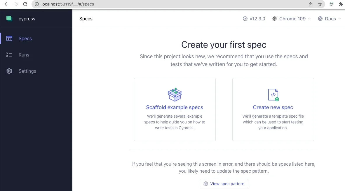
In a separate window, a browser opens to the Create your first spec page:
(Jordan Graham, CC BY-SA 4.0)
Click on the Scaffold example specs button to create a couple of new folders with example specs to help you understand how to use Cypress. Read through these in your code editor, and you'll likely find the language (based on JavaScript) intuitive and easy to follow.
Click on any in the test browser. This reveals two panels. On the left, a text panel shows each step in the active spec. On the right, a simulated browser window shows the actual user experience as Cypress steps through the spec.
Open the cypress.config.js file in your project root and change it as follows:
const { defineConfig } = require("cypress");

module.exports = defineConfig({
  component: {
    fixturesFolder: "cypress/fixtures",
    integrationFolder: "cypress/integration",
    pluginsFile: "cypress/plugins/index.js",
    screenshotsFolder: "cypress/screenshots",
    supportFile: "cypress/support/e2e.js",
    videosFolder: "cypress/videos",
    viewportWidth: 1440,
    viewportHeight: 900,
  },

  e2e: {
    setupNodeEvents(on, config) {
      // implement node event listeners here
    },
    baseUrl: "https://[your-local-dev-url]",
    specPattern: "cypress/**/*.{js,jsx,ts,tsx}",
    supportFile: "cypress/support/e2e.js",
    fixturesFolder: "cypress/fixtures"
   },
 });
Change the baseUrl to your project's URL in your local dev environment.
These changes tell Cypress where to find its resources and how to find all of the specs in your project.
Create a new directory called integration in your /cypress directory. Within the integration directory, create a file called test.cy.js:
cypress/
├─ e2e/
├─ fixtures/
├─ integration/
│  ├─ test.cy.js
├─ support/
node_modules/
vendor/
web/
.editorconfig
.gitattributes
composer.json
composer.lock
cypress.config.js
package-lock.json
package.json
Add the following contents to your test.cy.js file:
describe('Loads the front page', () => {
  it('Loads the front page', () => {
    cy.visit('/')
    cy.get('h1.page-title')
      .should('exist')
  });
});

describe('Tests logging in using an incorrect password', () => {
  it('Fails authentication using incorrect login credentials', () => {
    cy.visit('/user/login')
    cy.get('#edit-name')
      .type('Sir Lancelot of Camelot')
    cy.get('#edit-pass')
      .type('tacos')
    cy.get('input#edit-submit')
      .contains('Log in')
      .click()
    cy.contains('Unrecognized username or password.')
  });
});When you click on test.cy.js in the Cypress application, watch each test description on the left as Cypress performs the steps in each describe() section.
This spec demonstrates how to tell Cypress to navigate your website, access HTML elements by ID, enter content into input elements, and submit the form. This process is how I discovered that I needed to add the assertion that the <input id="edit-submit"> element contains the text Log in before the input was clickable. Apparently, the flex styling of the submit input impeded Cypress' ability to "see" the input, so it couldn't click on it. Testing really works!
You can write your own custom Cypress commands, too. Remember the supportFile entry in the cypress.config.js file? It points to a file that Cypress added, which in turn imports the ./commands files. Incidentally, Cypress is so clever that when importing logic or data fixtures, you don't need to specify the file extension, so you import ./commands, not ./commands.js. Cypress looks for any of a dozen or so popular file extensions and understands how to recognize and parse each of them.
Enter commands into commands.js to define them:
/**
 * Logs out the user.
 */

Cypress.Commands.add('drupalLogout', () => {
  cy.visit('/user/logout');
})

/**
 * Basic user login command. Requires valid username and password.
 *
 * @param {string} username
 *   The username with which to log in.
 * @param {string} password
 *   The password for the user's account.
 */

Cypress.Commands.add('loginAs', (username, password) => {
  cy.drupalLogout();
  cy.visit('/user/login');
  cy.get('#edit-name')
    .type(username);
  cy.get('#edit-pass').type(password, {
    log: false,
  });

  cy.get('#edit-submit').contains('Log in').click();
});
This example defines a custom Cypress command called drupalLogout(), which you can use in any subsequent logic, even other custom commands. To log a user out, call cy.drupalLogout(). This is the first event in the custom command loginAs to ensure that Cypress is logged out before attempting to log in as a specific user.
Using environment variables, you can even create a Cypress command called drush(), which you can use to execute Drush commands in your tests or custom commands. Look at how simple this makes it to define a custom Cypress command that logs a user in using their UID:
/**
* Logs a user in by their uid via drush uli.
*/

Cypress.Commands.add('loginUserByUid', (uid) => {
 cy.drush('user-login', [], { uid, uri: Cypress.env('baseUrl') })
   .its('stdout')
   .then(function (url) {
     cy.visit(url);
   });
});
This example uses the drush user-login command (drush uli for short) and takes the authenticated user to the site's base URL.
Consider the security benefit of never reading or storing user passwords in your testing. Personally, I find it amazing that a front-end technology like Cypress can execute Drush commands, which I've always thought of as being very much on the back end.
There's a lot more to Cypress, like fixtures (files that hold test data) and various tricks for navigating the sometimes complex data structures that produce a website's user interface. For a look into what's possible, watch the Cypress Testing for Drupal Websites webinar, particularly the section on fixtures that begins at 18:33. That webinar goes into greater detail about some interesting use cases, including an Ajax-enabled form. Once you start using it, feel free to use or fork Aten's public repository of Cypress Testing for Drupal.
Happy testing!
This article originally appeared on the Aten blog and is republished with permission.
Testing makes everything better. Learn how to use Cypress for your Drupal website.
Image by Mapbox Uncharted ERG, CC-BY 3.0 US
This work is licensed under a Creative Commons Attribution-Share Alike 4.0 International License.Ideally, designers have a good relationship with their product team and users. However, the relationship between designers and developers is more difficult to build and maintain. The lack of a close relationship makes it difficult to solve problems or improve.
In my experience, the open source Open Decision Framework can overcome many of these obstacles.
The Open Decision Framework asserts that open decision-making is transparent, inclusive, and customer-centric. It involves clearly sharing problems, requirements, and constraints with affected parties. It enables collaboration with multiple stakeholders to secure diverse opinions and comprehensive feedback. Most importantly, it manages relationships and expectations across competing needs and priorities.
These principles probably resonate with anyone involved in the many decisions around designing a product, feature, or service. For a designer, developers are key stakeholders in making the best design decisions. If you're a designer, it's time to embrace the opportunity to get diverse opinions.
Developers are key stakeholders because a user's product or service experience is more than just the pixels on the screen or the workflow designs. It encompasses the service's performance, the speediness of API calls, the way user data is treated, and even the design of the data for scalability. When they're considered full stakeholders in the design, developers can contribute their expertise on the backend and architecture of services to assist the overall design of the experience.
A user experience (UX) designer is a stakeholder for the items the dev team is responsible for. A performance deficit, or the effects of an architecture on what data is available, can hinder the user experience. An open, collaborative relationship between dev and design allows for trust and transparency in all areas.
An open and transparent relationship between developers and design is not as common as it should be. This way of working may be new to both sides. Here are my top five tips for making collaboration a success:
Set up a recurring time to collaborate: Establish a recurring time for design and development to meet between once a week and once a month. The invitation should at least include UX, lead engineering, and quality engineering. Ideally, all developers on the team should be invited to attend as schedules permit.
Make sharing the main agenda: UX should share the current use cases and features they are working on, along with any relevant user research data. UX designers should demonstrate workflow designs, wireframes, and high-fidelity mockups to the development team. Development should share any design decisions made on their side that may affect how the user experience works.
Encourage questions: Collaboration is the ideal scenario. Encourage all attendees to ask questions and give feedback. Answers to questions and responses to feedback are opportunities to discuss design and direction, as well as a chance to learn from one another.
Embrace a learning mindset: Avoid lecturing or "telling." Instead, aim to learn from each other. Use mutual expertise to design and build a great experience for users and customers. Ask for explanations of unfamiliar technology or concepts.
Consider formal learning: A collaborative relationship can be easier when groups speak the same language. Consider formal learning paths, such as:
In an early design review with a developer on my team, I showed a specific interaction for displaying more data about an object. I communicated the user's need and demonstrated the interaction when the developer asked, "Does it need to be done in exactly this way?"
He mentioned that with a few minor design changes, the effort to develop it would be significantly lower. We agreed that the changes would not negatively affect the user experience, and the user would still be able to achieve their goals.
This feedback saved the development team time, leaving more opportunity to address bugs, build additional features, and preserve a healthy work-life balance. The user experience remained strong, and the team was even stronger. This result would not have been possible without the early feedback from a developer with whom I had a strong working relationship.
Creating an experience is a series of decisions made by a collaborative team. Product, design, and development need to work together as experts in their respective fields and stakeholders in the others. I encourage you to engage development and design for more collaborative feedback and work together to create the best product with the best user experience.
Designing with open decisions can help increase collaboration between user experience and dev teams.
Opensource.com
This work is licensed under a Creative Commons Attribution-Share Alike 4.0 International License.I use GNOME as my primary desktop environment on my Linux PC at home. GNOME gives me an easy-to-use graphical desktop that provides the flexibility I need yet doesn't get in my way when I focus on my work.
GNOME recently released GNOME 44 with a bunch of new features. I reached out to the GNOME team to ask about the latest version and what was in it. Here's what team members Caroline Henriksen (brand manager), Matthias Clasen (GNOME developer and release team member), and Allan Day (design team) had to share.
Jim Hall: What are some of the new and updated features in GNOME 44 that you're most excited about?
GNOME Team: I am very excited to see how fresh and modern our user interfaces look. Not just in the core apps like Files (the file manager, Nautilus) but also in our Settings, which have seen a lot of work in the last cycle—many Settings panels have been improved. If you have a chance, you should try the new Mouse & Touchpad panel and enjoy the animated illustrations.
There's a lot to like in GNOME 44. For example, I think that a lot of people are going to be really happy about the new grid view in the file chooser, as well as being able to easily connect devices from the new Bluetooth menu in the quick settings.
Jim: The release notes mention GNOME Circle and that a few new apps have been added. What is GNOME Circle?
Team: GNOME Circle is a collection of fantastic apps that use the GNOME platform. It's GNOME's way of promoting the best apps that use our technologies and supporting app developers.
To be included in GNOME Circle, an app has to meet a set of requirements. Once it does, the developers get things like extra publicity and GNOME Foundation membership. That, in turn, gives them access to additional infrastructure and travel sponsorship. More information and how to apply can be found on the GNOME Circle page.
We're thrilled with how successful GNOME Circle has been. It contains more than 50 apps now! I particularly like that not all of these apps revolve around computing. You can find apps like a health tracker, a metronome, or a chess clock.
Jim: GNOME is the standard desktop in several Linux distributions. Where can we expect to see GNOME 44?
Team: The upcoming Fedora 38 release will include GNOME 44 and should be out sometime in April, as will Ubuntu 23.04. And GNOME 44 builds have already landed in openSUSE's Tumbleweed and MicroOS, to name just a few of the major distros.
Jim: The release name for GNOME 44 is Kuala Lumpur. Where does this name come from?
Team: GNOME has two major yearly conferences, GUADEC in the middle of the year (the next conference will take place in Latvia in July 2023) and GNOME Asia towards the end of the year. We are very thankful to the local team in Malaysia who welcomed us for GNOME Asia 2022 in Kuala Lumpur.
Organizing these events takes a lot of effort and commitment from the GNOME staff and the local teams. As a small sign of our appreciation, GNOME releases are named after the location of the most recent conference. This naming scheme was introduced a number of years ago. GNOME 3.18, Gothenburg, was the first.
Jim: GNOME has a strong user community with active members. How does GNOME keep the community so engaged?
Team: GNOME has always been a community-driven project with a strong sense of collaboration and inclusivity. That's part of what makes being a GNOME contributor and user so rewarding. Being a member of the GNOME community means that you get to interact with people from all over the world to work on common goals and exchange ideas. It is an enriching and inspiring experience, and I think that is what helps keep our community excited and engaged.
One important aspect of fostering that engagement is meeting our community where they're at and making our events more accessible to people from all over the world. For example, our flagship conference, GUADEC, was hosted in Guadalajara, Mexico, last year. This was the first time GUADEC happened outside of Europe, and this helped make it easier for GNOME users and contributors in Latin America to attend.
We also make an effort to meet our community members not just online and at our own conferences but at other events such as Linux Application Summit, FOSDEM, or SCaLE. If you see a GNOME booth at any of these events, please stop by and say hi. You'll often find developers, designers, foundation staff, and board members all happy to chat and answer questions.
Jim: How can folks get started with writing their own apps for GNOME? If I wanted to learn how to write my first "hello world" app for GNOME, is there a tutorial I can follow?
Team: The Get started developing for GNOME site includes a collection of tutorials, including a guide on quickly creating your first app. With new technologies like Flatpak and GNOME Builder, it's amazing just how easy it is to create your own app nowadays. Fire up Builder, click "new project," fill in some details, and you'll have your own running GNOME app. It really is that easy.
Jim: What are some ways that people can contribute?
Team: If someone is interested in GNOME and is motivated to get involved, there are definitely things they can do to help. Participating in discussions on our Discourse instance or reporting issues is a great place to start if you're a beginner. There are also lots of non-technical jobs that need doing, like helping with our documentation, translating GNOME into different languages, or even helping organize our annual conferences. A lot of these activities have friendly teams working on them who will help you to get started.
Alternatively, if you have coding experience, you can browse our "newcomer" tickets for tasks that might interest you.
Another way to contribute is through donating to GNOME. As an open source project and a non-profit foundation, regular donations help us continue to build up GNOME, provide necessary infrastructure, and power new initiatives.
[ Get the guide to installing applications on Linux ]
The GNOME Linux desktop's latest release is now available. Find out about the new and improved Bluetooth, user interface, apps, and other features in GNOME 44.
Gunnar Wortmann via Pixabay. Modified by Opensource.com. CC BY-SA 4.0.
This work is licensed under a Creative Commons Attribution-Share Alike 4.0 International License.Original post in French by Aurélien PIERRE, edited by the pixls community.
Darktable is slowly converging to a scene-referred RGB workflow. Why is that? What does it involve? How does the use of darktable change? Answers here…
This article begins with a 3 section introduction of the Lab space. You don’t need to understand it in detail in order to understand what happens next.
The color space CIE Lab was published in 1976 by the International Commission on Illumination (CIE), in an attempt to mathematically describe the color perception of the average human being. Lab space aims to decouple the brightness information (L channel) from the chroma information (channels a and b) and takes into account the non-linear corrections that the human brain makes to the linear signal it receives from the retina. Lab space is derived from CIE XYZ space, which represents the physiological response of 3 of the 4 types of photo-sensitive cells in the retina (the cones).
The XYZ space represents what happens in the retina, and Lab represents what subsequently happens in the brain, but both color spaces are models, that is, attempts to describe reality and not the reality itself. There are always discrepancies between a model and reality, but these models are refined and improved as research progresses. Moreover, a model often represents reality only under certain conditions and assumptions, which define the area of validity of each model.
Regarding their respective areas of validity, XYZ works well almost all the time, Lab only works as long as the image has a contrast less than 100:1 (i.e. a maximum dynamic range of 6.5 EV). In the context of the creation of the Lab model in 1976, researchers were working with scanned negatives, and color negatives have a dynamic range of 6 to 7 EV. 6.5 EV is also the static contrast of the retina, and it was a little after 1976 that we realized that the brain was constantly performing HDR fusion of several images per second, meaning that static contrast as a model parameter doesn’t make much sense in the context of human vision.
What is CIE Lab for? It is intended to predict the perceptual difference between 2 colors (the delta E) and to make gamut adaptations when converting an image from one color space to another. One can then try to remap the gamut to the closest color in the target color space via strategies that minimize the delta E digitally.
The big disadvantages of Lab are:
The original idea was to allow separate manipulation of the brightness and chromaticity. In 2009, the year of the project’s creation, cameras had dynamic ranges quite close to Lab’s valid range; the idea was far from bad at the time, especially because darktable did not have a complex masking option then.
Advantages:
Problems:
In brief, Lab was a youthful mistake. That said, all other photo processing pieces of software seem to work by default in non-linear RGB spaces (with a “gamma” applied at the beginning of the pipe) that are basically equivalent (regarding their flaws and drawbacks for image filters).
Everything (e.g. the camera sensor) starts from a linear RGB space. We convert linear RGB to XYZ. For the purposes of the demonstration, we can consider the XYZ space as a special RGB space whose primary colors have been slightly manipulated (that’s not the case, but it behaves the same way). XYZ is also a linear space.
We then switch from XYZ to Lab by applying a “gamma correction” on the luminance channel (from Y to L), and a rotation on the channels a and b. Mathematically, Lab is like applying 2.44 gamma to linear RGB – it poses the same practical problem: it’s highly non-linear.
Lab doesn’t work for high-contrast images and doesn’t work well for images with moderate contrast. It encodes pixel values in a perceptual manner rather than physical one, which will pose a problem in the following. Lab was not designed for image processing, but only as a way to study human vision.
Precision: I have used the term “gamma” or “gamma correction” incorrectly here. Strictly, a gamma function is the specific (technical) electrico-optical transfer function (EOTF) of old-school CRT screens, which is a power function with an exponent between 1.8 and 2.2. Nowadays, people incorrectly name “gamma” any power function used for technical integers encoding or artistic lightness adjustments, which is confusing. Any encoding transfer function (using a power function or not) should be called OETF (Opto Electrical Transfer Function), and is used only to alleviate the limits of 8 bits integer file formats. Any artistic power-like brightness corrections should be called a tone curve. Even if the operation is the same, it does not have the same meaning and should not be applied at the same place in the graphics pipe. But ICC nomenclature continues to call “gamma” the exponent used to encode/decode RGB pixels when using integer file formats, so here we are, mixing unrelated concepts under an umbrella name just because the maths write the same. But, when communicating with people out of the industry, it’s often easier to use the incorrect name so that everyone sort-of understands, even if it carries on the confusion.
By the way, power-like OETF are completely unnecessary as long as you use floating point arithmetic and files format (32 bits TIFF, PFM, OpenEXR…).
First of all, what do we mean by “linear”? If y is linear with respect to x, it means there’s a relationship between x and y in the form y= a . x + b, where a and b are real constants. Linear means proportional to something plus or minus a constant.
So, when we talk about linear RGB space, we mean that the RGB values are proportional to something. But proportional to what?
The sensor counts the number of photons it receives at each photosite. Every pixel contains information on the light spectrum captured at its position, in the form of 3 intensities (red, green, blue). The coefficient of proportionality a between the number of photons and the final RGB value is the ISO sensitivity of the sensor. The constant b is the sensor noise threshold. The RGB signal is proportional to the energy of the light emission picked up by the camera sensor.
From the point of view of human perception, these intensities being proportional to the physical energy level of the light emission, does not make sense. In fact, the brain applies a non-linear, logarithmic correction that the Lab color space approximates using a cubic root. This means that we have an increased sensitivity to dim light, and reduced sensitivity to bright light.
However, all optical operations that are performed during image capture (e.g. lens blur, noise creation, or the effect of a color filter added to the lens) are applied directly to the photons. To reverse the lens blur or to simulate it when processing, we need to work on the linear RGB information, which is the closest thing to the photon data that is available to us.
See for yourself: Which one of these two computer generated bokeh (original below) seems the most natural to you? (See also a more spectacular example on Chris Brejon’s website)
Observe in particular how the dark silhouettes (bottom left) merge into the light background, or the contrast of the pentagons formed by the lens diaphragm on spotlights.
Another example, with a simple blur on smooth surfaces: Which of these gradations seems to you to be the most progressive?
These two examples were generated with Krita, which allows you to work in both linear and non-linear RGB, and has filter layers including a physically realistic lens blur.
This type of problem will occur the same way in darktable, as soon as you use the modules sharpen, high-pass, low-pass, and feathering/smoothing of drawn and/or parametric masks (which are blurs).
Blurring, deblurring, or anything else connected to optics must take place in linear RGB. There’s no mathematical model* that allows correct gradients in RGB encoded for display (with an OETF) or in Lab, due to loss of connection between pixel values and light energy.
* and just because the problems aren’t visible all the time doesn’t mean the problems aren’t always there. We can, up to a certain point, hide them with mathematical trickery (thresholds, opacity, etc.), but they will always end up coming out at the worst time. Trust me, I know exactly where to push to make it break.
This is also the problem that arises with hue zones blending in the color zones module (even if a tweak, introduced under the “smooth” process mode, attempts to hide this under the rug), which produces granular and sharp transitions.
The only darktable module that works in Lab to make a blur, and where it still works reasonably, is the local laplacian mode of the local contrast module. The price we pay for it to work is that it’s very computationally heavy and theory is like rocket science. And, even if the blur is stable, it comes with an ungracious desaturation with a hue shift to muddy grey-blue when you push the sliders a little too hard.
So here’s where you say “as long as I’m not blurring my images or working only on color, I can still use Lab”.
That’s partly true, but in fact, even in those cases, working in linear RGB is simpler, with faster algorithms that can tolerate more extreme adjustments without showing annoying side-effects. Also, once again, Lab can’t support high dynamic ranges, so care must be taken to use the Lab modules after HDR tone mapping.
Strictly speaking, the only application where Lab is required is the gamut mapping, when changing color space before sending the image to a file or to the screen. And even then, since 1976, better spaces have been developed (IPT-HDR, JzAzBz) for this purpose, in HDR and with an almost perfect linearity of hues.
With the release of darktable 3.0, the default pipeline (i.e. the basic module order) has been reordered around filmic RGB. There are 4 essential steps in this pipe:
Note that the base curve approach remains the one applied by default because it allows darktable to more-or-less approximate the rendering of the camera JPEG as soon as the software is opened, which seems to be the preference of many users. Nevertheless, as part of darktable 3.0, the base curve was pushed back in the pixel pipe by default, to just before the filmic RGB module, which makes it safe for the colors produced by the modules that are applied earlier. The base curve module also was provided with a color preservation mode, which produces results similar to filmic RGB. Between base curve and filmic RGB, for darktable 3.0, the difference is now only about ergonomics and on the ability to recover very low light. filmic RGB is a little more complex to understand but faster to set up (once properly understood), and is more powerful when working in deep shadows.
Modules that work in linear RGB and output in linear (thus leaving the pipeline linear after them) are:
The advantage of performing linear operations is that they do not affect the chrominance of the image (because changing the luminosity leaves the chrominance intact) and preserve the energy proportionality of the signal. These modules must be positioned before filmic RGB or the base curve. Exposure and tone equalizer are recommended prior to the input color profile. They can be used safely and without moderation. Note that there is a catch here on the tone equalizer, which preserves local linearity (within the image areas), but not the overall linearity (between zones). It corresponds to what would happen if we walked onto the scene with a flashlight, and hand reilluminated the objects in the scene, so we still keep the physical coherence of the signal.
Modules that work in linear RGB and carry out non-linear, but chrominance-preserving operations, (provided that the chroma preservation mode is activated) are:
The chrominance is preserved via methods that constrain the RGB ratios in and out of the module, so as to keep them identical. Note that RGB curves and RGB levels can be moved before or after filmic RGB depending on the intention, since they’re doing non-linear operations anyway. On the other hand, be careful not to use the mask feathering on modules that come later, as linearity is no longer assured and mask blurring + blending could produce unpleasant results.
Modules that work in linear RGB and carry out non-linear operations without preserving the chrominance are:
Color balance is designed to be applied to linear RGB data that hasn’t been corrected for contrast, i.e. before filmic RGB, tone curves etc. It does not preserve the chrominance because its explicit purpose is to adjust chrominance creatively. Similarly for LUT 3D, for which the main goal is to emulate analog film emulsions or complex aesthetic transforms.
I remind readers here that filmic RGB is a dynamic range compressor, from the high dynamic range of the camera to the low dynamic range of the screen. It is not a tone curve intended to apply an artistic correction, but a mapping of tones to force fit the sensor data into the the available screen space. filmic RGB tries to protect the details as much as possible (which we assume a priori are in the middle tones) and to keep a certain optical readability in the image.
Before filmic RGB, in the linear pipe, we still find some modules that work in Lab but perform linear operations that should (strictly speaking) be realized in linear RGB:
These modules need to be adapted in the future to be able to work on a linear Yxy space (derived from CIE XYZ) because it is a mistake to make them work in Lab (at least, as a default). It’s a relatively easy job to do, because Yxy breaks down the luminance (Y channel) and chrominance (channels x and y) with a logic similar to Lab, minus the non-linear transformation. In the meantime, you can continue to use them, but with moderation. For the contrast equalizer, note that it uses an edge-sensitive wavelet separation, which makes it quite cumbersome to execute, but very effective at preventing halos, even considering that it works in Lab.
After filmic RGB, in the non-linear pipe, are all the other Lab modules, since they require low dynamic range. Some of these modules could also be converted to xyY and moved before filmic RGB in the future (in particular the soften, grain and fill light modules). Also note that the vignette module was left at the end of the pipe, as before, even though it works in RGB. It’s likely it’ll be better off before filmic RGB, or even before the input profile, but its code is surprisingly complex for what it does, and I haven’t had the time to unravel the imbroglio in order to understand what its working hypotheses are.
A number of modules are not recommended due to fundamental errors in design (based on my personal opinion, which is based on my practical and theoretical experience in image retouching), and in the spirit of streamlining the workflow with a minimum number of steps. There is nothing stopping you from continuing to use them, especially since users regularly introduce me to new use cases that I hadn’t thought of. But the idea here is to give you the keys to the best possible result as quickly as possible with as little fuss as possible.
Local tone mapping internally encodes RGB values logarithmically (they are then decoded at the output, so no problem at at this level), then applies a bilateral blur to these logarithmic values. As we saw above, theory is clear: a blur, on anything non-linear, produces halos and fringes. And as promised, the default setting range of this module is much reduced, so that users have become accustomed to merging the output of the module with low opacity – this is only hiding the misery.
Prefer the tone equalizer.
This module works in Lab color space to perform HDR compression, and if you have followed my explanations, you will understand that this is a contradiction in terms. In addition – and this is important – the white value is adjusted automatically from the maximum in the image, so the overall brightness of the image may change depending on the size of the export, due to the smoothing effect of the setting to scale (interpolation). To be expected: a lighter or darker JPEG than the preview in the darkroom.
Prefer filmic RGB.
Similarly, this module works in Lab color space to perform HDR compression and uses a Gaussian or bilateral blur to isolate highlights and shadows. In practice, it gives halos quickly as soon as you push the parameters (even if the bilateral blurring lessens the problems a little), and it even tends to add local contrast (as a secondary effect) in the highlights, giving clouds a very HDR look. In the shadows, used a little hard, colors turn blue-grey. In practice, it does not work, except for minor corrections.
Prefer the tone equalizer.
The low-pass filter is actually a simple blur. A lot of people use it to invert the contrast, and then blend it with overlay or soft/hard/linear light, to compress the dynamic range. This is in fact exactly what the shadows and highlights module already does in fewer steps for the user. As mentioned above, the low-pass module works in Lab color space, so for the blur… Expect the worst.
Prefer the contrast equalizer for blur, or the tone equalizer for local dynamic range compression
A lot of people use the high-pass module by blending it with overlay or soft/hard/linear light, for adding sharpness. This is in fact exactly what the sharpen module already does. The high pass is achieved by subtracting between a blur (low-pass) and the original image, so we have the same problem as for the low-pass because it’s still working in Lab.
Prefer the contrast equalizer for fine sharpness, or the local contrast for the general sharpness.
The sharpen module was originally intended for sensors with an optical low-pass filter as well as the smoothing due to demosaicing in some cases. First, as this module works in Lab, you need to avoid pushing it so much that it produces halos. Second, the internal sharpening method (using unsharp mask) is rather archaic and quickly artificial, even in RGB mode. Thirdly, in view of the sharpness of modern optics, given that many sensors no longer have low-pass filters, and that most of the photos will be exported at a reduction ratio of at least 8:1 (24 Mpx sensors to 3 Mpx screen), pixel-level sharpness enhancement has become practically useless. Generally speaking, the digital photographer of the 21st century would benefit from calming down with the crisp sharpness - it would be good for everyone.
Prefer to the contrast equalizer to deflect the optics via the presets provided, or the local contrast for general sharpness.
The monochrome module works in Lab, which it uses to define a weighted contribution of certain colours to the density of the black, in order to convert color into shades of gray. The problem is that the interface is quite sensitive to the settings, and a small correction can produce large changes and break the overall contrast in a rather ungraceful way. In practice, getting a predictable result is quite difficult and this module often results in a lot of tedious micro-adjustment sessions.
The idea of a weighted contribution of colors to the density of black comes from silver film, which behaves exactly the same way as this. But, as you saw coming, film doesn’t work in Lab and is not perceptually realistic. This idea is taken up in a physically realistic way in the channel mixer module, where several emulsion presets of commercial silver film are offered to create a grey channel. Note that, in order for the coefficients to be accurate, the colour space of the operating mode (in the module input profile) must be set to REC 709 linear, otherwise the settings will have to be adjusted.
For a black and white treatment that is based on human perceptual luminance (linear), simply lower the input or output saturation to 0% in the color balance module (right-click on the slider and enter 0 on the keypad – the setting is only up to 50% by default in the interface).
Prefer the channel mixer for a silver approach or the color balance for a perceptual approach.
These three modules aim to re-illuminate a part of the image, and attempt to dilute the correction in intensity and in space by blurring in the picture. But since they’re working in the Lab color space …I won’t say it again… The results are just bad all the time, except with very soft settings, in which case you didn’t’ really need those modules in the first place.
Prefer the exposure module with masks, or the tone equalizer
Every photograph has at least two sources of light: a direct source (lamp, sun, candle) and a reflected source (walls, clouds, floors, ceiling). It often happens that the white balance of these two sources does not coincide. In practice, human vision has ways to correct for this this, but not the camera. So it requires a separate white balance correction for the highlights (which generally receive direct light) and the shadows (which usually receive reflected light).
This is what the color correction module offers you, again in Lab color space, and with mixed and unnatural results as soon as you push the adjustment. When you think about it carefully, the white balance can be reduced to discussions of light spectrum, and the correction is simpler in RGB, especially to manage progressively of correction.
The color balance module allows you to adjust this quickly, and not just for the shadows and the highlights, but also for midtones. Using the color-pickers, to the right of the tint sliders, it also allows you to go directly to sample neutral tones in the image (for black, gray and white) and let the software calculate the complementary color. See the manual for more details.
Prefer color balance.
Velvia works in RGB and works on a logic quite similar to the color balance saturation. On the surface, it smells good. Except that in fact, its colorimetric equation is not perceptually correct. What it’s doing is changing the saturation (which is its intention), but at the same time it also changes the hue and brightness (which becomes awkward). The problem is that it seems to have been optimized for non-linear RGB. As a result, it is the kind of module that is typically unpredictable.
Prefer color balance.
These two are working as they should, no problem with that. But when you look at the code, you can see that it duplicates exactly the slope/offset/power mode of the color balance module. The white point is scaled by a simple exposure correction, such as the slope factor or even the exposure of the exposure module. The black point is adjusted by adding a constant, such as the factor of the offset, or the black level correction of the exposure module. The grey point is adjusted by a power function (sometimes improperly called gamma), just like the power factor of the color balance. They are not just the same features, they are exactly the same math. The difference is therefore not only in ergonomics, but also in the fact that the color balance gives you the numerical value settings, making them more easily transferable from one image to another or from one application to another. Curves and levels also assume you work SDR images, with data encoded between 0 and 1. If you work HDR pictures or raised the exposure quite a lot earlier in the pipe, the pixel values will not be clipped, but the GUI will not give you control over the pixels above 1 (or 100 %).
If you already use the color balance, there is no need to add an additional level module. Finish your retouching in the same module.
These also work well, but considering their classic use … are they really useful? Usually they are used to add/remove brightness, which falls in the same use case as the grey of the levels module or the power of the color balance module, or to add/remove contrast, which can be adjusted or by decreasing/increasing the interval between white and black (in a linear way) or by applying a non-linear brightness compression, again available from color balance.
Curve ergonomics is a real problem in an RGB linear workflow, because the middle gray is assumed to be in the center of the graph, which therefore assumes that we are working in non-linear RGB (where the gray at has been increased to 50%). In a linear encoding, the standard medium grey is expected at 18% (but the practice depends or where you anchored your exposure in camera), and the contrast control around this value not being centered on the graph becomes complex in the interface. In addition, the graph of the curves assumes a limited RGB signal between the values 0 and 100% (or 1)… 100% of What? White screen luminance. In a linear workflow, the HDR signal can go from 0 to infinity, and it is at filmic RGB step that we’re in charge of putting everything back between 0 and 100% of the white screen.
The contrast in the color balance module is compatible with this approach using the contrast fulcrum parameter, which allows the selection of the contrast reference. Thus when changing the contrast, we increase the light above the fulcrum, and reduce it below, but the fulcrum remains unchanged. The display workflow (in Lab or non-linear RGB) always has the implicit assumption that gray is 50%, uses it as a contrast reference, and doesn’t allow you to change that value.
Prefer color balance.
Module working in Lab, which duplicates again the modules levels, curves, and color balance while adding undesirable effects on colours.
Prefer color balance.
There is no correct replacement for the following modules for the moment, but they should be used with caution because they can be unpredictable and can cause you to lose a lot of time.
Vibrance works in Lab by applying a saturation correction that penalizes already saturated pixels to avoid over-saturation, but also tends to darken colors. The result is far from ugly, but the problem is that we can’t control how much we darken for the amount we resaturate.
Prefer color zones with a selection by saturation.
This module would be awesome if the merging of colour zones were more progressive. It now has two processing modes (strong, the old, and smooth, the new) which are trying to meet this challenge of two different ways, resulting in transitions too discrete for the new, and too abrupt for the old. One more time, it works in Lab, when similar functionality in Capture One seems to be using HSL or HSV, which seems to perform better than Lab.
In some cases, color zones will benefit from being replaced by the color balance module where parametric masking may be used to isolate the shades you want to act on. Then the refinement of the guided filter parametric mask should help in difficult cases. For the rest, color balance allows us to change the shade, saturation and brightness exactly the same.
Note, however, that the color balance module, although working in RGB internally, merges the masks into Lab because this module is older than the possibility to have 100 % RGB modules, and converts from Lab to RGB internally. We’re still working on it…
Prefer color balance.
Adding a vignette around an image is not complicated: you just have to to gradually lower the exposure, and eventually the saturation with a drawn mask. However, the vignetting module performs incomprehensible black magic, which is much more complicated than that, with an internal homogenization which would be superfluous if things were well done. The result is rarely natural, the transition in luminosity being too violent compared to a real vignette.
You will get better results with an instance of the exposure module set to -0.5 EV, a circular mask with a large transition area whose polarity is reversed, possibly coupled with a desaturation in color balance to which you pass the same mask as used in exposure (via a rasterized mask).
Prefer the exposure (and, optionally, the color balance saturation) modules.
Few people know this, but the blend modes lighten, darken, overlay, soft light, hard light, pin light and linear light implicitly expect the grey level to be 50% grey and are thus totally connected to the display-referred workflow. The blend modes are going to treat the pixels differently depending on whether they are above or below 50 %. Remember that the linear RGB workflow keeps the gray point at 18% (or even less). These blend modes will therefore behave in a way that is unpredictable in the scene-linear portions of the pipe.
In linear RGB, you should only use blend modes based on arithmetic operations (addition, multiplication, division, subtraction, average), on maximum/minimum comparisons (screen) or on channel separations (hue, color, chroma, etc.).
Note that the multiply mode is one of the most powerful in linear RGB. For example, to enhance the contrast of an image in a natural way, it is enough to use an instance of the exposure module blended with multiply. Set the exposure between 2 and 3 EV and the opacity between 10% and 50%. Exposure is then used to control the pivot of contrast, and opacity the intensity of the effect. It’s fast, simple and effective.
In darktable, you can choose between many modules that allow you to do the same thing in a lot of different ways. But this is merely an illusion of choice, as many of them have more disadvantages than advantages (provided you want to achieve predictable results for demanding edits). If you open the code for any of the modules not recommended above, you will see that they are almost all dated 2010-2011 - the only reason we retained them was to maintain compatibility with edits performed in prior versions of darktable.
You can perform at least 80% of your processing with just 4 modules :
The reason they’re so powerful is because they’re actually extremely simple, when you look at their equations:
With these 4 modules, you have everything you need to produce a correct image in terms of colorimetry, contrast, and artistic intent. Remember to turn off the base curve if you use the filmic RGB module. Then, if needed, finalize your edit with the following modules:
Some of the following modules have an underestimated power, and they are vastly underutilized:
Finally, to display only a minimal selection in the interface and modules, to the right of “More modules“, open the list of presets and select “workspace: all-purpose“.
darktable is a lot simpler when you understand that you don’t have to use all 77 of its modules at once …
If you have any doubts about the order of the modules, you should know that the default order for version 3.0 has been considered globally, and, apart from some uncertainties on the best position of the vignetting and monochrome modules, the rest is pretty solid, in theory and practice.
Pushing pixel values in either direction is one thing. Merging the corrections so they blend seamlessly together on the whole is another. We’ve seen that Lab or non-linear RGB allow the pixels to be pushed more or less correctly, but that it is always when doing mask blending (aka occlusion) and feathering (aka blurs) that we’re paying the price. It turns out there are a lot of blurs under the hood of darktable, sometimes where you don’t expect them. It’s especially problematic when you’re compositing, e.g. inlaying one image within another, to exchange their background without touching the foreground. And it’s precisely this kind of manipulation that led the movie industry to migrate to a scene-referred linear workflow about twenty years ago.
So darktable is in transition. It’s long, it’s sometimes painful, there are a lot of little bits to change in different places along with grumbling users who are hungry for consistency. At least now you know the why and the how. You also know what you have to win. I hope this helps you move forward.
For new users, limit yourself to the above recommended modules, and venture further when you begin to be comfortable. For older users, the new modules have a lot to offer to you, but old Lab modules are still relevant for moderate creative effects and when used with knowledge of their dangers.
The linear toolbox is being expanded. On the agenda:
There is more work than people to do it, so wish us good luck, don’t forget to support us, and Happy New Year 2020 to all of you!
Portrait photographer in Nancy-Metz. Calculation specialist, modeling and numerical simulation for image processing (denoising, deblurring, colour management) and thermal engineering. Developer of filmic RGB, tone equalizer, color balance, and the new themeable interface for darktable 3.0. darktable user since 2010. darktable is my job, so help me out to develop.
The IMAGE team at the GREYC research laboratory is pleased to announce the release of version 2.7 of G’MIC (GREYC’s Magic for Image Computing), its free, generic, extensible, and probably a little magical, framework for digital image processing.
The previous PIXLS.US article on this open-source framework was published a year ago, in August 2018. This new release is therefore a good opportunity to summarize the main features and milestones of the project’s life over the past twelve months. Fasten your seat belts, the road is long and full of surprises!
G’MIC is a piece of software that has been developed for more than 10 years now, mainly in C++, by two members of the IMAGE team of the GREYC lab: Sébastien Fourey and David Tschumperlé. It is distributed under the terms of the CeCILL free-software license. GREYC is a French public research laboratory located in Caen, specialized in digital sciences, under the head of three academic institutions: CNRS, University of Caen, and ENSICAEN.
The IMAGE team, one of the seven teams in the laboratory, is composed of researchers, professors, Ph.D. students and engineers, all specialized in the fields of algorithmics and mathematics of image processing.

G’MIC is cross-platform (GNU/Linux, MacOS, Windows, …). It provides various user interfaces for manipulating generic image data, i.e. 2D or 3D hyperspectral images or sequences of images with floating-point values (which indeed includes “usual” color images). Around a thousand different processing functions are already available. However, arbitrarily many features can be added thanks to an integrated scripting language.
The most commonly used G’MIC interfaces are: the gmic command, that can be accessed from the command line (which is an essential complement to ImageMagick or GraphicsMagick), the G’MIC Online Web service, but above all, the plug-in G’MIC-Qt, available for the well-known image editing software GIMP, Krita, and Paint.net. It provides more than 500 different filters to apply on images.
Thanks to its extensible architecture, G’MIC is regularly enhanced with new image processing algorithms, and it is these latest additions that will be discussed in the following sections.
G’MIC has recently implemented a neat filter for style transfer between two images, available from the G’MIC-Qt plug-in under the “Artistic / Stylize“ entry. The concept of style transfer is quite simple: we try to transform an image (typically a photograph) by transferring the style of another image to it (for example a painting).
The implementation of such a style transfer method is relatively complex: The algorithm must be able to recompose the original photograph by “borrowing” pixels from the style image and intelligently combining them, like a puzzle to be reconstructed, to best match the content of the data to be reproduced, in terms of contours, colors and textures. How easily this is done depends of course on the compatibility between the input image and the chosen style. In computer graphics, most existing implementations of style transfer methods are based on convolutional neural networks, more particularly generative adversarial networks (GANs).
G’MIC implements style transfer in a different way (without relying on neural networks, the scientific article detailing the algorithm is currently being written!). This method is parallelizable and can therefore benefit from all the processing units (cores) available on the user’s computer. The computation time naturally depends on the input image resolution, and the accuracy of the desired reconstruction. On a standard 4-cores PC, it could take tens of seconds for low resolution images (e. g. 800x800), up to several minutes for larger pictures.
As one can imagine, it is a very versatile filter, since we can apply any style to any input image without hard constraints. Some famous paintings are available by default in the filter, in order to propose predefined styles to the user.
Let us be honest, it is not always easy to obtain satisfactory results from the first draft. It is generally necessary to choose your starting images carefully, and to play with the many parameters available to refine the type of rendering generated by the algorithm. Nevertheless, the filter is sometimes able to generate quite interesting outcomes, such as those shown below (the original photo is visible at the top left, the style chosen at the top right, and the result of the style transfer at the bottom). Imagine how long it would take for a graphic designer to make these transformations “by hand”!


Other examples of image stylization can be found on the image gallery, dedicated to this filter. To our knowledge, G’MIC is the only “mainstream” image processing software currently offering a generic style transfer filter, where any style image can be chosen.
A last funny experiment: get a picture of an Alien’s head, like Roswell, and then select a crop of the Mandelbrot fractal set as your style image. Use the transfer filter to generate a “fractal” rendering of your alien head. Then, make the whole world believe that the Mandelbrot set contains the mathematical proof of the existence of aliens… ☺
In short, this filter has a clear creative potential for all kind of artists!
This year, G’MIC got an implementation of the RBFs interpolation method (Radial Basis Functions), which is able to estimate a dense interpolated function in any dimension, from a known set of scattered samples (not necessarily located on a regular grid). Thus, it gave us the idea to add distortion filters where the user interaction is focused in adding and moving keypoints over the image. In a second stage, G’MIC interpolates the data represented by these keypoints in order to perform the distortion on the entire image.
Let us start with the “Deformations / Warp [interactive]” filter which, as its name suggests, allows the user to distort an image locally by creating/moving keypoints.
The animation below shows this interactive filter in use, and illustrates the fact that these keypoints can be considered as anchors to the image, when they are moved.
(For those who might be concerned about the portraits photos used in the figures above and below: all these portraits are totally artificial, randomly generated by GANs via the website This Person Does Not Not Exist. No moral prejudices to dread!).
The great advantage of using RBFs-based interpolation is that we do not have to explicitly manage a spatial structure between the keypoints, for instance by defining a mesh (i.e. a “deformation grid”). This gives a greater degree of freedom in the obtained distortion (see Fig.3.3. below). And at the same time, we keep a rather fine control on the local amplitude of the applied distortion, since adding more “identity” keypoints around a region naturally limits the distortion amplitude inside this region.

A short demonstration of this distortion filter is also visible in this Youtube video.
And why not extending this kind of distortion for two images, instead of a single one? This is precisely what the new filter “Deformations / Morph [interactive]” does. It is able to render a morphing sequence between two images (put on two separate layers), using the same interpolation technique that only asks for the user to set colored keypoints which match on both images.
In the example above, keypoints are placed on characteristic areas of both faces (tip of nose, lips, eyebrows, etc.). In practice, this takes no more than 5 minutes. Thanks to these keypoints, the algorithm is able to estimate a global deformation map from one image to another, and can generate temporally “mixed” frames where the elements of the face remain relatively well aligned during the whole morphing sequence.

By comparison, here is what we would obtain by simply averaging the two input images together, i.e. without correcting the displacement of the facial features between both images. Not a pretty sight indeed!
Thus, the morphing filter is able to quickly generate a set of intermediate frames, ranging from the “Source” to the “Target” faces, a sequence that can then be saved as an animation.
Many other use cases of this morphing filter can be considered. The following example illustrates its application to render an animation from two photographs of the same object (a garden gnome), but shot with different DOFs (Depth of Field).


Command line users will be pleased to know that these two filters can be tested very quickly from a shell, as follows:
$ gmic image.jpg x_warp
$ gmic source.jpg target.jpg x_morph
~
For several years, G’MIC has contained colorimetric transformation filters able to simulate the film development process, or to give particular colorimetric moods to images (sunlight, rain, fog, morning, afternoon, evening, night, etc.). In a previous report, we already mentioned these filters, which are essentially based on the use of 3D CLUTs (Color Lookup Tables) for modeling the color transformation.
A 3D CLUT is technically a three-dimensional array that provides for each possible RGB color, a replacement color to apply to the image.
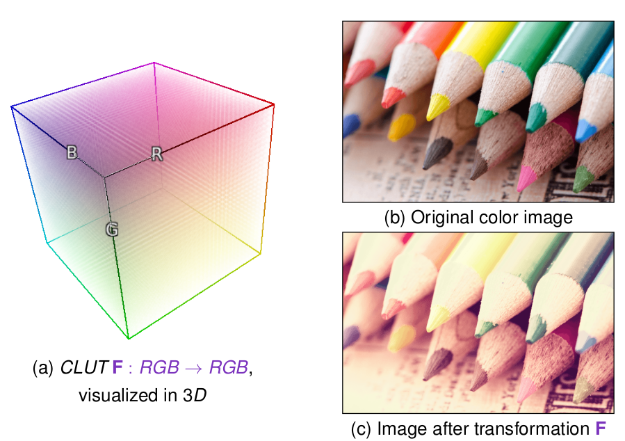
The main interest of these 3D CLUTs is the great variety of transformations they can represent: They can indeed define RGB-to-RGB functions with almost any kind of variations. The only “constraint” of these methods is that all image pixels having the same color will be transformed into pixels that also have an identical color.
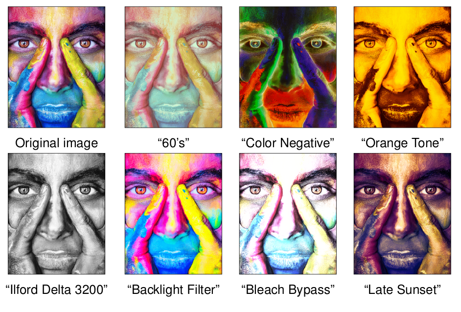
The disadvantage, however, is that these 3D CLUTs are relatively data intensive. When you want to embed several hundred different ones in the same piece of software (which is the case in G’MIC), you quickly find yourself with a large volume of data to install and manage. For instance, our friends at RawTherapee offer on their website an additional pack of 294 CLUTs functions to download. All these CLUTs are stored as .png files in a .zip archive with a total size of 402 MB. Even if downloading and storing a few hundred _MB_ is no longer limiting nowadays, it is still quite large for things as simple as color changing filters.
This year, we have therefore carried out important research and development work at the GREYC lab on this topic. The result: a new lossy compression algorithm (with visually imperceptible compression losses) that can generate binary representations of CLUTs with an average compression rate of more than 99%, relative to the data already loslessy compressed. The general idea is to determine an optimal set of color keypoints from which the CLUT can be reconstructed (decompression), and this, with a minimal reconstruction error.

As a result, this original compression method allowed us to offer no less than 763 CLUTs in G’MIC, all stored in a binary file that weights less than 3 MB !
All these color variation filters have been grouped into two separate entries in the G’MIC-Qt plug-in, namely “Colors / Simulate Film” (for analog film simulations), and “Colors / Color Presets” (for other color transformations). Each of these filters provides sub-categories for a structured access to the hundreds of CLUTs available. To our knowledge, this makes G’MIC one of the image processing software with the most colorimetric transformations, while keeping a reasonable size.
Readers interested in the mathematical details of these CLUT compression/decompression algorithms may refer to the scientific paper we wrote about it, as well as the presentation slides that have been presented at the conferences GRETSI’2019 (French conference, in Lille) and CAIP’2019 (International conference, in Salerno).
To finish with this topic, note that we have made an open-source implementation of our decompression algorithm of CLUTs available online (in C++, with 716 CLUTs already included). Discussions have also been initiated for a potential integration as a Darktable module for managing 3D CLUTs.
Let us now talk about the recent “Colors / Colorful Blobs” filter which is directly inspired by the original concept of Playful Palette created by the Adobe Research team in 2017. This filter is intended for illustrators (designers and digital painters). The goal: Create color palettes which contain only a few main colors (the ones you want to use in an illustration), but also a few sets of intermediate shades between these colors, in the form of color gradients. An artist is theoretically able to better preserve the color coherence of its artwork, by picking colors only from this palette.
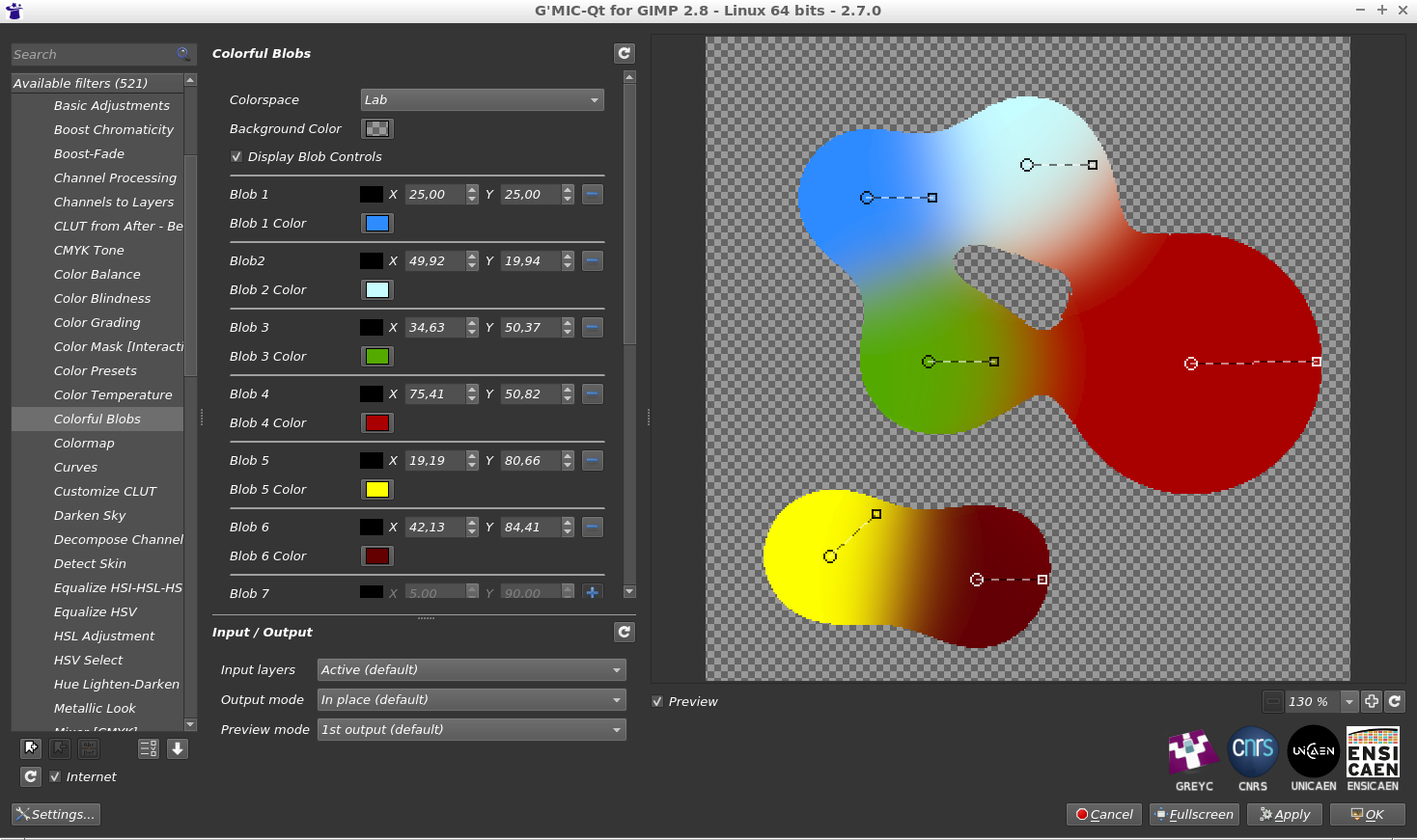
As shown on the figure above, the filter allows the artist to create and move colored “blobs” that, when merged together, create the desired color gradients. The result of the filter is thus an image that the artist can use afterward as a custom 2D color palette.
From a technical point of view, this filter is based on 2D metaballs to model the color blobs. Up to twelve separate blobs can be added and different color spaces can be chosen for the calculation of the color gradient (sRGB, Linear RGB or Lab). The filter also benefits from the recent development of the G’MIC-Qt plug-in that enhances the user interactivity inside the preview widget (a feature we mentioned in a previous report), as seen in the animation below (see also this longer video).
This filter may not be useful for most G’MIC users. But you have to admit, it’s pretty fun, isn’t it?
Let us now describe a selection of a few other filters and effects added during the year, perhaps less original than the previous ones (but not completely useless anyway!).
First of all, the “Rendering / Symmetric 2D Shape” filter is a great help when you want to draw geometric shapes having angular symmetries.
The plane can be subdivided into up to 32 angular pieces, each of which can contain a maximum of six keypoints to define a shape profile, allowing potentially complex and varied shapes to be rendered (such as the super-shuriken below!).
The “Degradations / Self Glitching” filter combines an image with a shifted version of itself, to create a Glitch-art type image. Several bitwise operations (Add, Mul, And, _Or_, Xor,…) can be chosen and you can adjust the shift direction and amplitude, as well as various other controls.
Again, this is not a filter that will necessarily be used every day! But it may be helpful for some people. It was actually added in response to a user request.
In the same style, the “Degradations / Mess With Bits” filter applies some arithmetic operations to the pixel values, seen as binary numbers (for instance, bit shift and bit inversion). Always with the idea of rendering Glitch art, of course!
The “Degradations / Noise [Perlin]” filter implements the generation of the Perlin noise, a very classical noise model in image synthesis, used for the generation of elevation maps for virtual terrains. Here we propose a multi-scale version of the original algorithm, with up to four simultaneous variation scales.
The “Frames / Frame [Mirror]” filter is also a “tailor-made” effect, to meet the needs of a G’MIC-Qt plug-in user. This photographer wanted to resize his photos to obtain a precise width/height ratio, but without having to crop his images. The solution was instead to add image information at the edges of the picture, by symmetry, in order to obtain the desired ratio. So that’s what this filter does.
Finally, let us mention the upcoming advanced image noise reduction filter, by Iain Fergusson, whose development is still in progress. Iain has been contributing to G’MIC for several years now by implementing and experimenting original denoising filters, and his latest project seems really interesting, with promising results. This video shows this filter in action, a good place to learn a little more about how it works.
Now that we’ve looked at these new filters, it seems important for us to remind that, as in many IT projects, this visible part of the iceberg hides a set of lower-level developments done to improve the interactive possibilities of the G’MIC-Qt plug-in, as well as the performance of the internal scripting language interpreter (the G’MIC language), which is how all these filters and effects are actually implemented. These improvements and incremental slight optimizations of the code base benefit to all filters (even those already available for several years) and it actually represents most of the development time we spend on G’MIC. So, dear users, do not be surprised if no new filters appear for a while. It is probably just because we are doing serious work on the G’MIC framework core!
Here are listed some other important news that have punctuated the life of the project since August 2018.
This is essential news for us: since March 2019, the G’MIC project has been granted permission to collect donations (via Paypal), to help in its maintenance and development!

This is a good thing, because until now, there was no simple way for a public research laboratory as the GREYC, to accept donations for supporting the development of a free software application such as G’MIC, an application used daily by several thousand people around the world. And we have currently no other ways to finance this piece of software in the long term.
Thus, we have partnered with LILA (Libre comme l’Art), a French non-profit organization promoting Arts, Artists and Free Software, who accepted to collect donations for us.
In practice, this is something that has been a little long to set up, but now that the donation system is operational, we hope to benefit from it in the future to make the project development even faster (the possible use of the raised funds is detailed on the donations page, this being of course very dependent on the amount of money collected).
For the sake of transparency, we will post the monthly amount of collected donations on the project website. At this point, we don’t really know what to expect in practice. We will see how these donations evolve. Of course, we would like to thank all those who have already participated (or plan to do so) in supporting our open-source framework for image processing. Our ultimate dream would be, one day, to say that the illustration below is only a distant memory!

Let us also mention the work of Jehan, known to PIXLS.US readers as a regular GIMP developer. Jehan has been hired by the GREYC laboratory in September 2018, to work on G’MIC (for a 12-month fixed-term contract), thanks to a grant funded by the INS2I Institute of the CNRS (for which we are grateful).
One of its first missions was to re-implement the G’MIC “Smart Coloring” algorithm (that we had already talked about previously) as a new interactive mode integrated into the existing GIMP “Bucket Fill“ tool.

Jehan described all his work in a blog post, which is strongly recommended for reading. Of course, we don’t want to copy his post here, but we want to mention this activity, and to consider it as another original contribution of the G’MIC project to free software for graphic creation: at the GREYC laboratory, we are really happy and proud to have imagined and developed an image colorization algorithm, which artists can use through a well integrated tool into such a popular piece of software as GIMP!
This intelligent colorization algorithm has been the subject of scientific publications, presentations at the conferences GRETSI’2017, EuroGraphics VMV’2018, as well as at the Libre Graphics Meeting’2019. And it is with a great pleasure we see this algorithm is used in real life, for various realizations (as in this great video of GDQuest, for colorizing sprites for video games, for instance).
Scientific research carried out in a public laboratory, which becomes available for the general public, that is what we want to see!
Recently, a major improvement in the performances of G’MIC under Windows has been achieved, by recoding the random number generator (now reentrant)) and removing some slow mutex which were responsible of performance drops for all filters requiring sequences of random numbers (and there were many!). As a result, some filters are accelerated by a factor of four to six under Windows!
Since December 2018, our G’MIC-Qt plug-in is available for Paint.net, a free graphic editing software application under Windows (not open-source though). This has been possible thanks to the work of Nicholas Hayes who wrote the glue code allowing the interaction between our G’MIC-Qt plug-in and the host software. Users of Paint.net are now able to benefit from the 500+ filters offered by G’MIC. This plug-in, available here, has already been voted “Best Plug-in of the Year 2018“ by the members of the Paint.net forum ☺ !
Since October 2018, the G’MIC-Qt plug-in for GIMP has been compiled and proposed for MacOS by a new maintainer, Andrea Ferrero, who is also the main developer of the free software application Photoflow, a non-destructive image editor (more information here). Many thanks Andrea, for this wonderful contribution!
Let us also thank Santa Claus, who kindly brang us a materialized version of our mascot “Gmicky” last year. That looks almost perfect!

The G’MIC project was presented at the FENO, the “Fête de l’Excellence Normande“, from 12 to 14 April 2019, at the Caen Exhibition Centre. We were hosted on the stand of the CNRS Normandie, and we carried out demonstrations of style transfer (teaser) and automatic illumination of clip arts (teaser), for the general public.
As you see, G’MIC is still an active open-source project, and with its 11 years of existence, it can be considered as mature enough to be used “in production” (whether artistic or scientific).
We have never defined and followed a precise roadmap for the project development: the functionalities come according to the needs of the developers and users (and the limited time we can devote to it!). At the moment, there is a lot of interest in image processing methods based on neural networks, and deep learning techniques. It is therefore possible that one day, some of these methods will be integrated into the software (for instance, we already have a prototyped code running in G’MIC that actually learns from image data with convolutional neural networks, but we are still at the prototyping stage…).
After 11 years of development (make it 20 years, if we include the development of the CImg library on which G’MIC is based), we have reached a point where the core of the project is, technically speaking, sufficiently well designed and stable, so as not to have to rewrite it completely in the next years. In addition, the number of features available in G’MIC already covers a large part of the traditional image processing needs.
The evolution of this project may therefore take several paths, depending on the human and material resources that we will be able to devote to it in the future (for the development, but also in project management, communication, etc.). Achieving an increase in these resources will undoubtedly be one of the major challenges of the coming years, if we want G’MIC to continue its progress (and we already have plenty of ideas for it!). Otherwise, this image processing framework might end up being just maintained in its current (and functional) state. It is of course with a hope for progression that we have recently set up the donation page. We also hope that other opportunities will soon arise to enable us to make this project more visible (you are invited to share this post if you like it!)
That’s it for now, this long post is now over, thank you for holding on until the end, you can resume normal activity! I’ll be happy to answer any questions in the comments.
Post-scriptum: Note that the 3D animation displayed as the teaser image for this post has been actually generated by G’MIC, via the command $ gmic x_starfield3d. An opportunity to remind that G’MIC also has its own _3D_ rendering engine capable of displaying simple objects, which is very practical for scientific visualization! We may have the occasion to talk about it again in a future post…
A special thank you for reviewing and helping to translate this article to:
Patrick David, Sébastien Fourey, Christine Porquet, Ryan Webster.
digiKam stores the current state of the application in the ~/.config/digikamrc file. This file keeps track of pretty much everything: from the database connection profile and custom toolbar settings, to the last-used curve and sharpening parameters. So next time you install or reinstall digiKam, don’t forget to back up the digikamrc file. This way, you don’t have to configure a fresh digiKam installation from scratch. Simply copy the file to a safe location or external storage device, and drop the file into the ~/.config folder before you run digiKam.
When it comes to Android apps for photographers, we are spoiled for choice. From depth-of-field and golden hour calculators to sun position and remote control apps – there are plenty of clever tools to choose from. But there is one particular app combination that can prove to be indispensable for any photographer on the move: a GPS logger and a GPX viewer. There are two main reasons for that.
Tracking your movements and saving them in the GPX format can come in handy for geotagging photos.
The ability to attach comments to the current location allows you to use the GPS logging app to note places you either photographed or you plan to photograph later. You can then use a GPX viewer app to see and manage bookmarked locations.
There are several apps that offer GPS logging and viewing, but you can’t go wrong with GPS Logger for Android and Trekarta. Both apps are released under an open source license, and they are available free of charge on Google Play and F-Droid.
How you set up GPS Logger for Android is a matter of personal preference. One way to go is to configure the app to automatically start tracking on boot and upload tracks to the desired destination (e.g., a NAS or a file sharing service).
Once GPS Logger for Android is running, adding a comment to the current location is as easy as pulling down the notification drawer and tapping Comment. The app saves the tracks as GPX files in the Android/data/com.mendhak.gpslogger/files directory on your Android device. To view a GPX file in Trekarta, use a file manager to navigate to the directory, and use Android’s sharing functionality to send the desired GPX file to Trekarta.
Siril is a program for processing astronomical photographs.
In this tutorial, I’ll show you how to process a nightscape in Siril 0.9.10.
It doesn’t intend to be comprehensive tutorial but rather to present a basic general workflow that is a good starting point for those who want to learn Siril.
For this purpose, I’m sharing the raw files I used for the image I presented here, except that for this tutorial I limited the number of frames for the sake of bandwidth and processing speed.
You can find and download the raw files here (~1GB).
The raw files are placed in specific sub-folders according to their use:
./Bias (20 files)./Darks (15 files)./Flats (15 files)./Lights (10 files)Bias, dark, and flat field frames are also called “calibration” frames, their purpose being to improve the quality of the image by correcting the signal-to-noise ratio (in the case of bias and dark frames) and vignetting (with the flat frames). There are several places where you can learn more about the different types of frames for astrophotography.
At the root of the folder, I placed two text files with the .ssf extension, these are scripts used by Siril for batch processing the files. Quite useful. If you want to run a script from Siril, place the .ssf files in ~/.siril/scripts. Upon restarting Siril, a new Scripts menu appears in the top menu bar, allowing you to launch the installed scripts.
I suggest you download the whole folder (~1GB), and move the scripts as indicated above. This way, if you set the working directory in Siril to the root of the folder, launching the script named processing_from_raw.ssf will automagically process the raws and create the output image in both .fit and .tif (16-bit) formats. Please note that in order to successfuly run the scripts, there must be a folder structure like the one used in this tutorial.
I will present the steps I used to process an image of the Milky Way. I don’t know if it’s the best way, but it’s probably close to what the developers of Siril advise to do for the general case of starting from raw files (actually, I started from one of their scripts and just slightly adapted it).
We will start with processing the calibration files, and then processing the lights.
Change dir….
+ button as shown (make sure that you select RAW DSLR Camera Files in the combo box) and select the bias frames located in the Bias subfolder.
bias (or whatever you see fit) to set the prefix of the sequence and subsequent files, and click Convert to convert the files to the FITS format, which is the main format used by Siril. Note that you don’t need to demosaic the files yet, make sure the Debayer box is unchecked.When done converting the bias frames, a window will pop up showing a preview of one of the bias frames. Note that since it’s not demosaiced, it will only show as a B&W channel image.
At this point, the bias frames are loaded and ready to be processed to make a master-bias frame.
It should look like this:
bias_stacked.fit in the Bias subfolder.Since the flats also contain the sensor readout noise (contained in the bias frames), we should remove it by subtracting the master-bias.
In the File conversion tab, remove the files already loaded by clicking on the button located just below the - (minus) button, and by clicking on the + (plus) button select and load the flat frames located in the Flats subfolder.
Set the working directory to the Flats sub-folder by clicking on “Change dir…” and set the Sequence name as “flats”.
Like for the bias frames, ensure Debayer is unchecked, then click on Convert.
In the Pre-processing tab, check only the Use offset box, click on Browse to select the Bias/bias_stacked.fit file, and click on Start pre-processing.
To generate the master-flat, go to the Stacking tab, and this time set Normalisation to Multiplicative and the Stacking Method as Average with rejection.
Click on Start stacking to produce the pp_flat_stacked.fit master-flat frame in the Flats subfolder.
As with the bias and flats, you need to load the dark frames.
In the File conversion tab, remove the files already loaded, select and load the dark frames located in the Darks subfolder.
Set the working directory to the Darks sub-folder by clicking on Change dir…, and set Sequence name as darks.
Debayer should be unchecked.
Click on Convert.
The darks need to be stacked the same way as the bias frames. In the Stacking tab, choose Average with rejection and No normalisation.
Click Start Stacking.
The master-dark frame is saved as Darks/dark_stacked.fit.
Note: if you take images often in the same conditions (same air temperature, same exposure settings), you can save the dark_stacked and pp_flat_stacked files, and re-use them to process future light frames faster. I read on some forums that some astrophotographers keep their calibration files and use those for around 1 year, before taking new calibration frames.
Now it’s time to start processing the light frames, by first subtracting the darks (which also contain the bias signal) and the flats (from which bias has already been subtracted).
Select the light frames in the File conversion tab.
Set the Sequence name to lights, and point the working directory to the Lights (Change dir...).
Convert the files, still without debayering.
Then go to the Pre-Processing tab, check Use dark, select the Darks/dark_stacked.fit file, check Use flat, and select the Flats/pp_flat_stacked.fit file.
Make sure that the other boxes are checked as in the following screenshot.
Note that “Cosmetic Correction” can also be done from the “Image Processing” tab.
This will produce new FITS files with the prefix pp_light_ and the corresponding .seq file. These files are loaded.
It’s time to demosaic our processed files. There’s something strange in the GUI, in that after pre-processing, when you uncheck “Use dark” and “Use flat” boxes, the “Debayer FITS images before saving” and the “Start pre-processing” button become grayed out.
pp_light_000xx.fit files.db_pp_light as the sequence name.
The pre-processed lights will be saved as FITS files, and the corresponding db_pp_light.seq file loaded. Two preview windows will open this time, one with the 3 RGB channels separated, and one with the RGB composite image.
If you have more 8GB of RAM, you can try checking the Simplified Drizzle x2 box (it will up-sample the images by a factor 2, increasing the RAM usage by a factor 4). Siril will detect the stars and register each of the 10 images. The preview windows will be updated. By the way, you can play with the zoom and select AutoStretch to get a better preview of the selected image.
In the Stacking tab, make sure that Average with rejection is selected as the stacking method, and that Additive with scaling is set for Normalisation.
Click on Start stacking.
The resulting aligned and stacked image will be saved as Lights\r_db_pp_light_stacked.fit.
Siril can do some more or less specialized post-processing to your image. I found it interesting to use.
crop 30 30 5950 3970.The resulting image can be saved as JPEG, TIFF, PNG, etc. for further processing in your favorite image editor or as a finished image if you’re satisfied.
The problem with this whole process, is that because the images have been aligned with the stars as reference, the foreground will be blurred because earth moved between successive frames. What I do is to reprocess the light frames from just after the calibration step (i.e. after the dark and flat frames subtraction) but only skipping the stars registration step. By doing so, the foreground will undergo the same pre- and post-processing, and the resulting image will have a sharp foreground and trailing sky.
I provided a script (processing_from_raw_foreground.ssf) which will do that for you, if you already used the first script or if you use the same file naming convention as in the script.
Finally, in your favorite image editor, you can combine the “sky” and “foreground” images using a mask, to get both the sky and the foreground sharp.
Here’s what I obtained following these steps (but using the scripts), after just combining the 2 images in Gimp:
And after quick curve and saturation tweaking in Gimp: