Normal view

G'MIC 1.7.1


G'MIC 1.7.1

When the flowers are blooming, image filters abound!

A new version 1.7.1Spring 2016” of G’MIC (GREYC’s Magic for Image Computing), the open-source framework for image processing, has been released recently (26 April 2016). This is a great opportunity to summarize some of the latest advances and features over the last 5 months.

G’MIC: A brief overview

G’MIC is an open-source project started in August 2008. It has been developed in the IMAGE team of the GREYC laboratory from the CNRS (one of the major French public research institutes). This team is made up of researchers and teachers specializing in the algorithms and mathematics of image processing. G’MIC is released under the free software licence CeCILL (GPL-compatible) for various platforms (Linux, Mac and Windows). It provides a set of various user interfaces for the manipulation of generic image data, that is images or image sequences of multispectral data being _2D_ or _3D_, and with high-bit precision (up to 32bits floats per channel). Of course, it manages “classical” color images as well.

logo_gmic
Logo and (new) mascot of the G’MIC project, the open-source framework for image processing.

Note that the project just got a redesign of its mascot Gmicky, drawn by David Revoy, a French illustrator well-known to free graphics lovers for being responsible for the great libre webcomics Pepper&Carott.

G’MIC is probably best known for it’s GIMP plug-in, first released in 2009. Today, this popular GIMP extension proposes more than 460 customizable filters and effects to apply on your images.

gmic_gimp171_s
Overview of the G’MIC plug-in for GIMP.

But G’MIC is not a plug-in for GIMP only. It also offers a command-line interface, that can be used in addition with the CLI tools from ImageMagick or GraphicsMagick (this is undoubtly the most powerful and flexible interface of the framework). G’MIC also has a web service G’MIC Online to apply effects on your images directly from a web browser. Other G’MIC-based interfaces also exist (ZArt, a plug-in for Krita, filters for Photoflow…). All these interfaces are based on the generic C++ libraries CImg and libgmic which are portable, thread-safe and multi-threaded (through the use of OpenMP). Today, G’MIC has more than 900 functions to process images, all being fully configurable, for a library of only approximately 150 kloc of source code. It’s features cover a wide spectrum of the image processing field, with algorithms for geometric and color manipulations, image filtering (denoising/sharpening with spectral, variational or patch-based approaches…), motion estimation and registration, drawing of graphic primitives (up to 3d vector objects), edge detection, object segmentation, artistic rendering, etc. This is a versatile tool, useful to visualize and explore complex image data, as well as elaborate custom image processing pipelines (see these slides to get more information about the motivations and goals of the G’MIC project).

A selection of some new filters and effects

Here we look at the descriptions of some of the most significant filters recently added. We illustrate their usage from the G’MIC plug-in for GIMP. All of these filters are of course available from other interfaces as well (in particular within the CLI tool gmic).

Painterly rendering of photographs

The filter Artistic / Brushify tries to transform an image into a painting. Here, the idea is to simulate the process of painting with brushes on a white canvas. One provides a template image and the algorithm first analyzes the image geometry (local contrasts and orientations of the contours), then attempt to reproduce the image with a single brush that will be locally rotated and scaled accordingly to the contour geometry. By simulating enough of brushstrokes, one gets a “painted” version of the template image, which is more or less close to the original one, depending on the brush shape, its size, the number of allowed orientations, etc. All these settings being customizable by the user as parameters of the algorithm: This filter allows thus to render a wide variety of painting effects.

gmic_brushify
Overview of the filter “Brushify” in the G’MIC plug-in GIMP. The brush that will be used by the algorithmis visible on the top left.

The animation below illustrates the diversity of results one can get with this filter, applied on the same input picture of a lion. Various brush shapes and geometries have been supplied to the algorithm. Brushify is computationally expensive so its implementation is parallelized (each core gives several brushstrokes simultaneously).

brushify2
A few examples of renderings obtained with “Brushify” from the same template image, but with different brushes and parameters.

Note that it’s particularly fun to invoke this filter from the command line interface (using the option -brushify available in gmic) to process a sequence of video frames (see this example of “ brushified “ video):


Reconstructing missing data from sparse samples

G’MIC gets a new algorithm to reconstruct missing data in images. This is a classical problem in image processing, often named “Image Inpainting“, and G’MIC already had a lot of useful filters to solve this problem. Here, the newly added interpolation method assumes only a sparse set of image data is known, for instance a few scattered pixels over the image (instead of continuous chuncks of image data). The analysis and the reconstruction of the global image geometry is then particularly tough.

The new option -solidify in G’MIC allows the reconstruction of dense image data from such a sparse sampling, based on a multi-scale diffusion PDE’s-based technique. The figure below illustrates the ability of the algorithm with an example of image reconstruction. We start from an input image of a waterdrop, and we keep only 2.7% of the image data (a very little amount of data!). The algorithm is able to reconstruct a whole image that looks like the input, even if all the small details have not been fully reconstructed (of course!). The more samples we have, the finer details we can recover.

waterdrop2
Reconstruction of an image from a sparse sampling.

As this reconstruction technique is quite generic, several new G’MIC filters takes advantage of it:

  • Filter Repair / Solidify applies the algorithm in a direct manner, by reconstructing transparent areas from the interpolation of opaque regions. The animation below shows how this filter can be used to create an artistic blur on the image borders.
gmic_sol
Overview of the “Solidify” filter, in the G’MIC plug-in for GIMP.

From an artistic point of view, there are many possibilities offered by this filters. For instance, it becomes really easy to generate color gradients with complex shapes, as shown with the two examples below (also in this video that details the whole process).

gmic_solidify2
Using the “Solidify” filter of G’MIC to easily create color gradients with complex shapes (input images on the left, filter results on the right).
  • Filter Artistic / Smooth abstract uses same idea as the one with the waterdrop image: it purposely sub-samples the image in a sparse way, by choosing keypoints mainly on the image edges, then use the reconstruction algorithm to get the image back. With a low number of samples, the filter can only render a piecewise smooth image, i.e. a smooth abstraction of the input image.
smooth_abstract
Overview of the “Smooth abstract” filter in the G’MIC plug-in for GIMP.
  • Filter Rendering / Gradient [random] is able to synthetize random colored backgrounds. Here again, the filter initializes a set of colors keypoints randomly chosen over the image, then interpolate them with the new reconstruction algorithm. We end up with a psychedelic background composed of randomly oriented color gradients.
gradient_random
Overview of the “Gradient [random]” filter in the G’MIC plug-in for GIMP.
  • Simulation of analog films : the new reconstruction algorithm also allowed a major improvement for all the analog film emulation filters that have been present in G’MIC for years. The section Film emulation/ proposes a wide variety of filters for this purpose. Their goal is to apply color transformations to simulate the look of a picture shot by an analogue camera with a certain kind of film. Below, you can see for instance a few of the 300 colorimetric transformations that are available in G’MIC.
gmic_clut1
A few of the 300+ color transformations available in G’MIC.

From an algorithmic point of view, such a color mapping is extremely simple to implement : for each of the 300+ presets, G’MIC actually has an HaldCLUT, that is a function defining for each possible color (R,G,B) (of the original image), a new color (R’,G’,B’) color to set instead. As this function is not necessarily analytic, a HaldCLUT is stored in a discrete manner as a lookup table that gives the result of the mapping for all possible colors of the RGB cube (that is 2^24 = 16777216 values if we work with a 8bits precision per color component). This HaldCLUT-based color mapping is illustrated below for all values of the RGB color cube.

gmic_clut0
Principle of an HaldCLUT-based colorimetric transformation.

This is a large amount of data: even by subsampling the RGB space (e.g. with 6 bits per component) and compressing the corresponding HaldCLUT file, you ends up with approximately 200 and 300 kB for each mapping file. Multiply this number by 300+ (the number of available mappings in G’MIC), and you get a total of 85MB of data, to store all these color transformations. Definitely not convenient to spread and package!

The idea was then to develop a new lossy compression technique focused on HaldCLUT files, that is volumetric discretised vector-valued functions which are piecewise smooth by nature. And that what has been done in G’MIC, thanks to the new sparse reconstruction algorithm. Indeed, the reconstruction technique also works with _3D_ image data (such as a HaldCLUT!), so one simply has to extract a sufficient number of significant keypoints in the RGB cube and interpolate them afterwards to allow the reconstruction of a whole HaldCLUT (taking care to have a reconstruction error small enough to be sure that the color mapping we get with the compressed HaldCLUT is indistinguishable from the non-compressed one).

gmic_clut2
How the decompression of an HaldCLUT now works in G’MIC, from a set of colored keypoints located in the RGB cube.

Thus, G’MIC doesn’t need to store all the color data from a HaldCLUT, but only a sparse sampling of it (i.e. a sequence of { rgb_keypoint, new_rgb_color }). Depending on the geometric complexity of the HaldCLUTs to encode, more or less keypoints are necessary (roughly from _30_ to 2000). As a result, the storage of the 300+ HaldCLUTs in G’MIC requires now only 850 KiB of data (instead of 85 MiB), that is a compression gain of 99% ! That makes the whole HaldCLUT data storable in a single file that is easy to ship with the G’MIC package. Now, a user can then apply all the G’MIC color transformations while being offline (previously, each HaldCLUT had to be downloaded separately from the G’MIC server when requested).

It looks like this new reconstruction algorithm from sparse samples is really great, and no doubts it will be used in other filters in the future.

Make textures tileable

Filter Arrays & tiles / Make seamless [patch-based] tries to transform an input texture to make it tileable, so that it can be duplicated as tiles along the horizontal and vertical axes without visible seams on the borders of adjacent tiles. Note that this is something that can be extremely hard to achieve, if the input texture has few auto-similarity or glaring luminosity changes spatially. That is the case for instance with the “Salmon” texture shown below as four adjacent tiles (configuration 2x2) with a lighting that goes from dark (on the left) to bright (on the right). Here, the algorithm modifies the texture so that the tiling shows no seams, but where the aspect of the original texture is preserved as much as possible (only the texture borders are modified).

seamless1
Overview of the “Make Seamless” filter in the G’MIC plug-in for GIMP.

We can imagine some great uses of this filter, for instance in video games, where texture tiling is common to render large virtual worlds.

seamless2
Result of the “Make seamless” filter of G’MIC to make a texture tileable.

Image decomposition into several levels of details

A “new” filter Details / Split details [wavelets] has been added to decompose an image into several levels of details. It is based on the so-called “à trous” wavelet decomposition. For those who already know the popular Wavelet Decompose plug-in for GIMP, there won’t be so much novelty here, as it is mainly the same kind of decomposition technique that has been implemented. Having it directly in G’MIC is still a great news: it offers now a preview of the different scales that will be computed, and the implementation is parallelized to take advantage of multiple cores.

gmic_wavelets
Overview of the wavelet-based image decomposition filter, in the G’MIC plug-in for GIMP.

The filter outputs several layers, so that each layer contains the details of the image at a given scale. All those layers blended together gives the original image back.

Thus, one can work on those output layers separately and modify the image details only for a given scale. There are a lot of applications for this kind of image decomposition, one of the most spectacular being the ability to retouch the skin in portraits : the flaws of the skin are indeed often present in layers with middle-sized scales, while the natural skin texture (the pores) are present in the fine details. By selectively removing the flaws while keeping the pores, the skin aspect stays natural after the retouch (see this wonderful link for a detailed tutorial about skin retouching techniques, with GIMP).

skin
Using the wavelet decomposition filter in G’MIC for removing visible skin flaws on a portrait.

Image denoising based on “Patch-PCA”

G’MIC is also well known to offer a wide range of algorithms for image denoising and smoothing (currently more than a dozen). And he got one more ! Filter Repair / Smooth [patch-pca] proposed a new image denoising algorithm that is both efficient and computationally intensive (despite its multi-threaded implementation, you probably should avoid it on a machine with less than 8 cores…). In return, it sometimes does magic to suppress noise while preserving small details.

patchpca
Result of the new patch-based denoising algorithm added to G’MIC.

The “Droste” effect

The Droste effect (also known as “mise en abyme“ in art) is the effect of a picture appearing within itself recursively. To achieve this, a new filter Deformations / Continuous droste has been added into G’MIC. It’s actually a complete rewrite of the popular Mathmap’s Droste filter that has existed for years. Mathmap was a very popular plug-in for GIMP, but it seems to be not maintained anymore. The Droste effect was one of its most iconic and complex filter. Martin “Souphead”, one former user of Mathmap then took the bull by the horns and converted the complex code of this filter specifically into a G’MIC script, resulting in a parallelized implementation of the filter.

droste0
Overview of the converted “Droste” filter, in the G’MIC plug-in for GIMP.

This filter allows all artistic delusions. For instance, it becomes trivial to create the result below in a few steps: create a selection around the clock, move it on a transparent background, run the Droste filter, et voilà!.

droste2
A simple example of what the G’MIC “Droste” filter can do.

Equirectangular to nadir-zenith transformation

The filter Deformations / Equirectangular to nadir-zenith is another filter converted from Mathmap to G’MIC. It is specifically used for the processing of panoramas: it reconstructs both the Zenith and the Nadir regions of a panorama so that they can be easily modified (for instance to reconstruct missing parts), before being reprojected back into the input panorama.

zenith1
Overview of the “Deformations / Equirectangular to nadir-zenith” filter in the G’MIC plug-in for GIMP.

Morgan Hardwood has wrote a quite detailled tutorial, here on pixls.us, about the reconstruction of missing parts in the Zenith/Nadir of an equirectangular panorama. Check it out!

Other various improvements

Finally, here are other highlights about the G’MIC project:

  • Filter Rendering / Kitaoka Spin Illusion is another Mathmap filter converted to G’MIC by Martin “Souphead”. It generates a certain kind of optical illusions as shown below (close your eyes if you are epileptic!)
spin2
Result of the “Kitaoka Spin Illusion” filter.
  • Filter Colors / Color blindness transforms the colors of an image to simulate different types of color blindness. This can be very helpful to check the accessibility of a web site or a graphical document for colorblind people. The color transformations used here are the same as defined on Coblis, a website that proposes to apply this kind of simulation online. The G’MIC filter gives strictly identical results, but it ease the batch processing of several images at once.
gmic_cb
Overview of the colorblindness simulation filter, in the G’MIC plug-in for GIMP.
  • Since a few years now, G’MIC has its own parser of mathematical expression, a really convenient module to perform complex calculations when applying image filters This core feature gets new functionalities: the ability to manage variables that can be complex, vector or matrix-valued, but also the creation of user-defined mathematical functions. For instance, the classical rendering of the Mandelbrot fractal set (done by estimating the divergence of a sequence of complex numbers) can be implemented like this, directly on the command line:
    $ gmic 512,512,1,1,"c = 2.4*[x/w,y/h] - [1.8,1.2]; z = [0,0]; for (iter = 0, cabs(z)<=2 && ++iter<256, z = z**z + c); 6*iter" -map 7,2
    
gmic_mand
Using the G’MIC math evaluator to implement the rendering of the Mandelbrot set, directly from the command line!_

This clearly enlarge the math evaluator ability, as you are not limited to scalar variables anymore. You can now create complex filters which are able to solve linear systems or compute eigenvalues/eigenvectors, and this, for each pixel of an input image. It’s a bit like having a micro-(micro!)-Octave inside G’MIC. Note that the Brushify filter described earlier uses these new features extensively. It’s also interesting to know that the G’MIC math expression evaluator has its own JIT compiler to achieve a fast evaluation of expressions when applied on thousands of image values simultaneously.

  • Another great contribution has been proposed by Tobias Fleischer, with the creation of a new _C_ API to invoke the functions of the libgmic library (which is the library containing all the G’MIC features, initially available through a C++ API only). As the _C_ ABI is standardized (unlike C++), this basically means G’MIC can be interfaced more easily with languages other than C++. In the future, we can imagine the development of G’MIC APIs for languages such as Python for instance. Tobias is currently using this new _C_ API to develop G’MIC-based plug-ins compatible with the OpenFX standard. Those plug-ins should be usable indifferently in video editing software such as After effects, Sony Vegas Pro or Natron. This is still an on-going work though.
gmic_natron
Overview of some G’MIC-based OpenFX plug-ins, running under Natron.
gmic_blender2
Overview of a dedicated G’MIC script running within the Blender VSE.
  • You can find out G’MIC filters also in the opensource nonlinear video editor Flowblade, thanks to the hard work of Janne Liljeblad (Flowblade project leader). Here again, the goal is to allow the application of G’MIC effects and filters directly on image sequences, mainly for artistic purposes (as shown in this video or this one).
gmic_flowblade
Overview of a G’MIC filter applied under Flowblade, a nonlinear video editor.

What’s next ?

As you see, the G’MIC project is doing well, with an active development and cool new features added months after months. You can find and use interfaces to G’MIC in more and more opensource software, as GIMP, Krita, Blender, Photoflow, Flowblade, Veejay, EKD and Natron in a near future (at least we hope so!).

At the same time, we can see more and more external resources available for G’MIC : tutorials, blog articles (here, here, here,…), or demonstration videos (here, here, here, here,…). This shows the project becoming more useful to users of opensource software for graphics and photography.

The development of version 1.7.2 already hit the ground running, so stay tuned and visit the official G’MIC forum on pixls.us to get more info about the project developement and get answers to your questions. Meanwhile, feel the power of free software for image processing!
Links:

Post Libre Graphics Meeting


Post Libre Graphics Meeting

What a trip!

What a blast!

This trip report is long overdue, but I wanted to process some of my images to share with everyone before I posted.

It had been a couple of years since I had an opportunity to travel and meet with the GIMP team again (Leipzig was awesome) so I was really looking forward to this trip. I missed the opportunity to head up to the great white North for last years meeting in Toronto.

London Calling

Passport to LGM
Passport? Check! Magazine? Check! Ready to head to London!

I was going to attend the pre-LGM photowalk again this year so this time I decided to pack some bigger off-camera lighting modifiers for everyone to play with. Here’s a neat travelling photographer pro-tip: most airlines will let you carry on an umbrella as a “freebie” item. They just don’t specify that it has to be an umbrella to keep the rain off you. So I carried on my big Photek Softlighter II (luckily my light stands fit in my checked luggage). Just be sure not to leave it behind somewhere (which I was paranoid about for most of my trip). Luckily I was only changing planes in Atlanta.

Atlanta Airport International Terminal
The new ‘futristic’ looking Atlanta airport international terminal.

A couple of (bad) movies and hours later I was in Heathrow. I figured it wouldn’t be much trouble getting through border control.

I may have been a little optimistic about that.

The Border Force agent was quite nice and super inquisitive. So much so that I actually began to worry at some point (I think I must have spent almost 20 minutes talking to her) that she might not let me in!

She kept asking what I was coming to London for and I kept trying to explain to her what a “Libre Graphics Meeting“ was. This was almost a tragic comedy. The idea of Free Software did not seem to compute to her and I was sorry I had even made the passing mention. Her attention then turned to my umbrella and photography. What was I there to photograph? Who? Why? (Come to think of it, I should start asking myself those same questions more often… It was an existential visit to the border control.)

In the end I think she got bored with my answers and figured that I was far too awkward to be a threat to anything. Which pretty much sums up my entire college dating life.

Photowalk

In what I hope will become a tradition we had our photowalk the day before LGM officially kicked off and we could not have asked for a better day of weather! It was partly cloudy and just gorgeous (pretty much the complete opposite to what I was expecting for London weather).

Furtherfield Commons

Furtherfield Logo

I want to thank Ruth Catlow (http://ruthcatlow.net/) for allowing us to use the awesome space at Furtherfield Commons in Finsbury Park as a base for our photowalk! They were amazingly accommodating and we had a wonderful time chatting in general about art and what they were up to at the gallery and space.

They have some really neat things going on at the gallery and space so be sure to check them out if you can!

Going for a Walk with Friends

This is one of my favorite things about being able to attend LGM. I get to take a stroll and talk about photography with friends that I only usually get to interact with through an IRC window. I also feel like I can finally contribute something back to these awesome people that provide software I use every day.

IMGP6089
Mairi between Simon and myself (I’m holding a reflector for him).
Photo by Michael Schumacher cbna

We meandered through the park and chatted a bit about various things. Simon had brought along his external flash and wanted to play with off-camera lighting. So we convinced Liam to stand in front of a tree for us and Simon ended up taking one of my favorite images from the entire trip. This was Liam standing in front of the tree under the shade with me holding the flash slightly above him and to the camera right.

Liam by nomis
Liam by Simon

We even managed to run into Barrie Minney while on our way back to the Commons building. Aryeom and I started talking a little bit while walking when we crossed paths with some locals hanging out in the park. One man in particular was quite outgoing and let Aryeom take his photo, leading to another fun image!

Upon returning to the Commons building we experimented with some of the pretty window light coming into the building along with some black panels and a model (Mairi). This was quite fun as we were experimenting with various setups for the black panels and speedlights. Everyone had a chance to try some shots out and to direct Mairi (who was super patient and accommodating while we played).

Mairi Natural Light
I was having so much fun talking and trying things out with everyone that I didn’t even take that many photos of my own! This is one of my only images of Mairi inside the Commons.
Mairi Natural Light cba

Towards the end of our day I decided get my big Softlighter out and to try a few things in the lane outside the Commons building. Luckily Michael Schumacher grabbed an image of us while we were testing some shots with Mairi outside.

IMGP6108
A nice behind-the-scenes image from schumaml of the lighting setup used below.
Yes, that’s darktable developer hanatos bracing the umbrella from the wind for me!
Photo by Michael Schumacher cbna

I loved the lane receding in the background and thought it might make for some fun images of Mairi. I had two YN-560 flashes in the Softlighter both firing around ¾ power. I had to balance the ambient sky with the softlighter so needed the extra power of a second flash (it also helps to keep the cycle times down).

Mairi Finsbury
Mairi waiting patiently while we set things up.
Mairi Finsbury cba
50mm f/8.0 1200 ISO200
Mairi Finsbury Park (In the Lane)
Mairi Finsbury Park (In the Lane) cba

The day was awesome and I really enjoyed being able to just hang out with everyone and take some neat photos. The evening at the pub was pretty great also (I got to hang out with Barrie and his friend and have a couple of pints - thanks again Barrie!).

LGM

It never fails to amaze me how every year the LGM organizers manage to put together such a great meeting for everyone. The venue was great and the people were just fantastic at the University of Westminster.

University of Westminster
View of the lobby and meeting rooms (on the second floor).
LGM Auditorium
Andrea Ferrero (@Carmelo_DrRaw) presenting PhotoFlow in the auditorium!

The opening “State of the Libre Graphics“ presentation was done by our (the GIMP teams) very own João Bueno who did a fantastic job! João will also be the local organizer for the 2017 LGM in Rio.

Thanks to contributions from community members Kees Guequierre, Jonas Wagner, and Philipp Haegi I had some great images to use for the PIXLS.US community slides for the “State of the Libre Graphics“. If anyone is curious, here is what I submitted:

PIXLS State of Libre Graphics 0

These slides can be found on our Github PIXLS.US Presentations page (along with all of our other presentations that relate to PIXLS.US and promoting the community).

Speaking of presentations…

Presentation

I was given some time to talk about and present our community to everyone at the meeting. (See embedded slides below):

LGM2016 PIXLS.US Presentation

I started by looking at what my primary motivation was to begin the site and what the state of free software photography was like at that time (or not like). Mainly that the majority of resources online for photographers that were high quality (and focused on high-quality results) were usually aimed at proprietary software users. Worse still, in some cases these websites locked away their best tutorials and learning content behind paywalls and subscriptions. I finished by looking at what was done to build this site and forum as a community for everyone to learn and share with each other freely.

I think the presentation went well and people seemed to be interested in what we were doing! Nate Willis even published an article about the presentation at LWN.net, “Refactoring the open-source photography community”:

Pat David presenting on PIXLS.US at LGM 2016
A photo of me I don’t hate! :)

Exhibition

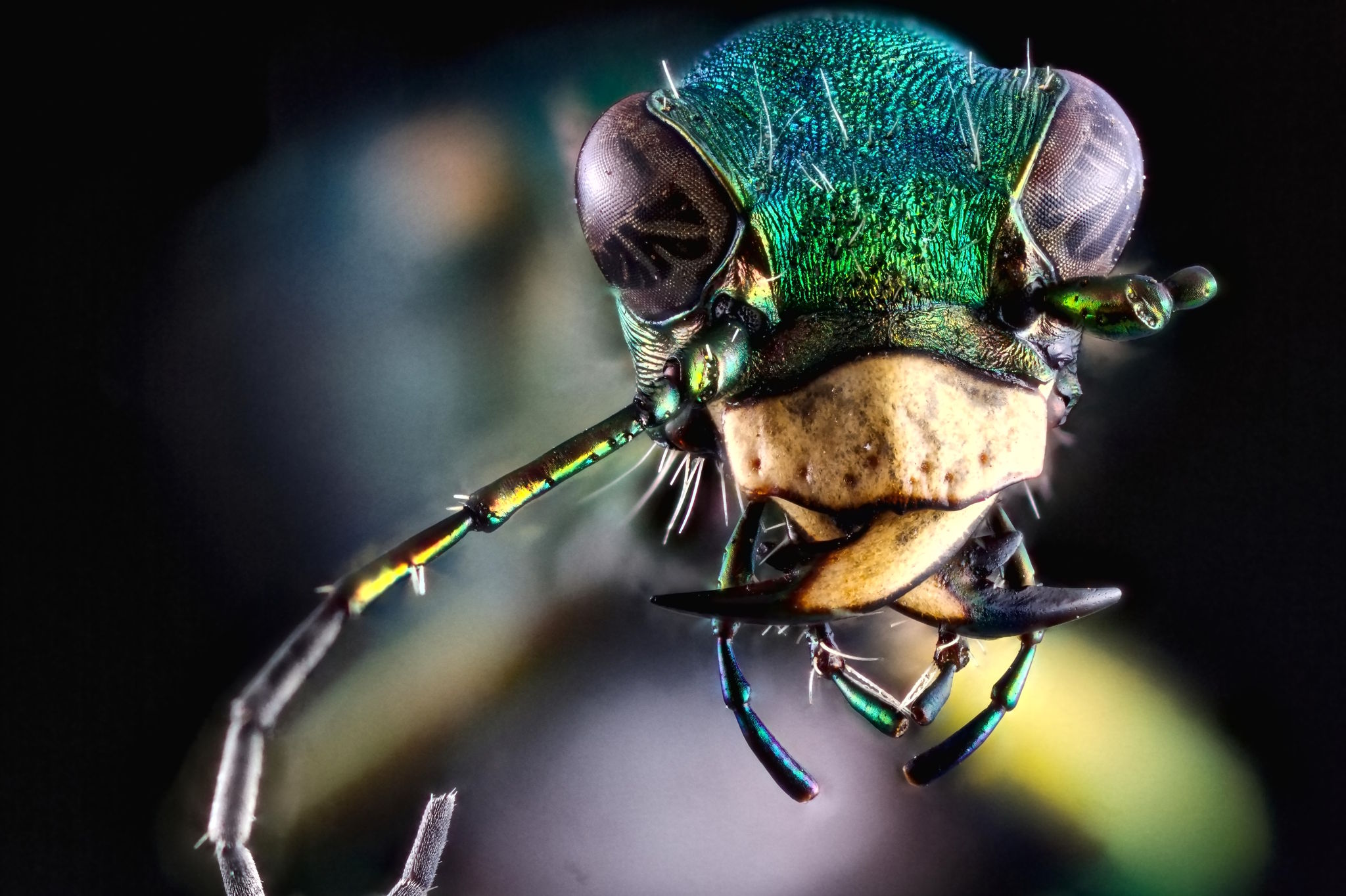
A nice change this year was the inclusion of an exhibition space to display works by LGM members and artists. We even got an opportunity to hang a couple of prints (for some reason they really wanted my quad-print of pippin). I was particularly happy that we were able to print and display the Green Tiger Beetle by community member Kees Guequierre:

hanatos and houz at LGM
Hanatos and houz inspecting the prints at the exhibition.
View of the LGM Exhibition
View of the Exhibition. Well attended!
Pippin x5
pippin x5

Portraits

In Leipzig I thought it would be nice to offer portraits/headshots of folks that attended the meeting. I think it’s a great opportunity to get a (hopefully) nice photograph that people can use in social media, avatars, websites, etc. Here’s a sample of portraits from LGM2014 of the GIMP team that sat for me:

GIMPers

In 2014 I was lucky that houz had brought along an umbrella and stand to use, so this time I figured it was only fair that I bring along some gear myself. I had the Softlighter setup on the last couple of days for anyone that was interested in sitting for us. I say us because Marek Kubica (@Leonidas) from the community was right there to shoot with me along with the very famous @Ofnuts (well - famous to me - I’ve lost count of the neat things I’ve picked up from his advice)! Marek took quite a few portraits and managed the subjects very well - he was conversational, engaged, and managed to get some great personality from them.

Still don't know your name
A sample portrait by Marek Kubica cba
Better with glasses
Better with glasses by Marek Kubica cba

A couple of samples from the images that I got are here as well, and they are the local organizer Lara with students from the University! I simply can’t thank them enough for the efforts and generosity in making us feel so welcome.

Lara University of Westminster

I’m still working through the portraits I took, but I’ll have them uploaded to my Flickr soon to share with everyone!

GIMPers

One of the best parts of attendance is getting to spend some time with the rest of the GIMP crew. Here’s an action shot during the GIMP meeting over lunch with a neat, glitchy schumaml:

GIMP Meeting Panorama
There’s even some darktable nerds thrown in there!

It was great to see everyone at the flat on our last evening there as well…

GIMP and darktable at LGM
Everyone spending the evening together! Mitch is missing from his seat in this shot (back there by pippin).

Wrap up

Overall this was another incredible meeting bringing together great folks who are building and supporting Free Software and Libre Graphics. Just my kind of crowd!

I even got a chance to speak a bit with the wonderful Susan Spencer of the Valentina project and we roughed out some thoughts about getting together at some point. It turns out she lives just up the same state as me (Alabama)! This is simply too great to not take advantage of - Free Software Fashion + Photography?! That will have to be a fun story (and photos) for another day…

Keep watching the blog for some more images from the trip - up next are the portraits of everyone and some more shots of the venue and exhibition!

Pre-LGM Photowalk


Pre-LGM Photowalk

Time to take some photos!

It’s that time of year again! The weather is turning mild, the days are smelling fresh, and a bunch of photography nerds are all going to get together in a new country to roam around and (possibly) annoy locals by taking a ton of photographs! It’s the Pre-Libre Graphics Meeting photowalk of 2016!

Come join us the day before LGM kicks off to have a stroll through a lovely park and get a chance to shoot some photos between making new friends and having a pint.

Thanks to the wonderful work by the local LGM organizing team, we are able to invite everyone out to the photowalk on Thursday, April 14th the day before LGM kicks off.

Furtherfield Logo

They were able to get us in touch with the kind folks at Furtherfield Gallery & Commons in Finsbury Park. They’ve graciously offered us the use of their facilities at the Furtherfield Commons as a base to start from. So we will meet at the Commons building at 10:00 on Thursday morning.

Pre-LGM Photowalk
10:00 (AM), Thursday, April 14th
Furtherfield Commons
Finsbury Gate - Finsbury Park
Finsbury Park, London, N4 2NQ

An overview of the photowalk venue relative to the LGM venue at the University of Westminster, Harrow:

If you would like to join us but may not make it to the Commons by 10:00, email me and let me know. I’ll try my best to make arrangements to meet up so you can join us a little later. I can’t imagine we’d be very far away (likely somewhere relatively near by in the park).

We’ll plan on meandering through the park with frequent stops to shoot images that strike our fancy. I will personally be bringing along my off-camera lighting equipment and a model (Mairi) to pose for us during the day. In case anyone wanted to play/learn a little about that type of photography.

There is no set time for finishing up. I figured we would play it by ear through lunch and to possibly all finish up at a nice pub together. (Taking advantage of the golden hour light at the end of the day hopefully).

In the spirit of saying “Thank you!” and sharing, I have also offered the Furtherfield folks our services for headshots and architectural/environmental shots of the Commons and Gallery spaces. For sure I will be taking these images for them but if anyone else wanted to pitch in and try, help, or assist the effort would be very welcome!

Dot in the Leipzig Market, 2014
Dot in the Leipzig Market from the 2014 Pre-LGM photowalk.

Speaking of which, if you plan on attending and would like to explore some particular aspect of photography please feel free to let me know. I’ll do my best to match folks up based on interest. I sincerely hope this will be a fun opportunity to learn some neat new things, make some new friends, and to maybe grab some great images at the same time!

If there are any questions, please don’t hesitate to reach out to me!
`patdavid@gmail.com`
patdavid on irc://irc.gimp.org/#gimp

Happy Birthday DISCUSS.PIXLS.US


Happy Birthday DISCUSS.PIXLS.US

Where did the time go?!

For some reason I was checking my account on the forums earlier today and noticed that it was created in April, 2015. On further inspection it looks like my, and @darix, accounts were created on April 2nd 2015.

(Not to be confused with the main site because apparently it took me about 8 months to get a forum stood up…)

Which means that the forums have been around for just over a year now?!

So, Happy Birthday discuss!

We’re just over a year old and just under 500 users on the forum!

For fun, I looked for the oldest (public) post we had and it looks like it’s the “Welcome to PIXLS.US Discussion“ thread. In case anyone wanted to revisit a classic…

THANK YOU so much to everyone who has made this an awesome place to be and nerd out about photography and software and more! Since we started we migrated the official G’MIC forums here as well as our friends at RawTherapee! We’ve been introduced to some awesome projects like PhotoFlow as well as Filmulator. And everyone has just been amazing, supportive, and fun to be around.

As I posted in the original Welcome thread…

Lighting Diagrams


Lighting Diagrams

Help Us Build Some Assets!

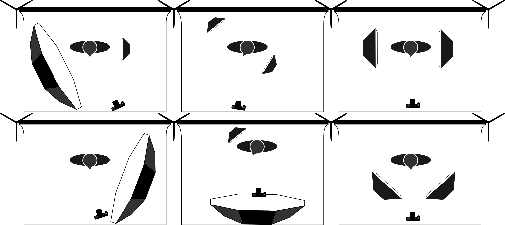
Community member Eric Mesa asked on the forums the other day if there might be some Free resources for photographers that want to build a lighting diagram of their work. These are the diagrams that show how a shot might be set up with the locations of lights, what types of modifiers might be used, and where the camera/photographer might be positioned with respect to the subject. These diagrams usually also include lighting power details and notes to help the production.

It turns out there wasn’t really anything openly available and permissively licensed. So we need to fix that…

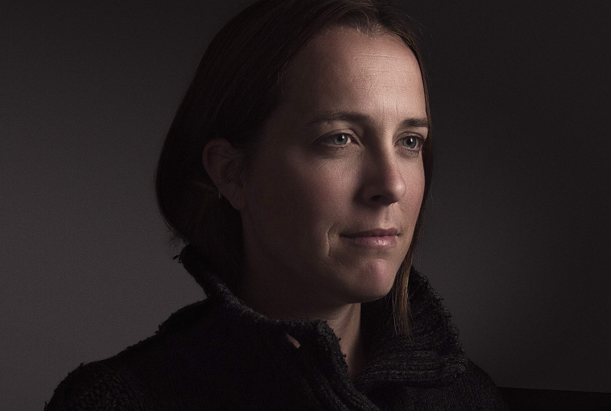
These diagrams are particularly handy for planning a shoot conceptually or explaining what the lighting setup was to someone after the fact. For instance, here’s a look at the lighting setup for Sarah (Glance):

Sarah (Glance) by Pat David
Sarah (Glance)
Sarah (Glance) Lighting Diagram
YN560 full power into a 60” Photek Softlighter, about 20” from subject.
She was actually a bit further from the rear wall…

There are a few different commercial or restrictive-licensed options for photographers to create a lighting diagram, but nothing truly Free.

So thanks to the prodding by Eric, I thought it was something we should work on as a community!

I already had a couple of simple, basic shapes created in Inkscape for another tutorial so I figured I could at least get those files published for everyone to use.

I don’t have much to start with but that shouldn’t be a problem! I already had a backdrop, person, camera, octabox (+grid), and a softbox (+grid):

Lighting Diagram Assets

PIXLS.US Github Organization

I already have a GitHub organization setup just for PIXLS.US, you can find the lighting-diagram assets there:

https://github.com/pixlsus/pixls-lighting-diagram

Feel free to join the organization!

Even better: join the organization and fork the repo to add your own additions and to help us flesh out the available diagram assets for all to use! From the README.md on that repo, I compiled a list of things I thought might be helpful to create:

  • Cameras
    • DSLR
    • Mirrorless
    • MF
  • Strobes
    • Speedlight
    • Monoblock
  • Lighting Modifiers
    • Softbox (+ grid?)
    • Umbrella (+ grid?)
    • Octabox (+ grid?)
    • Brolly
  • Reflectors
  • Flags
  • Barn Doors / Gobo
  • Light stands? (C-Stands?)
  • Environmental
    • Chairs
    • Stools
    • Boxes
    • Backgrounds (+ stands)
  • Models

If you don’t want to create something from scratch, perhaps grabbing the files and tweaking the existing assets to make them better in some way?

Hopefully we can fill out the list fairly quickly (as it’s a fairly limited subset of required shapes). Even better would be if someone picked up the momentum to possibly create a nice lighting diagram application of some sort!

The files that are there now are all licensed Creative Commons By-Attribution, Share-Alike 4.0.

PlayRaw (Again)


PlayRaw (Again)

The Resurrectioning

On the old RawTherapee forums they used to have a contest sharing a single raw file amongst the members to see how everyone would approach processing from the same starting point. They called it PlayRaw. This seemed to really bring out some great work from the community so I thought it might be fun to start doing something similar again here.

I took a (relatively) recent image of Mairi and decided to see how it would be received (I’d say fairly well given the responses). This was my result from the raw file that I called Mairi Troisième:

Mairi Troisieme

I made the raw file available under a Creative Commons, By-Attribution, Non-Commercial, Share-Alike license so that anyone could freely download and process the file as they wanted to.

The only things I asked for was to see the results and possibly the processing steps through either an XMP or PP3 sidecar file (darktable and RawTherapee respectively).

Here’s a montage of the results from everyone:

I loved being able to see what everyone’s approaches looked like. It’s neat to get a feel for all the different visions out there among the users and there were some truly beautiful results!

If you haven’t given it a try yourself yet, head on over to the [PlayRaw] Mairi Troisieme thread to get the raw file and try it out yourself! Just don’t forget to show us your results in the topic.

I’ll be soliciting options for a new image to kick off another round of processing again soon.

Speaking of Mairi

Don’t forget that we still have a Pledgie Campaign going on to help us offset the costs of getting everyone together at the 2016 Libre Graphics Meeting in London this April!

Click here to lend your support to: PIXLS.US at Libre Graphics Meeting 2016 and make a donation at pledgie.com !

Donations go to help cover to costs of various projects to come together and meet, photograph, discuss, and hack at things. Please consider donating as every little bit helps us immensely! If you can’t donate then please consider helping us to raise awareness of what we’re trying to do! Either link the Pledgie campaign to others or let them know we’re here to help and share!

Even better is if you’re in the vicinity of London this April 15–18! Come out and join us as well as many other awesome Free Software projects all focused on the graphics community! We (PIXLS) will be conducting photowalks and meet-ups the Thursday before LGM kicks off as well!

Oh, and I finally did convince Mairi to join us through the weekend to model for us as needed. She’s super awesome and worth raising a glass to/with! Even more reason to come out and join us!

Mairi Deux

Shimming an Adapter to be Parallel


Shimming an Adapter to be Parallel

Achieving perfect infinity focus

Some of you may know I exclusively use Contax manual focus lenses on my Canon cameras. I have had one reliable adapter from the start, that just happened to be perfect in every way: perfectly parallel, and lets my lenses focus exactly to infinity, and none of my lenses hit the mirror on my 5D.

However, swapping adapters between cameras gets mighty tedious, so recently I have been trying a variety of different adapters for my cameras, several quality tiers ranging from the cheapest ($15) up to the most expensive ($70).

39cc6bc295d7b8fb61f7f30bddb439236c3c07ba.jpg

However, I wasn’t satisfied with any of them. In order to assure that the adapted lenses can focus to infinity even with manufacturing tolerances, they’re made thinner than necessary. This means that they focus past infinity, and with some lenses the mirror of my 5D would hit the back of the lens, needing me to wiggle it to free the mirror after taking a photo.

e2d3556dfa31bafeebe55be3503cd31d320ca418.jpg

I measured my fancier Fotodiox Pro adapter, and found that not only was it too thin, but it was unevenly thick! The top was 8 thousandths of an inch thin, the bottom right was 2 thousandth of an inch thin, and the bottom left was exactly the right thickness.

I decided I could do something about it.

c8f2904056b5956c424217eac2e5ff8c071bcd35.jpg

I bought some shim stock from McMaster Carr, plastic and 2 thousandths of an inch thick, figuring I might be able to fold it to build up thickness if necessary. (Spoiler: it does fold.) It comes as a giant sheet five by twenty inches, but you’ll only need the tiniest amount of it.

9e62a1fa5ec3df578b5068e04c06bf70826cea6c.jpg

Then I went about removing the screws that hold the two sides together.

23fcb9581ed7ba5b4b1ab8dc8f6d6abbd1b1edd5.jpg

The screws are incredibly small.

3328b75d620272e42a07e6d923012e762f244736.jpg

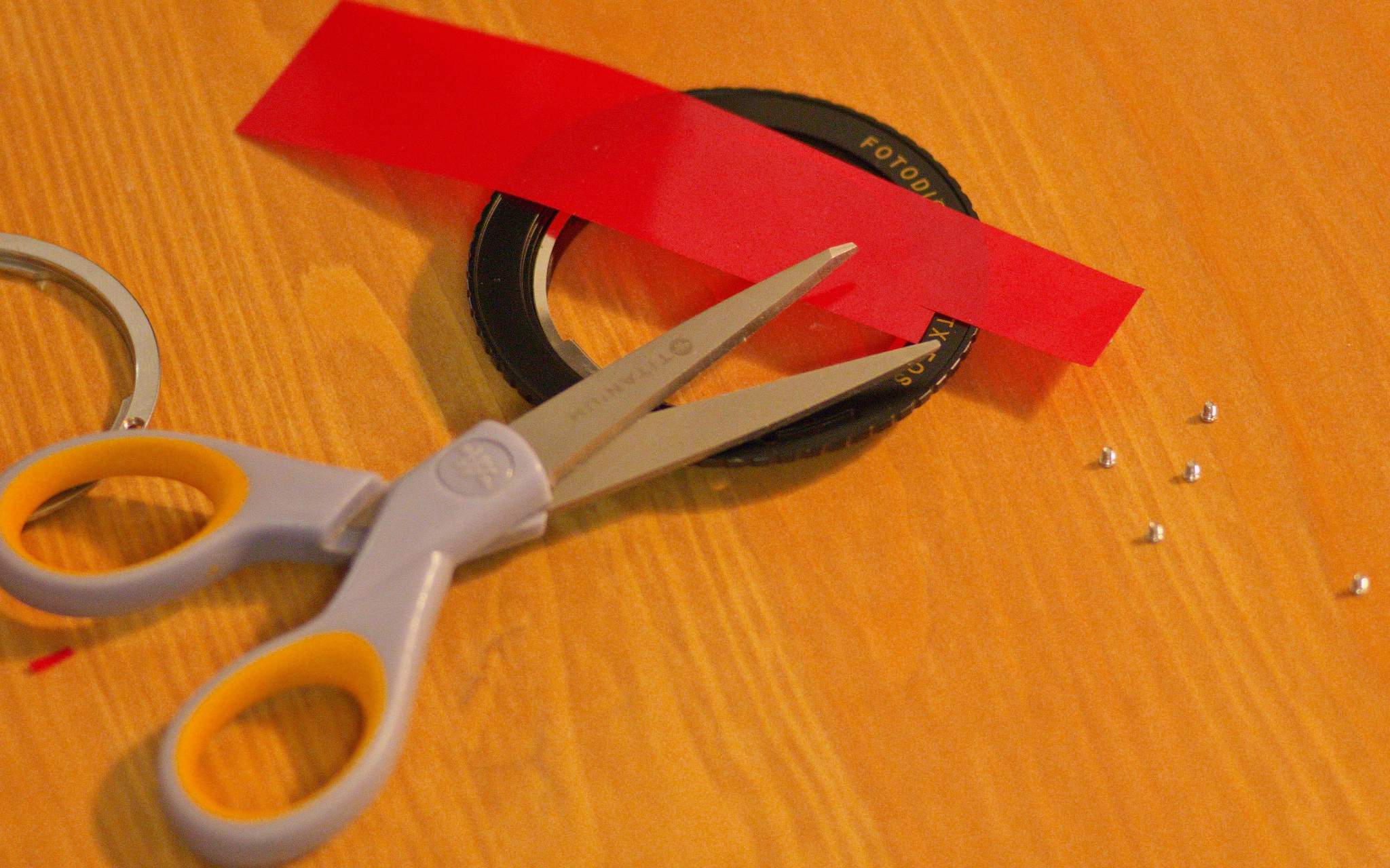
Here you can see that there are only three points on the ring that actually control the thickness; I point to one with the scissors. I had to be careful when measuring the thickness to only measure it between the screws, and that was challenging because the EF mount diameter is larger than the C/Y mount diameter, and there was only the slightest overlap between the outside of the C/Y registration surface and the inside of the EF mount.

630d554c266458e194fa65c77c21d00b2426cfe7.jpg

Next I just cut a narrow strip out of this piece of shim stock using scissors, and put slits in it so it could fold more easily.

bc177c29ec559927f3f1b8df373a53dea4d2270a.jpg

The right hand shim is folded in the shape of a W, and the left hand shim is only one layer.

b7b673db42db682c8681e11363500892230d11f6.jpg

The thicker shim went on the top, and the thinner shim went on the bottom-right.

2c15b643aabc97d65f6fce6547d80e769391d70c.jpg

Put the ring back on, and then…

201a553a455b9780fc4120632b4db51bb2bf3a6c.jpg

Reinstall the screws.

Test your lenses for infinity focus and, if applicable, mirror slap, and rejoice if they’re good!


If you don’t have a perfect adapter as a reference for the proper thickness, you can first adjust the adapter to be perfectly even thickness all the way around, and then you can add thickness uniformly until your lenses just barely focus to infinity. It might be time consuming, but it’s very rewarding being able to trust the infinity stop on your lenses.

This method isn’t only applicable to the two-part SLR->SLR Fotodiox adapters; it should also work for SLR or rangefinder to mirrorless adapters as well.

I’ve seen it written that you can’t be sure whether or not your adapters are even thickness all the way around, but with this technique, you can make sure that your adapters are perfect.


Carlo originally posted this as a thread on the forums but I thought it would be useful as a post. He has graciously allowed us to re-publish it here. –Pat

jpeg2RAW Guest Spot


jpeg2RAW Guest Spot

An interview! LGM update! And Github?

Mike Howard, the host and creator of the jpeg2RAW podcast reached out to me last week to see if I might be able to come on the show to talk about Free Software Photography and what we’ve been up to here. One of the primary reasons for creating this site was to be able to raise awareness of the Free Software community to a wider audience.

So this is a great opportunity for us to expose ourselves!

Exposing Ourselves

The podcast airs live this Tuesday, February 23rd at 8PM Eastern (-0500). You can join us at the jpeg2RAW live podcast page! Mike has the live feed available to watch on that page and also has a chat server set up so viewers can interact with us live during the broadcast.

If you are free on Tuesday night then come on by and join us! I’ll be happy to field any questions you want answered (and that Mike asks) and will do my best to not embarrass myself (or our community). If you would like to make sure I address something in particular (or just don’t forget something), I also have a thread on discuss where you can make sure I know it.

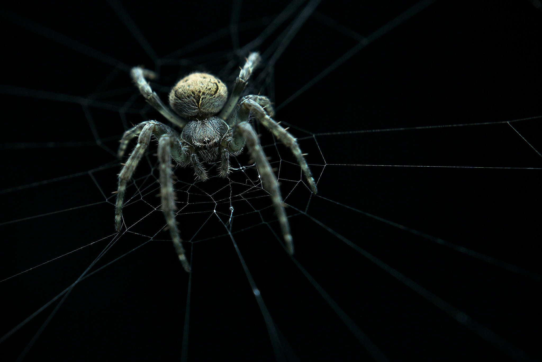
I’m also looking for community members to submit some photos to help highlight our work and what’s possible with Free Software. Feel free to link them in the same thread as above. I’ve already convinced andabata to point us to some of his great macro shots (like that awesome lede image) and I’ll be submitting a few of my own images as well. If you have some works that you’d like to share please let me know!

In Case You Miss It

Mike has all of his prior podcasts archived on his Podcasts page. So if you miss the live show it looks like you’ll be able to catch up later at your convenience.

LGM Update

As mentioned previously we are heading to London for Libre Graphics Meeting 2016! We’ve got a flat rented for a great crew to be able to stay together and we’re on track for a PIXLS meet up before LGM!

Speaking of people, I’m looking forward to being able to spend some time with some great folks again this year! We’ve got Tobias, Johannes, and Pascal making it out (I’m not sure that Simon, top below, will be making it out) from darktable, DrSlony and qogniw from RawTherapee, Andrea Ferrero creator of PhotoFlow, even Ofnuts (how cool is that?) may make it out!

Darktable II
Pascal, Johannes, and Tobias (left to right, bottom row) will be there!

We’ve also already had a great response so far on our Pledgie campaign. The campaign is still running if you want to help out!

Click here to lend your support to: PIXLS.US at Libre Graphics Meeting 2016 and make a donation at pledgie.com !

If anyone is thinking they’d like to make it out to join us, please let me know as soon as possible so we can plan for space!

Mairi (Further)
Looks like Mairi will be joining us!

My friend and model Mairi will also be making it out for the meeting. She’ll be on hand to help us practice lighting setups, model interactions, and will likely be shooting right along with the rest of us as well!

I’ll also be assembling slides for my presentation during LGM. I’ve got a 20 minute time slot to talk about the community we’ve been building here and the neat things our members have been up to (Filmulator, PhotoFlow, and more).

Speaking of slides and sharing information…

Github Organization

I’ve setup a Github Pixls organization so that we can begin to share various things. This came about after talking with @paperdigits on the post about the upcoming podcast at jpeg2RAW. We were talking about ways to share information and assets for creating/delivering presentations about Free Software photography.

At the moment there is only the single repository Presentations as we are figuring out structure. I’ve uploaded my slides and notes from the LGM2015 State of the Libre Graphics presentation announcing PIXLS. If you’re on Github and want to join us just let me know!

HDR Photography with Free Software (LuminanceHDR)


HDR Photography with Free Software (LuminanceHDR)

A first approach to creating and mapping HDR images

I have a mostly love/hate relationship with HDR images (well, tonemapping HDR more than the HDR themselves). I think the problem is that it’s very easy to create really bad HDR images that the photographer thinks look really good. I know because I’ve been there:

Hayleys - Mobile, AL
Don’t judge me, it was a weird time in my life…

The best term I’ve heard used to describe over-processed images created from an HDR is “clown vomit” (which would also be a great name for a band, by the way). They are easily spotted with some tell-tale signs such as the halos at high-contrast edges, the unrealistically hyper-saturated colors that make your eyes bleed, and a general affront to good taste. In fact, while I’m putting up embarrassing images that I’ve done in the past, here’s one that scores on all the points for a crappy image from an HDR:

Tractor
“My Eyes! The goggles do nothing!”

Crap-tastic! Of course, the allure here is that it provides first timers a glimpse into something new, and they feel the desire to crank every setting up to 11 with no regards to good taste or aesthetics.

If you take anything away from this post, let it be this: “Turn it DOWN. If it looks good to you, then it’s too much. ;)

HDR lightprobes are used in movie fx compositing to ensure that the lighting on CG models matches exactly the lighting for a live-action scene. By using an HDR lightprobe, you can match the lighting exactly to what is filmed.

I originally learned about, and used, HDR images when I would use them to illuminate a scene in Blender. In fact, I will still often use Paul Debevec’s Uffizi gallery lightprobe to light scene renders in Blender today.

For example, you may be able to record 10-12 stops of light information using a modern camera. Some old films could record 12-13 stops of light, while your eyes can approximately see up to 14 stops.

HDR images are intended to capture more than this number of stops. (Depending on your patience, significantly more in some cases).

I can go on a bit about the technical aspects of HDR imaging, but I won’t. It’s boring. Plus, I’m sure you can use Wikipedia, or Google yourselves. :) In the end, just realize that an HDR image is simply one where there is a greater amount of light information being stored than is able to be captured by your camera sensor in one shot.

Taking an HDR image(s)

More light information than my camera can record in one shot?
Then how do I take an HDR photo?

You don’t.

You take multiple photos of a scene, and combine them to create the final HDR image. Before I get into the process of capturing these photos to create an HDR with, consider something:

When/Why to use HDR

An HDR image is most useful to you when the scene you want to capture has bright and dark areas that fall outside the range of a single exposure, and you feel that there is something important enough outside that range to include in your final image.

That last part is important, because sometimes it’s OK to have some of your photo be too dark for details (or too light). This is an aesthetic decision of course, but keep it in mind…

Here’s what happens. Say you have a pretty scene you would like to photograph. Maybe it’s the Lower Chapel of Sainte Chapelle:

Sainte Chapelle Lower Chapel
Sainte Chapelle Lower Chapel by iwillbehomesoon on Flickr (cbsna)

You may setup to take the shot, but when you are setting your exposure you may run into a problem. To expose for the brighter parts of the image means that the shadows fall to black too quickly, crushing out the details there.

If you expose for the shadows, then the brighter parts of the image quickly clip beyond white.

The use case for an HDR is when you can’t find a happy medium between those two exposures.

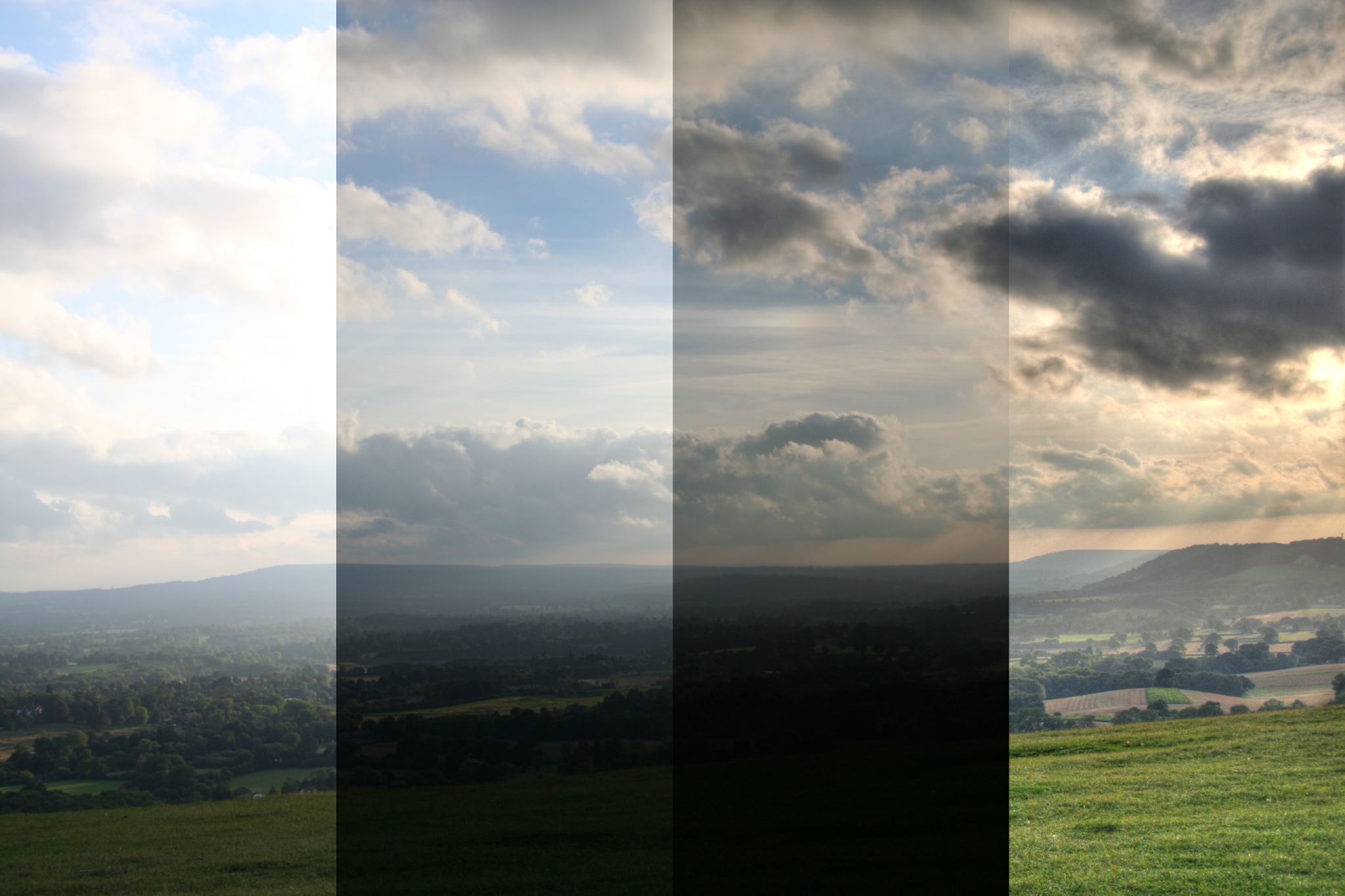
A similar situation comes up when you want to shoot any ground details against a bright sky, but you want to keep the details in both. Have a look at this example:

HDR Layers by dontmindme, on Flickr
HDR Layers by dontmindme, on Flickr (cbna)

In the first column, if you expose for the ground, the sky blows out.

In the second, you can drop the exposure to bring the sky in a bit, but the ground is getting too dark.

In the third, the sky is exposed nicely, but the ground has gone to mostly black.

If you wanted to keep the details in the sky and ground at the same time, you might use an HDR (you could technically also use exposure blending with just a couple of exposures and blend them by hand, but I digress) to arrive at the last column.

Shooting Images for an HDR

Many cameras have an auto-bracketing feature that will let you quickly shoot a number of photos while changing the exposure value (EV) of each. You can also do this by hand simply by changing one parameter of your exposure each time.

You can technically change any of ISO, shutter speed, or aperture to modify the exposure, but I’d recommend you change only the shutter speed (or EV value when in Aperture Priority modes).

The reason is that changing the shutter speed will not alter the depth-of-field (DoF) of your view or introduce any extra noise the way changing the aperture or ISO would.

When considering your scene, you will also want to try to stick to static scenes if possible. The reason is that objects that move around (swaying trees, people, cars, fast moving clouds, etc.) could end up as ghosts or mis-alignments in your final image. So as you’re starting out, choose your scene to help you achieve success.

Set up your camera someplace very steady (like a tripod), dial in your exposure and take a shot. If you let your camera meter your scene for you then this is a good middle starting point.

For example, if you setup your camera and meter your scene, it might report a 1160 second exposure. This is our starting point (0EV).

The base exposure, 1160 s, 0EV

To capture the lower values, just cut your shutter speed in half ( 180 second, +1EV), and take a photo. Repeat if you’d like ( 140 second, +2EV).

180 second, +1EV (left), 140 second, +2EV (right)

To capture the upper values, just double your starting point shutter speed ( 1320, -1EV) and take a photo. Repeat if you’d like again ( 1640, -2EV).

1320, -1EV (left), 1640, -2EV (right)

This will give you 5 images covering a range of -2EV to +2EV:

Shutter SpeedExposure Value
1640-2EV
1320-1EV
11600EV
180+1EV
140+2EV

Your values don’t have to be exactly 1EV each time, LuminanceHDR is usually smart enough to figure out what’s going on from the EXIF data in your image - I chose full EV stops here to simplify the example.

So armed with your images, it’s time to turn them into an HDR image!

Creating an HDR Image

You kids have it too easy these days. We used to have to bring all the images into Hugin and align them before we could save an hdr/exr file. Nowadays you’ve got a phenomenal piece of Free/Open Source Software to handle this for you:

LuminanceHDR
(Previously qtpfsgui. Seriously.)

After installing it, open it up and hit “New HDR Image“:

LuminanceHDR startup screen

This will open up the “HDR Creation Wizard” that will walk you through the steps of creating the HDR. The splash screen notes a couple of constraints.

LuminanceHDR wizard splash screen

On the next screen, you’ll be able to load up all of the images in your stack. Just hit the big green “+“ button in the middle, and choose all of your images:

LuminanceHDR load wizard

LuminanceHDR will load up each of your files, and investigate them to try and determine the EV values for each one. It usually does a good job of this on its own, but if there a problem you can always manually specify what the actual EV value is for each image.

Also notice that because I only adjusted my shutter speed by half or double, that each of the relative EV values is neatly spaced 1EV apart. They don’t have to be, though. I could have just as easily done ½ EV or &frac13; EV steps as well.

LuminanceHDR creation wizard

If there is even the remotest question about how well your images will line up, I’d recommend that you check the box for “Autoalign images”, and let Hugin’s align_image_stack do it’s magic. You really need all of your images to line up perfectly for the best results.

Hit “Next“, and if you are aligning the images be patient. Hugin’s align_image_stack will find control points between the images and remap them so they are all aligned. When it’s done you’ll be presented with some editing tools to tweak the final result before the HDR is created.

LuminanceHDR Creation Wizard

You are basically looking at a difference view between images in your stack at the moment. You can choose which two images to difference compare by choosing them in the list on the left. You can now shift an image horizontally/vertically if it’s needed, or even generate a ghosting mask (a mask to handle portions of an image where objects may have shifted between frames).

If you are careful, and there’s not much movement in your image stacks, then you can safely click through this screen. Hit the “Next“ button.

LuminanceHDR Creation Wizard

This is the final screen of the HDR Creation Wizard. There are a few different ways to calculate the pixel values that make up an HDR image, and this is where you can choose which ones to use. For the most part, people far smarter than I had a look at a bunch of creation methods, and created the predefined profiles. Unless you know what you’re doing, I would stick with those.

Hit “Finish“, and you’re all done!

You’ll now be presented with your HDR image in LuminanceHDR, ready to be tonemapped so us mere mortals can actually make sense of the HDR values present in the image. At this point, I would hit the “Save As…” button, and save your work.

LuminanceHDR Main

Tonemapping the HDR

So now you’ve got an HDR image. Congratulations!

The problem is, you can’t really view it with your puny little monitor.

The reason is that the HDRi now contains more information than can be represented within the limited range of your monitor (and eyeballs, likely). So we need to find a way to represent all of that extra light-goodness so that we can actually view it on our monitors. This is where tonemapping comes in.

We basically have to take our HDRi and use a method for compressing all of that radiance data down into something we can view on our monitors/prints/eyeballs. We need to create a Low Dynamic Range (LDR) image from our HDR.

Yes - we just went through all the trouble of stacking together a bunch of LDR images to create the HDRi, and now we’re going back to LDR ? We are - but this time we are armed with way more radiance data than we had to begin with!

The question is, how do we represent all that extra data in an LDR? Well, there’s quite a few different ways. LuminanceHDR provides for 9 different tonemapping operators (TMO’s) to represent your HDRi as an LDR image:

Just a small reminder, there’s a ton of math involved in how to map these values to an LDR image. I’m going to skip the math. The references are out there if you want them.

I’ll try to give examples of each of the operators below, and a little comment here and there. If you want more information, you can always check out the list on the Open Source Photography wikidot page.

Before we get started, let’s have a look at the window we’ll be working in:

LuminanceHDR Main Window

Tonemap is the section where you can choose which TMO you want to use, and will expose the various parameters you can change for each TMO. This is the section you will likely be spending most of your time, tweaking the settings for whichever TMO you decide to play with.

Process gives you two things you’ll want to adjust. The first is the size of the output that you want to create (Result Size). While you are trying things out and dialing in settings you’ll probably want to use a smaller size here (some operators will take a while to run against the full resolution image). The second is any pre-gamma you want to apply to the image. I’ll talk about this setting a bit later on.

Oh, and this section also has the “Tonemap” button to apply your settings and generate a preview. I’ll also usually keep the “Update current LDR” checked while I rough in parameters. When I’m fine-tuning I may uncheck this (it will create a new image every time you hit the “Tonemap” button).

Results are shown in this big center section of the window. The result will be whatever Result Size you set in the previous section.

Previews are automatically generated and shown in this column for each of the TMO. If you click on one, it will automatically apply that TMO to your image and display it (at a reduced resolution - I think the default is 400px, but you can change it if you want). It’s a nice way to quickly get a preview overview of what all the different TMOs are doing to your image.

Ok, with that out of the way, let’s dive into the TMOs and have a look at what we can do. I’m going to try to aim for a reasonably realistic output here that (hopefully) won’t make your eyeballs bleed. No promises, though.

Need an HDR to follow along? I figured it might be more fun (easier?) to follow along if you had the same file I do.
So here it is, don’t say I never gave you anything (This hdr is licensed cc-by-sa-nc by me):
Download from Google Drive (41MB .hdr)

Another note - all of the operators can have their results tweaked by modification of the pre-gamma value ahead of time. This is applied the image before the TMO is applied, and will make a difference in the final output. Usually pushing the pre-gamma value down will increase contrast/brightness in the image, while increasing it will do the opposite. I find it better to start with pre-gamma set to 1 as I experiment, just remember that it is another factor that you use to modify your final result.

Mantiuk ‘06

I’m starting with this one because it’s the first in the list of TMOs. Let’s see what the defaults from this operator look like against our base HDRi:

Mantiuk 06 default
Default Mantiuk ‘06 applied

By default Mantiuk ‘06 produces a muted color result that seems pleasing to my eye. Overall the image feels like it’s almost “dirty” or “gritty” with these results. The default settings produce a bit of extra local contrast boosting as well.

Let’s see what the parameters do to our image.

Contrast Factor

The default factor is 0.10.

Pushing this value down to as low as 0.01 produces just a slight increase in contrast across the image from the default. Not that much overall.

Pushing this value up, though, will tone down the contrast overall. I think this helps to add some moderation to the image, as hard contrasts can be jarring to the eyes sometimes. Here is the image with only the Contrast Factor pushed up to 0.40:

Mantiuk 06 Contrast Factor 0.4
Mantiuk ‘06 - Contrast Factor increased to 0.40
(click to compare to defaults)

Saturation Factor

The default value is 0.80.

This factor just scales the saturation in the image, and behaves as expected. If you find the colors a bit muted using this TMO, you can bump this value a bit (don’t get crazy). For example, here is the Saturation Factor bumped to 1.10:

Mantiuk 06 Saturation 1.10
Mantiuk ‘06 - Saturation Factor increased to 1.10
(click to compare to defaults)

Of course, you can also go the other way if you want to mute the colors a bit more:

Mantiuk 06 Saturation 0.40
Mantiuk ‘06 - Saturation Factor decreased to 0.40
(click to compare to defaults)

Detail Factor

The default is 1.0.

The Detail Factor appears to control local contrast intensity. It gets overpowering very quickly, so make small movements here (if at all). Here is what pushing the Detail Factor up to 10.0 produces:

Mantiuk 06 Detail Factor
Don’t do this. Mantiuk ‘06 - Detail Factor increased to 10.0
(click to compare to defaults)

Contrast Equalization

This is supposed to equalize the contrast if there are heavy swings of light/dark across the image on a global scale, but in my example did little to the image (other than a strange lightening in the upper left corner).

My Final Version

I played a bit starting from the defaults. First I wanted to push down the contrast a bit to make everything just a bit more realistic, so I pushed Contrast Factor up to 0.30. I slightly bumped the Saturation Factor to 0.95 as well.

I liked the textures of the tree and house, so I wanted to bring those back up a bit after decreasing the Contrast Factor, so I pushed the Detail Factor up to 5.0.

Here is what I ended up with in the end:

Mantiuk 06 Final Result
My final output (Contrast 0.3, Saturation 0.95, Detail 5.0)
(click to compare to defaults)

Mantiuk ‘08

Mantiuk ‘08 is a global contrast TMO (for comparison, Mantiuk ‘06 uses local contrast heavily). Being a global operator, it’s very quick to apply.

Mantiuk 08 default
Default Mantiuk ‘08 applied

As you can see, the effect of this TMO is to compress the dynamic range into an LDR output using a function that operates across the entire image globally. This will produce a more realistic result I think, overall.

The default output is not bad at all, where brights seem appropriately bright, and darks are dark while still retaining details. It does feel like the resulting output is a little over-sharp to my eye, however.

There are only a couple of parameters for this TMO (unless you specifically override the Luminance Level with the checkbox, Mantiuk ‘08 will automatically adjust it for you):

Predefined Display

There are options for LCD Office, LCD, LCD Bright, and CRT but they didn’t seem to make any difference in my final output at all.

Color Saturation

The default is 1.0.

Color Saturation operates exactly how you’d expect. Dropping this value decreases the saturation, and vice versa. Here’s a version with the Color Saturation bumped to 1.50:

Mantiuk ‘08 - Color Saturation increased to 1.50
(click to compare to defaults)

Contrast Enhancement

The default value is 1.0.

This will affect the global contrast across the image. The default seemed to have a bit too much contrast, so it’s worth it to dial this value in. For instance, here is the Contrast Enhancement dialed down to 0.51:

Mantiuk 08 Contrast Enhancement 0.51
Mantiuk ‘08 - Contrast Enhancement decreased to 0.51
(click to compare to defaults)

Compared to the default settings I feel like this operator can work better if the contrast is turned down just a bit to make it all a little less harsh.

Enable Luminance Level

This checkbox/slider allows you to manually specify the Luminance Level in the image. The problem that I ran into was that with this enabled, I couldn’t adjust the Luminance far enough to keep bright areas in the image from blowing out. if I let the default behavior of automatically adjusting Luminanace, then it kept things more under control.

My Final Version

Starting from the defaults, I pushed down the Contrast Enhancement to 0.61 to even out the overall contrast. I bumped the Color Saturation to 1.10 to bring out the colors a bit more as well.

I also dropped the pre-gamma correction to 0.91 in order to bring back some of the contrast lost from the Contrast Enhancement.

Mantiuk 08 final result
My final Mantiuk ‘08 output
(pre-gamma 0.91, Contrast Enhancement 0.61, Color Saturation 1.10)
(click to compare to defaults)

Fattal

Crap. Time for this TMO I guess…

THIS is the TMO responsible for some of the greatest sins of HDR images. Did you see the first two images in this post? Those were Fattal. The problem is that it’s really easy to get stupid with this TMO.

Fattal (like the other local contrast operators) is dependent on the final output size of the image. When testing this operator, do it at the full resolution you will want to export. The results will not match up if you change size. I’m also going to focus on using only the newer v.2.3.0 version, not the old one.

Here is what the default values look like on our image:

Fattal default
Default Fattal applied

The defaults are pretty contrasty, and the color seems saturated quite a bit as well. Maybe we can get something useful out of this operator. Let’s have a look at the parameters.

Alpha

The default is 1.00.

This parameter is supposed to be a threshold against which to apply the effect. According to the wikidot, decreasing this value should increase the level of details in the output and vice versa. Here is an example with the Alpha turned down to 0.25:

Fattal - Alpha decreased to 0.25
(click to compare to defaults)

Increasing the Alpha value seems to darken the image a bit as well.

Beta

The default value is 0.90.

This parameter is supposed to control the amount of the algorithm applied on the image. A value of 1 is no effect on the image (straight gamma=1 mapping). Lower values will increase the amount of the effect. Recommended values are between 0.8 and 0.9. As the values get lower, the image gets more cartoonish looking.

Here is an example with Beta dropped down to 0.75:

Fattal Beta 0.75
Fattal - Beta decreased to 0.75
(click to compare to defaults)

Color Saturation

The default value is 1.0.

This parameter does exactly what’s described. Nothing interesting to see here.

Noise Reduction

The default value is 0.

This should suppress fine detail noise from being picked up by the algorithm for enhancement. I’ve noticed that it will slightly affect the image brightness as well. Fine details may be lost if this value is too high. Here the Noise Reduction has been turned up to 0.15:

Fattal NR 0.15
Fattal - Noise Reduction increased to 0.15
(click to compare to defaults)

My Final Version

This TMO is sensitive to changes in its parameters. Small changes can swing the results far, so proceed lightly.

I increased the Noise Reduction a little bit up front, which lightened up the image. Then I dropped the Beta value to let the algorithm work to brighten up the image even further. To offset the increase, I pushed Alpha up a bit to keep the local contrasts from getting too harsh. A few minutes of adjustments yielded this:

Fattal Final Result
My Fattal output - Alpha 1.07, Beta 0.86, Saturation 0.7, Noise red. 0.02
(click to compare to defaults)

Overall, Fattal can be easily abused. Don’t abuse the Fattal TMO. If you find your values sliding too far outside of the norm, step away from your computer, get a coffee, take a walk, then come back and see if it still hurts your eyes.

Drago

Drago is another of the global TMOs. It also has just one control: bias.

Here is what the default values produce:

Default Drago applied

The default values produced a very washed out appearance to the image. The black points are heavily lifted, resulting in a muddy gray in dark areas.

Bias is the only parameter for this operator. The default value is 0.85. Decreasing this value will lighten the image significantly, while increasing it will darken it. For my image, even pushing the Bias value all the way up to 1.0 only produced marginal results:

Drago Bias 1.0
Drago - Bias 1.0
(click to compare to defaults)

Even at this level the image still appears very washed out. The only other parameter to change would be the pre-gamma before the TMO can operate. After adjusting values for a bit, I settled on a pre-gamma of 0.67 in addition to the Bias being set to 1:

My Final Version

Drago final result
My result: Drago - Bias 1.0, pre-gamma 0.67
(click to compare to defaults)

Durand

Most of the older documentation/posts that I can find describe Durand as the most realistic of the TMOs, yielding good results that do not appear overly processed.

Indeed the default settings immediately look reasonably natural, though it does exhibit a bit of blowing out in very bright areas - which I imagine can be fixed by adjustment of the correct parameters. Here is the default Durand output:

Default Durand applied

There are three parameters that can be adjusted for this TMO, let’s have a look:

Base Contrast

The default is 5.00.

This value is considered a little high from most sources I’ve read. Usually recommending to drop this value to the 3-4 range. Here is the image with the Base Contrast dropped to 3.0:

Durand Base Contrast 3.5
Durand - Base Contrast decreased to 3.5
(click to compare to defaults)

The Base Contrast does appear to drop the contrast in the image, but it also drops the blown-out high values on the house to more reasonable levels.

Spatial Kernel Sigma

The default value is 2.00.

This parameter seems to produce a change to contrast in the image. Large value swings are required to notice some changes, depending on the other parameter values. Pushing the value up to 65.00 looks like this:

Durand Spatial Kernel 65.00
Durand - Spatial Kernel Sigma increased to 65.00
(click to compare to defaults)

Range Kernel Sigma

The default value is 2.00.

My limited testing shows that this parameters doesn’t quite operate correctly. Changes will not modify the output image until you reach a certain threshold in the upper bounds, where it will overexpose the image. I am assuming there is a bug in the implementation, but will have to test further before filing a bug report.

My Final Version

In experiment I found that pre-gamma adjustments can affect the saturation in the output image. Pushing pre-gamma down a bit will increase the saturation.

Durand final result
My Durand results - pre-gamma 0.88, Contrast 3.6, Spatial Sigma 5.00
(click to compare to defaults)

I pulled the Base Contrast back to keep the sides of the house from blowing out. Once I had done that, I also dropped the pre-gamma to 0.88 to bump the saturation slightly in the colors. A slight boost to Spatial Kernel Sigma let me increase local contrasts slightly as well.

Finally, I used the Adjust Levels dialog to modify the levels slightly by raising the black point a small amount (hey - I’m the one writing about all these #@$%ing operators, I deserve a chance to cheat a little).

Reinhard ‘02

This is supposed to be another very natural looking operator. The initial default result looks good with medium-low contrast and nothing blowing out immediately:

Default Reinhard ‘02 applied

Even though many parameters are listed, they don’t really appear to make a difference. At least with my test HDR. Even worse, attempting to use the “Use Scales” option usually just crashes my LuminanceHDR.

Key Value

The default is 0.18.

This appears to be the only operator that does anything in my image at the moment. Increasing it will increase the brightness of the image, and decreasing it will darken the image.

Here is the image with Key Value turned down to 0.05:

Reinhard 02 Key Value 0.05
Reinhard ‘02 - Key Value 0.05
(click to compare to defaults)

Phi

The default is 1.00.

This parameter does not appear to have any affect on my image.

Use Scales

Turning this option on currently crashes my session in LuminanceHDR.

My Final Version

I started by setting the Key Value very low (0.01), and adjusted it up slowly until I got the highlights about where I wanted them. Due to this being the only parameter that modified the image, I then started adjusting pre-gamma up until I got to roughly the exposure I thought looked best (1.09).

Reinhard 02 final result
Final Reinhard ‘02 version - Key Value 0.09, pre-gamma 1.09
(click to compare to defaults)

Reinhard ‘05

Reinhard ‘05 is supposed to be another more ‘natural’ looking TMO, and also operates globally on the image. The default settings produce an image that looks under-exposed and very saturated:

Default Reinhard ‘05 applied

There are three parameters for this TMO that can be adjusted.

Brightness

The default value is -10.00.

Interestingly, pushing this parameter down (all the way to its lowest setting, -20) did not darken my image at all. Pulling it up, however, did increase the brightness overall. Here the brightness is increased to -2.00:

Reinhard 05 brightness -2.00
Reinhard ‘05 - Brightness increased to -2.00
(click to compare to defaults)

Chromatic Adaptation

The default is 0.00.

This parameter appears to affect the saturation in the image. Increasing it desaturates the results, which is fine given that the default value of 0.00 shows a fairly saturated image to begin with. Here is the Chromatic Adaptation turned up to 0.60:

Reinhard 05 chromatic adaptation 0.6
Reinhard ‘05 - Chromatic Adaptation increased to 0.6
(click to compare to defaults)

Light Adaptation

The default is 1.00.

This parameter modifies the global contrast in the final output. It starts at the maximum of 1.00, and decreasing this value will increase the contrast in the image. Pushing the value down to 0.5 does this to the test image:

Reinhard 05 light adaptation 0.50
Reinhard ‘05 - Light Adaptation decreased to 0.50
(click to compare to defaults)

My Final Version

Reinhard 05 final result
My Reinhard ‘05 - Brightness -5.00, Chromatic Adapt. 0.60, Light Adapt. 0.75
(click to compare to defaults)

Starting from the defaults, I raised the Brightness to -5.00 to lift the darker areas of the image, while keeping an eye on the highlights to keep them from blowing out. I then decreased the Light Adaptation until the scene had a reasonable amount of contrast without becoming overpowering to 0.75. At that point I turned up the Chromatic Adaptation to reduce the saturation in the image to be more realistic, and finished at 0.60.

Ashikhmin

This TMO has little in the way of controls - just options for two different equations that can be used, and a slider. The default (Eqn. 2) image is very dark and heavily saturated:

Ashikhmin default
Default Ashikhmin applied

There is a checkbox option for using a “Simple” method (that produces identical results regardless of which Eqn is checked - I’m thinking it doesn’t use that information).

Simple

Checking the Simple checkbox removes any control over the image parameters, and yields this image:

Ashikhmin simple
Ashikhmin - Simple
(click to compare to defaults)

Fairly saturated, but exposed reasonably well. It lacks some contrast, but the tones are all there. This result could use some further massaging to knock down the saturation and to bump the contrast slightly (or adjust pre-gamma).

Equation 4

This is the result of choosing Equation 4 instead:

Ashikhmin equation 4
Ashikhmin - Equation 4
(click to compare to defaults)

There is a large loss of local contrast details in the scene, and some of the edges appear very soft. Overall the exposure remains very similar.

Local Contrast Threshold

The default value is 0.50.

This parameter modifies the local contrast being applied to the image. The result will be different depending on which Equation is being used.

Here is Equation 2 with the Local Contrast Threshold reduced to 0.20:

Ashikhmin eqn 2 local contrast 0.20
Ashikhmin - Eqn 2, Local Contrast Threshold 0.20
(click to compare to defaults)

Lower values will decrease the amount of local contrast in the final output.

Equation 4 with Local Contrast Threshold reduced to 0.20:

Ashikhmin eqn 4 local contrast 0.20
Ashikhmin - Eqn 4, Local Contrast Threshold 0.20
(click to compare to defaults)

My Final Version

After playing with the options, the overall best version I feel is had by just using the Simple option. Further tweaking may be necessary to get usable results beyond this.

Pattanaik

This TMO appears to attempt to mimic the behavior of human eyes with the inclusion of terminology like “Rod” and “Cone”. There are quite a few different parameters to adjust if wanted. The default TMO results in an image like this:

Default Pattanaik applied

The default results are very desaturated, and tends to blow out in the highlights. The dark areas appear well exposed, with the problems (in my test hdr) being mostly constrained to highlights for this example. On first glance, the results look like something that could be worked with.

There are quite a few different parameters for this TMO. Let’s have a look at them:

Multiplier

The default value is 1.00.

This parameter appears to modify the overall contrast in the image. Decreasing the value will decrease contrast, and vice versa. It also appears to slightly modify the brightness in the image as well (pushing the highlights to a less blown-out value). Here is the Multiplier decreased to 0.03:

Pattanaik multiplier 0.03
Pattanaik - Multiplier 0.03
(click to compare to defaults)

Local Tone Mapping

This parameter is just a checkbox, with no controls. The result is a washed out image with heavy local contrast adjustments:

Pattanaik local tone mapping
Pattanaik - Local Tone Mapping
(click to compare to defaults)

Cone/Rod Levels

The default is to have Auto Cone/Rod checked, greying out the options to change the parameters manually.

Turning off Auto Cone/Rod will get the default manual values of 0.50 for both applied:

Pattanaik manual cone/rod 0.5 each
Pattanaik - Manual Cone/Rod (0.50 for each)
(click to compare to defaults)

The image gets very blown out everywhere, and modification of the Cone/Rod values does not significantly reduce brightness across the image.

My Final Version

Starting with the defaults, I reduced the Multiplier to bring the highlights under control. This reduced contrast and saturation in the image.

Pattanaik final result
My final Pattanaik - Multiplier 0.03, pre-gamma 0.91
(click to compare to defaults)

To bring back contrast and some saturation, I decreased the pre-gamma to 0.91. The results are not too far off of the defualt settings. The results could still use some further help with global contrast and saturation, and might benefit from layering or modifications in GIMP.

Closing Thoughts

Looking through all of the results shows just how different each TMO will operate across the same image. Here are all of the final results in a single image:

I personally like the results from Mantiuk ‘06. The problem is that it’s still a little more extreme than I would care for in a final result. For a really good, realistic result that I think can be massaged into a great image, I would go to Mantiuk ‘08 or Reinhard.

I could also do something with Fattal, but would have to tone a few things down a bit.

While you’re working, remember to occasionally open up the Levels Adjustment to keep an eye on the histogram. Look for highlights blowing out, and shadows becoming too murky. All the normal rules of image processing still apply here - so use them!

You’re trying to use HDR as a tool for you to capture more information, but remember to still keep it looking realistic. If you’re new to HDR processing, then I can’t recommend enough to stop occasionally, get away from the monitor, and come back to look at your progress.

If it hurts your eyes, dial it all back. Heck, if you think it looks good, still dial it back .

If I can head off even one clown-vomit image, then I’ll consider my mission accomplished with this post.

A Couple of Further Resources

Here’s a few things I’ve found scattered around the internet if you want to read more.

We also have a sub-category on the forums dedicated entirely to LuminanceHDR and HDR processing in general: https://discuss.pixls.us/c/software/luminancehdr.

This tutorial was originally published here.

Libre Graphics Meeting London


Libre Graphics Meeting London

Join us in London for a PIXLS meet-up!

We’re heading to London!

LGM/London Logo

I missed LGM last year in Toronto (having a baby - well, my wife was). I am going to be there this year for LGM/London!

Help Support Us

I don’t ever do this normally, but you’ve got to start somewhere, right?

It’s my long-term desire to be able to hold a PIXLS meetup/event every year where the community can get together. Where we can hold workshops, photowalks, and generally share knowledge and information. For free, for anyone.

For now though, we need support. LGM is a great opportunity for us to meet with many different projects usually having representatives there.

Donations will help us to offset travel costs to attend LGM as well as a pre-LGM meetup we are holding (more below). Anything further will go to creating new content and to cover hosting costs for the site.

Pledgie

I have started a Pledgie campaign to help ease the solicitation of donations:
https://pledgie.com/campaigns/30905

Here’s the fancy little widget they make available:

Click here to lend your support to: PIXLS.US at Libre Graphics Meeting 2016 and make a donation at pledgie.com !

If you want to help by adding this button places, here’s the code to do it:

<a href='https://pledgie.com/campaigns/30905'>
<img alt='Click here to lend your support to: PIXLS.US at Libre Graphics Meeting 2016 and make a donation at pledgie.com !' src='https://pledgie.com/campaigns/30905.png?skin_name=chrome' border='0' style='width: initial;'>
</a>

Feel free to use it wherever you think it might help. :)

PayPal

You can also donate directly via PayPal if you want:

Lend a hand via PayPal

Awareness

I realize that not everyone will be able to donate funds. No sweat! If you’d still like to help out then perhaps you can help us raise awareness for the campaign? The more folks that know about it the better!

Re-tweeting, blogging, linking, yelling on a street corner all help to raise awareness of what we are doing here. Heck, just invite folks to come read and participate in the community. Let’s help even more people learn about free software!

Come Join Us

Of course, even better if you are able to make your way to London and actually join us at the Libre Graphics Meeting 2016!

The event will be April 15th — 18th, hosted by Westminster School of Media Arts and Design, University of Westminster at the Harrow Campus (red marker on the map).

The little checkered flag on the map is for something really neat: a PIXLS meetup!

PIXLS Meet Up

I am going to arrive a day early so that we can have a gathering of PIXLS community folks and anyone else who wants to join us for some photographic fun!

Thanks to the local organizers in London (yay Lara!), we have facilities for us to use. We will be meeting on Thursday, April 14th at the Furtherfield Commons. The facilities will be available from 1000 – 1800 for us to use.

Furtherfield Commons
Finsbury Gate – Finsbury Park
Finsbury Park, London, N4 2NQ

As near as I can tell, here’s a street view of the Finsbury Gate:

I believe the Commons building is just inside this gate, and on the left.

In 2014 I held a photowalk with LGM attendees in Leipzig the day before the event that was great fun. Let’s expand the idea and do even more!

Nikolaikirche, Leipzig, LGM 2014
Nikolaikirche, Leipzig, from the 2014 LGM photowalk.
(That’s houz in the bottom right)

Here’s a Flickr album of my images from LGM2014 in Leipzig:

LGM2014

This year I plan on bringing a model along to shoot while we are out and about (my friend Mairi if she’s available - or a local model if not). I will also be doing a photowalk again, either in the morning or afternoon.

I am also looking for folks from the community to suggest holding their own photoshoots or workshops, so please step forward and let me know if you’d be interested in doing something! The facilities have bench seating for approximately 20 people, a big desk, and a projector as well.

Three things that I personally will be doing are (in no particular order):

  • Natural + flash portraits and model shooting workshop.
  • Photowalk around the park + surrounding environs.
  • Portraits + architectural photos for Furtherfield (the hosts).

I am hoping to possibly record some of these workshops and interactions for posterity and others that might not be able to make it to London. It might be fun to record some shoots for the community to be able to use!

I am also 100% open to suggestions for content that you, the community, might be interested in seeing. If you have something you’d like me to try (and record), please let me know!

Mairi Troisieme
Hopefully Mairi will be able to make it to London to model for us!

darktable 2.0


darktable 2.0

An awesome present for the end of 2015!

Sneaking a release out on Christmas Eve, the darktable team have announced their feature release of darktable 2.0! After quite a few months of Release Candidates the 2.0 is finally here. Please join me in saying Congratulations and a hearty Thank You! for all of their work bringing this release to us.

Alex Prokoudine of Libre Graphics World has a more in-depth look at the release including a nice interview with part of the team: Johannes Hanika, Tobias Ellinghaus, Roman Lebedev, and Jeremy Rosen. My favorite tidbit from the interview:

There is a lot less planning involved than many might think.

— Tobias Ellinghaus

Robert Hutton has taken the time to produce a video covering the new features and other changes between 1.6 and 2.0 as well:

A high-level look at the changes and improvements from the release post on the darktable site:

gui:

  • darktable has been ported to gtk-3.0
  • the viewport in darkroom mode is now dynamically sized, you specify the border width
  • side panels now default to a width of 350px in dt 2.0 instead of 300px in dt 1.6
  • further hidpi enhancements
  • navigating lighttable with arrow keys and space/enter
  • brush size/hardness/opacity have key accels
  • allow adding tone- and basecurve nodes with ctrl-click
  • the facebook login procedure is a little different now
  • image information now supports gps altitude

features:

  • new print mode
  • reworked screen color management (softproof, gamut check etc.)
  • delete/trash feature
  • pdf export
  • export can upscale
  • new “mode” parameter in the export panel to fine tune application of styles upon export

core improvements:

  • new thumbnail cache replaces mipmap cache (much improved speed, stability and seamless support for even up to 4K/5K screens)
  • all thumbnails are now properly fully color-managed
  • it is now possible to generate thumbnails for all images in the library using new darktable-generate-cache tool
  • we no longer drop history entries above the selected one when leaving darkroom mode or switching images
  • high quality export now downsamples before watermark and framing to guarantee consistent results
  • optimizations to loading jpeg’s when using libjpeg-turbo with its custom features
  • asynchronous camera and printer detection, prevents deadlocks in some cases
  • noiseprofiles are in external JSON file now
  • aspect ratios for crop&rotate can be added to config file

image operations:

  • color reconstruction module
  • magic lantern-style deflicker was added to the exposure module (extremely useful for timelapses)
  • text watermarks
  • shadows&highlights: add option for white point adjustment
  • more proper Kelvin temperature, fine-tuning preset interpolation in white balance iop
  • monochrome raw demosaicing (for cameras with color filter array physically removed)
  • raw black/white point module

packaging:

  • removed dependency on libraw
  • removed dependency on libsquish (solves patent issues as a side effect)
  • unbundled pugixml, osm-gps-map and colord-gtk

generic:

  • 32-bit support is soft-deprecated due to limited virtual address space
  • support for building with gcc earlier than 4.8 is soft-deprecated
  • numerous memory leaks were exterminated
  • overall stability enhancements

scripting:

  • lua scripts can now add UI elements to the lighttable view (buttons, sliders etc…)
  • a new repository for external lua scripts was started: https://github.com/darktable-org/lua-scripts
  • it is now possible to edit the collection filters via lua
  • it is now possible to add new cropping guides via lua
  • it is now possible to run background tasks in lua
  • a lua event is generated when the mouse under the cursor changes

The source is available now as well as a .dmg for OS X.
Various Linux distro builds are either already available or will be soon!

Let's Encrypt!


Let's Encrypt!

Also a neat 2.5D parallax video for Wikipedia.

I finally got off my butt to get a process in place to obtain and update security certificates using Let’s Encrypt for both pixls.us and discuss.pixls.us. I also did some (more) work with Victor Grigas and Wikipedia to support their #Edit2015 video this year.

Wikipedia #Edit2015

Last year, I did some 2.5 parallax animations for Wikipedia to help with their first-ever end-of-the-year retrospective video (see the blog post from last year). Here is the retrospective from #Edit2014:

So it was an honor to hear from Victor Grigas again this year! This time around there was a neat new crop of images he wanted to animate for the video. Below you’ll find my contributions (they were all used in the final edit, just shortened to fit appropriately):

Wiki #Edit2015 Bel from Pat David on Vimeo.
Wiki #Edit2015 Je Suis Charlie from Pat David on Vimeo.
Wiki #Edit2015 Samantha Cristoforetti Nimoy Tribute from Pat David on Vimeo.
Wiki #Edit2015 SCOTUS LGBQT from Pat David on Vimeo.

Here is the final cut of the video, just released today:

Victor chose some really neat images that were fun to work on! Of course, all free software was used in this creation (GIMP for cutting up the images into sections and rebuilding textures as needed and Blender for re-assembling the planes and animating the camera movements). I had previously written a tutorial on doing this with free software on my blog.

You can read more on the wikimedia.org blog!

New Certificates

Let's Encrypt Logo

Yes, this is not very exciting I’ll concede. I think it _is_ important though.

I recently took advantage of my beta invite to Let’s Encrypt. It’s a certificate authority that provides free X.509 certs for domain owners that was founded by the Electronic Frontier Foundation, Mozilla, and the University of Michigan.

The key principles behind Let’s Encrypt are:

  • Free: Anyone who owns a domain name can use Let’s Encrypt to obtain a trusted certificate at zero cost.
  • Automatic: Software running on a web server can interact with Let’s Encrypt to painlessly obtain a certificate, securely configure it for use, and automatically take care of renewal.
  • Secure: Let’s Encrypt will serve as a platform for advancing TLS security best practices, both on the CA side and by helping site operators properly secure their servers.
  • Transparent: All certificates issued or revoked will be publicly recorded and available for anyone to inspect.
  • Open: The automatic issuance and renewal protocol will be published as an open standard that others can adopt.
  • Cooperative: Much like the underlying Internet protocols themselves, Let’s Encrypt is a joint effort to benefit the community, beyond the control of any one organization.

It was relatively painless to obtain the certs. I only had to run their program to use ACME to verify my domain ownership through placing a file on my web root. Once the certs were generated I only had to make some small changes for it to work automatically on https://discuss.pixls.us. (And to automatically get picked up when I update the certs within 90 days).

I still had to manually copy/paste the certs into cpanel for https://pixls.us, though. Not automated (or elegant) but it works and only takes an extra moment to do.

Users Guide to High Bit Depth GIMP 2.9.2, Part 2


Users Guide to High Bit Depth GIMP 2.9.2, Part 2

Part 2: Radiometrically correct editing, unbounded ICC profile conversions, and unclamped editing

This is Part 2 of a two-part guide to high bit depth editing in GIMP 2.9.2 with Elle Stone. The first part of this article can be found here: Part 1.

Contents

  1. Using GIMP 2.9.2 for radiometrically correct editing
    1. Linearized sRGB channel values and radiometrically correct editing
    2. Using the “Linear light” option in the “Image/Precision” menu
    3. A note on interoperability between Krita and GIMP
  2. GIMP 2.9.2’s unbounded floating point ICC profile conversions (handle with care!)
  3. Using GIMP 2.9.2’s floating point precision for unclamped editing
    1. High bit depth GIMP’s unclamped editing: a whole realm of new editing possibilities
    2. If the thought of working with unclamped RGB data is unappealing, use integer precision
  4. Looking to the future: GIMP 3.0 and beyond

Radiometrically correct editing

Linearized sRGB channel values and radiometrically correct editing

One goal for GIMP 2.10 is to make it easy for users to produce radiometrically correct editing results. “Radiometrically correct editing” reflects the way light and color combine out there in the real world, and so requires that the relevant editing operations be done on linearized RGB.

Like many commonly used RGB working spaces, the sRGB color space is encoded using perceptually uniform RGB. Unfortunately colors simply don’t blend properly in perceptually uniform color spaces. So when you open an sRGB image using GIMP 2.9.2 and start to edit, in order to produce radiometrically correct results, many GIMP 2.9 editing operations will silently linearize the RGB channel information before the editing operation is actually done.

GIMP 2.9.2 editing operations that automatically linearize the RGB channel values include scaling the image, Gaussian blur, UnSharp Mask, Channel Mixer, Auto Stretch Contrast, decomposing to LAB and LCH, all of the LCH blend modes, and quite a few other editing operations.

GIMP 2.9.2 editing operations that ought to, but don’t yet, linearize the RGB channels include the all-important Curves and Levels operations. For Levels and Curves, to operate on linearized RGB, change the precision to “Linear light” and use the Gamma hack. However, the displayed histogram will be misleading.

The GIMP 2.9.2 editing operations that automatically linearize the RGB channel values do this regardless of whether you choose “Perceptual gamma (sRGB)” or “Linear light” precision. The only thing that changes when you switch between the “Perceptual gamma (sRGB)” and “Linear light” precisions is how colors blend when painting and when blending different layers together.

(Well, what the Gamma hack actually does changes when you switch between the “Perceptual gamma (sRGB)” and “Linear light” precisions, but the way it changes varies from one operation to the next, which is why I advise to not use the Gamma hack unless you know exactly what you are doing.)

Using the “Linear light” option in the “Image/Precision” menu

normal-blend-perceptual-vs-linear-cyan-background
Large soft disks painted on a cyan background.
  1. Top row: Painted using “Perceptual gamma (sRGB)” precision. Notice the darker colors surrounding the red and magenta disks, and the green surrounding the yellow disk: those are “gamma” artifacts.
  2. Bottom row: Painted using “Linear Light” precision. This is how light waves blend to make colors out there in the real world.
normal-blend-perceptual-vs-linear
Circles painted on a red background.
  1. Top row: Painted using “Perceptual gamma (sRGB)” precision. The dark edges surrounding the paint strokes are “gamma” artifacts.
  2. Bottom row: Painted using “Linear Light” precision. This is how light waves blend to make colors out there in the real world.

In GIMP 2.9.2, when using the Normal, Multiply, Divide, Addition, and Subtract painting and Layer blending:

  • For radiometrically correct Layer blending and painting, use the “Image/Precision” menu to select the “Linear light” precision option.
  • When “Perceptual gamma (sRGB)” is selected, layers and colors will blend and paint like they blend in GIMP 2.8, which is to say there will be “gamma” artifacts.

The LCH painting and Layer blend modes will always blend using Linear light precision, regardless of what you choose in the “Image/Precision” menu.

What about all the other Layer and painting blend modes? The concept of “radiometrically correct” doesn’t really apply to those other blend modes, so choosing between “Perceptual gamma (sRGB)” and “Linear light” depends entirely on what you, the artist or photographer, actually want to accomplish. Switching back and forth is time-consuming so I tend to stay at “Linear light” precision all the time, unless I really, really, really want a blend mode to operate on perceptually uniform RGB.

A note on interoperability between Krita and GIMP

Many digital artists and photographers are switching to linear gamma image editing. Let’s say you use Krita for digital painting in a true linear gamma sRGB profile, specifically the “sRGB-elle-V4-g10.icc” profile that is supplied with recent Krita installations, and you want to export your image from Krita and open it with GIMP 2.9.2.

Upon opening the image, GIMP will automatically detect that the image is in a linear gamma color space, and will offer you the option to keep the embedded profile or convert to the GIMP built-in sRGB profile. Either way, GIMP will automatically mark the image as using “Linear light” precision.

For interoperability between Krita and GIMP, when editing a linear gamma sRGB image that was exported to disk by Krita:

  1. Upon importing the Krita-exported linear gamma sRGB image into GIMP, elect to keep the embedded “sRGB-elle-V4-g10.icc” profile.
  2. Keep the precision at “Linear light”.
  3. Then assign the GIMP built-in Linear RGB profile (“Image/Color management/Assign”). The GIMP built-in Linear RGB profile is functionally exactly the same as Krita’s supplied “sRGB-elle-V4-g10.icc” profile (as are the GIMP built-in sRGB profile and Krita’s “sRGB-elle-V4-srgbtrc.icc” profile).

Once you’ve assigned the GIMP built-in Linear RGB profile to the imported linear gamma sRGB Krita image, then feel free to change the precision back and forth between “Linear light” and “Perceptual gamma (sRGB)”, as suits your editing goal.

When you are finished editing the image that was imported from Krita to GIMP:

  1. Convert the image to one of the “Perceptual gamma (sRGB) precisions (“Image/Precision”).
  2. Convert the image to the Krita-supplied “sRGB-elle-V4-g10.icc” profile (“Image/Color management/Convert”).
  3. Export the image to disk and import it into Krita.

If your Krita image is in a color space other than sRGB, I would suggest that you simply not try to edit non-sRGB images in GIMP 2.9.2 because many GIMP 2.9.2 editing operations do depend on hard-coded sRGB color space parameters.

GIMP 2.9.2’s unbounded floating point ICC profile conversions (handle with care!)

Compared to most other RGB color spaces, the sRGB color space gamut is very small. When shooting raw, it’s incredibly easy to capture colors that exceed the sRGB color space.

srgb-inside-prophoto-3-views
The sRGB (the gray blob) and ProPhotoRGB (the multicolored wire-frame) color spaces as seen from different viewing angles inside the CIELAB reference color space. (Images produced using ArgyllCMS and View3DScene).

Every time you convert saturated colors from larger gamut RGB working spaces to GIMP’s built-in sRGB working space using floating point precision, you run the risk of producing out of gamut RGB channel values. Rather than just explaining how this works, it’s better if you experiment and see for yourself:

  1. Download this 16-bit integer ProPhotoRGB png, “saturated-colors.png“.
  2. Open “saturated-colors.png” with GIMP 2.9.2. GIMP will report the color space profile as “LargeRGB-elle-V4-g18.icc” — this profile is functionally equivalent to ProPhotoRGB.
  3. Immediately change the precision to 32-bit floating point precision (“Image/Precision/32-bit floating point) and check the “Perceptual gamma (sRGB)” option.
  4. Using the Color Picker Tool, make sure the Color Picker is set to “Use info Window” in the Tools dialog. Then eye-dropper the color squares, and make sure to set one of the columns in the Color Picker info Window to “Pixel”. The red square will eye-dropper as (1.000000, 0.000000, 0.000000). The cyan square will eyedropper as (0.000000, 1.000000, 1.000000), and so on. All the channel values will be either 1.000000 or 0.000000.
  5. While still at 32-bit floating point precision, and still using the “Perceptual gamma (sRGB)” option, convert “saturated-colors.png” to GIMP’s built-in sRGB.
  6. Eyedropper the color squares again. The red square will now eyedropper as approximately (1.363299, -2.956852, -0.110389), the cyan square will eyedropper as approximately (-13.365499, 1.094588, 1.003746), and so on.
  7. For extra credit, change the precision from 32-bit floating point “Perceptual gamma (sRGB)” to 32-bit floating point “Linear light” and eye-dropper the colors again. I will leave it to you as an exercise to figure out why the eye-droppered RGB “Pixel” values change so radically when you switch back and forth between “Perceptual gamma (sRGB)” and “Linear light”.

Where did the funny RGB channel values come from? At floating point precision, GIMP uses LCMS2 to do unbounded ICC profile conversions. This allows an RGB image to be converted from the source to the destination color space without clipping otherwise out of gamut colors. So instead of clipping the RGB channels values to the boundaries of the very small sRGB color gamut, the sRGB color gamut was effectively “unbounded”.

When you do an unbounded ICC profile conversion from a larger color space to sRGB, all the otherwise out of gamut colors are encoded using at least one sRGB channel value that is less than zero. And you might get one or more channel values that are greater than 1.0. Figure 11 below gives you a visual idea of the difference between bounded and unbounded ICC profile conversions:

red-flower-clipping-prophoto-to-srgb
Unbounded (unclipped floating point) and bounded (clipped integer) conversions of a very colorful red flower from the original ProPhotoRGB color space to the much smaller sRGB color space. (Images produced using ArgyllCMS and View3DScene).

  • Top row: Unbounded (unclipped floating point) and bounded (clipped integer) conversions of a very colorful red flower from the original ProPhotoRGB color space to the much smaller sRGB color space. The unclipped flower is on the left and the clipped flower is on the right.
  • Middle and bottom rows: the unclipped and clipped flower colors in the sRGB color space. The unclipped colors are shown on the left and the clipped colors are shown on the right:
    • The gray blobs are the boundaries of the sRGB color gamut.
    • The middle row shows the view inside CIELAB looking straight down the LAB Lightness axis.
    • The bottom row shows the view inside CIELAB looking along the plane formed by the LAB A and B axes.
The unclipped sRGB colors shown on the left are all encoded using at least one sRGB channel value that is less than zero, that is, using a negative RGB channel value.

When converting saturated colors from larger color spaces to sRGB, not clipping would seem to be much better than clipping. Unfortunately a whole lot of RGB editing operations don’t work when performed on negative RGB channel values. In particular, multiplying such colors produces meaningless results, which of course applies not just to the Multiply and Divide blend modes (division and multiplications are inverse operations), but to all editing operations that involve multiplication by a color (other than gray, which is a special case).

So here’s one workaround you can use to clip the out of gamut channel values: Change the precision of “saturated-colors.png” from 32-bit floating point to 32-bit integer precision (“Image/Precision/32-bit integer”). This will clip the out of gamut channel values (integer precision always clips out of gamut RGB channel values). Depending on your monitor profile’s color gamut, you might or might not see the displayed colors change appearance; on a wide-gamut monitor, the change will be obvious.

When switching to integer precision, all colors are clipped to fit within the sRGB color gamut. Switching back to floating point precision won’t restore the clipped colors.

As an important aside (and contrary to a distressingly popular assumption), when doing a normal “bounded” conversion to sRGB, using “Perceptual intent” does not “keep all the colors”. The regular and linear gamma sRGB working color space profiles are matrix profiles, which don’t have perceptual intent tables. When you ask for perceptual intent and the destination profile is a matrix profile, what you get is relative colorimetric intent, which clips.

Using GIMP 2.9.2’s floating point precision for unclamped editing

High bit depth GIMP’s unclamped editing: a whole realm of new editing possibilities

I’ve warned you about the bad things that can happen when you try to multiply or divide colors that are encoded using negative sRGB channel values. However, out of gamut sRGB channel values can also be incredibly useful.

GIMP 2.9.2 does provide a number of “unclamped” editing operations from which the clipping code in the equivalent GIMP 2.8 operation has been removed. For example, at floating point precision, the Levels upper and lower sliders, Unsharp Mask, Channel Mixer and “Colors/Desaturate/Luminance” do not clip out of gamut RGB channel values (however, Curves does clip). Also the Normal, Lightness, Chroma, and Hue blend modes do not clip out of gamut channel values.

Unclamped editing opens up a whole realm of new editing possibilities. Quoting from Autumn colors: An Introduction to High Bit Depth GIMP’s New Editing Capabilities:

Unclamped editing operations might sound more arcane than interesting, but especially for photographers this is a really big deal:

  • Automatically clipped RGB data produces lost detail and causes hue and saturation shifts.
  • Unclamped editing operations allow you, the photographer, to choose when and how to bring the colors back into gamut.
  • Of interest to photographers and digital artists alike, unclamped editing sets the stage for (and already allows very rudimentary) HDR scene-referred image image editing.

Having used high bit depth GIMP for quite a while now, I can’t imagine going back to editing that is constrained to only using clipped RGB channel values. The Autumn colors tutorial provides a start-to-finish editing example making full use of unclamped editing and the LCH blend modes, with a downloadable XCF file so you can follow along.

If the thought of working with unclamped RGB data is unappealing, use integer precision

If working with unclamped RGB channel data is simply not something you want to do, then use integer precision for all your image editing. At integer precision all editing operations clip. This is a function of integer encoding and so happens regardless of whether the particular editing function includes or doesn’t include clipping code.

Looking to the future: GIMP 3.0 and beyond

Even though GIMP 2.10 hasn’t yet been released, high bit depth GIMP is already an amazing image editor. GIMP 3.0 and beyond will bring many more changes, including the port to GTK+3 (for GIMP 3.0), full color management for any well-behaved RGB working space (maybe by 3.2?), plus extended LCH processing with HSV strictly for use with legacy files. Also users will eventually have the ability to choose “Perceptual” encodings other than the sRGB TRC.

If you would like to see GIMP 3.0 and beyond arrive sooner rather than later, GIMP is coded, documented, and maintained by volunteers, and GIMP needs more developers. If you are not a programmer, there are many other ways you can contribute to GIMP development.

All text and images ©2015 Elle Stone, all rights reserved.

Happy Birthday GIMP!


Happy Birthday GIMP!

Also, wallpapers and darktable 2.0 creeps even closer!

I got busy building a birthday present for a project I work with and all sort of neat things happened in my absence! The Ubuntu Free Culture Showcase chose winners for it’s wallpaper contest for Ubuntu 15.10 ‘Wily Werewolf’ (and quite a few community members were among those chosen).

The darktable crew is speeding along to a 2.0 release with a new RC2 being released.

Also, a great big HAPPY 20th BIRTHDAY GIMP! I made you a present. I hope it fits and you like it! :)

Ubuntu Wallpapers

Back in early September I posted on discuss about the Ubuntu Free Culture Showcase that was looking for wallpaper submissions from the free software community to coincide with the release of Ubuntu 15.10 ‘Wily Werewolf’. The winners were recently chosen from among the submissions and several of our community members had their images chosen!

The winning entries from our community include:

Moss inflorescence by carmelo75
Moss inflorescence
The first winner is from PhotoFlow creator Andrea Ferrero
Light my fire, evening sun by Dariusz Duma
Light my fire, evening sun
by Dariusz Duma
Sitting Here, Making Fun by Philipp Haegi
Sitting Here, Making Fun
by Mimir
Tranquil by Pat David
Tranquil
by Pat David

A big congratulations to you all for some amazing images being chosen! If you’re running Ubuntu 15.10, you can grab the ubuntu-wallpapers package to get these images right here!

darktable 2.0 RC2

Hot on the heels of the prior release candidate, darktable now has an RC2 out. There are many minor bugfixes from the previous RC1, such as:

  • high iso fix for exif data of some cameras
  • various macintosh fixes (fullscreen)
  • fixed a deadlock
  • updated translations

The preliminary changelog from the 1.6.x series:

  • darktable has been ported to gtk-3.0
  • new thumbnail cache replaces mipmap cache (much improved speed, less crashiness)
  • added print mode
  • reworked screen color management (softproof, gamut check etc.)
  • removed dependency on libraw
  • removed dependency on libsquish (solves patent issues as a side effect)
  • unbundled pugixml, osm-gps-map and colord-gtk
  • text watermarks
  • color reconstruction module
  • raw black/white point module
  • delete/trash feature
  • addition to shadows&highlights
  • more proper Kelvin temperature, fine-tuning preset interpolation in WB iop
  • noiseprofiles are in external JSON file now
  • monochrome raw demosaicing (not sure whether it will stay for release, like Deflicker, but hopefully it will stay)
  • aspect ratios for crop&rotate can be added to conf (ae36f03)
  • navigating lighttable with arrow keys and space/enter
  • pdf export – some changes might happen there still
  • brush size/hardness/opacity have key accels
  • the facebook login procedure is a little different now
  • export can upscale
  • we no longer drop history entries above the selected one when leaving dr or switching images
  • text/font/color in watermarks
  • image information now supports gps altitude
  • allow adding tone- and basecurve nodes with ctrl-click
  • new “mode” parameter in the export panel
  • high quality export now downsamples before watermark and frame to guarantee consistent results
  • lua scripts can now add UI elements to the lighttable view (buttons, sliders etc…)
  • a new repository for external lua scripts was started.

More information and packages can be found on the darktable github repository.

Remember, updating from the currently stable 1.6.x series is a one-way street for your edits (no downgrading from 2.0 back to 1.6.x).

GIMP Birthday

All together now…

Happy Birthday to GIMP! Happy Birthday to GIMP!

GIMP Wilber Big Icon

This past weekend GIMP celebrated it’s 20th anniversary! It was twenty years ago on November 21st that Peter Mattis announced the availability of the “General Image Manipulation Program” on comp.os.linux.development.apps.

Twenty years later and GIMP doesn’t look a day older than a 1.0 release! (Yes, there’s a double entendre there).

To celebrate, I’ve been spending the past couple of months getting a brand new website and infrastructure built for the project! Just in case anyone was wondering where I was or why I was so quiet. I like the way it turned out and is shaping up so go have a look if you get a moment!

There’s even an official news post about it on the new site!

GIMP 2.8.16

To coincide with the 20th anniversary, the team also released a new stable version in the 2.8 series: 2.8.16. Head over to the downloads page to pick up a copy!!

New PhotoFlow Tutorial

Still working hard and fast on PhotoFlow, Andreas took some time to record a new video tutorial. He walks through some basic usage of the program, in particular opening an image, adding layers and layer masks, and saving the results. Have a look and if you have a moment give him some feedback!

Andreas is working on PhotoFlow at a very fast pace, so expect some more news about his progress very soon!

News from the World of Tomorrow


News from the World of Tomorrow

And more awesome updates!

Some awesome updates from the community and activity over on the forums! People have been busy doing some really neat things (that really never fail to astound me). The level of expertise we have floating around on so many topics is quite inspiring.


darktable 2.0 Release Candidate

Towards a Better darktable!

A nice Halloween weekend gift for the F/OSS photo community from darktable: a first Release Candidate for a 2.0 release is now available!

Houz made the announcement on the forums this past weekend and includes some caveats. (Edits will be preserved going up, but it won’t be possible to downgrade back to 1.6.x).

Preliminary notes from houz (and Github):

  • darktable has been ported to gtk-3.0
  • new thumbnail cache replaces mipmap cache (much improved speed, less crashiness)
  • added print mode
  • reworked screen color management (softproof, gamut check etc.)
  • text watermarks
  • color reconstruction module
  • raw black/white point module
  • delete/trash feature
  • addition to shadows&highlights
  • more proper Kelvin temperature, fine-tuning preset interpolation in WB iop
  • noiseprofiles are in external JSON file now
  • monochrome raw demosaicing (not sure whether it will stay for release, like Deflicker, but hopefully it will stay)
  • aspect ratios for crop&rotate can be added to conf (ae36f03)
  • navigating lighttable with arrow keys and space/enter
  • pdf export – some changes might happen there still
  • brush size/hardness/opacity have key accels
  • the facebook login procedure is a little different now
  • export can upscale
  • we no longer drop history entries above the selected one when leaving dr or switching images
  • text/font/color in watermarks
  • image information now supports gps altitude
  • allow adding tone- and basecurve nodes with ctrl-click
  • we renamed mipmaps to thumbnails in the preferences
  • new “mode” parameter in the export panel
  • high quality export now downsamples before watermark and frame to guarantee consistent results
  • lua scripts can now add UI elements to the lighttable view (buttons, sliders etc…)
  • a new repository for external lua scripts was started.


G’MIC 1.6.7

Because apparently David Tschumperlé doesn’t sleep, a new release of G’MIC was recently announced as well! This release includes a really neat new patch-based texture resynthesizer that David has been playing with for a while now.

G'MIC Syntexturize Patch
Re-synthesizing an input texture to an output of arbitrary size.

It will build an output texture of arbitrary size based on an input texture (and can result in some neat looking peppers apparently).

Speaking of G’MIC…

G’MIC for Adobe After Effects and Premier Pro

Yes, I know it’s Adobe. Still, I can’t help but think that this might be an awesome way to introduce some people to the amazing work being done by so many F/OSS creators.

Tobias Fleischer announced on this post that he has managed to get G’MIC working with After Effects and Premier Pro. Even some of the more intensive filters like skeleton and Rodilius appear to be working fine (if a bit sluggish)!

Adobe After Effects G'MIC

PhotoFlow

You might remember PhotoFlow as the project that creator Andrea Ferrero used when writing his Blended Panorama Tutorial from a few months ago. What you might not realize is that Andrea has also been working at a furious pace improving PhotoFlow (indeed it feels like every few days he is announcing new improvements - almost as fast as G’MIC!).

PhotoFlow Perspective Correction Original PhotoFlow Perspective Correction Corrected
Example of PhotoFlow perspective correction.

His latest release was announced a few days ago as 0.2.3. He’s incorporated some nice new improvements in this version:

  • the additon of the LMMSE demosaicing method, directly derived from the algorithm implemented in RawTherapee
  • an impulse noise (also known as salt&pepper) reduction tool, again derived from rawTherapee. It effectively reduces isolated bright and dark pixels.
  • a perspective correction tool, derived from Darktable. It can simultaneously correct horizontal and vertical perspective as well as tilting, and works interactively.

Head on over to the PhotoFlow Blog to check things out!

LightZone 4.1.3 Released

We don’t hear as often from folks using LightZone, but that doesn’t mean they’re not working on things! In fact, Doug Pardee just stopped by the forums a while ago to announce a new release is available, 4.1.3. (Bonus fun - read that topic to see the Revised BSD License go flying right over my head!)

Head over to [their announcement] to see what they’re up to. [their announcement]: http://lightzoneproject.org/content/september-27-2015-lightzone-v413-now-available

Rapid Photo Downloader

We also had the developer of Rapid Photo Downloader, Damon Lynch, stop by the forums to solicit feedback from users just the other day. A nice discussion ensued and is well worth reading (or even contributing to!).

Damon is working hard on the next release of RPD (apparently the biggest update since the projects inception in 2007!), so go show some support and provide some feedback for him.

RawTherapee Forum

RawTherapee Logo

The RawTherapee team is testing out having a forum over here on discuss as well (we welcomed the G’MIC community a little while ago). This is currently an alternate forum for the project (which may become the official forum in the future). The category is quiet as we only just set it up, so drop by and say hello!

Speaking of RawTherapee…

Lede Image

I want to thank Morgan Hardwood (LondonLight.org) for providing us a wonderful view of Röstånga, Sweden as a background image on the main page.

Rostanga by Morgan Hardwood LondonLight.org
Röstånga by Morgan Hardwood cba

Users Guide to High Bit Depth GIMP 2.9.2, Part 1


Users Guide to High Bit Depth GIMP 2.9.2, Part 1

Part 1: New high bit depth precision options, new color space algorithms, and new color management options

Contents

  1. Introduction: high bit depth GIMP 2.9.2
    1. Purpose of this guide
    2. Useful links: the official GIMP website, builds for Windows and MAC, building GIMP on Linux
    3. Editing in sRGB vs editing in other color spaces
    4. A note about the “Gamma hack” that’s provided for many editing operations
  2. New high bit depth precision options
    1. Menu for choosing the image precision
    2. Which precision should you choose for editing?
    3. Using the image precision options when exporting an image to disk
  3. New color management options
    1. GIMP 2.9.2 automatically detects camera DCF information
    2. Black point compensation
  4. New and updated algorithms for converting to Luminance, LAB, and LCH
    1. Converting sRGB images from Color to Black and White using Luma and Luminance
    2. Decomposing from sRGB to LAB
    3. LCH: the actually usable replacement for the entirely inadequate color space known as “HSV”

Introduction: high bit depth GIMP 2.9.2

Purpose of this guide

As announced on the GIMP users and developers mailing lists, the recent (November 26, 2015) GIMP 2.9.2 release is the first development release in the GIMP 2.9.x series leading to GIMP 2.10. The release announcement summarizes the many code changes that were made to port the old GIMP code over to GEGL’s high bit depth processing.

This user’s guide to high bit depth GIMP 2.9.2 introduces you to some of high bit depth GIMP’s new editing capabilities that are made possible by GEGL’s high bit depth processing. The guide also points out a few “gotchas” that you should be aware of. Please keep in mind that GIMP 2.9 really is a development branch, so many things don’t yet work exactly like they will work when GIMP 2.10 is released.

Useful links: the official GIMP website, builds for Windows and MAC, building GIMP on Linux

High bit depth GIMP is a work in progress. If you read the release notes for GIMP 2.9.2, you already know that the primary goal for the GIMP 2.10 release is full “Geglification” of the GIMP code base.

Editing in sRGB vs editing in other color spaces

For best results when using GIMP 2.9.2, only edit sRGB images.

GIMP 2.8 has hard-coded sRGB parameters that make many editing operations produce wrong results for images that are in RGB working spaces other than sRGB. GIMP 2.9.2 still has these hard-coded sRGB parameters. Almost certainly GIMP 2.10 also will have these same hard-coded sRGB parameters.

Full support for editing images in other RGB working spaces won’t happen at least until GIMP 3.0, and maybe not until some time after GIMP 3.0. The next big change for GIMP will be the change-over from GTK+2 to GTK+3, which is a pretty critical step to make as GTK+2 is on the verge of being retired. GIMP development is a volunteer effort, porting GIMP over to GEGL has required an enormous amount of work, and porting from GTK+2 to GTK+3 isn’t exactly a trivial task. More GIMP developers would help a lot, so if you have any coding skills, please consider volunteering.

If you really do want to edit in color spaces other than sRGB “right now”, and you are comfortable building GIMP from git, my patched version of GIMP 2.9 is hard-coded to use the much larger Rec.2020 color space, and it should be obvious how to modify the patches for other RGB working spaces.

A note about the “Gamma hack” that’s provided for many editing operations

Desaturate dialog with Gamma hack

A “Gamma hack” option is provided by many GIMP 2.9.2 editing operations. This option sits next to some text that says “(temp hack, please ignore)”. Unless you know exactly what you are doing, you really are better off not using the Gamma hack.

New high bit depth precision options

Menu for choosing the image precision

As shown by the screenshot below, GIMP 2.9.2 offers six different image precisions:

  • Three integer precisions: 8-bit integer, 16-bit integer, and 32-bit integer.
  • Three floating point precisions: 16-bit floating point, 32-bit floating point, and 64-bit floating point.
Precision Menu
Menu for choosing the image precision.
(The “Perceptual gamma (sRGB)” and “Linear light” switches are explained in Part 2 of this article, under “Radiometrically correct editing”).

Which precision should you choose for editing?

If you have a fast computer with a lot of RAM, I recommend that you always promote your images to 32-bit floating point before you begin editing. Here’s why:

  1. Regardless of which precision you choose, all babl/GEGL/GIMP internal processing is done at 32-bit floating point. Read that sentence three times.
  2. There seems to be a small speed penalty for not using 32-bit floating point precision.
  3. The Precision menu options dictate how much memory is used to store in RAM the results of internal calculations:
    • Choosing 32-bit floating point precision allows you to take full advantage of GEGL’s 32-bit floating point processing.
    • If you are working on a lower-RAM machine, performance will benefit from using 16-bit floating point or integer precision, but of course the price is a loss in precision as new editing operations use the results of previous edits as stored in memory.
    • On very low RAM systems, performance will benefit even more from using 8-bit integer precision. But if you use 8-bit integer precision, you are throwing away most of the advantages of working with a high bit depth image editor.
    • 64-bit precision is made available mostly to accommodate importing and exporting very high bit precision images for scientific editing. You don’t gain any computational precision from using 64-bit precision for actual editing. If you choose 64-bit precision for editing, all you are really doing is wasting system RAM resources.

As discussed in Part 2 of this article, “Using GIMP 2.9.2’s floating point precision for unclamped editing” (and depending on your editing style and goals), instead of 32-bit floating point precision, sometimes you might prefer using 16-bit or 32-bit integer precision. But making full use of all of high bit depth GIMP’s new editing capabilities does require using floating point precision.

Sometimes people assume that floating point is “more precise” than integer, but this isn’t actually true: At any given bit-depth, integer precision is more precise than floating point precision, but uses about the same amount of RAM:

  • 16-bit integer precision is more precise than 16-bit floating point precision, and the two precisions use about the same amount of RAM.
  • 32-bit integer is more precise than 32-bit floating point precision, and the two precisions use about the same amount of RAM.

GEGL/GIMP’s internal processing uses 32-bit floating point precision, so both of GIMP’s 32-bit precisions actually provide the same degree of precision.

Using the image precision options when exporting an image to disk

The precision menu options have another extremely important use beside dictating the precision with which the results of editing operations are held in RAM. When you export the image to disk, the precision options allow you to change the bit depth of the exported image.

For example, some image editors can’t read floating point tiffs. So if you want to export an image as a tiff file that will be opened in another image editor that can only read 8-bit and 16-bit integer tiffs, and your GIMP XCF layer stack is currently using 32-bit floating point precision, you might want to change the XCF layer stack precision to 16-bit integer before exporting the tiff.

After exporting the image, don’t forget to hit “UNDO” (“Edit/Undo . . . “, or else just use the CNTL-Z keyboard shortcut) to get back to 32-bit floating point precision (or whatever other precision you were using).

New color management options

GIMP 2.9.2 automatically detects camera DCF information

For reasons only the camera manufacturers know, instead of embedding a proper ICC profile in camera-saved jpegs, usually they embed “DCF” and “maker note” information. Whenever a camera manufacturer offers the option to embed a color space that isn’t officially supported by the DCF/Exif standards, each manufacturer feels free to improvise with new tags.

GIMP 2.9.2 does detect and assign the correct color space for most camera-saved jpegs. Like all editing software, GIMP has to play “catch up” with new tags for new color spaces offered by new camera models.

Tell your camera manufacturer that you want proper ICC profiles embedded in your camera-saved jpegs.

Black point compensation

Unlike GIMP 2.8, GIMP 2.9 does offer black point compensation as an explicit option, and it’s enabled by default.

GIMP 2.9.2 color management preferences GIMP 2.8 color management preferences
GIMP 2.9 offers black point compensation as an explicit option. As an aside, GIMP 2.8 actually did offer black point compensation, but in a very round-about way: In GIMP 2.8, if you used the default “Perceptual intent” for the Display rendering intent, then black point compensation was disabled. And if you chose “Relative colorimetric” for the Display rendering intent, then black point compensation was enabled.

Even though black point compensation is checked by default in GIMP 2.9.2, whether you should use black point compensation partly depends on the color management settings provided by the other imaging software that you routinely use. For example, Firefox doesn’t provide for black point compensation. As far as I can tell, neither does RawTherapee or darktable. If one of your goals is to make sure that images look the same as displayed in various softwares, you need to make sure all the relevant color management settings match.

What is black point compensation? LCD monitors can’t display “zero light”. There’s always some minimum amount of light coming from the screen. Fill your screen with a solid black image, turn out all the lights and close the doors and curtains, and you’ll see what I mean.

Black point compensation compensates for the fact that RGB working spaces like sRGB allow you to produce colors (for example solid black) that are darker than your monitor can actually display. GIMP uses the LCMS black point compensation algorithm, which very sensibly scales the image tonality so that “solid black” in the image file maps to “darkest dark” in the monitor profile’s color gamut.

Zero non-zero black points
Non-zero and zero black points (images produced using icc_examin and ArgyllCMS).

However, depending on your monitor profile, using or not using black point compensation might not make any difference at all. The only time black point compensation makes a difference is if the Monitor profile you choose in “Preferences/Color management” actually does have a “higher than zero” black point.

Why some monitor profiles do and some don’t have “higher than zero” black points is beyond the scope of this tutorial. Suffice it to say that a very accurate LCD monitor profile will always have a higher than zero black point. But sometimes, and especially for consumer-grade monitors, a very accurate monitor profile will make displayed images look worse than they will when using a less accurate monitor profile.

New and updated algorithms for converting to Luminance, LAB, and LCH

Converting sRGB images from Color to Black and White using Luma and Luminance

Under “Colors/Desaturate”, GIMP 2.8 offers three options for converting an sRGB image to black and white: Lightness, Luminosity, and Average:

  1. The “Lightness” option adds the lowest and highest RGB channel values and divides the result by two.
  2. The “Luminosity” option is equal to (the Red channel times 0.213) plus (the Green channel times 0.715) plus (the Blue channel times 0.072).
  3. The “Average” option sums all three RGB channel values and divides the result by three.

GIMP 2.9.2 still offers all three options for converting an sRGB image to black and white. But the “Luminosity” option has been renamed Luma, which is the technically correct term (though various image editors use the term “Luminosity” in various incorrect ways.

Also GIMP 2.9.2’s “Luma” option uses slightly different multipliers for calculating Luma, being (the Red channel times 0.222) plus (the Green channel times 0.717) plus (the Blue channel times 0.061). The GIMP 2.8 multipliers were wrong and the GIMP 2.9 multipliers are correct.

Since I know you won’t be able to get any sleep until someone tells you why the multipliers for calculating Luma were changed, the GIMP 2.9 multipliers have been Bradford-adapted from D65 to D50, which is required for use in an ICC profile color-managed editing application (at least until the next version of the ICC specs is released and people figure out how to deal with the new freedom to use non-D50 reference white points).

GIMP 2.9.2 also offers a fourth option for converting sRGB images to black and white, which is “Luminance”. “Luminance” is short for relative luminance. Luminance is calculated using the same channel multipliers that are used to calculate Luma. The mathematical difference between calculating Luma and Luminance is as follows:

  • Luma is calculated using RGB channel values that are encoded using the sRGB TRC.
  • Luminance is calculated using linearized RGB channel values, producing a radiometrically correct and physically meaningful conversion from color to black and white.

Of the various options in the “Colors/Desaturate” menu, “Luminance” is the only physically meaningful way to convert from color to black and white.

The Red, Blue, and Green Luma and Luminance channel multipliers are specific to the sRGB color space. These channel multipliers are actually the “Y” components of the sRGB ICC profile’s XYZ primaries. As you might expect, different RGB working spaces have different “Y” values, and so the GIMP 2.9.2 conversions to Luma and Luminance only produce correct results for sRGB images.

GIMP 2.9 sRGB Luminance and Luma conversions to black and white
Click to compare sRGB Luminance and Luma conversions to black and white:
1. “Colors/Desaturate/Luminance” conversion to black and white 2. “Colors/Desaturate/Luma” conversion to black and white

Decomposing from sRGB to LAB

Decomposing to LAB does use hard-coded sRGB parameters and so will produce wrong results in other RGB working spaces.

In GIMP 2.8, decomposing an sRGB image to LAB produced flatly wrong results. In GIMP 2.9.2, decomposing an sRGB image to LAB does produce mathematically correct results. But if you use “drag and drop” to pull the decomposed grayscale layers over to your sRGB layer stack, there is still a small error in the resulting RGB layer. Figure 3 below illustrates the problem:

RGB Glass Color LAB L Mathematically Correct
Decomposing to LAB and retrieving the LAB Lightness (“L”) channel
Click the links below the image to see the original color image and the results of decomposing to LAB plus “dragging and dropping the L channel” in GIMP 2.8 vs GIMP 2.9. 1. Mathematically correct conversion to LAB Lightness 2. GIMP 2.9.2 decompose to LAB + drag and drop (a little wrong) 3. GIMP 2.8 decompose to LAB + drag and drop (not done on linearized RGB, so results are very wrong) 4. The original color layer that was decomposed to LAB 5. Difference between the LAB and sRGB companding curves (the reason why “drag and drop” in GIMP 2.9 produces slightly wrong results)

Assuming you start with an image in the regular sRGB color space, then:

  • In GIMP 2.9.2, decomposing a layer to LAB in GIMP 2.9 produces mathematically correct results.

    However, dragging the resulting grayscale channels back to the RGB XCF color stack results in a slightly wrong result. This is because the dropped grayscale layer(s), which don’t have an embedded ICC profile, are assumed to be encoded using the sRGB companding curve (Tone Reproduction Curve, “TRC”), when really they are encoded using the LAB companding curve. This is a color management problem that can be solved by enabling GIMP to do grayscale color management (all that’s needed is a little developer time — did I mention that GIMP really does need more developers?).

    As an incredibly important aside, a mathematically correct conversion from sRGB to LAB Lightness and back to sRGB produces exactly the same thing as using GIMP 2.9.2’s “Colors/Desaturate/Luminance” option to change an sRGB image from color to black and white.

  • In GIMP 2.8, decomposing a layer to LAB produces wildly mathematically incorrect results, and dragging the resulting channel(s) back to the RGB XCF color stack also produces wildly mathematically incorrect results. So older GIMP tutorials on using the LAB Lightness channel to convert an image to black and white won’t produce anywhere near the same results when using GIMP 2.9/GIMP 2.10.

If you’d like to know more about “LAB Lightness to black and white”, the following two-part article untangles the massive amounts of confusion regarding converting an RGB image to black and white using the LAB Lightness channel:

  1. LAB Lightness to black and white using GIMP 2.8.
  2. LAB Lightness to black and white using GIMP 2.9 and PhotoShop (the typical PhotoShop tutorial on using the LAB Lightness channel to convert to black and white does produce mathematically incorrect results).

LCH: the actually usable replacement for the entirely inadequate color space known as “HSV”

LCH calculations do use hard-coded sRGB parameters, and so will produce wrong results in other RGB working spaces.

HSV (“Hue/Saturation/Value”) is a sad little color space designed for fast processing on slow computers, way back in the stone age of digital processing. HSV is OK for picking colors from a color wheel. But it’s really wretched for just about any other editing application, because despite the fact that “HSV” stands for “Hue/Saturation/Value”, you actually can’t adjust color and tonality separately in the HSV color space.

“LCH” stands for “Lightness, Chroma, Hue”. LCH is mathematically derived from the CIELAB reference color space, which in turn is a perceptually uniform transform of the CIEXYZ reference color space. Unlike HSV, LCH is a physically meaningful color space that allows you to edit separately for color and tonality.

Very roughly speaking:

  • LCH Lightness corresponds to HSV Value.
  • LCH Chroma corresponds to HSV Saturation.
  • LCH Hue corresponds to HSV Hue (the names are the same, but the two blend modes are based on very different mathematics).
  • LCH Color is a combination of LCH Chroma and Hue, and corresponds to HSV Color, which is a combination of HSV Hue and Saturation (again, the names are the same, but the two blend modes are based on very different mathematics).

LCH blend modes and painting are a game-changing addition to high bit depth GIMP editing capabilities. If you’d like to see examples of what you can do with LCH, that you can’t even come close to doing with HSV, I’ve written a couple of tutorials on using GIMP’s LCH color space capabilities:

  1. A tutorial on GIMP’s very awesome LCH Blend Modes, which shows how to use GIMP’s new LCH blend modes to repair a badly damaged image, and then to colorize a black and white rendering of the image.
  2. Autumn colors: An Introduction to High Bit Depth GIMP’s New Editing Capabilities, which shows how to use GIMP’s new LCH blend modes to edit separately for color and tonality.
Compare LCH vs HSV when restoring color.
Restoring color to a damaged image: LCH Color blend mode vs the HSV Color blend mode: The LCH Color blend mode produces smooth, believable color transitions. The HSV Color blend mode produces very splotchy results.
LCH vs HSV when changing color.
Changing an image’s color: LCH Color blend mode vs HSV Color blend mode: The LCH Color blend mode changes the image color without modifying the image tonality, whereas the HSV Color blend mode simultaneously changes tonality along with color (HSV blending with blue made the tonality darker, HSV blending with yellow made the tonality lighter).

I’m not an especially skilled programmer. In fact I find writing code to be a painfully slow exercise. But one major reason why I maintain a patched version of high bit depth GIMP is precisely so I can use the LCH color space not just for blending and painting, but also for picking colors and as a replacement for the essentially useless HSV “Hue-Saturation” tool. These particular editing capabilities will eventually make it into an official GIMP release, but I didn’t want to wait for “eventually” to happen.

Click here to go to Part 2 of this guide to GIMP 2.9.2!
Part 2 discusses using GIMP 2.9.2 to do radiometrically correct editing, unbounded ICC profile conversions, and unclamped editing.

All text and images ©2015 Elle Stone, all rights reserved.

Portrait Lighting Cheat Sheets


Portrait Lighting Cheat Sheets

Blender to the Rescue!

Many moons ago I had written about acquiring a YN-560 speedlight for playing around with off-camera lighting. At the time I wanted to experiment with how different modifiers might be used in a portrait setting. Unfortunately, these were lighting modifiers that I didn’t own yet.

I wasn’t going to let that slow me down, though!

If you want to skip the how and why to get straight to the cheat sheets, click here.

Infinite Realities had released a full 3D scan by Lee Perry-Smith of his head that was graciously licensed under a Creative Commons Attribution 3.0 Unported License. For reference, here is a link to the object file and textures (80MB) and the displacement maps (65MB) from the Infinite Realities website.

What I did was to bring the high resolution scan and displacement maps into Blender and manually created my lights with modifiers in a virtual space. Then I could simply render what a particular light/modifier would look like with a realistic person being lit in any way I wanted.

Blender View Lighting Setup

This leads to all sorts of neat freedom to experiment with things to see how they might come out. Here’s another look at the lede image:

Blender Lighting Samples
Various lighting setups test in Blender.

I had originally intended to make a nice bundled application that would allow someone to try all sorts of different lighting setups, but my skill in Blender only go so far. My skills at convincing others to help me didn’t go very far either. :)

So, if you’re ok with navigating around Blender already, feel free to check out my original blog post to download the .blend file and give it try! Jimmy Gunawan even took it further and modified the .blend to work with Blender cycles rendering as well.

With the power to create a lighting visualization of any scenario I then had to see if there was something cool I could make for others to use…

The Lighting Cheat Sheets

I couldn’t help but generate some lighting cheat sheets to help others use as a reference. I’ve seen some different ones around but I took advantage of having the most patient model in the world to do this with. :)

These were generated by rotating a 20” (virtual) softbox in a circle around the subject at 3 different elevations (0, 30°, and 60°).

Click the caption title for a link to the full resolution files:

Blender Lighting Setup 0 degrees
Softbox 0° Portrait Lighting Cheat Sheet Reference
by Pat David (cba)
Blender Lighting Setup 30 degrees
Softbox 30° Portrait Lighting Cheat Sheet Reference
by Pat David (cba)
Blender Lighting Setup 60 degrees
Softbox 60° Portrait Lighting Cheat Sheet Reference
by Pat David (cba)

Hopefully these might prove useful as a reference for some folks. Share them, print them out, tape them to your lighting setups! :) I wonder if we could get some cool folks from the community to make something neat with them?

Softness and Superresolution


Softness and Superresolution

Experimenting and Clarifying

A small update on how things are progressing (hint: well!) and some neat things the community is playing with.

I have been quiet these past few weeks because I decided I didn’t have enough to do and thought a rebuild/redesign of the GIMP website would be fun, apparently. Well, it _is_ fun and something that couldn’t hurt to do. So I stepped up to help out.

A Question of Softness

There was a thread recently on a certain large social network in a group dedicated to off-camera flash. The thread was started by someone with the comment:

The most important thing you can do with your speed light is to put some rib [sic] stop sail cloth over the speed light to soften the light.

Which just about gave me an aneurysm (those that know me and lighting can probably understand why). Despite some sound explanations about why this won’t work to “soften” the light, there was a bit of back and forth about it. To make matters worse, even after over 100 comments, nobody bothered to just go out and shoot some sample images to see it for themselves.

So I finally went out and shot some to illustrate and I figured they would be more fun if they were shared (I did actually post these on our forum).

I quickly set a lightstand up with a YN560 on it pointed at my garden statue. I then took a shot with bare flash, one with diffusion material pulled over the flash head, and one with a 20” diy softbox attached.

Here’s what the setup looked like with the softbox in place:

Soft Light Test - Softbox Setup
Simple light test setup (with a DIY softbox in place).

Remember, this was done to demonstrate that simply placing some diffusion fabric over the head of a speedlight does nothing to “soften” the resulting light:

Softness test image bare flash
Bare flash result. Click to compare with diffusion material.

This shows clearly that diffusion material over the flash head does nothing to affect the “softness” of the resulting light.

For a comparison, here is the same shot with the softbox being used:

Softness test image softbox
Same image with the softbox in place. Click to compare with diffusion material.

I also created some crops to help illustrate the difference up close:

Softness test crop #1
Click to compare: Bare Flash With Diffusion With Softbox
Softness test crop #1
Click to compare: Bare Flash With Diffusion With Softbox

Hopefully this demonstration can help put to rest any notion of softening a light through close-set diffusion material (at not-close flash-to-subject distances). At the end of the day, the “softness” quality of a light is a function of the apparent size of the light source relative to the subject. (The sun is the biggest light source I know of, but it’s so far it’s quality is quite harsh.)

A Question of Scaling

On discuss, member Mica asked an awesome question about what our workflows are for adding resolution (upsizing) to an image. There were a bunch of great suggestions from the community.

One I wanted to talk about briefly I thought was interesting from a technical perspective.

Both Hasselblad and Olympus announced not too long ago the ability to drastically increase the resolution of images in their cameras that used a “sensor-shift” technology to shift the sensor by a pixel or so while shooting multiple frames, then combing the results into a much larger megapixel image (200MP in the case of Hasselblad, and 40MP in the Olympus).

It turns out we can do the same thing manually by burst shooting a series of images while handholding the camera (the subtle movement of our hand while shooting provides the requisite “shift” to the sensor). Then we simply combine the images, upscale, and average the results to get a higher resolution result.

The basic workflow uses Hugin align_image_stack, Imagemagick mogrify, and G’MIC mean blend script to achieve the results.

  1. Shoot a bunch of handheld images in burst mode (if available).
  2. Develop raw files if that’s what you shot.
  3. Scale images up to 4x resolution (200% in width and height). Straight nearest-neighbor type of upscale is fine.
    • In your directory of images, create a new sub-directory called resized.
    • In your directory of images, run mogrify -scale 200% -format tif -path ./resized *.jpg if you use jpg’s, otherwise change as needed. This will create a directory full of upscaled images.
  4. Align the images using Hugin’s align_image_stack script.
    • In the resized directory, run /path/to/align_image_stack -a OUT file1.tif file2.tif ... fileX.tif The -a OUT option will prefix all your new images with OUT.
    • I move all of the OUT* files to a new sub-directory called aligned.
  5. In the aligned directory, you now only need to mean average all of the images together.
    • Using Imagemagick: convert OUTfile*.tif -evaluate-sequence mean output.bmp
    • Using G’MIC: gmic video-avg.gmic -avg \" *.tif \" -o output.bmp

I used 7 burst capture images from an iPhone 6+ (default resolution 3264x2448). This is the test image:

Superresolution test image
Sample image, red boxes show 100% crop areas.

Here is a 100% crop of the first area:

Superresolution crop #1 example
100% crop of the base image, straight upscale.
Superresolution crop #1 example result
100% crop, super resolution process result.

The second area crop:

Superresolution crop #2 example
100% crop, super resolution process result.
Superresolution crop #2 example result
100% crop, super resolution process result.

Obviously this doesn’t replace the ability to have that many raw pixels available in a single exposure, but if the subject is relatively static this method can do quite well to help increase the resolution. As with any mean/median blending technique, a nice side-effect of the process is great noise reduction as well…

Not sure if this warrants a full article post, but may consider it for later.

Freaky Details (Calvin Hollywood)


Freaky Details (Calvin Hollywood)

Replicating Calvin Hollywood's Freaky Details in GIMP

German photographer/digital artist/photoshop trainer Calvin Hollywood has a rather unique style to his photography. It’s a sort of edgy, gritty, hyper-realistic result, almost a blend between illustration and photography.

Calvin Hollywood Examples

As part of one of his courses, he talks about a technique for accentuating details in an image that he calls “Freaky Details”.

Here is Calvin describing this technique using Photoshop:

In my meandering around different retouching tutorials I came across it a while ago, and wanted to replicate the results in GIMP if possible. There were a couple of problems that I ran into for replicating the exact same workflow:

  1. Lack of a “Vivid Light” layer blend mode in GIMP
  2. Lack of a “Surface Blur” in GIMP

Those problems have been rectified (and I have more patience these days to figure out what exactly was going on), so let’s see what it takes to replicate this effect in GIMP!

Replicating Freaky Details

Requirements

The only extra thing you’ll need to be able to replicate this effect is G’MIC for GIMP.

You don’t technically need G’MIC to make this work, but the process of manually creating a Vivid Light layer is tedious and error-prone in GIMP right now. Also, you won’t have access to G’MIC’s Bilateral Blur for smoothing. And, seriously, it’s G’MIC - you should have it anyway for all the other cool stuff it does!

Summary of Steps

Here’s the summary of steps we are about to walk through to create this effect in GIMP:

  1. Duplicate the background layer.
  2. Invert the colors of the top layer.
  3. Apply “Surface Blur” to top layer.
  4. Set top layer blend mode to “Vivid Light”.
  5. New layer from visible.
  6. Set layer blend mode of new layer to “Overlay”, hide intermediate layer.

There are just a couple of small things to point out though, so keep reading to be aware of them!

Detailed Steps

I’m going to walk through each step to make sure it’s clear, but first we need an image to work with!

As usual, I’m off to Flickr Creative Commons to search for a CC licensed image to illustrate this with. I found an awesome portrait taken by the U.S. National Guard/Staff Sergeant Christopher Muncy:

New York National Guard, on Flickr
New York National Guard by U.S. National Guard/Staff Sergeant Christopher Muncy on Flickr (cb).
Airman First Class Anthony Pisano, a firefighter with the New York National Guard’s 106th Civil Engineering Squadron, 106th Rescue Wing conducts a daily equipment test during a major snowstorm on February 17, 2015.
(New York Air National Guard / Staff Sergeant Christopher S Muncy / released)

This is a great image to test the effect, and to hopefully bring out the details and gritty-ness of the portrait.

1./2. Duplicate background layer, and invert colors

So, duplicate your base image layer (Background in my example).

Layer → Duplicate
(Shift-Ctrl-D,Shift-⌘-D)

I will usually name the duplicate layer something descriptive, like “Temp” ;).

Next we’ll just invert the colors on this “Temp” layer.

Colors → Invert

So right now, we should be looking at this on our canvas:

GIMP Freaky Details Inverted Image
The inverted duplicate of the base layer.
GIMP Freaky Details Inverted Image Layers
What the Layers dialog should look like.

Now that we’ve got our inverted “Temp” layer, we just need to apply a little blur.

3. Apply “Surface Blur” to Temp Layer

There’s a couple of different ways you could approach this. Calvin Hollywood’s tutorial explicitly calls for a Photoshop Surface Blur. I think part of the reason to use a Surface Blur vs. Gaussian Blur is to cut down on any halos that will occur along edges of high contrast.

There are three main methods of blurring this layer that you could use:

  1. Straight Gaussian Blur (easiest/fastest, but may halo - worst results)

    Filters → Blur → Gaussian Blur

  2. Selective Gaussian Blur (closer to true “Surface Blur”)

    Filters → Blur → Selective Gaussian Blur

  3. G’MIC’s Smooth [bilateral] (closest to true “Surface Blur”)

    Filters → G’MIC → Repair → Smooth [bilateral]

I’ll leave it as an exercise for the reader to try some different methods and choose one they like. (At this point I personally pretty much just always use G’MIC’s Smooth [bilateral] - this produces the best results by far).

For the Gaussian Blurs, I’ve had good luck with radius values around 20% - 30% of an image dimension. As the blur radius increases, you’ll be acting more on larger local contrasts (as opposed to smaller details) and run the risk of halos. So just keep an eye on that.

So, let’s try applying some G’MIC Bilateral Smoothing to the “Temp” layer and see how it looks!

Run the command:

Filters → G’MIC → Repair → Smooth [bilateral]

GIMP Freaky Details G'MIC Bilateral Filter
The values I used in this example for Spatial/Value Variance.

The values you want to fiddle with are the Spatial Variance and Value Variance (25 and 20 respectively in my example). You can see the values I tried for this walkthrough, but I encourage you to experiment a bit on your own as well!

Now we should see our canvas look like this:

GIMP Freaky Details G'MIC Bilateral Filter Result
Our “Temp” layer after applying G’MIC Smoothing [bilateral]
GIMP Freaky Details Inverted Image Layers
Layers should still look like this.

Now we just need to blend the “Temp” layer with the base background layer using a “Vivid Light” blending mode…

4./5. Set Temp Layer Blend Mode to Vivid Light & New Layer

Now we need to blend the “Temp” layer with the Background layer using a “Vivid Light” blending mode. Lucky for me, I’m friendly with the G’MIC devs, so I asked nicely, and David Tschumperlé added this blend mode for me.

So, again we start up G’MIC:

Filters → G’MIC → Layers → Blend [standard] - Mode: Vivid Light

GIMP Freaky Details Vivid Light Blending
G’MIC Vivid Light blending mode, pay attention to Input/Output!

Pay careful attention to the Input/Output portion of the dialog. You’ll want to set the Input Layers to All visibles so it picks up the Temp and Background layers. You’ll also probably want to set the Output to New layer(s).

When it’s done, you’re going to be staring at a very strange looking layer, for sure:

GIMP Freaky Details Vivid Light Blend Mode
Well, sure it looks weird out of context…
GIMP Freaky Details Vivid Light Blend Mode Layers
The layers should now look like this.

Now all that’s left is to hide the “Temp” layer, and set the new Vivid Light result layer to Overlay layer blending mode…

6. Set Vivid Light Result to Overlay, Hide Temp Layer

We’re just about done. Go ahead and hide the “Temp” layer from view (we won’t need it anymore - you could delete it as well if you wanted to).

Finally, set the G’MIC Vivid Light layer output to Overlay layer blend mode:

GIMP Freaky Details Final Blend Mode Layers
Set the resulting G’MIC output layer to Overlay blend mode.

The results we should be seeing will have enhanced details and contrasts, and should look like this (mouseover to compare the original image):

GIMP Freaky Details Final
Our final results (whew!)
(click to compare to original)

This technique will emphasize any noise in an image so there may be some masking and selective application required for a good final effect.

Summary

This is not an effect for everyone. I can’t stress that enough. It’s also not an effect for every image. But if you find an image it works well on, I think it can really do some interesting things. It can definitely bring out a very dramatic, gritty effect (it works well with nice hard rim lighting and textures).

The original image used for this article is another great example of one that works well with this technique:

GIMP Freaky Details Alternate Final
After a Call by Mark Shaiken on Flickr. (cbna)

I had muted the colors in this image before applying some Portra-esque color curves to the final result..

Finally, a BIG THANK YOU to David Tschumperlé for taking the time to add a Vivid Light blend mode in G’MIC.

Try the method out and let me know what you think or how it works out for you! And as always, if you found this useful in any way, please share it, pin it, like it, or whatever you kids do these days…

This tutorial was originally published here.

Addendum

For those looking for a faster/easier way to achieve this effect, it has now been integrated as a filter into G’MIC. (Again, thanks to David Tschumperlé!)

Notes from the dark(table) Side


Notes from the dark(table) Side

A review of the Open Source Photography Course

We recently posted about the Open Source Photography Course from photographer Riley Brandt. We now also have a review of the course as well.

This review is actually by one of the darktable developers, houz! He had originally posted it on discuss as a topic but I think it deserves a blog post instead. (When a developer from a favorite project speaks up, it’s usually worth listening…)

Here is houz’s review:


The Open Source Photography Course Review

by houz

Author houz headshot

It seems that there is no topic to discuss The Open Source Photography Course yet so let’s get started.

Disclaimer

First of all, as a darktable developer I am biased so take everything I write with a grain of salt. Second, I didn’t pay for my copy of the videos but Riley was kind enough to provide a free copy for me to review. So add another pinch of salt. I will therefore not tell you if I would encourage you to buy the course. You can have my impressions nevertheless.

Review

I won’t say anything about the GIMP part, not because it wouldn’t know how to use that software but it’s relatively short and I just didn’t notice anything to comment on. It’s solid basics of how to use GIMP and the emphasis on layer masks is really important in real world usage.

Now for the darktable part, I have to say that I liked it a lot. It showcases a viable workflow and is relatively complete – not by explaining every module and becoming the audio book of the user manual but by showing at least one tool for every task. And as we all know, in darktable there are many ways to skin a cat, so concentrating on your favourites is a good thing.

What I also appreciate is that Riley managed to cut the single topics to manageable chunks of around 10 minutes or less so you can easily watch them in your lunch break and have no problem to come back to one topic later and easily find what you are looking for.

Before this starts to sound like an advertisement I will just point out some small nitpicking things I noticed while watching the videos. Most of these were not errors in the videos but are just extra bits of information that might make your workflow even smoother, so it’s more of an addendum than an erratum.

  • When going through your images on lighttable you can either zoom in till you only see a single image (alt-1 is a shortcut for that) or hold the z key pressed. Both are shown in the videos. The latter can quickly become tedious since releasing z just once bring you back to where you were. There are however two more keyboard shortcuts that are not assigned by default under views>lighttable: ‘sticky preview’ and ‘sticky preview with focus detection’. Both work just like normal z and ctrl-z, just without the need to keep the key pressed. You can assign a key to these, for example by reusing z and ctrl-z.
  • Color labels can be set with F1 .. F5, similar to rating.
  • Basecurve and tonecurve allow very fine up/down movement of points with the mouse wheel. Hover over a node and scroll.
  • Gaussian in shadows&highlights tends to give stronger halos than bilateral in normal use, see the darktable blog for an example.
  • For profiled denoising better use ‘HSV color’ instead of ‘color’ and ‘HSV lightness’ instead of ‘lightness’, see the user manual for details.
  • When using the mouse wheel to zoom the image you can hold ctrl to get it smaller than fitting to the screen. That’s handy to draw masks over the image border.
  • When moving the triangles in color zones apart you actually widen the scope of affected values since the curve gets moved off the center line on a wider range.
  • Also color zones: You can also change reds and greens in the same instance, no need for multiple instances. Riley knows that and used two instances to be able to control the two changes separately.
  • When loading sidecar files from lighttable, you can even treat a JPEG that was exported from darktable like an XMP file and manually select that since the JPEGs get the processing data embedded. It’s like a backup of the XMP with a preview. Caveat: When using LOTS of mask nodes (mostly with the brush mask) the XMP data might get too big so it’s no longer possible to embed in the JPEG, but in general it works.
  • The collect module allows to store presets so you can quickly access often used search rules. And since presets only store the module settings and not the resulting image set these will be updated when new images are imported.
  • In neutral density you can draw a line with the right mouse button, similar to rotating images.
  • Styles can also be created from darkroom, there is a small button next to the history compression button.

So, that’s it from me. Did you watch the videos, too? What was your impression? Do you have any remarks?

❌