100 years since its publication, Hermione Lee discusses The Voyage Out by Virginia Woolf.In discussion with Thea Lenarduzzi from the TLS.Find out more: www.the-tls.co.uk
I hate when things take me away for a little while, but won’t make any apologies just yet for having little activity here!
It’s mostly a one-man show here at the moment so I do beg for some patience as I build things out and get articles together.
I have been giving some thought to the general site structure lately.
I thought it might be fun to talk about it briefly.
My original (and still current) intention for the main piece of content for PIXLS.US is a tutorial.
It’s the main type of content I was writing on my blog as well as what I’ve been trying to update on http://www.gimp.org/tutorials.
It’s a nice, known quantity…
So I spent my early time building the site focusing on the layout and design of tutorial pages.
Fonts, sizes, weights, layout, and more.
It’s just the way I think.
Plus, if I did a decent job on this layout, I could not worry about fiddling with it later and instead focus on writing.
I finally ended up with a layout that I liked (basically what you’re reading on right now).
The problem was, I wanted a bunch of tutorials, not just one!
So with a little work and the help of some contributors (yay Ian Hex!), I was looking at a few different tutorials now for the site. Yay!
The problem now was that I needed to create a nice page to help guide users to the various tutorials.
This is still not done…
So here I am at the moment still working on how best to showcase the neat tutorials on an index page of some sort:
I need to find an attractive and usable means of listing the various tutorial articles.
So this is one of the things that has been taking up some of my time.
The main page has also been occupying some of my attention,
as I’m not 100% sure how to present all the site information (tutorials, blog posts, showcases, etc…).
There’s kind of a running theme here I guess.
I’m also going to be trying to produce some “Showcase” type of article posts that will highlight a F/OSS photographer or images.
The blog pages I’ve already finished (it’s what you’re reading now).
I’ve also mostly gotten the index pages for the blog in a workable state.
I took some time recently to paginate the blog index pages as well so as to not try to load the entire post history on a single page.
To summarize, there are a few things yet to design and code.
I’m working on getting them so we can have an actual launch.
Main Page
I still need to design and layout how best to show off the site content.
Tutorial/Articles Page
This is another page to design and layout.
I have some ideas and neat content already written, so this is just designing the page.
Showcase Pages & Index
These pages will be functionally the same as the article pages, but the content will focus more on showcasing FL/OSS artists and their works.
I’ll categorize these pages differently so I can collect them on their own index page separate from the tutorials.
So, things are moving along (albeit slower than I would like).
I’m building the scaffolding for the future, so I don’t feel so rushed.
Better to do it well than quick in my opinion.
Also, if anyone would like to immortalize themselves on the early pages of an experimental website to bring high quality tutorials and discussions to the the Free/Open Source Imaging world – well then you know where to turn: pat@patdavid.net.
Ruth Scurr talks about her unconventional approach to writing a biography of John Aubrey, the seventeenth-century biographer most famous for Brief Lives.In discussion with Mika Ross-Southall from the TLS.Find out more: www.the-tls.co.uk
Michael Caines reads a selection of verses by the seventeenth-century poet Robert Herrick, as well as a remarkable and little-known elegy by the diarist John Evelyn.Find out more: www.the-tls.co.uk
Just before the holidays Ian Hex sent me his finished tutorial to post, and I just finished editing it.
It’s a wonderful look at using Luminosity Masks in darktable for targeted adjustments. (Parametric masks in darktable-speak).
You can find the new tutorial here:
On a side note, I had previously written about doing Luminosity Masks in GIMP on my personal blog, and yes I will be porting that tutorial here a little later!
I am still working on the Wavelet article (I took a break to copyedit Ian’s article).
I am continuing my work on that article as well as taking a rudimentary first stab at an article index page (or possibly a variation for a main landing page for the site).
Just need to decide on an attractive and functional layout for presenting the list of articles we have available.
I’m also open to suggestions if any of you readers out there have seen something that you think would be appropriate or neat to consider…
I am also open to taking submissions from folks who may have the mental fortitude to write something for the site.
Just shoot me any ideas/sketches/outlines you think may be appropriate!
(pat@patdavid.net in case you didn’t already have it…)
Luminosity Masking, the ability to create selections of your image based on its specific tones for ultra-targeted editing, is a relatively recent concept favoured by landscape photographers the world over.
In this article, we will explore how to create and use Luminosity Masks in the F/OSS RAW editor darktable, so that you can make adjustments on your RAW files to isolated tones.
What is Luminosity Masking?
Luminosity Masking is a technique developed in the last 10 years or so primarily by American Southwest landscape photographer Tony Kuyper over at goodlight.us.
Tony provides extensive writing and information on Luminosity Masking and how to create Luminosity Masks; in this article I’ll be primarily focusing and creating and using the masks in darktable, but if you want to really understand the basics I highly recommend giving Tony’s guide a good read over first.
In essence, Luminosity Masking is about creating highly specific selections of your photo based on the tones of the image itself.
This enables you to have extremely fine control over what parts of the photo are selected to make adjustments on (such as contrast, saturation etc.) whilst keeping other tones of the photo completely unaffected.
Let’s quickly illustrate this with some screenshots.
Here’s a shot I got of the Coral Beach on the Isle of Skye, Scotland, when my partner and I toured there recently in October 2014.
It’s a pretty solid exposure. Let’s have a look at the histogram.
This article assumes you already have a basic understanding of histograms and how they work but I’ll give a quick summary here: the histogram represents the tonal information of your photo.
It’s a graph of the light.
On the left-hand side of the histogram is where all the Shadow information is, all the darker tones of the image.
On the right-hand side you’ll find all the Highlight information, the brighter tones.
And therefore, towards the middle of the histogram, is where all your midtones are located.
The taller the graph is in a certain section of your histogram, the more information there is.
So for this photo, you can see that we have a lot of shadow and highlight information, but hardly any midtones.
We’re also not clipping (losing information) any shadows and highlights as well i.e. the graph isn’t flattened against either side of the histogram.
So we’ve got plenty of room to work with here.
So let’s say that I feel the sky is a little too bright and I want to darken it.
The day was quite overcast at this point and the sky in this image feels too washed out.
Let’s darken it by dropping the exposure.
Now we’re starting to see some more definition in the sky but the image overall feels too dingy and dark.
Let’s look at the histogram.
As you can see, underneath the histogram I have the Exposure module open and I’ve pulled the exposure of the photo down by -1.02EV, darkening the image.
This is reflected in the histogram.
What was previously highlight information has been brought down so that it now resides in the midtones of the photo.
This has brought back some definition and colour to the sky but now the rest of the photo is too dark; you can see on the histogram that the shadow information is bundling up on the left-hand side and we’re in danger of clipping the shadows, that is, losing information, which would result in blotches of pure black in the photo.
Not good.
How do we get around this? Well, we create and use a Luminosity Mask that selects just the highlights in the photo, mostly the sky, but leaves the rest of the photo alone, keeping the shadows where they are.
Here’s the result of using a Luminosity Mask to darken just the highlights in the photo.
Much better.
We’ve darkened the highlights, the sky, bringing back some colour and definition but have left the shadows, the beach and grass, well alone.
Let’s see how our histogram is doing.
Once again, I’ve opened up the Exposure module and dropped the exposure of the photo down to -1.02EV but you can see that the module looks a little different this time.
That’s because I’ve applied a Luminosity Mask to the Exposure change.
We’ll come back to that in a bit.
Look at the histogram in the top-right.
We’ve brought the highlights down into the midtones but kept the shadows where they are.
We can make another targeted adjustment if we want.
Let’s say that I want to brighten the shadows a little bit as well.
Ah-ha!
Now we’re bringing back some clarity and interest to the foreground, that lovely sweeping curve of the grass, beach and loch, with the hill in the distance.
Check out the histogram.
You can see at the bottom-right that I’ve made a new adjustment, known as “Exposure 1”, where I’ve increased the exposure of the image by 0.72EV.
But again, I’ve applied a Luminosity Mask to this adjustment so that the brightening effect only happens to the shadows in the photo, leaving the highlights alone.
In the histogram, you’ll note that we now have a lot of midtone information, by darkening the highlights and brightening the shadows.
Tony Kuyper talks alot about the “Magic Midtones” and for good reason: the midtones are the real meat of the photo and applying targeted adjustments to the midtones of a photo can really take your work to the next level.
So, let’s review the changes we’ve made to this photo.
Fig. 1: Original RAW Fig. 2: Whole photo darkened Fig. 3: Highlights darkened only Fig. 4: Shadows brightened as well
And let’s also look at how the histogram has changed.
Fig. 5: Original RAW Fig. 6: Whole photo darkened Fig. 7: Highlights darkened only Fig. 8: Shadows brightened as well
Creating Luminosity Masks in darktable
Luminosity Masking is easy to do in darktable; it’s built right in to the software since v1.4 (and now we’re on v1.6).
Every single module in darktable, whether that’s Contrast, Vibrance, Exposure etc., can have a Luminosity Mask applied to it for targeted adjustments.
Let’s demonstrate on a new image.
Here’s a shot I grabbed on that same tour of Scotland in October 2014, this time of the Glenfinnan Monument.
Pretty neat? If you look at the histogram at the top-right, you’ll see that I have a lot of shadow information (in fact it’s almost clipping) and I have a good range of highlight information that moves into the midtones as well.
Thankfully there’s no clipping going on but the photo is too dark, with the monument and mountains appearing almost as shadowy silhouettes against the sky.
What we want to do is to brighten up those shadows to bring back the details and colour in the monument and the mountains.
We may also do a smidgen of highlight darkening as well.
So, let’s open the Exposure module and I’ll walk us through it.
You can find the Exposure module in the Basic Group, represented by the hollow white circle icon.
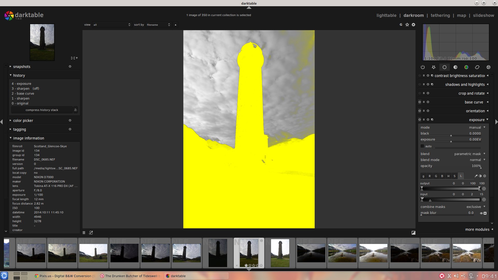
The magic we’re looking for is under the “blend” dropdown:
Simply select “parametric mask”.
This is where the magic is.
In my view, it should be renamed to Luminosity Mask, but that’s just me.
This is where we can create a mask of the photo by selecting just certain tonal ranges.
Now, we’re not going to go into detail on every aspect of this masking system; I’ll leave to you to experiment with.
Just note that this “parametric mask” function is available in every darktable module, so you can apply Luminosity Masks on Exposure, Saturation, Contrast, Vibrance, Local Contrast… whatever you wish.
This is neat and very powerful.
So, next step: select the “L” tab for “Luminosity” – located on the far right of the other tabs “g”, “R”, “G”, “B”, “H”, “S” — and then select the little icon that has the black circle in the white square, this will show the mask.
This is what your photo will now look like.
Don’t panic!
All this yellow is telling you is that, currently, any Exposure adjustment you make will take effect on the whole photo. Clearly, this isn’t what we want.
What we’re going to do is adjust the Input slider to start narrowing down our selection to just the tones we want; in this case, we’re after the shadows so we can brighten them up whilst leaving the highlights alone.
We can do this by bringing the sliders on the right-hand side of the Input slider down towards the left.
This will start deselecting the highlights of the photo as we narrow our mask further towards the shadows.
As you can see, I’ve brought the Input sliders from the right-hand side down to 25, very close to the left-hand sliders.
This is reflected in the mask, as we’re now starting to deselect some of the brighter highlights in the sky.
But we want to narrow it down further so that we’re targeting just the darkest parts of the photo: the mountains, foreground and monument.
Boom!
We’ve had to bring the sliders down all the way to 5 to cut off the highlights in the sky.
We’ve also managed to deselect some of the brighter highlights in the foreground as well.
Let’s just make one final adjustment to the sliders before we start brightening the Exposure.
Here, all we’ve done is move the bottom right-hand slider back up towards the highlights a little bit.
What this does is feather and soften the mask so that when we do our Exposure brightening it will look more natural and blend better.
OK, we’ve got our initial mask targeted nicely towards the shadows; hide the mask by selecting that black circle in the white square icon again.
Now it’s time to start brightening up the Exposure.
Boom!
Much better. Let’s do a side-by-side comparison.
Fig. 9: Original RAW unedited Fig. 10: Foreground, monument and mountains (shadow areas) have been brightened through a Luminosity Mask, leaving the highlights in the sky alone.
Already, we’ve made a striking change to how the photo looks.
There’s now a lot more interest as our subject, the monument, is much brighter with plenty of details available.
However, we’re not quite done.
The sky to the right of the monument looks a bit… funky.
That’s because when we feathered our Luminosity Mask a bit we selected too much highlight information.
This has resulted in part of the sky getting brighter but the rest of the sky staying the same, which looks strange.
We can correct this by moving the bottom right-hand slide back to the left a bit, cutting off those highlights in the sky more.
Better.
By moving the bottom right-hand slider back down from 20 to 8 the sky looks more natural.
Already, this photo is looking a lot better.
Let’s take some of those bright highlights in the sky and darken them a bit, so that the eye isn’t distracted and focuses more on the monument.
To do this, we’re going to make another Exposure adjustment.
To the left of the Exposure module name you’ll see four little icons.
Click the rightmost one and then select “New Instance” in the dropdown that appears.
We now have a new module called “Exposure 1” that sits on top of our previous Exposure module.
With this Exposure 1, we’re going to create a Luminosity Mask targeting the highlights so that we can darken the exposure in them.
Same process as before: in “Exposure 1” select the “blend” dropdown then select “parametric mask”.
Select the “L” tab for Luminosity then make the mask visible by clicking on the black circle in the white square icon.
This time, we’re going to take the left-hand sliders and bring them to the right, slowly deselecting the shadows until we’ve targeted the highlight tones we want to darken.
In our example, we’ve taken the left-hand sliders of Input up to 17 and then brought the bottom left-hand Input slider back down a little to 6 so that we feather the mask out for a more seamless blend.
Let’s start decreasing the exposure to see what it looks like.
Just click on the black circle in the white square icon again to hide the mask and starting decreasing the exposure slider.
Nice!
Here, we’ve brought the exposure down by -0.50EV through our Luminosity Mask, targeting the highlights and darkening them.
We’ve also tweaked the bottom left-hand slider by bringing it down to 3 for a bit more feathering.
Here’s a before and after.
Fig 11: Shadows brightened only via a Luminosity Mask Fig 12: Brightest highlights darkened through a Luminosity Mask in a new exposure adjustment.
Giggedy. So this photo is starting to look pretty sweet.
Let’s just make one more adjustment, globally this time with no Luminosity Mask.
I want to generally increase the overall exposure of the photo.
Good!
As you can see, on the right-hand side I’ve created another Exposure module, now called “exposure 2” and have increased the overall exposure of the photo by 0.50EV.
To round up this tutorial, let’s look into making one more adjustment through Luminosity Masks.
Now that we’ve brightened up the shadows and darkened down the highlights, we’ve moved a lot of the tones in the photo towards the midtones.
This is where the real meat of the image is.
We can now really give this photo some punch and pop by applying some contrast to just the midtones of the image.
Here’s how.
Open the Contrast, Brightness & Saturation module, select “blend” then select the “parametric mask” option in the dropdown.
You’ll note this time round that the tabs in the module—the “L”, “a”, “b”, “C” and “h”—are different to the Exposure module.
Don’t worry.
Just leave the “L” for Luminosity selected.
We’re now going to adjust the Input sliders so that we’re targeting just the midtones of the photo.
We do this by deselecting both the highlights and shadows.
This is done by moving the left-hand sliders up and the right-hand sliders down towards the middle.
So here’s how my midtones Luminosity Mask looks.
On the right, you can see that I’ve brought the sliders towards the middle and then dropped the bottom slider of the pair away so that there’s some feathering.
This is quite a tight midtones mask but that’s OK.
Now let’s hide the mask and start increasing the contrast.
Much better.
Because we’re only targeting a tight selection of the midtones we can make quite an aggressive contrast adjustment (I’ve brought the contrast slider way up to 50).
I’ve also increased the brightness of the midtones a little, pulled down the saturation to compensate for the contrast adjustment, and also increased the blurring of the mask to 100, feathering out the mask further for a more natural adjustment.
Let’s look at the before and after.
Fig. 13: Our RAW with the shadows brightened and the highlights darkened Fig. 14: Contrast increased in the midtones through a Luminosity Mask
You can see the biggest difference this contrast adjustment made was to the texture in the foreground grass and the stone detail in the monument.
You can make out the individual clumps of growth in the foreground as well as the individual tones in the stone of the monument.
Neat.
Finally, here’s an overview of the adjustments we’ve made to this photo
Fig. 15: Original unedited RAW Fig. 16: Shadows brightened through a Luminosity Mask Fig. 17: Highlights darkened through a Luminosity Mask Fig. 18: Overall exposure increased a little, no mask Fig. 19: Contrast in the midtones increased through a Luminosity Mask.
Conclusion
In this tutorial, I’ve only gone through the very basics of what is possible with darktable’s Luminosity Masks, so that one can make subtle adjustments to the shadows, highlights and midtones of their photo in order to balance the image better.
But Luminosity Masks can be used for so much more and so I invite you to experiment! Try out the different modules available in darktable and see how you can apply various filters through different masks to achieve highly-specific adjustments to your RAWs like never before.
Henri on Facebook: http://tinyurl.com/henrifb
Henri on Twitter: http://twitter.com//HenriLeChatNoir
Henri's store: http://store.henrilechatnoir.com/
Henri's book: http://www.henrilechatnoir.com/book/
Co-starring "Olive" as "the dog".
Music for this video is "Gone Dog", by Will Braden (the thieving filmmaker).
All new Henri videos will be uploaded here, so be sure to subscribe to this channel. Thank you for watching!
Alan Jenkins reads a selection of Ariel poems by, among others, Thomas Hardy, Walter de la Mare and T. S. Eliot, from Faber's Christmas pamphlet seriesFind out more: www.the-tls.co.uk
As I mentioned in the previous post, I’m currently working through a re-write of the various tutorials I had done about using Wavelet Decompose for skin retouching.
I’m about 2⁄3 of the way through it now and expect to have it finished shortly.
I also previously mentioned that I’ve been reaching out to a few folks to see if they might be interested in writing some articles for the site.
I’m extremely pleased to say that Ian Hex is stepping up to the plate with a neat tutorial about darktable that is being written right at this very moment!
If you haven’t had a chance to see Ian’s work I highly recommend stopping by his site at http://lightsweep.co.uk/ to get a gander at some epic images from the UK.
I desperately want to hop on a plane and visit after seeing them!
His self-professed mission is:
..to show off the beauty of British landscapes and architecture to the world
and I’d say he’s doing a bang-up job of it so far!
TLS VoicesMichael Caines considers the work of the war poet Ivor Gurney, and reads a selection from his work, including the previously unpublished poems "The Women at Work" and "The Vow of Life".Find out more: www.the-tls.co.uk
The Times Literary Supplement - an occasional series of readings.The TLS turns to the dark side, finding stories within stories, eyes in the dark, guilty consciences and beasts in the woods – tales from M. R. James, Edith Wharton and Saki, read and introduced by Michael Caines, Mika Ross-Southall and Lucy Dallas.3 of 3Find out more: www.the-tls.co.uk
I’m working my way through some of the suggestions I’ve received from many folks.
In particular, the “px” icon in the upper left to slide open the navigation and Table of Contents has been changed to a (hopefully) more familiar ‘hamburger’ icon.
I’ll also be testing some other things in the coming weeks as time permits such as having a TOC show up by default in the right ⅓ of the page at the top.
Don’t expect it too soon as I want to focus on writing more content first.
I’m aiming for a December-ish timeframe for a more official launch and want to make sure there is a decent amount of material for folks to consume.
Speaking of material, I’m starting work on a tutorial for skin retouching with wavelet decompose.
I’ve written about this many times before, but want to port the ideas over here.
“Dot Eyes Closed” wavelet decomposition
I have a few extra thoughts surrounding the use of wavelets as well as some minor changes in my workflow with them that should make a new writeup more interesting (hopefully).
I’ll also focus specifically on skin retouching as opposed to some of the other things that can be done with wavelets.
I have reached out to some of my favorite amazing photographers using F/OSS in their workflows and the response has been overwhelmingly positive. I’ll speak more about the folks in a later post, but I am personally very thankful that they have taken the time to respond and that it’s been so positive!
The Times Literary Supplement - an occasional series of readings.The TLS turns to the dark side, finding stories within stories, eyes in the dark, guilty consciences and beasts in the woods – tales from M. R. James, Edith Wharton and Saki, read and introduced by Michael Caines, Mika Ross-Southall and Lucy Dallas.2 of 3Find out more: www.the-tls.co.uk
The Times Literary Supplement - an occasional series of readings.The TLS turns to the dark side, finding stories within stories, eyes in the dark, guilty consciences and beasts in the woods – tales from M. R. James, Edith Wharton and Saki, read and introduced by Michael Caines, Mika Ross-Southall and Lucy Dallas.1 of 3Find out more: www.the-tls.co.uk
I’ve pretty much finished up the first article mentioned in the previous post.
There is still a long way to go.
As much as I’d like to believe that “If you build it, they will come”, the reality is that nobody is coming until there is something worth coming for.
So I’m working hard on getting good content in place.
I’m also acutely aware that nobody will stay unless good content continues to be published, but that’s for another post.
I am thinking the next article that I’ll update/port will be either Luminosity Masks or Skin Retouching.
I am also thinking that a port of my older color curves tutorials might be nice as well (particularly using sample points).
That should get me to four good tutorials to start the site with.
At that point I can start queueing up the next few asap.
I also wanted to do more than straight single tutorials, though, which brings me to a question.
These would be similar to the Digital B&W article I’ve already ported.
If you’ve read most of my tutorials on my blog, then you’re already familiar with what I’m thinking for these.
These are straight tutorials looking at a single (usually) effect and how to achieve it.
The primary focus is on the steps and tools to produce the desired result.
I am envisioning a workflow article to be more of a look at the creative process to achieve a final resulting image.
This is more along the lines of another previous set of posts I had written about: The Open Source Portrait and the Open Source Headshot.
These articles would focus on all of the steps and tools to arrive at a resulting image.
The difference from a tutorial article is that if a tutorial article might explore how to use Wavelet Decompose for skin retouching, a workflow article might include using that technique (among others) to realize a final vision.
Showcasing some of the amazing work I see occasionally is important as well, I think.
One, the artists doing this great work really do deserve to be talked about and exposed to a wider audience.
Second, great work by F/OSS using artists act as ambassadors for what is possible using these tools.
Too often the low opinion of many concerning F/OSS tools is framed by sub-standard work being shown.
There are some amazing photographers working with these tools, and my hope is that they can stand as examples to not only showcase F/OSS but also as a bar for others to aim for (and hopefully smash through).
I’m not 100% sure on this yet, but I think I was originally viewing this as a complete workflow from start to finish, including actually shooting.
This is more focused on the photographic process in general and things to keep in mind while capturing the shots for processing later.
I’m not at all sure about this, but the idea is there.
Possibly posts that are very short and targeted at a very specific task or function.
Something that might not really warrant a long-form article but could still be quickly useful for others.
I am reminded of this due to an old video of mine that I had done quickly for someone on G+ about how to add a watermark over an image.
You can tell why making videos is best left to folks like Rolf…
Thanks to darix (once again) over in irc on #darktable for setting up a Discourse instance for me to play with.
I have used it previously on boingboing.net, and I rather like what I’ve seen.
It also appears that there may be a way to embed thread posts as well, which would be a nice solution for commenting.
The first article is almost done being ported and formatted.
For anyone who’s curious, it’s a long post from the five part series I did on B&W conversion using GIMP (originally published on my blog).
The writing is going a bit slow because I am also feeling out the formatting and a couple of other minor visual things as they relate to a full-blown article.
Of course, it doesn’t help that it’s also a really, really long article…
For those of you bothering to read this blog, and who want to take a look at the state of that article, it can be found here:
Pixls.us: Digital B&W Conversion (GIMP).
Just don’t forget to let me know if anything looks funky, or with any suggestions/comments/criticisms.
Speaking of which, one of my first conundrums while working on it was a question of load times vs. convenience.
The original article was written as five separate blog posts which kept everything in reasonably bite-sized chunks to digest.
The problem is that as a reader I am sometimes annoyed at having to click through multiple pages to read an article and I thought that most readers here might feel the same way.
One of my concerns was load times and rendering speed of large pages.
I think I have all the assets set to load as quick as possible above the fold.
I’ve tried to optimize all images as much as possible and am making sure to define discrete width and height attributes in the html to help the browser render and not have to reflow (hopefully).
There are still a few optimizations that I have to implement that I haven’t yet (minify javascript and concatenating all my stylesheets for actual delivery), but I have them in the queue to do.
Oh, and spritesheets for some assets that I will get around to making soon as well.
So my current thought is to keep the articles to a single page, even if they are long.
I am also 100% open to other ideas as well so if you have one feel free to hit me up!
Long pages can be a bit cumbersome to navigate, though.
To help make it easier to target relevant information in the page, all of the headings in a page should have a unique id attribute.
This means that users will be able to link directly to sections of a long page (this seems to have fallen out of favor with many websites - why?!).
For instance, I can link directly to the previous section of this post by including the id of the element in the url:
I’m not 100% sure this is obvious, but the “px” logo in the upper-left corner of the page should slide out a navigation from the left side of the page (assuming you have javascript enabled in your browser).
If you don’t have javascript enabled, then clicking the logo will take you to the footer of the page where the basic navigation links are located.
I’m also considering a re-working of the icon to possibly make it more obvious that it opens a menu.
Perhaps something like the “hamburger menu icon” is in order?
The first set of links are the main ones for navigating the site Home, Blog, Articles and Software.
Just below that will be the navigation links for the contents of the current page.
For no other reason than I thought it was neat, I also made it so that the background of each of the Table of Contents entries will be a slightly darker color relative to how far along you are in the page/section.
In the example above, I have already read Getting Closer and First Test Article, and I am ~75% of the way through the Speaking of Long section of the post.
Unfortunately, this won’t work without javascript enabled.
I am still thinking of a way to possibly include the TOC in the page without screwing up the layout too much.
Something to play with later I suppose…
At the moment I am using a combination of serving up the images directly from my host, and using Google+ photos.
Mostly because I have limited space on my webhost, and I’m not quite sure what the impact will be just yet.
I also gain the distributed Google infrastructure for image hosting, which helps I think as images are by far the biggest files to serve for these pages.
I also get on-the-fly image resizing when hosting the images on Google, which is handy while I build things out.
One of the downsides is that the on-the-fly resizing doesn’t produce progressive jpegs, which I thought might help with rendering speeds of large pages (images loading progressively at least show that something is there…).
I think I mentioned it in the previous post The Big Picture that I had done the styling to get images to span the entire width of the page.
In that same post I also demonstrated a means for making embedded videos bigger as well.
It turned out that the same styling worked great for images as well.
Here is the lede image wrapped in a <figure> tag:
A caption to the image in a <figcaption> tag.
I can re-use the styling for the larger video to automatically make the image much larger and centered on the page:
Using class big-vid on the figure.
And, of course, wrapping the <figure> in a <!-- FULL-WIDTH --> tag yields:
Wrapping <figure> with a <!-- FULL-WIDTH --> tag and setting the class to full-width.
This is a photography site, right?!
#### Comparing Images
I still don’t have a great solution for image comparison.
The problem is that ideally I could have an image that shows some results with an easy way to toggle back to a comparison image (before/after for instance).
The current way I am doing it is to toggle the image when it’s clicked on.
If you hover over an image, and the cursor changes to a crosshair, then click on it to compare.
I’m borrowing this from the B&W article I was just working on:
Click on the image to compare to original.
This works across mobile as well but I can’t help but feel it is a bit inelegant.
It is also dependent on javsacript and I don’t know if there is a simple way around this.
At least now, without javascript turned on, everything else still works except toggling to the comparison version.
I’d like to have at least a few good articles ready to go at launch time.
As I said, I’m almost finished with the B&W conversion article, but the question is what to migrate next?
I’m thinking that one of the Open-Source Portrait posts would make a nice article to launch with as well,
or perhaps an update/re-write of using Wavelet Decompose for skin retouching?
If anyone has a preference or suggestion, I’m all ears!
I’m also going to publish an interview with a F/OSS photographer whose work I admire.
The Times Literary Supplement - an occasional series of readings.Poet, novelist and screenwriter Laurie Lee is discussed with further contribution from fellow writer, Ronald Blythe.Introduced by Michael Caines and Rozalind Dineen from The TLS.Find out more: www.the-tls.co.uk
Black and White photography is a big topic that deserves entire books devoted to the subject.
In this article we are going to explore some of the most common methods for converting a color digital image into monochrome in GIMP.
What We are Trying to Achieve
There are a few things you should focus on in regards to preparing your images for a B&W conversion.
You want to keep in mind that by removing color information you are effectively left with only tonal data (and composition) to convey your intentions.
By liberating yourself of color data the focus is entirely on the subjects and composition
(this is often one of the primary reasons street photography is associated with B&W).
Conversely, the subjects and composition need to be much stronger to carry the result.
As an interesting side note, Edward Weston’s Pepper #30 is the image that began my personal interest in B&W photography.
Tonality
What I tend to refer to when using this term is the presence and relationship between different values of gray in the image. This can be subtle with smooth, even differences between values or much more pronounced.
When referred to as the singular “tone”, it is usually referring to a single value of gray in the image.
Contrast
Contrast is the relative difference in tones between parts of an image.
High contrast will have a sharper differentiation between tones, while low contrast will have less differences.
Often, a straight conversion to grayscale can result in values that are all similar, yielding a tonally “flat” image.
Contrast is often considered in terms of the entire image globally, or in smaller sections locally.
Dynamic Range
Dynamic range is the overall range of values in your image from the darkest to the brightest.
The Approach
The approach we will take here is similar to what I had done in my film days.
We’ll attempt to use different methods of grayscale conversion (and possibly blending them) to get to a working image that is as full of tonal detail as possible.
Petteri Sulonen refers to this as his “digital negative” – if you want a great look at a digital B&W workflow head over and read his article.
Then, with an image containing as much tonal detail as possible, we will modify it with adjustments of various types to produce a final result that is visually pleasing.
Before heading down that path, it may help to have a closer look at the tools being used.
Let’s have a look at how an image gets displayed on your monitor first.
Your Pixels and You
You are working in an RGB world when you stare at your monitors.
Every single pixel is composed of 3 sub-pixels of Red, Green, and Blue.
300X magnification of an LCD panel.
(Image from wikipedia)
The variations in brightness of each of the sub-pixels will “mix” to produce the colors you finally see.
The scales available in an 8-bit display are discrete levels from 0–255 for each color (28 = 256).
So if all of the sub-pixel values are 0, the resulting color is black.
If they are all 255, you’ll see white.
Any other combination will produce some variation of a color.
80, 205, 255 for instance
or 255, 172, 80
But what about 16-bit images?
Well - the data is still in the image file to correctly describe the colors at 16bit/channel, but most likely what you’ll be seeing on your monitor is an interpolation of the values to an 8-bit/channel colorspace.
You should always work in the highest bit depth color that you can, and leave any conversions to 8-bit for when you are saving your work to be viewed on a monitor.
The important point to take away from this is to realize that when all three color channels are the same value, you’ll got a grey color.
So a middle gray value of 127, 127, 127 would look like this:
127, 127, 127
While this is a little brighter: 220, 220, 220
Very quickly you should realize that a true monochromatic grayscale image can display up to 256 discrete shades of gray going from 0 (pure black) to 255 (pure white),
while for 16-bit images, 216 will yield 65,536 different shades.
It is this limitation for purely gray 8-bit images that introduces artifacts over smooth gradations (posterization or banding) – and is a good reason to keep your bit depths as high as possible.
Getting to Grey
There are many different paths to get to a grayscale image and almost none of them are equal.
They will all produce different images based on their method of conversion,
and it will be up to you to decide which ones (or portions of) to keep and build upon to create your final result.
A combination of luminosity desaturation and GEGL C2G Conversation in Hayleys by Pat David (cba)
For this tutorial we are going to try and cover as many different methods as possible.
This means we’ll be having a look at:
One of these methods may work fine for you.
Or, if you’re like me, it will most likely be a combination of one or more of these methods blended through a combination of layer masking and opacity adjustments.
Desaturate (GIMP)
Perhaps the easiest and most straightforward path to a grayscale image is using the Desaturate command.
It can be invoked from the GIMP menu:
Colors → Desaturate…
There are three options available from this menu:
Each of these options (Lightness, Luminosity, Average) will generate a grayscale image for you,
but the difference lies in the way they interpret the image colors into values of gray.
To illustrate the differences, consider the following two figures.
One is a gradient of red, green and blue from black to full saturation.
The other are overlapping circles of color in an additive mix.
Base RGB gradient of pure colors
Base RGB (additive color) mix
Let’s investigate each of the desaturation options on these test images.
Lightness
The Lightness method will add the largest value of red, green or blue and the smallest value, then divide the result by 2.
½ × ( MAX(R,G,B) + MIN(r,g,b) )
So, for instance, with an RGB value of 100, 20, 210, the equation would be:
½ × ( 210 + 20 ) = 115
Using the Lightness function on our test images yields the following results:
Lightness conversion yields similar values regardless of color
Click to compare to original
This means that one channel is actually ignored in creating the final value.
Average
Average will use the numerical average of the RGB values in each pixel.
⅓ × ( R + G + B )
Averaging, the values will trend darker overall
Click to compare to original
Luminosity
Lightness and Average both evaluate the final value of gray as a purely numerical function without regard to the actual color components.
Luminosity on the other hand, utilizes the fact that our eyes will perceive green as lighter than red, and both lighter than blue (relative luminance).
This is also why your camera sensor usually has twice as many green detectors as red and blue.
The weighted function describing relative luminance is:
(0.2126 × R) + (0.7152 × G) + (0.0722 × B)
This is closer to how our eyes will actually perceive the brightness of each color
Notice the overwhelming contribution from green
Click to compare to original
No one of these methods is necessarily any better than the other objectively for your own conversions.
It really depends on the desired results.
However, if you are in doubt about which one to use, Luminosity may be the better option of the three to more closely emulate the brightness levels you will perceive.
Examples
The image below, Joseph N. Langan Park, is an interesting example to see just how much green influences the conversion result using luminosity. Click through each of the different conversion types to them, and pay careful attention to what Luminosity does with the green bushes along the waters edge.
Click to compare: OriginalLightnessAverageLuminosity
This shot of Whitney shows the effect on skin tones, as well as the change in her shirt color due to the heavy reds present.
In just a Lightness conversion, the red shirt becomes relatively flat compared to her skin tones,
but becomes darker and more pronounced using Luminosity.
Her lips get a bit of a boost in tone in the Luminosity conversion as well.
Click to compare:
OriginalLightnessAverageLuminosity
Channel Mixer
Using Desaturate lets you convert to grayscale based on pre-defined functions for calculating the final value,
but what if you wanted even further control?
What if you wanted to decide just how much the red channel should influence the final gray value,
or to have more control over the ratios and weightings from each of the different channels independently?
That’s precisely what the Channel Mixer will allow you to do.
For the examples below I’ll use a different color gradient test map going from blue to blue HSV gradient, with a gradient to black vertically.
This represents the entire 8-bit colorspace.
Gradient representing all the colors/shades in 8-bit sRGB colorspace.
Click to compare:
OriginalLightnessAverageLuminosity
Take a quick moment to click through the various desaturation methods already mentioned.
The Channel Mixer can be invoked through:
Colors → Components → Channel Mixer…
The dialog will look like this with the test gradient:
The Channel Mixer can be used to modify these channel on a full color image, but we are focusing on grayscale conversion right now.
So check the box for Monochrome, which will disable the Output channel option in the dialog (it’s no longer applicable).
This will turn your preview into a grayscale image.
Warning: Math Ahead
If you checked the Monochrome option, and left the Red slider at 100, then you’d be seeing a representation of your image with no Green or Blue contribution (ie: you would basically be seeing the Red channel of your image):
Basically just the red channel
What this means is that with Green and Blue set to 0, the values of the Red are directly mapped to the output value for the grayscale image.
If you were looking at a pixel with RGB components of 200, 150, 100, then the Value for the pixel in this instance would become 200, 200, 200.
It’s also important to note that the sliders represent a percent contribution to the final value.
That is, if you set the Red and Green channels to 50(%), you would see something like this:
In this case, Red and Green would contribute 50% of their values (with nothing from Blue) to the final pixel gray value.
Considering the same pixel example from above, where the RGB components are 200, 150, 100, we would get:
The astute will notice that the sliders actually have a range from -200 to 200.
So you may be asking – what happens if two channels contribute more than what is possible to show?
Using the pixel example again, what if both the Red and Green channels were set to contribute 100%?
While the Channel Mixer will allow us to set these values, we can’t very well set the grayscale pixel value to be 350 (in an 8-bit image).
So anything above 255 will simply end up being clipped to 255 (effectively throwing away any tones above 255, bad!).
This means that you have to be careful to make sure that each of the three channel contributions don’t exceed 100 between all of them.
50% Red, 50% Green is ok – but 50% Red, 50% Green, and 50% Blue (150%) will clip your data.
This is where the Preserve Luminosity option comes into play.
This option will scale your final values so the effective result will always add up to 100%.
The scale factor from the above example would be calculated as:
1⁄( 1.00 + 1.00 + 0 ) = 0.5
So the value of 350 would be scaled by 0.5, giving the actual final value as 175.
If Preserve Luminosity is active, all the values would be scaled by this amount.
This is not to say that Preserve Luminosity is always needed, just stay aware of the possible effects if you don’t use it.
Speaking of Luminosity
Previously we talked about the function used for desaturating according to relative luminance.
If you’ll recall, the formula was:
( 0.2126 × R ) + ( 0.7152 × G ) + ( 0.0722 × B )
If you wanted to replicate the same results that Desaturate → Luminosity produces, you can just set the RGB sliders to the same values from that function (21.3, 71.5, 7.2):
Replicating the luminosity function
If you’re just getting started with the Channel Mixer, this makes a pretty nice starting point to begin experimenting.
Experimenting
A pretty landscape image by Flickr user Cyndi Calhoun serves as a nice test image for experimentation:
You’ll want to keep in mind the primary RGB influences in different portions of your image as you approach you adjustments.
For instance, this image (not coincidentally) happens to have strong Red features (the rocks), Blue features (the sky), and Green features (the trees).
Keep an eye on the individual channels from getting so bright that you lose detail (blowouts),
or from crushing the shadows too much.
Remember, you want to try to keep as much tonal detail as possible!
So, using the luminosity function as a starting point…
Straight conversion using the luminosity
It’s not a bad start at all, but the prominence of the red rocks in the sunlight has been dulled quite a bit.
It’s a central feature of the image and should really draw the eye towards it.
So the reds could be more pronounced to make the stone pop a little more.
With the Preserve Luminosity option checked, begin bumping the Red channel to taste.
Red channel bumped up to 66.1
(Click image to compare to base luminosity conversion)
This gives a little more prominence to the red stone.
The Green channel seems ok, but for comparison try lowering it to about half of the Red channel value.
Remember – Preserve Luminosity is checked so the final values will scale to give Red values twice the weight as Green.
Green channel at ~half of Red.
(Click image to compare to previous step)
This brings up the shadow side of the central rocks a bit as well as adds some definition to the trees and vegetation.
Also interesting is the apparent boost to the red rocks as well.
If you’re wondering why the red rocks got brighter as well, consider the math.
Previously Red and Green were very near each other in value (around 70), so both colors had approximately equal weight.
When Green got its influence cut in half, Red scaled to take a much larger influence, and because there was more red than green the final value will end up higher.
If we look at the RGB values of the red rocks, the values are roughly like this (ignoring Blue for the moment because for this example it’s staying constant): 226, 127.
If both Red and Green have equal influence, the final pixel value will be:
( 226 × 0.5 ) + ( 127 × 0.5 ) = 176.5
Now if Green is only half as strong as Red, the value will be:
The result was divided by the influence amount to scale the way Preserve Luminosity would.
The final pixel value will become brighter in this case, which is why the red rocks got brighter with a decrease in the Green channel.
It should go without saying that the Blue channel will have a heavy influence on the sky (and many areas of the image in shadow).
To add a little drama to the sky, try removing the Blue channel influence by setting it to 0:
Blue channel set to 0
(Click image to compare to previous step)
This will darken the sky up a bit (as well as some shadow areas).
Pay careful attention to what these changes do to the image in closer views.
In this case there is a higher amount of banding and noise in the smooth sky if values get pushed too far.
So try to approach it with a light hand.
The sliders also allow negative values.
This will seriously crush the channel results when applied (and will quickly lead to funky results if you’re not careful).
For example, to push the Blue channel even darker in the final result, try setting the Blue channel to -20:
Red: 66.1, Green: 33, Blue: -20
(Click image to compare to previous step)
The sky has become much darker, as have the shadow side of the rocks.
There is an overall increase in contrast as well, but at the expense of nasty noise and banding artifacts in the sky.
General Rules of Thumb
The Red channel is well suited for contrast (particularly in the brighter tones).
The Green channel will hold most of the details.
The Blue channel contains grain and (often) a lot of noise.
In skin, the Red channel is very flattering to the final result and you’ll often get good results by emphasizing the Red channel in portraits.
On Skin
The Red channel can be very flattering on skin and is a great tool to keep in mind when working on portraits.
For instance, below is the color image of Whitney from earlier:
Whitney in color
The straight Luminosity conversion is below.
Click on the image to compare it to a version where the Red channel is set equal to the Green channel (giving a greater emphasis on the Reds):
Whitney in Luminosity
(Click to compare Red channel = Green channel)
B&W Film Simulation
Due to the popularity of the Channel Mixer as a straightforward means of conversion with nice control over each of the RGB channel contributions, many people have used it as a basis for building profiles of what they felt was a close emulation to the tonal response of classic black and white films.
Borrowing the table from Petteri Sulonen’s site, these are some common RGB Channel Mixer values to emulate some B&W films.
These aren’t exact, of course, but some people may find them useful.
Particularly as a starting-off point for further modifications.
Film
R, G, B
Agfa 200X
18, 41, 41
Agfapan 25
25, 39, 36
Agfapan 100
21,40,39
Agfapan 400
20,41,39
Ilford Delta 100
21,42,37
Ilford Delta 400
22,42,36
Ilford Delta 400 Pro & 3200
31,36,33
Ilford FP4
28,41,31
Ilford HP5
23,37,40
Ilford Pan F
33,36,31
Ilford SFX
36,31,33
Ilford XP2 Super
21,42,37
Kodak Tmax 100
24,37,39
Kodak Tmax 400
27,36,37
Kodak Tri-X
25,35,40
There’s a good reason that Channel Mixer is such a popular means for converting an image to grayscale.
It’s flexible and allows for a great level of control over the contributions from each channel.
Unfortunately the only way to preview what is happening is in the tiny dialog window.
Even when zooming in it can sometimes be frustrating to make fine adjustments to the channel contributions.
Decomposing Colors
Another method of converting the image to grayscale is to decompose the image into its constituent channels.
When looking at the Channel Mixer previously, there was an option to set one of the RGB channels to 100 (and leaving the others at 0) that would isolate that specific channel.
If you wanted to isolate each of the RGB channel contributions into its own layer, it would be tedious to do manually.
Luckily, GIMP has a built-in command to automatically Decompose the image into different channels:
Colors → Components → Decompose…
Will bring up the Decompose dialog box:
The Decompose dialog
The options available are which Color model to decompose to, and whether to create a new image with the decomposed channels as layers.
If Decompose to layers is not checked, there will be a new image for each channel separately (chances are that you’ll want to start out leaving this checked).
The most important option is which Color model to decompose to.
Up to now we have mostly been considering RGB, but there are other modes that might be handy as well.
Let’s have a look at some of the most useful decomposition modes.
This is the Color mode that we’ve been focusing on up to now, and is usually the most helpful in terms of having multiple sources to draw from.
This separates out the Red, Green, and Blue Channels into individual layers for you (and Alpha if your image has it).
RGB decomposed.
HSV/HSL
Hue, Saturation, and Value/Lightness is another useful decomposition, though usually only the Value or Lightness is useful for B&W conversion.
Hue, Saturation, Value (HSV) Channels
The Value in HSV is derived according to a simple formula:
Value, V = MAX( R, G, B )
Which is basically just the largest value of Red, Green, or Blue.
Hue, Saturation, Lightness (HSL) Channels
The Lightness in HSL is derived from this formula:
Lightness, L = ( MAX( R, G, B ) + MIN( R, G, B ) )⁄2
Where Lightness is simply determined as the average of the largest and smallest component of RGB.
While Hue and Saturation may seem interesting, it should be obvious that the most useful channels for a grayscale conversion here would likely be Value or Lightness.
Overall, Lightness will tend to be a bit brighter than Value.
LAB
There is far too much information concerning the LAB colorspace to really go into much detail here. Suffice it to say that the L in LAB is for Lightness, while A and B are for color opponents (A = Green⇔Red, B = Blue⇔Yellow).
Later articles about color toning will show some neat tricks using the LAB colorspace for adjustments.
The LAB colorspace is based on a perceptual model (similar to the relative luminance previously discussed).
In fact, the Lightness in LAB is calculated using the cube root of the luminance from that function.
LAB Channels
As you can see, the only channel of any use for a B&W conversion is really the Lightness, L channel.
CMY(K)
Cyan, Magenta, Yellow and (Black, K) are often discussed in terms of printing.
When doing the decomposition in GIMP, you’ll have to invert the results to make them useful.
Once you do, you may notice that they are, in fact, the same as RGB (for CMY decomposition):
CMY conversion (inverted from direct conversion)
CMYK produces a similar result, but adds another channel to control the level of black in the result.
Inverting the Black, K channel yields something usable.
CMYK conversion with the Black, K channel inverted
YCbCr
Anyone who has done video processing might recognize this colorspace representation, as it often shows up in digital video.
YCbCr is a means for encoding the RGB colorspace with three channels: Luma, Y, and two channels of Red (Cr) and Blue (Cb) chroma differences.
YCbCr
Try to use the 256 variants of the ITU recommendations to allow the decomposition to span the full 256 values available (the non-256 versions will pad 16 to the range, only allowing values to go from 16-240).
So What’s the Result?
Let’s summarize some of the most useful results from Colors → Components → Decompose for a B&W conversion:
RGB - All channels
HSV/HSL - V (Value) and L (Lightness)
LAB - L
CMYK - K
YCbCr - Y (Luma)
This gives a total of 9 different types of color mode conversions that may be useful for generating a B&W image.
It helps to visually see all of the options at once to get a better feel for what is going on:
All 9 useful channels from Colors → Components → Decompose
Chances are that one of these conversions might prove useful as a direct B&W conversion.
It helps to notice that the first 4 conversions are all color channels, while the last 5 conversions are brightness values based on different functions for achieving the results (K, Value, Lightness, L, Y (luma)).
The Script
I had previously written some Script-Fu to automate the task of generating these useful channel decompositions (it was tedious choosing each color model manually).
The script will take the active layer in an image, and decompose it to each of the useful color channels listed above, each on its own layer.
Once downloaded and placed into your Scripts folder, the command can be found here:
Likely that some parts of some conversions will be useful in some way.
I am personally rarely satisfied with any of the straight conversion options on their own,
but would like to pick and choose which parts of the image contain the best detail and tones from the different conversion options.
The fun is then combining them in such a way so as to produce a final result that is pleasing.
Pseudogrey
Pseudogrey (grey, not gray, per the original author, Rich Franzen) is a means for increasing the available levels of perceived gray in an image using a bit-stealing technique.
The basic approach in Pseudogrey is that you can achieve a much higher number of perceived gray values in an image, if you allow some of the pixels to stray just a tiny bit away from pure gray. For instance, if a pixel value in a true gray image was: 180, 180, 180, Pseudogrey may actually make the pixel value something like 180, 181, 180.
That is, the Green value may be just a bit higher. The full post on Pseudogrey goes into much more detail about the algorithm.
The results from using Pseudogrey will follow the same model as for Luminosity desaturation, but will provide a much larger range of tones (1786 possible shades vs 256 in a truly gray image).
There are a couple of ways to convert images to pseudogrey.
Once the file has been downloaded and placed into your Scripts folder, the command can be found under:
Colors → Pseudogrey…
Alternatively, if G’MIC is installed then the command can be found at the Black & white filter:
G’MIC → Black & white → Black & white
At the end of all of the various options in the filter, there is a Pseudo-gray dithering option to apply the algorithm at various levels (higher levels increase the distance from true gray for each pixel).
Pseudogrey can be helpful in areas with slight tonal value changes over a large area, as this is often where banding will become visible in an 8-bit image.
While the differences may be slight in many cases, if allowing the tiniest amount of color shifting to creep into the image for an expanded tonal range is ok, then pseudogrey is a great option to have.
GEGL C2G
The Generic Graphics Library (GEGL) is the underlying graphics engine for GIMP.
There is one neat function in GEGL specificaly for B&W conversions called Color 2 Grayscale (c2g).
It can be found on the Tools menu in GIMP:
Tools → GEGL Operation…
Rolf Steinort covers c2g briefly in episode 84 of Meet the GIMP.
Paul Bou also looks at using c2g for B&W conversions in a little more detail, and Joel Cornuz also asks if c2g could be the “ultimate” B&W converter.
It may not be worth all the hyperbole, but c2g does do some very interesting things.
The operation considers each pixel relative to its neighbors within a given radius.
The value determined is evaluated as a function of perceived luminance weighted against neighboring pixels.
The description from GEGL.org is:
Color to grayscale conversion, uses envelopes formed from spatial color differences to perform color-feature preserving grayscale spatial contrast enhancement
In practice, c2g will attempt to scale the values of pixels within its neighborhood (radius) to maximize contrast.
What some people like about c2g is that the operation will also introduce a nice range of synthetic grain during the conversion.
There are ways to minimize the resulting grain by adjusting settings, though.
Let’s consider this test image:
Straight Luminosity desaturation in GIMP
At first glance, GEGL c2g will likely produce ugly results.
The default settings are not conducive to producing a pretty image:
c2g conversion, default settings (radius 300, samples 4, iterations 10)
(Click image to compare to original)
The default settings will (usually) produce a nasty halo effect on edges where the radius is not large enough to fully consider transitions.
The edges of the buildings/trees against the sky show this particularly.
There is also an excessive amount of synthetic graininess to the result.
Tweaking parameters can lead to better results at the cost of processing time.
GEGL c2g is not a fast algorithm.
Haloing can be decreased by increasing the radius and graininess can be decreased by increasing the samples or iterations.
Iterations seem to have a larger effect on overall noisiness in the result but (again) at the cost of increased processing time.
Betters results after increasing some parameters (radius 750, samples 8, iterations 15)
(Click image to compare to default parameters)
Increasing the radius helped to alleviate some of the halos and will allow the algorithm to spread the contrast over a larger area.
The increase in samples and iterations helps to keep the noise down to a more manageable level as well.
Refining even further yields slightly better results:
Betters results after increasing some parameters (radius 1500, samples 8, iterations 20)
(Click image to compare to original)
At this point the noise is nicely suppressed while the halos have mostly been eliminated.
The overall image still has more contrast than the straight luminosity desaturation (click to compare) and the contrast has been weighted for the surrounding pixels as well.
If a luminosity desaturation will choose a pixel value based on the perceived color brightness, c2g will do the same in addition to weighting the result relative to neighboring pixels.
For example, below is an optical illusion showing the effect on perceived luminosity relative to nearby brightness:
Square A and B are the same value of gray!
Squares A & B are the same exact shade of gray.
The reason we perceive B as lighter than A is due to the way our eyes are perceiving nearby colors (and our expectations are strengthened by the checkerboard pattern as well).
The results of running the image through c2g aligns the pixel values closer to what our eyes see:
After letting c2g do its thing
This operation can be very handy for bringing out micro-contrasts in an image (or increasing global contrast at large radius settings).
Conversion Examples
Finally, a look at a simple workflow for applying these various methods of grayscale conversion to arrive at a final result.
The overall workflow here will be to decompose the image to various grayscale layers.
Then to investigate each of the different versions to identify features of interest aesthetically.
Finally, combine the different decompositions and mask accordingly to highlight those features or tones.
Pretty Woman
Do a Creative Commons search on Flickr, and it’s very likely that photographer Frank Kovalchek will show up in some fashion. He liberally licenses many photographs under Creative Commons licenses, and we will be using one of his portraits for this first example.
Utilizing the script from earlier to quickly break the image down into multiple layers using different decomposition modes produces a nice array overview to consider:
These various decompositions supply a large amount of possible variations in getting to a finished product.
Keep in mind that the goal in this example is to maintain good tonal density as well as imparting a sense of texture and detail.
The Scarf
As good a starting point as any, consider the texture and detail of the scarf. Looking at the various decompositions in the array, the question you should be asking yourself is:
Which of these results produces the best quality/texture in the fabric of the scarf?
Looking at the previews leads to three possible choices: Luma Y709F, Luma Y470F, and HSL - Lightness.
Of those let’s go with Luma Y709F.
This is very subjective, of course.
The important point to take away is the choice being made due to qualities it possesses for a particular purpose.
The Y709F - Luma channel as a “base” layer - chosen for the fabric texture
The main focus of the image will be the models face but you will still want to retain detail and texture in the scarf as well.
The Skin
Looking at the model and her skin there is already fine detail , but could use a bit more emphasis overall.
Perhaps get the skin a little bit brighter and in a higher key to offset the dark background and the scarf.
It would be nice to smoothen/soften the skin tones as well.
Keeping that in mind, look back at the various decompositions again, this time with an eye towards skin tones and her face.
Not surprisingly, the RGB - Red channel looks very pretty (as well as the HSV - Value).
It’s fairly common that the red channel will be complimentary on (Caucasian) skin.
There is even an old trick to use the red channel as an overlay on a color image to help “enhance” skin tones.
So let’s try that here.
Place the RGB - Red channel over the Luma - y709f channel and change the layer blending mode to Overlay.
Luma Y709F base, with Red channel over (layer blend mode: Overlay)
(Click to compare to base Y709F - Luma)
Visually this appears to have more impact, but the skin may be blown out a little too much.
One option to attenuate this would be to lower the opacity on the RGB - Red layer.
Also, note that very often the visual impact may also be due to the higher contrast in the image at this point.
Sometimes it’s best to stand up and look away from the image for a while before committing to a change…
The problem with adjusting the opacity for the entire layer is that the ratio of levels between the skin and scarf may not be desirable for the final output.
Adjusting the opacity might reduce the effect on the skin, but at the same time will reduce the effect on the scarf by an equal amount.
What is needed is a way to apply the effect stronger on the scarf or skin separately.
This is exactly what Layer Masks are for!
Masks
At this point a layer mask could be added to the RGB - Red layer, and then painted by hand to modify the intensity by isolating the face and giving a little less opacity to the scarf.
It’s a lot of tedious, detailed work.
However, if you look back on the array of decompositions you may notice that channels like RGB - Blue and RGB - Green look pretty good for isolating the face from the scarf already.
So we are going to use the RGB - Green layer and apply it as a layer mask to the RGB - Red layer.
The Layers palette should look something like this in GIMP now:
Keep in mind, a layer mask will be more transparent the darker the color is in it.
The lighter areas will show more of the layer it is applied to.
In this case, the lighter areas will allow more of the RGB - Red layer to show, while darker areas will show more of the layer below, Luma - Y709F.
The results at this point with the mask:
RGB - Red as overlay with RGB - Green as a layer mask
(Click to compare without the layer mask)
What this has done is to isolate the models face from the surrounding scarf.
You can now modify the opacity of the layer, or adjust the values of the mask using Levels or Curves to adjust the intensity of the result.
Any changes to the RGB - Red layer will now be masked to apply mainly to the models face.
Looking at the results, the scarf has become much more flat in tones, while the models face has brightened up.
Considering it, the ratios look backwards a bit. The scarf has flattened out, and the face has brightened a bit too much.
To flip the ratios, simply invert the colors of the layer mask.
Select the mask (not the layer itself!), and run:
Colors → Invert
The layers palette will now look like this:
The result on the image so far:
Inverted mask results
(Click to compare to non-inverted mask)
At this point the results look pretty nice and would make a fine stopping point.
The overlay and mask added some nice depth to the scarf fabric while maintaining a nice effect on the skin of the model as well.
More work could be done if wanted with adjusting layer mask levels and increasing/decreasing the results on the models skin but this looks good as it is.
A final comparison of the results against a straight color desaturation:
Final result
(Click to compare to straight color desaturation)
This path was a little fussier than doing a straight color desaturation but the results are much nicer and is visually more interesting.
Methuselah
Well, this isn’t the actualMethuselah, but it is a similar species of Bristlecone Pine. Once again, image courtesy of Flickr user Frank Kovalchek.
As before, a first look at multiple decomposition modes originally pointed to Luma - Y709F as being a good candidate for the conversion.
In this case, the focus would be on the texture of the tree itself.
The RGB - Green decomposition also looks quite good to use as a base moving forward.
The primary focus is the gnarled old tree itself and the secondary focus the lighting of the sun across the ground.
RGB - Green channel decomposition
While the RGB - Green channel is nice for the tree texture, the sky still appears too bright and the ground could be a bit darker compared to the tree.
The sunlight on the upper branches of the tree and topping the brush on the ground gets slightly lost when the sky is so bright comparatively.
Having found a good layer for the tree texture, the other decompositions are examined for something that represents the sky and ground a little better.
The RGB - Red channel is a good compromise (the RGB - Blue channel is a little too noisy).
RGB - Red channel decomposition
(Click to compare to RGB - Green)
RGB - Red looks like a great candidate for the sky and ground, while RGB - Green will do nicely for the tree textures.
As before, layer masks can be used to modify the mix of the two layers to arrive at a final result.
Set the RGB - Green channel above the RGB - Red channel on the layer palette, and add a layer mask to the RGB - Green channel layer initialized to Black (full transparency).
This lets all of the underlying RGB - Red channel layer show through.
Red channel layer, with Green channel over + mask
Now with the layer mask active (see the white outline around the layer mask, not the layer itself above), paint with a white color to allow that portion of the RGB - Green channel layer to show through.
When painting with white, it will turn the current layer the mask is associated with opaque in those areas – so focus on painting white where the tree is.
Below is a quick mask to illustrate.
It’s only a quick mask, don’t judge it too harshly…
The layers at this point will look like this:
The results from applying the mask above to the image:
Final blend of RGB - Red and RGB - Green channels with mask
(Click to compare to straight desaturation)
This could be a good final version, though there is still a bit of noise in the upper-left corner of the sky from the Red channel.
This could be fixed by adding another layer mask just for the sky which would allow adjustments to the levels of the sky relative to everything else.
Grain
Following some ideas from the great tutorial by Petteri Sulonen on Digital Black and White, he speaks a bit about grain in B&W images.
There are a few different methods of adding synthetic grain to an image but visually the results are less than impressive.
Petteri was kind enough to make available a grain field that he processed himself from scanned film.
An easy way to add grain to an image using this grain field is to add it as a layer over the image, set the layer blending mode to Overlay, and adjust opacity to suit.
100% crop with Petteri’s grain field applied as Overlay layer
(Click to compare no grain)
There are many ways to get to a monochrome image.
The important process to take way from this article is to consider elements of the final image as built up from multiple conversion methods, and controlling/applying them as needed to serve the final result best.
Mix and match the methods presented here to get to the best base for further modifications.
First things first.
I forgot to actually link to the new About page in my last post.
So here it is.
As with all things related to the site, any feedback, comments, or criticisms are welcome!
Speaking of feedback, comments, and criticisms, I wanted to write about it for a moment.
First, I want to thank everyone who has taken the time to contact me and provide me feedback on the site.
You have no idea how valuable it is to both as a motivator, and as a means to know when something is off.
I appreciate and give my full attention to each and every person and idea thrown at me. Thank you!
From the beginning I have been considering how to let everyone interact with the site and posts.
It would be so much easier for folks to leave a comment on a page (or forum) directly.
Particularly if it allows everyone to view the conversation.
One thing I could do relatively easily is just use a third party commenting system, like Disqus.
They make it so easy it almost seems silly not to do it.
An account, a few lines of javascript, and done.
This method comes with a price, though.
A price in both user privacy concerns as well as the fact that comments are no longer mine (pixls.us) to manage and archive.
I don’t know that I’m willing to pay that price yet just for convenience.
If anything, I may set it up as a temporary solution while I work on something a little more long term.
From what I’ve seen so far, Discourse is the long term solution that I would like to get up and running.
It’s also “Yet-Another-Thing” I should thank darix on #darktable for pointing me to.
The only drawback at the moment is that my hosting provider doesn’t have what I need to get it running (relatively easily).
There are a couple of options for hosted solutions that I may go with, but I want to focus on getting the content ready to go for an “official” launch before I get too far down that rabbit hole.
Yes, I know there’s a need for having some sort of commenting system available for everyone to participate!
I’ll get one running just as soon as I can.

 Login
Login