Michael Caines looks back to Douglas Oliver's long poem The Infant and the Pearl, first published in 1985 – a poetic vision of the contemporary political scene, among other things, cast in the mould of a medieval dream poem.Find out more: www.the-tls.com
Many moons ago I had written about acquiring a YN-560 speedlight for playing around with off-camera lighting.
At the time I wanted to experiment with how different modifiers might be used in a portrait setting.
Unfortunately, these were lighting modifiers that I didn’t own yet.
I wasn’t going to let that slow me down, though!
If you want to skip the how and why to get straight to the cheat sheets, click here.
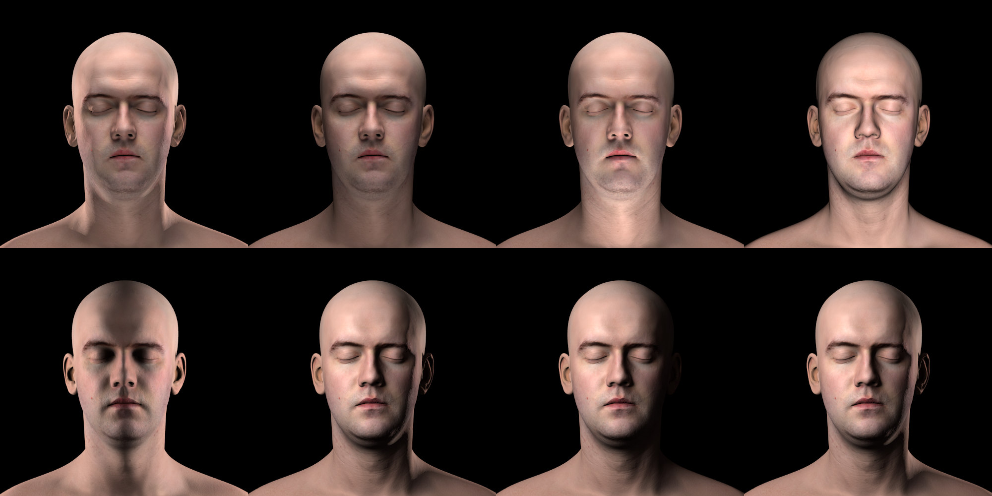
What I did was to bring the high resolution scan and displacement maps into Blender and manually created my lights with modifiers in a virtual space.
Then I could simply render what a particular light/modifier would look like with a realistic person being lit in any way I wanted.
This leads to all sorts of neat freedom to experiment with things to see how they might come out.
Here’s another look at the lede image:
Various lighting setups test in Blender.
I had originally intended to make a nice bundled application that would allow someone to try all sorts of different lighting setups, but my skill in Blender only go so far.
My skills at convincing others to help me didn’t go very far either. :)
So, if you’re ok with navigating around Blender already, feel free to check out my original blog post
to download the .blend file and give it try!
Jimmy Gunawan even took it further and modified the .blend to work with Blender cycles rendering as well.
With the power to create a lighting visualization of any scenario I then had to see if there was something cool I could make for others to use…
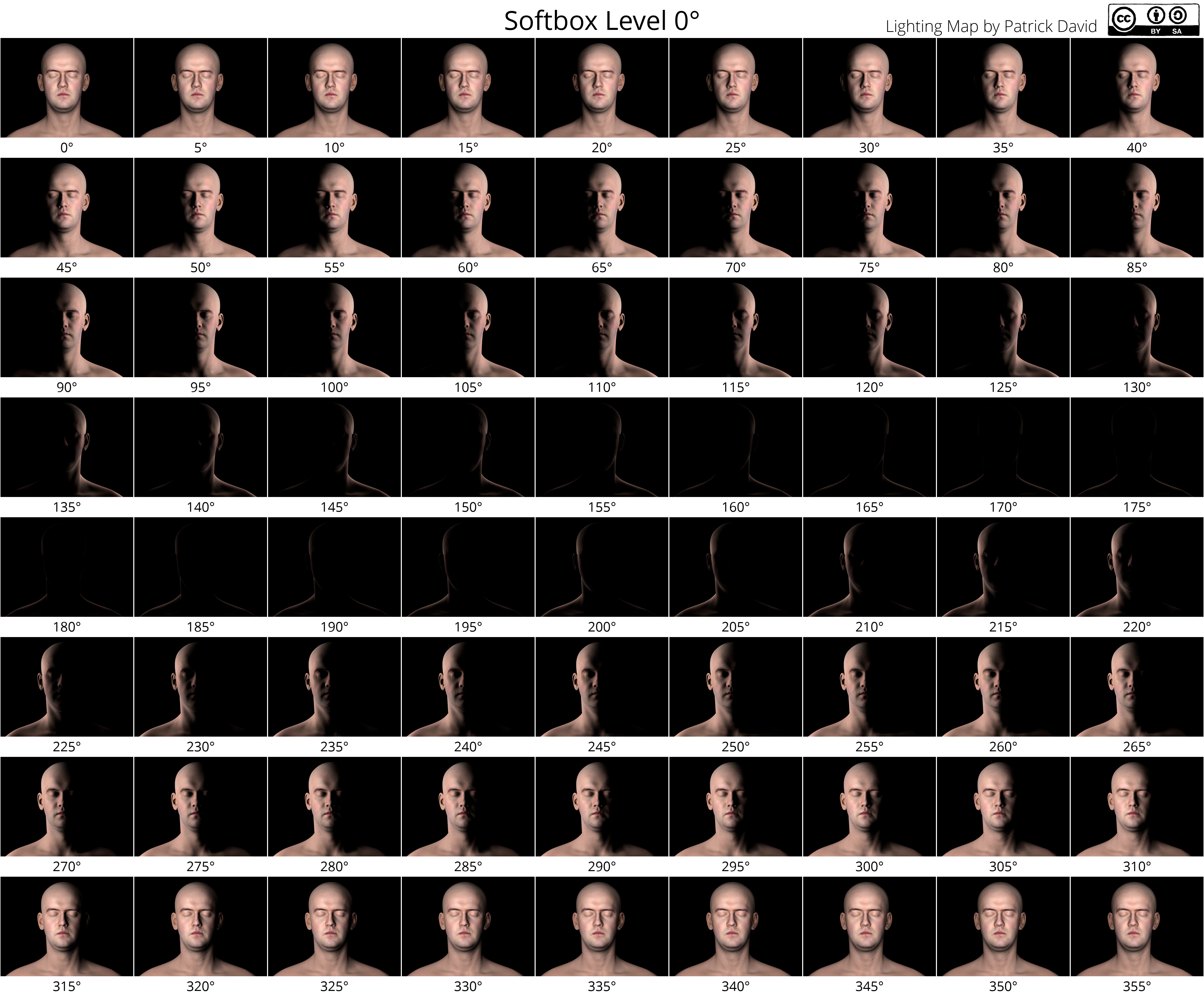
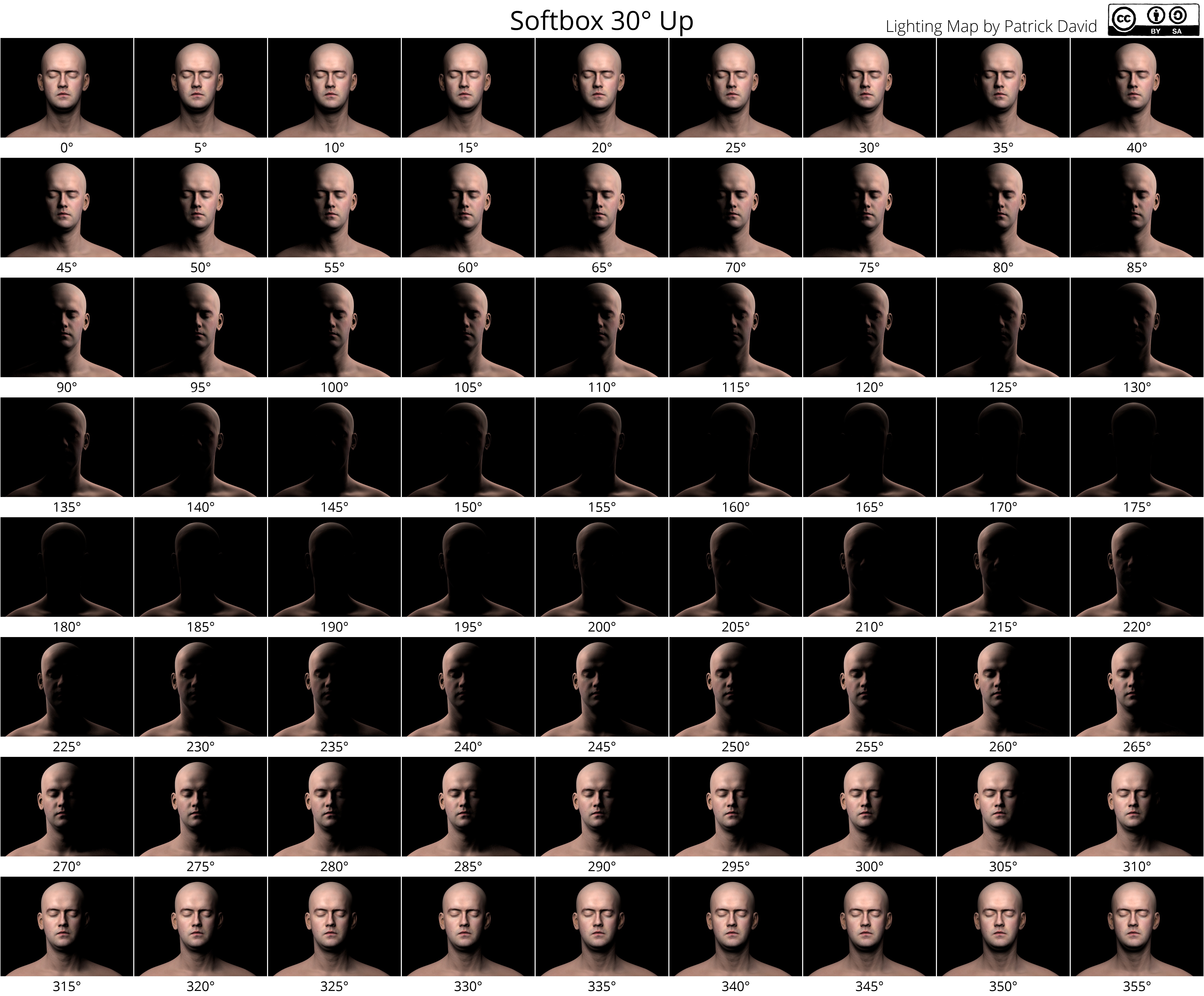
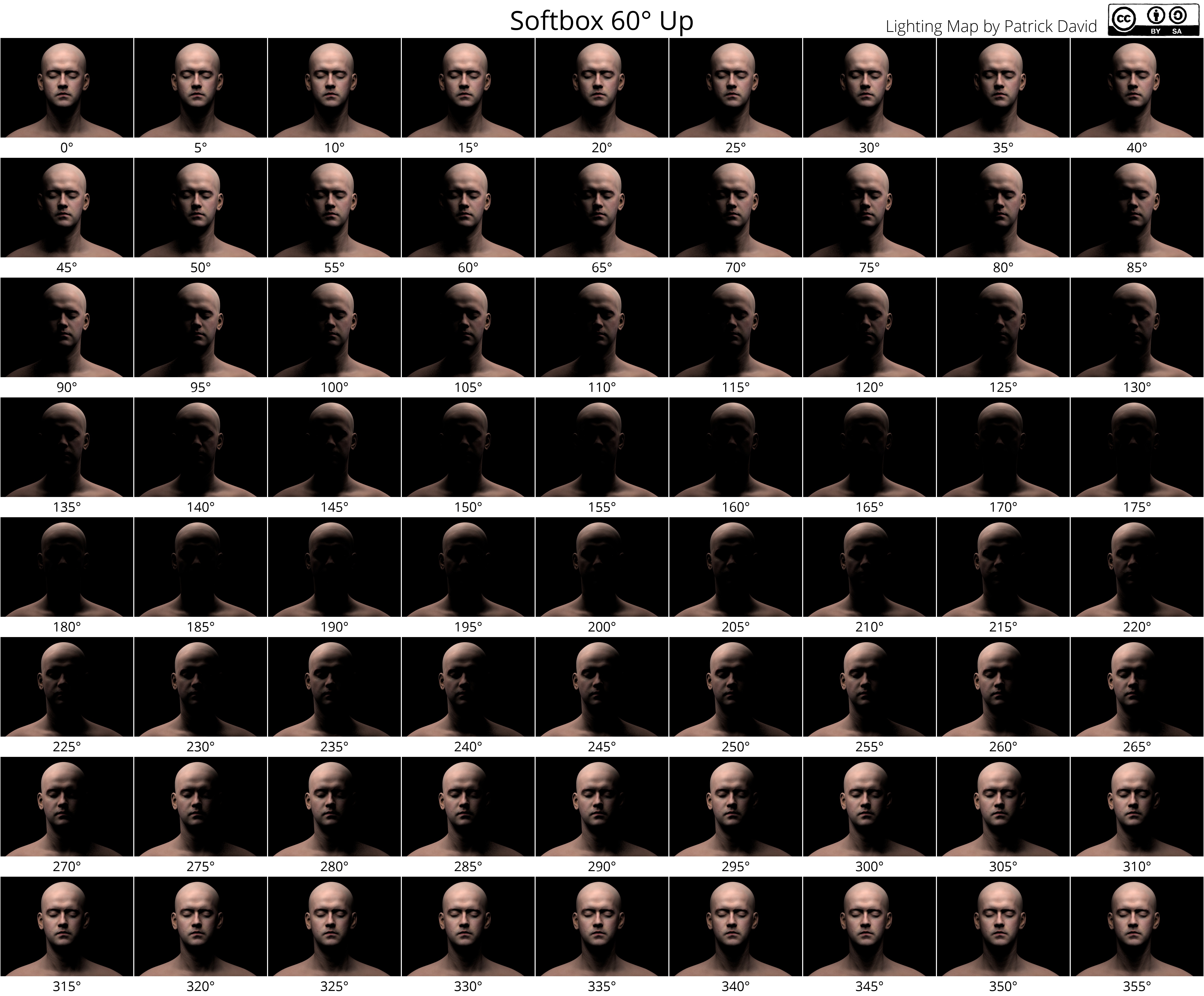
I couldn’t help but generate some lighting cheat sheets to help others use as a reference.
I’ve seen some different ones around but I took advantage of having the most patient model in the world to do this with. :)
These were generated by rotating a 20” (virtual) softbox in a circle around the subject at 3 different elevations (0, 30°, and 60°).
Click the caption title for a link to the full resolution files:
Hopefully these might prove useful as a reference for some folks.
Share them, print them out, tape them to your lighting setups! :)
I wonder if we could get some cool folks from the community to make something neat with them?
We discuss a poem by J.H. Prynne called To Pollen, from 2006, which conducts its own examination of the uses and misuses of images and stories of suffering.Read by Robert Potts.Find out more: www.the-tls.co.uk
A small update on how things are progressing (hint: well!) and some neat things the community is playing with.
I have been quiet these past few weeks because I decided I didn’t have enough to do and thought a rebuild/redesign of the GIMP website would be fun, apparently.
Well, it _is_ fun and something that couldn’t hurt to do.
So I stepped up to help out.
There was a thread recently on a certain large social network in a group dedicated to off-camera flash.
The thread was started by someone with the comment:
The most important thing you can do with your speed light is to put some rib [sic] stop sail cloth over the speed light to soften the light.
Which just about gave me an aneurysm (those that know me and lighting can probably understand why).
Despite some sound explanations about why this won’t work to “soften” the light, there was a bit of back and forth about it.
To make matters worse, even after over 100 comments, nobody bothered to just go out and shoot some sample images to see it for themselves.
So I finally went out and shot some to illustrate and I figured they would be more fun if they were shared
(I did actually post these on our forum).
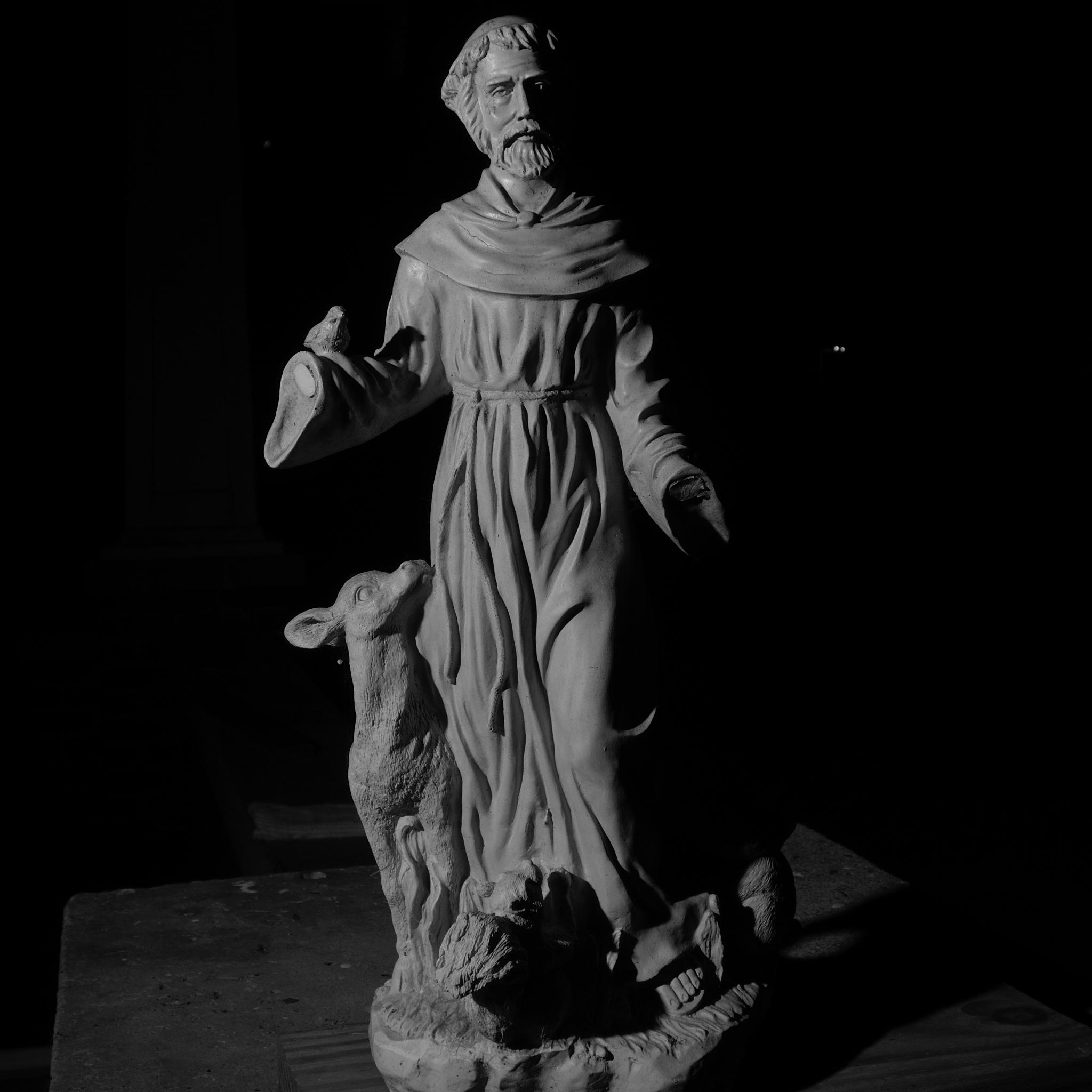
I quickly set a lightstand up with a YN560 on it pointed at my garden statue.
I then took a shot with bare flash, one with diffusion material pulled over the flash head, and one with a 20” diy softbox attached.
Here’s what the setup looked like with the softbox in place:
Simple light test setup (with a DIY softbox in place).
Remember, this was done to demonstrate that simply placing some diffusion fabric over the head of a speedlight does nothing to “soften” the resulting light:
Bare flash result. Click to compare with diffusion material.
This shows clearly that diffusion material over the flash head does nothing to affect the “softness” of the resulting light.
For a comparison, here is the same shot with the softbox being used:
Same image with the softbox in place. Click to compare with diffusion material.
I also created some crops to help illustrate the difference up close:
Click to compare:
Bare FlashWith DiffusionWith Softbox
Click to compare:
Bare FlashWith DiffusionWith Softbox
Hopefully this demonstration can help put to rest any notion of softening a light through close-set diffusion material (at not-close flash-to-subject distances). At the end of the day, the “softness” quality of a light is a function of the apparent size of the light source relative to the subject. (The sun is the biggest light source I know of, but it’s so far it’s quality is quite harsh.)
On discuss, member Micaasked an awesome question about what our workflows are for adding resolution (upsizing) to an image.
There were a bunch of great suggestions from the community.
One I wanted to talk about briefly I thought was interesting from a technical perspective.
Both Hasselblad and Olympus announced not too long ago the ability to drastically increase the resolution of images in their cameras that used a “sensor-shift” technology to shift the sensor by a pixel or so while shooting multiple frames, then combing the results into a much larger megapixel image (200MP in the case of Hasselblad, and 40MP in the Olympus).
It turns out we can do the same thing manually by burst shooting a series of images while handholding the camera (the subtle movement of our hand while shooting provides the requisite “shift” to the sensor).
Then we simply combine the images, upscale, and average the results to get a higher resolution result.
The basic workflow uses Huginalign_image_stack, Imagemagickmogrify, and G’MICmean blend script to achieve the results.
Shoot a bunch of handheld images in burst mode (if available).
Develop raw files if that’s what you shot.
Scale images up to 4x resolution (200% in width and height). Straight nearest-neighbor type of upscale is fine.
In your directory of images, create a new sub-directory called resized.
In your directory of images, run mogrify -scale 200% -format tif -path ./resized *.jpg if you use jpg’s, otherwise change as needed.
This will create a directory full of upscaled images.
Align the images using Hugin’s align_image_stack script.
In the resized directory, run /path/to/align_image_stack -a OUT file1.tif file2.tif ... fileX.tif
The -a OUT option will prefix all your new images with OUT.
I move all of the OUT* files to a new sub-directory called aligned.
In the aligned directory, you now only need to mean average all of the images together.
Using Imagemagick: convert OUTfile*.tif -evaluate-sequence mean output.bmp
Using G’MIC: gmic video-avg.gmic -avg \" *.tif \" -o output.bmp
I used 7 burst capture images from an iPhone 6+ (default resolution 3264x2448).
This is the test image:
Sample image, red boxes show 100% crop areas.
Here is a 100% crop of the first area:
100% crop of the base image, straight upscale.
100% crop, super resolution process result.
The second area crop:
100% crop, super resolution process result.
100% crop, super resolution process result.
Obviously this doesn’t replace the ability to have that many raw pixels available in a single exposure, but if the subject is relatively static this method can do quite well to help increase the resolution.
As with any mean/median blending technique, a nice side-effect of the process is great noise reduction as well…
Not sure if this warrants a full article post, but may consider it for later.
Replicating Calvin Hollywood's Freaky Details in GIMP
German photographer/digital artist/photoshop trainer Calvin Hollywood has a rather unique style to his photography. It’s a sort of edgy, gritty, hyper-realistic result, almost a blend between illustration and photography.
As part of one of his courses, he talks about a technique for accentuating details in an image that he calls “Freaky Details”.
Here is Calvin describing this technique using Photoshop:
In my meandering around different retouching tutorials I came across it a while ago, and wanted to replicate the results in GIMP if possible. There were a couple of problems that I ran into for replicating the exact same workflow:
Lack of a “Vivid Light” layer blend mode in GIMP
Lack of a “Surface Blur” in GIMP
Those problems have been rectified (and I have more patience these days to figure out what exactly was going on), so let’s see what it takes to replicate this effect in GIMP!
Replicating Freaky Details
Requirements
The only extra thing you’ll need to be able to replicate this effect is G’MIC for GIMP.
You don’t technically need G’MIC to make this work, but the process of manually creating a Vivid Light layer is tedious and error-prone in GIMP right now.
Also, you won’t have access to G’MIC’s Bilateral Blur for smoothing.
And, seriously, it’s G’MIC - you should have it anyway for all the other cool stuff it does!
Summary of Steps
Here’s the summary of steps we are about to walk through to create this effect in GIMP:
Duplicate the background layer.
Invert the colors of the top layer.
Apply “Surface Blur” to top layer.
Set top layer blend mode to “Vivid Light”.
New layer from visible.
Set layer blend mode of new layer to “Overlay”, hide intermediate layer.
There are just a couple of small things to point out though, so keep reading to be aware of them!
Detailed Steps
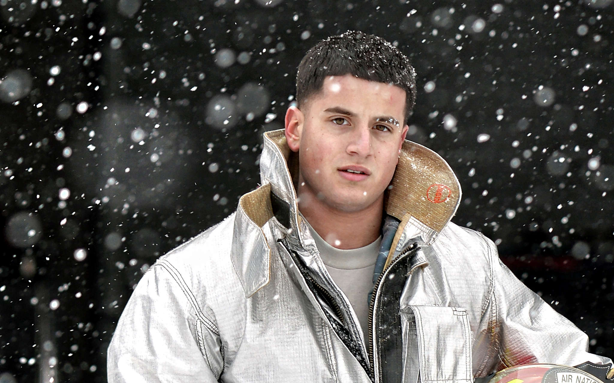
I’m going to walk through each step to make sure it’s clear, but first we need an image to work with!
New York National Guard by U.S. National Guard/Staff Sergeant Christopher Muncy
on Flickr (cb).
Airman First Class Anthony Pisano, a firefighter with the New York National Guard’s 106th Civil Engineering Squadron, 106th Rescue Wing conducts a daily equipment test during a major snowstorm on February 17, 2015.
(New York Air National Guard / Staff Sergeant Christopher S Muncy / released)
This is a great image to test the effect, and to hopefully bring out the details and gritty-ness of the portrait.
1./2. Duplicate background layer, and invert colors
So, duplicate your base image layer (Background in my example).
Layer → Duplicate (Shift-Ctrl-D,Shift-⌘-D)
I will usually name the duplicate layer something descriptive, like “Temp” ;).
Next we’ll just invert the colors on this “Temp” layer.
Colors → Invert
So right now, we should be looking at this on our canvas:
The inverted duplicate of the base layer.
What the Layers dialog should look like.
Now that we’ve got our inverted “Temp” layer, we just need to apply a little blur.
3. Apply “Surface Blur” to Temp Layer
There’s a couple of different ways you could approach this. Calvin Hollywood’s tutorial explicitly calls for a Photoshop Surface Blur. I think part of the reason to use a Surface Blur vs. Gaussian Blur is to cut down on any halos that will occur along edges of high contrast.
There are three main methods of blurring this layer that you could use:
Straight Gaussian Blur (easiest/fastest, but may halo - worst results)
Filters → Blur → Gaussian Blur
Selective Gaussian Blur (closer to true “Surface Blur”)
Filters → Blur → Selective Gaussian Blur
G’MIC’s Smooth [bilateral] (closest to true “Surface Blur”)
Filters → G’MIC → Repair → Smooth [bilateral]
I’ll leave it as an exercise for the reader to try some different methods and choose one they like. (At this point I personally pretty much just always use G’MIC’s Smooth [bilateral] - this produces the best results by far).
For the Gaussian Blurs, I’ve had good luck with radius values around 20% - 30% of an image dimension. As the blur radius increases, you’ll be acting more on larger local contrasts (as opposed to smaller details) and run the risk of halos. So just keep an eye on that.
So, let’s try applying some G’MIC Bilateral Smoothing to the “Temp” layer and see how it looks!
Run the command:
Filters → G’MIC → Repair → Smooth [bilateral]
The values I used in this example for Spatial/Value Variance.
The values you want to fiddle with are the Spatial Variance and Value Variance (25 and 20 respectively in my example). You can see the values I tried for this walkthrough, but I encourage you to experiment a bit on your own as well!
Now we should see our canvas look like this:
Our “Temp” layer after applying G’MIC Smoothing [bilateral]
Layers should still look like this.
Now we just need to blend the “Temp” layer with the base background layer using a “Vivid Light” blending mode…
4./5. Set Temp Layer Blend Mode to Vivid Light & New Layer
Now we need to blend the “Temp” layer with the Background layer using a “Vivid Light” blending mode. Lucky for me, I’m friendly with the G’MIC devs, so I asked nicely, and David Tschumperlé added this blend mode for me.
G’MIC Vivid Light blending mode, pay attention to Input/Output!
Pay careful attention to the Input/Output portion of the dialog. You’ll want to set the Input Layers to All visibles so it picks up the Temp and Background layers. You’ll also probably want to set the Output to New layer(s).
When it’s done, you’re going to be staring at a very strange looking layer, for sure:
Well, sure it looks weird out of context…
The layers should now look like this.
Now all that’s left is to hide the “Temp” layer, and set the new Vivid Light result layer to Overlay layer blending mode…
6. Set Vivid Light Result to Overlay, Hide Temp Layer
We’re just about done. Go ahead and hide the “Temp” layer from view (we won’t need it anymore - you could delete it as well if you wanted to).
Finally, set the G’MIC Vivid Light layer output to Overlay layer blend mode:
Set the resulting G’MIC output layer to Overlay blend mode.
The results we should be seeing will have enhanced details and contrasts, and should look like this (mouseover to compare the original image):
Our final results (whew!)
(click to compare to original)
This technique will emphasize any noise in an image so there may be some masking and selective application required for a good final effect.
Summary
This is not an effect for everyone. I can’t stress that enough. It’s also not an effect for every image. But if you find an image it works well on, I think it can really do some interesting things. It can definitely bring out a very dramatic, gritty effect (it works well with nice hard rim lighting and textures).
The original image used for this article is another great example of one that works well with this technique:
I had muted the colors in this image before applying some Portra-esque color curves to the final result..
Finally, a BIG THANK YOU to David Tschumperlé for taking the time to add a Vivid Light blend mode in G’MIC.
Try the method out and let me know what you think or how it works out for you! And as always, if you found this useful in any way, please share it, pin it, like it, or whatever you kids do these days…
For those looking for a faster/easier way to achieve this effect, it has now been integrated as a filter into G’MIC. (Again, thanks to David Tschumperlé!)
We recently posted about the Open Source Photography Course from photographer Riley Brandt.
We now also have a review of the course as well.
This review is actually by one of the darktable developers, houz!
He had originally posted it on discuss as a topic but I think it deserves a blog post instead.
(When a developer from a favorite project speaks up, it’s usually worth listening…)
First of all, as a darktable developer I am biased so take everything I write with a grain of salt. Second, I didn’t pay for my copy of the videos but Riley was kind enough to provide a free copy for me to review. So add another pinch of salt. I will therefore not tell you if I would encourage you to buy the course. You can have my impressions nevertheless.
I won’t say anything about the GIMP part, not because it wouldn’t know how to use that software but it’s relatively short and I just didn’t notice anything to comment on. It’s solid basics of how to use GIMP and the emphasis on layer masks is really important in real world usage.
Now for the darktable part, I have to say that I liked it a lot. It showcases a viable workflow and is relatively complete – not by explaining every module and becoming the audio book of the user manual but by showing at least one tool for every task. And as we all know, in darktable there are many ways to skin a cat, so concentrating on your favourites is a good thing.
What I also appreciate is that Riley managed to cut the single topics to manageable chunks of around 10 minutes or less so you can easily watch them in your lunch break and have no problem to come back to one topic later and easily find what you are looking for.
Before this starts to sound like an advertisement I will just point out some small nitpicking things I noticed while watching the videos. Most of these were not errors in the videos but are just extra bits of information that might make your workflow even smoother, so it’s more of an addendum than an erratum.
When going through your images on lighttable you can either zoom in till you only see a single image (alt-1 is a shortcut for that) or hold the z key pressed. Both are shown in the videos. The latter can quickly become tedious since releasing z just once bring you back to where you were. There are however two more keyboard shortcuts that are not assigned by default under views>lighttable: ‘sticky preview’ and ‘sticky preview with focus detection’. Both work just like normal z and ctrl-z, just without the need to keep the key pressed. You can assign a key to these, for example by reusing z and ctrl-z.
Color labels can be set with F1 .. F5, similar to rating.
Basecurve and tonecurve allow very fine up/down movement of points with the mouse wheel. Hover over a node and scroll.
Gaussian in shadows&highlights tends to give stronger halos than bilateral in normal use, see the darktable blog for an example.
For profiled denoising better use ‘HSV color’ instead of ‘color’ and ‘HSV lightness’ instead of ‘lightness’, see the user manual for details.
When using the mouse wheel to zoom the image you can hold ctrl to get it smaller than fitting to the screen. That’s handy to draw masks over the image border.
When moving the triangles in color zones apart you actually widen the scope of affected values since the curve gets moved off the center line on a wider range.
Also color zones: You can also change reds and greens in the same instance, no need for multiple instances. Riley knows that and used two instances to be able to control the two changes separately.
When loading sidecar files from lighttable, you can even treat a JPEG that was exported from darktable like an XMP file and manually select that since the JPEGs get the processing data embedded. It’s like a backup of the XMP with a preview. Caveat: When using LOTS of mask nodes (mostly with the brush mask) the XMP data might get too big so it’s no longer possible to embed in the JPEG, but in general it works.
The collect module allows to store presets so you can quickly access often used search rules. And since presets only store the module settings and not
the resulting image set these will be updated when new images are imported.
In neutral density you can draw a line with the right mouse button, similar to rotating images.
Styles can also be created from darkroom, there is a small button next to the history compression button.
So, that’s it from me. Did you watch the videos, too? What was your impression? Do you have any remarks?
“August for the people and their favourite islands”, said W.H. Auden in 1935, with the Isle of Wight in mind. Now people’s favourite islands are more likely to be Majorca or Mykonos, but the lure of the seaside remains. Alan Jenkins reads a selection of holiday poems from the past eighty years.Find out more: www.the-tls.co.uk
In my previous post on Color Curves for Toning/Grading, I looked at the basics of what the Curves dialog lets you do in GIMP.
I had been meaning to revisit the subject with a little more restraint (the color curve in that post was a little rough and gross, but it was for illustration so I hope it served its purpose).
This time I want to look at the use of curves a little more carefully.
You’d be amazed at the subtlety that gentle curves can produce in toning your images.
Even small changes in your curves can have quite the impact on your final result.
For instance, have a look at the four film emulation curves created by Petteri Sulonen (if you haven’t read his page yet on creating these curves, it’s well worth your time):
Original
Portraesque (Kodak Portra NC400 Film)
Proviaesque (Fujichrome Provia)
Velviaesque (Fujichrome Velvia)
Crossprocess (E6 slide film in C-41 neg. processing)
I can’t thank Petteri enough for releasing these curves for everyone to use (for us GIMP users, there is a .zip file at the bottom of his post that contains these curves packaged up).
Personally I am a huge fan of the Portraesque curve that he has created.
If there is a person in my images, it’s usually my go-to curve as a starting point.
It really does generate some wonderful skin tones overall.
The problem in generating these curves is that one has to be very, very familiar with the characteristics of the film stocks you are trying to emulate.
I never shot Velvia personally, so it is hard for me to have a reference point to start from when attempting to emulate this type of film.
What we can do, however, is to use our personal vision or sense of aesthetic to begin toning our images to something that we like. GIMP has some great tools for helping us to become more aware of color and the effects of each channel on our final image. That is what we are going to explore…
Disclaimer
I cannot stress enough that what we are approaching here is an entirely subjective interpretation of what is pleasing to our own eyes. Color is a very complex subject and deserves study to really understand. Hopefully some of the things I talk about here will help pique your interest to push further and experiment!
There is no right or wrong, but rather what you find pleasing to your own eye.
Approximating Tones
What we will be doing is using Sample Points and the Curves dialog to modify the color curves in my image above to emulate something else. It could be another photograph, or even a painting.
I’ll be focusing on the skin tones, but the method can certainly be used for other things as well.
My wonderful model.
With an image you have, begin considering what you might like to approximate the tones on. For instance, in my image above I want to work on the skin tones to see where it leads me.
Now find an image that you like, and would like to approximate the tones from. It helps if the image you are targeting already has tones somewhat similar to what you are starting with (for instance, I would look for another Caucasian image with similar tones to start from, as opposed to Asian). Keeping tones at least similar will reduce the violence you’ll do to your final image.
So for my first example, perhaps I would like to use the knowledge that the Old Masters already had in regards to color, and would like to emulate the skin tones from Vermeer’s Girl with the Pearl Earring.
In GIMP I will have my original image already opened, and will then open my target image as a new layer. I’ll pull this layer to one side of my image to give me a view of the areas I am interested in (faces and skin).
I will be using Sample Points extensively as I proceed. Read up on them if you haven’t used them before. They are basically a means of giving you real-time feedback of the values of a pixel in your image (you can track up to four points at one time).
I will put a first sample point somewhere on the higher skin tones of my base image. In this case, I will put one on my models forehead (we’ll be moving it around shortly, so somewhere in the neighborhood is fine).
Ctrl + Left Click in the ruler area of your main window (shown in green above), and drag out into your image. There should be crosshairs across your entire image screen showing you where you are dragging.
When you release the mouse button, you’ve dropped a Sample Point onto your image. You can see it in my image above as a small crosshair with the number 1 next to it.
GIMP should open the sample points dialog for you when you create the first point, but if not you can access it from the image menu under:
Windows → Dockable Dialogs → Sample Points
This is what the dialog looks like.
You can see the RGB pixel data for the first sample point that I have already placed.
As you place more sample points, they will each be reflecting their data on this dialog.
You can go ahead and place more sample points on your image now. I’ll place another sample point, but this time I will put it on my target image where the tones seem similar in brightness.
What I’ll then do is change the data being shown in the Sample Points dialog to show HSV data instead of Pixel data.
Now, I will shoot for around 85% value on my source image, and try to find a similar value level in similar tones from my target image as well. Once you’ve placed a sample point, you can continue to move it around and see what types of values it gives you. (If you use another tool in the meantime, and can no longer move just the sample point - you can just select the Color Picker Tool to be able to move them again).
Move the points around your skin tones until you get about the same Value for both points.
Once you have them, make sure your original image layer is active, then start up the curves dialog.
Colors → Curves…
Now here is something really handy to know while using the Curves dialog: if you hover your mouse over your image, you’ll notice that the cursor is a dropper - you can click and drag on an area of your image, and the corresponding value will show up in your curves dialog for that pixel (or averaged area of pixels if you turn that on).
So click and drag to about the same pixel you chose in your original image for the sample point.
Curves dialog with a value point (217) for my sampled pixel.
Here is what my working area currently looks like:
I have my curves dialog open, and an area around my sample point chosen so that the values will be visible in the dialog, my images with their associated sample points, and the sample points dialog showing me the values of those points.
The basic idea now is to adjust my RGB channels to get my original image sample point (#1) to match my target image sample point (#2).
Because I selected an area around my sample point with the curves dialog open, I will know roughly where those values need to be adjusted. Let’s start with the Red channel.
First, set the Sample Points dialog back to Pixel to see the RGBA data for that pixel.
We can now see that to match the pixel colors we will need to make some adjustments to each channel. Specifically,
the Red channel will have to come down a bit (218 → 216),
the Green down some as well (188 → 178),
and Blue much more (171 → 155).
You may want to resize your Curves dialog window larger to be able to more finely control the curves. If we look at the Red channel in my example, we would want to adjust the curve down slightly at the vertical line that shows us where our pixel values are:
We can adjust the red channel curve along this vertical axis (marked x:217) until our pixel red value matches the target (216).
Then just change over to the green channel and do the same:
Here we are adjusting the green curve vertically along the axis marked x:190 until our pixel green value matches the target (178).
Finally, follow the same procedure for the blue channel:
As before, we adjust along the vertical axis x:173 until our blue channel matches the target (155).
At this point, our first sample point pixel should be the same color as from our target.
The important thing to take away from this exercise is to be watching your image as you are adjusting these channels to see what types of effects they produce. Dropping the green channel should have seen a slight addition of magenta to your image, and dropping the blue channel should have shown you the addition of a yellow to balance it.
Watch your image as you make these changes.
Don’t hit OK on your curves dialog yet!
You’ll want to repeat this procedure, but using some sample points that are darker than the previous ones. Our first sample points had values of about 85%, so now let’s see if we can match pixels down below 50% as well.
Without closing your curves dialog, you should be able to click and drag your sample points around still. So I would set your Sample Points dialog to show you HSV values again, and now drag your first point around on your image until you find some skin that’s in a darker value, maybe around 40-45%.
Once you do, try to find a corresponding value in your target image (or something close at least).
I managed to find skin tones with values around 45% in both of my images:
In these darker tones, I can see that the adjustments I will have to make are for:
Red down a bit (116 → 114),
Green bumped up some (60 → 73),
Blue slightly down (55 → 53).
With the curves dialog still active, I then click and drag on my original image until I am in the same area as my sample point again. This give me my vertical line showing me the value location in my curves dialog, just as before:
Red down to 114.
Green up to 73.
Blue down to 53.
At this point you should have something similar to the tones of your target image. Here is my image after these adjustments so far:
Effects of the curves so far (click to compare to original).
Once you’ve got things in a state that you like, it would be a good idea to save your progress.
At the top of the Curves dialog there is a “+” symbol.
This will let you add the current settings to your favorites.
This will allow you to recall these settings later to continue working on them.
However, you’re results might not quite look right at the moment. So why not?
Well, the first problem is that Sample Points will only allow you to sample a single pixel value. There’s a chance that the pixels you pick are not truly representative of the correct skin tones in that range (for instance you may have inadvertently clicked a pixel that represents the oil paint cracks in the image). It would be nice if there were an option for Sample Points to allow an adjustable sample radius (if there is an option I haven’t found it yet).
The second issue is that similar value points might be very different colors overall. Hopefully your sources will be nice for you to pick in areas that you know are relatively consistent and representative of the tones you want, but it’s not always a guarantee.
If the results are not quite what you want at the moment, you can do what I will sometimes do and go back to the beginning…
While still keeping the curves dialog open you can pull your sample points to another location, and match the target again. Try choosing another sample point with a similar value as the first one. This time instead of adding new points the curve as you make adjustments, just drag the existing points you previously placed.
It’s an Iterative Process
Depending on how interested you are in tweaking your resulting curve, you may find yourself going around a couple of times. That’s ok.
I would recommend keeping your curves to having two control points at first. You want your curves to be smooth across the range (any abrupt changes will do strange things to your final image).
If you are doing a couple of iterations, try modifying existing points on your curves instead of adding new ones. It may not be an exact match, but it doesn’t have to be. It only needs to look nice to your eyes.
There won’t be a perfect solution for a perfect color matching between images, but we can produce pleasing curves that emulate the results we are looking for.
In Conclusion
I personally have found the process of doing this with different images to be quite instructive in how the curves will affect my image.
If you try this out and pay careful attention to what is happening while you do it, I’m hopeful you will come away with a similar appreciation of what these curves will do.
Most importantly, don’t be constrained by what you are targeting, but rather use it as a stepping off point for inspiration and experimentation for your own expression!
And finally, as promised, here’s the video tutorial that steps through everything I’ve explained above:
From a request, I’ve packaged up some of the curves from this tutorial (Pearl Earring, St. Michael, the previous Orange/Teal Hell, and another I was playing with from a Norman Rockwell painting):
Download the Curves (7zip .7z)
Hot on the heels of our last post about welcoming G’MIC to the forums at discuss.pixls.us, I thought I should speak briefly about some other additions I’ve recently made.
These were tough for me to finally make a decision about.
I want to be careful and not get crazy with over-categorization.
At the same time, I do want to make good logical breakdowns for people that is still intuitive.
Here is what the current category breakdown looks like for discuss:
PIXLS.US The comment/posts from articles/blogposts here on the main site.
Processing Processing and managing images after they’ve been captured.
Capturing Capturing an image and the ways we go about doing it.
Along with the addition of the Software category (and the G’MIC subcategory), I decided that the Help! category would make more sense under the Meta category.
That is, the Help! section is for website/forum help, which is more of a Meta topic (hence moving it).
As we’ve already seen, there is now a Software category for all discussions about the various software we use.
The first sub-category to this is of course, the G’MIC subcategory.
If there is enough interest in it, I am open to creating more sub-categories as needed to support particular software projects (GIMP, darktable, RawTherapee, etc…).
I will wait until there is some interest before adding more categories here.
This category had some interest from members and I agree that it’s a good idea.
It’s intended as a place for members to showcase the works they’re proud of and to hopefully serve as a nice example of what we’re capable of producing using F/OSS tools.
A couple of examples from the Showcase category so far:
This is intended as a place for members to solicit advice and critiques on their works from others.
It took me a little work to come up with an initial take on the overall description for the category.
I can promise that I will do my best to give honest and constructive feedback to anyone that asks in this category.
I also promise to do my best to make sure that no post goes un-answered here (I know how beneficial feedback has been to me in the past, so it’s the least I could do to help others out in return).
I also bit the bullet this week and finally caved to sign up for a Facebook account.
The only reason was because I had to have a personal account to get an API key to allow people to log in using their FB account (with OAuth).
We can now use Google, Facebook, Twitter, and Yahoo! to Log In.
On the other hand, we now accept four different methods of logging in automatically along with signing up for a normal account.
I have been trying to make it as frictionless as possible to join the conversation and hopefully this most recent addition (FB) will help in some small way.
Color has this amazing ability to evoke emotional responses from us.
From the warm glow of a sunny summer afternoon to a cool refreshing early evening in fall.
We associate colors with certain moods, places, feelings, and memories (consciously or not).
Volumes have been written on color and I am in no ways even remotely qualified to speak on it.
So I won’t.
Instead, we are going to take a look at the use of the Curves tool in GIMP.
Even though GIMP is used to demonstrate these ideas, the principles are generic to just about any RGB curve adjustments.
Your Pixels and You
First there’s something you need to consider if you haven’t before, and that’s what goes into representing a colored pixel on your screen.
Open up an image in GIMP.
Now zoom in.
Nope - don’t be shy now, zoom in more!
Aaand there’s your pixel.
So let’s investigate what goes into making your pixel.
Remember, each pixel is represented by a combination of 3 colors: Red, Green, and Blue.
In GIMP (currently at 8-bit), that means that each RGB color can have a value from 0 - 255, and combining these three colors with varying levels in each channel will result in all the colors you can see in your image.
If all three channels have a value of 255 - then the resulting color will be pure white.
If all three channels have a value of 0 - then the resulting color will be pure black.
If all three channels have the same value, then you will get a shade of gray (128,128,128 would be a middle gray color for instance).
So now let’s see what goes into making up your pixel:
The RGB components that mix into your final blue pixel.
As you can see, there is more blue than anything else (it is a blue-ish pixel after all), followed by green, then a dash of red.
If we were to change the values of each channel, but kept ratio the same between Red, Green, and Blue, then we would keep the same color and just lighten or darken the pixel by some amount.
Curves: Value
So let’s leave your pixel alone for the time being, and actually have a look at the Curves dialog.
I’ll be using this wonderful image by Eric from Flickr.
Opening up my Curves dialog shows me the following:
We can see that I start off with the curve for the Value of the pixels.
I could also use the drop down for “Channel” to change to red, green or blue curves if I wanted to.
For now let’s look at Value, though.
In the main area of the dialog I am presented with a linear curve, behind which I will see a histogram of the value data for the entire image (showing the amount of each value across my image).
Notice a spike in the high values on the right, and a small gap at the brightest values.
What we can do right now is to adjust the values of each pixel in the image using this curve.
The best way to visualize it is to remember that the bottom range from black to white represents the current value of the pixels, and the left range is the value to be mapped to.
So to show an example of how this curve will affect your image, suppose I wanted to remap all the values in the image that were in the midtones, and to make them all lighter.
I can do this by clicking on the curve near the midtones, and dragging the curve higher in the Y direction:
What this curve does is takes the values around the midtones, and pushes their values to be much lighter than they were.
In this case, values around 128 were re-mapped to now be closer to 192.
Because the curve is set Smooth, there will be a gradual transition for all the tones surrounding my point to be pulled in the same direction (this makes for a smoother fall-off as opposed to an abrupt change at one value).
Because there is only a single point in the curve right now, this means that all values will be pulled higher.
The results of pushing the midtones of the value curve higher (click to compare to original).
Care should be taken when fiddling with these curves to not blow things out or destroy detail, of course.
I only push the curves here to illustrate what they do.
A very common curve adjustment you may hear about is to apply a slight “S” curve to your values.
The effect of this curve would be to darken the dark tones, and to lighten the light tones - in effect increasing global contrast on your image.
For instance, if I click on another point in the curves, and adjust the points to form a shape like so:
A slight “S” curve
This will now cause dark values to become even darker, while the light values get a small boost.
The curve still passes through the midpoint, so middle tones will stay closer to what they were.
Slight “S” curve increases global contrast (click for original).
In general, I find it easiest to visualize in terms of which regions in the curve will effect different tones in your image.
Here is a quick way to visualize it (that is true for value as well as RGB curves):
If there is one thing you take away from reading this, let it be the image above.
Curves: Colors
So how does this apply to other channels? Let’s have a look.
The exact same theory applies in the RGB channels as it did with values.
The relative positions of the darks, midtones, and lights are still the same in the curve dialog.
The primary difference now is that you can control the contribution of color in specific tonal regions of your image.
Value, Red, Green, Blue channel picker.
You choose which channel you want to adjust from the “Channel” drop-down.
To begin demonstrating what happens here it helps to have an idea of generally what effect you would like to apply to your image.
This is often the hardest part of adjusting the color tones if you don’t have a clear idea to start with.
For example, perhaps we wanted to “cool” down the shadows of our image.
“Cool” shadows are commonly seen during the day in shadows out of direct sunlight.
The light that does fall in shadows is mostly reflected light from a blue-ish sky, so the shadows will trend slightly more blue.
To try this, let’s adjust the Blue channel to be a little more prominent in the darker tones of our image, but to get back to normal around the midtones and lighter.
Boosting blues in darker tones
Pushing up blues in darker tones (click for original).
Now, here’s a question: If I wanted to “cool” the darker tones with more blue, what if I wanted to “warm” the lighter tones by adding a little yellow?
Well, there’s no “Yellow” curve to modify, so how to approach that? Have a look at this HSV color wheel below:
The thing to look out for here is that opposite your blue tones on this wheel, you’ll find yellow.
In fact, for each of the Red, Green, and Blue channels, the opposite colors on the color wheel will show you what an absence of that color will do to your image.
So remember:
Red → CyanGreen → MagentaBlue → Yellow
What this means to you while manipulating curves is that if you drag a curve for blue up, you will boost the blue in that region of your image.
If instead you drag the curve for blue down, you will be removing blues (or boosting the Yellows in that region of your image).
So to boost the blues in the dark tones, but increase the yellow in the lighter tones, you could create a sort of “reverse” S-curve in the blue channel:
Boost blues in darks, boost yellow in high tones (click for original).
In the green channel for instance, you can begin to introduce more magenta into the tones by decreasing the curve.
So dropping the green curve in the dark tones, and letting it settle back to normal towards the high tones will produce results like this:
Suppressing the green channel in darks/mids adds a bit of magenta (click for original).
In isolation, these curves are fun to play with, but I think that perhaps walking through some actual examples of color toning/grading would help to illustrate what I’m talking about here.
I’ll choose a couple of common toning examples to show what happens when you begin mixing all three channels up.
Color Toning/Grading
Orange and Teal Hell
I use the (cinema film) term color grading here because the first adjustment we will have a look at to illustrate curves is a horrible hollywood trend that is best described by Todd Miro on his blog.
Grading is a term for color toning on film, and Todd’s post is a funny look at the prevalence of orange and teal in modern film palettes.
So it’s worth a look just to see how silly this is (and hopefully to raise awareness of the obnoxiousness of this practice).
The general thought here is that caucasian skin tones trend towards orange, and if you have a look at a complementary color on the color wheel, you’ll notice that directly opposite orange is a teal color.
If you don’t already know about it, Adobe has online a fantastic tool for color visualization and palette creation called KulerAdobe Color CC.
It lets you work on colors based on some classic rules, or even generate a color palette from images.
Well worth a visit and a fantastic bookmark for fiddling with color.
So a quick look at the desired effect would be to keep/boost the skin tones into a sort of orange-y pinkish color, and to push the darker tones into a teal/cyan combination.
(Colorists on films tend to use a Lift, Gamma, Gain model, but we’ll just try this out with our curves here).
Quick disclaimer - I am purposefully exaggerating these modifications to illustrate what they do.
Like most things, moderation and restraint will go a long ways towards not causing your viewers eyeballs to bleed.
Remember - light touch!
So I know that I want to see my skin tones head into an orange-ish color.
In my image the skin tones are in the upper mids/low highs range of values, so I will start around there.
What I’ve done is put a point around the low midtones to anchor the curve closer to normal for those tones.
This lets me fiddle with the red channel and to isolate it roughly to the mid and high tones only.
The skin tones in this image in the red channel will fall toward the upper end of the mids, so I’ve boosted the reds there.
Things may look a little weird at first:
If you look back at the color wheel again, you’ll notice that between red and green, there is a yellow, and if you go a bit closer towards red the yellow turns to more of an orange.
What this means is that if we add some more green to those same tones, the overall colors will start to shift towards an orange.
So we can switch to the green channel now, put a point in the lower midtones again to hold things around normal, and slightly boost the green.
Don’t boost it all the way to the reds, but about 2/3rds or so to taste.
This puts a little more red/orange-y color into the tones around the skin.
You could further adjust this by perhaps including a bit more yellow as well.
To do this, I would again put an anchor point in the low mid tones on the blue channel, then slightly drop the blue curve in the upper tones to introduce a bit of yellow.
Remember, we’re experimenting here so feel free to try things out as we move along.
I may consider the upper tones to be finished at the moment, and now I would want to look at introducing a more blue/teal color into the darker tones.
I can start by boosting a bit of blues in the dark tones.
I’m going to use the anchor point I already created, and just push things up a bit.
Now I want to make the darker tones a bit more teal in color.
Remember the color wheel - teal is the absence of red - so we will drop down the red channel in the lower tones as well.
And finally to push a very slight magenta into the dark tones as well, I’ll push down the green channel a bit.
If I wanted to go a step further, I could also put an anchor point up close to the highest values to keep the brightest parts of the image closer to a white instead of carrying over a color cast from our previous operations.
If your previous operations also darkened the image a bit, you could also now revisit the Value channel, and make modifications there as well.
In my case I bumped the midtones of the image just a bit to brighten things up slightly.
Finally to end up at something like this.
After fooling around a bit - disgusting, isn’t it?
(click for original).
I am exaggerating things here to illustrate a point.
Please don’t do this to your photos. :)
If you’d like to download the curves file of the results we reached above, get it here: Orange Teal Hell Color Curves
Conclusion
Remember, think about what the color curves represent in your image to help you achieve your final results.
Begin looking at the different tonalities in your image and how you’d like them to appear as part of your final vision.
For even more fun - realize that the colors in your images can help to evoke emotional responses in the viewer, and adjust things accordingly.
I’ll leave it as an exercise for the reader to determine some of the associations between colors and different emotions.
Alf Hornborg - Does the An- thropocene Really Imply the End of Culture/ Nature and Subject/Object Distinctions?
Equipe de vídeo:
realização: Joaquim Castro e Luiz Giban
edição: Joaquim Castro
ass. de edição: Guilherme Leandro
câmeras: Joaquim Castro, Luiz Giban e TVQWEB
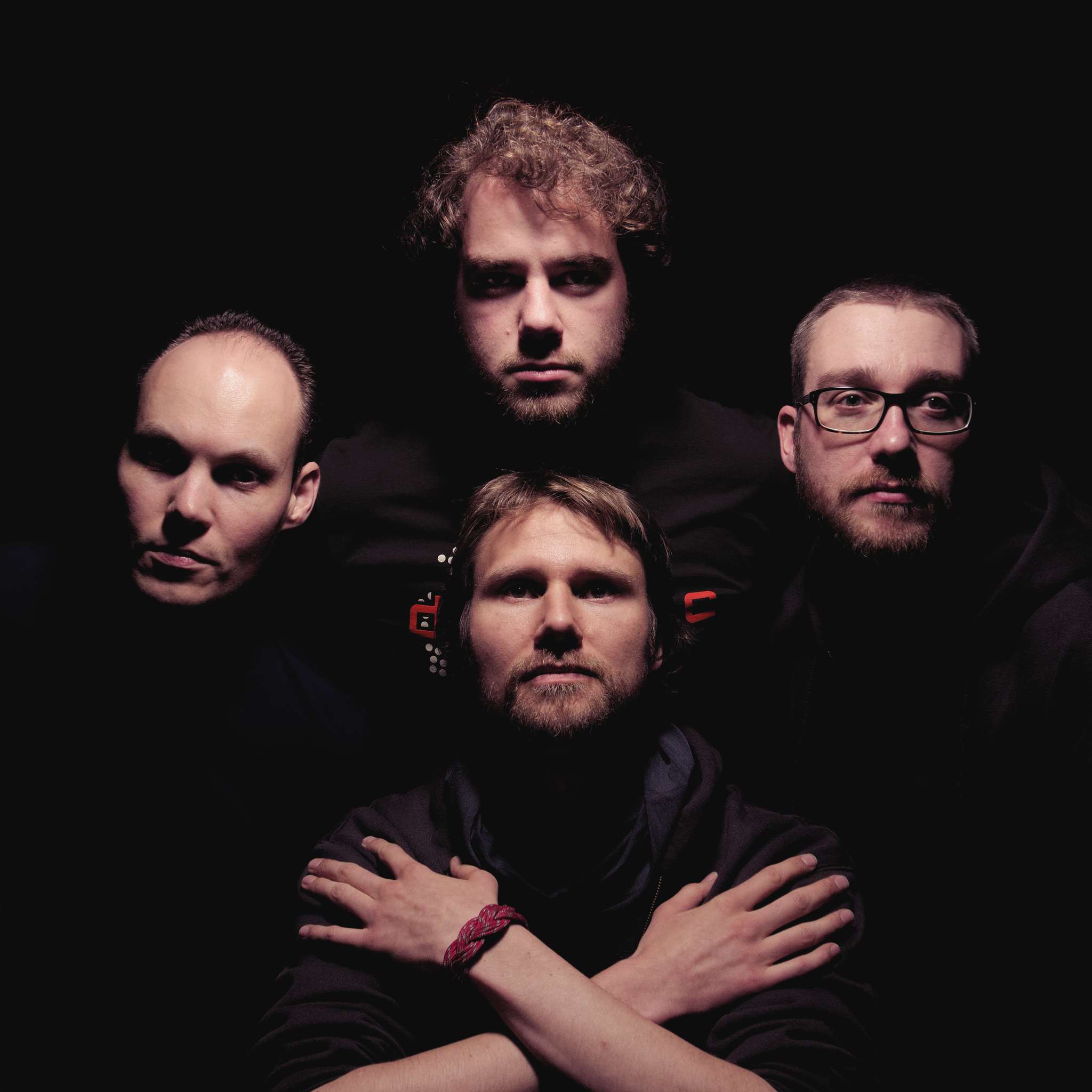
Anyone who’s followed me for a while likely knows that I’m friends with G’MIC (GREYC’s Magic for Image Computing) creator David Tschumperlé.
I was also able to release all of my film emulationpresets on G’MIC for everyone to use with David’s help and we collaborated on a bunch of different fun processing filters for photographers in G’MIC (split details/wavelet decompose, freaky details, film emulation, mean/median averaging, and more).
It’s also David that helped me by writing a G’MIC script to mean average images for me when I started making my amalgamations
(Thus moving me away from my previous method of using Imagemagick):
So when the forums here on discuss.pixls.us were finally up and running, it only made sense to offer G’MIC its own part of the forums.
They had previously been using a combination of Flickr groups and gimpchat.com.
These are great forums, they were just a little cumbersome to use.
To the winners of the Open Source Photography Course Giveaway
I compiled the list of entries this afternoon across the various social networks and let random.org pick an integer in the domain of all of the entries…
I’ll be contacting you shortly (assuming you don’t read this announcement here first…)!
I will need a valid email address from you both in order to send your download links.
You can reach me at pixlsus@pixls.us.
Thank you to everyone who shared the post to help raise awareness!
The lessons are still on sale until August 1st for $35USD over on Riley’s site.
Photographer Riley Brandt recently released his Open Source Photography Course.
I managed to get a little bit of his time to answer some questions for us about his photography and the course itself.
You can read the full interview right here:
Riley went above and beyond for us.
He has graciously offered us an opportunity for 2 readers to win a free copy of the course (one in an open format like WebM/VP8, and another in a popular format like MP4/H.264)!
For a chance to win, I’m asking you to share a link to this post on:
with the hashtag #PIXLSGiveAway (you can click those links to share to those networks).
Each social network counts as one entry, so you can triple your chances by posting across all three.
Next week (Monday, 2015-07-20 Wednesday, 2015-07-22 to give folks a full week), I will search those networks for all the posts and compile a list of people, from which I’ll pick the winners (using random.org).
Make sure you get that hashtag right! :)
He recently announced the availability of The Open Source Photography Course.
It’s a full photographic workflow course using only free, open source software that he has spent the last ten months putting together.
Riley has graciously offered two free copies for us to give away! For a chance to win, see this blog post.
I was lucky enough to get a few minutes of Riley’s time to ask him a few questions about his photography and this course.
A Chat with Riley Brandt
Tell us a bit about yourself!
Hello, my name is Riley Brandt and I am a professional photographer at the University of Calgary.
At work, I get to spend my days running around a university campus taking pictures of everything from a rooster with prosthetic legs made in a 3D printer, to wild students dressed in costumes jumping into freezing cold water for charity. It can be pretty awsome.
Outside of work, I am a supporter of Linux and open source software. I am also a bit of a film geek.
[ed. note: He’s not kidding - That’s a rooster with prosthetic legs…]
I see you were trained in photojournalism. Is this still your primary photographic focus?
Though I definitely enjoy portraits, fashion and lifestyle photography, my day to day work as a photographer at a university is very similar to my photojournalism days.
I have to work with whatever poor lighting conditions I am given, and I have to turn around those photos quickly to meet deadlines.
However, I recently became an uncle for the first time to a baby boy, so I imagine I will be expanding into new born and toddler photography very soon :)
Photography started as a hobby for me when I was living the Czech Republic in the late 90s and early 2000s. My first SLR camera was the classic Canon AE1 (which I still have).
I didn’t start to work as a full time professional photographer until I graduated from the Journalism program at SAIT Polytechnic in 2008.
What type of photography do you enjoy doing the most?
In a nutshell, I enjoy photographing people. This includes both portraits and candid moments at events.
I love meeting someone with an interesting story, and then trying to capture some of their personality in an image.
At events, I’ve witnessed everything from the joy of someone meeting an astronaut they idolize, to the anguish of a parent at graduation collecting a degree instead of their child who was killed. Capturing genuine emotion at events is challenging, and overwhelming at times, but is also very gratifying.
It would be hard for me to choose between candids or portraits. I enjoy them both.
I’ve been told several times that my images are very “clean”. Which I think means I limit the image to only a few key elements, and remove any major distractions.
If you had to choose your favorite image from your portfolio, what would it be?
I don’t have a favorite image in my collection.
However, at the end of a work week, I usually have at least one image that I am really happy with. A photo that I will look at again when I get home from work. An image that I look forward to seeing published. Those are my favorites.
Has free-software always been the foundation of your workflow?
Definitely not. I started with Adobe software, and still use it (and other non-free software) at work. Though hopefully that will change.
I switched to free software for all my personal work at home, because all my computers at home run Linux.
I also dislike at lot of Adobe’s actions as a company, ie: horrible security and switching to a “cloud” version of their software which is really just a DRM scheme.
There many significant reasons to not run non-free software, but what really motivated my switch initially was simply that Adobe never released a Linux version of their software.
What is your normal OS/platform?
I guess I am transitioning from Ubuntu to Fedora (both GNU/Linux). My main desktop is still running Ubuntu Gnome 14.04. But my laptop is running Fedora 21.
Ubuntu doesn’t offer an up to date version of the Gnome desktop environment. It also doesn’t use the Gnome Software Centre or many Gnome apps. Fedora does. So my desktop will be running Fedora in the near future as well.
What drove you to consider creating a free-software centric course?
Because it was so difficult for me to transition from Adobe software to free software, I wanted to provide an easier option for others trying to do the same thing.
Instead of spending weeks or months searching through all the different manuals, tutorials and websites, someone can spend a weekend watching my course and be up and running quickly.
Also, it was just a great project to work on. I got to combine two of my passions, Linux and photography.
Is the course the same as your own approach?
Yes, it’s the same way I work.
I start with fundamentals like monitor calibration and file management. Then onto basics like correcting exposure, color, contrast and noise. After that, I cover less frequently used tools. It’s the same way I work.
The course focuses heavily on darktable for RAW processing - have you also tried any of the other options such as RawTherapee?
I originally tried digiKam because it looked like it had most of the features I needed. However, KDE and I are like oil and water. The user interface felt impenetrable to me, so I moved on.
I also tried RawTherapee, but only briefly. I got some bad results in the beginning, but that was probably due to my lack of familiarity with the software. I might give it another go one day.
Once darktable added advanced selective editing with masks, I was all in. I like the photo management element as well.
Have you considered expanding your (course) offerings to include other aspects of photography?
Umm.. not just yet. I first need to rest :)
If you were to expand the current course, what would you like to focus on next?
It’s hard to say right now. Possibly a more in depth look at GIMP. Or a series where viewers watch me edit photos from start to finish.
It took 10 months to create this course, will you be taking a break or starting right away on the next installment? :)
A break for sure :) I spent most of my weekends preparing and recording a lesson for the past year. So yes, first a break.
Some parting words?
I would like to recommend the Desktop Publishing course created by GIMP Magazine editor Steve Czajka for anyone who is trying to transition from Adobe InDesign to Scribus.
I would also love to see someone create a similar course for Inkscape.

 Login
Login