For some reason I was checking my account on the forums earlier today and noticed that it was created in April, 2015. On further inspection it looks like my, and @darix, accounts were created on April 2nd 2015.
(Not to be confused with the main site because apparently it took me about 8 months to get a forum stood up…)
Which means that the forums have been around for just over a year now?!
We’re just over a year old and just under 500 users on the forum!
For fun, I looked for the oldest (public) post we had and it looks like it’s the “Welcome to PIXLS.US Discussion“ thread. In case anyone wanted to revisit a classic…
THANK YOU so much to everyone who has made this an awesome place to be and nerd out about photography and software and more! Since we started we migrated the official G’MIC forums here as well as our friends at RawTherapee!
We’ve been introduced to some awesome projects like PhotoFlow as well as Filmulator. And everyone has just been amazing, supportive, and fun to be around.
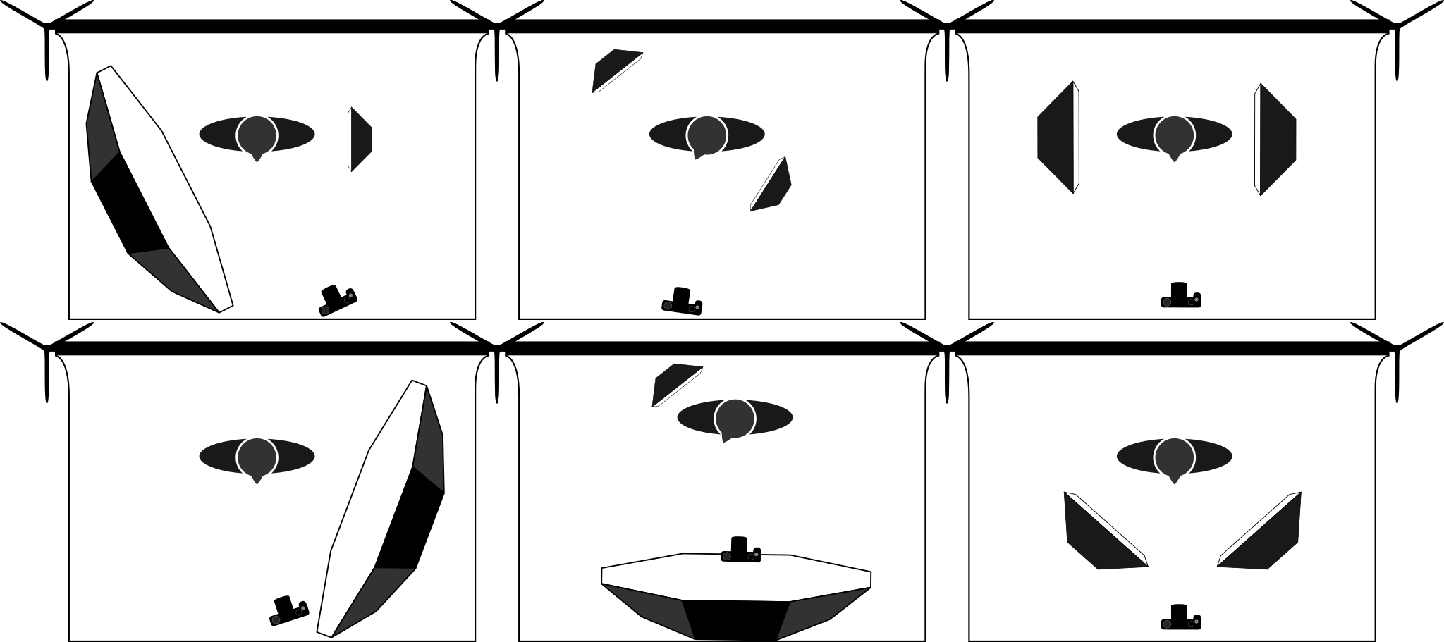
Community member Eric Mesa asked on the forums the other day if there might be some Free resources for photographers that want to build a lighting diagram of their work. These are the diagrams that show how a shot might be set up with the locations of lights, what types of modifiers might be used, and where the camera/photographer might be positioned with respect to the subject. These diagrams usually also include lighting power details and notes to help the production.
It turns out there wasn’t really anything openly available and permissively licensed. So we need to fix that…
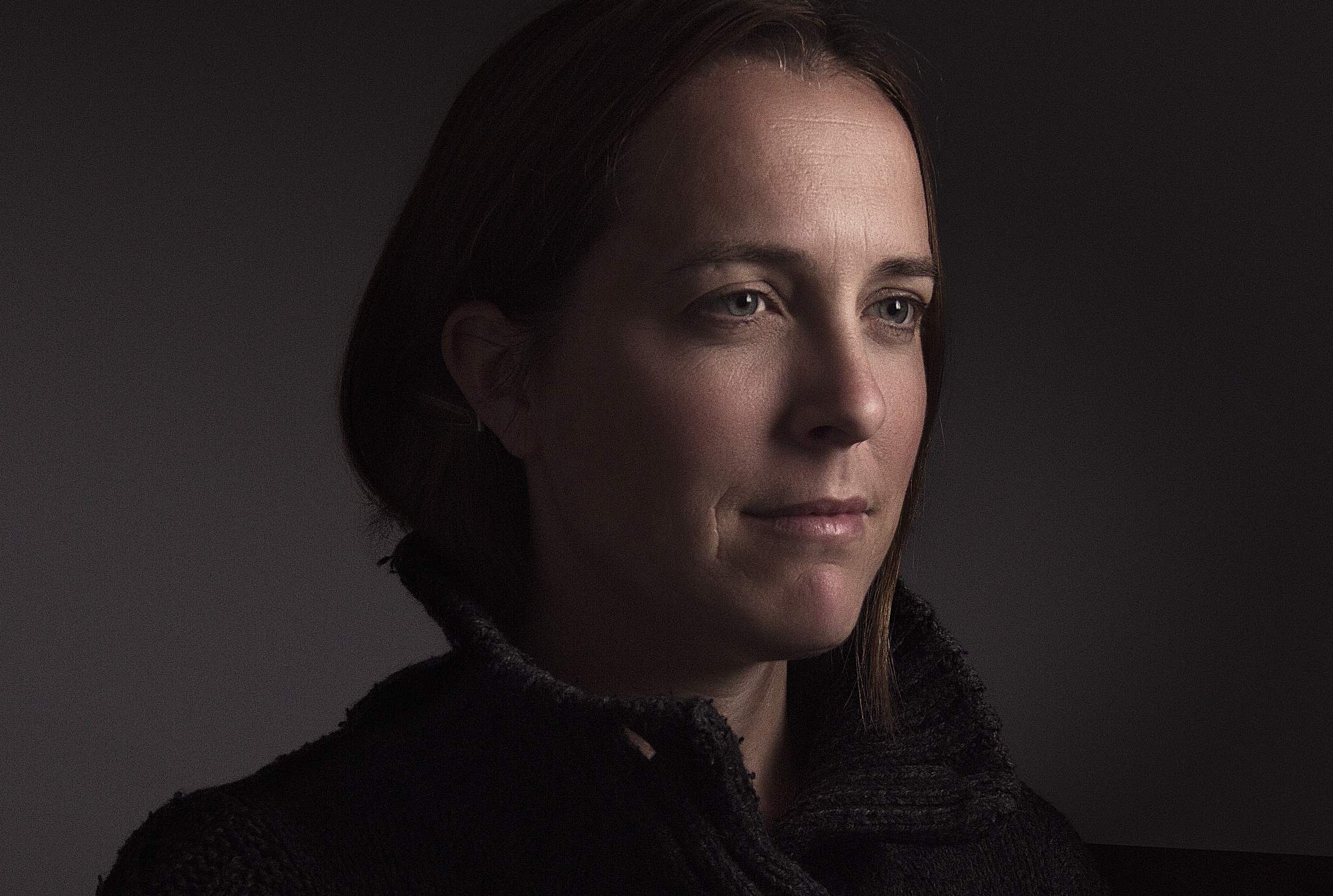
These diagrams are particularly handy for planning a shoot conceptually or explaining what the lighting setup was to someone after the fact. For instance, here’s a look at the lighting setup for Sarah (Glance):
Sarah (Glance)
YN560 full power into a 60” Photek Softlighter, about 20” from subject.
She was actually a bit further from the rear wall…
There are a few different commercial or restrictive-licensed options for photographers to create a lighting diagram, but nothing truly Free.
So thanks to the prodding by Eric, I thought it was something we should work on as a community!
I already had a couple of simple, basic shapes created in Inkscape for another tutorial so I figured I could at least get those files published for everyone to use.
I don’t have much to start with but that shouldn’t be a problem! I already had a backdrop, person, camera, octabox (+grid), and a softbox (+grid):
Even better: join the organization and fork the repo to add your own additions and to help us flesh out the available diagram assets for all to use!
From the README.md on that repo, I compiled a list of things I thought might be helpful to create:
Cameras
DSLR
Mirrorless
MF
Strobes
Speedlight
Monoblock
Lighting Modifiers
Softbox (+ grid?)
Umbrella (+ grid?)
Octabox (+ grid?)
Brolly
Reflectors
Flags
Barn Doors / Gobo
Light stands? (C-Stands?)
Environmental
Chairs
Stools
Boxes
Backgrounds (+ stands)
Models
If you don’t want to create something from scratch, perhaps grabbing the files and tweaking the existing assets to make them better in some way?
Hopefully we can fill out the list fairly quickly (as it’s a fairly limited subset of required shapes). Even better would be if someone picked up the momentum to possibly create a nice lighting diagram application of some sort!
On the old RawTherapee forums they used to have a contest sharing a single raw file amongst the members to see how everyone would approach processing from the same starting point. They called it PlayRaw. This seemed to really bring out some great work from the community so I thought it might be fun to start doing something similar again here.
I took a (relatively) recent image of Mairi and decided to see how it would be received (I’d say fairly well given the responses). This was my result from the raw file that I called Mairi Troisième:
The only things I asked for was to see the results and possibly the processing steps through either an XMP or PP3 sidecar file (darktable and RawTherapee respectively).
Here’s a montage of the results from everyone:
I loved being able to see what everyone’s approaches looked like. It’s neat to get a feel for all the different visions out there among the users and there were some truly beautiful results!
If you haven’t given it a try yourself yet, head on over to the [PlayRaw] Mairi Troisieme thread to get the raw file and try it out yourself! Just don’t forget to show us your results in the topic.
I’ll be soliciting options for a new image to kick off another round of processing again soon.
Donations go to help cover to costs of various projects to come together and meet, photograph, discuss, and hack at things. Please consider donating as every little bit helps us immensely! If you can’t donate then please consider helping us to raise awareness of what we’re trying to do! Either link the Pledgie campaign to others or let them know we’re here to help and share!
Even better is if you’re in the vicinity of London this April 15–18! Come out and join us as well as many other awesome Free Software projects all focused on the graphics community! We (PIXLS) will be conducting photowalks and meet-ups the Thursday before LGM kicks off as well!
Oh, and I finally did convince Mairi to join us through the weekend to model for us as needed. She’s super awesome and worth raising a glass to/with! Even more reason to come out and join us!
Some of you may know I exclusively use Contax manual focus lenses on my Canon cameras. I have had one reliable adapter from the start, that just happened to be perfect in every way: perfectly parallel, and lets my lenses focus exactly to infinity, and none of my lenses hit the mirror on my 5D.
However, swapping adapters between cameras gets mighty tedious, so recently I have been trying a variety of different adapters for my cameras, several quality tiers ranging from the cheapest ($15) up to the most expensive ($70).
However, I wasn’t satisfied with any of them. In order to assure that the adapted lenses can focus to infinity even with manufacturing tolerances, they’re made thinner than necessary. This means that they focus past infinity, and with some lenses the mirror of my 5D would hit the back of the lens, needing me to wiggle it to free the mirror after taking a photo.
I measured my fancier Fotodiox Pro adapter, and found that not only was it too thin, but it was unevenly thick! The top was 8 thousandths of an inch thin, the bottom right was 2 thousandth of an inch thin, and the bottom left was exactly the right thickness.
I decided I could do something about it.
I bought some shim stock from McMaster Carr, plastic and 2 thousandths of an inch thick, figuring I might be able to fold it to build up thickness if necessary. (Spoiler: it does fold.) It comes as a giant sheet five by twenty inches, but you’ll only need the tiniest amount of it.
Then I went about removing the screws that hold the two sides together.
The screws are incredibly small.
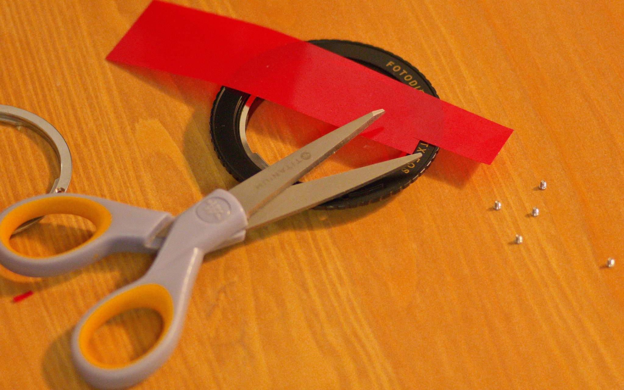
Here you can see that there are only three points on the ring that actually control the thickness; I point to one with the scissors. I had to be careful when measuring the thickness to only measure it between the screws, and that was challenging because the EF mount diameter is larger than the C/Y mount diameter, and there was only the slightest overlap between the outside of the C/Y registration surface and the inside of the EF mount.
Next I just cut a narrow strip out of this piece of shim stock using scissors, and put slits in it so it could fold more easily.
The right hand shim is folded in the shape of a W, and the left hand shim is only one layer.
The thicker shim went on the top, and the thinner shim went on the bottom-right.
Put the ring back on, and then…
Reinstall the screws.
Test your lenses for infinity focus and, if applicable, mirror slap, and rejoice if they’re good!
If you don’t have a perfect adapter as a reference for the proper thickness, you can first adjust the adapter to be perfectly even thickness all the way around, and then you can add thickness uniformly until your lenses just barely focus to infinity. It might be time consuming, but it’s very rewarding being able to trust the infinity stop on your lenses.
This method isn’t only applicable to the two-part SLR->SLR Fotodiox adapters; it should also work for SLR or rangefinder to mirrorless adapters as well.
I’ve seen it written that you can’t be sure whether or not your adapters are even thickness all the way around, but with this technique, you can make sure that your adapters are perfect.
Carlo originally posted this as a thread on the forums but I thought it would be useful as a post. He has graciously allowed us to re-publish it here. –Pat
Mika Ross-Southall and Michael Caines look at the enduring appeal of Thomas Chatterton, an icon of thwarted Romantic genius, and how he became a figure of especial importance for Oscar Wilde.
To mark the centenary of Henry James's death, Catharine Morris and Michael Caines trace the course of his work as it was discussed in his lifetime – and as some of it appeared in the TLS itself.
Mike Howard, the host and creator of the jpeg2RAW podcast reached out to me last week to see if I might be able to come on the show to talk about Free Software Photography and what we’ve been up to here.
One of the primary reasons for creating this site was to be able to raise awareness of the Free Software community to a wider audience.
So this is a great opportunity for us to expose ourselves!
The podcast airs live this Tuesday, February 23rd at 8PM Eastern (-0500). You can join us at the jpeg2RAW live podcast page!
Mike has the live feed available to watch on that page and also has a chat server set up so viewers can interact with us live during the broadcast.
If you are free on Tuesday night then come on by and join us! I’ll be happy to field any questions you want answered (and that Mike asks) and will do my best to not embarrass myself (or our community). If you would like to make sure I address something in particular (or just don’t forget something), I also have a thread on discuss where you can make sure I know it.
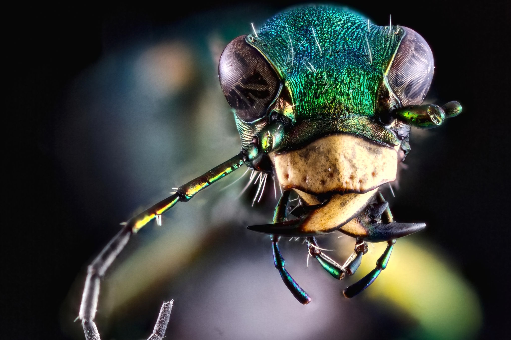
I’m also looking for community members to submit some photos to help highlight our work and what’s possible with Free Software. Feel free to link them in the same thread as above. I’ve already convinced andabata to point us to some of his great macro shots (like that awesome lede image) and I’ll be submitting a few of my own images as well. If you have some works that you’d like to share please let me know!
Mike has all of his prior podcasts archived on his Podcasts page. So if you miss the live show it looks like you’ll be able to catch up later at your convenience.
As mentioned previously we are heading to London for Libre Graphics Meeting 2016! We’ve got a flat rented for a great crew to be able to stay together and we’re on track for a PIXLS meet up before LGM!
Speaking of people, I’m looking forward to being able to spend some time with some great folks again this year! We’ve got Tobias, Johannes, and Pascal making it out (I’m not sure that Simon, top below, will be making it out) from darktable, DrSlony and qogniw from RawTherapee, Andrea Ferrero creator of PhotoFlow, even Ofnuts (how cool is that?) may make it out!
Pascal, Johannes, and Tobias (left to right, bottom row) will be there!
We’ve also already had a great response so far on our Pledgie campaign. The campaign is still running if you want to help out!
If anyone is thinking they’d like to make it out to join us, please let me know as soon as possible so we can plan for space!
My friend and model Mairi will also be making it out for the meeting. She’ll be on hand to help us practice lighting setups, model interactions, and will likely be shooting right along with the rest of us as well!
I’ll also be assembling slides for my presentation during LGM. I’ve got a 20 minute time slot to talk about the community we’ve been building here and the neat things our members have been up to (Filmulator, PhotoFlow, and more).
I’ve setup a Github Pixls organization so that we can begin to share various things. This came about after talking with @paperdigits on the post about the upcoming podcast at jpeg2RAW. We were talking about ways to share information and assets for creating/delivering presentations about Free Software photography.
At the moment there is only the single repository Presentations as we are figuring out structure. I’ve uploaded my slides and notes from the LGM2015 State of the Libre Graphics presentation announcing PIXLS. If you’re on Github and want to join us just let me know!
On the 10th anniversary of her blog, A Don's Life, The TLS' Classics Editor Mary Beard joins Rozalind Dineen to discuss its success. Find out more: www.the-tls.co.uk
A first approach to creating and mapping HDR images
I have a mostly love/hate relationship with HDR images (well, tonemapping HDR more than the HDR themselves).
I think the problem is that it’s very easy to create really bad HDR images that the photographer thinks look really good.
I know because I’ve been there:
Don’t judge me, it was a weird time in my life…
The best term I’ve heard used to describe over-processed images created from an HDR is “clown vomit” (which would also be a great name for a band, by the way).
They are easily spotted with some tell-tale signs such as the halos at high-contrast edges, the unrealistically hyper-saturated colors that make your eyes bleed, and a general affront to good taste.
In fact, while I’m putting up embarrassing images that I’ve done in the past, here’s one that scores on all the points for a crappy image from an HDR:
Crap-tastic!
Of course, the allure here is that it provides first timers a glimpse into something new, and they feel the desire to crank every setting up to 11 with no regards to good taste or aesthetics.
If you take anything away from this post, let it be this: “Turn it DOWN“.
If it looks good to you, then it’s too much. ;)
HDR lightprobes are used in movie fx compositing to ensure that the lighting on CG models matches exactly the lighting for a live-action scene. By using an HDR lightprobe, you can match the lighting exactly to what is filmed.
I originally learned about, and used, HDR images when I would use them to illuminate a scene in Blender. In fact, I will still often use Paul Debevec’s Uffizi gallery lightprobe to light scene renders in Blender today.
For example, you may be able to record 10-12 stops of light information using a modern camera. Some old films could record 12-13 stops of light, while your eyes can approximately see up to 14 stops.
HDR images are intended to capture more than this number of stops. (Depending on your patience, significantly more in some cases).
I can go on a bit about the technical aspects of HDR imaging, but I won’t. It’s boring. Plus, I’m sure you can use Wikipedia, or Google yourselves. :)
In the end, just realize that an HDR image is simply one where there is a greater amount of light information being stored than is able to be captured by your camera sensor in one shot.
Taking an HDR image(s)
More light information than my camera can record in one shot? Then how do I take an HDR photo?
You don’t.
You take multiple photos of a scene, and combine them to create the final HDR image.
Before I get into the process of capturing these photos to create an HDR with, consider something:
When/Why to use HDR
An HDR image is most useful to you when the scene you want to capture has bright and dark areas that fall outside the range of a single exposure, and you feel that there is something important enough outside that range to include in your final image.
That last part is important, because sometimes it’s OK to have some of your photo be too dark for details (or too light). This is an aesthetic decision of course, but keep it in mind…
Here’s what happens. Say you have a pretty scene you would like to photograph. Maybe it’s the Lower Chapel of Sainte Chapelle:
You may setup to take the shot, but when you are setting your exposure you may run into a problem. To expose for the brighter parts of the image means that the shadows fall to black too quickly, crushing out the details there.
If you expose for the shadows, then the brighter parts of the image quickly clip beyond white.
The use case for an HDR is when you can’t find a happy medium between those two exposures.
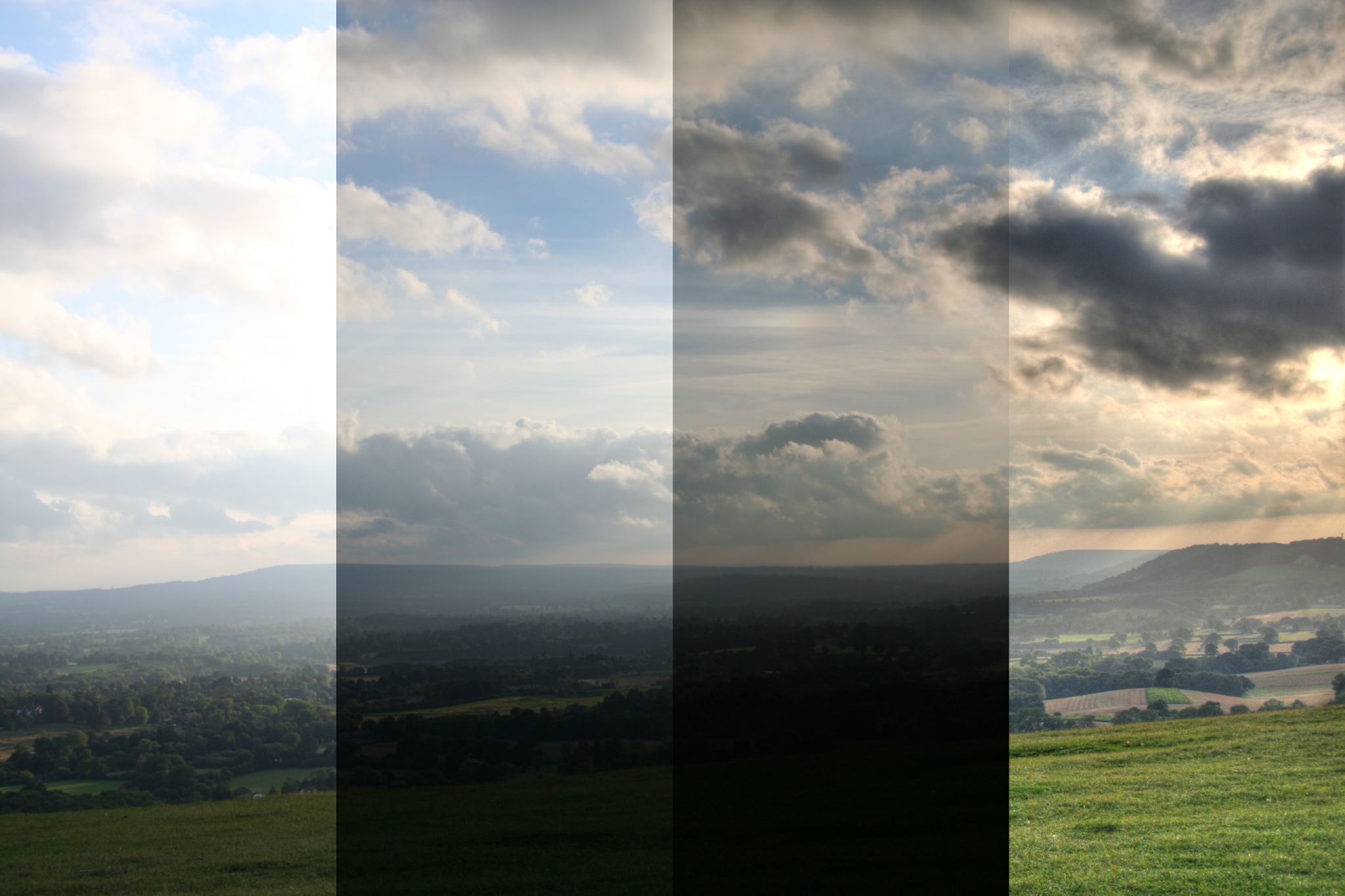
A similar situation comes up when you want to shoot any ground details against a bright sky, but you want to keep the details in both. Have a look at this example:
In the first column, if you expose for the ground, the sky blows out.
In the second, you can drop the exposure to bring the sky in a bit, but the ground is getting too dark.
In the third, the sky is exposed nicely, but the ground has gone to mostly black.
If you wanted to keep the details in the sky and ground at the same time, you might use an HDR (you could technically also use exposure blending with just a couple of exposures and blend them by hand, but I digress) to arrive at the last column.
Shooting Images for an HDR
Many cameras have an auto-bracketing feature that will let you quickly shoot a number of photos while changing the exposure value (EV) of each. You can also do this by hand simply by changing one parameter of your exposure each time.
You can technically change any of ISO, shutter speed, or aperture to modify the exposure, but I’d recommend you change only the shutter speed (or EV value when in Aperture Priority modes).
The reason is that changing the shutter speed will not alter the depth-of-field (DoF) of your view or introduce any extra noise the way changing the aperture or ISO would.
When considering your scene, you will also want to try to stick to static scenes if possible.
The reason is that objects that move around (swaying trees, people, cars, fast moving clouds, etc.) could end up as ghosts or mis-alignments in your final image.
So as you’re starting out, choose your scene to help you achieve success.
Set up your camera someplace very steady (like a tripod), dial in your exposure and take a shot.
If you let your camera meter your scene for you then this is a good middle starting point.
For example, if you setup your camera and meter your scene, it might report a 1⁄160 second exposure. This is our starting point (0EV).
The base exposure, 1⁄160 s, 0EV
To capture the lower values, just cut your shutter speed in half ( 1⁄80 second, +1EV), and take a photo. Repeat if you’d like ( 1⁄40 second, +2EV).
To capture the upper values, just double your starting point shutter speed ( 1⁄320, -1EV) and take a photo. Repeat if you’d like again ( 1⁄640, -2EV).
1⁄320, -1EV (left), 1⁄640, -2EV (right)
This will give you 5 images covering a range of -2EV to +2EV:
Shutter Speed
Exposure Value
1⁄640
-2EV
1⁄320
-1EV
1⁄160
0EV
1⁄80
+1EV
1⁄40
+2EV
Your values don’t have to be exactly 1EV each time, LuminanceHDR is usually smart enough to figure out what’s going on from the EXIF data in your image - I chose full EV stops here to simplify the example.
So armed with your images, it’s time to turn them into an HDR image!
Creating an HDR Image
You kids have it too easy these days. We used to have to bring all the images into Hugin and align them before we could save an hdr/exr file. Nowadays you’ve got a phenomenal piece of Free/Open Source Software to handle this for you:
After installing it, open it up and hit “New HDR Image“:
This will open up the “HDR Creation Wizard” that will walk you through the steps of creating the HDR. The splash screen notes a couple of constraints.
On the next screen, you’ll be able to load up all of the images in your stack. Just hit the big green “+“ button in the middle, and choose all of your images:
LuminanceHDR will load up each of your files, and investigate them to try and determine the EV values for each one. It usually does a good job of this on its own, but if there a problem you can always manually specify what the actual EV value is for each image.
Also notice that because I only adjusted my shutter speed by half or double, that each of the relative EV values is neatly spaced 1EV apart. They don’t have to be, though. I could have just as easily done ½ EV or ⅓ EV steps as well.
If there is even the remotest question about how well your images will line up, I’d recommend that you check the box for “Autoalign images”, and let Hugin’s align_image_stack do it’s magic.
You really need all of your images to line up perfectly for the best results.
Hit “Next“, and if you are aligning the images be patient.
Hugin’s align_image_stack will find control points between the images and remap them so they are all aligned.
When it’s done you’ll be presented with some editing tools to tweak the final result before the HDR is created.
You are basically looking at a difference view between images in your stack at the moment. You can choose which two images to difference compare by choosing them in the list on the left. You can now shift an image horizontally/vertically if it’s needed, or even generate a ghosting mask (a mask to handle portions of an image where objects may have shifted between frames).
If you are careful, and there’s not much movement in your image stacks, then you can safely click through this screen. Hit the “Next“ button.
This is the final screen of the HDR Creation Wizard.
There are a few different ways to calculate the pixel values that make up an HDR image, and this is where you can choose which ones to use.
For the most part, people far smarter than I had a look at a bunch of creation methods, and created the predefined profiles.
Unless you know what you’re doing, I would stick with those.
Hit “Finish“, and you’re all done!
You’ll now be presented with your HDR image in LuminanceHDR, ready to be tonemapped so us mere mortals can actually make sense of the HDR values present in the image.
At this point, I would hit the “Save As…” button, and save your work.
Tonemapping the HDR
So now you’ve got an HDR image. Congratulations!
The problem is, you can’t really view it with your puny little monitor.
The reason is that the HDRi now contains more information than can be represented within the limited range of your monitor (and eyeballs, likely). So we need to find a way to represent all of that extra light-goodness so that we can actually view it on our monitors. This is where tonemapping comes in.
We basically have to take our HDRi and use a method for compressing all of that radiance data down into something we can view on our monitors/prints/eyeballs. We need to create a Low Dynamic Range (LDR) image from our HDR.
Yes - we just went through all the trouble of stacking together a bunch of LDR images to create the HDRi, and now we’re going back to LDR ? We are - but this time we are armed with way more radiance data than we had to begin with!
The question is, how do we represent all that extra data in an LDR? Well, there’s quite a few different ways. LuminanceHDR provides for 9 different tonemapping operators (TMO’s) to represent your HDRi as an LDR image:
Just a small reminder, there’s a ton of math involved in how to map these values to an LDR image.
I’m going to skip the math.
The references are out there if you want them.
I’ll try to give examples of each of the operators below, and a little comment here and there. If you want more information, you can always check out the list on the Open Source Photography wikidot page.
Before we get started, let’s have a look at the window we’ll be working in:
Tonemap is the section where you can choose which TMO you want to use, and will expose the various parameters you can change for each TMO. This is the section you will likely be spending most of your time, tweaking the settings for whichever TMO you decide to play with.
Process gives you two things you’ll want to adjust. The first is the size of the output that you want to create (Result Size). While you are trying things out and dialing in settings you’ll probably want to use a smaller size here (some operators will take a while to run against the full resolution image). The second is any pre-gamma you want to apply to the image. I’ll talk about this setting a bit later on.
Oh, and this section also has the “Tonemap” button to apply your settings and generate a preview. I’ll also usually keep the “Update current LDR” checked while I rough in parameters. When I’m fine-tuning I may uncheck this (it will create a new image every time you hit the “Tonemap” button).
Results are shown in this big center section of the window. The result will be whatever Result Size you set in the previous section.
Previews are automatically generated and shown in this column for each of the TMO. If you click on one, it will automatically apply that TMO to your image and display it (at a reduced resolution - I think the default is 400px, but you can change it if you want). It’s a nice way to quickly get a preview overview of what all the different TMOs are doing to your image.
Ok, with that out of the way, let’s dive into the TMOs and have a look at what we can do. I’m going to try to aim for a reasonably realistic output here that (hopefully) won’t make your eyeballs bleed. No promises, though.
Need an HDR to follow along?
I figured it might be more fun (easier?) to follow along if you had the same file I do.
So here it is, don’t say I never gave you anything (This hdr is licensed cc-by-sa-nc by me):
Download from Google Drive (41MB .hdr)
Another note - all of the operators can have their results tweaked by modification of the pre-gamma value ahead of time. This is applied the image before the TMO is applied, and will make a difference in the final output. Usually pushing the pre-gamma value down will increase contrast/brightness in the image, while increasing it will do the opposite. I find it better to start with pre-gamma set to 1 as I experiment, just remember that it is another factor that you use to modify your final result.
Mantiuk ‘06
I’m starting with this one because it’s the first in the list of TMOs. Let’s see what the defaults from this operator look like against our base HDRi:
Default Mantiuk ‘06 applied
By default Mantiuk ‘06 produces a muted color result that seems pleasing to my eye. Overall the image feels like it’s almost “dirty” or “gritty” with these results. The default settings produce a bit of extra local contrast boosting as well.
Let’s see what the parameters do to our image.
Contrast Factor
The default factor is 0.10.
Pushing this value down to as low as 0.01 produces just a slight increase in contrast across the image from the default. Not that much overall.
Pushing this value up, though, will tone down the contrast overall. I think this helps to add some moderation to the image, as hard contrasts can be jarring to the eyes sometimes. Here is the image with only the Contrast Factor pushed up to 0.40:
Mantiuk ‘06 - Contrast Factor increased to 0.40
(click to compare to defaults)
Saturation Factor
The default value is 0.80.
This factor just scales the saturation in the image, and behaves as expected. If you find the colors a bit muted using this TMO, you can bump this value a bit (don’t get crazy). For example, here is the Saturation Factor bumped to 1.10:
Mantiuk ‘06 - Saturation Factor increased to 1.10
(click to compare to defaults)
Of course, you can also go the other way if you want to mute the colors a bit more:
Mantiuk ‘06 - Saturation Factor decreased to 0.40
(click to compare to defaults)
Detail Factor
The default is 1.0.
The Detail Factor appears to control local contrast intensity. It gets overpowering very quickly, so make small movements here (if at all). Here is what pushing the Detail Factor up to 10.0 produces:
Don’t do this. Mantiuk ‘06 - Detail Factor increased to 10.0
(click to compare to defaults)
Contrast Equalization
This is supposed to equalize the contrast if there are heavy swings of light/dark across the image on a global scale, but in my example did little to the image (other than a strange lightening in the upper left corner).
My Final Version
I played a bit starting from the defaults. First I wanted to push down the contrast a bit to make everything just a bit more realistic, so I pushed Contrast Factor up to 0.30. I slightly bumped the Saturation Factor to 0.95 as well.
I liked the textures of the tree and house, so I wanted to bring those back up a bit after decreasing the Contrast Factor, so I pushed the Detail Factor up to 5.0.
Here is what I ended up with in the end:
My final output (Contrast 0.3, Saturation 0.95, Detail 5.0)
(click to compare to defaults)
Mantiuk ‘08
Mantiuk ‘08 is a global contrast TMO (for comparison, Mantiuk ‘06 uses local contrast heavily). Being a global operator, it’s very quick to apply.
Default Mantiuk ‘08 applied
As you can see, the effect of this TMO is to compress the dynamic range into an LDR output using a function that operates across the entire image globally. This will produce a more realistic result I think, overall.
The default output is not bad at all, where brights seem appropriately bright, and darks are dark while still retaining details. It does feel like the resulting output is a little over-sharp to my eye, however.
There are only a couple of parameters for this TMO (unless you specifically override the Luminance Level with the checkbox, Mantiuk ‘08 will automatically adjust it for you):
Predefined Display
There are options for LCD Office, LCD, LCD Bright, and CRT but they didn’t seem to make any difference in my final output at all.
Color Saturation
The default is 1.0.
Color Saturation operates exactly how you’d expect. Dropping this value decreases the saturation, and vice versa. Here’s a version with the Color Saturation bumped to 1.50:
Mantiuk ‘08 - Color Saturation increased to 1.50
(click to compare to defaults)
Contrast Enhancement
The default value is 1.0.
This will affect the global contrast across the image. The default seemed to have a bit too much contrast, so it’s worth it to dial this value in. For instance, here is the Contrast Enhancement dialed down to 0.51:
Mantiuk ‘08 - Contrast Enhancement decreased to 0.51
(click to compare to defaults)
Compared to the default settings I feel like this operator can work better if the contrast is turned down just a bit to make it all a little less harsh.
Enable Luminance Level
This checkbox/slider allows you to manually specify the Luminance Level in the image. The problem that I ran into was that with this enabled, I couldn’t adjust the Luminance far enough to keep bright areas in the image from blowing out. if I let the default behavior of automatically adjusting Luminanace, then it kept things more under control.
My Final Version
Starting from the defaults, I pushed down the Contrast Enhancement to 0.61 to even out the overall contrast. I bumped the Color Saturation to 1.10 to bring out the colors a bit more as well.
I also dropped the pre-gamma correction to 0.91 in order to bring back some of the contrast lost from the Contrast Enhancement.
My final Mantiuk ‘08 output
(pre-gamma 0.91, Contrast Enhancement 0.61, Color Saturation 1.10)
(click to compare to defaults)
Fattal
Crap. Time for this TMO I guess…
THIS is the TMO responsible for some of the greatest sins of HDR images.
Did you see the first two images in this post? Those were Fattal.
The problem is that it’s really easy to get stupid with this TMO.
Fattal (like the other local contrast operators) is dependent on the final output size of the image.
When testing this operator, do it at the full resolution you will want to export.
The results will not match up if you change size.
I’m also going to focus on using only the newer v.2.3.0 version, not the old one.
Here is what the default values look like on our image:
Default Fattal applied
The defaults are pretty contrasty, and the color seems saturated quite a bit as well. Maybe we can get something useful out of this operator. Let’s have a look at the parameters.
Alpha
The default is 1.00.
This parameter is supposed to be a threshold against which to apply the effect. According to the wikidot, decreasing this value should increase the level of details in the output and vice versa. Here is an example with the Alpha turned down to 0.25:
Fattal - Alpha decreased to 0.25
(click to compare to defaults)
Increasing the Alpha value seems to darken the image a bit as well.
Beta
The default value is 0.90.
This parameter is supposed to control the amount of the algorithm applied on the image. A value of 1 is no effect on the image (straight gamma=1 mapping). Lower values will increase the amount of the effect. Recommended values are between 0.8 and 0.9. As the values get lower, the image gets more cartoonish looking.
Here is an example with Beta dropped down to 0.75:
Fattal - Beta decreased to 0.75
(click to compare to defaults)
Color Saturation
The default value is 1.0.
This parameter does exactly what’s described. Nothing interesting to see here.
Noise Reduction
The default value is 0.
This should suppress fine detail noise from being picked up by the algorithm for enhancement. I’ve noticed that it will slightly affect the image brightness as well. Fine details may be lost if this value is too high. Here the Noise Reduction has been turned up to 0.15:
Fattal - Noise Reduction increased to 0.15
(click to compare to defaults)
My Final Version
This TMO is sensitive to changes in its parameters. Small changes can swing the results far, so proceed lightly.
I increased the Noise Reduction a little bit up front, which lightened up the image. Then I dropped the Beta value to let the algorithm work to brighten up the image even further. To offset the increase, I pushed Alpha up a bit to keep the local contrasts from getting too harsh. A few minutes of adjustments yielded this:
My Fattal output - Alpha 1.07, Beta 0.86, Saturation 0.7, Noise red. 0.02
(click to compare to defaults)
Overall, Fattal can be easily abused. Don’t abuse the Fattal TMO. If you find your values sliding too far outside of the norm, step away from your computer, get a coffee, take a walk, then come back and see if it still hurts your eyes.
Drago
Drago is another of the global TMOs. It also has just one control: bias.
Here is what the default values produce:
Default Drago applied
The default values produced a very washed out appearance to the image. The black points are heavily lifted, resulting in a muddy gray in dark areas.
Bias is the only parameter for this operator. The default value is 0.85. Decreasing this value will lighten the image significantly, while increasing it will darken it. For my image, even pushing the Bias value all the way up to 1.0 only produced marginal results:
Drago - Bias 1.0
(click to compare to defaults)
Even at this level the image still appears very washed out. The only other parameter to change would be the pre-gamma before the TMO can operate. After adjusting values for a bit, I settled on a pre-gamma of 0.67 in addition to the Bias being set to 1:
My Final Version
My result: Drago - Bias 1.0, pre-gamma 0.67
(click to compare to defaults)
Durand
Most of the older documentation/posts that I can find describe Durand as the most realistic of the TMOs, yielding good results that do not appear overly processed.
Indeed the default settings immediately look reasonably natural, though it does exhibit a bit of blowing out in very bright areas - which I imagine can be fixed by adjustment of the correct parameters. Here is the default Durand output:
Default Durand applied
There are three parameters that can be adjusted for this TMO, let’s have a look:
Base Contrast
The default is 5.00.
This value is considered a little high from most sources I’ve read. Usually recommending to drop this value to the 3-4 range. Here is the image with the Base Contrast dropped to 3.0:
Durand - Base Contrast decreased to 3.5
(click to compare to defaults)
The Base Contrast does appear to drop the contrast in the image, but it also drops the blown-out high values on the house to more reasonable levels.
Spatial Kernel Sigma
The default value is 2.00.
This parameter seems to produce a change to contrast in the image. Large value swings are required to notice some changes, depending on the other parameter values. Pushing the value up to 65.00 looks like this:
Durand - Spatial Kernel Sigma increased to 65.00
(click to compare to defaults)
Range Kernel Sigma
The default value is 2.00.
My limited testing shows that this parameters doesn’t quite operate correctly. Changes will not modify the output image until you reach a certain threshold in the upper bounds, where it will overexpose the image. I am assuming there is a bug in the implementation, but will have to test further before filing a bug report.
My Final Version
In experiment I found that pre-gamma adjustments can affect the saturation in the output image. Pushing pre-gamma down a bit will increase the saturation.
My Durand results - pre-gamma 0.88, Contrast 3.6, Spatial Sigma 5.00
(click to compare to defaults)
I pulled the Base Contrast back to keep the sides of the house from blowing out. Once I had done that, I also dropped the pre-gamma to 0.88 to bump the saturation slightly in the colors. A slight boost to Spatial Kernel Sigma let me increase local contrasts slightly as well.
Finally, I used the Adjust Levels dialog to modify the levels slightly by raising the black point a small amount (hey - I’m the one writing about all these #@$%ing operators, I deserve a chance to cheat a little).
Reinhard ‘02
This is supposed to be another very natural looking operator. The initial default result looks good with medium-low contrast and nothing blowing out immediately:
Default Reinhard ‘02 applied
Even though many parameters are listed, they don’t really appear to make a difference. At least with my test HDR. Even worse, attempting to use the “Use Scales” option usually just crashes my LuminanceHDR.
Key Value
The default is 0.18.
This appears to be the only operator that does anything in my image at the moment. Increasing it will increase the brightness of the image, and decreasing it will darken the image.
Here is the image with Key Value turned down to 0.05:
Reinhard ‘02 - Key Value 0.05
(click to compare to defaults)
Phi
The default is 1.00.
This parameter does not appear to have any affect on my image.
Use Scales
Turning this option on currently crashes my session in LuminanceHDR.
My Final Version
I started by setting the Key Value very low (0.01), and adjusted it up slowly until I got the highlights about where I wanted them. Due to this being the only parameter that modified the image, I then started adjusting pre-gamma up until I got to roughly the exposure I thought looked best (1.09).
Final Reinhard ‘02 version - Key Value 0.09, pre-gamma 1.09
(click to compare to defaults)
Reinhard ‘05
Reinhard ‘05 is supposed to be another more ‘natural’ looking TMO, and also operates globally on the image. The default settings produce an image that looks under-exposed and very saturated:
Default Reinhard ‘05 applied
There are three parameters for this TMO that can be adjusted.
Brightness
The default value is -10.00.
Interestingly, pushing this parameter down (all the way to its lowest setting, -20) did not darken my image at all. Pulling it up, however, did increase the brightness overall. Here the brightness is increased to -2.00:
Reinhard ‘05 - Brightness increased to -2.00
(click to compare to defaults)
Chromatic Adaptation
The default is 0.00.
This parameter appears to affect the saturation in the image. Increasing it desaturates the results, which is fine given that the default value of 0.00 shows a fairly saturated image to begin with. Here is the Chromatic Adaptation turned up to 0.60:
Reinhard ‘05 - Chromatic Adaptation increased to 0.6
(click to compare to defaults)
Light Adaptation
The default is 1.00.
This parameter modifies the global contrast in the final output. It starts at the maximum of 1.00, and decreasing this value will increase the contrast in the image. Pushing the value down to 0.5 does this to the test image:
Reinhard ‘05 - Light Adaptation decreased to 0.50
(click to compare to defaults)
My Final Version
My Reinhard ‘05 - Brightness -5.00, Chromatic Adapt. 0.60, Light Adapt. 0.75
(click to compare to defaults)
Starting from the defaults, I raised the Brightness to -5.00 to lift the darker areas of the image, while keeping an eye on the highlights to keep them from blowing out. I then decreased the Light Adaptation until the scene had a reasonable amount of contrast without becoming overpowering to 0.75. At that point I turned up the Chromatic Adaptation to reduce the saturation in the image to be more realistic, and finished at 0.60.
Ashikhmin
This TMO has little in the way of controls - just options for two different equations that can be used, and a slider. The default (Eqn. 2) image is very dark and heavily saturated:
Default Ashikhmin applied
There is a checkbox option for using a “Simple” method (that produces identical results regardless of which Eqn is checked - I’m thinking it doesn’t use that information).
Simple
Checking the Simple checkbox removes any control over the image parameters, and yields this image:
Ashikhmin - Simple
(click to compare to defaults)
Fairly saturated, but exposed reasonably well. It lacks some contrast, but the tones are all there. This result could use some further massaging to knock down the saturation and to bump the contrast slightly (or adjust pre-gamma).
Equation 4
This is the result of choosing Equation 4 instead:
Ashikhmin - Equation 4
(click to compare to defaults)
There is a large loss of local contrast details in the scene, and some of the edges appear very soft. Overall the exposure remains very similar.
Local Contrast Threshold
The default value is 0.50.
This parameter modifies the local contrast being applied to the image. The result will be different depending on which Equation is being used.
Here is Equation 2 with the Local Contrast Threshold reduced to 0.20:
Ashikhmin - Eqn 2, Local Contrast Threshold 0.20
(click to compare to defaults)
Lower values will decrease the amount of local contrast in the final output.
Equation 4 with Local Contrast Threshold reduced to 0.20:
Ashikhmin - Eqn 4, Local Contrast Threshold 0.20
(click to compare to defaults)
My Final Version
After playing with the options, the overall best version I feel is had by just using the Simple option. Further tweaking may be necessary to get usable results beyond this.
Pattanaik
This TMO appears to attempt to mimic the behavior of human eyes with the inclusion of terminology like “Rod” and “Cone”. There are quite a few different parameters to adjust if wanted. The default TMO results in an image like this:
Default Pattanaik applied
The default results are very desaturated, and tends to blow out in the highlights. The dark areas appear well exposed, with the problems (in my test hdr) being mostly constrained to highlights for this example. On first glance, the results look like something that could be worked with.
There are quite a few different parameters for this TMO. Let’s have a look at them:
Multiplier
The default value is 1.00.
This parameter appears to modify the overall contrast in the image. Decreasing the value will decrease contrast, and vice versa. It also appears to slightly modify the brightness in the image as well (pushing the highlights to a less blown-out value). Here is the Multiplier decreased to 0.03:
Pattanaik - Multiplier 0.03
(click to compare to defaults)
Local Tone Mapping
This parameter is just a checkbox, with no controls. The result is a washed out image with heavy local contrast adjustments:
Pattanaik - Local Tone Mapping
(click to compare to defaults)
Cone/Rod Levels
The default is to have Auto Cone/Rod checked, greying out the options to change the parameters manually.
Turning off Auto Cone/Rod will get the default manual values of 0.50 for both applied:
Pattanaik - Manual Cone/Rod (0.50 for each)
(click to compare to defaults)
The image gets very blown out everywhere, and modification of the Cone/Rod values does not significantly reduce brightness across the image.
My Final Version
Starting with the defaults, I reduced the Multiplier to bring the highlights under control. This reduced contrast and saturation in the image.
My final Pattanaik - Multiplier 0.03, pre-gamma 0.91
(click to compare to defaults)
To bring back contrast and some saturation, I decreased the pre-gamma to 0.91. The results are not too far off of the defualt settings. The results could still use some further help with global contrast and saturation, and might benefit from layering or modifications in GIMP.
Closing Thoughts
Looking through all of the results shows just how different each TMO will operate across the same image. Here are all of the final results in a single image:
I personally like the results from Mantiuk ‘06. The problem is that it’s still a little more extreme than I would care for in a final result. For a really good, realistic result that I think can be massaged into a great image, I would go to Mantiuk ‘08 or Reinhard.
I could also do something with Fattal, but would have to tone a few things down a bit.
While you’re working, remember to occasionally open up the Levels Adjustment to keep an eye on the histogram. Look for highlights blowing out, and shadows becoming too murky. All the normal rules of image processing still apply here - so use them!
You’re trying to use HDR as a tool for you to capture more information, but remember to still keep it looking realistic. If you’re new to HDR processing, then I can’t recommend enough to stop occasionally, get away from the monitor, and come back to look at your progress.
If it hurts your eyes, dial it all back. Heck, if you think it looks good, still dial it back .
If I can head off even one clown-vomit image, then I’ll consider my mission accomplished with this post.
A Couple of Further Resources
Here’s a few things I’ve found scattered around the internet if you want to read more.
Michael Caines and Catharine Morris celebrate the bicentenary of Jane Austen's magnificent novel and its quixotic heroine.Find out more: www.the-tls.co.uk
Michael Caines reads a short story about a man and a woman taking tea, watching the surfers at Morecambe Bay – and falling out over art.For more information, head to www.the-tls.co.uk
I don’t ever do this normally, but you’ve got to start somewhere, right?
It’s my long-term desire to be able to hold a PIXLS meetup/event every year where the community can get together.
Where we can hold workshops, photowalks, and generally share knowledge and information.
For free, for anyone.
For now though, we need support.
LGM is a great opportunity for us to meet with many different projects usually having representatives there.
Donations will help us to offset travel costs to attend LGM as well as a pre-LGM meetup we are holding (more below).
Anything further will go to creating new content and to cover hosting costs for the site.
Here’s the fancy little widget they make available:
If you want to help by adding this button places, here’s the code to do it:
<a href='https://pledgie.com/campaigns/30905'>
<img alt='Click here to lend your support to: PIXLS.US at Libre Graphics Meeting 2016 and make a donation at pledgie.com !' src='https://pledgie.com/campaigns/30905.png?skin_name=chrome' border='0' style='width: initial;'>
</a>
Feel free to use it wherever you think it might help. :)
I realize that not everyone will be able to donate funds. No sweat!
If you’d still like to help out then perhaps you can help us raise awareness for the campaign?
The more folks that know about it the better!
Re-tweeting, blogging, linking, yelling on a street corner all help to raise awareness of what we are doing here.
Heck, just invite folks to come read and participate in the community. Let’s help even more people learn about free software!
I am going to arrive a day early so that we can have a gathering of PIXLS community folks and anyone else who wants to join us for some photographic fun!
Thanks to the local organizers in London (yay Lara!), we have facilities for us to use.
We will be meeting on Thursday, April 14th at the Furtherfield Commons.
The facilities will be available from 1000 – 1800 for us to use.
Furtherfield Commons
Finsbury Gate – Finsbury Park
Finsbury Park, London, N4 2NQ
As near as I can tell, here’s a street view of the Finsbury Gate:
I believe the Commons building is just inside this gate, and on the left.
In 2014 I held a photowalk with LGM attendees in Leipzig the day before the event that was great fun.
Let’s expand the idea and do even more!
Nikolaikirche, Leipzig, from the 2014 LGM photowalk.
(That’s houz in the bottom right)
This year I plan on bringing a model along to shoot while we are out and about (my friend Mairi if she’s available - or a local model if not).
I will also be doing a photowalk again, either in the morning or afternoon.
I am also looking for folks from the community to suggest holding their own photoshoots or workshops, so please step forward and let me know if you’d be interested in doing something!
The facilities have bench seating for approximately 20 people, a big desk, and a projector as well.
Three things that I personally will be doing are (in no particular order):
Natural + flash portraits and model shooting workshop.
Photowalk around the park + surrounding environs.
Portraits + architectural photos for Furtherfield (the hosts).
I am hoping to possibly record some of these workshops and interactions for posterity and others that might not be able to make it to London.
It might be fun to record some shoots for the community to be able to use!
I am also 100% open to suggestions for content that you, the community, might be interested in seeing.
If you have something you’d like me to try (and record), please let me know!
Hopefully Mairi will be able to make it to London to model for us!
Sneaking a release out on Christmas Eve, the darktable team have announced their feature release of darktable 2.0!
After quite a few months of Release Candidates the 2.0 is finally here.
Please join me in saying Congratulations and a hearty Thank You! for all of their work bringing this release to us.
Alex Prokoudine of Libre Graphics World has a more in-depth look at the release including a nice interview with part of the team: Johannes Hanika, Tobias Ellinghaus, Roman Lebedev, and Jeremy Rosen. My favorite tidbit from the interview:
There is a lot less planning involved than many might think.
I finally got off my butt to get a process in place to obtain and update security certificates using Let’s Encrypt for both pixls.us and discuss.pixls.us.
I also did some (more) work with Victor Grigas and Wikipedia to support their #Edit2015 video this year.
So it was an honor to hear from Victor Grigas again this year!
This time around there was a neat new crop of images he wanted to animate for the video.
Below you’ll find my contributions (they were all used in the final edit, just shortened to fit appropriately):
Here is the final cut of the video, just released today:
Victor chose some really neat images that were fun to work on!
Of course, all free software was used in this creation (GIMP for cutting up the images into sections and rebuilding textures as needed and Blender for re-assembling the planes and animating the camera movements).
I had previously written a tutorial on doing this with free software on my blog.
Free: Anyone who owns a domain name can use Let’s Encrypt to obtain a trusted certificate at zero cost.
Automatic: Software running on a web server can interact with Let’s Encrypt to painlessly obtain a certificate, securely configure it for use, and automatically take care of renewal.
Secure: Let’s Encrypt will serve as a platform for advancing TLS security best practices, both on the CA side and by helping site operators properly secure their servers.
Transparent: All certificates issued or revoked will be publicly recorded and available for anyone to inspect.
Open: The automatic issuance and renewal protocol will be published as an open standard that others can adopt.
Cooperative: Much like the underlying Internet protocols themselves, Let’s Encrypt is a joint effort to benefit the community, beyond the control of any one organization.
It was relatively painless to obtain the certs.
I only had to run their program to use ACME to verify my domain ownership through placing a file on my web root.
Once the certs were generated I only had to make some small changes for it to work automatically on https://discuss.pixls.us.
(And to automatically get picked up when I update the certs within 90 days).
I still had to manually copy/paste the certs into cpanel for https://pixls.us, though.
Not automated (or elegant) but it works and only takes an extra moment to do.
John Donne was the greatest English dramatic poet who never wrote a play. Here, Alan Jenkins reads a selection of his works. Find out more: www.the-tls.co.uk
Vertigo special: Toby Lichtig of The TLS introduces David Collard who compares Alfred Hitchcock's film interpretation to the original novel.The film was recently voted 'the best of all time' by 846 critics, programmers, academics and distributors. Find out more: www.the-tls.com
Linearized sRGB channel values and radiometrically correct editing
One goal for GIMP 2.10 is to make it easy for users to produce radiometrically correct editing results. “Radiometrically correct editing” reflects the way light and color combine out there in the real world, and so requires that the relevant editing operations be done on linearized RGB.
Like many commonly used RGB working spaces, the sRGB color space is encoded using perceptually uniform RGB. Unfortunately colors simply don’t blend properly in perceptually uniform color spaces. So when you open an sRGB image using GIMP 2.9.2 and start to edit, in order to produce radiometrically correct results, many GIMP 2.9 editing operations will silently linearize the RGB channel information before the editing operation is actually done.
GIMP 2.9.2 editing operations that automatically linearize the RGB channel values include scaling the image, Gaussian blur, UnSharp Mask, Channel Mixer, Auto Stretch Contrast, decomposing to LAB and LCH, all of the LCH blend modes, and quite a few other editing operations.
The GIMP 2.9.2 editing operations that automatically linearize the RGB channel values do this regardless of whether you choose “Perceptual gamma (sRGB)” or “Linear light” precision. The only thing that changes when you switch between the “Perceptual gamma (sRGB)” and “Linear light” precisions is how colors blend when painting and when blending different layers together.
(Well, what the Gamma hack actually does changes when you switch between the “Perceptual gamma (sRGB)” and “Linear light” precisions, but the way it changes varies from one operation to the next, which is why I advise to not use the Gamma hack unless you know exactly what you are doing.)
Using the “Linear light” option in the “Image/Precision” menu
Large soft disks painted on a cyan background.
Top row: Painted using “Perceptual gamma (sRGB)” precision. Notice the darker colors surrounding the red and magenta disks, and the green surrounding the yellow disk: those are “gamma” artifacts.
Bottom row: Painted using “Linear Light” precision. This is how light waves blend to make colors out there in the real world.
Circles painted on a red background.
Top row: Painted using “Perceptual gamma (sRGB)” precision. The dark edges surrounding the paint strokes are “gamma” artifacts.
Bottom row: Painted using “Linear Light” precision. This is how light waves blend to make colors out there in the real world.
In GIMP 2.9.2, when using the Normal, Multiply, Divide, Addition, and Subtract painting and Layer blending:
For radiometrically correct Layer blending and painting, use the “Image/Precision” menu to select the “Linear light” precision option.
When “Perceptual gamma (sRGB)” is selected, layers and colors will blend and paint like they blend in GIMP 2.8, which is to say there will be “gamma” artifacts.
The LCH painting and Layer blend modes will always blend using Linear light precision, regardless of what you choose in the “Image/Precision” menu.
What about all the other Layer and painting blend modes? The concept of “radiometrically correct” doesn’t really apply to those other blend modes, so choosing between “Perceptual gamma (sRGB)” and “Linear light” depends entirely on what you, the artist or photographer, actually want to accomplish. Switching back and forth is time-consuming so I tend to stay at “Linear light” precision all the time, unless I really, really, really want a blend mode to operate on perceptually uniform RGB.
A note on interoperability between Krita and GIMP
Many digital artists and photographers are switching to linear gamma image editing. Let’s say you use Krita for digital painting in a true linear gamma sRGB profile, specifically the “sRGB-elle-V4-g10.icc” profile that is supplied with recent Krita installations, and you want to export your image from Krita and open it with GIMP 2.9.2.
Upon opening the image, GIMP will automatically detect that the image is in a linear gamma color space, and will offer you the option to keep the embedded profile or convert to the GIMP built-in sRGB profile. Either way, GIMP will automatically mark the image as using “Linear light” precision.
For interoperability between Krita and GIMP, when editing a linear gamma sRGB image that was exported to disk by Krita:
Upon importing the Krita-exported linear gamma sRGB image into GIMP, elect to keep the embedded “sRGB-elle-V4-g10.icc” profile.
Keep the precision at “Linear light”.
Then assign the GIMP built-in Linear RGB profile (“Image/Color management/Assign”). The GIMP built-in Linear RGB profile is functionally exactly the same as Krita’s supplied “sRGB-elle-V4-g10.icc” profile (as are the GIMP built-in sRGB profile and Krita’s “sRGB-elle-V4-srgbtrc.icc” profile).
Once you’ve assigned the GIMP built-in Linear RGB profile to the imported linear gamma sRGB Krita image, then feel free to change the precision back and forth between “Linear light” and “Perceptual gamma (sRGB)”, as suits your editing goal.
When you are finished editing the image that was imported from Krita to GIMP:
Convert the image to one of the “Perceptual gamma (sRGB) precisions (“Image/Precision”).
Convert the image to the Krita-supplied “sRGB-elle-V4-g10.icc” profile (“Image/Color management/Convert”).
Export the image to disk and import it into Krita.
If your Krita image is in a color space other than sRGB, I would suggest that you simply not try to edit non-sRGB images in GIMP 2.9.2 because many GIMP 2.9.2 editing operations do depend on hard-coded sRGB color space parameters.
GIMP 2.9.2’s unbounded floating point ICC profile conversions (handle with care!)
The sRGB (the gray blob) and ProPhotoRGB (the multicolored wire-frame) color spaces as seen from different viewing angles inside the CIELAB reference color space.(Images produced using ArgyllCMS and View3DScene).
Every time you convert saturated colors from larger gamut RGB working spaces to GIMP’s built-in sRGB working space using floating point precision, you run the risk of producing out of gamut RGB channel values. Rather than just explaining how this works, it’s better if you experiment and see for yourself:
Open “saturated-colors.png” with GIMP 2.9.2. GIMP will report the color space profile as “LargeRGB-elle-V4-g18.icc” — this profile is functionally equivalent to ProPhotoRGB.
Immediately change the precision to 32-bit floating point precision (“Image/Precision/32-bit floating point) and check the “Perceptual gamma (sRGB)” option.
Using the Color Picker Tool, make sure the Color Picker is set to “Use info Window” in the Tools dialog. Then eye-dropper the color squares, and make sure to set one of the columns in the Color Picker info Window to “Pixel”. The red square will eye-dropper as (1.000000, 0.000000, 0.000000). The cyan square will eyedropper as (0.000000, 1.000000, 1.000000), and so on. All the channel values will be either 1.000000 or 0.000000.
While still at 32-bit floating point precision, and still using the “Perceptual gamma (sRGB)” option, convert “saturated-colors.png” to GIMP’s built-in sRGB.
Eyedropper the color squares again. The red square will now eyedropper as approximately (1.363299, -2.956852, -0.110389), the cyan square will eyedropper as approximately (-13.365499, 1.094588, 1.003746), and so on.
For extra credit, change the precision from 32-bit floating point “Perceptual gamma (sRGB)” to 32-bit floating point “Linear light” and eye-dropper the colors again. I will leave it to you as an exercise to figure out why the eye-droppered RGB “Pixel” values change so radically when you switch back and forth between “Perceptual gamma (sRGB)” and “Linear light”.
Where did the funny RGB channel values come from? At floating point precision, GIMP uses LCMS2 to do unbounded ICC profile conversions. This allows an RGB image to be converted from the source to the destination color space without clipping otherwise out of gamut colors. So instead of clipping the RGB channels values to the boundaries of the very small sRGB color gamut, the sRGB color gamut was effectively “unbounded”.
When you do an unbounded ICC profile conversion from a larger color space to sRGB, all the otherwise out of gamut colors are encoded using at least one sRGB channel value that is less than zero. And you might get one or more channel values that are greater than 1.0. Figure 11 below gives you a visual idea of the difference between bounded and unbounded ICC profile conversions:
Unbounded (unclipped floating point) and bounded (clipped integer) conversions of a very colorful red flower from the original ProPhotoRGB color space to the much smaller sRGB color space.(Images produced using ArgyllCMS and View3DScene).
Top row: Unbounded (unclipped floating point) and bounded (clipped integer) conversions of a very colorful red flower from the original ProPhotoRGB color space to the much smaller sRGB color space. The unclipped flower is on the left and the clipped flower is on the right.
Middle and bottom rows: the unclipped and clipped flower colors in the sRGB color space. The unclipped colors are shown on the left and the clipped colors are shown on the right:
The gray blobs are the boundaries of the sRGB color gamut.
The middle row shows the view inside CIELAB looking straight down the LAB Lightness axis.
The bottom row shows the view inside CIELAB looking along the plane formed by the LAB A and B axes.
The unclipped sRGB colors shown on the left are all encoded using at least one sRGB channel value that is less than zero, that is, using a negative RGB channel value.
When converting saturated colors from larger color spaces to sRGB, not clipping would seem to be much better than clipping. Unfortunately a whole lot of RGB editing operations don’t work when performed on negative RGB channel values. In particular, multiplying such colors produces meaningless results, which of course applies not just to the Multiply and Divide blend modes (division and multiplications are inverse operations), but to all editing operations that involve multiplication by a color (other than gray, which is a special case).
So here’s one workaround you can use to clip the out of gamut channel values: Change the precision of “saturated-colors.png” from 32-bit floating point to 32-bit integer precision (“Image/Precision/32-bit integer”). This will clip the out of gamut channel values (integer precision always clips out of gamut RGB channel values). Depending on your monitor profile’s color gamut, you might or might not see the displayed colors change appearance; on a wide-gamut monitor, the change will be obvious.
When switching to integer precision, all colors are clipped to fit within the sRGB color gamut. Switching back to floating point precision won’t restore the clipped colors.
As an important aside (and contrary to a distressingly popular assumption), when doing a normal “bounded” conversion to sRGB, using “Perceptual intent” does not “keep all the colors”. The regular and linear gamma sRGB working color space profiles are matrix profiles, which don’t have perceptual intent tables. When you ask for perceptual intent and the destination profile is a matrix profile, what you get is relative colorimetric intent, which clips.
Using GIMP 2.9.2’s floating point precision for unclamped editing
High bit depth GIMP’s unclamped editing: a whole realm of new editing possibilities
I’ve warned you about the bad things that can happen when you try to multiply or divide colors that are encoded using negative sRGB channel values. However, out of gamut sRGB channel values can also be incredibly useful.
GIMP 2.9.2 does provide a number of “unclamped” editing operations from which the clipping code in the equivalent GIMP 2.8 operation has been removed. For example, at floating point precision, the Levels upper and lower sliders, Unsharp Mask, Channel Mixer and “Colors/Desaturate/Luminance” do not clip out of gamut RGB channel values (however, Curves does clip). Also the Normal, Lightness, Chroma, and Hue blend modes do not clip out of gamut channel values.
Unclamped editing operations might sound more arcane than interesting, but especially for photographers this is a really big deal:
Automatically clipped RGB data produces lost detail and causes hue and saturation shifts.
Unclamped editing operations allow you, the photographer, to choose when and how to bring the colors back into gamut.
Of interest to photographers and digital artists alike, unclamped editing sets the stage for (and already allows very rudimentary) HDR scene-referred image image editing.
Having used high bit depth GIMP for quite a while now, I can’t imagine going back to editing that is constrained to only using clipped RGB channel values. The Autumn colors tutorial provides a start-to-finish editing example making full use of unclamped editing and the LCH blend modes, with a downloadable XCF file so you can follow along.
If the thought of working with unclamped RGB data is unappealing, use integer precision
If working with unclamped RGB channel data is simply not something you want to do, then use integer precision for all your image editing. At integer precision all editing operations clip. This is a function of integer encoding and so happens regardless of whether the particular editing function includes or doesn’t include clipping code.
Looking to the future: GIMP 3.0 and beyond
Even though GIMP 2.10 hasn’t yet been released, high bit depth GIMP is already an amazing image editor. GIMP 3.0 and beyond will bring many more changes, including the port to GTK+3 (for GIMP 3.0), full color management for any well-behaved RGB working space (maybe by 3.2?), plus extended LCH processing with HSV strictly for use with legacy files. Also users will eventually have the ability to choose “Perceptual” encodings other than the sRGB TRC.
If you would like to see GIMP 3.0 and beyond arrive sooner rather than later, GIMP is coded, documented, and maintained by volunteers, and GIMP needs more developers. If you are not a programmer, there are many other ways you can contribute to GIMP development.
Also, wallpapers and darktable 2.0 creeps even closer!
I got busy building a birthday present for a project I work with and all sort of neat things happened in my absence!
The UbuntuFree Culture Showcase chose winners for it’s wallpaper contest for Ubuntu 15.10 ‘Wily Werewolf’ (and quite a few community members were among those chosen).
Back in early September I posted on discuss about the Ubuntu Free Culture Showcase that was looking for wallpaper submissions from the free software community to coincide with the release of Ubuntu 15.10 ‘Wily Werewolf’.
The winners were recently chosen from among the submissions and several of our community members had their images chosen!
A big congratulations to you all for some amazing images being chosen!
If you’re running Ubuntu 15.10, you can grab the ubuntu-wallpapers package to get these images right here!
This past weekend GIMP celebrated it’s 20th anniversary!
It was twenty years ago on November 21st that Peter Mattis announced the availability of the “General Image Manipulation Program” on comp.os.linux.development.apps.
Twenty years later and GIMP doesn’t look a day older than a 1.0 release!
(Yes, there’s a double entendre there).
To celebrate, I’ve been spending the past couple of months getting a brand new website and infrastructure built for the project!
Just in case anyone was wondering where I was or why I was so quiet.
I like the way it turned out and is shaping up so go have a look if you get a moment!
To coincide with the 20th anniversary, the team also released a new stable version in the 2.8 series: 2.8.16.
Head over to the downloads page to pick up a copy!!
Still working hard and fast on PhotoFlow, Andreas took some time to record a new video tutorial.
He walks through some basic usage of the program, in particular opening an image, adding layers and layer masks, and saving the results.
Have a look and if you have a moment give him some feedback!
Andreas is working on PhotoFlow at a very fast pace, so expect some more news about his progress very soon!

 Login
Login