❌

Normal view

Welcome Digital Painters


Welcome Digital Painters

You mean there's art outside photography?

Yes, there really is art outside photography. :)

The history and evolution of painting has undergone a similar transformation as most things adapting to a digital age. As photographers, we adapted techniques and tools commonly used in the darkroom to software, and found new ways to extend what was possible to help us achieve a vision. Just as we tried to adapt skills to a new environment, so too did traditional artists, like painters.

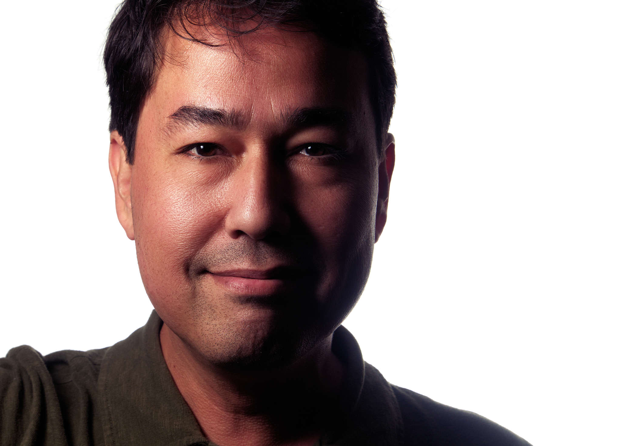
Pat David Painting by Gustavo Deveze
My headshot, as painted by Gustavo Deveze

These artists adapted by not only emulating the results of various techniques, but by pushing forward the boundaries of what was possible through these new (Free Software) tools.

Impetus

Digital painting discussions with Free Software lacks a good outlet for collaboration that can open the discussion for others to learn from and participate in. This is a similar situation the Free Software + photography world was in that prompted the creation of pixls.us.

Due to this, both Americo Gobbo and Elle Stone reached out to us to see if we could create a new category in the community about Digital Painting with a focus on promoting serious discussion around techniques, processes, and associated tools.

Both of them have been working hard on advancing the capabilities and quality of various Free Software tools for years now. Americo brings with him the interest of other painters who want to help accelerate the growth and adoption of Free Software projects for painting (and more) in a high-quality and professional capacity. A little background about them:

Americo Gobbo studied Fine Arts in Bologna, Italy. Today he lives and works in Brazil, where he continues to develop studies and create experimentation with painting and drawing mainly within the digital medium in which he tries to replicate the traditional effects and techniques from the real world to the virtual.

Imaginary Landscape Painting by Americo Gobbo
Imaginary Landscape - Wet sketches, experiments on GIMP 2.9.+
Americo Gobbo, 2016.

Elle Stone is an amateur photographer with a long-standing interest in the history of photography and print making, and in combining painting and photography. She’s been contributing to GIMP development since 2012, mostly in the areas of color management and proper color mixing and blending.

Leaves in May Image by Elle Stone
Leaves in May, GIMP-2.9 (GIMP-CCE)
Elle Stone, 2016.

Artists

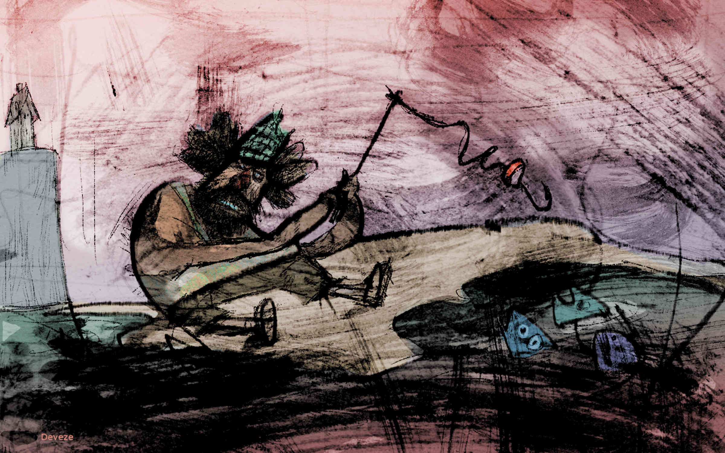
With this introductory post to the new Digital painting category forum we feature Gustavo Deveze, who is a Visual Artist using free software. Deveze’s work is characterized by mixing different medias and techniques. With future posts we want to continue featuring artists using free software.

Gustavo Deveze

Gustavo Deveze is a visual artist and lives in Buenos Aires. He trained as a draftsman at the National School of Fine Arts “Manuel Belgrano”, and filmmaker at IDAC - Instituto de Arte Cinematográfica in Avellaneda, Argentina.

His works utilize different materials and supports and he is published by different publishers. Although in the last years he works mainly in digital format and with free software. He has participated in national and international shows and exhibitions of graphics and cinema with many awards. His last exposition can be seen on issuu.com: https://issuu.com/gustavodeveze/docs/inadecuado2edicion

Website: http://www.deveze.com.ar

Cudgels and Bootlickers: The Emperor's happiness - Gustavo Deveze
Cudgels and Bootlickers: The Emperor’s happiness - Gustavo Deveze.
Let's be clear: the village's idiot is not tall... - Gustavo Deveze
Let’s be clear: the village’s idiot is not tall… - Gustavo Deveze.

Digital Painting Category

The new Digital Painting category is for discussing painting techniques, processes, and associated tools in a digital environment using Free/Libre software. Some relevant topics might include:

  • Emulating non-digital art, drawing on diverse historical and cultural genres and styles of art.

  • Emulating traditional “wet darkroom” photography, drawing on the rich history of photographic and printmaking techniques.

  • Exploring ways of making images that were difficult or impossible before the advent of new algorithms and fast computers to run them on, including averaging over large collections of images.

  • Discussion of topics that transcend “just photography” or “just painting”, such as composition, creating a sense of volume or distance, depicting or emphasizing light and shadow, color mixing, color management, and so forth.

  • Combining painting and photography: Long before digital image editing artists already used photographs as aids to and part of making paintings and illustrations, and photographers incorporated painting techniques into their photographic processing and printmaking.

  • An important goal is also to encourage artists to submit tutorials and videos about Digital Painting with Free Software and to also submit high-quality finished works.

Say Hello!

Please feel free to stop into the new [Digital Painting category][dp-forum], introduce yourself, and say hello! I look forward to seeing what our fellow artists are up to.

All images not otherwise specified are licensed [CC-BY-NC-SA][] [CC-BY-NC-SA]: https://creativecommons.org/licenses/by-nc-sa/4.0/ [dp-forum]: https://discuss.pixls.us/c/digital-painting
Controlled violence

With Stig Abell and Thea Lenarduzzi: – Jennifer Howard on the threats and thrills of the internet: what price for online freedom?; Rebecca Lemov considers the neurological effects of torture, plus the chilling account of a man who survived Guantanamo; Tom Shippey on the liberated and oppressed societies of Scandinavia, where light meets dark.Find out more at www.the-tls.co.uk

Hosted on Acast. See acast.com/privacy for more information.

💾

A Masashi Wakui look with GIMP


A Masashi Wakui look with GIMP

A color bloom fit for night urban landscapes

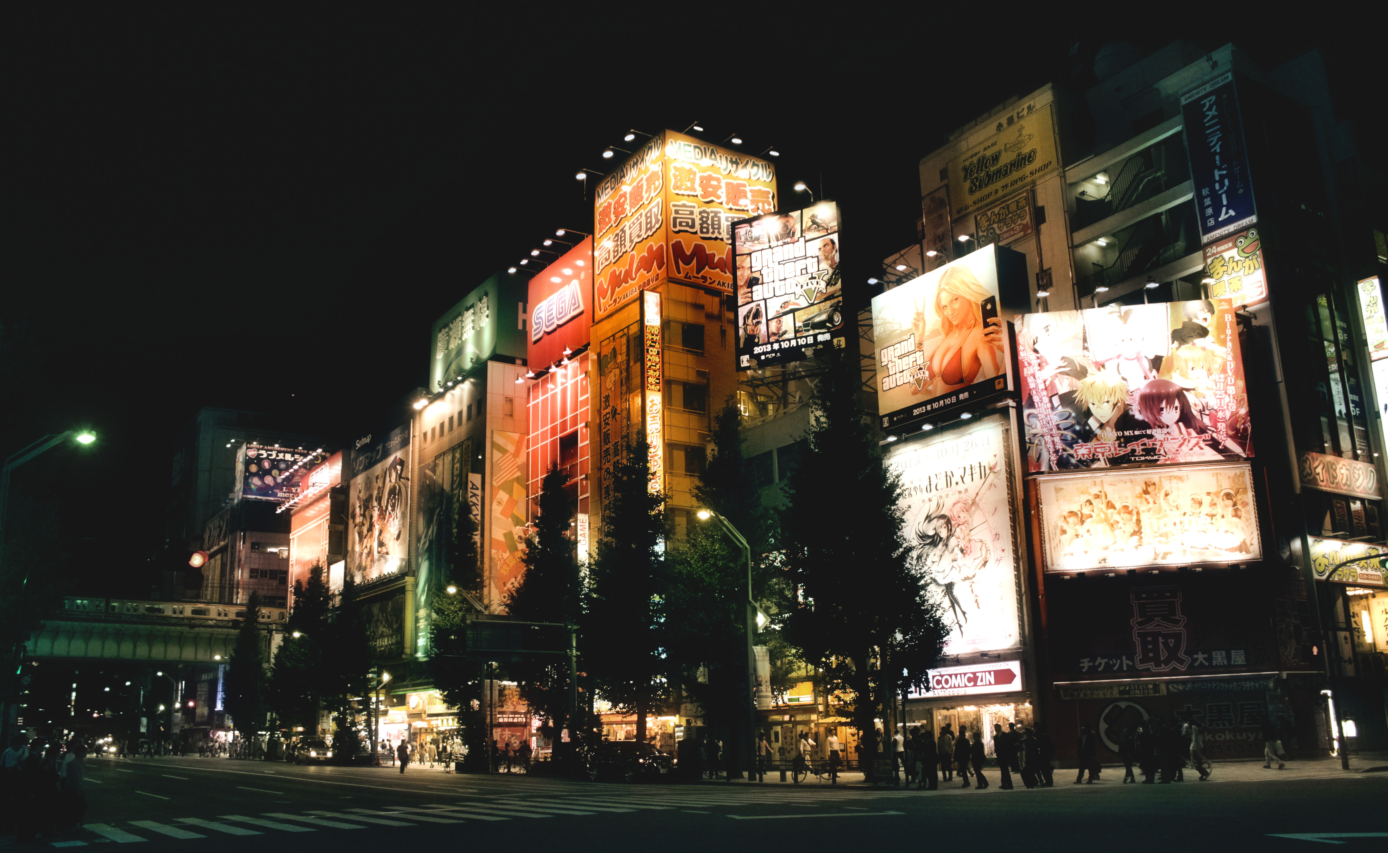
This tutorial explains how to achieve an effect based on the post processing by photographer Masashi Wakui. His primary subjects appear as urban landscape views of Japan where he uses some pretty and aggressive color toning to complement his scenes along with a soft ‘bloom’ effect on the highlights. The results evoke a strong feeling of an almost cyberpunk or futuristic aesthetic (particularly for fans of Bladerunner or Akira!).

Untitled Untitled Untitled

This tutorial started its life in the pixls.us forum, which was inspired by a forum post seeking assistance on replicating the color grading and overall look/feel of Masashi’s photography.

Prerequisites

To follow along will require a couple of plugins for GIMP.

The Luminosity Mask filter will be used to target color grading to specific tones. You can find out more about luminosity masks in GIMP at Pat David’s blog post and his follow-up blog post. If you need to install the script, directions can be found (along with the scripts) at the PIXLS.US GIMP scripts git repository.

You will also need the Wavelet decompose plugin. The easiest way to get this plugin is to use the one available in G’MIC. As a bonus you’ll get access to many other incredible filters as well! Once you’ve installed G’MIC the filter can be found under
Details → Split details [wavelets].

We will do some basic toning and then apply Gimp’s wavelet decompose filter to do some magic. Two things will be used from the wavelet decompose results:

  • the residual
  • the coarsest wavelet scale (number 8 in this case)

The basic idea is to use the residual of the the wavelet decompose filter to color the image. What this does is average and blur the colors. The trick strengthens the effect of the surroundings being colored by the lights. The number of wavelet scales to use depends on the pixel size of the picture; the relative size of the coarsest wavelet scale compared to the picture is the defining parameter. The wavelet scale 8 will then produce overemphasised local contrasts, which will accentuate the lights further. This works nicely in pictures with lights as the brightest areas will be around lights. Used on daytime picture this effect will also accentuate brighter areas which will lead to a kind of “glow” effect. I tried this as well and it does look good on some pictures while on others it looks just wrong. Try it!

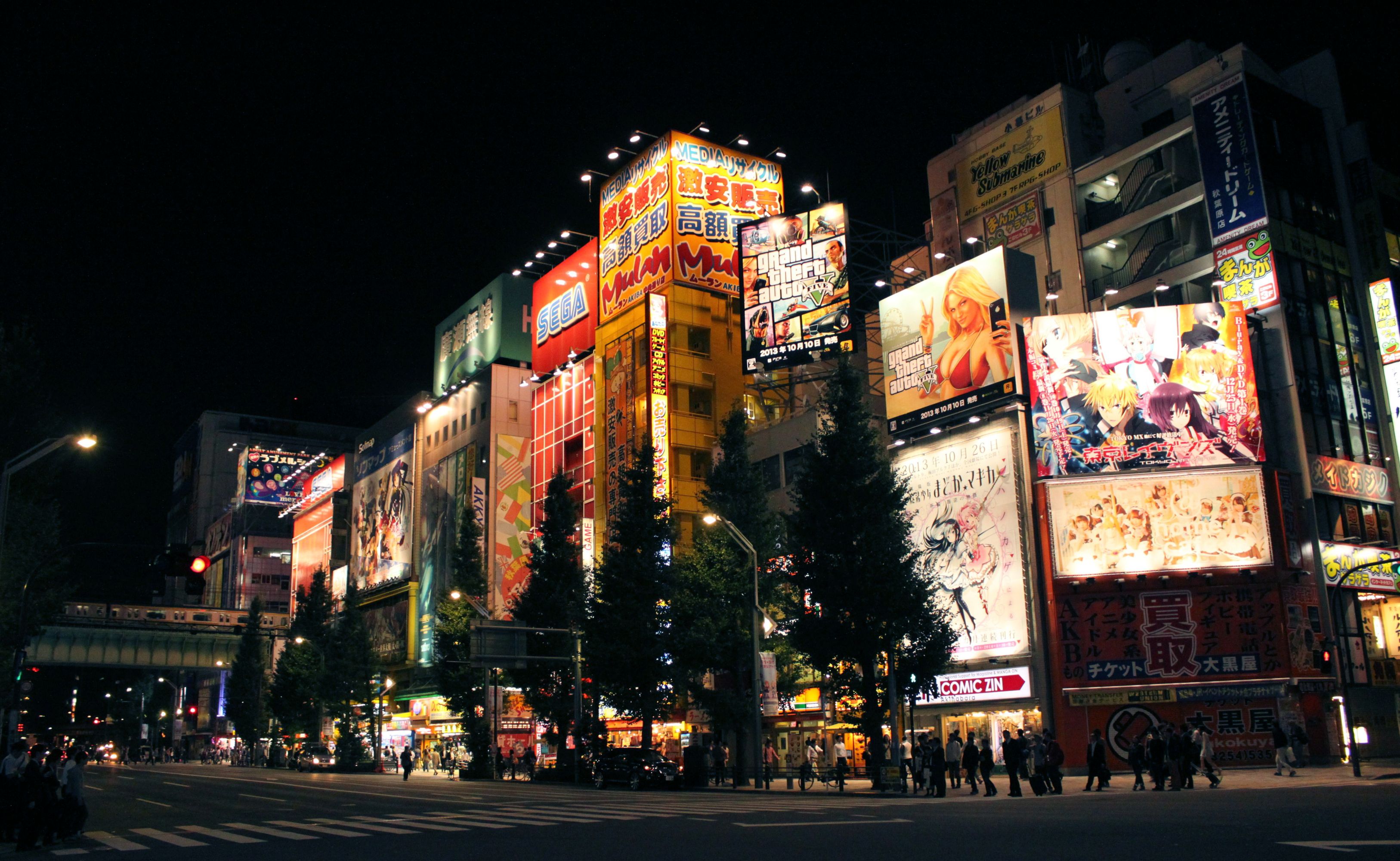
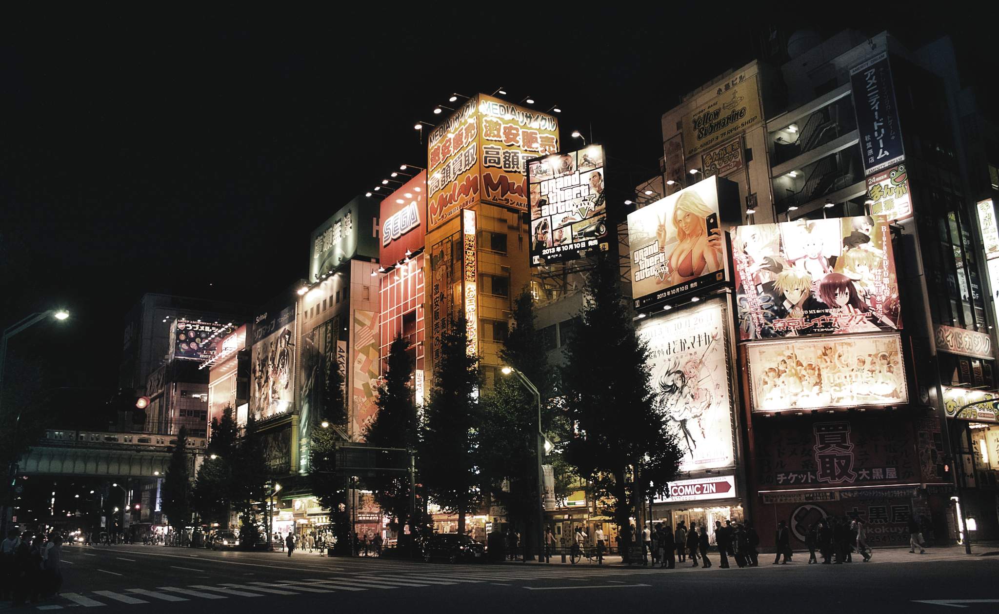
We will be applying all the following steps to this picture, taken in Akihabara, Tokyo.

The unaltered photograph
The starting image (download full resolution).
  1. Apply the luminosity mask filter to the base picture. We will use this later.

    Filters → Generic → Luminosity Masks

  2. Duplicate the base picture (Ctrl+Shift+D).

    Layer → Duplicate Layer

  3. Tone the shadows of the duplicated picture using the tone curve by lowering the reds in the shadows. If you want your shadows to be less green, slightly raise the blues in the shadows.

    Colors → Curves

    The toning curves
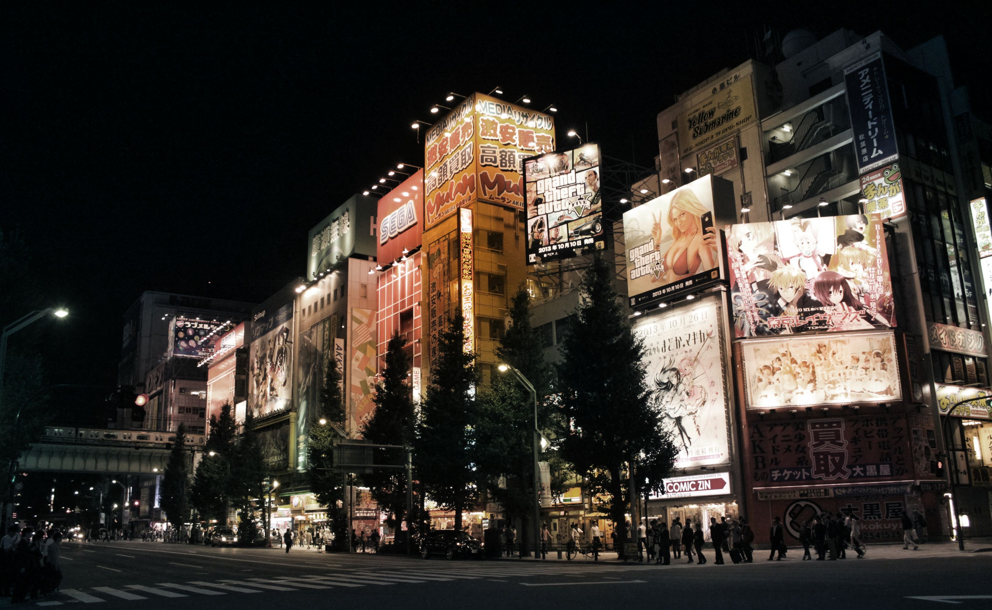
    The photograph with the toning curve applied
  4. Apply a layer mask to the duplicated and toned picture. Choose the DD luminosity mask from a channel.

    Layer → Mask → Add Layer Mask

    Luminosity Mask Added
  5. With both layers visible, create a new layer from what is visible. Call this layer the “blended” layer.

    Layer → New from Visible

    The photograph after the blended layer
  6. Apply the wavelet decompose filter to the “blended” layer and choose 9 as number of detail scales. Set the G’MIC output mode to “New layer(s)” (see below).

    Filters → G’MIC
    Details → Split Details [wavelets]

    G'MIC Split Details Wavelet Decompose dialog
    Remember to set G’MIC to output the results on New Layer(s).
  7. Make the blended and blended [residual] layers visible. Then set the mode of the blended [residual] layer to color. This will give you a picture with averaged, blurred colors.

    The fully colored photograph
  8. Turn the opacity of the blended [residual] down to 70%, or any other value to your taste, to bring back some color detail.

    The partially colored photograph
  9. Turn on the blended [scale #8] layer, set the mode to grain merge, and see how the lights start shining. Adjust opacity to taste.

    The augmented contrast layer
  10. Optional: Turn the wavelet scale 3 (or any other) on to sharpen the picture and blend to taste.

  11. Make sure the following layers are visible:

    • blended
    • residual
    • wavelet scale 8
    • Any other wavelet scale you want to use for sharpening
  12. Make a new layer from visible

    Layer → New from Visible

  13. Raise and slightly crush the shadows using the tone curve.

    Raise the shadow curve
  14. Optional: Adjust saturation to taste. If there are predominantly white lights and the colors come mainly from other objects, the residual will be washed out, as is the case with this picture.

    I noticed that the reds and yellows were very dominant compared to greens and blues. So using the Hue-Saturation dialog I raised the master saturation by +70 and lowered the yellow saturation by -50 and lowered the red saturation by -40 all using an overlap of _60_.

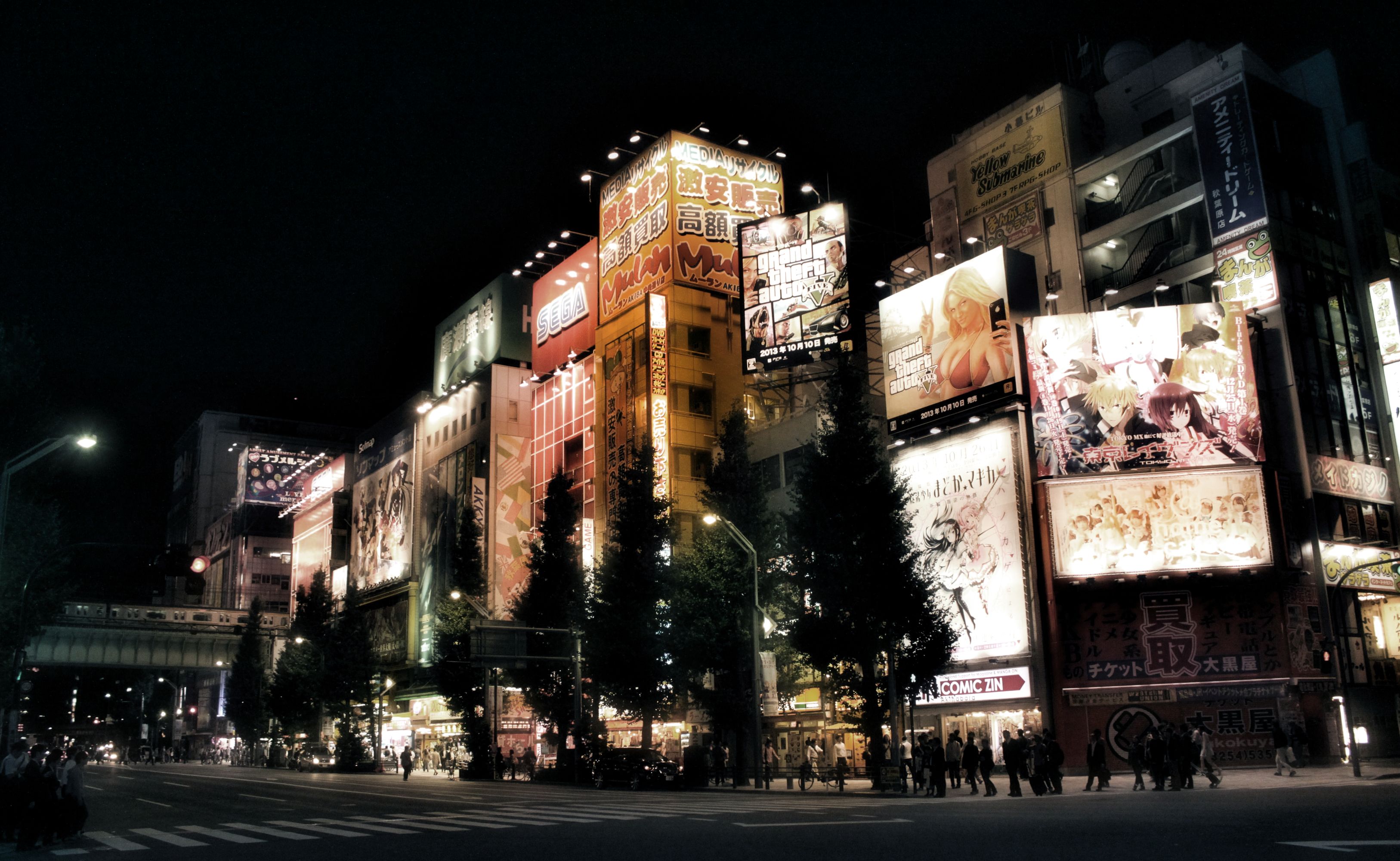
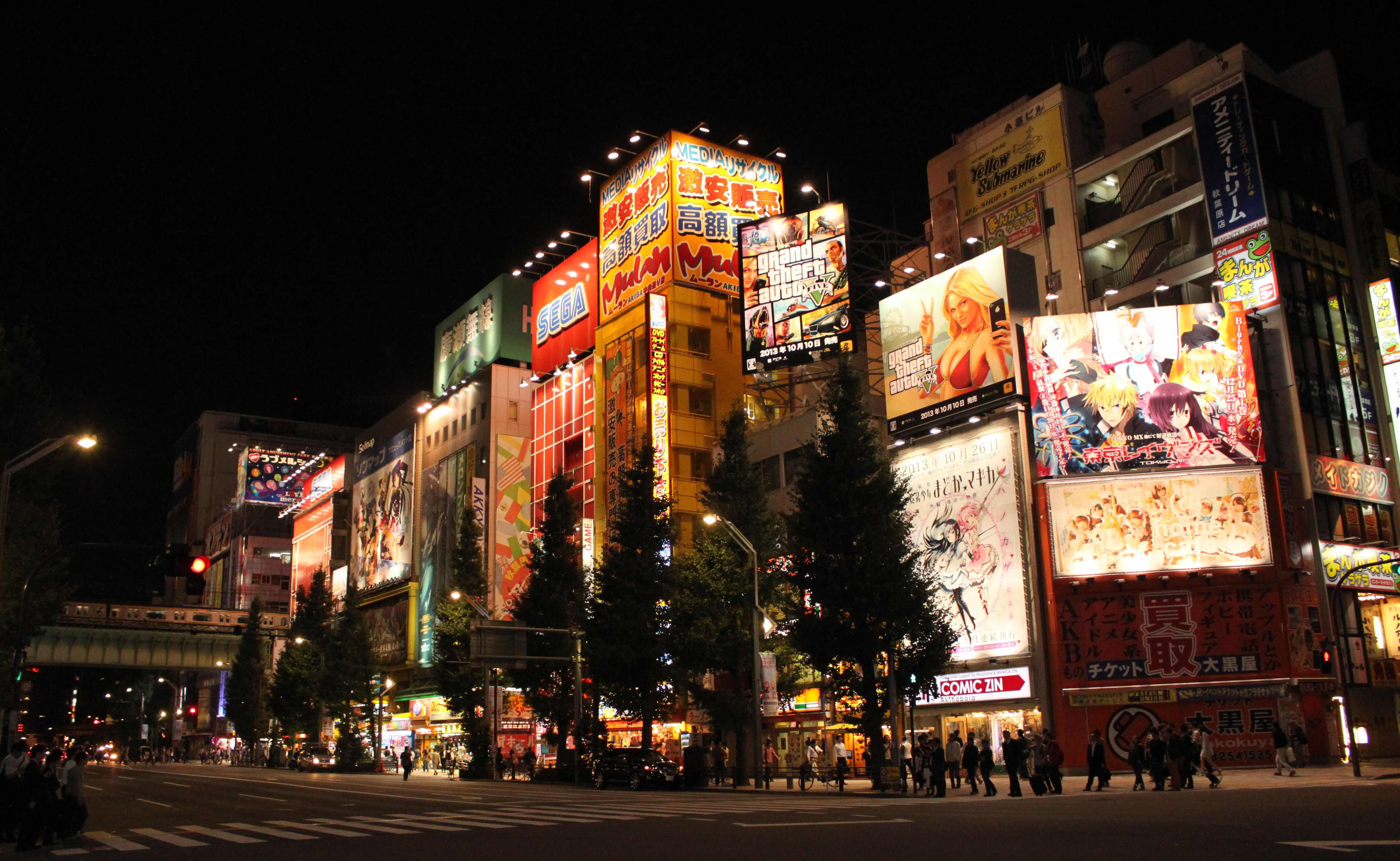
The final result:

The final image!
The final result. (Click to compare to original.)
Download the full size result.

Books of the Year

Stig Abell and Thea Lenarduzzi are joined by Fiction editor Toby Lichtig and Arts editor Lucy Dallas to discuss their favourite books of 2016, plus the titles they guiltily haven't read (yet), old favourites, and a few disappointments; to end the show, Alan Jenkins, TLS Poetry editor, reads "The Song of the Swimmer" by J. A. Symonds, a feverish poem which could never have been shared in the writer's lifetime and which is published for the first time in this week's issue of the TLS.

Hosted on Acast. See acast.com/privacy for more information.

💾

Giving Thanks


Giving Thanks

For an awesome community!

Here in the U.S., we have a big holiday coming up this week: Thanksgiving. Serendipitously, this holiday also happens to fall when a few neat things are happening around the community, and what better time is there to recognize some folks and to give thanks of our own? No time like the present!

A Special Thanks

I feel a special “Thank You” should first go to a photographer and fantastic supporter of the community, Dimitrios Psychogios. Last year for our trip to Libre Graphics Meeting, London he stepped up with an awesome donation to help us bring some fun folks together.

LGM2016 Dinner
Fun folks together.
Mairi, the darktable nerds, a RawTherapee nerd, and a PhotoFlow nerd.
(and the nerd taking the photo, patdavid)

This year he was incredibly kind by offering a donation to the community (completely unsolicited) that covers our hosting and infrastructure costs for an entire year! So on behalf of the community, Thank You for your support, Dimitrios!

I’ll be creating a page soon that will list our supporters as a means of showing our gratitude. Speaking of supporters and a new page on the site…

A Support Page

Someone had asked about the possibility of donating to the community on a post. We were talking about providing support in darktable for using a midi controller deck and the costs for some of the options weren’t too extravagant. This got us thinking that enough small donations could probably cover something like this pretty easily, and if it was community hardware we could make sure it got passed around to each of the projects that would be interested in creating support for it.

KORG NanoControl2
An example midi-controller that we might get support
for in darktable and other projects.

That conversation had me thinking about ways to allow folks to support the community. In particular, ways to make it easy to provide support on an on-going basis if possible (in addition to simple, single donations). There are goal-oriented options out there that folks are probably already familiar with (Kickstarter, Indiegogo and others) but the model for us is less goal-oriented and more about continuous support.

Patreon was an option as well (and I already had a skeleton Patreon account set up), but the fees were just too much in the end. They wanted a flat 5% along with the regular PayPal fees. The general consensus among the staff was that we wanted to maximize the funds getting to the community.

The best option in the end was to create a merchant account on PayPal and manually set up the various payment options. I’ve set them up similar to how a service like Patreon might run with four different recurring funding levels and an option for a single one-time payment of whatever a user would like. Recurring levels are nice because they make it easier to plan with.

We’re Not Asking

Our requirements for the infrastructure of the site are modest and we haven’t actively pursued support or donations for the site before. That hasn’t changed.

We’re not asking for support now. The best way that someone can help the community is by being an active part of it.

Engaging others, sharing what you’ve done or learned, and helping other users out wherever you can. This is the best way to support the community.

I purposely didn’t talk about funding before because I don’t want folks to have to worry or think about it. And before you ask: no, we are not and will not run any advertising on the site. I’d honestly rather just keep paying for things out of my pocket instead.

We’re not asking for support, but we’ll accept it.

With that being said, I understand that there’s still some folks that would like to contribute to the infrastructure or help us to get hardware to add support in projects and more. So if you do want to contribute, the page for doing so can be found here:

https://pixls.us/support

There are four recurring funding levels of $1, $3, $5, and $10 per month. There is also a one-time contribution option as well.

We also have an Amazon Affiliate link option. If you’re not familiar with it, you simply click the link to go to Amazon.com. Then anything you buy for the next 24 hours will give us some small percentage of your purchase price. It doesn’t affect the price of what you’re buying at all. So if you were going to purchase something from Amazon anyway, and don’t mind - then by all means use our link first to help out!


1000 Users

This week we also finally hit 1,000 users registered on discuss! Which is just bananas to me. I am super thankful for each and every member of the community that has taken the time to participate, share, and generally make one of the better parts of my day catching up on what’s been going on. You all rock!

While we’re talking about a number “1” with bunch of zeros after it, we recently made some neat improvements to the forums…

100 Megabytes

We are a photography community and it seemed stupid to have to restrict users from uploading full quality images or raw files. Previously it was a concern because the server the forums are hosted on have limited disk space (40GB). Luckily, Discourse has an option for storing all uploads to the forum on Amazon S3 buckets.

I went ahead and created some S3 buckets so that any uploads to the forums will now be hosted on Amazon instead of taking up precious space on the server. The costs are quite reasonable (around $0.30/GB right now), and it also means that I’ve been able to bump the upload size to 100MB for forum posts! You can now just drag and drop full resolution raw files directly into the post editor to include the file!

Drag and Drop files in discuss
70MB GIMP .xcf file? Just drag-and-drop to upload, no problem! :)

Travis CI Automation

On a slightly geekier note, did you know that the code for the entire website is available on Github? It’s also licensed liberally (CC-BY-SA), so no reason not to come and fiddle with things with us! One of the features of using Github is integration with Travis CI (Continuous Integration).

What this basically means is that every commit to the Github repo for the website gets picked up by Travis and built to test that everything is working ok. You can actually see the history of the website builds there.

I’ve now got it set up so that when a build is successful on Travis, it will automatically publish the results to the main webserver and make it live. Our build system, Metalsmith, is a static site generator. This means that we build the entire website on our local computers when we make changes, and then publish all of those changes to the webserver. This change automates that process for us now by handling the building and publishing if everything is ok.

In fact, if everything is working the way I think it should, this very blog post will be the first one published using the new automated system! Hooray!

You can poke me or @paperdigits on discuss if you want more details or feel like playing with the website.

Mica

Speaking of @paperdigits, I want to close this blog post with a great big “Thank You!“ to him as well. He’s the only other person insane enough to try and make sense of all the stuff I’ve done building the site so far, and he’s been extremely helpful hacking at the website code, writing articles, make good infrastructure suggestions, taking the initiative on things (t-shirts and github repos), and generally being awesome all around.

Lionel Shriver: "Terror as recreation"

Catharine Morris, at the 2016 Singapore Writers Festival, interviews the American novelist and journalist Lionel Shriver about Trump, Brexit and her unsettling new novel, The Mandibles. Find out more at www.the-tls.co.uk

Hosted on Acast. See acast.com/privacy for more information.

💾

The life in the work

With Stig Abell and Thea Lenarduzzi – Seamus Perry on the difficult, "spiritually dyspeptic" life and work of D. H. Lawrence; Ruth Scurr on two new books by Elena Ferrante, and the struggle over her name; Kathryn Hughes on the knotty, globe-spanning cultural life of hair; and finally, a snippet from our recent interview with the American author Lionel Shriver: can fiction contain the real-life Trump?

Hosted on Acast. See acast.com/privacy for more information.

💾

João Almeida's darktable Presets


João Almeida's darktable Presets

A gorgeous set of film emulation for darktable

I realize that I’m a little late to this, but photographer João Almeida has created a wonderful set of film emulation presets for darktable that he uses in his own workflow for personal and commisioned work. Even more wonderful is that he has graciously released them for everyone to use.

These film emulations started as a personal side project for João, and he adds a disclaimer to them that he did not optimize them all for each brand or model of his cameras. His end goal was for these to be as simple as possible by using a few darktable modules. He describes it best on his blog post about them:

The end goal of these presets is to be as simple as possible by using few Darktable modules, it works solely by manipulating Lab Tone Curves for color manipulation, black & white films rely heavily on Channel Mixer. Since I what I was aiming for was the color profiles of each film, other traits related with processing, lenses and others are unlikely to be implemented, this includes: grain, vignetting, light leaks, cross-processing, etc.

Some before/after samples from his blog post:

João Almeida Portra 400 sample
João Portra 400
(Click to compare to original)
João Alemida Kodachrome 64 sample
João Kodachrome 64
(Click to compare to original)
João Alemida Velvia 50 sample
João Velvia 50
(Click to compare to original)

You can read more on João’s website and you can see many more images on Flickr with the #t3mujinpack tag. The full list of film emulations included with his pack:

  • AGFA APX 25, 100
  • Fuji Astia 100F
  • Fuji Neopan 1600, Acros 100
  • Fuji Pro 160C, 400H, 800Z
  • Fuji Provia 100F, 400F, 400X
  • Fuji Sensia 100
  • Fuji Superia 100, 200, 400, 800, 1600, HG 1600
  • Fuji Velvia 50, 100
  • Ilford Delta 100, 400, 3200
  • Ilford FP4 125
  • Ilford HP5 Plus 400
  • Ilford XP2
  • Kodak Ektachrome 100 GX, VS
  • Kodak Ektar 100
  • Kodak Elite Chrome 400
  • Kodak Kodachrome 25, 64, 200
  • Kodak Portra 160 NC, VC
  • Kodak Portra 400 NC, UC, VC
  • Kodak Portra 800
  • Kodak T-Max 3200
  • Kodak Tri-X 400

If you see João around the forums stop and say hi (and maybe a thank you). Even better, if you find these useful, consider buying him a beer (donation link is on his blog post)!

Related Reading

Against nature

With Stig Abell and Lucy Dallas:Mary Beard shares her experience of election night in America; Mark Bostridge discusses Queen Victoria and the stinginess of the Royal Archive; and Nick Groom makes the case for wondrous nature writing.Find out more at www.the-tls.co.uk

Hosted on Acast. See acast.com/privacy for more information.

💾

Aligning Images with Hugin


Aligning Images with Hugin

Easily process your bracketed exposures

Hugin is an excellent tool for for aligning and stitching images. In this article, we’ll focus on aligning a stack of images. Aligning a stack of images can be useful for achieving several results, such as:

  • bracketed exposures to make an HDR or fused exposure (using enfuse/enblend), or manually blending the images together in an image editor
  • photographs taken at different focal distances to extend the depth of field, which can be very useful when taking macros
  • photographs taken over a period of time to make a time-lapse movie

For the example images included with this tutorial, the focal length is 12mm and the focal length multiplier is 1. A big thank you to @isaac for providing these images.

You can download a zip file of all of the sample Beach Umbrellas images here:

Download Outdoor_Beach_Umbrella.zip (62MB)

Other sample images to try with this tutorial can be found at the end of the post.

These instructions were adapted from the original forum post by @Carmelo_DrRaw; many thanks to him as well.

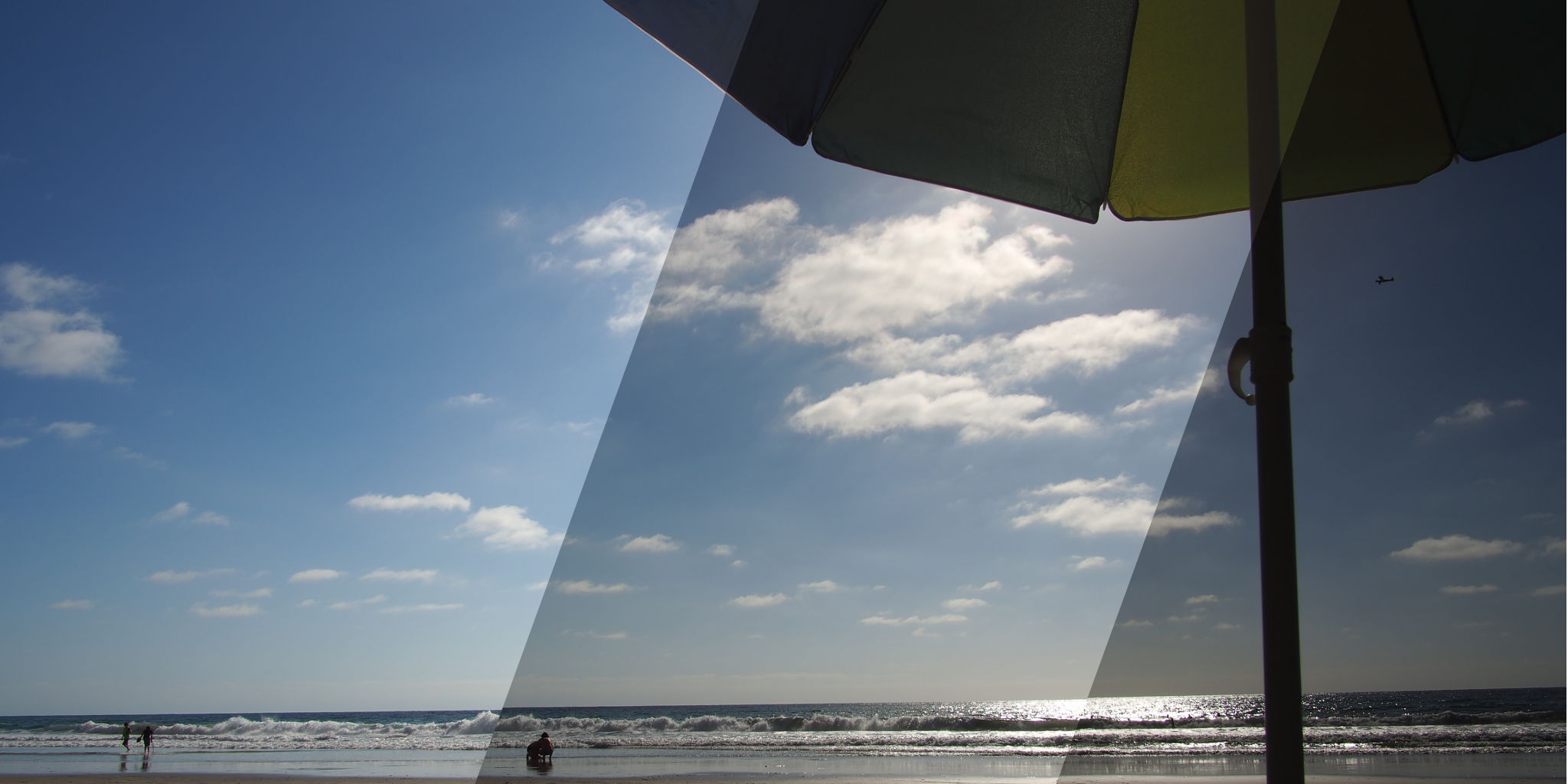
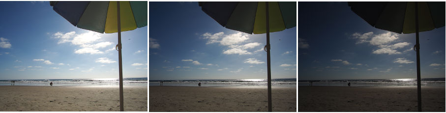
We’re going to align these bracked exposures so we can blend them:

Blend Examples
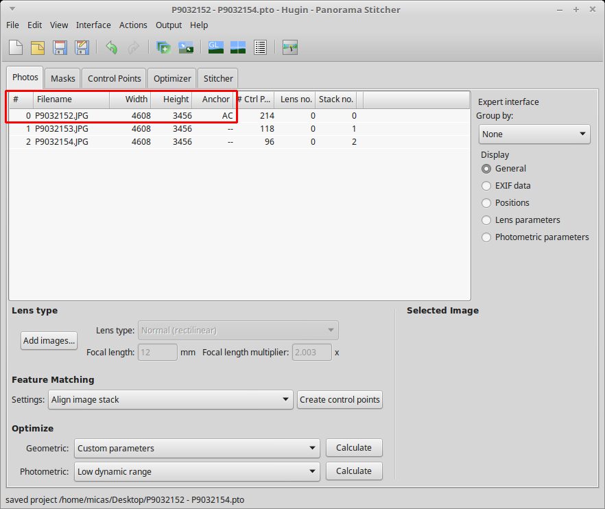
  1. Select Interface → Expert to set the interface to Expert mode. This will expose all of the options offered by Hugin.

  2. Select the Add images… button to load your bracketed images. Select your images from the file chooser dialog and click Open.

  3. Set the optimal setting for aligning images:

    • Feature Matching Settings: Align image stack
    • Optimize Geometric: Custom parameters
    • Optimize Photometric: Low dynamic range
  4. Select the Optimizer tab.

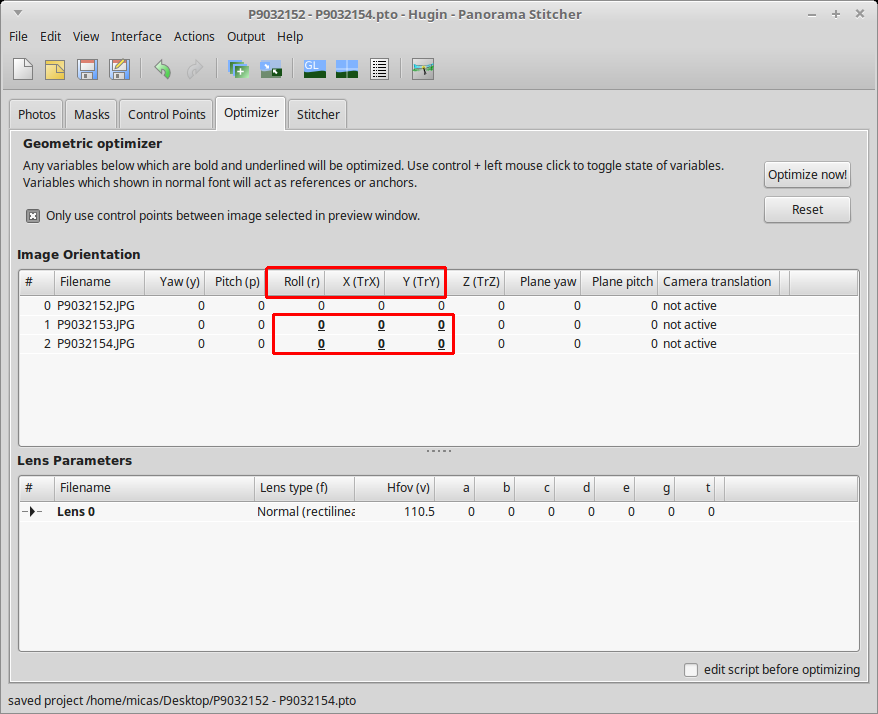
  5. In the Image Orientation section, select the following variables for each image:

    • Roll
    • X (TrX) [horizontal translation]
    • Y (TrY) [vertical translation]

    You can Ctrl + left mouse click to enable or disable the variables.

    roll x y Hugin

    Note that you do not need to select the parameters for the anchor image:

    Hugin anchor image
  6. Select Optimize now! and wait for the software to finish the calculations. Select Yes to apply the changes.

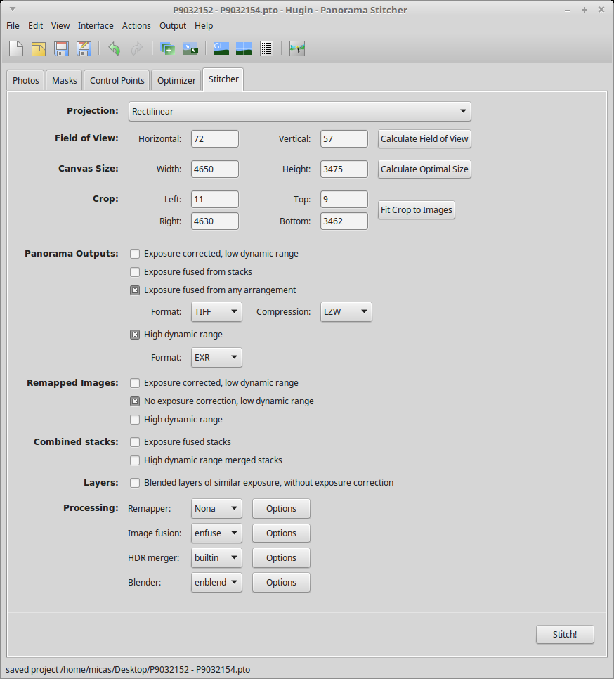
  7. Select the Stitcher tab.

  8. Select the Calculate Field of View button.

  9. Select the Calculate Optimal Size button.

  10. Select the Fit Crop to Images button.

  11. To have the maximum number of post-processing options, select the following image outputs:

    • Panorama Outputs: Exposure fused from any arrangement
      • Format: TIFF
      • Compression: LZW
    • Panorama Outputs: High dynamic range
      • Format: EXR
    • Remapped Images: No exposure correction, low dynamic range

      Hugin Image Export
  12. Select the Stitch! button and choose a place to save the files. Since Hugin generates quite a few temporary images, save the PTO file in it’s own folder.

Hugin will output the following images:

  • a tif file blended by enfuse/enblend
  • an HDR image in the EXR format
  • the individual images after remapping and without any exposure correction that you can import into the GIMP as layers and blend manually.

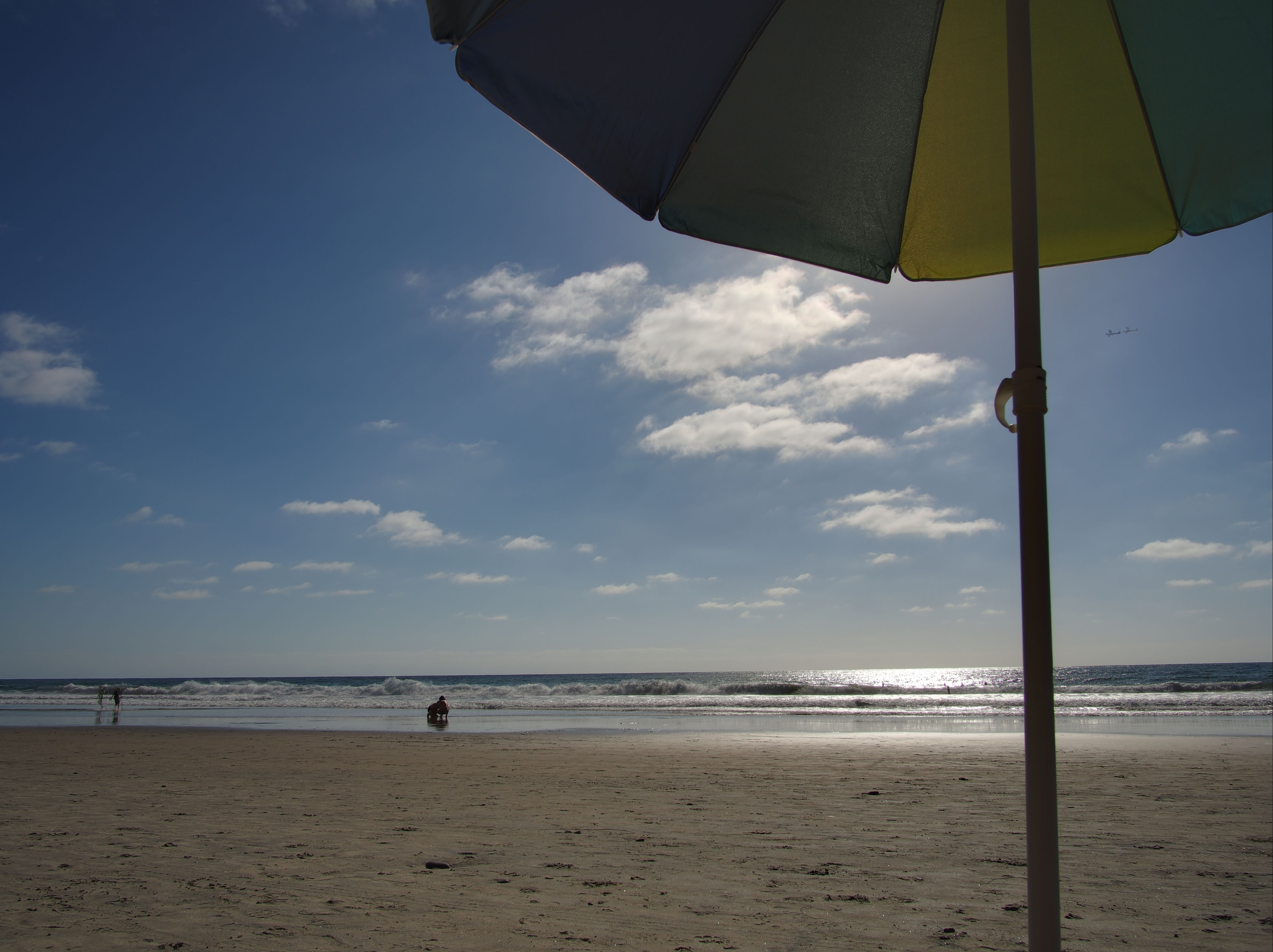
You can see the result of the image blended with enblend/enfuse:

Beach Umbrella Fused

With the output images, you can:

  • edit the enfuse/enblend tif file further in the GIMP or RawTherapee
  • tone map the EXR file in LuminanceHDR
  • manually blend the remapped tif files in the GIMP or PhotoFlow

Image files

  • Camera: Olympus E-M10 mark ii
  • Lens: Samyang 12mm F2.0

Indoor_Guitars

Download Indoor_Guitars.zip (75MB)

  • 5 brackets
  • ±0.3 EV increments
  • f5.6
  • focus at about 1m
  • center priority metering
  • exposed for guitars, bracketed for the sky, outdoor area, and indoor area
  • manual mode (shutter speed recorded in EXIF)
  • shot in burst mode, handheld

Outdoor_Beach_Umbrella

Download Outdoor_Beach_Umbrella.zip (62MB)

  • 3 brackets
  • ±1 EV increments
  • f11
  • focus at infinity
  • center priority metering
  • exposed for the water, bracketed for umbrella and sky
  • manual mode (shutter speed recorded in EXIF)
  • shot in burst mode, handheld

Outdoor_Sunset_Over_Ocean

Download Outdoor_Sunset_Over_Ocean.zip (60MB)

  • 3 brackets
  • ±1 EV increments
  • f11
  • focus at infinity
  • center priority metering
  • exposed for the darker clouds, bracketed for darker water and lighter sky areas and sun
  • manual mode (shutter speed recorded in EXIF)
  • shot in burst mode, handheld

Licencing Information

Violence and poetry

With Stig Abell and Thea Lenarduzzi – our History editor David Horspool on the (uniquely?) violent English and seven centuries' worth of pacification; Mark Hutchinson on the lesser-known modernist poet Basil Bunting and his love-hate relationship with T. S. Eliot; Fiona Green on a bold new collection of Emily Dickinson poems – does it bring us closer to the reclusive poet herself?; and finally, we have a recording of the late Robert Conquest, a man best known for his groundbreaking work as a historian, reading his poem "The Rokeby Venus" in 1960.

Hosted on Acast. See acast.com/privacy for more information.

💾

The Royal Photographic Society Journal


The Royal Photographic Society Journal

Who let us in here?

The Journal of the Photographic Society is the journal for one of oldest photographic societies in the world: the Royal Photographic Society. First published in 1853, the RPS Journal is the oldest photographic periodical in the world (just edging out the British Journal of Photography by about a year).

So you can imagine my doubt when confronted with an email about using some material from pixls.us for their latest issue…


If the name sounds familiar to anyone it may be from a recent post by Joe McNally who is featured prominently in the September 2016 issue. He was also just inducted as a fellow into the society!

RPS Journal 2016-09 Cover

It turns out my initial doubts were completely unfounded, and they really wanted to run a page based off one of our tutorials. The editors liked the Open Source Portrait tutorial. In particular, the section on using Wavelet Decompose to touch up the skin tones:

RPS Journal 2016-11 PD
Yay Mairi!

How cool is that? I actually searched the archive and the only other mention I can find of GIMP (or any other F/OSS) is from a “Step By Step” article written by Peter Gawthrop (Vol. 149, February 2009). I think it’s pretty awesome that we can promote a little more exposure for Free Software alternatives. Especially in more mainstream publications and to a broader audience!

Arnold Newman Portraits


Arnold Newman Portraits

The beginnings of "Environmental Portraits"

Anyone that has spent any time around me would realize that I’m particularly fond of portraits. From the wonderful works of Martin Schoeller to the sublime Dan Winters, I am simply fascinated by a well executed portrait. So I thought it would be fun to take a look at some selections from the “father” of environmental portraits - Arnold Newman.

Arnold Newman, Self Portrait, Baltimore MD, 1939

Newman wanted to become a painter before needing to drop out of college after only two years to take a job shooting portraits in a photo studio in Philadelphia. This experience apparently taught him what he did not want to do with photography…

Luckily it may have started defining what he did want to do with his photography. Namely, his approach to capturing his subjects alongside (or within) the context of the things that made them notable in some way. This would became known as “Environmental Portraiture”. He described it best in an interview for American Photo in 2000:

I didn’t just want to make a photograph with some things in the background. The surroundings had to add to the composition and the understanding of the person. No matter who the subject was, it had to be an interesting photograph. Just to simply do a portrait of a famous person doesn’t mean a thing. 1

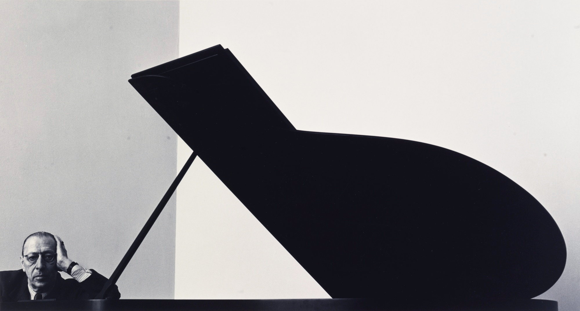
Though he has felt that the term might be unnecessarily restrictive (and possibly overshadows his other pursuits including abstractions and photojournalism), there’s no denying the impact of the results. Possibly his most famous portrait, of composer Igor Stravinsky, illustrates this wonderfully. The overall tones are almost monotone (flat - pun intended, and likely intentional on behalf of Newman) and are dominated by the stark duality of the white wall with the black piano.

Igor Stravinsky by Arnold Newman
Igor Stravinsky, New York, NY, 1946 by Arnold Newman

Newman realized that the open lid of the piano “…is like the shape of a musical flat symbol—strong, linear, and beautiful, just like Stravinsky’s work.” 1 The geometric construction of the image instantly captures the eye and the aggressive crop makes the final composition even more interesting. In this case the crop was a fundamental part of the original composition as shot, but it was not uncommon for him to find new life in images with different crops.

In a similar theme his portraits of both Salador Dalí and John F. Kennedy show a willingness to allow the crop to bring in different defining characteristics of his subjects. In the case of Dalí it allows an abstraction to hang there mimicking the pose of the artist himself. Kennedy is mostly the only organic form, striking a relaxed pose, while dwarfed by the imposing architecture and hard lines surrounding him.

Salvador Dali, New York, NY, 1951
Salvador Dali, New York, NY, 1951 by Arnold Newman
John F. Kennedy, Washington D.C., 1953
John F. Kennedy, Washington D.C., 1953 by Arnold Newman

He manages to bring the same deft handling of placing his subjects in the context of their work with other photographers as well. His portrait of Ansel Adams shows the photographer just outside his studio with the surrounding wilderness not only visible around the frame but reflected in the glass of the doors behind him (and the photographers glasses). Perhaps an indication of the nature of Adams work being to capture natural scenes through glass?

Ansel Adams, 1975 by Arnold Newman

For anyone familiar with the pioneer of another form of photography, Newman’s portrait of (the usually camera shy) Henri Cartier-Bresson will instantly evoke a sense of the artists candid street images. In it, Bresson appears to take the place of one of his subjects caught briefly on the streets in a fleeting moment. The portrait has an almost spontaneous feeling to it, (again) mirroring the style of the work of its subject.

Henri Cartier-Bresson, New York, NY, 1947
Henri Cartier-Bresson, New York, NY, 1947 by Arnold Newman

Eight years after his portrait of surrealist painter Dali, Newman shot another famous (abstraction) artist, Pablo Picasso. This particular portrait is much more intimate and more classically composed, framing the subject as a headshot with little of the surrounding environment as before. I can’t help but think that the placement of the hand being similar in both images is intentional; a nod to the unconventional views both artists brought to the world.

Pablo Picasso,Vallauris, France, 1954
Pablo Picasso,Vallauris, France, 1954 by Arnold Newman

The eloquent Gregory Heisler had a wonderful discussion about Newman for Atlanta Celebrates Photography at the High Musuem in 2008:

Arnold Newman produced an amazing body of work that warrants some time and consideration for anyone interested in portraiture. These few examples simply do not do his collection of portraits justice. If you have a few moments to peruse some amazing images head over to his website and have a look (I’m particularly fond of his extremely design-oriented portrait of chinese-american architect I.M. Pei):

I.M. Pei, New York, NY, 1967
I.M. Pei, New York, NY, 1967 by Arnold Newman

Of historical interest is a look at Newman’s contact sheet for the Stravinsky image showing various compositions and approaches to his subject with the piano. (I would have easily chosen the last image in the first row as my pick.) I have seen the second image in the second row cropped as indicated, which was also a very strong choice. I adore being able to investigate contact sheets from shoots like this - it helps me to humanize these amazing photographers while simultaneously allowing me an opportunity to learn a little about their thought process and how I might incorporate it into my own photography.

Igor Stravinsky contact sheet

To close, a quote from his interview with American Photo magazine back in 2000 that will likely remain relevant to photographers for a long time:

But a lot of photographers think that if they buy a better camera they’ll be able to take better photographs. A better camera won’t do a thing for you if you don’t have anything in your head or in your heart. 1

1 Harris, Mark. “Arnold Newman: The Stories Behind Some of the Most Famous Portraits of the 20th Century.” American Photo, March/April 2000, pp. 36-38

Halloween story special

With Stig Abell, Thea Lenarduzzi and Michael Caines.Three extracts of spooky stories for Halloween. Stig reads from Dracula by Bram Stoker; Thea from Mr Jones by Edith Wharton; and Michael from Two Doctors by MR James.Find out more at www.the-tls.co.uk

Hosted on Acast. See acast.com/privacy for more information.

💾

Shades of censorship

With Stig Abell and Thea Lenarduzzi – Elaine Showalter on how extreme misogyny turned Clinton vs Trump into woman vs man; Jonathan Barnes on the long shadow of Bram Stoker's 'Dracula'; Houman Barekat on 250 years of 'Index on Censorship' and the mutable and myriad threats to free speech; Lara Feigel on two books, by the late Sue Lloyd-Roberts and Lara Pawson, about violence and the sufferings of women around the world – how much progress is there?

Hosted on Acast. See acast.com/privacy for more information.

💾

Ali Smith on Autumn

Toby Lichtig talks to Ali Smith about her new novel, Autumn; plus, an exclusive extract read by the author. Find out more: the-tls.co.uk

Hosted on Acast. See acast.com/privacy for more information.

💾

Life, writing and life-writing

With Stig Abell and Thea Lenarduzzi – Ruth Scurr on Beryl Bainbridge's life, love and works; Jessica Loudis on two memoirs, of New York City and the Chelsea Hotel; ruthless and high-minded or likeable and good-natured? Dinah Birch on the ever-enigmatic J. M. W. Turner; and finally, we're joined by the TLS's resident Shakespearean Michael Caines to talk us through a new compendium of writing on the playwright. Just don't call him the Bard. Find out more: www.the-tls.co.uk

Hosted on Acast. See acast.com/privacy for more information.

💾

The mythical Lévi-Strauss

With Stig Abell and Thea Lenarduzzi – Adam Kuper on French structuralist and hoarder of myths Claude Lévi-Strauss; Joe Paul Kroll on what happened when a slightly belligerent group of eminent German writers visited America; Laura James on the intractable paradox of aid in Africa and different approaches to nation-building; finally, TLS Poetry Editor Alan Jenkins discusses the enigmatic poet Louis Aragon, and reads his new translation "Elsa at the Mirror".Find out more at www.the-tls.co.uk

Hosted on Acast. See acast.com/privacy for more information.

💾

Highlight Bloom and Photoillustration Look


Highlight Bloom and Photoillustration Look

Replicating a 'Lucisart'/Dave Hill type illustrative look

Over in the forums community member Sebastien Guyader (@sguyader) posted a neat workflow for emulating a photo-illustrative look popularized by photographers like Dave Hill where the resulting images often seem to have a sort of hyper-real feeling to them. Some of this feeling comes from a local-contrast boost and slight ‘blooming’ of the lighter tones in the image (though arguably most of the look is due to lighting and compositing of multiple elements).

To illustrate, here are a few representative samples of Dave Hill’s work that reflects this feeling:

Dave Hill Cliff Dave Hill Finishline Lotion Dave Hill Track Dave Hill Nick Saban
A collection of example images. ©Dave Hill

A video of Dave presenting on how he brought together the idea and images for the series the first image above is from:

This effect is also popularized in Photoshop® filters such as LucisArt in an effort to attain what some would (erroneously) call an “HDR” effect. Really what they likely mean is a not-so-subtle tone-mapping. In particular the exaggerated local contrasts is often what garners folks attention.

We had previously posted about a method for exaggerating fine local contrasts and details using the “Freaky Details” method described by Calvin Hollywood. This workflow provides a similar idea but different results that many might find more appealing (it’s not as gritty as the Freaky Details approach).

Sebastien produced some great looking preview images to give folks a feeling for what the process would produce:

BMW IFA-F9 Fashion Woman
Images from pixabay (CC0, public domain): Motorcycle, car, woman.

Replicating a “Dave Hill”/“LucasArt” effect

Sebastien’s approach relies only on having the always useful G’MIC plugin for GIMP. The general workflow is to do a high-pass frequency separation, and to apply some effects like local contrast enhancement and some smoothing on the residual low-pass layer. Then recombine the high+low pass layers to get the final result.

  1. Open the image.
  2. Duplicate the base layer.
    Rename it to “Lowpass”.
  3. With the top layer (“Lowpass”) active, open G’MIC.
  4. Use the Photocomix smoothing filter:

    Testing → Photocomix → Photocomix smoothing

    Set the Amplitude to 10. Apply.
    This is to taste, but a good startig place might be around 1% of the image dimensions (so a 2000px wide image - try using an Amplitude of 20).
  5. Change the “Lowpass” layer blend mode to Grain extract.
  6. Right-Click on the layer and choose New from visible.
    Rename this layer from “Visible“ to something more memorable like “Highpass” and set its layer mode to Grain merge.
    Turn off this layer visibility for now.
  7. Activate the “Lowpass” layer and set its layer blend mode back to Normal.
    The rest of the filters are applied to this “Lowpass” layer.
  8. Open G’MIC again.
    Apply the Simple local contrast filter:

    Details → Simple local contrast

    Using:
    • Edge Sensitivity to 25
    • Iterations to 1
    • Paint effect to 50
    • Post-gamma to 1.20
  9. Open G’MIC again.
    Now apply the Graphic novel filter:

    Artistic → Graphic novel

    Using:
    • check the Skip this step checkbox for Apply Local Normalization
    • Pencil size to 1
    • Pencil amplitude to 100-200
    • Pencil smoother sharpness/edge protection/smoothness
      to 0
    • Boost merging options Mixer to Soft light
    • Painter’s touch sharpness to 1.26
    • Painter’s edge protection flow to 0.37
    • Painter’s smoothness to 1.05
  10. Finally, make the “Highpass” layer visible again to bring back the fine details.

Trying It Out!

Let’s walk through the process. Sebastien got his sample images from the website https://pixabay.com, so I thought I would follow suit and find something suitable from there also. After some searching I found this neat image from Jerzy Gorecki licensed Create Commons 0/Public Domain.

Model
The base image (link).
From pixabay, (CC0 - Public Domain): Jerzy Gorecki.

Frequency Separation

The first steps (1—7) are to create a High/Low pass frequency separation of the image. If you have a different method for obtaining the separation then feel free to use it. Sebastien uses the Photocomix smoothing filter to create his low-pass layer (other options might be Gaussian blur, bi-lateral smoothing, or even wavelets).

The basic steps to do this are to duplicate the base layer, blur it, then set the layer blend mode to Grain extract and create a new layer from visible. The new layer will be the Highpass (high-frequency) details and should have its layer blend mode set to Grain merge. The original blurred layer is the Lowpass (low-frequency) information and should have its layer blend mode set back to Normal.

So, following Sebastien’s steps, duplicate the base layer and rename the layer to “lowpass”. Then open G’MIC and apply:

Testing → Photocomix → Photocomix smoothing

with an amplitude of around 20. Change this to suit your own taste, but about 1% of the image width is a decent starting point. You’ll now have the base layer and the “lowpass” layer above it that has been smoothed:

Photocomix Smoothing
“lowpass” layer after Photocomix smoothing with Amplitude set to 20.

Setting the “lowpass” layer blend mode to Grain extract will reveal the high-frequency details:

Grain Extract HP
The high-frequency details visible after setting the blurred “lowpass” layer blend mode to Grain extract.

Now create a new layer from what is currently visible. Either right-click the “lowpass” layer and choose “New from visible” or from the menus:

Layer → New from Visible

Rename this new layer from “Visible” to “highpass” and set its layer blend mode to Grain merge. Select the “lowpass” layer and set its layer blend mode back to Normal.

Layers

The visible result should be back to what your starting image looked like. The rest of the steps for this tutorial will operate on the “lowpass” layer. You can leave the “highpass” filter visible during the rest of the steps to see what your results will look like.

Modifying the Low-Frequency Layer

These next steps will modify the underlying low-frequency image information to smooth it out and give it a bit of a contrast boost. First the “Simple local contrast” filter will separate tones and do some preliminary smoothing, while the “Graphic novel” filter will provide a nice boost to light tones along with further smoothing.

Simple Local Contrast

On the “lowpass” layer, open G’MIC and find the “Simple local contrast” filter:

Details → Simple local contrast

Change the following settings:

  • Edge Sensitivity to 25
  • Iterations to 1
  • Paint effect to 50
  • Post-gamma to 1.20

This will smooth out overall tones while simultaneously providing a nice local contrast boost. This is the step that causes small lighting details to “pop”:

Simple Local Contrast
After applying the “Simple local contrast” filter.
(Click to compare to the original image)

The contrast increase provides a nice visual punch to the image. The addition of the “Graphic novel” filter will push the overall image much closer to a feeling of a photo-illustration.

Graphic Novel

Still on the “lowpass” layer, re-open G’MIC and open the “Graphic Novel” filter:

Artistic → Graphic novel

Change the following settings:

  • check the Skip this step checkbox for Apply Local Normalization
  • Pencil size to 1
  • Pencil amplitude to 100-200
  • Pencil smoother sharpness/edge protection/smoothness
    to 0
  • Boost merging options Mixer to Soft light
  • Painter’s touch sharpness to 1.26
  • Painter’s edge protection flow to 0.37
  • Painter’s smoothness to 1.05

The intent with this filter is to further smooth the overall tones, simplify details, and to give a nice boost to the light tones of the image:

Graphic Novel
After applying the “Graphic novel” filter.
(Click to compare to the local contrast result)

The effect at 100% opacity can be a little strong. If so, simply adjust the opacity of the “lowpass” layer to taste. In some cases it would probably be desirable to mask areas you don’t want the effect applied to.

I’ve included the GIMP .xcf.bz2 file of this image while I was working on it for this article. You can download the file here (34.9MB). I did each step on a new layer so if you want to see the results of each effect step-by-step, simply turn that layer on/off:

Sample layers
Example XCF layers

Finally, a great big Thank You! to Sebastien Guyader (@sguyader) for sharing this with everyone in the community!

A G’MIC Command

Of course, this wouldn’t be complete if someone didn’t come along with the direct G’MIC commands to get a similar result! And we can thank Iain Fergusson (@Iain) for coming up with the commands:

--gimp_anisotropic_smoothing[0] 10,0.16,0.63,0.6,2.35,0.8,30,2,0,1,1,0,1

-sub[0] [1]

-simplelocalcontrast_p[1] 25,1,50,1,1,1.2,1,1,1,1,1,1
-gimp_graphic_novelfxl[1] 1,2,6,5,20,0,1,100,0,1,0,0.78,1.92,0,0,2,1,1,1,1.26,0.37,1.05
-add
-c 0,255
❌