Login
Login
Henri 11 - "Oh, revoir"


The world is being slowly poisoned, the environment destroyed. Why don’t we care about such an apocalypse more? Clare Saxby joins us to discuss; Mary Beard considers the cultural legacy of Caligula, that most reviled of all emperors, via a revisionist work of fiction told from the perspective of the emperor's exiled sister; as Arsène Wenger's twenty-two year tenure as Arsenal manager draws to a close, the TLS's History editor and Arsenal fan David Horspool shares his thoughts on football's modern myth-making
Books
Mourning Nature: Hope at the heart of ecological loss and grief, edited by Ashlee and Karen Landman Cunsolo
Walking on Lava: Selected works for uncivilised times, edited by Charlotte Du Cann, Dougald Hine, Nick Hunt and Paul Kingsnorth
Energy Humanities: An anthology, edited by Imre Szeman and Dominic Boyer
Caligula by Simon Turney
Hosted on Acast. See acast.com/privacy for more information.
Hosted on Acast. See acast.com/privacy for more information.
With Stig Abell and Lucy Dallas
Real-life millennial Samuel Earle pops in to consider the status of young people in an unequal society, keeping avocado references to a minimum; Ruth Scurr analyses the role of mothers in life and literature; and Madeline Miller talks about inhabiting the role of Circe.
Hosted on Acast. See acast.com/privacy for more information.
Stefan Schmitz is a photographer living in Northern France and specializing in sensual and nude portraits. I stumbled upon his work during one of my searches for photographers using Free Software on Flickr, and as someone who loves shooting portraits his work was an instant draw for me.
He’s a member of the forums here (@beachbum) and was gracious enough recently to spare some time chatting with me. Here is our conversation (edited for clarity)…
Nope, I’m not a professional photographer, and I think I’m quite happy about that. I do happen to photograph my surroundings for ±40 years now, and I have a basic idea about camera-handling and light. Being a pro is about paying invoices by shooting photos, and I fear that the pressure at the end of some months or quarters can easily take the fun out of photography. I’m an engineer and photography is my second love behind wife and kids.
Every now and then some of my pictures are requested and published by some sort of magazine, press or web-service, and I appreciate the attention and exposure, but there is no (or very little) money in the kind of photography I specialize in, so … everything’s OK the way it is.
Starting with photographers: Andreas Feininger, Peter Lindbergh and Alfred Stieglitz. Check out the portrait of Georgia O’Keeffe by Alfred Stieglitz: it’s 100 years old and it’s all there. Pose, light, intensity, personality - nobody has invented anything [like it] afterwards. We all just try to get close. I feel the same when I look at images taken by Peter Lindbergh, but my eternal #1 is Andreas Feininger.
I got the photo-virus from my father and I learned nearly everything from daddy’s well-worn copy of The Complete Photographer [amzn] (Feininger) from 1965. Every single photo in that book is a masterpiece, even the strictly “instructional” ones. You measure every photo-book in the world against this one and they all finish second. Get your copy!
I shoot portraits of women and most of the time they don’t wear clothes. The portrait-part is very important for me: the model must connect with the viewer and ideally the communication goes beyond skin-deep. I want to see (and show) more than just the surface, and when that happens, I just press the shutter-button and try to get out of the way of the model’s performance.
I like women, so I take photos of women. If I were interested in beetles, I’d buy a macro lens and shoot beetles. All kidding aside, I think it’s a natural thing to do. I am married to a beautiful woman, an ex-model, and when she got fed-up with my eternal “can we do one more shoot” requests, we discussed things and she allowed me to go ahead and shoot models. Her support is very important to me, but her taste is very different from mine. I really never asked myself “why” I shoot sensual portraits and nudes. It just feels like “I want to do that” and I feel comfy with it. Does there have to be a reason?
The location is very important for me. Nothing is more boring than blinding a person with a flashlight in front of a gray wallpaper. A room, a window-sill, a landmark - there’s a lot of inspiration out there, and I often think “this is where I want to shoot”. Sometimes my wife tells me of some place she has been to or seen, and I check that out.
Jennifer is a very professional and inspiring model. We’ve worked together quite a number of times and while you may think that this shot was inspired by The Who’s “Pinball Wizard”, I’d answer “right band, wrong song”. It’s The Who, alright, but the song’s “A quick one while he’s away”. I chose this photo because it’s all about Jennifer’s pose and facial expression. It’s sensual, even sexy, but looking at Jennifer’s face you forget about the naked skin and all. There’s beauty, there’s depth … that’s what I’m after.
This shot of Alice is an example for the importance of natural light. There are photographers out there who can arrange light in a similar way, but I doubt that Alice would express this natural serenity in a studio setup with cables and stands and electric-transformers humming. She’s at ease, the light is perfect - I just try to be invisible because I don’t want to ruin the moment.
Try to escape Khiara’s eyes. Go, do it. It’s all there, the pose, the room, the ribbon-chair and the little icon, but those eyes make the picture. I did NOT whiten the eyeballs nor did I dodge the iris, and of course it’s all natural/available light.
I already named Stieglitz’ Georgia O’Keeffe as an inspiration further up - next to that there’s Helmut Newton’s Big Nude III, Henrietta and Kim Basinger’s striptease in 9 1⁄2 weeks (white silk nighty and all). Each one a masterpiece, each one very influential for me. Imagine the truth and depth of Georgia with the force and pride of Henrietta and the erotic playfulness of Kim Basinger. That photo would rule the world.
I would like to work more with women above the age of 35, but it’s hard to find them. In general they stop modeling nude when the kids arrive.
Shooting more often outdoors would be cool, too, but that’s not easy here in northern France - there is no guarantee for good weather, and it’s frustrating when you organize a shoot two weeks in advance just to call it off in the very last minute due to bad weather.
Last but not least there’s a special competition among photographers; it’s totally unofficial and called “the white shirt contest”. Shoot a woman in a white shirt and make everybody “feel” the texture of that shirt. I give it a try on every shoot and very few pictures come out the way I wish. Go for it - it’s way harder than I thought!
There are websites where models and photographers can present their work and get in contact. The biggest-one worldwide is modelmayhem.com, and I highly recommend to become a member. Another good place is tumblr.com, but you have to go through a lot of dirt before you find some true gems. I have made contact via both sites and I recommend them.
You will need some pictures in your portfolio in order to show that you are - in fact - a photographer with a basic idea of portrait-work. If you shoot portraits (I mean really portraits, not some snapshots of granny and the kids under the Christmas-tree), you probably have enough photos on your disk to state the point. But if you don’t and you want to start (nude) portraits, spend some money on a workshop. I did that twice and it really helped me in several ways: communication with the model, how to start a session, do’s and don’ts - and at the end of the day you will drive home with a handful of pictures for your portfolio.
Gear is overrated. I am with Nikon since 1979 and today I own and use two bodies: a 1975 Nikon F2 photomic (bought used in 82), loaded with Kodak Tri-X and a Nikon D610 DSLR. 90% of my pictures are shot with a 50mm standard lens. Next on the list is the 35mm - you will need that in small rooms when the 50mm is already a bit too long and you want to keep some distance. I happen to own a 85mm, but the locations I book and shoot rarely offer enough space to make use of that lens.
There are these cheap, circular 1m silver reflectors on amazon. They cost about 15 €/$ and you get a crappy stand for the same price. That stuff is pure gold - I use the reflector a lot and I highly recommend to learn how to work with it. It’s my little secret weapon when I shoot against the light (see Alice here above).
A camera with a reasonably fast standard lens, a second battery and a silver reflector is all I need. The rest is luxury for me, but I am pretty much a one-trick-pony. Other photographers will benefit more from a bigger kit.
Right - available light is where it’s at. I very rarely shoot with a flash kit today because it distracts me from the work with the model. I’m a loner on the set, no assistants or friends who come and help, so everything must be totally simple and foolproof.
Saying that, I own an alarming number of speedlights, umbrellas, triggers and softboxes, but I don’t need that gear very often. I try to visit the locations before I shoot. I check the directions and plan for a realistic timeframe, so today I will neither find myself in a totally dark dungeon nor in a sun-filled room with contrasts à gogo. Windows to the west - shoot in the morning, windows facing south-east: shooting in the (late) afternoon.
Here’s a shot of Karolina Lewschenko. We took this photo in a hotel room by the end of October and the available (window) light got too weak, so I used an Aurora Firefly 65 cm softbox with a Metz speedlight and set-up some classic Rembrandt-Light. I packed that gear because I knew that our timeframe wasn’t guaranteed to work out perfectly. “Better be safe than sorry”.
Yes, I do. When I visit a place, a possible location, I have some Ideas of where to shoot, what furniture to push around and what pose to try. I can pretty much see the final picture (or my idea of it) before I book the model. Having said that, you know that no battle-plan has ever survived the first shot fired…
When the model arrives, we take some time to walk around the locations and discuss possible sets. We will then start to shoot fully clothed in order to get used to another and see how the light will be on the final shots. It’s very important for me to get feedback from the model. She might say that a pose is difficult for her or hurts after a few seconds, that she’s not comfy with something or that she would like to try a totally different thing here. I always pay a lot of attention to those ideas and - out of experience - those shots based on the model’s ideas are in general among the best of the day.
I mean we’re not here because I shoot bugs or furniture, you don’t give me the opportunity to express myself here because you are a fan of crickets; all the attention is linked to the beautiful women on my photos and how they connect with the beholder. I am just the one who captures the moments, it’s the models who fill those moments with intensity and beauty. It would be very stupid of me not to cooperate with a model who knows how to present herself and who comes up with her own ideas.
Always listen to the model, always communicate, never go quiet.
The discussion with the model also includes what degree of nudity we consider. So the second round of photos starts with the “open shirt” or topless shots before the model undresses completely. If we take photos in lingerie, we do that last (after the nudes) because lingerie often leaves traces on the skin and we don’t want that to show.
It is important to know what to do and in what order. You don’t want to have a nude model standing in front of you, asking “what’s next?” and you answer “I dunno - maybe (!) try this or that again”. If you lose your directions for a moment, just say so or say “please get your bathrobe and let’s have a look at the last pictures together”. If you are “not sure”, the model might be “not comfy”, and that’s something we want to avoid.
A typical session is 90 to 120 minutes and I will end-up with about 500 exposures on the SD-card and maybe a roll of exposed Kodak Tri-X. The film goes to a lab and I will get the negatives and scans back within 15 to 30 days.
There’s two SD-cards, one with RAW files that I import with gThumb to /photos/year/month/day. The other card holds fine-quality JPG and those go to /pictures/year/name_of_model. My camera is already set to monochrome, I get every picture I shoot in b/w on the camera-screen and the JPG-files are also monochrome.
Next step is a pre-selection in Geeqie. That’s one great picture viewer and I delete all the missed shots (bad framing, out of focus etc.) and note/mark all the promising/good shots here. This is normally the end of day one.
Switching from RAWstudio to darktable has been a giant step for me. dt is just a great program and I still learn about new functions and modules every day. The file comes in, is converted to monochrome and afterwards color saturation and lights (red and yellow) are manipulated . This way I can treat the skin (brighter or darker) without influencing the general brightness of the picture. Highlights and lowlights may be pushed a bit to the left and I add the signature and a frame 0,5% wide, lens correction is set automatically. That’s the whole deal. On very rare occasions I add some vignette or drop the brightness gradually from top to bottom, but again: it doesn’t happen all that often. I never cut, crop or re-frame a shot. WYSIWYG. Cropping something out, turning the picture in order to get perfectly vertical lines or the likes - it all feels like cheating. I have no client to please, no deadline to meet, I can take a second longer and frame my photo when I look through the viewfinder.
The photos will then be treated in the GIMP. Some dodge and burn (especially when there are problematic, very high or low contrasts), maybe stamp an electric plug away and in the end I re-size them down to 2560 on the long side (big enough for A3 prints) and (sometimes) apply the sharpening tool with value 20 or 25. Done. I can’t save a crappy shot in post-prod and I won’t try. Out of the 500 or so frames, 10 to 15 will be processed like that and it feels like nothing has changed over the last 40 years. The golden rule was “one good shot per roll of film” and I happen to be there, too. Spot-on!
I load those 15 pictures up on my Flickr account and about once or twice a week I place a shot in the many Flickr groups. Also once a week (or every ten days) I post a photo on my Tumblr account. Today I have about 5k followers and my photos are seen between 500’000 and one million times a month, depending on the time of year and weather. There’s less traffic on warm summer days and more during cold and rainy winter-nights.
It takes me some time before I add a shot to my own website. In comparison I show few photos there, every one for a reason and I point point people to that address, so I hope I only show the best.
I owned an Apple II in 1983 and a digital MicroVax in 1990 or so. My way to FOSS started out pragmatic and it became a conviction later on. In the late 90’s and early 2000’s I had my own small business and worked with MS Office on a Win NT machine. Photos were processed with a Nikon film-scanner through the proprietary software into an illegal copy of Adobe PS4. It was OK, stable and I didn’t fear anything, but I wasn’t really happy neither. One day I swung over to Star-Office/OpenOffice.org for financial reasons and I also got rid of that unlicensed PS and installed the GIMP (I don’t know what version, but I upgraded some time later to 1.2, that’s for sure). I had internet access and an email address since 1994, but in the late 90’s big programs still came on CDs attached to computer-magazines. Downloading the GIMP was out of question.
Gaming was never my thing and when I installed Win XP, all hell broke lose - keeping a computer safe, virus-free and running wasn’t easy before the first service pack, but MS reacted way too slow in my opinion - I tried debian (10 CD kit) on my notebook, got it running, found the GIMP and OOo - and that was it. It took a bit of trial and error and I had to buy a number of W-Lan sticks because very few were supported and so on, but in the end I got the machines running.
Later on I got hold of an Ubuntu 7.10 CD, tried that and never looked back. The few changes on my system were from Gnome to XFCE desktop and from Thunderbird to a browser-based mail-client. Xubuntu is a no-brainer, it runs stable and fast. I contribute every December 100.- € to FOSS. That’s in general 50 and 40 to two projects and a tenner to Wikipedia. I’d spend an extra tenner to any project that helps to convert old star-office files (.sdw and so on) to today’s standards (odt…), but nobody seems interested.
Don’t take any advise from me, i’m still learning myself. Or wait: be kind and a gentleman with the models. They all - each and everyone of them - have had bad experiences with photographers who forgot that the models are nude for the camera, not for the man behind it. They all have been in a room with a photographer who breathes a bit too hard and doesn’t get his gear working … don’t be that arsewipe!
Arrange for a place where the model can undress in privacy - she didn’t come for a strip-show and you shouldn’t try to make it one. Have some bottles of water at hand and talk about your plans, poses and sets with the model. Few people can read minds, so communication works best when you say what you have in mind and the model says how she thinks this can be realized. The more you talk, the better you communicate, the better the pictures. No good photo has ever been shot during a quiet session, believe me.
In general the model will check your portfolio/website and expect to do more or less the same kind of work with you. If you want to do something different, say so when booking the model. If your website shows a lot of nude portraits, models will expect to do that kind of photos. They may be a bit upset if you ask them out of nowhere to wear a latex suit because it’s fetish-Friday in your world. The more open and honest you are from the beginning, the better the shooting will go down.
Don’t overdo the gear-thingy. 90% of my photos are taken with the 50mm standard lens. Period. Sometimes I have to switch to 35mm because the room is a bit to small and the distance too close for the one four-fifty, so everything I bring to an indoor-shooting is the camera, a 50, a 35, an el-cheap-o 100cm reflector from amazon (+/- 15 €/$) and an even cheaper stand for the reflector. Gear is not important, communication is.
Want to spend 300 €/$ on new gear? Spend it on a workshop. Learn how to communicate, get inspiration and fill your portfolio with a first set of pictures, so the next model you email can see that you already have some experience in the field of (nude) portraits. That’s more important than a new flashlight in your bag.
I want to thank Stefan again for taking the time and being patient enough to chat with me!
Stefan is currently living in Northern France. Before that he lived and worked in Miami, FL, and Northern Germany where he is from, went to school, and met his wife. His main website is at https://whatstefansees.com/, and he can be found on Flickr, Facebook, Twitter, Instagram, and Tumblr.
Unless otherwise noted, all of the images are copyright Stefan Schmitz (all rights reserved) and are used with permission.
Hosted on Acast. See acast.com/privacy for more information.
How do we account for Richard Nixon's stubborn unpopularity? Sure, he was a liar and a crook, but that has not stopped the rehabilitation of many a politician – as a new biography appears Barton Swaim joins us to discuss; why is it that certain ailments suffered by women are so scarcely discussed or resolved? Leonore Tiefer considers endometriosis and a "legacy of disinterest"; “The world is far more complicated than what we see”, says the theoretical physicist Carlo Rovelli, putting it mildly. Reality “is mind-blowing” – here, he discusses the structure of time with the TLS's Samuel Graydon
Books
Richard Nixon: The Life by John A. Farrell
The Order of Time by Carlo Rovelli
Ask Me About My Uterus: A quest to make doctors believe in women's pain by Abby Norman
Hosted on Acast. See acast.com/privacy for more information.
[Article updated on: 2019-06-18]
A camera profile is often a combination of a color lookup table (LUT) and a tone curve which is applied to a RAW file to get a developed image. It translates the colors that a camera captures into the colors they should look like. If you shoot in RAW and JPEG at the same time, the JPEG file is already a developed picture. Your camera can do color corrections to the data it gets from the sensor when developing a picture. In other words, if a certain camera tends to turn blue into turquoise, the manufacturers internal profile will correct for the color shift and convert those turquoise values back to their proper hue.
The camera manufacturer creates a tone curve for the camera and understands what color drifts the camera tends to capture and can correct it. Also RAW files normally look very dull and the profile will allow it to look more pleasing with just one click. We can mimic what the camera does using a tone curve and a color LUT. We want to do this as the base curves provided by darktable are generalized for a manufacturers sensor behavior, but individually profiling your camera can provide better color results.
The camera captures light as linear RGB values. RAW development software needs to transform those into CIE XYZ tristimulus values for mathematical calculations. The color transformation is often done under the assumption that the conversion from camera RGB to CIE XYZ is a linear 3x3 mapping. Unfortunately it is not because the process is spectral and the camera sensor sensitivity also absorbs spectral light. In darktable the conversion is done the following way: The camera RGB values are transformed using the color matrix (either coming from the Adobe DNG Converter or dcraw) to arrive at approximately profiled XYZ values. darktable provides color lookup table in Lab color space to fix inaccuracies or implement styles which are semi-camera independent. A very cool feature is that a user can edit the color LUT. This color LUT can be created by darktable-chart as this article will show so that you don’t have to create it yourself.
What we want to have is the same knowledge about colors in our raw development software as the manufacturer put into the camera. Therefore we have two ways to achieve this. Either we fit to a JPEG generated by the camera, which can also apply creative styles (such as film emulations, filters), or we profile against real color reproduction. For real color a color target ships with a file providing the color values for each patch it has.
In summary, we can create a profile that emulates the manufactures color processing inside the body, or we can create a profile that renders real color as accurately as possible.
The process for both is nearly identical, and we will note when it diverges in the instructions.
To create the required pictures for camera profiling we need a color chart (aka Color Checker) or an IT8 chart as our target. The difference between a color chart and IT8 chart is the number of patches and often the price. As the IT8 chart has more patches the result will be much better. Optimal would be if the color target comes with a grey card for creating a custom White Balance. I can recommend the X-Rite ColorChecker Passport Photo. It is small, lightweight, all plastic, a good quality tool and also has a gray card. An alternative is the Spyder Checkr. If you want a better profiling result, you can buy a good IT8 chart from Coloraid (you want C1) or invest for example in the ColorChecker Digital SG. (Please share you experience if you buy a Coloraid C1!). I recommend getting a gray card as this makes profiling easier.
Note: ArgllCMS offers CIE and CHT files for different color charts, if you already have one or are going to buy one, check if ArgyllCMS offers support for it first! You can always add support to your color chart to ArgylCMS, but the process is much more complex. This will be very important later! You can find these files (generally) in:
/usr/share/color/argyll/ref/
The path might differ depending on the distribution you’re using. Your package management tool should provide a way to list all files of a package so it should be easy to find.
find /usr/share -name "*.cht"
is a possible alternative to track down where the files are located.
We are creating a color profile for direct sunlight conditions (D50) which can be used as a general purpose profile. For this we need some special conditions.
The Color Checker needs to be photographed in direct sunlight at 5000K (K = Kelvin), which helps to reduce any metamerism of colors on the target and ensures a good match to the data file that tells the profiling software what the colors on the target should look like. However a major concern is glare, but we can reduce it with some tricks.
One of the things we can do to reduce glare, is to build a simple shooting box. For this we need a cardboard box and at least three black T-Shirts. The box should be open on the top and on the front like in the following picture (Figure 1).
Normally you just need to cut one side open. However it is better if you use one big cardboard and build the box yourself. This way you can make the box so it widens up in the front, see Figure 1. Then coat the inside of the box with black T-Shirts like this:
To further reduce glare we just need the right location to shoot the picture. We want to shoot the target when the sun provides a temperature of 5000K (D50). We get that in the morning hours when the sun is at about 45° in the sky. It varies on where on earth you are located and on the season of the year.
I took my shots in central Europe in mid October at 09:45.
To measure 5000K I used a gray card for white balancing. When I shoot the gray card, my camera displayed which temperature the profile has.
Try to shoot on a day with minimal clouds so the sun isn’t changing intensity while you shoot. The higher the temperature the more water is in the atmosphere, which means the quality of the images for profiling might be reduced. Temperatures below 20°C are better than above.
In some countries it may not be possible to accurately produce these images with sunlight. This could be due to air pollution (or lack of), temperature, humidity, latitude, and atmospheric conditions. For example, in Australia, one might be unable to use direct sunlight to create this profile, and would have to use a set of color balanced bulbs with the same box setup to create this.
If you want to shoot outdoor, look for an empty tared parking lot or a lonely road. The parking lot should be pretty big, like from a mall, without any cars or trees! You should be far away from walls, trees or anything which could possibly reflect. Put the box on the ground or a small chair and shoot with the sun above your right or left shoulder behind you. You can use a black fabric (bed sheets) if the ground reflects.
Avoid all windows and stained glass. Create the box as mentioned, and arrange it in a V shape with your tripod. At the top left of the V is the camera, at the bottom is the color target, and at the top right is the light source. The right source should be bright and even across the room and your setup. Position yourself underneath it to avoid all shadows.
If you’re shooting outdoor, do the following preparations at home. You will not have much time for taking the pictures of your target. You only have a Window of about 10 minutes. An assitent in the field can be useful.
You should use a prime lens for taking the pictures. If possible a 50 mm or 85 mm lens (or anything in between, numbers are for full frame). The less glass the light has to travel through the better it is for profiling. Thus those two lenses are a good choice in the number of glass elements they have and their field of view and also vignetting! With a tele lens we would be too far away and with a wide angle lens we would need to be too near to have just the black box in the picture.
Set your metering mode to matrix metering (evaluative metering or multi metering - this is often a symbol with 4 boxes and a circle in the center) and use an aperture of f/8.0 (+/- 1/3 EV). [If you have a spot metering mode which isn’t fixed on the center, then you can point it to the neutral gray patch of the color checker, that’s the one we want to have exposed correctly.]
Make sure that Dynamic Range Optimization (DRO) and Auto HDR (High Dynamic Range) or anything like that are turned off!
Set the camera to capture “RAW & JPEG” and disable lens corrections (vignetting corrections) for JPEG files if possible. This is important for JPEG and real color fitting. You can leave corrections for color failures turned on.
Set your camera to color profile to AdobeRGB.
Set the ISO to the lowest possible value. Some cameras have an extended ISO range, don’t use any of those values. For example my camera offers ISO 50, ISO 64 and ISO 80. Those are extended ISO values. The lowest ISO not in the extended range for my camera is ISO 100. Check your camera manual!
Wear dark cloths, the best is a black hoody with long sleeves :-)
Be there in advance so you have time to prepare everything.
Make sure the color chart is parallel to plane of the camera sensors so all patches of the chart are in focus. The color chart should be in the middle of the image using about 1/3 of the screen so that vignetting is not an issue.
Shoot the target, zoom to 100% and check for glare and reposition if necessary! In Figure 3b you can see a patch with extreme glare. In Figure 3c you can see a patch with a bit of glare. You should try to get no glare at all. Make sure the sun is shining at an angle on the Color Checker. Change the angle of the target in to box till you get no glare!
If your camera has a custom white balance feature and you have a gray card, create a custom white balance profiles till you get 5000K (D50) and use it (see figure 3). Put the gray card in your black box in the sunlight or artificial light at the same position as the Color Checker. If you don’t have a gray card, you have to use Auto White Balance (AWB) and find other ways how to measure when you get 5000K from the sun.
Once you get 5000K from the the sun, you have about 10 minutes to take the pictures of your target!
Now you want to begin taking images. Normally we want to have a camera profile just for the lowest ISO value.
Note: I created profiles for ISO 100 to ISO 640, because my camera has a gain switch at ISO 640. I learned about that by inspecting the charts which have been measured by DPReview.
You need to take 5 pictures of your target. This is so that if an image is over or under exposed, you have an image with a stop above or below that is then exposed correctly. One photo for -0.3 EV, 0 EV, 0.3 EV, 0.7 EV and 1.0 EV. Some cameras (Fuji) ISO 100 is an Extended value, so use ISO 200. Normally Extended ISO values are captured with the lowest physical ISO and overexposed and then exposure is reduced with image processing. Use the lowest ISO profile for them.
Hint: Some cameras have a “Continues Bracketing” feature. You can set this to 0.3EV and 5 Images. Then the camera will automatically capture 5 images in 0.3 EV stops (-0.3 EV, 0.0 EV, 0.3 EV, 0.7 EV, 1.0 EV) for you.
Once you have done all the required shots, it is time to download the RAW and JPEG files to your computer.
For verifying the images we need to know the L-value from the Lab color space of the neutral gray field in the gray ramp of our color target. For the ColorChecker Passport we can look it up in the color information (CIE) file (ColorCheckerPassport.cie) shipping with ArgyllCMS, which should be located at:
/usr/share/color/argyll/ref/ColorCheckerPassport.cie
The ColorChecker Passport has actually two gray ramps. The neutral gray field is the field on the bottom right of the color target ramp and is called D1 (see Figure 4). For the ColorChecker SG it is the patch E5 and for Wolf Faust’s IT8 target the one on the left of the gray ramp (GS0). It should be described in the specification of your target.
If we check the CIE file, we will find out that the neutral gray field D1 has an L-value of: L=96.260066. Lets round it to L=96. For other color targets you can find the L-value in the description or specification of your target, often it is L=92 (e.g. Wolf Faust’s IT8 GS0). Better check the CIE or CGATS file!
You then open the RAW file in darktable and disable the base curve and all other modules which might be applied automatically! You can leave the Orientation module turned on. Select the standard input matrix in the input color profile module and disable gamut clipping. Make sure “camera white balance” in the white balance module is selected. If lens corrections are automatically applied to your JPEG files, you need to enable lens corrections for your RAW files too! Only apply what has been applied to the JPEG file too.
For my configuration I was left with the following modules enabled:
Output Color Profile
Input Color Profile
Lens Correction (Optional)
Crop & Rotate (Optional)
Demosaic
White Balance
Raw Black/White Point
Apply the changes to all RAW files you have created!
You could consider making a “profiling” style and applying it en-masse.
You can also crop the image but you need to apply exactly the same crop to the RAW and JPEG file! (This is why you use a tripod!)
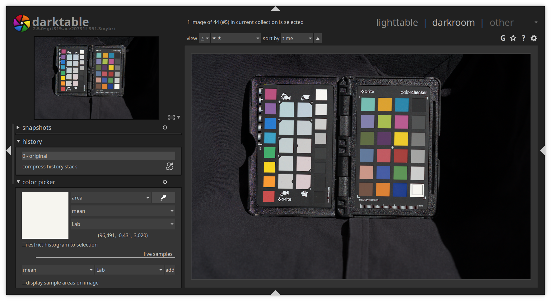
Now we need to use the global color picker module in darkroom to find out the value of the natural white field on the color target.
If the value displayed in the color picker module matches the L-value of the field or is close (+0/-2. This means L=94 to L=96 is acceptable), give the RAW file and the corresponding JPEG file 5 stars. In the picture above it is the first value of: (96.491, -0.431, 3.020). This means L=96.491, which is what you’re looking for on this color target. You might be looking for e.g. L=92 if you are using a different Color Checker. See above how to find out the L-value for your target.
For real color profiling this is very important to get right. Additionally you want to check the JPEG is registering a L value between 96 and 98 (0/+2 tolerance). You do not want overexposure here (L=100 is white)! If your images are over exposed, your profile will actually darken the images (this is not what you want).
For profile extraction, this is less important as darktable-chart will extract the differences between the raw and the JPEG, and will assume the camera’s exposure level was correct. This means if your camera “thinks” a good exposure is L=98 for the JPEG, and the RAW reads as L=85, then your profile needs to create the difference here so you get the same effect.
For exporting we need to select Lab as output color profile. This color space is not visible in the combo box by default. You can enable it by starting darktable with the following command line argument:
darktable --conf allow_lab_output=true
Or you always enable it by setting allow_lab_output to TRUE in darktablerc. Make sure that you have closed darktable before making this change, then reopen it ( darktable writes to this file and may erase your change if you edit while darktable is running).
~/.config/darktable/darktablerc
allow_lab_output=TRUE
As the output format select “PFM (float)” and for the export path you can use:
$(FILE_FOLDER)/PFM/$(MODEL)_ISO$(EXIF_ISO)_$(FILE_EXTENSION)
Remember to select the Lab output color profile here as well.
You need to export all the RAW and JPEG files, not just the RAWs.
Select all 5 star RAW and JPEG files and export them.
Before we can start you need the chart file for your color target. The chart file contains the layout of the color checker. For example it tells the profiling software where the gray ramp is located or which field contains which color. For the “X-Rite Colorchecker Passport Photo” there is a (ColorCheckerPassport.cht) file provided by ArgyllCMS. You can find it here:
/usr/share/color/argyll/ref/ColorCheckerPassport.cht
Now it is time to start darktable-chart. The initial screen will look like this:
In the source image tab, select your PFM exported RAW file as image and for chart your Color Checker chart file. Then fit the displayed grid on your image.
Make sure that the inner rectangular of the grid is completely inside of the color field, see Figure 8. If it is too big, you can use the size slider in the top right corner to adjust it. Better too small than too large.
This is the only step where the process diverges for real color vs camera profile creation.
If you are creating a color profile to match the manufacturers color processing in body, you will want to select color chart image and as the reference image select the PFM exported JPEG file which corresponds to the RAW file in the source image tab. Once opened you need to resize the grid again to match the Color Checker in your image. Adjust the size with the slider if necessary.
If you are creating a color profile for real color, select the mode as cie/it8 file and load the corresponding CIE file for your color target. If you have issues with this, run darktable-chart from the CLI and check the output. I found that my chart would not open with:
error with the IT8 file, can't find the SAMPLE_ID column
It’s worth checking the ‘Lab (reference)’ values at the bottom of the display to ensure they match what you expect and were correctly loaded. I saw some cool (but incorrect) results when they did not load!
In this tab you’re asked to select the patches with the gray ramp. For the ‘X-Rite Color Checker Passport’ these are the ‘NEU1 .. NEU8’ fields. Newer version of darktable automatically detect the gray ramps! The input field number of final patches defines how many editable color patches the resulting style will use within the color look up table module. More patches give a better result but slows down the process. I think 28 is a good compromise but you might want to user the maxium of 49.
Once you have done this click on ‘process’ to start the calculation. The quality of the result in terms of average delta E and maximum delta E are displayed below the button. These data show how close the resulting style applied to the source image will be able to match the reference values – the lower the better.
You must click process each time you change source images or reference chart to generate the new profiles. Sometimes process is “greyed out”, so simply toggling the grey ramp setting will reactivate it.
After running ‘process’, click on ‘export’ to save the darktable style.
In the export window you should already get a good name for the style. Add a leading zero for ISO values smaller than 1000 get correct sorting in the styles module, for example: ILCE-7M3_ISO0100_JPG.dtstyle. The JPG in the name should indicate that we fitted against a JPG file. If you fitted against a CIE file, remove the CIE filename from the style name. If you applied a creative style (for example, a film emulation or filter in the camera). to the JPG, probably add it at the end of the file name and style name.
To use your just created style, you need to import it in the style module in the lighttable. In the lighttable open the module on the right and click on ‘import’. Select the dtstyle file you created to add it. Once imported you can select a raw file and then double click on the style in the ‘style module’ to apply it.
Open the image in darkroom and you will notice that the base curve has been disabled and a few modules been enabled. The additional modules activated are normally: input color profile, color lookup table and tone curve.
To verify the style you created you can either apply it to one of the RAW files you created for profiling. Then use the global color picker to compare the color in the RAW with the style applied to the one in the JPEG file.
I also shoot a few normal pictures with nice colors like flowers in RAW and JPEG and then compare the result. Sometimes some colors can be off which can indicate that your pictures for profiling are not the best. This can be because there were some kind of clouds, glare or the wrong daytime. Redo the shots till you get the result you’re satisfied with.
Sadly this is a trial and error process, so you will have to create some number of profiles before you find the results you want. It’s a good idea to read this article again to see if you missed any important steps.
In the following screenshot (Figure 11) you can see the calculated tone curve by darktable chart and the Sony base curve of darktable. The tone curve is based on the color LUT. It will look flat if you apply it without the LUT.
Here is a comparison between the base curve for Sony on the left and the dtstyle (color LUT + tone curve) created with darktable-chart:
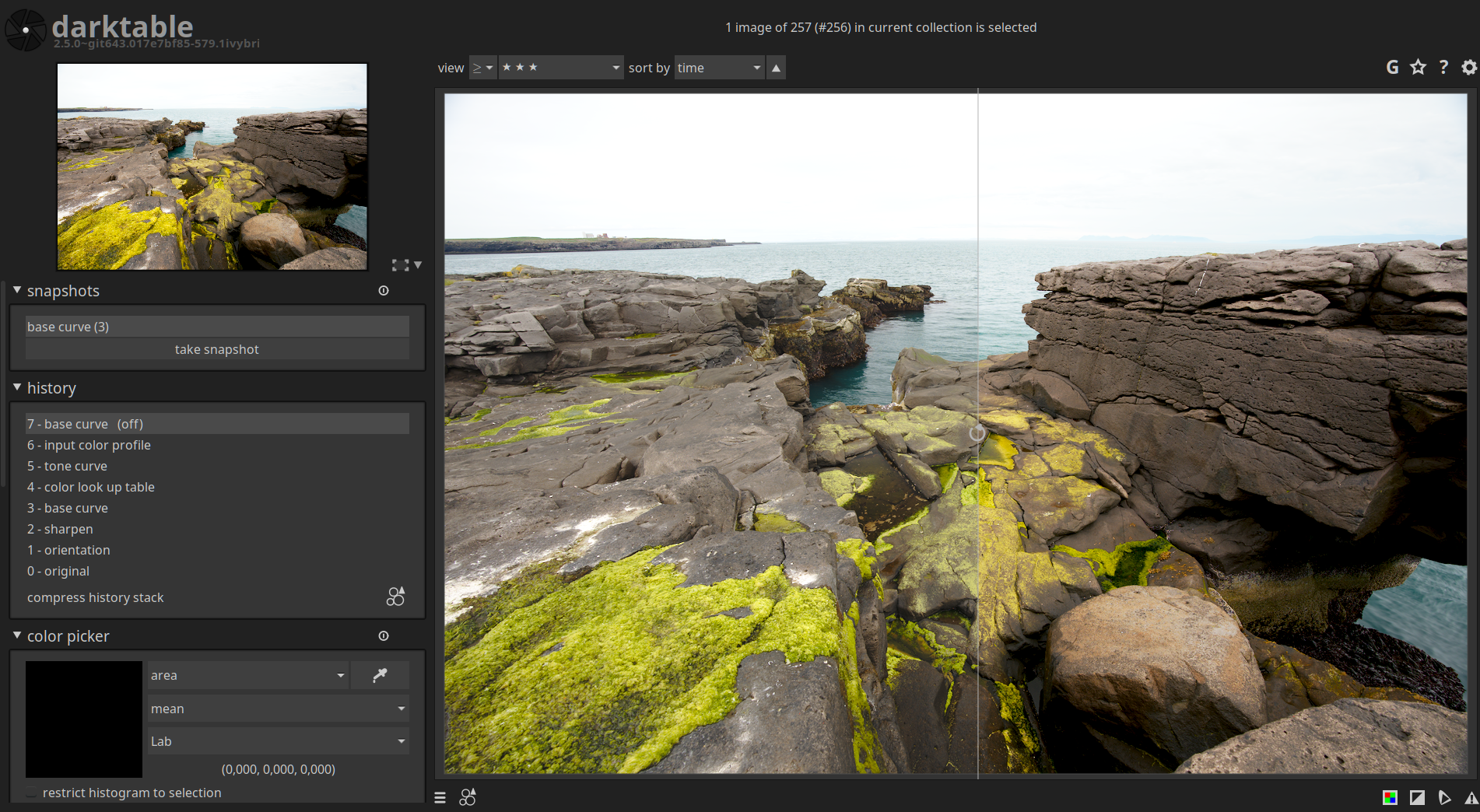
This process will work for extracting in-body black and white profiles, as well as creative color profiles. I see a significant improvment in black and white profiles from this process over the use of some of the black and white modules in darktable.
You may find that the lowest ISO profile may provide pretty good results for higher ISO values. This will save you a lot of time profiling, and allows you to blanket-apply your profile to all your images quickly - you only need one profile now! This is highly dependant on your camera however, so experiment with this.
These profiles should work in all light conditions, provided your white balance is correct. Given you now have a color target, you should always take one photo of it, so you can correct the whitebalance later.
As always the ways to get better colors are open for discussion an it can be improved in collaboration.
Feedback is very welcome.
Thanks to the darktable developers for such a great piece of software! :-)
William Brown has contributed to the article, based on his profiling experience following this tutorial.
Martin Rowson, cartoonist for the Guardian and elsewhere, joins us to discuss caricature as political hit-job; the TLS's Arts editor Lucy Dallas considers the jolly japes and scrapes of the Beano, as that publication marks its eightieth year; and our Features editor Rozalind Dineen goes to meet Jesmyn Ward, a writer described in our pages as “an important new voice of the American South – one developing, perhaps, into the twenty-first-century’s answer to William Faulkner”
Books
The Communist Manifesto: A Graphic Novel, adapted by Martin Rowson
The Fire This Time: A New Generation Speaks about Race by Jesmyn Ward
Hosted on Acast. See acast.com/privacy for more information.
Hosted on Acast. See acast.com/privacy for more information.
[Article updated on: 2019-11-26]
Noise in digital images is similar to film grain in analogue photography. In digital cameras, noise is either created by the amplification of digital signals or heat produced by the sensor. It appears as random, colored speckles on an otherwise smooth surface and can significantly degrade image quality.
Noise is always present, and if it gets too pronounced, it detracts from the image and needs to be mitigated. Removing noise can decrease image quality or sharpness. There are different algorithms to reduce noise, but the best option is if having profiles for a camera to understand the noise patterns a camera model produces.
Noise reduction is an image restoration process. You want to remove the digital artifacts from the image in such a way that the original image is discernible. These artifacts can be just some kind of grain (luminance noise) or colorful, disturbing dots (chroma noise). It can either add to a picture or detract from it. If the noise is disturbing, we want to remove it. The following pictures show a picture with noise and a denoised version:
To get the best noise reduction, we need to generate noise profiles for each ISO value for a camera.
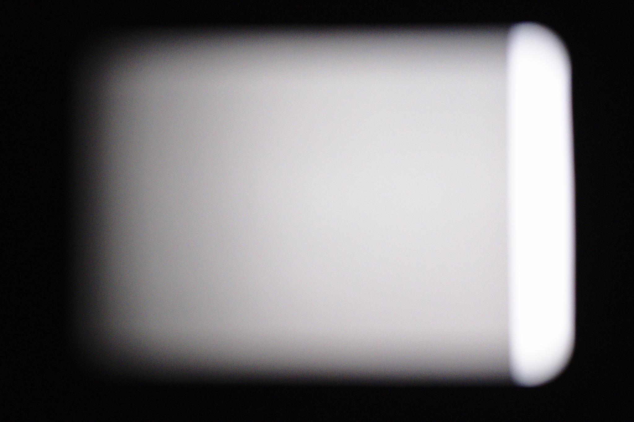
For every ISO value your camera has, you have to take a picture. The pictures need to be exposed a particular way to gather the information correctly. The photos need to be out of focus with a widespread histogram like in the following image:
We need overexposed and underexposed areas, but mostly particularly the grey areas in between. These areas contain the information we are looking for.
Let’s go through the noise profile generation step by step. For easier creation of the required pictures, we will create a stencil which will make it easier to capture the photos.
First you need to get some thicker black paper or cardboard. No light should shine through it! Then you need to print out a gradient on white paper. Light should shine through the white paper!
Print this black to white gradient (PDF)
I got black thick paper (DIN A3, >= 200g/m²) and used two sheets. You need to be able to cover your monitor with the black paper. Put the printed gradient in the middle and draw around it. From three sides (bottom, left, top) make the window smaller by 1 cm, see Figure 1. On the right we need to have a gap.
Next is to cut out the window and type the gradient onto the black paper like in Figure 2. It is important that there is a gap between the white and the black paper on the white side of the gradient. We need light for an overexposed area.
Once you have done that go to your monitor and make it all white. You can an all white image for that. Then tape the sheets to your monitor like in Figure 3.
It is time to get your camera. You need to shoot in RAW. It is best to turn off any noise reduction especially long exposure noise reduction. Mount the camera on a tripod and use a lens between 35 mm to 85 mm (full frame). I used a 85 mm f/1.4 lens.
Make sure the gradient fills most of the frame. Set your camera to manual focus and focus on infinity. Select the manual mode of your camera and choose the fastest aperture and ISO100. Depending on the lens you’re using you might want to close the aperture. For me f/1.4 was too blurry and I closed it till f/4.0. You don’t want to see any edges or any structure on the paper but be too blurry. You want to still see the gradient but we want nice transitions between different lightning zone black -> grey -> white like in Figure 4.
Now you need to set the shutter speed. Make the picture really dark and then make the shutter speed longer till the gap which gives us the white from the monitor is overexposed, pure white see Figure 4. The black around the white paper should be underexposed (pure black).
Now you need to take a picture for each ISO value of your camera. When you increase the ISO value you need to decrease the shutter speed!
Run
/usr/lib/darktable/tools/darktable-gen-noiseprofile --help
If this gives you the help of the tool, continue with STEP 2 otherwise go to STEP 1a. Packages for openSUSE, Fedora, Ubuntu and Debian packaging the noise tools can be found here.
Your darktable installation doesn’t offer the noise tools so you need to compile it yourself. Before you start make sure that you have the following dependencies installed on your system:
Get the darktable source code using git:
git clone https://github.com/darktable-org/darktable.git
Now change to the source and build the tools for creating noise profiles using:
mkdir build
cd build
cmake -DCMAKE_INSTALL_PREFIX=/opt/darktable -DBUILD_NOISE_TOOLS=ON ..
cd tools/noise
make
sudo make install
Download the pictures from your camera and change to the directory on the command line:
cd /path/to/noise_pictures
and run the following command:
/usr/lib/darktable/tools/darktable-gen-noiseprofile -d $(pwd)
or if you had to download and build the source, run:
/opt/darktable_source/lib/tools/darktable-gen-noiseprofile -d $(pwd)
This will automatically do everything for you. Note that this can take quite some time to finish. I think it took 15 to 20 minutes on my machine. If a picture is not exposed correctly, the tool will tell you the image name and you have to recapture the picture with that ISO. Remove the non-working picture.
The tool will tell you, once completed, how to test and verify the noise profiles you created.
Once the tool finished, you end up with a tarball you can send to darktable for inclusion. You can open a bug here
The interesting files are the presets.json file (darktable input) and, for the
developers, the noise_result.pdf file. You can find an example PDF
here. It is a
collection of diagrams showing the histogram for each picture and the results
of the calculations.
A detailed explanation of the diagrams and the math behind it can be found in the original noise profile tutorial by Johannes Hanika.
Feedback is very much welcome in the comments below!
Are we hard-wired to feel other people’s pain? And if so, is it necessarily a good thing? Andrew Scull has reviewed three new books on empathy and joins us to tell us more; Charles Dickens's love of all things theatrical – in life as in art – is no secret. Robert Douglas-Fairhurst considers fifty years' worth of Dickens adaptations for the stage (and film)
Books
The Empathy Instinct by Peter Bazalgette
Against Empathy: The case for rational compassion by Paul Bloom
The Invention of Humanity: Equality and cultural difference in world history by Siep Stuurman
Dickensian Dramas: Plays from Charles Dickens (Volume One, edited by Jacky Bratton; Volume Two, edited by Jim Davis
Hosted on Acast. See acast.com/privacy for more information.
Hosted on Acast. See acast.com/privacy for more information.
Hosted on Acast. See acast.com/privacy for more information.
Hosted on Acast. See acast.com/privacy for more information.
Hosted on Acast. See acast.com/privacy for more information.
Hosted on Acast. See acast.com/privacy for more information.
Hosted on Acast. See acast.com/privacy for more information.
Hosted on Acast. See acast.com/privacy for more information.