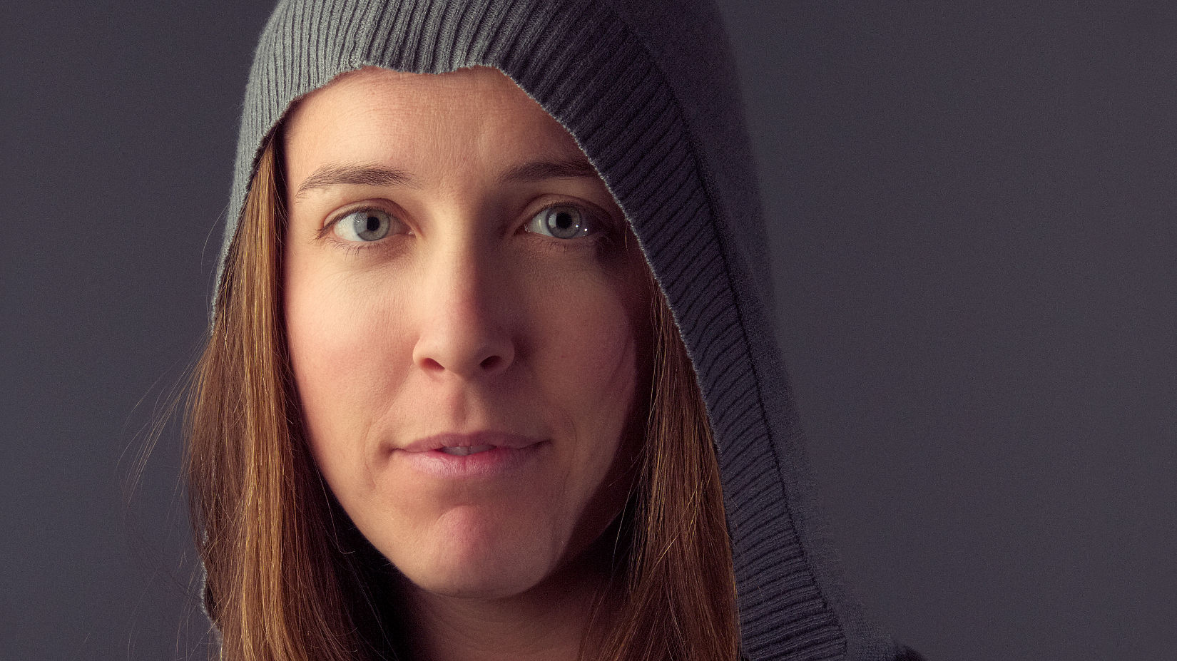
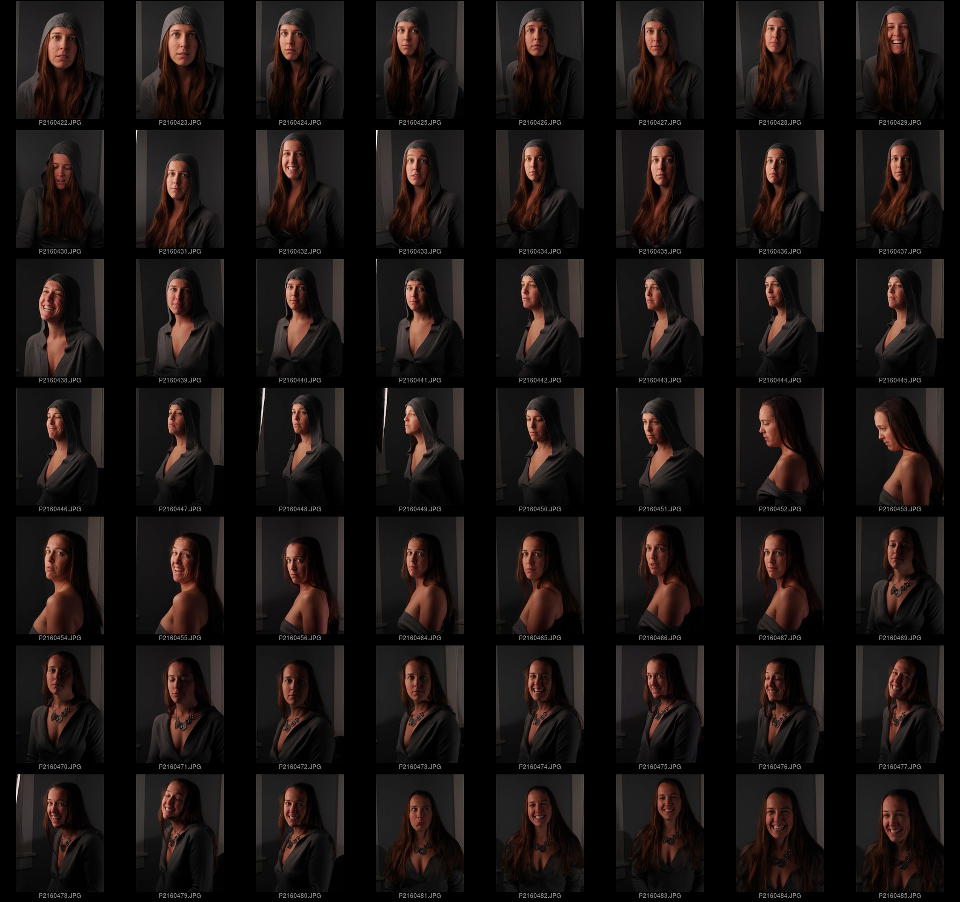
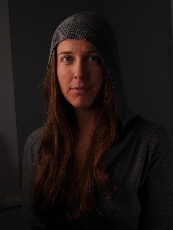
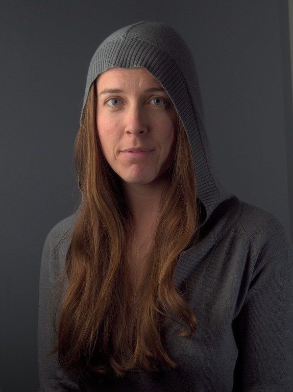
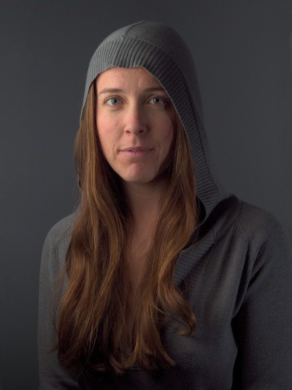
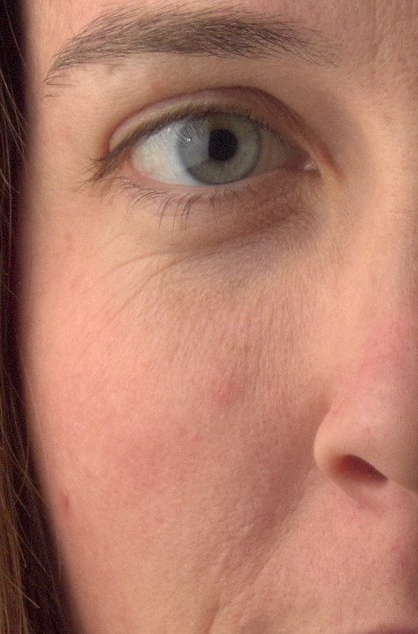
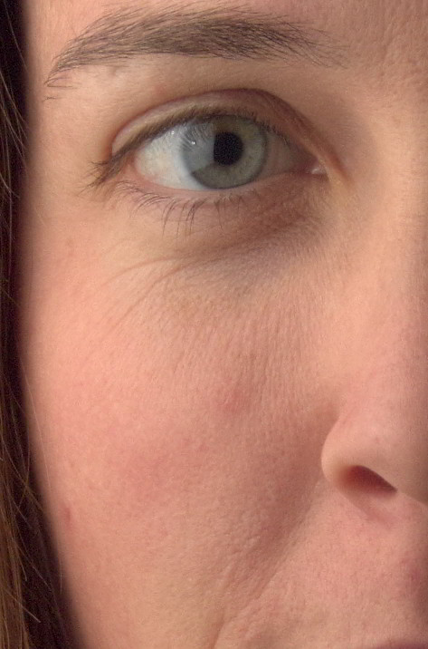
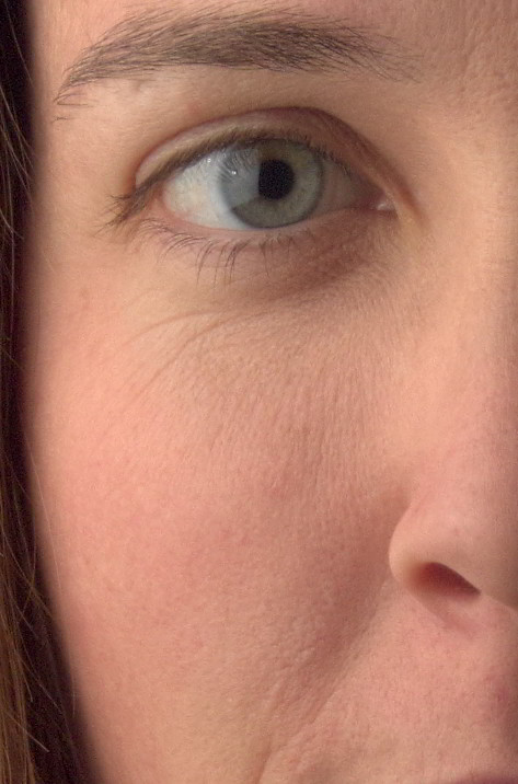
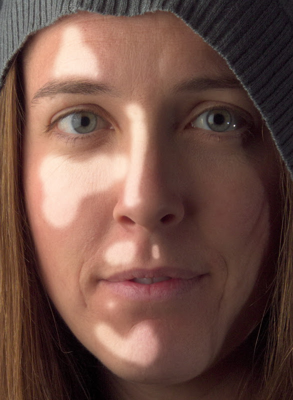
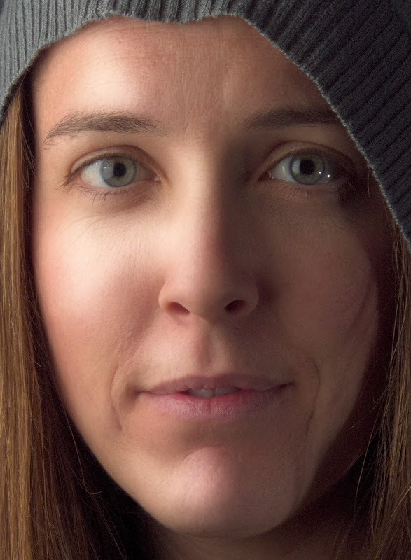
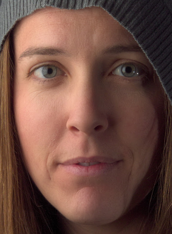
Replicating Calvin Hollywood's Freaky Details in GIMP
German photographer/digital artist/photoshop trainer Calvin Hollywood has a rather unique style to his photography. It’s a sort of edgy, gritty, hyper-realistic result, almost a blend between illustration and photography.
As part of one of his courses, he talks about a technique for accentuating details in an image that he calls “Freaky Details”.
Here is Calvin describing this technique using Photoshop:
In my meandering around different retouching tutorials I came across it a while ago, and wanted to replicate the results in GIMP if possible. There were a couple of problems that I ran into for replicating the exact same workflow:
Lack of a “Vivid Light” layer blend mode in GIMP
Lack of a “Surface Blur” in GIMP
Those problems have been rectified (and I have more patience these days to figure out what exactly was going on), so let’s see what it takes to replicate this effect in GIMP!
Replicating Freaky Details
Requirements
The only extra thing you’ll need to be able to replicate this effect is G’MIC for GIMP.
You don’t technically need G’MIC to make this work, but the process of manually creating a Vivid Light layer is tedious and error-prone in GIMP right now.
Also, you won’t have access to G’MIC’s Bilateral Blur for smoothing.
And, seriously, it’s G’MIC - you should have it anyway for all the other cool stuff it does!
Summary of Steps
Here’s the summary of steps we are about to walk through to create this effect in GIMP:
Duplicate the background layer.
Invert the colors of the top layer.
Apply “Surface Blur” to top layer.
Set top layer blend mode to “Vivid Light”.
New layer from visible.
Set layer blend mode of new layer to “Overlay”, hide intermediate layer.
There are just a couple of small things to point out though, so keep reading to be aware of them!
Detailed Steps
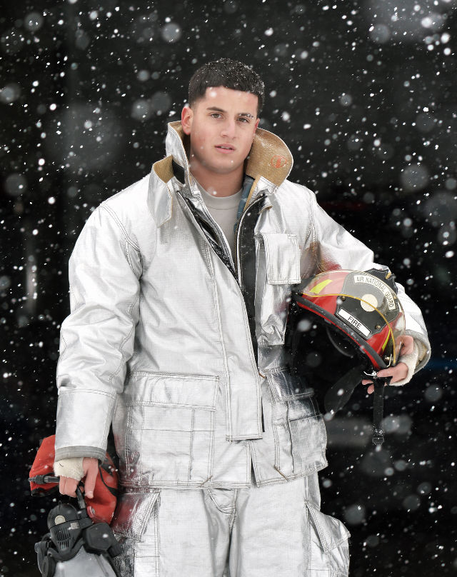
I’m going to walk through each step to make sure it’s clear, but first we need an image to work with!
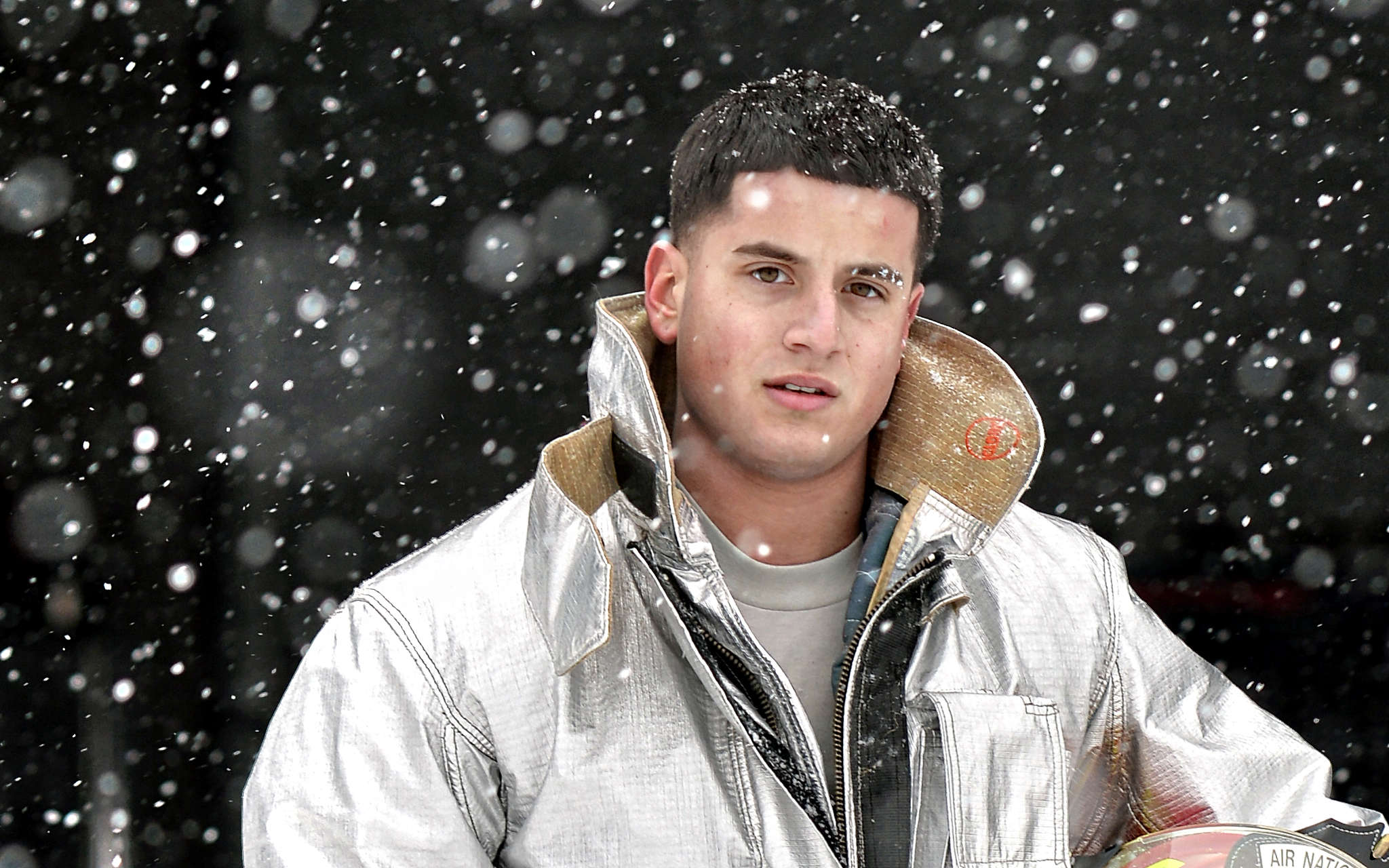
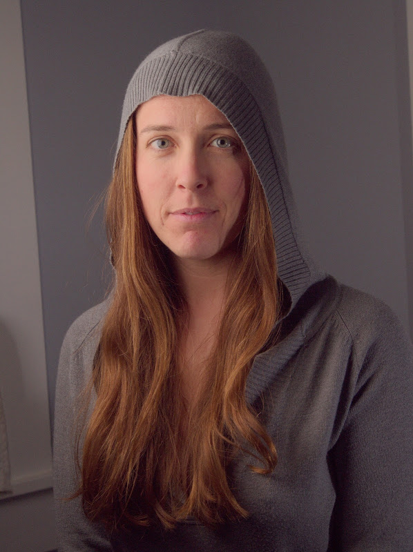
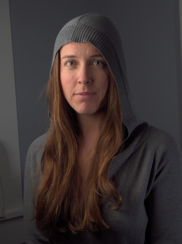
New York National Guard by U.S. National Guard/Staff Sergeant Christopher Muncy
on Flickr (cb).
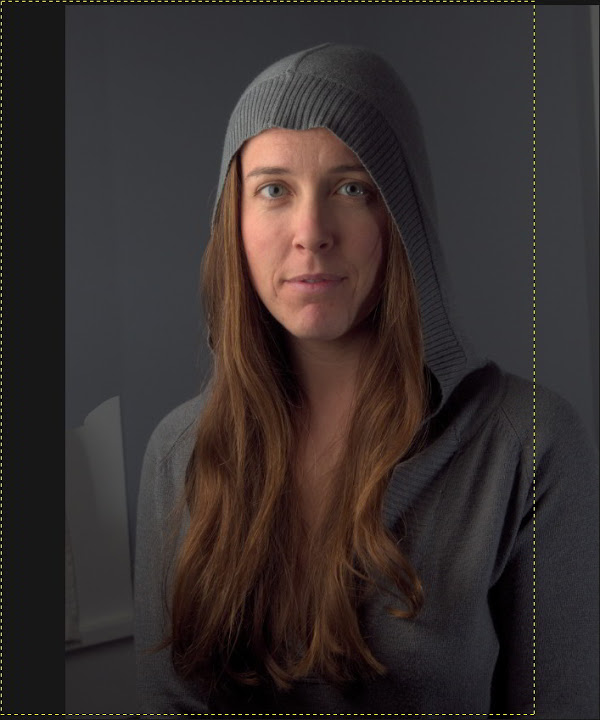
Airman First Class Anthony Pisano, a firefighter with the New York National Guard’s 106th Civil Engineering Squadron, 106th Rescue Wing conducts a daily equipment test during a major snowstorm on February 17, 2015.
(New York Air National Guard / Staff Sergeant Christopher S Muncy / released)
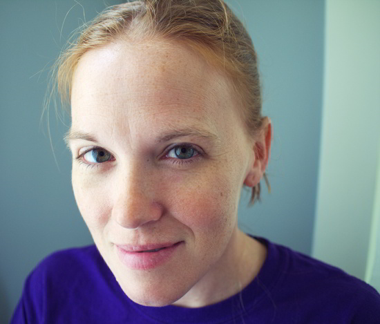
This is a great image to test the effect, and to hopefully bring out the details and gritty-ness of the portrait.
1./2. Duplicate background layer, and invert colors
So, duplicate your base image layer (Background in my example).
Layer → Duplicate (Shift-Ctrl-D,Shift-⌘-D)
I will usually name the duplicate layer something descriptive, like “Temp” ;).
Next we’ll just invert the colors on this “Temp” layer.
Colors → Invert
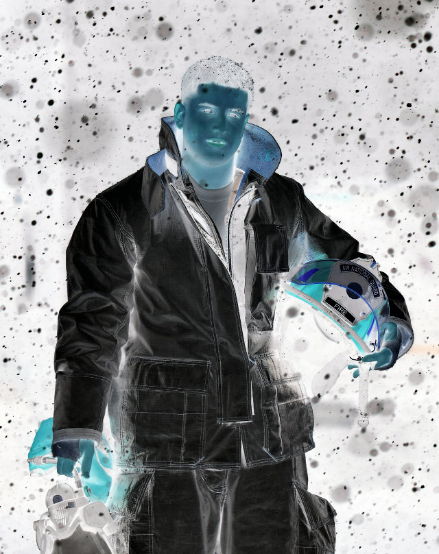
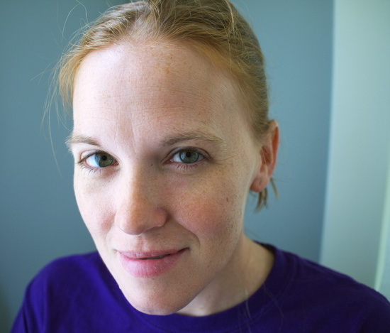
So right now, we should be looking at this on our canvas:
The inverted duplicate of the base layer.
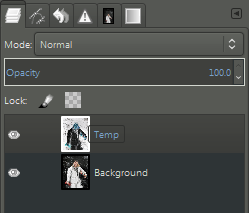
What the Layers dialog should look like.
Now that we’ve got our inverted “Temp” layer, we just need to apply a little blur.
3. Apply “Surface Blur” to Temp Layer
There’s a couple of different ways you could approach this. Calvin Hollywood’s tutorial explicitly calls for a Photoshop Surface Blur. I think part of the reason to use a Surface Blur vs. Gaussian Blur is to cut down on any halos that will occur along edges of high contrast.
There are three main methods of blurring this layer that you could use:
Straight Gaussian Blur (easiest/fastest, but may halo - worst results)
Filters → Blur → Gaussian Blur
Selective Gaussian Blur (closer to true “Surface Blur”)
Filters → Blur → Selective Gaussian Blur
G’MIC’s Smooth [bilateral] (closest to true “Surface Blur”)
Filters → G’MIC → Repair → Smooth [bilateral]
I’ll leave it as an exercise for the reader to try some different methods and choose one they like. (At this point I personally pretty much just always use G’MIC’s Smooth [bilateral] - this produces the best results by far).
For the Gaussian Blurs, I’ve had good luck with radius values around 20% - 30% of an image dimension. As the blur radius increases, you’ll be acting more on larger local contrasts (as opposed to smaller details) and run the risk of halos. So just keep an eye on that.
So, let’s try applying some G’MIC Bilateral Smoothing to the “Temp” layer and see how it looks!
Run the command:
Filters → G’MIC → Repair → Smooth [bilateral]
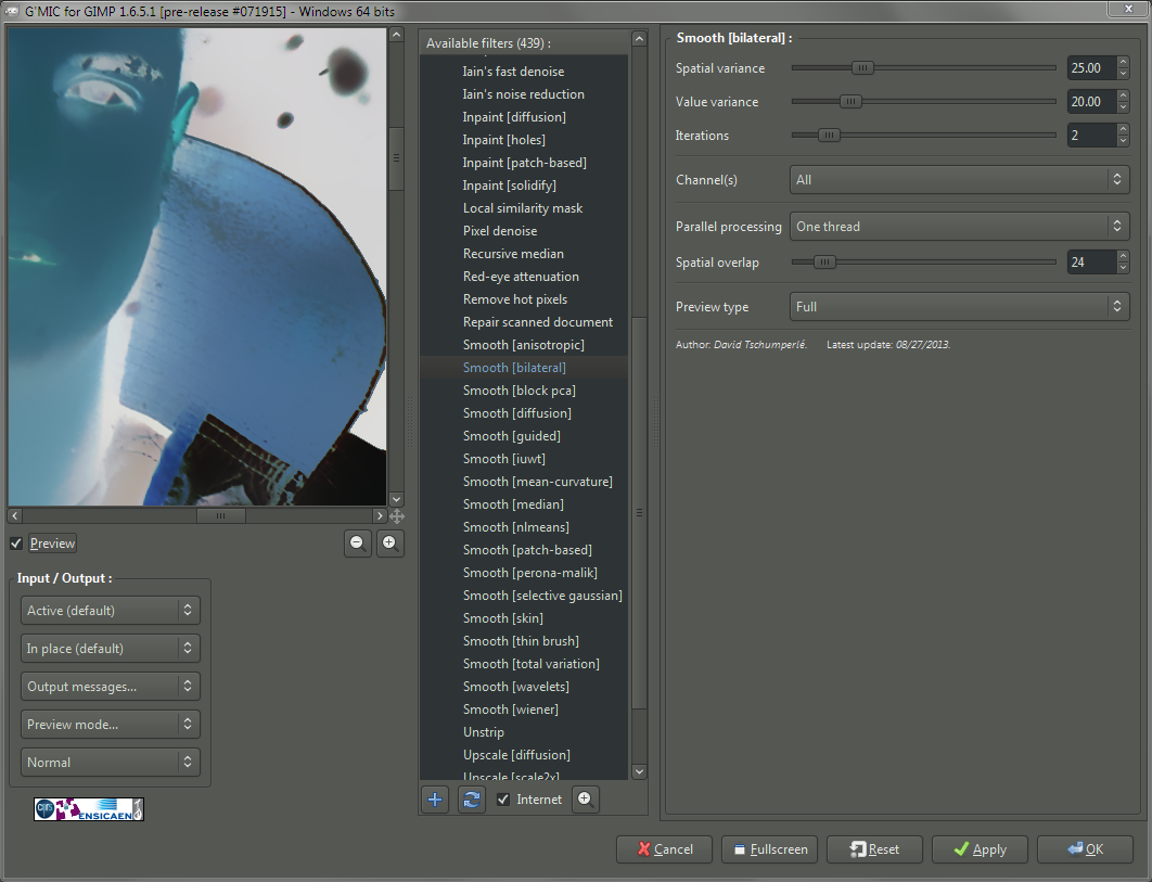
The values I used in this example for Spatial/Value Variance.
The values you want to fiddle with are the Spatial Variance and Value Variance (25 and 20 respectively in my example). You can see the values I tried for this walkthrough, but I encourage you to experiment a bit on your own as well!
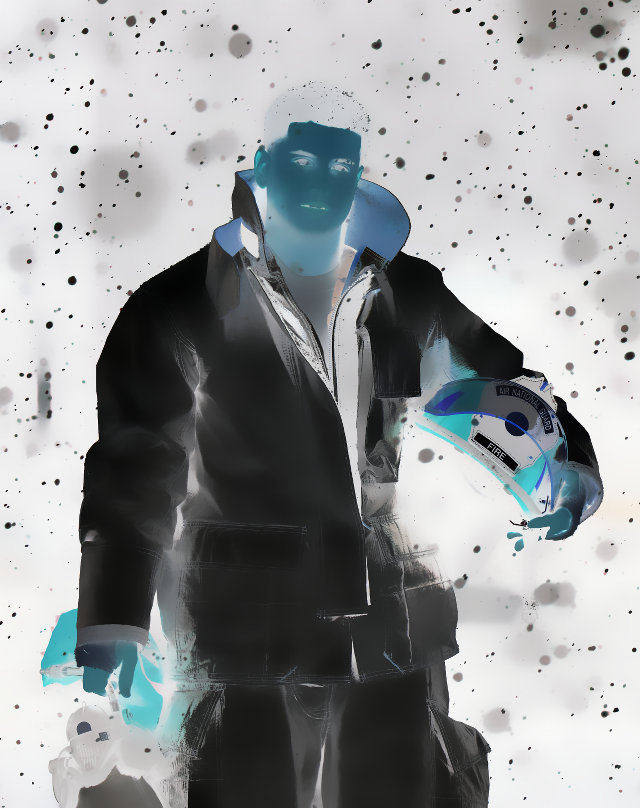
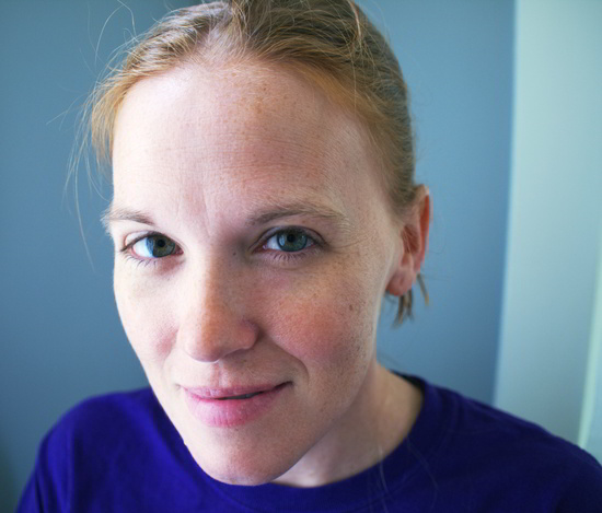
Now we should see our canvas look like this:
Our “Temp” layer after applying G’MIC Smoothing [bilateral]
Layers should still look like this.
Now we just need to blend the “Temp” layer with the base background layer using a “Vivid Light” blending mode…
4./5. Set Temp Layer Blend Mode to Vivid Light & New Layer
Now we need to blend the “Temp” layer with the Background layer using a “Vivid Light” blending mode. Lucky for me, I’m friendly with the G’MIC devs, so I asked nicely, and David Tschumperlé added this blend mode for me.
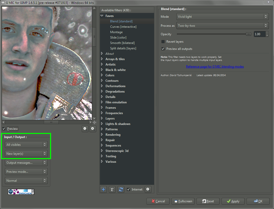
G’MIC Vivid Light blending mode, pay attention to Input/Output!
Pay careful attention to the Input/Output portion of the dialog. You’ll want to set the Input Layers to All visibles so it picks up the Temp and Background layers. You’ll also probably want to set the Output to New layer(s).
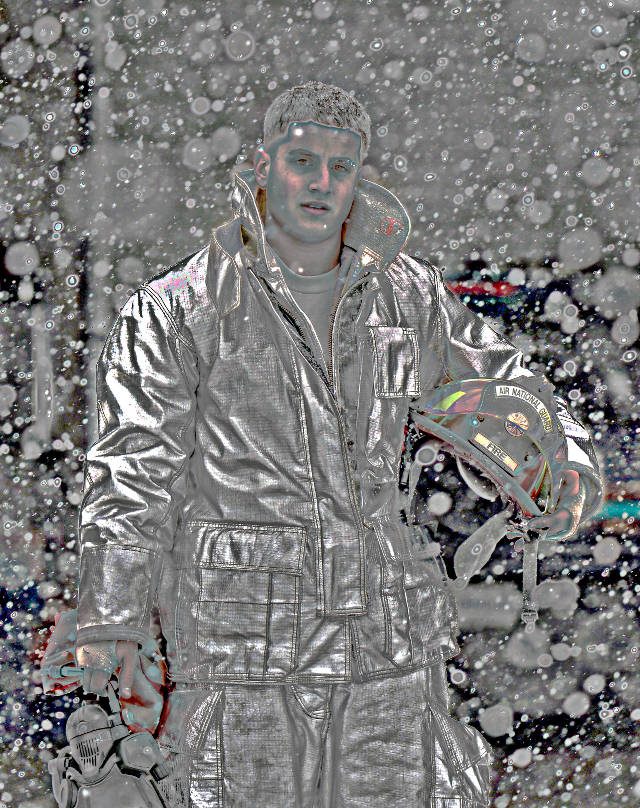
When it’s done, you’re going to be staring at a very strange looking layer, for sure:
Well, sure it looks weird out of context…
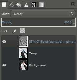
The layers should now look like this.
Now all that’s left is to hide the “Temp” layer, and set the new Vivid Light result layer to Overlay layer blending mode…
6. Set Vivid Light Result to Overlay, Hide Temp Layer
We’re just about done. Go ahead and hide the “Temp” layer from view (we won’t need it anymore - you could delete it as well if you wanted to).
Finally, set the G’MIC Vivid Light layer output to Overlay layer blend mode:
Set the resulting G’MIC output layer to Overlay blend mode.
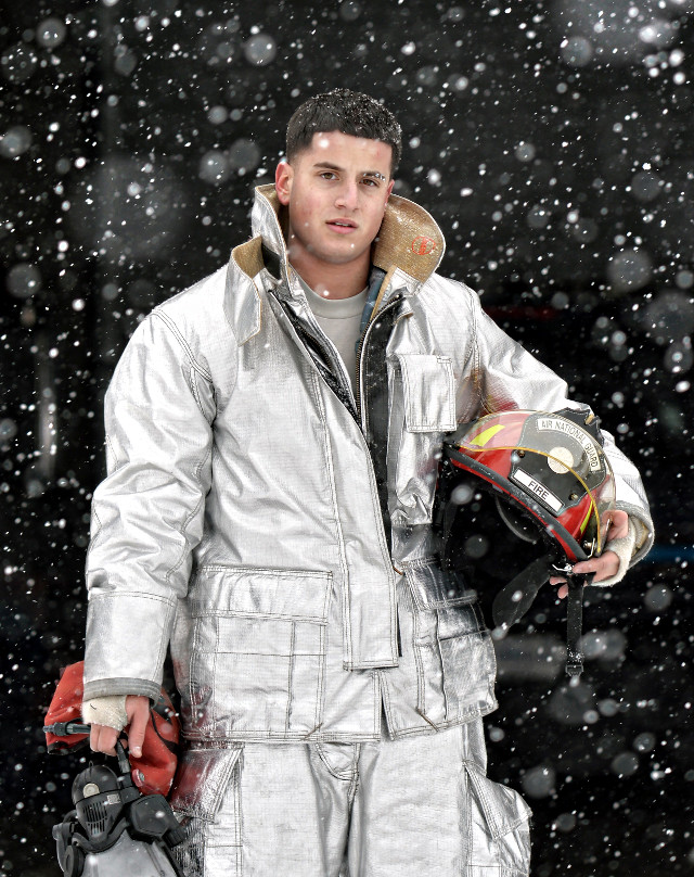
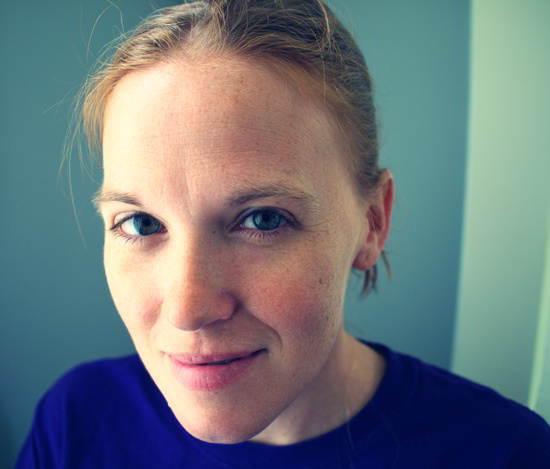
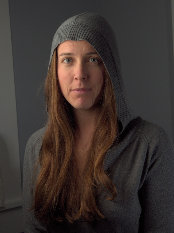
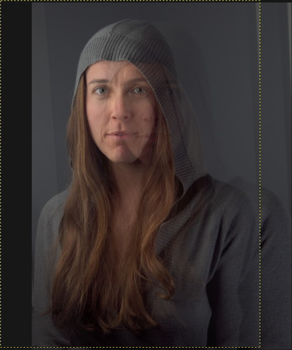
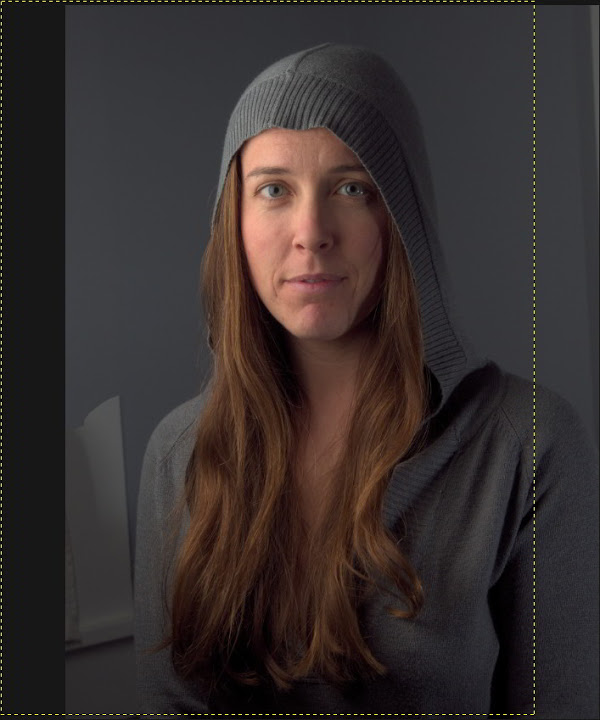
The results we should be seeing will have enhanced details and contrasts, and should look like this (mouseover to compare the original image):
Our final results (whew!)
(click to compare to original)
This technique will emphasize any noise in an image so there may be some masking and selective application required for a good final effect.
Summary
This is not an effect for everyone. I can’t stress that enough. It’s also not an effect for every image. But if you find an image it works well on, I think it can really do some interesting things. It can definitely bring out a very dramatic, gritty effect (it works well with nice hard rim lighting and textures).
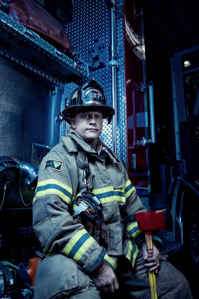
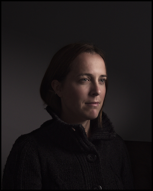
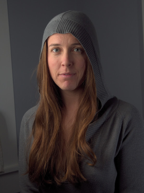
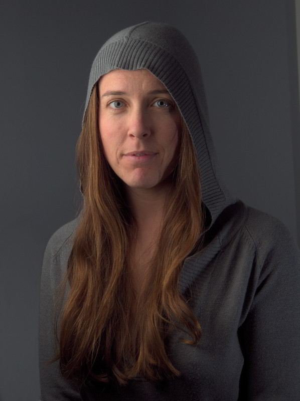
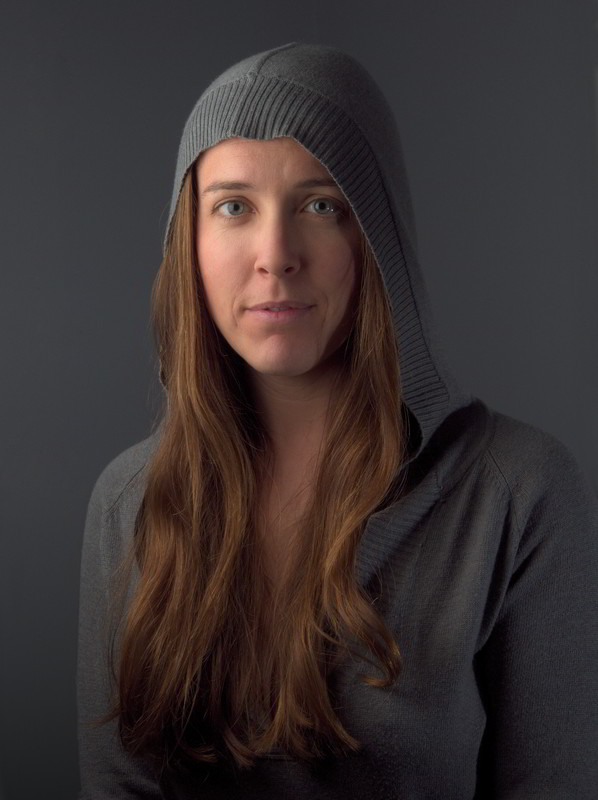
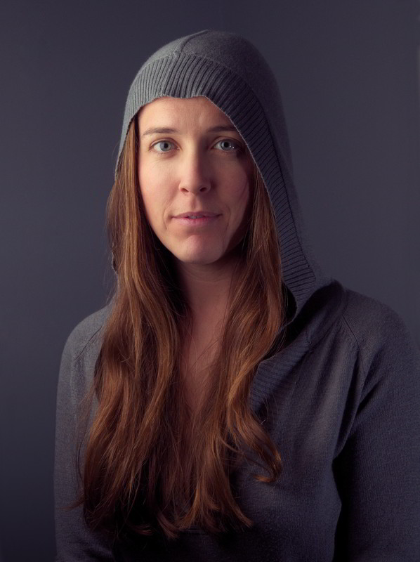
The original image used for this article is another great example of one that works well with this technique:
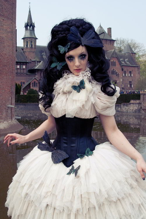
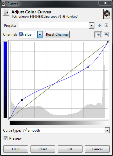
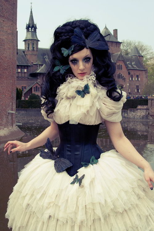
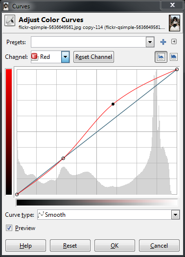
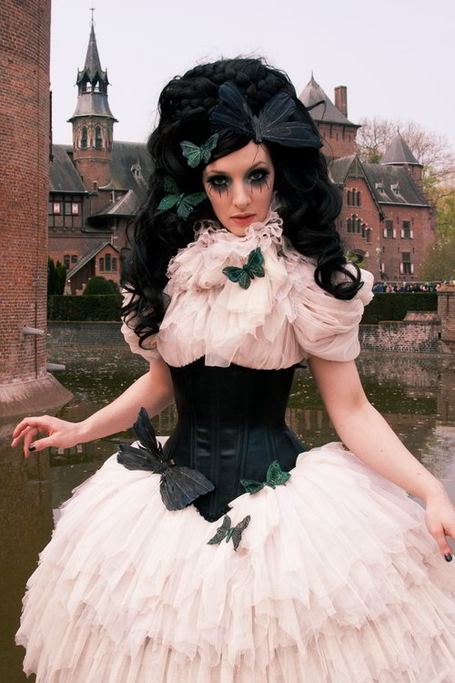
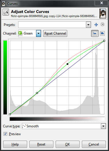
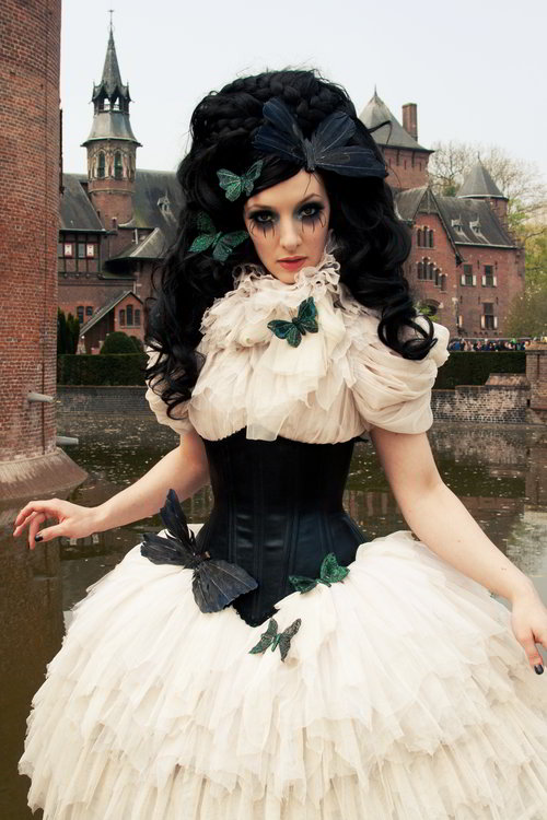
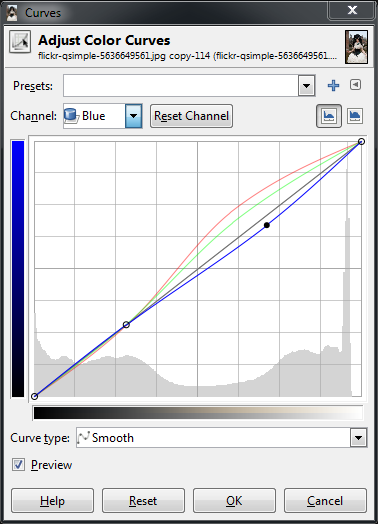
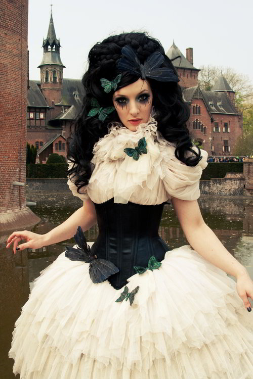
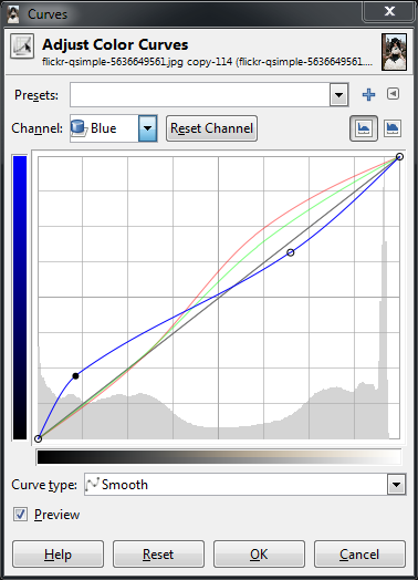
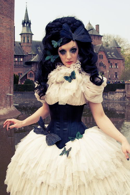
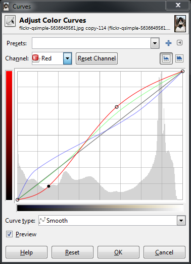
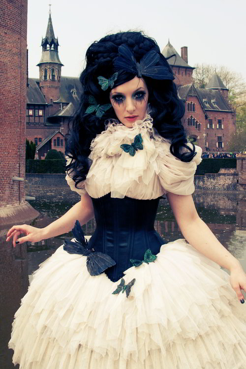
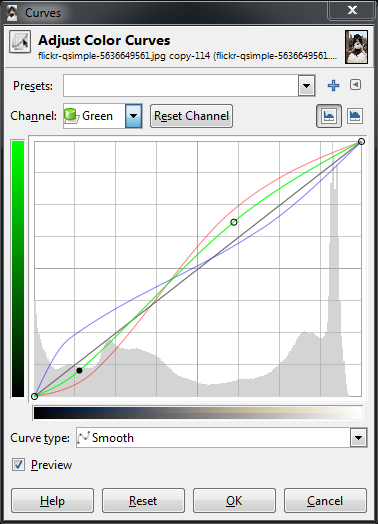
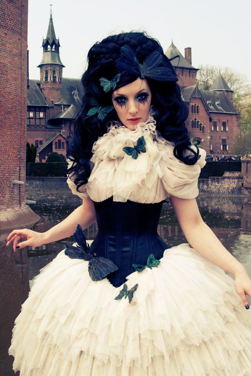
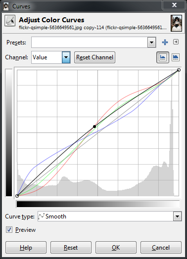
I had muted the colors in this image before applying some Portra-esque color curves to the final result..
Finally, a BIG THANK YOU to David Tschumperlé for taking the time to add a Vivid Light blend mode in G’MIC.
Try the method out and let me know what you think or how it works out for you! And as always, if you found this useful in any way, please share it, pin it, like it, or whatever you kids do these days…
For those looking for a faster/easier way to achieve this effect, it has now been integrated as a filter into G’MIC. (Again, thanks to David Tschumperlé!)
We recently posted about the Open Source Photography Course from photographer Riley Brandt.
We now also have a review of the course as well.
This review is actually by one of the darktable developers, houz!
He had originally posted it on discuss as a topic but I think it deserves a blog post instead.
(When a developer from a favorite project speaks up, it’s usually worth listening…)
First of all, as a darktable developer I am biased so take everything I write with a grain of salt. Second, I didn’t pay for my copy of the videos but Riley was kind enough to provide a free copy for me to review. So add another pinch of salt. I will therefore not tell you if I would encourage you to buy the course. You can have my impressions nevertheless.
I won’t say anything about the GIMP part, not because it wouldn’t know how to use that software but it’s relatively short and I just didn’t notice anything to comment on. It’s solid basics of how to use GIMP and the emphasis on layer masks is really important in real world usage.
Now for the darktable part, I have to say that I liked it a lot. It showcases a viable workflow and is relatively complete – not by explaining every module and becoming the audio book of the user manual but by showing at least one tool for every task. And as we all know, in darktable there are many ways to skin a cat, so concentrating on your favourites is a good thing.
What I also appreciate is that Riley managed to cut the single topics to manageable chunks of around 10 minutes or less so you can easily watch them in your lunch break and have no problem to come back to one topic later and easily find what you are looking for.
Before this starts to sound like an advertisement I will just point out some small nitpicking things I noticed while watching the videos. Most of these were not errors in the videos but are just extra bits of information that might make your workflow even smoother, so it’s more of an addendum than an erratum.
When going through your images on lighttable you can either zoom in till you only see a single image (alt-1 is a shortcut for that) or hold the z key pressed. Both are shown in the videos. The latter can quickly become tedious since releasing z just once bring you back to where you were. There are however two more keyboard shortcuts that are not assigned by default under views>lighttable: ‘sticky preview’ and ‘sticky preview with focus detection’. Both work just like normal z and ctrl-z, just without the need to keep the key pressed. You can assign a key to these, for example by reusing z and ctrl-z.
Color labels can be set with F1 .. F5, similar to rating.
Basecurve and tonecurve allow very fine up/down movement of points with the mouse wheel. Hover over a node and scroll.
Gaussian in shadows&highlights tends to give stronger halos than bilateral in normal use, see the darktable blog for an example.
For profiled denoising better use ‘HSV color’ instead of ‘color’ and ‘HSV lightness’ instead of ‘lightness’, see the user manual for details.
When using the mouse wheel to zoom the image you can hold ctrl to get it smaller than fitting to the screen. That’s handy to draw masks over the image border.
When moving the triangles in color zones apart you actually widen the scope of affected values since the curve gets moved off the center line on a wider range.
Also color zones: You can also change reds and greens in the same instance, no need for multiple instances. Riley knows that and used two instances to be able to control the two changes separately.
When loading sidecar files from lighttable, you can even treat a JPEG that was exported from darktable like an XMP file and manually select that since the JPEGs get the processing data embedded. It’s like a backup of the XMP with a preview. Caveat: When using LOTS of mask nodes (mostly with the brush mask) the XMP data might get too big so it’s no longer possible to embed in the JPEG, but in general it works.
The collect module allows to store presets so you can quickly access often used search rules. And since presets only store the module settings and not
the resulting image set these will be updated when new images are imported.
In neutral density you can draw a line with the right mouse button, similar to rotating images.
Styles can also be created from darkroom, there is a small button next to the history compression button.
So, that’s it from me. Did you watch the videos, too? What was your impression? Do you have any remarks?
In my previous post on Color Curves for Toning/Grading, I looked at the basics of what the Curves dialog lets you do in GIMP.
I had been meaning to revisit the subject with a little more restraint (the color curve in that post was a little rough and gross, but it was for illustration so I hope it served its purpose).
This time I want to look at the use of curves a little more carefully.
You’d be amazed at the subtlety that gentle curves can produce in toning your images.
Even small changes in your curves can have quite the impact on your final result.
For instance, have a look at the four film emulation curves created by Petteri Sulonen (if you haven’t read his page yet on creating these curves, it’s well worth your time):
Original
Portraesque (Kodak Portra NC400 Film)
Proviaesque (Fujichrome Provia)
Velviaesque (Fujichrome Velvia)
Crossprocess (E6 slide film in C-41 neg. processing)
I can’t thank Petteri enough for releasing these curves for everyone to use (for us GIMP users, there is a .zip file at the bottom of his post that contains these curves packaged up).
Personally I am a huge fan of the Portraesque curve that he has created.
If there is a person in my images, it’s usually my go-to curve as a starting point.
It really does generate some wonderful skin tones overall.
The problem in generating these curves is that one has to be very, very familiar with the characteristics of the film stocks you are trying to emulate.
I never shot Velvia personally, so it is hard for me to have a reference point to start from when attempting to emulate this type of film.
What we can do, however, is to use our personal vision or sense of aesthetic to begin toning our images to something that we like. GIMP has some great tools for helping us to become more aware of color and the effects of each channel on our final image. That is what we are going to explore…
Disclaimer
I cannot stress enough that what we are approaching here is an entirely subjective interpretation of what is pleasing to our own eyes. Color is a very complex subject and deserves study to really understand. Hopefully some of the things I talk about here will help pique your interest to push further and experiment!
There is no right or wrong, but rather what you find pleasing to your own eye.
Approximating Tones
What we will be doing is using Sample Points and the Curves dialog to modify the color curves in my image above to emulate something else. It could be another photograph, or even a painting.
I’ll be focusing on the skin tones, but the method can certainly be used for other things as well.
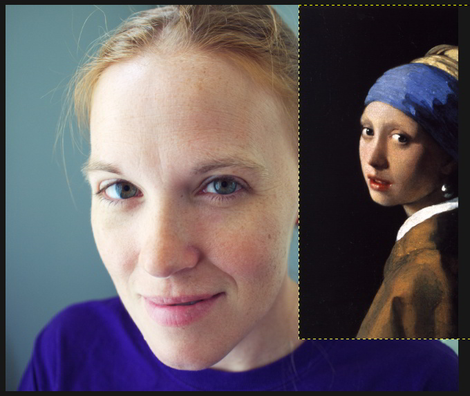
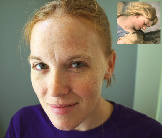
My wonderful model.
With an image you have, begin considering what you might like to approximate the tones on. For instance, in my image above I want to work on the skin tones to see where it leads me.
Now find an image that you like, and would like to approximate the tones from. It helps if the image you are targeting already has tones somewhat similar to what you are starting with (for instance, I would look for another Caucasian image with similar tones to start from, as opposed to Asian). Keeping tones at least similar will reduce the violence you’ll do to your final image.
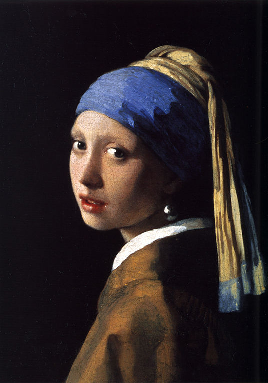
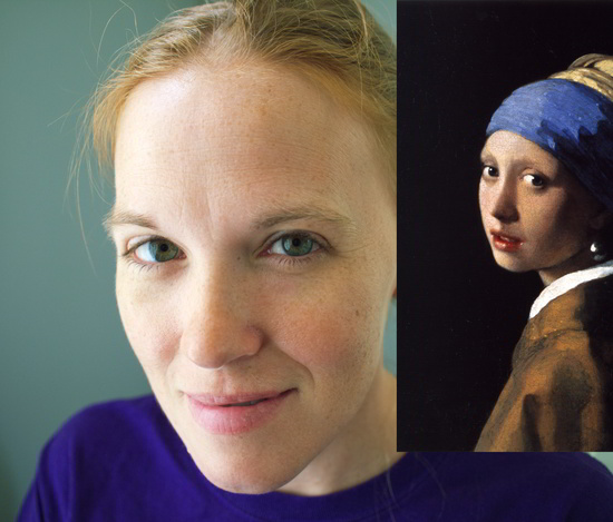
So for my first example, perhaps I would like to use the knowledge that the Old Masters already had in regards to color, and would like to emulate the skin tones from Vermeer’s Girl with the Pearl Earring.
In GIMP I will have my original image already opened, and will then open my target image as a new layer. I’ll pull this layer to one side of my image to give me a view of the areas I am interested in (faces and skin).
I will be using Sample Points extensively as I proceed. Read up on them if you haven’t used them before. They are basically a means of giving you real-time feedback of the values of a pixel in your image (you can track up to four points at one time).
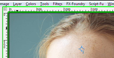
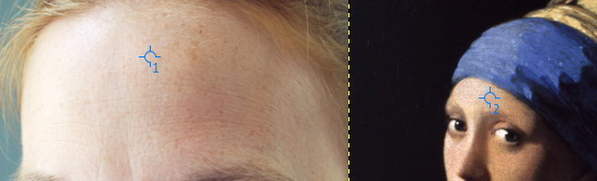
I will put a first sample point somewhere on the higher skin tones of my base image. In this case, I will put one on my models forehead (we’ll be moving it around shortly, so somewhere in the neighborhood is fine).
Ctrl + Left Click in the ruler area of your main window (shown in green above), and drag out into your image. There should be crosshairs across your entire image screen showing you where you are dragging.
When you release the mouse button, you’ve dropped a Sample Point onto your image. You can see it in my image above as a small crosshair with the number 1 next to it.
GIMP should open the sample points dialog for you when you create the first point, but if not you can access it from the image menu under:
Windows → Dockable Dialogs → Sample Points
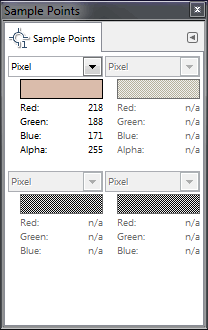
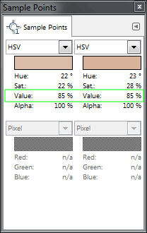
This is what the dialog looks like.
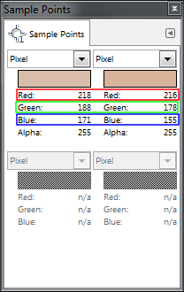
You can see the RGB pixel data for the first sample point that I have already placed.
As you place more sample points, they will each be reflecting their data on this dialog.
You can go ahead and place more sample points on your image now. I’ll place another sample point, but this time I will put it on my target image where the tones seem similar in brightness.
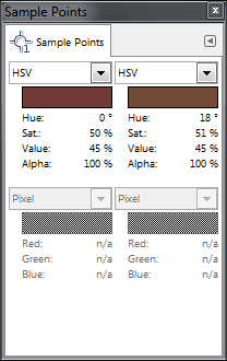
What I’ll then do is change the data being shown in the Sample Points dialog to show HSV data instead of Pixel data.
Now, I will shoot for around 85% value on my source image, and try to find a similar value level in similar tones from my target image as well. Once you’ve placed a sample point, you can continue to move it around and see what types of values it gives you. (If you use another tool in the meantime, and can no longer move just the sample point - you can just select the Color Picker Tool to be able to move them again).
Move the points around your skin tones until you get about the same Value for both points.
Once you have them, make sure your original image layer is active, then start up the curves dialog.
Colors → Curves…
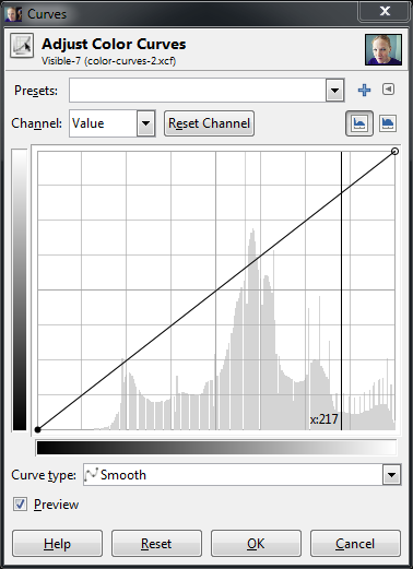
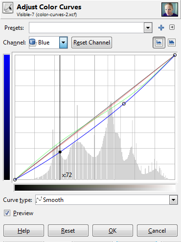
Now here is something really handy to know while using the Curves dialog: if you hover your mouse over your image, you’ll notice that the cursor is a dropper - you can click and drag on an area of your image, and the corresponding value will show up in your curves dialog for that pixel (or averaged area of pixels if you turn that on).
So click and drag to about the same pixel you chose in your original image for the sample point.
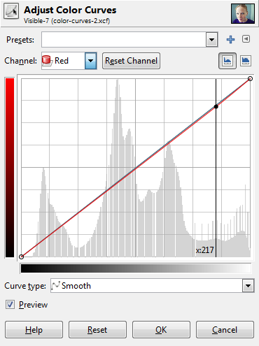
Curves dialog with a value point (217) for my sampled pixel.
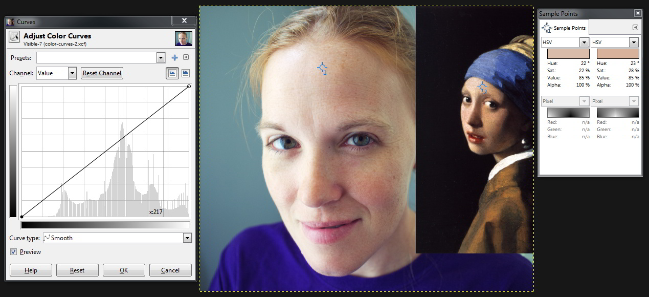
Here is what my working area currently looks like:
I have my curves dialog open, and an area around my sample point chosen so that the values will be visible in the dialog, my images with their associated sample points, and the sample points dialog showing me the values of those points.
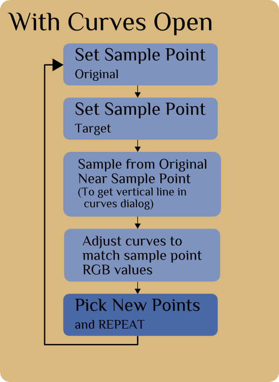
The basic idea now is to adjust my RGB channels to get my original image sample point (#1) to match my target image sample point (#2).
Because I selected an area around my sample point with the curves dialog open, I will know roughly where those values need to be adjusted. Let’s start with the Red channel.
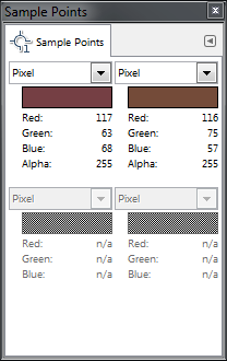
First, set the Sample Points dialog back to Pixel to see the RGBA data for that pixel.
We can now see that to match the pixel colors we will need to make some adjustments to each channel. Specifically,
the Red channel will have to come down a bit (218 → 216),
the Green down some as well (188 → 178),
and Blue much more (171 → 155).
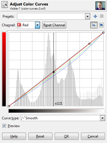
You may want to resize your Curves dialog window larger to be able to more finely control the curves. If we look at the Red channel in my example, we would want to adjust the curve down slightly at the vertical line that shows us where our pixel values are:
We can adjust the red channel curve along this vertical axis (marked x:217) until our pixel red value matches the target (216).
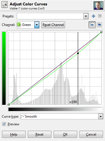
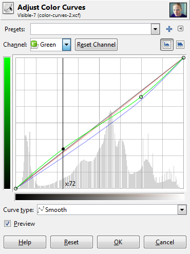
Then just change over to the green channel and do the same:
Here we are adjusting the green curve vertically along the axis marked x:190 until our pixel green value matches the target (178).
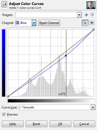
Finally, follow the same procedure for the blue channel:
As before, we adjust along the vertical axis x:173 until our blue channel matches the target (155).
At this point, our first sample point pixel should be the same color as from our target.
The important thing to take away from this exercise is to be watching your image as you are adjusting these channels to see what types of effects they produce. Dropping the green channel should have seen a slight addition of magenta to your image, and dropping the blue channel should have shown you the addition of a yellow to balance it.
Watch your image as you make these changes.
Don’t hit OK on your curves dialog yet!
You’ll want to repeat this procedure, but using some sample points that are darker than the previous ones. Our first sample points had values of about 85%, so now let’s see if we can match pixels down below 50% as well.
Without closing your curves dialog, you should be able to click and drag your sample points around still. So I would set your Sample Points dialog to show you HSV values again, and now drag your first point around on your image until you find some skin that’s in a darker value, maybe around 40-45%.
Once you do, try to find a corresponding value in your target image (or something close at least).
I managed to find skin tones with values around 45% in both of my images:
In these darker tones, I can see that the adjustments I will have to make are for:
Red down a bit (116 → 114),
Green bumped up some (60 → 73),
Blue slightly down (55 → 53).
With the curves dialog still active, I then click and drag on my original image until I am in the same area as my sample point again. This give me my vertical line showing me the value location in my curves dialog, just as before:
Red down to 114.
Green up to 73.
Blue down to 53.
At this point you should have something similar to the tones of your target image. Here is my image after these adjustments so far:
Effects of the curves so far (click to compare to original).
Once you’ve got things in a state that you like, it would be a good idea to save your progress.
At the top of the Curves dialog there is a “+” symbol.
This will let you add the current settings to your favorites.
This will allow you to recall these settings later to continue working on them.
However, you’re results might not quite look right at the moment. So why not?
Well, the first problem is that Sample Points will only allow you to sample a single pixel value. There’s a chance that the pixels you pick are not truly representative of the correct skin tones in that range (for instance you may have inadvertently clicked a pixel that represents the oil paint cracks in the image). It would be nice if there were an option for Sample Points to allow an adjustable sample radius (if there is an option I haven’t found it yet).
The second issue is that similar value points might be very different colors overall. Hopefully your sources will be nice for you to pick in areas that you know are relatively consistent and representative of the tones you want, but it’s not always a guarantee.
If the results are not quite what you want at the moment, you can do what I will sometimes do and go back to the beginning…
While still keeping the curves dialog open you can pull your sample points to another location, and match the target again. Try choosing another sample point with a similar value as the first one. This time instead of adding new points the curve as you make adjustments, just drag the existing points you previously placed.
It’s an Iterative Process
Depending on how interested you are in tweaking your resulting curve, you may find yourself going around a couple of times. That’s ok.
I would recommend keeping your curves to having two control points at first. You want your curves to be smooth across the range (any abrupt changes will do strange things to your final image).
If you are doing a couple of iterations, try modifying existing points on your curves instead of adding new ones. It may not be an exact match, but it doesn’t have to be. It only needs to look nice to your eyes.
There won’t be a perfect solution for a perfect color matching between images, but we can produce pleasing curves that emulate the results we are looking for.
In Conclusion
I personally have found the process of doing this with different images to be quite instructive in how the curves will affect my image.
If you try this out and pay careful attention to what is happening while you do it, I’m hopeful you will come away with a similar appreciation of what these curves will do.
Most importantly, don’t be constrained by what you are targeting, but rather use it as a stepping off point for inspiration and experimentation for your own expression!
And finally, as promised, here’s the video tutorial that steps through everything I’ve explained above:
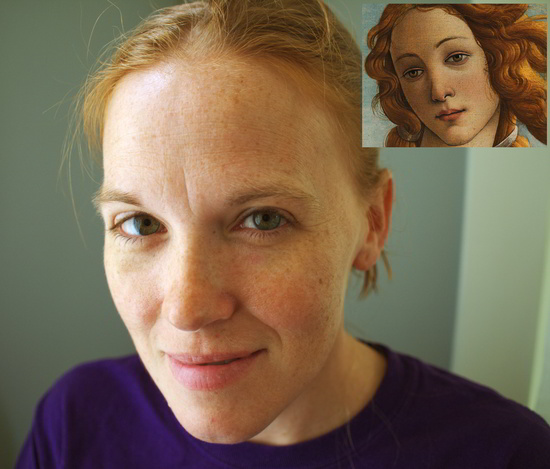
From a request, I’ve packaged up some of the curves from this tutorial (Pearl Earring, St. Michael, the previous Orange/Teal Hell, and another I was playing with from a Norman Rockwell painting):
Download the Curves (7zip .7z)
Hot on the heels of our last post about welcoming G’MIC to the forums at discuss.pixls.us, I thought I should speak briefly about some other additions I’ve recently made.
These were tough for me to finally make a decision about.
I want to be careful and not get crazy with over-categorization.
At the same time, I do want to make good logical breakdowns for people that is still intuitive.
Here is what the current category breakdown looks like for discuss:
PIXLS.US The comment/posts from articles/blogposts here on the main site.
Processing Processing and managing images after they’ve been captured.
Capturing Capturing an image and the ways we go about doing it.
Along with the addition of the Software category (and the G’MIC subcategory), I decided that the Help! category would make more sense under the Meta category.
That is, the Help! section is for website/forum help, which is more of a Meta topic (hence moving it).
As we’ve already seen, there is now a Software category for all discussions about the various software we use.
The first sub-category to this is of course, the G’MIC subcategory.
If there is enough interest in it, I am open to creating more sub-categories as needed to support particular software projects (GIMP, darktable, RawTherapee, etc…).
I will wait until there is some interest before adding more categories here.
This category had some interest from members and I agree that it’s a good idea.
It’s intended as a place for members to showcase the works they’re proud of and to hopefully serve as a nice example of what we’re capable of producing using F/OSS tools.
A couple of examples from the Showcase category so far:
This is intended as a place for members to solicit advice and critiques on their works from others.
It took me a little work to come up with an initial take on the overall description for the category.
I can promise that I will do my best to give honest and constructive feedback to anyone that asks in this category.
I also promise to do my best to make sure that no post goes un-answered here (I know how beneficial feedback has been to me in the past, so it’s the least I could do to help others out in return).
I also bit the bullet this week and finally caved to sign up for a Facebook account.
The only reason was because I had to have a personal account to get an API key to allow people to log in using their FB account (with OAuth).
We can now use Google, Facebook, Twitter, and Yahoo! to Log In.
On the other hand, we now accept four different methods of logging in automatically along with signing up for a normal account.
I have been trying to make it as frictionless as possible to join the conversation and hopefully this most recent addition (FB) will help in some small way.
Color has this amazing ability to evoke emotional responses from us.
From the warm glow of a sunny summer afternoon to a cool refreshing early evening in fall.
We associate colors with certain moods, places, feelings, and memories (consciously or not).
Volumes have been written on color and I am in no ways even remotely qualified to speak on it.
So I won’t.
Instead, we are going to take a look at the use of the Curves tool in GIMP.
Even though GIMP is used to demonstrate these ideas, the principles are generic to just about any RGB curve adjustments.
Your Pixels and You
First there’s something you need to consider if you haven’t before, and that’s what goes into representing a colored pixel on your screen.
Open up an image in GIMP.
Now zoom in.
Nope - don’t be shy now, zoom in more!
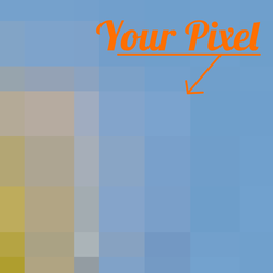
Aaand there’s your pixel.
So let’s investigate what goes into making your pixel.
Remember, each pixel is represented by a combination of 3 colors: Red, Green, and Blue.
In GIMP (currently at 8-bit), that means that each RGB color can have a value from 0 - 255, and combining these three colors with varying levels in each channel will result in all the colors you can see in your image.
If all three channels have a value of 255 - then the resulting color will be pure white.
If all three channels have a value of 0 - then the resulting color will be pure black.
If all three channels have the same value, then you will get a shade of gray (128,128,128 would be a middle gray color for instance).
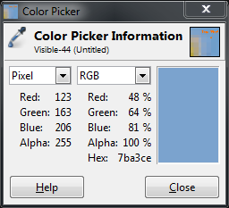
So now let’s see what goes into making up your pixel:
The RGB components that mix into your final blue pixel.
As you can see, there is more blue than anything else (it is a blue-ish pixel after all), followed by green, then a dash of red.
If we were to change the values of each channel, but kept ratio the same between Red, Green, and Blue, then we would keep the same color and just lighten or darken the pixel by some amount.
Curves: Value
So let’s leave your pixel alone for the time being, and actually have a look at the Curves dialog.
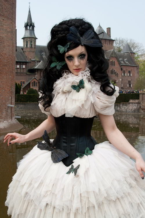
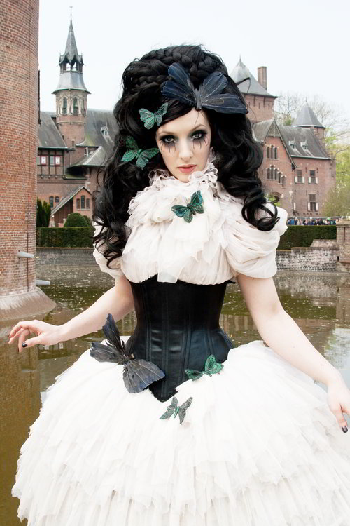
I’ll be using this wonderful image by Eric from Flickr.
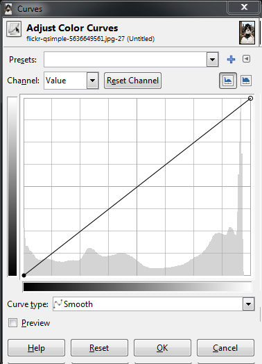
Opening up my Curves dialog shows me the following:
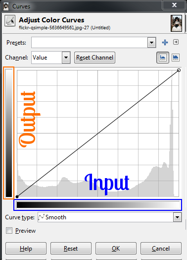
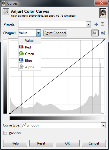
We can see that I start off with the curve for the Value of the pixels.
I could also use the drop down for “Channel” to change to red, green or blue curves if I wanted to.
For now let’s look at Value, though.
In the main area of the dialog I am presented with a linear curve, behind which I will see a histogram of the value data for the entire image (showing the amount of each value across my image).
Notice a spike in the high values on the right, and a small gap at the brightest values.
What we can do right now is to adjust the values of each pixel in the image using this curve.
The best way to visualize it is to remember that the bottom range from black to white represents the current value of the pixels, and the left range is the value to be mapped to.
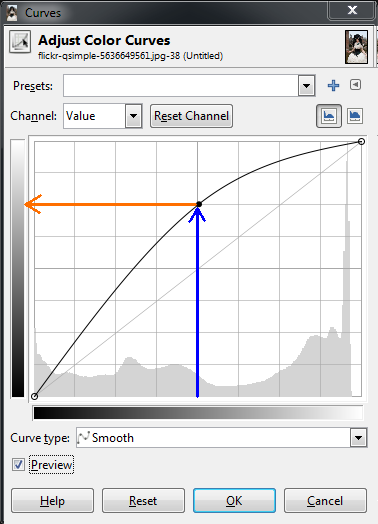
So to show an example of how this curve will affect your image, suppose I wanted to remap all the values in the image that were in the midtones, and to make them all lighter.
I can do this by clicking on the curve near the midtones, and dragging the curve higher in the Y direction:
What this curve does is takes the values around the midtones, and pushes their values to be much lighter than they were.
In this case, values around 128 were re-mapped to now be closer to 192.
Because the curve is set Smooth, there will be a gradual transition for all the tones surrounding my point to be pulled in the same direction (this makes for a smoother fall-off as opposed to an abrupt change at one value).
Because there is only a single point in the curve right now, this means that all values will be pulled higher.
The results of pushing the midtones of the value curve higher (click to compare to original).
Care should be taken when fiddling with these curves to not blow things out or destroy detail, of course.
I only push the curves here to illustrate what they do.
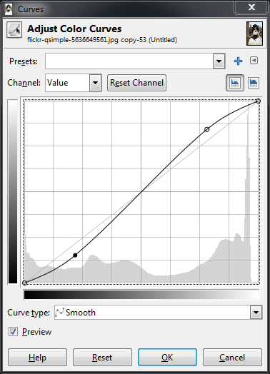
A very common curve adjustment you may hear about is to apply a slight “S” curve to your values.
The effect of this curve would be to darken the dark tones, and to lighten the light tones - in effect increasing global contrast on your image.
For instance, if I click on another point in the curves, and adjust the points to form a shape like so:
A slight “S” curve
This will now cause dark values to become even darker, while the light values get a small boost.
The curve still passes through the midpoint, so middle tones will stay closer to what they were.
Slight “S” curve increases global contrast (click for original).
In general, I find it easiest to visualize in terms of which regions in the curve will effect different tones in your image.
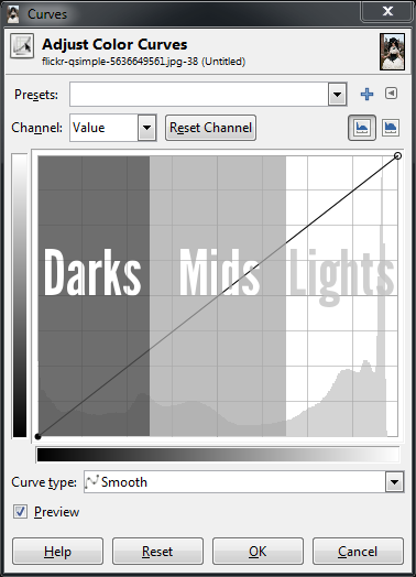
Here is a quick way to visualize it (that is true for value as well as RGB curves):
If there is one thing you take away from reading this, let it be the image above.
Curves: Colors
So how does this apply to other channels? Let’s have a look.
The exact same theory applies in the RGB channels as it did with values.
The relative positions of the darks, midtones, and lights are still the same in the curve dialog.
The primary difference now is that you can control the contribution of color in specific tonal regions of your image.
Value, Red, Green, Blue channel picker.
You choose which channel you want to adjust from the “Channel” drop-down.
To begin demonstrating what happens here it helps to have an idea of generally what effect you would like to apply to your image.
This is often the hardest part of adjusting the color tones if you don’t have a clear idea to start with.
For example, perhaps we wanted to “cool” down the shadows of our image.
“Cool” shadows are commonly seen during the day in shadows out of direct sunlight.
The light that does fall in shadows is mostly reflected light from a blue-ish sky, so the shadows will trend slightly more blue.
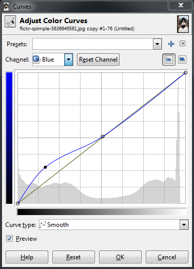
To try this, let’s adjust the Blue channel to be a little more prominent in the darker tones of our image, but to get back to normal around the midtones and lighter.
Boosting blues in darker tones
Pushing up blues in darker tones (click for original).
Now, here’s a question: If I wanted to “cool” the darker tones with more blue, what if I wanted to “warm” the lighter tones by adding a little yellow?
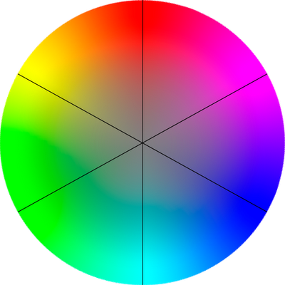
Well, there’s no “Yellow” curve to modify, so how to approach that? Have a look at this HSV color wheel below:
The thing to look out for here is that opposite your blue tones on this wheel, you’ll find yellow.
In fact, for each of the Red, Green, and Blue channels, the opposite colors on the color wheel will show you what an absence of that color will do to your image.
So remember:
Red → CyanGreen → MagentaBlue → Yellow
What this means to you while manipulating curves is that if you drag a curve for blue up, you will boost the blue in that region of your image.
If instead you drag the curve for blue down, you will be removing blues (or boosting the Yellows in that region of your image).
So to boost the blues in the dark tones, but increase the yellow in the lighter tones, you could create a sort of “reverse” S-curve in the blue channel:
Boost blues in darks, boost yellow in high tones (click for original).
In the green channel for instance, you can begin to introduce more magenta into the tones by decreasing the curve.
So dropping the green curve in the dark tones, and letting it settle back to normal towards the high tones will produce results like this:
Suppressing the green channel in darks/mids adds a bit of magenta (click for original).
In isolation, these curves are fun to play with, but I think that perhaps walking through some actual examples of color toning/grading would help to illustrate what I’m talking about here.
I’ll choose a couple of common toning examples to show what happens when you begin mixing all three channels up.
Color Toning/Grading
Orange and Teal Hell
I use the (cinema film) term color grading here because the first adjustment we will have a look at to illustrate curves is a horrible hollywood trend that is best described by Todd Miro on his blog.
Grading is a term for color toning on film, and Todd’s post is a funny look at the prevalence of orange and teal in modern film palettes.
So it’s worth a look just to see how silly this is (and hopefully to raise awareness of the obnoxiousness of this practice).
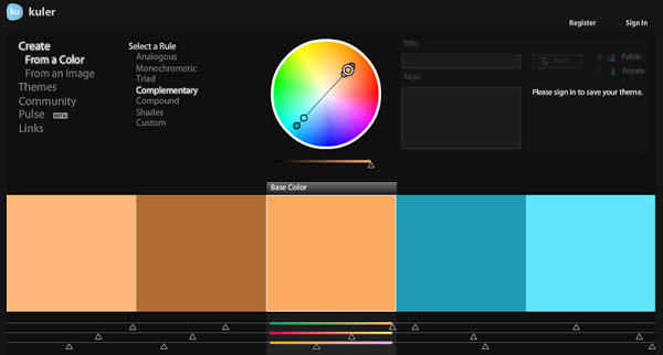
The general thought here is that caucasian skin tones trend towards orange, and if you have a look at a complementary color on the color wheel, you’ll notice that directly opposite orange is a teal color.
If you don’t already know about it, Adobe has online a fantastic tool for color visualization and palette creation called KulerAdobe Color CC.
It lets you work on colors based on some classic rules, or even generate a color palette from images.
Well worth a visit and a fantastic bookmark for fiddling with color.
So a quick look at the desired effect would be to keep/boost the skin tones into a sort of orange-y pinkish color, and to push the darker tones into a teal/cyan combination.
(Colorists on films tend to use a Lift, Gamma, Gain model, but we’ll just try this out with our curves here).
Quick disclaimer - I am purposefully exaggerating these modifications to illustrate what they do.
Like most things, moderation and restraint will go a long ways towards not causing your viewers eyeballs to bleed.
Remember - light touch!
So I know that I want to see my skin tones head into an orange-ish color.
In my image the skin tones are in the upper mids/low highs range of values, so I will start around there.
What I’ve done is put a point around the low midtones to anchor the curve closer to normal for those tones.
This lets me fiddle with the red channel and to isolate it roughly to the mid and high tones only.
The skin tones in this image in the red channel will fall toward the upper end of the mids, so I’ve boosted the reds there.
Things may look a little weird at first:
If you look back at the color wheel again, you’ll notice that between red and green, there is a yellow, and if you go a bit closer towards red the yellow turns to more of an orange.
What this means is that if we add some more green to those same tones, the overall colors will start to shift towards an orange.
So we can switch to the green channel now, put a point in the lower midtones again to hold things around normal, and slightly boost the green.
Don’t boost it all the way to the reds, but about 2/3rds or so to taste.
This puts a little more red/orange-y color into the tones around the skin.
You could further adjust this by perhaps including a bit more yellow as well.
To do this, I would again put an anchor point in the low mid tones on the blue channel, then slightly drop the blue curve in the upper tones to introduce a bit of yellow.
Remember, we’re experimenting here so feel free to try things out as we move along.
I may consider the upper tones to be finished at the moment, and now I would want to look at introducing a more blue/teal color into the darker tones.
I can start by boosting a bit of blues in the dark tones.
I’m going to use the anchor point I already created, and just push things up a bit.
Now I want to make the darker tones a bit more teal in color.
Remember the color wheel - teal is the absence of red - so we will drop down the red channel in the lower tones as well.
And finally to push a very slight magenta into the dark tones as well, I’ll push down the green channel a bit.
If I wanted to go a step further, I could also put an anchor point up close to the highest values to keep the brightest parts of the image closer to a white instead of carrying over a color cast from our previous operations.
If your previous operations also darkened the image a bit, you could also now revisit the Value channel, and make modifications there as well.
In my case I bumped the midtones of the image just a bit to brighten things up slightly.
Finally to end up at something like this.
After fooling around a bit - disgusting, isn’t it?
(click for original).
I am exaggerating things here to illustrate a point.
Please don’t do this to your photos. :)
If you’d like to download the curves file of the results we reached above, get it here: Orange Teal Hell Color Curves
Conclusion
Remember, think about what the color curves represent in your image to help you achieve your final results.
Begin looking at the different tonalities in your image and how you’d like them to appear as part of your final vision.
For even more fun - realize that the colors in your images can help to evoke emotional responses in the viewer, and adjust things accordingly.
I’ll leave it as an exercise for the reader to determine some of the associations between colors and different emotions.
Anyone who’s followed me for a while likely knows that I’m friends with G’MIC (GREYC’s Magic for Image Computing) creator David Tschumperlé.
I was also able to release all of my film emulationpresets on G’MIC for everyone to use with David’s help and we collaborated on a bunch of different fun processing filters for photographers in G’MIC (split details/wavelet decompose, freaky details, film emulation, mean/median averaging, and more).
It’s also David that helped me by writing a G’MIC script to mean average images for me when I started making my amalgamations
(Thus moving me away from my previous method of using Imagemagick):
So when the forums here on discuss.pixls.us were finally up and running, it only made sense to offer G’MIC its own part of the forums.
They had previously been using a combination of Flickr groups and gimpchat.com.
These are great forums, they were just a little cumbersome to use.
To the winners of the Open Source Photography Course Giveaway
I compiled the list of entries this afternoon across the various social networks and let random.org pick an integer in the domain of all of the entries…
I’ll be contacting you shortly (assuming you don’t read this announcement here first…)!
I will need a valid email address from you both in order to send your download links.
You can reach me at pixlsus@pixls.us.
Thank you to everyone who shared the post to help raise awareness!
The lessons are still on sale until August 1st for $35USD over on Riley’s site.
Photographer Riley Brandt recently released his Open Source Photography Course.
I managed to get a little bit of his time to answer some questions for us about his photography and the course itself.
You can read the full interview right here:
Riley went above and beyond for us.
He has graciously offered us an opportunity for 2 readers to win a free copy of the course (one in an open format like WebM/VP8, and another in a popular format like MP4/H.264)!
For a chance to win, I’m asking you to share a link to this post on:
with the hashtag #PIXLSGiveAway (you can click those links to share to those networks).
Each social network counts as one entry, so you can triple your chances by posting across all three.
Next week (Monday, 2015-07-20 Wednesday, 2015-07-22 to give folks a full week), I will search those networks for all the posts and compile a list of people, from which I’ll pick the winners (using random.org).
Make sure you get that hashtag right! :)
He recently announced the availability of The Open Source Photography Course.
It’s a full photographic workflow course using only free, open source software that he has spent the last ten months putting together.
Riley has graciously offered two free copies for us to give away! For a chance to win, see this blog post.
I was lucky enough to get a few minutes of Riley’s time to ask him a few questions about his photography and this course.
A Chat with Riley Brandt
Tell us a bit about yourself!
Hello, my name is Riley Brandt and I am a professional photographer at the University of Calgary.
At work, I get to spend my days running around a university campus taking pictures of everything from a rooster with prosthetic legs made in a 3D printer, to wild students dressed in costumes jumping into freezing cold water for charity. It can be pretty awsome.
Outside of work, I am a supporter of Linux and open source software. I am also a bit of a film geek.
[ed. note: He’s not kidding - That’s a rooster with prosthetic legs…]
I see you were trained in photojournalism. Is this still your primary photographic focus?
Though I definitely enjoy portraits, fashion and lifestyle photography, my day to day work as a photographer at a university is very similar to my photojournalism days.
I have to work with whatever poor lighting conditions I am given, and I have to turn around those photos quickly to meet deadlines.
However, I recently became an uncle for the first time to a baby boy, so I imagine I will be expanding into new born and toddler photography very soon :)
Photography started as a hobby for me when I was living the Czech Republic in the late 90s and early 2000s. My first SLR camera was the classic Canon AE1 (which I still have).
I didn’t start to work as a full time professional photographer until I graduated from the Journalism program at SAIT Polytechnic in 2008.
What type of photography do you enjoy doing the most?
In a nutshell, I enjoy photographing people. This includes both portraits and candid moments at events.
I love meeting someone with an interesting story, and then trying to capture some of their personality in an image.
At events, I’ve witnessed everything from the joy of someone meeting an astronaut they idolize, to the anguish of a parent at graduation collecting a degree instead of their child who was killed. Capturing genuine emotion at events is challenging, and overwhelming at times, but is also very gratifying.
It would be hard for me to choose between candids or portraits. I enjoy them both.
I’ve been told several times that my images are very “clean”. Which I think means I limit the image to only a few key elements, and remove any major distractions.
If you had to choose your favorite image from your portfolio, what would it be?
I don’t have a favorite image in my collection.
However, at the end of a work week, I usually have at least one image that I am really happy with. A photo that I will look at again when I get home from work. An image that I look forward to seeing published. Those are my favorites.
Has free-software always been the foundation of your workflow?
Definitely not. I started with Adobe software, and still use it (and other non-free software) at work. Though hopefully that will change.
I switched to free software for all my personal work at home, because all my computers at home run Linux.
I also dislike at lot of Adobe’s actions as a company, ie: horrible security and switching to a “cloud” version of their software which is really just a DRM scheme.
There many significant reasons to not run non-free software, but what really motivated my switch initially was simply that Adobe never released a Linux version of their software.
What is your normal OS/platform?
I guess I am transitioning from Ubuntu to Fedora (both GNU/Linux). My main desktop is still running Ubuntu Gnome 14.04. But my laptop is running Fedora 21.
Ubuntu doesn’t offer an up to date version of the Gnome desktop environment. It also doesn’t use the Gnome Software Centre or many Gnome apps. Fedora does. So my desktop will be running Fedora in the near future as well.
What drove you to consider creating a free-software centric course?
Because it was so difficult for me to transition from Adobe software to free software, I wanted to provide an easier option for others trying to do the same thing.
Instead of spending weeks or months searching through all the different manuals, tutorials and websites, someone can spend a weekend watching my course and be up and running quickly.
Also, it was just a great project to work on. I got to combine two of my passions, Linux and photography.
Is the course the same as your own approach?
Yes, it’s the same way I work.
I start with fundamentals like monitor calibration and file management. Then onto basics like correcting exposure, color, contrast and noise. After that, I cover less frequently used tools. It’s the same way I work.
The course focuses heavily on darktable for RAW processing - have you also tried any of the other options such as RawTherapee?
I originally tried digiKam because it looked like it had most of the features I needed. However, KDE and I are like oil and water. The user interface felt impenetrable to me, so I moved on.
I also tried RawTherapee, but only briefly. I got some bad results in the beginning, but that was probably due to my lack of familiarity with the software. I might give it another go one day.
Once darktable added advanced selective editing with masks, I was all in. I like the photo management element as well.
Have you considered expanding your (course) offerings to include other aspects of photography?
Umm.. not just yet. I first need to rest :)
If you were to expand the current course, what would you like to focus on next?
It’s hard to say right now. Possibly a more in depth look at GIMP. Or a series where viewers watch me edit photos from start to finish.
It took 10 months to create this course, will you be taking a break or starting right away on the next installment? :)
A break for sure :) I spent most of my weekends preparing and recording a lesson for the past year. So yes, first a break.
Some parting words?
I would like to recommend the Desktop Publishing course created by GIMP Magazine editor Steve Czajka for anyone who is trying to transition from Adobe InDesign to Scribus.
I would also love to see someone create a similar course for Inkscape.
Due to the heated debate lately, a short foreword:
We do not want to harass, insult or criticize anyone due to his or her choice of operating system. Still, from time to time we encounter comments from people accusing us of ignorance or even disrespect towards Windows users. If any of our statements can be interpreted such, we want to apologize for that – and once more give the full explanation of our lacking Windows support.
darktable is developed and maintained by a small group of people in their spare time, just for fun. We do not have any funds, do not provide travel reimbursements for conferences or meetings, and don’t even have a legal entity at the moment. In other words: None of the developers has ever seen (and most likely will ever see) a single $(INSERT YOUR CURRENCY) for the development of darktable, which is thus a project purely driven by enthusiasm and curiosity.
The team is quite mixed, some have a professional background in computing, others don’t. But all love photography and like exploring the full information recorded by the camera themselves. Most new features are added to darktable as an expert for, let’s say GPU computing, steps up and is willing to provide and maintain code for the new feature.
Up till now there is one technical thing that unites all developers: None of them is using Windows as operating system. Some are using Mac OSX, Solaris, etc, but most run some Linux distribution. New flavors of operating systems kept being added to our list with people willing to support their favorite system joining the team.
Also (since this stands out a bit as “commercial operating system”) Mac OS X support arrived in exactly this way. Someone (parafin!) popped up, said: “I like this software, and I want to run darktable on my Mac.”, compiled it on OS X and since then does testing and package building for the Mac OS X operating system. And this is not an easy job. Initially there were just snapshot builds from git, no official releases, not even release candidates – but already the first complaints about the quality arrived. Finally, there was a lot of time invested in working around specific peculiarities of this operating system to make it work and provide builds for every new version of darktable released.
This nicely shows one of the consequences of the project’s organizational (non-) structure and development approach: at first, every developer cares about darktable running on his personal system.
Usually feature requests from users or from the community are treated like a brainstorming session. Someone proposes a new feature, people think and discuss about it – and if someone likes the idea and has time to code it, it might eventually come – if the team agrees on including the feature.
But life is not a picnic. You probably wouldn’t pass by your neighbor and demand from him to repair your broken car – just because you know he loves to tinker with his vintage car collection at home. Same applies here. No one feels comfortable if suddenly request are being made that would require a non-negligible amount of work – but with no return for the person carrying out the work, neither moneywise nor intellectually.
This is the feeling created every time someone just passes by leaving as only statement: “Why isn’t there a Windows build (yet)?”.
The answer has always been the same: because no one stepped up doing it. None of the passers-by requesting a Windows build actually took the initiative, just downloaded the source code and started the compilation. No one approached the development team with actual build errors and problems encountered during a compilation using MinGW or else on Windows. The only thing ever aired were requests for ready-made binaries.
As stated earlier here, the development of darktable is totally about one’s own initiative. This project (as many others) is not about ordering things and getting them delivered. It’s about starting things, participating and contributing. It’s about trying things out yourself. It’s FLOSS.
One argument that pops up from time to time is: “darktable’s user base would grow immensely with a Windows build!”. This might be true. But – what’s the benefit from this? Why should a developer care how many people are using the software if his or her sole motivation was producing a nice software that he/she could process raw files with?
On the contrary: more users usually means more support, more bug tracker tickets, more work. And this work usually isn’t the pleasing sort, hunting seldom bugs occurring with some rare camera’s files on some other operating system is usually not exactly what people love to spent their Saturday afternoon on.
This argumentation would totally make sense if darktable would be sold, the developers paid and the overall profit would depend on the number of people using the software. No one can be blamed for sending such requests to a company selling their software or service (for your money or your data, whatever) – and it is up to them to make an economical decision on whether it makes sense to invest the time and manpower or not.
But this is different.
Not building darktable on Windows is not a technical issue after all. There certainly are problems of portability, and code changes would be necessary, but in the end it would probably work out. The real problem is (as has been pointed out by the darktable development team many times in the past) the maintenance of the build as well as all the dependencies that the package requires.
The darktable team is trying to deliver a high-quality reliable software. Photographers rely on being able to re-process their old developments with recent versions of darktable obtaining exactly the same result – and that on many platforms, being it CPUs or GPUs with OpenCL. Satisfying this objective requires quite some testing, thinking and maintenance work.
Spawning another build on a platform that not a single developer is using would mean lots and lots of testing – in unfamiliar terrain, and with no fun attached at all. Releasing a half-way working, barely tested build for Windows would harm the project’s reputation and diminish the confidence in the software treating your photographs carefully.
We hope that this reasoning is comprehensible and that no one feels disrespected due to the choice of operating system.
After quite a bit of back and forth I am quite happy to be able to announce that the latest tutorial is up: A Blended Panorama with PhotoFlow!
This contribution comes from Andrea Ferrero, the creator of a new project: PhotoFlow.
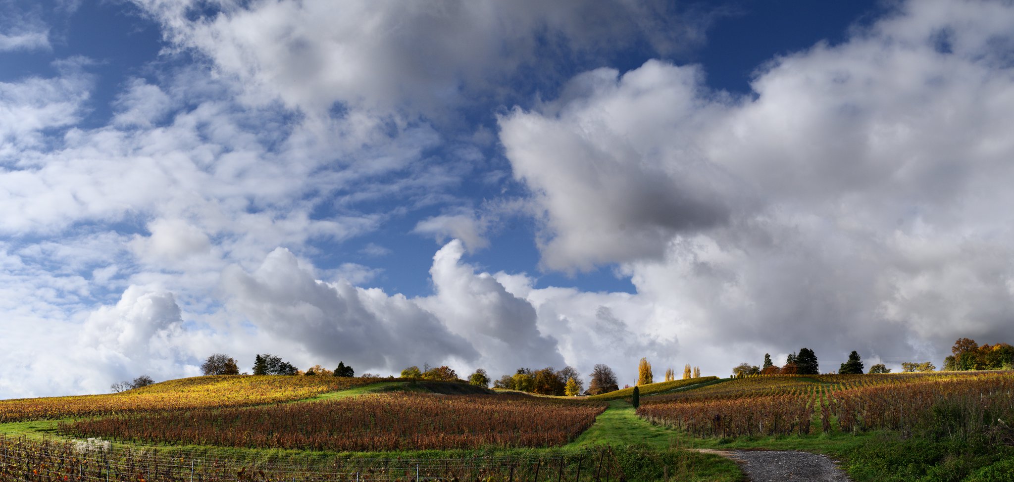
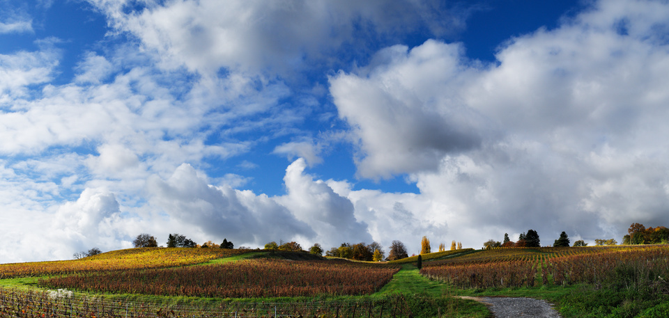
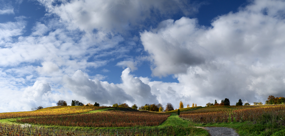
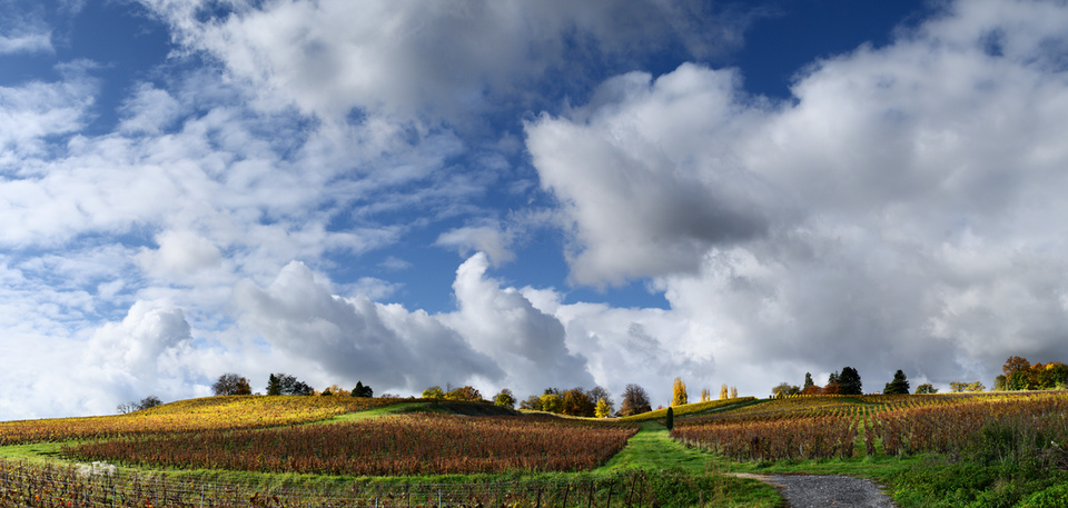
In it, he walks through a process of stitching a panorama together using Hugin and blending multiple exposure options through masking in PhotoFlow (see lede image).
The results are quite nice and natural looking!
Andrea also runs through a quick video comparison of doing LCE using both a Gaussian and Bilateral blur, in case you ever wanted to see them compared side-by-side:
Specifically I’m talking about the background lede image at the very top of the main page:
I had originally created that image as a placeholder in Blender.
The site is intended as a photography-centric site, so the natural thought was why not use photos as a background instead?
The thought is to rotate through images as provided by the community.
I’ve also mocked up two version of using an image as a background.
Simple replacement of the image with photos from the community.
This is the most popular in the poll on the forum at the moment.
The image will be rotated amongst images provided by community members.
I just need to make sure that the text shown is legible over whatever the image may be…
Full viewport splash version, where the image fills the viewport.
This is not very popular from the feedback I received (thank you akk, ankh, muks, DrSlony, LebedevRI, and others on irc!).
I personally like the idea but I can understand why others may not like it.
If anyone wants to chime in (or vote in the poll) then head over to the forum topic and let us know your thoughts!
Also, a big thank you to Morgan Hardwood for allowing us to use that image as a background example.
If you want a nice way to support F/OSS development, it just so happens that Morgan is a developer for RawTherapee, and a print of that image is available for purchase.
Contact him for details.
The goal of this tutorial is to show how to create a sort-of-HDR panoramic image using only Free and Open Source tools.
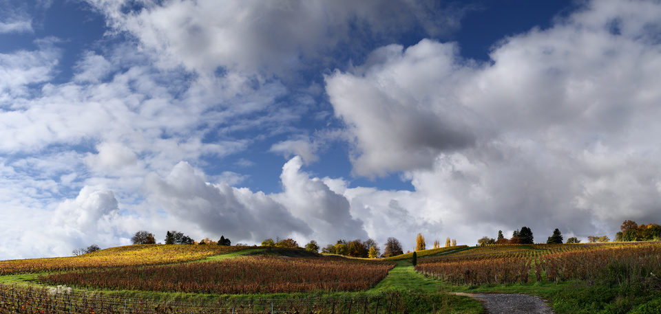
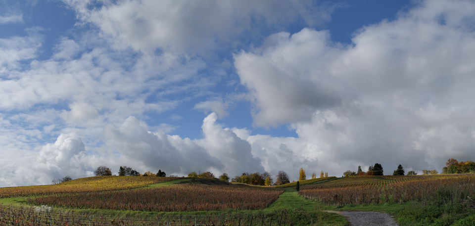
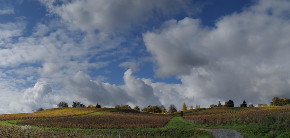
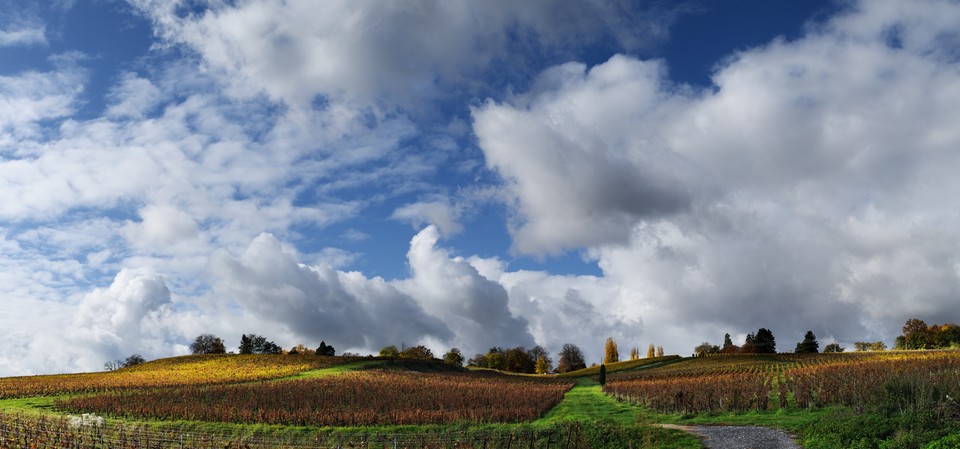
To explain my workflow I will use the image below as an example.
This panorama was obtained from the combination of six views, each consisting of three bracketed shots at -1EV, 0EV and +1EV exposure.
The three exposures are stitched together with the Hugin suite, and then exposure-blended with enfuse.
The PhotoFlow RAW editor is used to prepare the initial images and to finalize the processing of the assembled panorama.
The final result of the post-processing is below:
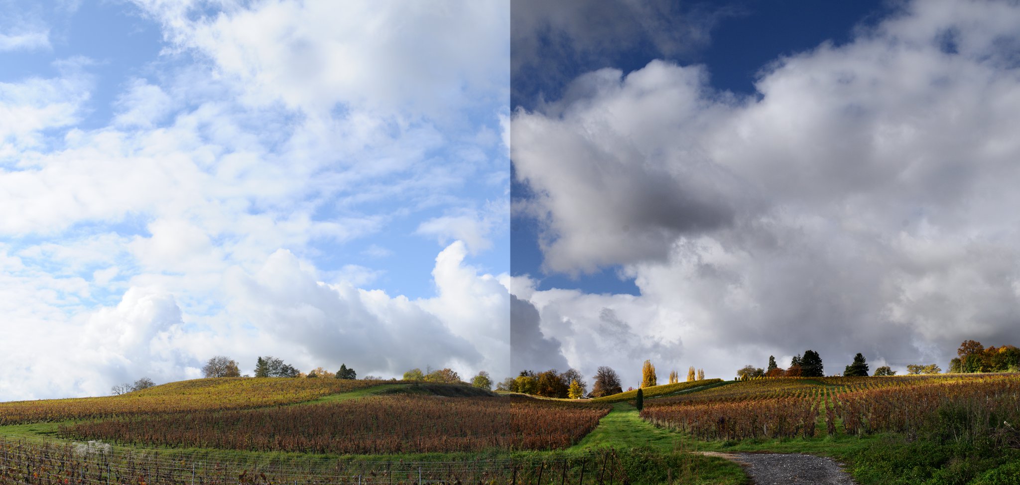
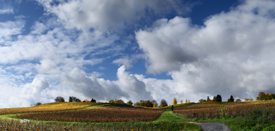
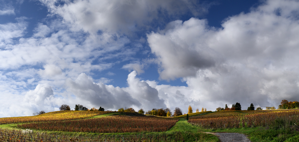
Final result of the panorama editing (click to compare to simple +1EV exposure)
In this case I have used the brightest image for the foreground, the darkest one for the sky and clouds, and and exposure-fused one for a seamless transition between the two.
The rest of the post will show how to get there…
Before we continue, let me advise you that I’m not a pro, and that the tips and “recommendations” that I’ll be giving in this post are mostly derived from trial-and-error and common sense.
Feel free to correct/add/suggest anything… we are all here to learn!
Taking the shots
Shooting a panorama requires a bit of preparation and planning to make sure that one can get the best out of Hugin when stitching the shots together. Here is my personal “checklist”:
Manual Focus - set the camera to manual focus, so that the focus plane is the same for all shots
Overlap Shots - make sure that each frame has sufficient overlap with the previous one (something between 1/2 and 1/3 of the total area), so that hugin can find enough control points to align the images and determine the lens correction parameters
Follow A Straight Line - when taking the shots, try to follow as much as possible a straight line (keeping for example the horizon at the same height in your viewfinder); if you have a tripod, use it!
Frame Appropriately - to maximize the angle of view, frame vertically for an horizontal panorama (and vice-versa for a vertical one)
Leave Some Room - frame the shots a bit wider than needed, to avoid bad surprises when cropping the stitched panorama
Fixed Exposure - take all shots with a fixed exposure (manual or locked) to avoid luminance variations that might not be fully compensated by hugin
Bracket if Needed - if you shoot during a sunny day, the brightness might vary significantly across the whole panorama; in this case, take three or more bracketed exposures for each view (we will see later how to blend them in the post-processing)
Processing the RAW files
If you plan to create the panorama starting from the in-camera Jpeg images, you can safely skip this section. On the other hand, if you are shooting RAW you will need to process and prepare all the input images for Hugin. In this case it is important to make sure that the RAW processing parameters are exactly the same for all the shots. The best is to adjust the parameters on one reference image, and then batch-process the rest of the images using those settings.
Using PhotoFlow
Loading and processing a RAW file is rather easy:
Click the “Open” button and choose the appropriate RAW file from your hard disk; the image preview area will show at this point a grey and rather dark image
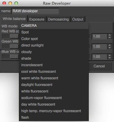
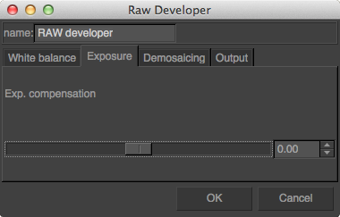
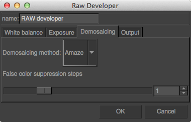
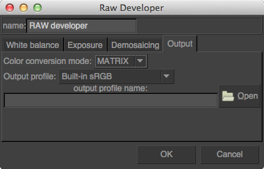
Add a “RAW developer” layer; a configuration dialog will show up which allows to access and modify all the typical RAW processing parameters (white balance, exposure, color conversion, etc… see screenshots below).
More details on the RAW processing in PhotoFlow can be found in this tutorial.
Once the result is ok the RAW processing parameters need to be saved into a preset. This can be done following a couple of simple steps:
Select the “RAW developer” layer and click on the “Save” button below the layers list widget (at the bottom-right of the photoflow’s window)
A file chooser dialog chooser dialog will pop-up, where one has to choose an appropriate file name and location for the preset and then click “Save”; the preset file name must have a “.pfp” extension
The saved preset needs then to be applied to all the RAW files in the set. Under Linux, PhotoFlow comes with an handy script that automates the process. The script is called pfconv and can be found here. It is a wrapper around the pfbatch and exiftool commands, and is used to process and convert a bunch of files to TIFF format. Save the script in one of the folders included in your PATH environment variable (for example /usr/local/bin) and make it executable:
sudo chmod u+x /usr/local/bin/pfconv
Processing all RAW files of a given folder is quite easy. Assuming that the RAW processing preset is stored in the same folder under the name raw_params.pfp, run this commands in your preferred terminal application:
cd panorama_dir
pfconv -p raw_params.pfp *.NEF
Of course, you have to change panorama_dir to your actual folder and the .NEF extension to the one of your RAW fles.
Now go for a cup of coffee, and be patient… a panorama with three or five bracketed shots for each view can easily have more than 50 files, and the processing can take half an hour or more. Once the processing completed, there will be one tiff file for each RAW image, an the fun with Hugin can start!
Assembling the shots
Hugin is a powerful and free software suite for stitching multiple shots into a seamless panorama, and more. Under Linux, Hugin can be usually installed through the package manager of your distribution. In the case of Ubuntu-based distros it can be usually installed with:
sudo apt-get install hugin
If you are running Hugin for the first time, I suggest to switch the interface type to Advanced in order to have full control over the available parameters.
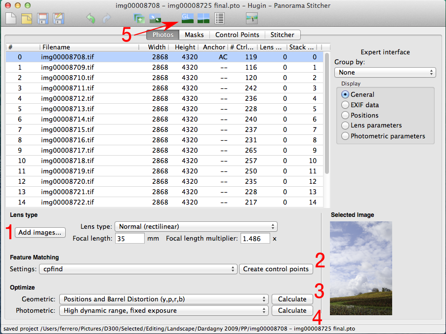
The first steps have to be done in the Photos tab:
Click on Add images and load all the tiff files included in your panorama. Hugin should automatically determine the lens focal length and the exposure values from the EXIF data embedded in the tiff files.
Click on Create control points to let hugin determine the anchor points that will be used to align the images and to determine the lens correction parameters so that all shots overlap perfectly. If the scene contains a large amount of clouds that have likely moved during the shooting, you can try setting the feature matching algorithm to cpfind+celeste to automatically exclude non-reliable control points in the clouds.
Set the geometric parameters to Positions and Barrel Distortion and hit the Calculate button.
Set the photometric parameters to High dynamic range, fixed exposure (since we are going to stitch bracketed shots that have been taken with fixed exposures), and hit the Calculate button again.
At this point we can have a first look at the assembled panorama. Hugin provides an OpenGL-based previewer that can be opened by clicking on the on the GL icon in the top toolbar (marked with the arrow in the above screenshot). This will open a window like this:
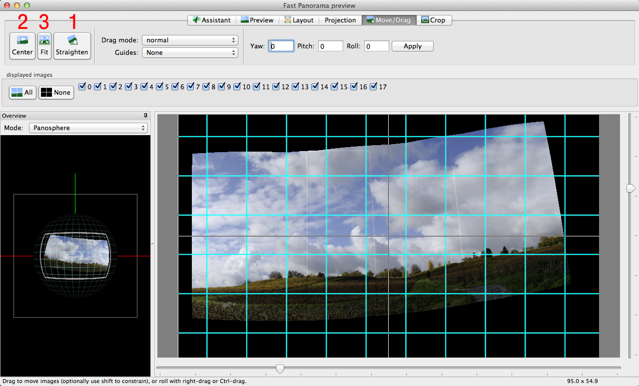
If the shots have been taken handheld and are not perfectly aligned, the panorama will probably look a bit “wavy” like in my example. This can be easily fixed by clicking on the Straighten button (at the top of the Move/Drag tab). Next, the image can be centered in the preview area with the Center and Fit buttons.
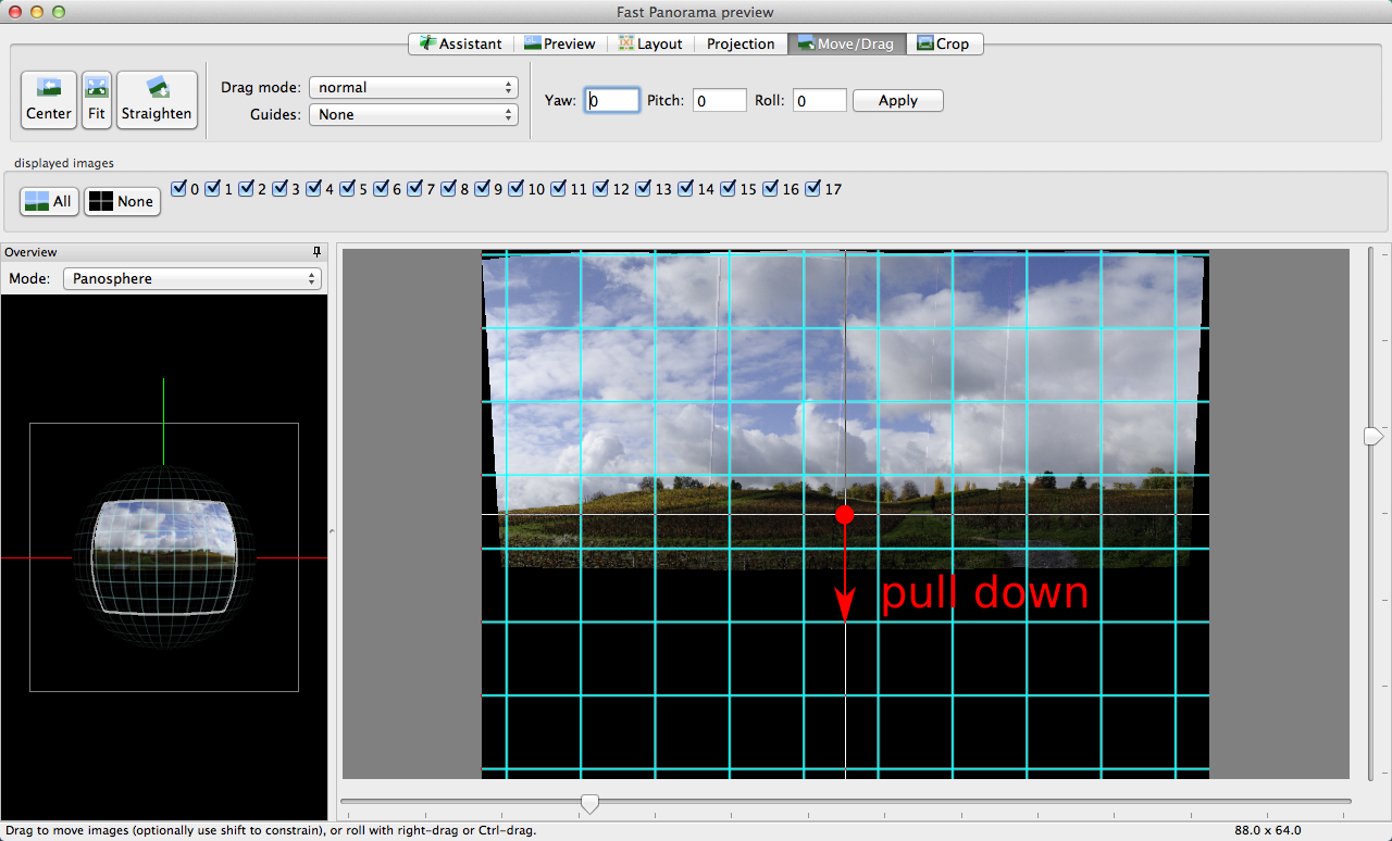
If the horizon is still not straight, you can further correct it by dragging the center of the image up or down:
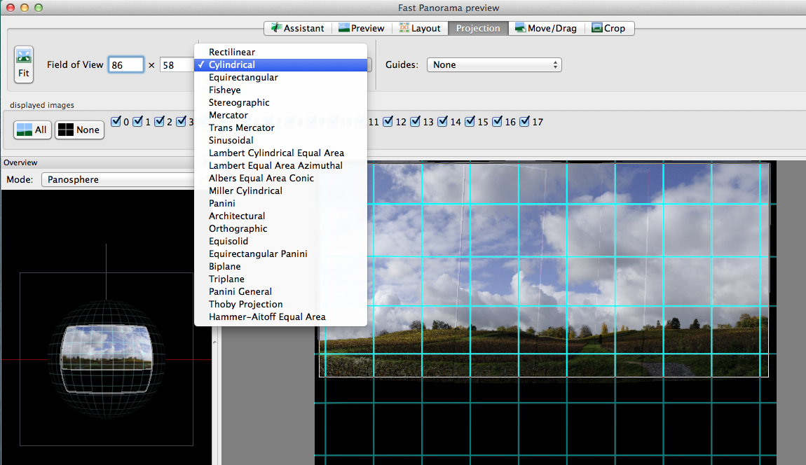
At this point, one can switch to the Projection tab and play with the different options. I usually find the Cylindrical projection better than the Equirectangular that is proposed by default (the vertical dimension is less “compressed”). For architectural panoramas that are not too wide, the Rectilinear projection can be a good option since vertical lines are kept straight.
If the projection type is changed, one has to click once more on the Center and Fit buttons.
Finally, you can switch to the Crop tab and click on the HDR Autocrop button to determine the limits of the area containing only valid pixels.
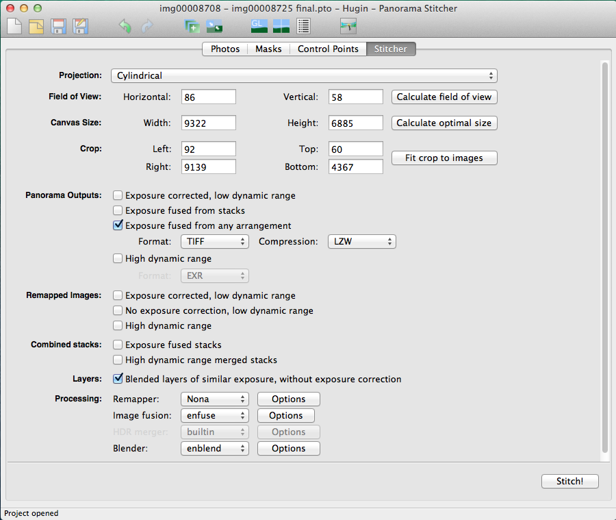
We are now done with the preview window; it can be closed and we can go back to the main window, in the Stitcher tab. Here we have to set the options to produce the output images the way we want. The idea is to blend each bracketed exposure into a separate panorama, and then use enfuse to create the final exposure-blended version. The intermediate panoramas, which will be saved along with the enfuse output, are already aligned with respect to each other and can be combined using different type of masks (luminosity, gradients, freehand, etc…).
The Stitcher tab has to be configured as in the image below, selecting Exposure fused from any arrangement and Blended layers of similar exposure, without exposure correction. I usually set the output format to TIFF to avoid compression artifacts.
The final act starts by clicking on the Stitch! button. The input images will be distorted, corrected for the lens vignetting and blended into seamless panoramas. The whole process is likely to take quite long, so it is probably a good opportunity for taking a pause…
At the end of the processing, few new images should appear in the output directory: one with an “_blended_fused.tif” suffix containing the output of the final enfuse step, and few with an “exposure????.tif” suffix that contain intermediate panoramas for each exposure value.
Blending the exposures
Very often, photo editing is all about getting what your eyes have seen out of what your camera has captured.
The image that will be edited through this tutorial is no exception: the human vision system can “compensate” large luminosity variations and can “record” scenes with a wider dynamic range than your camera sensor. In the following I will attempt to restore such large dynamics by combining under- and over-exposed shots together, in a way that does not produce unpleasing halos or artifacts. Nevertheless, I have intentionally pushed the edit a bit “over the top” in order to better show how far one can go with such a technique.
This second part introduces a certain number of quite general editing ideas, mixed with details specific to their realization in PhotoFlow. Most of what is described here can be reproduced in GIMP with little extra effort, but without the ease of non-destructive editing.
The steps that I followed to go from one to the other can be more or less outlined like that:
take the foreground from the +1EV version and the clouds from the -1EV version; use the exposure-blended Hugin output to improve the transition between the two exposures
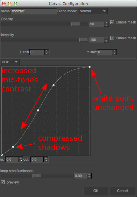
apply an S-shaped tonal curve to increase the overall brightness and add contrast.
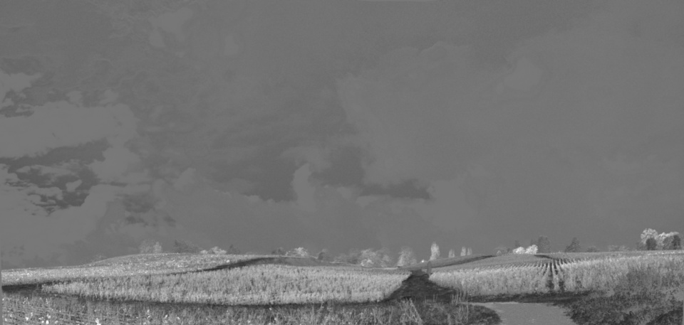
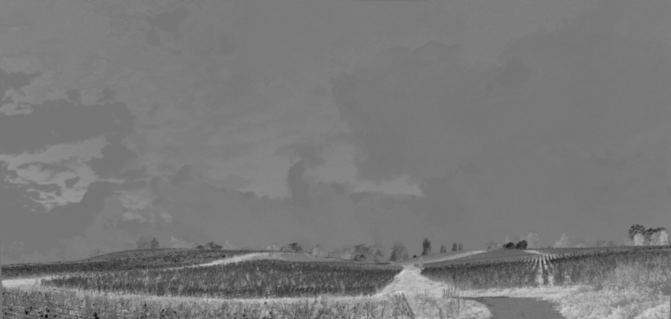
apply a combination of the a and b channels of the CIE-Lab colorspace in overlay blend mode to give more “pop” to the green and yellow regions in the foreground
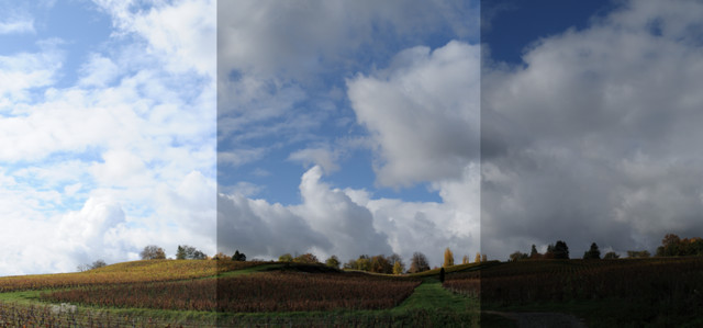
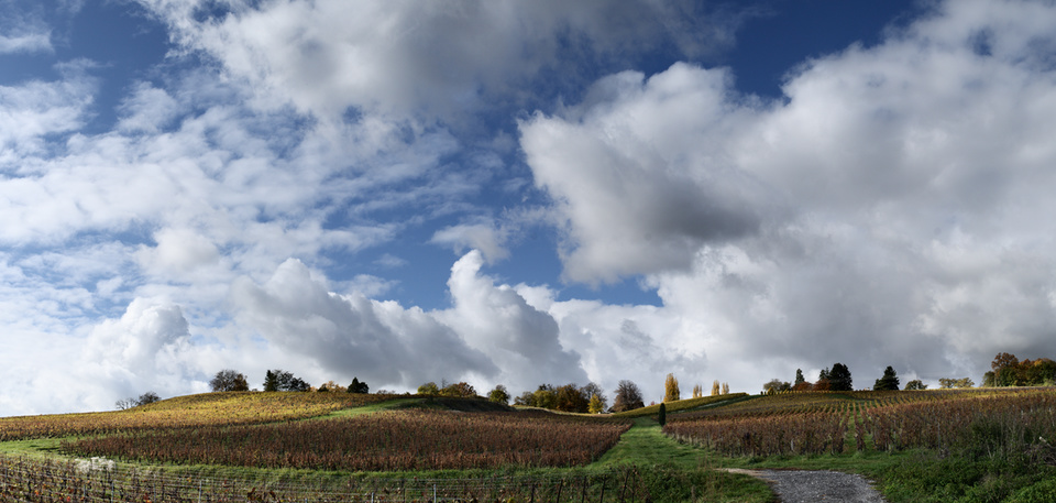
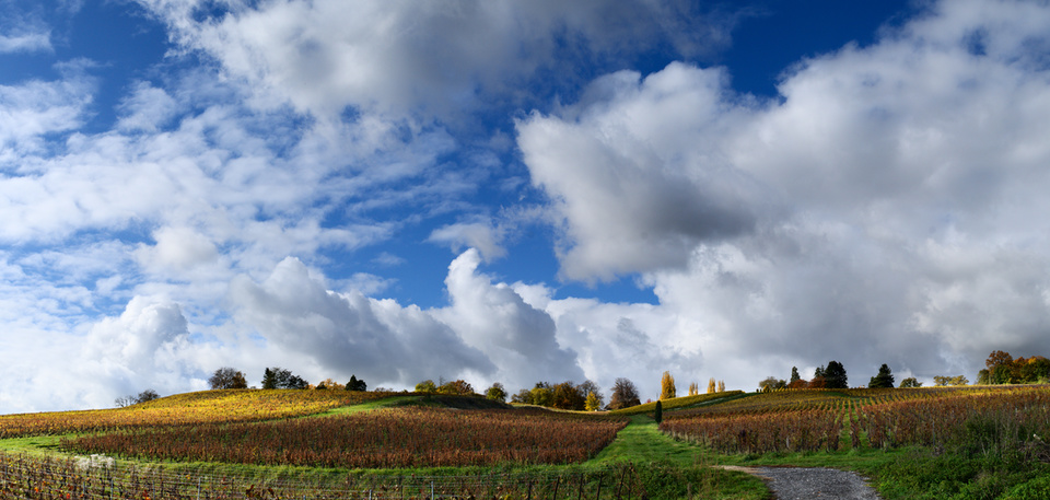
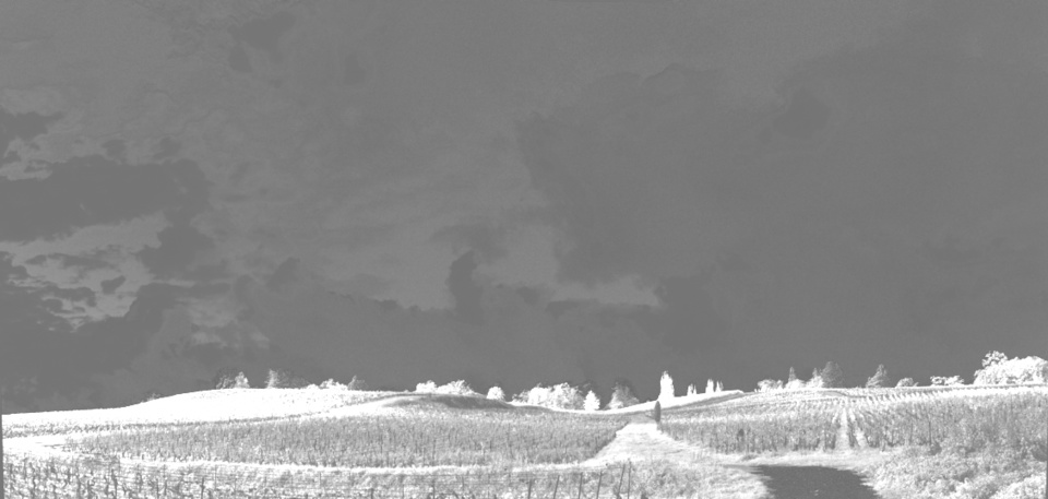
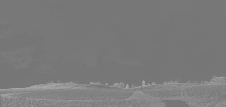
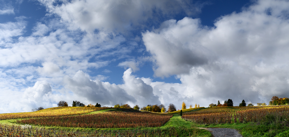
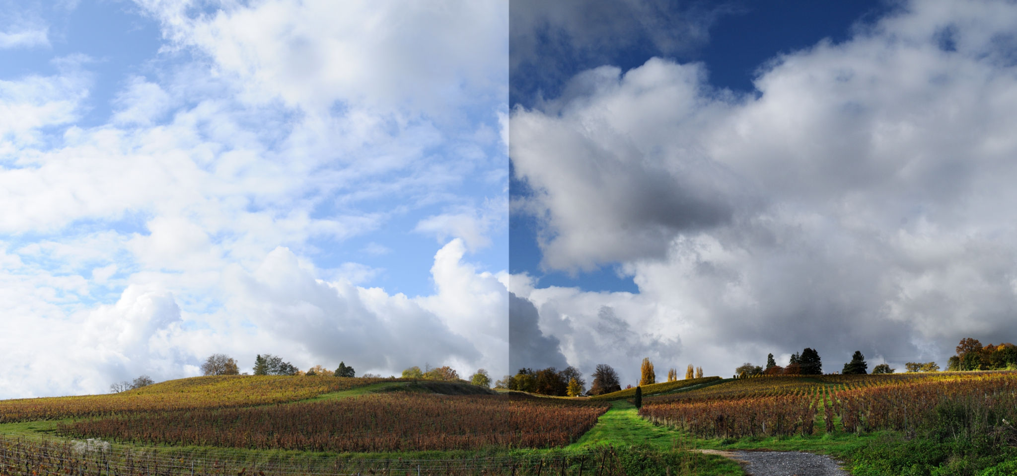
The image below shows side-by-side three of the output images produced with Hugin at the end of the first part. The left part contains the brightest panorama, obtained by blending the shots taken at +1EV. The right part contains the darkest version, obtained from the shots taken at -1EV. Finally, the central part shows the result of running the enfuse program to combine the -1EV, 0EV and +1EV panoramas.
Comparison between the +1EV exposure (left), the enfuse output (center) and the -1EV exposure (right)
Exposure blending in general
In scenes that exhibit strong brightness variations, one often needs to combine different exposures in order to compress the dynamic range so that the overall contrast can be further tweaked without the risk of losing details in the shadows or highlights.
In this case, the name of the game is “seamless blending”, i.e. combining the exposures in a way that looks natural, without visible transitions or halos.
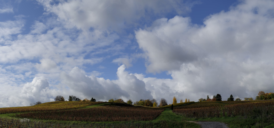
In our specific case, the easiest thing would be to simply combine the +1EV and -1EV images through some smooth transition, like in the example below.
Simple blending of the +1EV and -1EV exposures
The result is not too bad, however it is very difficult to avoid some brightening of the bottom part of the clouds (or alternatively some darkening of the hills), something that will most likely look artificial even if the effect is subtle (our brain will recognize that something is wrong, even if one cannot clearly explain the reason…). We need something to “bridge” the two images, so that the transition looks more natural.
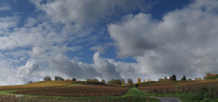
At this point it is good to recall that the last step performed by Hugin was to call the enfuse program to blend the three bracketed exposures. The enfuse output is somehow intermediate between the -1EV and +1EV versions, however a side-by-side comparison with the 0EV image reveals the subtle and sophisticated work done by the program: the foreground hill is brighter and the clouds are darker than in the 0EV version. And even more importantly, this job is done without triggering any alarm in your brain! Hence, the enfuse output is a perfect candidate to improve the transition between the hill and the sky.
Enfuse output (click to see 0EV version)
Exposure blending in PhotoFlow
It is time to put all the stuff together.
First of all, we should open PhotoFlow and load the +1EV image.
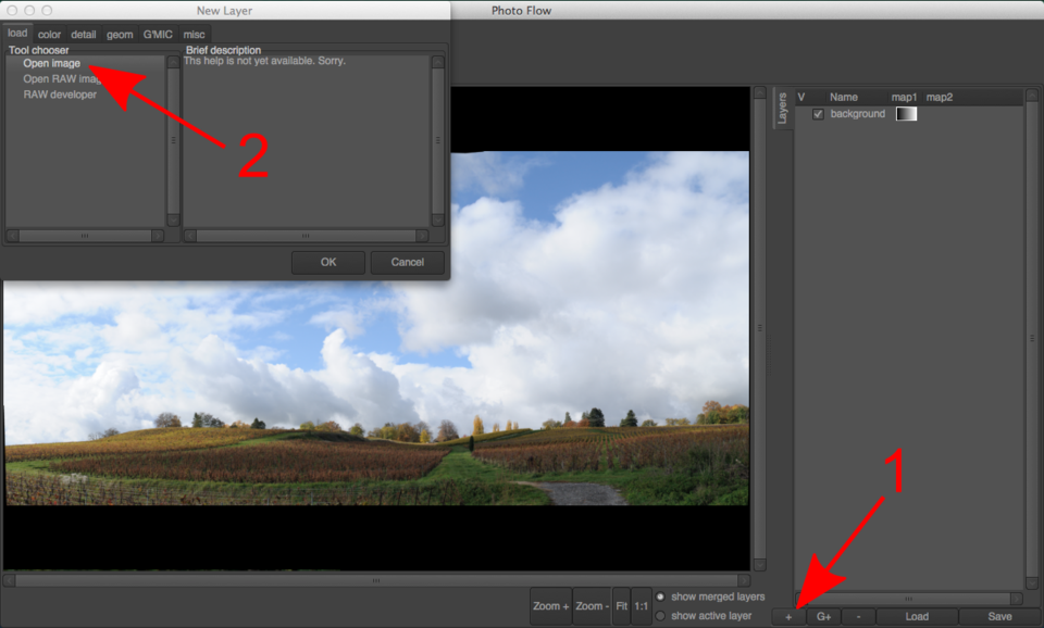
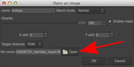
Next we need to add the enfuse output on top of it: for that you first need to add a new layer (1) and choose the Open image tool from the dialog that will open up (2)(see below).
Inserting as image from disk as a layer
After clicking the “OK” button, a new layer will be added and the corresponding configuration dialog will be shown. There you can choose the name of the file to be added; in this case, choose the one ending with “_blended_fused.tif” among those created by Hugin:
“Open image” tool dialog
Layer masks: theory (a bit) and practice (a lot)
For the moment, the new layer completely replaces the background image. This is not the desired result: instead, we want to keep the hills from the background layer and only take the clouds from the “_blended_fused.tif” version. In other words, we need a layer mask.
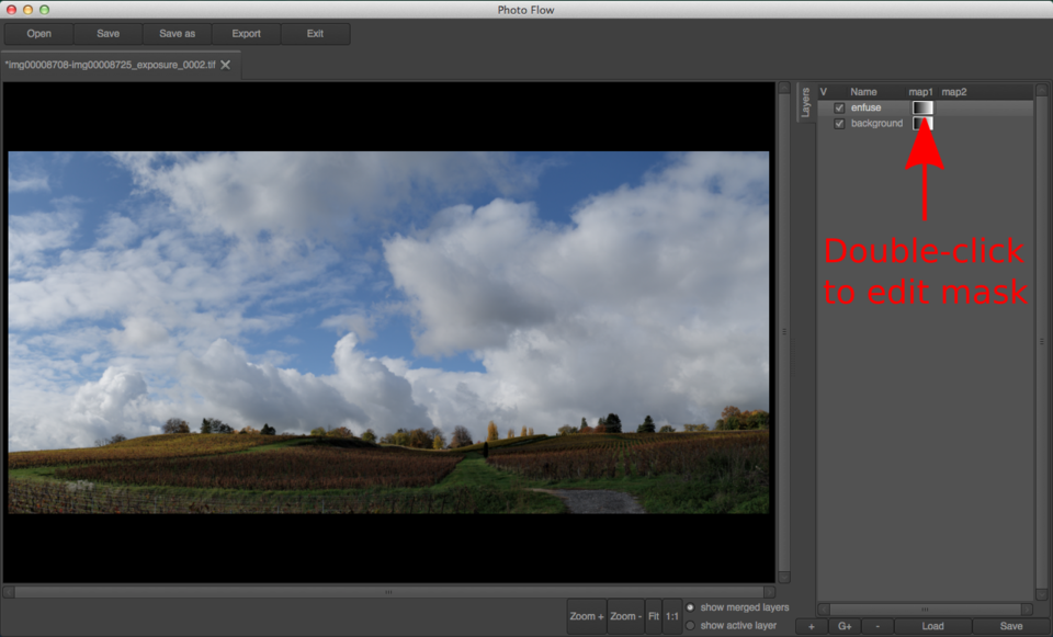
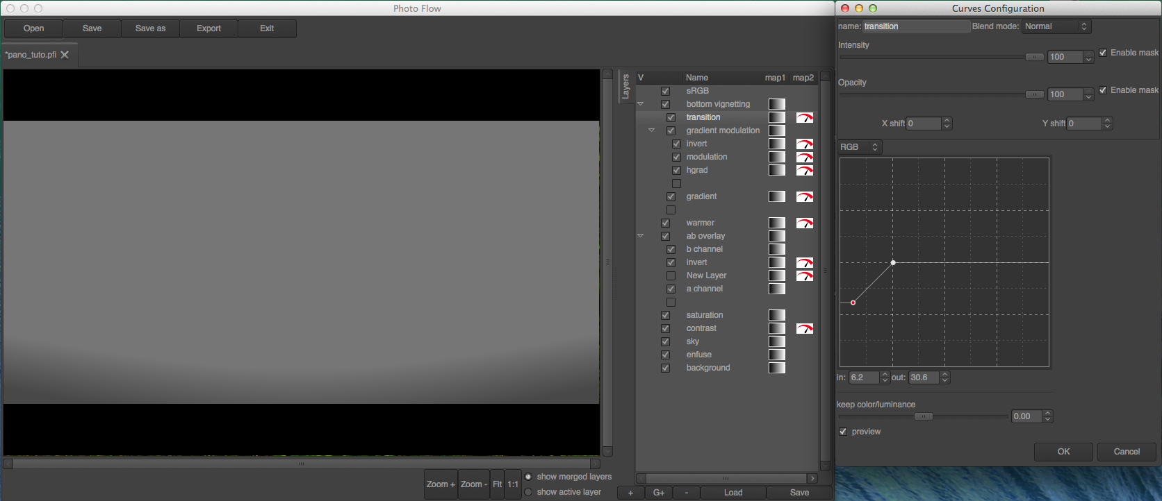
To access the mask associated to the “enfuse” layer, double-click on the small gradient icon next to the name of the layer itself. This will open a new tab with an initially empty stack, where we can start adding layers to generate the desired mask.
How to access the grayscale mask associated to a layer
In PhotoFlow, masks are edited the same way as the rest of the image: through a stack of layers that can be associated to most of the available tools. In this specific case, we are going to use a combination of gradients and curves to create a smooth transition that follows the shape of the edge between the hills and the clouds. The technique is explained in detail in this screencast.
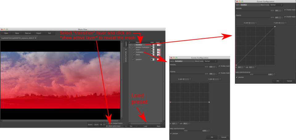
To avoid the boring and lengthy procedure of creating all the necessary layers, you can download this preset file and load it as shown below:
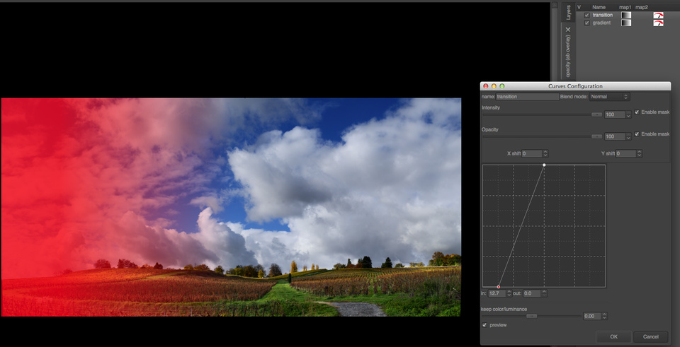
The mask is initially a simple vertical linear gradient. At the bottom (where the mask is black) the associated layer is completely transparent and therefore hidden, while at the top (where the mask is white) the layer is completely opaque and therefore replaces anything below it. Everywhere in between, the layer has a degree of transparency equal to the shade of gray in the mask.
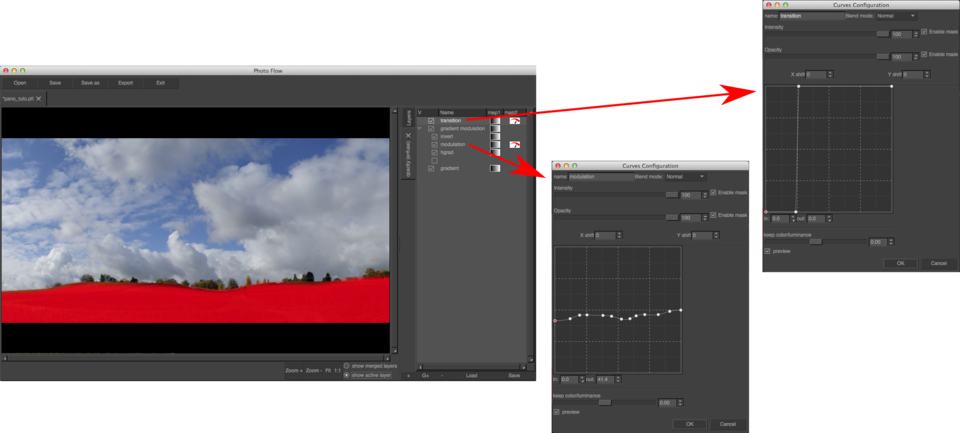
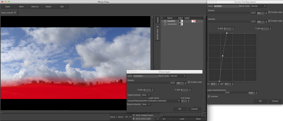
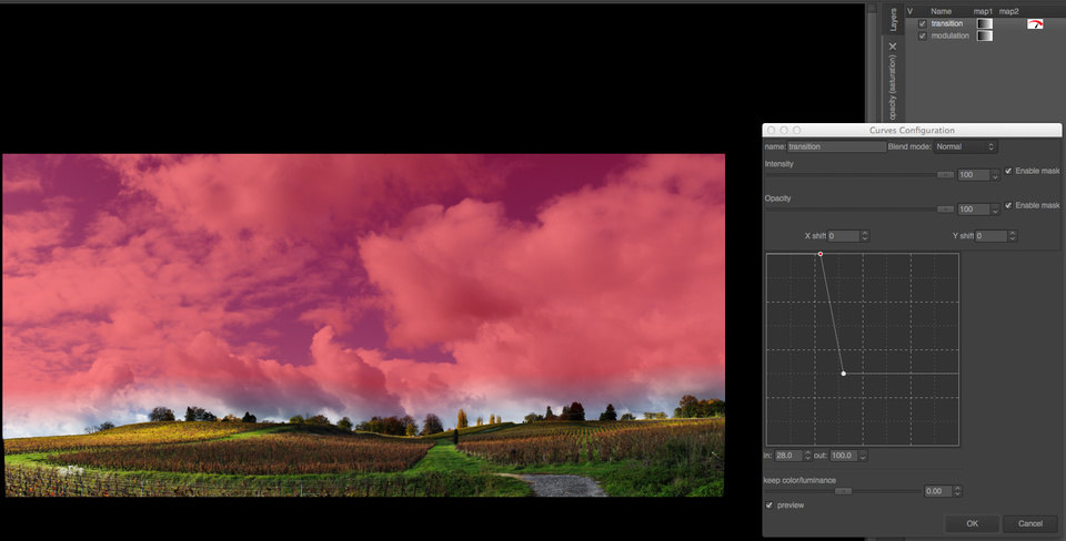
In order to show the mask, activate the “show active layer” radio button below the preview area, and then select the layer that has to be visualized. In the example above, I am showing the output of the topmost layer in the mask, the one called “transition”. Double-clicking on the name of the “transition layer allows to open the corresponding configuration dialog, where the parameters of the layer (a curves adjustment in this case) can be modified. The curve is initially a simple diagonal: output values exactly match input ones.
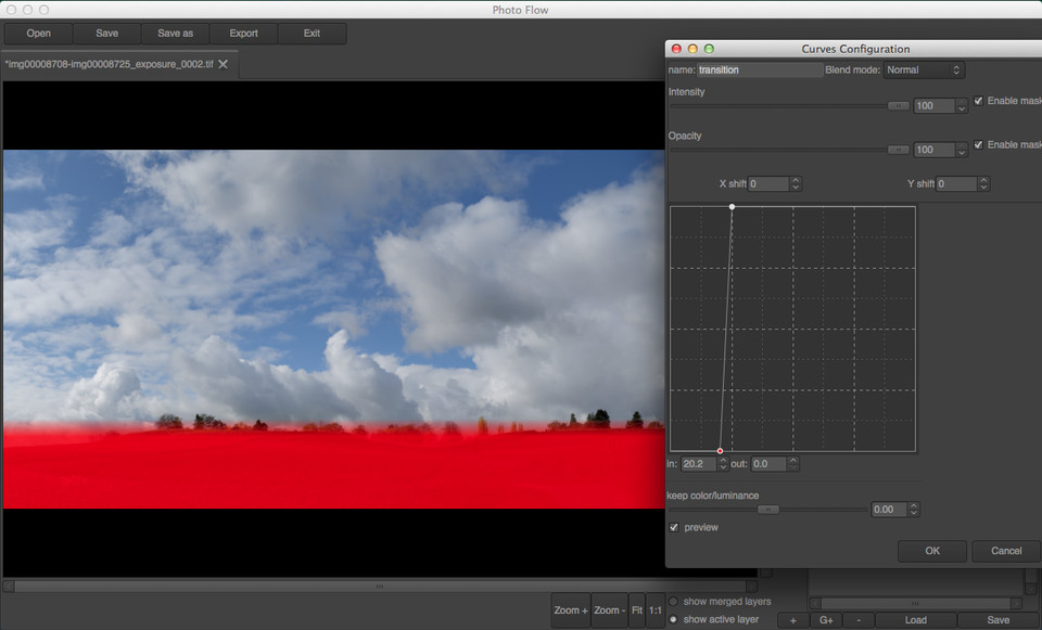
If the rightmost point in the curve is moved to the left, and the leftmost to the right, it is possible to modify the vertical gradient and the reduce the size of the transition between pure black and pure white, as shown below:
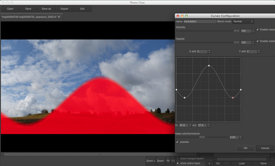
We are getting closer to our goal of revealing the hills from the background layer, by making the corresponding portion of the mask purely black. However, the transition we have obtained so far is straight, while the contour of the hills has a quite complex curvy shape… this is where the second curves adjustment, associated to the “modulation” layer, comes into play.
As one can see from the screenshot above, between the bottom gradient and the “transition” curve there is a group of three layers: an horizontal gradient, a modulation curve and invert operation. Moreover, the group itself is combined with the bottom vertical gradient in grain merge blending mode.
Double-clicking on the “modulation” layer reveals a tone curve which is initially flat: output values are always 50% independently of the input. Since the output of this “modulation” curve is combined with the bottom gradient in grain merge mode, nothing happens for the moment. However, something interesting happens when a new point is added and dragged in the curve: the shape of the mask matches exactly the curve, like in the example below.
The sky/hills transition
The technique introduced above is used here to create a precise and smooth transition between the sky and the hills. As you can see, with a sufficiently large number of points in the modulation curve one can precisely follow the shape of the hills:
The result of the blending looks like that (click the image to see the initial +1EV version):
Enfuse output blended with the +1EV image (click to see the initial +1EV version)
The sky looks already much denser and saturated in this version, and the clouds have gained in volume and tonal variations. However, the -1EV image looks even better, therefore we are going to take the sky and clouds from it.
To include the -1EV image we are going to follow the same procedure done already in the case of the enfuse output:
add a new layer of type “Open image” and load the -1EV Hugin output (I’ve named this new layer “sky”)
open the mask of the newly created layer and add a transition that reveals only the upper portion of the image
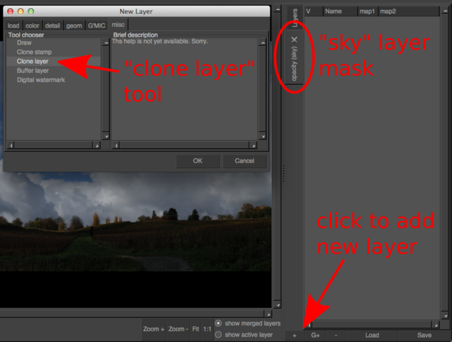
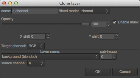
Fortunately we are not obliged to recreate the mask from scratch. PhotoFlow includes a feature called layer cloning, which allows to dynamically copy the content of one layer into another one. Dynamically in the sense that the pixel data gets copied on the fly, such that the destination always reflects the most recent state of the source layer.
After activating the mask of the “sky” layer, add a new layer inside it and choose the “clone layer” tool (see screenshot below).
Cloning a layer from one mask to another
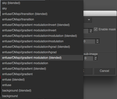
In the tool configuration dialog that will pop-up, one has to choose the desired source layer among those proposed in the list under the label “Layer name”. The generic naming scheme of the layers in the list is “[root group name]/root layer name/OMap/[mask group name]/[maks layer name]”, where the items inside square brackets are optional.
Choice of the clone source layer
In this specific case, I want to apply a smoother transition curve to the same base gradient already used in the mask of the “enfuse” layer. For that we need to choose “enfuse/OMap/gradient modulation (blended)” in order to clone the output of the “gradient modulation” group after the grain merge blend, and then add a new curves tool above the cloned layer:
The final transition mask between the hills and the sky
The result of all the efforts done up to now is shown below; it can be compared with the initial starting point by clicking on the image itself:
Edited image after blending the upper portion of the -1EV version through a layer mask. Click to see the initial +1EV image.
Contrast and saturation
We are not quite done yet, as the image is still a bit too dark and flat, however this version will “tolerate” some contrast and luminance boost much better than a single exposure. In this case I’ve added a curves adjustment at the top of the layer’s stack, and I’ve drawn an S-shaped RGB tone curve as shown below:
The effect of this tone curve is to increase the overall brightness of the image (the middle point is moved to the left) and to compress the shadows and highlights without modifying the black and white points (i.e. the extremes of the curve). This curve definitely gives “pop” to the image (click to see the version before the tone adjustment):
Result of the S-shaped tonal adjustment (click the image to see the version before the adjustment).
However, this comes at the expense of an overall increase in the color saturation, which is a typical side effect of RGB curves.
While this saturation boost looks quite nice in the hills, the effect is rather disastrous in the sky.
The blue as turned electric, and is far from what a nice, saturated blue sky should look like!
However, there is a simple fix to this problem: change the blend mode of the curves layer from Normal to Luminosity.
The tone curve in this case only modified the luminosity of the image, but preserves as much as possible the original colors.
The difference between normal and lumnosity blending is shown below (click to see the Normal blending).
As one can see, the Luminosity blend tends to produce a duller image, therefore we will need to fix the overall saturation in the next step.
S-shaped tonal adjustment with Luminosity blend mode (click the image to see the version with Normal blend mode).
To adjust the overall saturation of the image, let’s now add an Hue/Saturation layer above the tone curve and set the saturation value to +50.
The result is shown below (click to see the Luminosity blend output).
Saturation set to +50 (click the image to see the Luminosity blend output).
This definitely looks better on the hills, however the sky is again “too blue”.
The solution is to decrease the saturation of the top part through an opacity mask.
In this case I have followed the same steps as for the mask of the sky blend, but I’ve changed the transition curve to the one shown here:
In the bottom part the mask is perfectly white, and therefore a +50 saturation boost is applied. On the top the mask is instead just about 30%, and therefore the saturation is increased of only about +15. This gives a better overall color balance to the whole image:
Saturation set to +50 through a transition mask (click the image to see the Luminosity blend output).
###Lab blending
The image is already quite ok, but I still would like to add some more tonal variations in the hills.
This could be done with lots of different techniques, but in this case I will use one that is very simple and straightforward, and that does not require any complex curve or mask since it uses the image data itself.
The basic idea is to take the a and/or b channels of the Lab colorspace, and combine them with the image itself in Overlay blend mode.
This will introduce tonal variations depending on the color of the pixels (since the a and b channels only encode the color information).
Here I will assume you are quite familiar wit the Lab colorspace.
Otherwise, here is the link to the Wikipedia page that should give you enough informations to follow the rest of the tutorial.
Looking at the image, one can already guess that most of the areas in the hills have a yellow component, and will therefore be positive in the b channel, while the sky and clouds are neutral or strongly blue, and therefore have b values that are negative or close to zero. The grass is obviously green and therefore negative in the a channel, while the wineyards are brownish and therefore most likely with positive a values. In PhotoFlow the a and b values are re-mapped to a range between 0 and 100%, so that for example a=0 corresponds to 50%. You will see that this is very convenient for channel blending.
My goal is to lighten the green and the yellow tones, to create a better contrast around the wineyards and add some “volume” to the grass and trees. Let’s first of all inspect the a channel: for that, we’ll need to add a group layer on top of everything (I’ve called it “ab overlay”) and then added a clone layer inside this group. The source of the clone layer is set to the a channel of the “backgroud” layer, as shown in this screenshot:
Cloning of the Lab “a” channel of the background layer
A copy of the a channel is shown below, with the contrast enhanced to better see the tonal variations (click to see the original versions):
The Lab a channel (boosted contrast)
As we have already seen, in the a channel the grass is negative and therefore looks dark in the image above. If we want to lighten the grass we therefore need to invert it, to obtain this:
The inverted Lab a channel (boosted contrast)
Let’s now consider the b channel: as sursprising as it might seem, the grass is actually more yellow than green, or at least the b channel values in the grass are higher than the inverted a values. In addition, the trees at the top of the hill stick nicely out of the clouds, much more than in the a channel. All in all, a combination of the two Lab channels seems to be the best for what we want to achieve.
With one exception: the blue sky is very dark in the b channel, while the goal is to leave the sky almost unchanged. The solution is to blend the b channel into the a channel in Lighten mode, so that only the b pixels that are lighter than the corresponding a ones end up in the blended image. The result is shown below (click on the image to see the b channel).
b channel blended in Lighten mode (boosted contrast, click the image to see the b channel itself).
And this are the blended a and b channels with the original contrast:
The final a and b mask, without contrast correction
The last act is to change the blending mode of the “ab overlay” group to Overlay: the grass and trees get some nice “pop”, while the sky remains basically unchanged:
Lab channels overlay (click to see the image after the saturation adjustment).
I’m now almost satisfied with the result, except for one thing: the Lab overlay makes the yellow area on the left of the image way too bright. The solution is a gradient mask (horizontal this time) associated to the “ab overlay group”, to exclude the left part of the image as shown below:
The final, masked image is shown here, to be compared with the initial starting point:
The image after the masked Lab overlay blend (click to see the initial +1EV version).
The Final Touch
Through the tutorial I have intentionally pushed the editing quite above what I would personally find acceptable. The idea was to show how far one can go with the techniques I have described; fortunatey, the non-destructive editing allows us to go back on our steps and reduce the strength of the various effects until the result looks really ok.
In this specific case, I have lowered the opacity of the “contrast” layer to 90%, the one of the “saturation” layer to 80% and the one of the “ab overlay” group to 40%. Then, feeling that the “b channel” blend was still brightening the yellow areas too much, I have reduced the opacity of the “b channel” layer to 70%.
Opacities adjusted for a “softer” edit (click on the image to see the previous version).
Another thing I still did not like in the image was the overall color balance: the grass in the foreground looked a bit too “emerald” instead of “yellowish green”, therefore I thought that the image could profit of a general warming up of the colors. For that I have added a curves layer at the top of the editing stack, and brought down the middle of the curve in both the green and blue channels. The move needs to be quite subtle: I brought the middle point down from 50% to 47% in the greens and 45% in the blues, and then I further reduced the opacity of the adjustment to 50%. Here comes the warmed-up version, compared with the image before:
“Warmer” version (click to see the previous version)
At this point I was almost satisfied. However, I still found that the green stuff at the bottom-right of the image attracted too much my attention and distracted the eye. Therefore I darkened the bottom of the image with a slightly curved gradient applied in “soft light” blend mode. The gradient was created with the same technique used for blending the various exposures. The transition curve is shown below: in this case, the top part was set to 50% gray (remember that we blend the gradient in “soft light” mode) and the bottom part was moved a bit below 50% to obtain a slightly darkening effect:
Gradient used for darkening the bottom of the image.
It’s done! If you managed to follow me ‘till the end, you are now rewarded with the final image in all its glory, that you can again compare with the initial starting point.
The final image (click to see the initial +1EV version).
It has been a quite long journey to arrive here… and I hope not to have lost too many followers on the way!
Basic Landscape Exposure Blending with GIMP and G'MIC
Exploring exposure blending entirely in GIMP
Photographer Ian Hex had previously explored the topic of exposure blending with us by using luminosity masks in darktable.
For his first video tutorial he’s revisiting the subject entirely in GIMP and G’MIC.
Have a look and let him know what you think in the forum.
He’s promised more if he gets a good response from people - so let’s give him some encouragement!
I ran across a neat website the other day for getting actual user feedback when viewing your website: UserTesting.
They have a free option called peek that records a short (~5 min.) screencast of a user visiting the site and narrating their impressions.
You can imagine this to be quite interesting to someone building a site.
It appears the service asks its testers to answer three specific questions (I am assuming this is for the free service mainly):
What is your first impression of this web page? What is this page for?
What is the first thing you would like to do on this page?
Please go ahead and try to do that now.
Please describe your experience.
What stood out to you on this website?
What, if anything, frustrated you about this site?
Please summarize your thoughts regarding this website.
Here’s the actual video they sent me (can also be found on their website):
I don’t have much to say about the testing.
It was very insightful and helpful to hear someones view coming to the site fresh.
I’m glad that my focus on simplicity is appreciated!
It was interesting that the navigation drawer wasn’t used, or found, until the very end of the session.
It was also interesting to hear the testers thoughts around scrolling down the main page (is it so rare these days for content to be longer than a single screen - above the fold?).
The creator of new processing project PhotoFlow, Andrea Ferrero, is being kind enough to take a break from coding to write a new tutorial for us: “Exposure Blended Panoramas with Hugin and Photoflow”!
I’ve been collaborating with him on getting things in order to publish and this looks like it’s going to be a fun tutorial!
We’ve been talking back and forth trying to find a good workflow for contributors to be able to provide submissions as easily as possible.
At the moment I translate any submissions into Markdown/HTML as needed from whatever source the author decides to throw at me. This is less than ideal (but at least it’s nice and easy for authors - which is more important to me than having to port them manually).
Just follow the instructions on that page, and issue a pull request when you’re done.
Simple! :)
You may want to communicate with me to let me know the status of the submission, in case you’re still working on it, or it’s ready to be published.
Of course, if you want to submit some content, please don’t feel you have to use Github if you’re not comfortable with it.
Feel free to write it any way that works best for you (as I said, my native build files are usually simple Markdown).
You can also reach out to me and let me know what you may be thinking ahead of time, as I might be able to help out.
A little while back I had attempted to document a shoot with my friend and model, Mairi.
In particular I wanted to capture a start-to-finish workflow for processing a portrait using free software.
There are often many tutorials for individual portions of a retouching process but rarely do they get seen in the context of a full workflow.
The results became a two-part post on my blog.
For posterity (as well as for those who may have missed it the first time around) I am republishing the second part of the tutorial Postprocessing here.
Though the post was originally published in 2013 the process it describes is still quite current (and mostly still my same personal workflow).
This tutorial covers the retouching in post while the original article about setting up and conducting the shoot is still over on my personal blog.
The finished result from the tutorial. by Pat David (cba).
The tutorial may read a little long but the process is relatively quick once it’s been done a few times.
Hopefully it proves to be helpful to others as a workflow to use or tweak for their own process!
I am still working on getting some sample shots to demonstrate the previously mentioned noise free shadows idea using dual exposures.
I just need to find some sample shots that will be instructive while still at least being something nice to look at…
Also, another guest post is coming down the pipes from the creator of PhotoFlow, Andrea Ferrero!
He’ll be talking about creating blended panorama images using Hugin and PhotoFlow.
Judging by the results on his sample image, this will be a fun tutorial to look out for!
This is an article I had written long ago (originally published in 2013).
The material is still quite relevant and the workflow hasn’t really changed, so I am republishing it here for posterity and those that may have missed it the first time around.
The previous post for this article went over the shoot that led to this image.
To whet your appetite, here is the final result of all of the postprocessing done in this tutorial (click to compare it to no retouching):
The final result I’m aiming for. Click to compare to original.
Picking Your Image
This is a hard thing to quantify, as each of us is driven by our own vision and style.
In my case, I wanted something a little more somber looking with a focus on her eyes (they are the window to the soul, right?).
There’s just something I like about big, bright eyes in a portrait, particularly in women.
I also personally liked the grey sweater against the grey background as well.
I felt that it put more focus on the colors of her skin, hair, and eyes.
So that pretty much narrowed me down to this contact sheet:
Narrowing it down to this set.
Looking over the shots, I decided I liked the images with the hood up, but her hair down and flowing around her.
This puts me in the top two rows, with only a few left to decide upon.
At this point I narrowed it down to one that I liked best - grey sweater, hood up but not pulled back against her head, hair flowing out of it, and big eyes.
This is pretty common, I’d imagine.
You can grab several frames, but in the end hopefully just the right amount of small details will come together and you’ll find something that you really like.
In my case it was this one:
I finally decided on this shot based on the color, hair, eyes, and slight smile.
Now hold on a minute. The image above is the JPG straight out of the camera.
As you can see, I’ve underexposed this one a little bit, and the colors are not anywhere near where I’d like them to be.
If you’re following along don’t download this version of the image.
I’ll have a much better starting JPG after we run it through some RAW development first!
One of the reasons I love using F/OSS is the availability (usually) of the software across my OS’s.
In my case I went with RawTherapee a while back and liked it, so I’ve stuck with it so far (even though I had to build my own OSX versions).
So, my workflow includes RawTherapee at this point.
You should be able to follow along in other converters, but I’m going to focus on RT because that’s what I’m using.
If you shoot only in JPG (seriously, use RAW if you can), you can skip this section and head directly down to GIMP Retouching.
Load it up
After starting up RawTherapee, you’ll be in the File Browser interface, waiting for you to select a folder of images.
You can navigate to your folder of images through the file browser on the left side of the window.
It may take a bit while RawTherapee generates thumbnails of all the images in your directory.
RawTherapee file browser view. (Navigate folders on the left pane)
Once you’ve located your image, double clicking it in the main window will open it up for editing.
If you’re using a default install/options on RT, chances are a “Default” profile will be applied to your image that has Auto Levels turned on.
The base image with “Default” profile applied (auto levels).
Chances are that Auto Levels will not look very good.
My Default processing profile usually does not look so hot (no noise reduction, auto levels, etc.).
That’s ok, because we are going to fix this right up in the next few sections.
Adjust Exposure
I like to control the exposure and processing on my RAW images.
Auto Levels may work for some, but once you get used to some basic corrections and how to use them it’s relatively quick and painless to dial-in something you like quickly.
Again - much of what I’m going to describe is subjective, and will depend on personal taste and vision.
This just happens to be how I work, adjust as needed for you own workflow. :)
To give me a good starting point I will usually remove all adjustments to the image, and reset everything back to zero.
This is easy to do as my Default profile has nothing done to it other than Auto Levels.
Auto Levels values on the Exposure panel.
A quick and easy way to reset the Exposure values on the Exposure panel is to use the Neutral button on that panel (I’ve outlined it in green above).
You can also hit the small “undo” arrows next to each slider to set that slider back to zero as well.
At this point the image exposure is set to a baseline we can begin working on.
For reference, here is my image after zeroing out all of the exposure sliders and the saturation:
With all exposure adjustments (and saturation) set to zero.
Exposure Compensation
The first thing I’ll begin adjusting is the Exposure Compensation for the image.
You want to be paying careful attention to the histogram for the image to know what your adjustments to Exposure Compensation are doing, and to keep from blowing things out.
I personally begin pushing the Exposure Compensation until one of the RGB channels just begins butting up against the right side of the histogram.
Here is what the histogram looks like for the neutral exposure:
Neutral exposure histogram.
After adjusting Exposure Compensation I get the Red channel snug up against the right side of the histogram:
Exposure Compensation until the values just touch the right side.
If you go a little too far, you’ll notice one of the channels will spike against the side, and if you really go too far, you’ll get a small colored box in the upper right corner indicating that channel has gone out of range (is blown out).
So here is what my image looks like now with only the Exposure Compensation adjusted to a better range:
Exposure Compensation adjusted to 2.40.
The Exposure panel in RT now looks like this (only the Exposure Compensation has been adjusted):
Exposure Compensation set to 2.40 for this image.
If the highlights in your image begin to get slightly out of range, you may need to make adjustments to the Highlight recovery amount/threshold, but in my case the image was slightly under-exposed, so I kept it zero.
There is also a great visual method of seeing where your exposures for each channel are at, and to avoid hightlight/shadow clipping.
Along the top of your main image window, to the right, there are some icons that look like this:
The Channel previews let’s you individually toggle each of the R,G,B, and Luminosity previews for the image.
You can use these with the Highlight and Shadow clipping indicators to see which channels are clipping and where.
Highlight and Shadow clipping indicators will visually show you on your image where the values go beyond the threshold for each.
For highlights, it’s any values that are greater than 253, and for shadows it’s any values that are lower than 8.
To illustrate, here is what my image looks like in RT with the Exposure Compensation set to 2.40 from above:
With Highlight & Shadow clipping turned on.
I don’t mind the shadows clipping in the dark regions of the image, though I can make adjustments to the Black Point (below) to modify that.
The highlight clipping on her face is of more concern to me.
I certainly don’t want that!
At this point I can dial in my Exposure Compensation for the highlights by backing it down slightly.
As I ease off it I should be seeing the dark patch for Highlight Clipping growing smaller.
I’ll stop when it’s either all gone, or just about all gone.
I wasn’t too far off in my initial adjustment, and only had to back the Exposure Compensation off to 2.30 to remove most of the highlight clipping.
Settings so far (everything else zero)…
Exposure Compensation
2.30
Black Point
At this point I will usually zoom a bit into a shadow area of my image that might include dark/black tones.
The blacks feel a little flat to me, and I’m going to increase the black level just a bit to darken them up.
I want to be zoomed in a bit so I can determine at which point the black point crushes any details that I want to be visible still.
You want your blacks to be dark if possible, but you want to keep details in the shadows if possible (it’s really, really subjective where this point is, but I’ll err on the conservative side since I am still going to process colors a little bit in GIMP later).
Starting with a Black point of zero:
I will increase the Black point while keeping an eye on those shadow details, increasing it until I like how the blacks look and I haven’t destroyed detail in the dark tones.
I finally settled on a Black value of 150 as seen here:
Black value set at 150 (still keeping sweater details in the shadows). Click to compare to previous.
Watch out for Shadow Recovery when you first start adjusting the Black Point.
It’s default might be a different value than zero (mine is at 50), and the Neutral button won’t set it back to zero (resetting it will give it back to it’s default value of 50).
You may want to push it manually to zero, and if you feel you want to bump shadow details a bit, then start pushing it up.
I know things look noisy at the moment, but we’ll deal with that in the next section (there is no noise reduction being applied at this point).
Settings so far (everything else zero)…
Exposure Compensation
2.30
Black
150
Brightness, Contrast, and Saturation
For this image I didn’t feel the need to modify these values, but this is purely subjective (again).
If you do modify these values, keep an eye on the histogram and what it’s doing to keep things from getting out of range/whack again.
White Balance
Hopefully you had the right White Balance set during your shoot in camera.
If not, it’s ok - we’re shooting in RAW so we can just set it as needed now.
I happen to have had my in-camera WB set to Flash, so the embedded WB settings in my RAW file metadata are pretty close.
In my shot, however, you’ll notice that there is a bit of a white window visible in the left of the frame.
I happen to know that the window is quite white, and should be rendered as such in my image.
As a side note, what I really should have done was to get myself a good reference for balancing the white balance, and to shoot it as part of my setup.
Something like the X-Rite MSCCC ColorChecker Classic, or even a WhiBal G7 Certified Neutral White Balance Card.
These are a little pricey, but any good 18% grey card will do, really.
I just happen to know that my window borders are a pure white, so I’m cheating a bit here…
So here is what our image looks like at the moment:
Image so far, with White Balance set to Camera (Default).
The White Balance for your image can be adjusted from the Color panel:
Default Color panel showing Camera white balance.
You can try out some of the presets in the Method drop-down - there are the typical settings there for Sunny, Shade, Flashes, etc…
In my case I am going to use the Spot WB option.
Clicking that button will let me pick a section of my image that should be color neutral.
In my case, I know that the window border should be white (and color neutral), so I will pick from that area on my image.
Doing so will shift my WB, and will produce a result that looks like this:
WB based on white window border. Click to compare Camera based
I also happen to know that the grey colored walls in the background are close to neutral, but with the slightest hint of blue in them.
If I used the grey wall instead of the white window, I would introduce the slightest warm cast to the image.
I tried it (choosing a section of the grey wall on the right side of the background), and actually prefer the slightly warmer color, personally:
WB based on the grey wall background (right side of image).
Click to compare to window WB.
The difference is ever so slight, but it is there.
In my original final image, I went with the balance pulled from the wall, so I will continue with that version here.
If you’re curious, here is what my WB values look like:
After setting Spot WB to the window.
Seriously, though, don’t rely on luck.
Get a grey/color card to correct color casts if you can…
Settings so far (everything else zero)…
Exposure Compensation
2.30
Black
150
WB Temperature
7300
WB Tint
0.545
Noise Reduction & Sharpening
Chances are the RAW image is going to look pretty noisy zoomed in a bit.
This isn’t unusual since we are dealing with RAW data.
There are two noise reduction (NR) options in RT, and we are going to want to use both.
Impulse Noise Reduction
This NR will remove pixels that have a high impulse deviation from surrounding pixels.
Basically the “salt and pepper” noise you may notice in your images where individual pixels are oddly brighter/darker than the surrounding pixels.
If I zoom into a portion of my image (not far from where I was looking at shadows for setting a black point), I’ll see this:
Closeup crop with no Impulse Noise Reduction.
I’ll normally play a bit with the Impulse NR to alleviate the specks while still retaining details.
As with most NR methods - going a bit too far will obliterate some details with the noise.
The trick is to find a happy medium between the two.
In my case, I settled on a value of 55 (the default is 50):
Impulse NR set to a value of 55. Click to compare to no NR.
I could have gone a bit further (and have in others from this series), and pushed it up to the 60-70 range, but it’s a matter of taste and weighing the tradeoffs.
Luminance/Chrominance Noise Reduction
These two NR methods will suppress noise in the luminance channel (brightness), and the blue/red chrominances.
I will use a light hand with these NR values.
The defaults are 5 for each, and it should make a noticeable difference just with the default values.
If you push the Luminance NR too far, you’ll smear fine details right off your image.
If you push the Chrominance NR too far, you’ll suck the life out of the colors in your image.
Not surprisingly, it’s another trade off.
In my case, I pushed the L/C NR just a tiny bit past the default to 6 and 6 respectively.
You’ll be able to see the effect of chrominance NR by looking at the flat colored grey wall in the background.
Just don’t forget to check other areas of your image with the settings you choose.
For me it was a close look at her iris, where pushing the chrominance NR too far lost some of the beautiful colors in her eye.
Compare the same crop from above with and without Luminance/Chrominance noise reduction applied:
With Luminance & Chrominance NR set to 6. Click to compare without.
If you’ve read my previous article on B&W conversion, you’ll know that I don’t mind a little noise/grain in my images at all, so this level doesn’t bother me in the least.
I could chase the noise even further if I really wanted to, but always remember that doing so is going to be at the expense of detail/color in your final result.
As with most things in life, moderation is key!
Sharpening
If you are going to sharpen your image a bit, this is probably the best time to do so.
The problem is that usually sharpening is the last bit of post-processing you should do to your image, due to it’s destructive nature.
Plus, lately I’ve grown accustomed to sharpening by using an extra wavelet scale during my skin retouching in GIMP (you’ll see below in a bit).
So, I’ll avoid sharpening at this stage.
If I was going to use it here at all, it would be just very, very light.
Also, if you do any sharpening at this stage, try to make sure that it happens after any noise reduction in the pipeline.
Settings so far (everything else zero)…
Exposure Compensation
2.30
Black
150
WB Temperature
7300
WB Tint
0.545
Impulse NR
55
Luminance NR
6
Chrominance NR
6
Lens Correction
This is actually a section that deserves its own post, detailing methods for correcting for lens barrel distortion with Hugin.
RawTherapee actually has an “Automatic Distortion Correction” that will effect pincushion distortion in your images.
In my case, I was shooting at the long end of the lens at 50mm, and the distortion is minimal.
So I didn’t bother with correcting this (it might have been needed at a shorter focal length, and being closer to the subject, though).
In Summary
That about wraps up the RAW “development” I’m going to do on this image.
I try to keep things minimal where possible, though I could have gone further and adjusted color tones and LAB adjustments here as well.
In fact, with the exception of Wavelet Decompose for skin retouching, and some other masking/painting operations, I could do most of what I want for this portrait entirely in RawTherapee.
I know that this reads really long, but the truth is that once I am accustomed to a workflow, this takes less than 5 minutes from start to finish (faster if I’ve already fiddled with other images from the same set).
All I really modified here was Exposure, White Balance, and Noise Reduction.
Finally, as I hinted at earlier, here is the final version after doing all of these RAW edits, as we get ready to bring the image into GIMP for further processing:
This is the one to download if you want to follow along in GIMP below. Just click the image to open in a new window, then save it from there.
GIMP Retouching
Well, here we are.
Finally.
It’s the home stretch now, so don’t give up just yet!
If you didn’t follow along with the RAW processing earlier, you can download the full resolution JPG output from RawTherapee by clicking here:
Armed with our final results from RawTherapee, we’re now ready to do a little retouching to the image.
The overall workflow and the order in which I approach them is dependent on my mood mostly.
Most times, I enjoy doing skin retouching, so I’ll often jump right in with Wavelet Decompose and play around.
Really, though, I should start shifting Wavelet Decompose to a later part of my workflow, and fix other things like removing objects from the background and fixing flyaway hairs first.
This way, I can directly re-use wavelet scales for a slight wavelet sharpening while I have them.
Looking at this image so far, I can spot a few broad things that I want to correct, and I’m going to address them in this order:
Touchup flyaway hairs
Crop & remove distracting background elements
Skin retouching with Wavelet Decompose
Contour paint highlights
Apply some color curves
Touchup Flyaway Hairs
If you can have the model bring a hairbrush with them to a shoot - DO IT.
Seriously.
Your eyes and carpal tunnel will thank me later.
Even with a brush or hairstylist/make-up artist the occasional hair will decide to rebel and do its own thing.
This will require us to get down to the details and fix those hairs up.
Luckily for me, Mairis hair mostly cooperated with us during the shoot (and where it didn’t I kind of liked it).
To illustrate this step, though, I’m going to clean up some of the stray hairs on the left side of the image (the right side of her face).
Luckily for me, the background is a consistent color/texture.
This means cloning out these hairs shouldn’t be too much of a problem, but there are still some things you should keep in mind while doing this.
Here is the area that I’d like to clean up a little bit:
Sometimes you just have to work one strand of hair at a time…
I will usually use a hard-edged brush because a soft-edge will smear details on its edges, and can often be spotted pretty easily by the eye.
This works because the background is relatively constant in grain and color.
I’ll sample from an area near the hair I want to remove, and set the brush to be “Aligned”.
I also try to keep the brush size as small as I can and still remove the hair.
The thing to keep in mind is how the hair is actually flowing, and to follow that.
I will often follow outlying strands of hair back to where they start from the head, and begin cloning them out from there.
I also try not to get too ambitious (some stray hairs are sometimes fine).
Removing too many at once can lead to unrealistic results, so I try to be conservative, and to constantly zoom out and check my work visually.
Try not to leave hairs prematurely cut off in space if possible, it tends to look a bit distracting.
If you want to remove a hair that crosses over another strand that you may want to keep, make sure to adjust the source of the clone brush so you can do it without leaving a gap in the leftover strand.
Here is a quick 5 minute touchup of some of the stray hairs (click to compare to the original):
Click to compare.
Occasionally, you’ll need to fix hairs that are crossing over other hair (sort of like a virtual “brushing” of the hair).
In these cases, you really have to pay careful attention to how the hair flows and to use that as a guide when choosing a sample point with either the clone or heal brush.
If this sounds like a lot of work - it is.
Thankfully, once you’ve become accustomed to doing it, and doing it well, you’ll find yourself picking up a lot of speed.
It’s one of those things that’s worth learning to do right, and to let practice speed it up for you.
I actually like the cascading hair around her face opening up to a pretty color, so that’s about as far as I’m going to go with stray hairs on this image.
Fixing the Background & Cropping
With the limited space I had to shoot this portrait, it’s no surprise that I had gotten some undesirable background elements, like the window edges.
There’s a couple of ways I could go about fixing these - I could fix the background in place, or I can crop out the elements I don’t want.
In my final version shown in the previous post, I wanted to crop tighter, so it worked out well to remove the window on the left.
To illustrate how we can remove the window, I’m going to leave the aspect ratio as it is, and walk through removing the distracting background elements.
Removing Background Elements
Because most of the background is already a (relatively) solid color, this isn’t too hard.
There’s just a couple of simple things to keep in mind.
The way I’m going to approach this is to make a duplicate of my current layer, and to move the duplicate into place such that the background will cover up parts of the window I want to remove.
Then I’ll mask the duplicate layer to hide the window.
I start by choosing an area of the background that’s similar in color/tone:
Thankfully the background is relatively consistent.
I’ll then move the duplicate layer so that the green area covers up the window to the left:
Position the duplicate layer so the green area now covers up the window.
Here is what this looks like in GIMP, with the duplicate layer set to 90% opacity over the base layer (so you can see where the window edge is):
Moving the duplicate layer over to cover the window.
Now I’ll add a black (fully transparent) layer mask over the duplicate layer, and I’ll paint white on the mask to cover up the window edge (with a soft-edged brush).
This give me results that look like this:
After applying a transparent mask, and painting white over the window edge.
The problem is that the background area from the duplicate is a bit darker than the base layer background, and the seam is visible where they are masked.
To fix this, I can just adjust the lightness of the duplicate layer until I get a good match.
I used Hue-Saturation to adjust the lightness (because I wasn’t sure if I would need to adjust the hue slightly as well - turns out I didn’t).
I found that increasing the Lightness value to 3 got me reasonably close:
After increasing duplicate layer Lightness to 3.
To further fix the lower part of the window, I just repeated all the steps above with another duplicate of the base layer, just shifted to cover the lower part of the window.
I had to mask along her sweater.
Here is the result after repeating the above steps:
After repeating above steps for the lower left corner.
The results are ok, but could be just a little bit better.
Visually, the falloff of light on the background doesn’t match what’s happening on her body, so I added a small gradient to the lower left corner to give it a more natural looking light falloff:
Adding a gradient to the lower left background helps it look more natural.
Fixing the slight window/shadow on the right is easily done with a clone/heal tool combination.
The final result of quickly cleaning up the background is this:
Finished cleaning up the background.
I could have spent a little more with this, but I’m happy with the results for the purpose of this post.
If your cloning efforts leave obvious transitions between tones, the Heal tool can be helpful for alleviating this (especially when used with large brush radii, just be prepared to wait a bit).
With the background squared away, we can move on to one of my favorite things to play with, skin retouching!
The best way to utilize this tool is with a light touch.
Re-read that sentence and keep it in mind as we move forward.
Don’t make mannequins.
Ok, with a layer that contains all of the changes we’ve made so far rolled up, we can now decompose the image to wavelet scales.
In my case I almost always use the default of 5 scales unless there’s a good reason to increase/decrease that number.
For anyone new to this method, the basic idea of Wavelet Decompose is that it will break down your images to multiple layers, each containing a specific set of details based on their relative size, and a residual layer with color/tonal information.
For instance, Wavelet scale 1 will contain only the finest details in your image, while each successive scale will contain larger and larger details.
The benefit to us is that these details are isolated on each layer, meaning we can modify details on one layer without affecting other details from other layers (or adjust the colors/tones on the residual layer without modifying the details).
Here is an example of the resulting layers we get when running Wavelet Decompose:
Wavelet scales from 1 (finest) to the Residual
After running Wavelet Decompose, we’ll find ourselves with 6 new layers: Residual + 5 Wavelet scales.
I am going to start on Wavelet scale 5.
If you hold down Shift and click on a layer visibility icon, you’ll isolate just that single layer as visible.
Do this now to Wavelet scale 5, and let’s have a look at what we’re dealing with.
I usually work on skin retouching in sections.
Usually I’ll consider the forehead, nose, cheeks to smile lines, chin, and upper lip all as separate sections (trying to follow normal facial contours).
Something like this:
Rough breakdown of each area I’ll work on separately
I’m going to start with the forehead.
I’ll work with detail scales first, and follow up with touchups on the residual scale if needed to even out color tones.
Here is what Wavelet scale 5 looks like isolated:
Forehead, Wavelet scale 5
It may not seem obvious, especially if you don’t use wavelet scales much, but there’s a lot of large scale tonal imperfections here.
Look at the same image, but with the levels normalized:
These are the tones we want to smooth out
Normalizing the wavelet scale lets you see the tones that we want to smooth out.
My normal workflow is to have all of the wavelet scales and residual visible (each of the wavelet scales has a layer blending mode of Grain Merge).
This way I’m visually seeing the overall image results.
Then I will select each wavelet scale as I work on it.
I’ll normally use the Free Select Tool to select the forehead.
I’ll usually have the Feather edges option turned on, with a large radius (maybe 1% of the smallest image dimensions roughly - so ~35 pixels here).
Remember to have your layer selected that you want to work on.
With my area selected, I’ll often run a Gaussian Blur (IIR) over the skin to smooth out those imperfections.
The radius you use is dependent on how strong you want to smooth the tones out.
Too much, and you’ll obliterate the details on that scale, so start small.
Here is my selection I’ll work with (remember - my active layer is Wavelet scale 5):
Forehead with selection (feather turned on to 35px)
Now I’ll experiment with different Gaussian Blur radii to get a feel for how it will effect my entire image.
I settled on a high-ish value of 35px radius, which gave me this as a result (click to compare to original):
Forehead, Wavelet scale 5 after Gaussian Blur (IIR) 35px radius. Click to compare.
Just with this small change to a single wavelet scale, we can already see a remarkable improvement to the underlying skin tones, and we haven’t hurt any of the fine details in the skin!
In some cases, this may be all that is required for a particular area of skin.
I could push things just a tiny bit further if I wanted by working globally again on a finer wavelet scale, but I’ve learned the hard way to back off early if possible.
Instead, I’ll look at specific areas of the skin that I may want to touch up.
For instance, the two frown lines in the center of the forehead.
I may not want to remove them completely, but I may want to downplay how visible they are.
Wavelet scales are perfect for this.
Small frown lines I want to reduce
Because each of the Wavelet scales are set to a layer blend mode of Grain Merge, this means that any area that has a completely grey color will not effect the final image.
This means that you can paint with medium grey RGB(128,128,128) to completely remove a detail from a layer.
You can also use the Blur/Sharpen brush to selectively blur an area of the image as well.
(I’ve found that the Blur tool works best at smaller wavelet scales - it doesn’t appear to make a big difference on larger scales).
So, if we look at Wavelet scale 5 where the frown lines are, we’ll see there’s not much there - it was already smoothed earlier.
If we look at Wavelet scale 4 though, we’ll see them prominently.
I’ll use the Heal Tool to sample from the same wavelet scale in a different location, and paint over just the frown lines.
I’ll work on Wavelet scale 4 first.
If needed, I can also move down to Wavelet scale 3 and repeat the same procedure there.
A couple of quick passes just over the frown lines, and the results look like this:
Cloning over frown line on scale 4 & 3. Click to compare.
I could continue over any other blemishes I may want to correct, but small individual blemishes can usually be fixed with a little spot healing quickly.
Moving on to the nose, the tones have different requirements.
Overall, the tones on Wavelet scale 5 are similar to the forehead.
In this case, a similar amount of blurring as the forehead on scale 5 will nicely smooth out the tones.
Here is the nose after a slight blurring (click to see original):
Nose with 35px Gaussian blur on Wavelet scale 5. Click to compare.
There is a bit of color in the nose that is slightly uneven that I’d like to fix.
This is relatively easy to do with wavelet scales, because I can modify the underlying color tones of the nose without destroying the details on the other scale layers.
In this case, I’ll work on the Wavelet residual layer.
I’ll use a Heal Tool with a large, soft brush.
I’ll sample from about the middle of the nose, and clean up the slightly redder skin by healing new tones into that area.
I’ll follow the contours of the nose and the way that the light is hitting it in order to match the underlying tones to what is already there.
After a little work these are the results (click to compare to original):
Healing on the Wavelet residual scale to even tones. Click to compare.
Next I’ll take a look at the eyes and cheek on the brighter side of her face.
Overall tones are good here, just some slight retouching required
The tones here are not bad, particularly on scale 5.
After making my selection, I’ve applied a blur at 25px just to smooth things a bit.
A slight 25px blur to smooth overall tones. Click to compare.
The dark tones under/around the eyes is a bit different to deal with.
As before, I’ll turn to working on the Wavelet residual layer to brighten up the color tones under the eyes.
I use the Heal Tool to sample from a brighter area of skin near the eye.
Then I’ll carefully paint into the dark tones to brighten them up, and to even the colors out with the surrounding skin.
Carefully cloning/healing brighter skin tones under the eyes. Click to compare to original.
Wavelets are amazing for this type of adjustment, because I can brighten up/change the skin tones under the eyes without effecting the fine skin details here like small wrinkles and pores.
The textual character remains unchanged, but the underlying skin tones can be modified easily.
The same can be done for the slightly red tones on the cheek, and at the edge of her jaw.
Which I did.
I’m purposefully not going to modify the fine wrinkles under the eyes, either.
These small imperfections will often bring great character to a face, and unless they are very distracting or bad, I find it best to leave them be.
A good tip is that even though these small imperfections may seem large when you’re pixel peeping, get into the habit of zooming out to a sane zoom level and evaluate the image then.
Sometimes you’ll find you’ve gone too far, and things begin to creep into mannequin territory.
Don’t make mannequins!
In Summary Again
This entire post is getting a little long, so I’m going to stop here with the skin retouching breakdown.
Also, that’s honestly about it as far as the process goes.
Just repeat on the areas that are left (right cheek, chin, and upper lip).
You can just apply the processes I described above to those other areas, in the same way.
To summarize, here are the tools/steps I’ll use with Wavelet Decompose to retouch skin:
Area selection with Gaussian blur to even out overall tones at a particular scale
Paint with grey, Clone, Heal on wavelet scales to modify specific details
Clone/Heal on wavelet residual scale to modify underlying skin tones/colors (but leave details intact)
Here are the final results after using only Wavelet Decompose (click to compare to original):
After retouching in Wavelet Scales only. Click to compare to original.
Spot Touchups
There may be a few things that still need a little spot touchup that I didn’t bother to mess with in Wavelet scales.
In my case, I’ll clone/heal out some small hairs along the jaw line, and touch up some small spots of skin individually.
This is really just a light cleaning, and I usually do this at the pixel level (obnoxiously zoomed in, and small brush sizes).
I also use a method for checking the skin for areas that I may want to touchup, but might not be immediately visible or noticeable.
It uses the fact that the Blue channel of an image can show you just how scary skin can look (seriously, color decompose any image of skin, and look at the blue channel).
Contour Painting Highlights
One of the downsides of using Wavelet scales for modifying skin is that if you’re blurring on some of the scales, you’ll sometimes decrease the local contrast in your image.
This isn’t so bad, but you may want to bring back some of the contrast in areas you’ve touched up.
What I’m going to do is basically add some transparent layers over my image, and set their layer blend modes to “Overlay”.
Then I’ll paint white over contours I want to enhance, and adjust the opacity of the layer to taste.
(This is highly subjective, so I’m going to just show a quick idea of how I might approach it - you can get as nuts with this as you like…).
Here I’ve added a new transparent layer on top of my image, and set the Layer Blend Mode to Overlay.
Then I painted white onto contours that I want to highlight:
Painting on the Overlay layer along contours to highlight
It looks strange right now, but I’ll add a large radius Gaussian Blur to smooth these tones out.
I used a blur radius of 111 pixels.
Here is what it looks like after the blur:
Blurring the Overlay layer with Gaussian Blur (111 pixel radius)
Finally, I’ll adjust the opacity of the Overlay layer to taste.
I’ll usually dial this way, way down so that it’s not so obvious.
Here, I’ve dialed the opacity back to about 20%, which leaves us with this (click to compare):
After setting the Overlay layer to 20% opacity (still a little high for me, but it’s good for illustration). Click to compare.
I will sometimes add a few more of these layers to enhance other parts of the image as well.
I’ll use it (very lightly!!!) to enhance the eyes a bit, and in this case, I used an even larger layer to add some volume and highlights to her hair as well.
Here is the results after adding some eye and hair highlight layers as well (click to compare no highlights):
Face, eyes, and hair contour painting result. Click to compare.
Color Curves
Finally, I like to apply some color curves that I have around and use often.
I’ve been heavily favoring a Portra emulation curve from Petteri Sulonen that he calls Portra-esque, especially for skin.
It has a very pretty rolloff in the highlights that really renders pretty colors.
If I feel it’s too much, I can always apply it on a duplicate of my image so far, and adjust opacity to suit.
Here is the same image with only the Potra-esque curve applied:
Image so far, with a Portra-esque color curve applied. Click to compare.
If you’re curious, I had written up a much more in-depth look at color curves for skin here: Getting Around in GIMP - More Color Curves (Skin).
You can actually download the curves for Portra, Velvia, Provia emulation on that page.
Final Sharpening
Finally.
The last step before saving out our image!
For sharpening, I actually like to use one of the Wavelet scales that I generated earlier.
I’ll just duplicate a low scale, like 2 or 3, and drag it on top of my layer stack to sharpen the details from that scale.
In this case, I liked the details from Wavelet scale 2, so I duplicated that layer, and dragged it on top of my layer stack.
The blend mode is already set to Grain Merge, so I don’t have to do anything else:
Wavelet scale 2 copied to the top of the layer stack for sharpening. Click to compare.
Finally at the End
If you’re still with me - you really deserve a medal.
I’m sorry this has run as long as it has, but I wanted to try to be as complete as I could.
So, for a final comparison, here is the image we finished with (click to compare to what we started with before retouching in GIMP):
Our final result. Click to compare.
Not too bad for a little bit of fiddling, I think! I know that this tutorial reads really, really long, but I promise that once you’ve understood the processes being used, it’s actually very quick in practice.
I hope that this has been helpful to you in some way! If you happen to use anything from this tutorial please share it.
I’d love to see what others do with these techniques.
I want to take a moment to thank everyone for all of the kind words and support over the past week.
A positive response can be a great motivator to help keep the momentum rolling (and everyone really has been super positive)!
The Software page is live with a decent start at a list.
I posted an announcement of the site launch over on reddit and one of the comments (from /u/cb900crdr) was that it might be helpful to have a list of links to programs.
I had originally planned on having a page to list the various projects but removed it just before launch (until I could find some time to gather all the links).
This was as good a reason as any to take a shot at putting a page together.
I brought the topic up on the forums to get input from everyone as well.
If you see that I’ve missed anything, please consider adding it to the list on the forum.
I think it may be helpful to add at least a sentence or two description to identify what each project does for those not familiar with them.
For instance, if you didn’t know what Hugin was before, the name by itself is not very helpful (or GIMP, or G’MIC, etc…).
The problem is how to do it without cluttering up the page too much.
I had also mentioned in this post on the forums about a neat method for basically replacing shadow tones in one image with those from second, overexposed image.
The approach is similar in theory to tonemapping an HDR and is originally described by Guillermo Luijk (back in 2007).
The process basically exploits the fact that digital sensors have a linear response (a basis for the advice ETTR - “Expose to the Right”).
His suggested workflow is to use a second exposure of the scene but exposed +4EV.
Then to adjust the exposure of the second image down -4EV and then replace the shadow tones in the base image with the adjusted (noise-reduced) one.
I will write an article soon describing the workflow in a bit more detail. Stay tuned!
Well, here we are.
I just checked the first blog post and it was dated August 24th, 2014.
I had probably been working on the back end of the site getting things running for the basic blog setup a few weeks prior to that.
It’s almost been a full year since I started working on this idea.
So it is with great pleasure that I can finally say…
If you’re just now joining us, let me re-iterate the mission statement for this website.
PIXLS.US Mission Statement
To provide tutorials, workflows and a showcase for high-quality photography using Free/Open Source Software.
I started this site because the world of F/OSS photography is fractured across different places.
There’s no good single place for photographers to collaborate around free software workflows, as well as a lack of good tutorials aimed at high-quality processing with free software.
I have personally been writing tutorials on my blog for a few years now (holy crap).
I primarily started doing it because while there are many tutorials for photo editing, they almost always stopped short of working towards high-quality results.
The few tutorials that did try to address high quality results were all quite a few years old (and often in need of updating).
Workflows is something that doesn’t often get described either.
Specifically, what a workflow looks like with free software.
For instance, some thoughts off the top of my head:
Creating a panorama image from start to finish.
Shooting and editing fashion images.
Taking great portrait images, and how to retouch them.
What to watch out for when shooting macro.
Planning and shooting great astrophotography.
How to approach landscape editing.
Creating a composite dream image.
These are just some of the ideas around workflows.
It also doesn’t have to be only software-focused.
There is a wealth of knowledge about practical techniques that we can all share as well.
Quick - name 5 photographers whose work you love, that use free software.
Did you have trouble reaching five?
That’s another of the things that I would like to focus on here: showcasing amazing work from talented photographers that happen to use free software (and in some cases may be willing to share with us).
I even started a thread on the forum to try and note some amazing photographers. I will try to work through that list and get them to open up and speak with us a bit about their work and process.
I am floored by how awesome the community has been.
As I mentioned on my blog, the main reason for me to write was to give something back to the community.
I learned so much for so long from others before me and the least I could do is try to help others as well.
This community will be what we make it.
Come help make it something awesome that we can all be proud of.
Go sign up on the forum and let your voice be heard.
Have an idea for an article? Let me know (in the forums or by email)!
Finally, we are just starting out and are a small community at the moment.
If you’re feeling up to it, please consider letting your social circles know that we’re here and what we’re trying to do.
The only way for the community to grow is for people to know it’s here in the first place!
That lede image above is a quick (and dirty) snapshot of my go-to bag for running out the door.
I thought it might be fun to take a diversion and talk about gear a little bit.
Here’s the full image again:
My gear + bag. Not shown, spare battery and memory cards.
I had decided years ago on going with Micro Four Thirds (MFT) as a camera system because I like to travel light, and wanted options to adapt old lenses.
(On a side note, I’m still angry that there is not focus-peaking on the E-M5…)
My camera is the Olympus OM-D E-M5 (usually paired with the 12-50mm weatherproof lens when I’m out and about).
This is a perfect combination for me, particularly when I’m chasing around a 4 year old in who-knows-where situations.
A water and dust resistant lens/body is nice to have.
On the far left is a Promaster 5-in-1 reflector (41 inch).
These are usually relatively inexpensive and absolutely indispensable pieces of gear that can be adapted to many different situations.
I was recently reminded of this yet again while on a walk through some gardens…
Both images straight out of the camera, with/without reflector, same settings.
The base of the reflector (without its covering) is a great translucent scrim that is handy to use with flashes if you need to soften things up a bit (and not lug around a softbox).
Speedlight shooting into the reflector scrim, ~2 feet away from model, camera left.
Speaking of flashes, you’ll also find my pair of Yongnuo YN-560 manual speedlights.
I’ve been slowly teaching myself lighting with speedlights, so rarely will I not have them with me.
To use them off-camera I also have a pair of Cactus V5 transceivers (one to transmit, one to receive).
Everything (except the reflector) packs nice and neatly into my wife’s old camera bag (a precursor to the Domke bags) that I ran off with.
(That is, the old camera bag of my wife, not the old bag, my wife).
The bag is canvas and I waxed it myself to give it some water resistance.
This basically consisted of me melting some wax and brushing it all over the bag, then using a hairdryer to further melt it into the fibers.
This was a great DIY project that was relatively inexpensive (about $8USD for more wax than you’ll need) and relatively quick to do (just a few hours total).
I’d love to see what others are using out there! Take a minute, snap a photo of your gear/bag, and share it with us.
Bonus points if you arrange it by knolling.
I was recently poked by someone on the GIMP-Web mailing list to update one of the tutorials on www.gimp.org about sharpening.
I thought about it, then decided it may be better just to write some new material from scratch.
I figured why stop there? I might as well make it a fun post here taking a look at what methods we have for sharpening, why you may (or may not) want to use them, and where in the processing pipeline it makes sense.
(While still pushing the GIMP specific sharpening thoughts to a separate tutorial there).
If anyone has thoughts around this or just wants to share what they’re doing, please let us know in the comments below.
I took a bit of a break from writing articles to work on getting the forums up and running.
We are almost back to a stable enough point that I want to turn my attention back to writing.
I say almost because there are still a few wonky things that I’d like to work out.
There is still a little bit of an issue with the comment embeds from the forum for full-blown articles.
One of the reasons for the possibly strange behavior for articles in the forums is that darix convinced me to go ahead and get SSL setup for the domains. So working on it yesterday we got it running for both the main site here, as well as at the forums.
You should notice an indicator in your browser that your connection is over https somewhere (a little green lock?) for this page right now.
I’ve set all connections to PIXLS.US to use SSL now (same thing with the forums).
The only drawback was that we uncovered some strange behavior when importing posts into the forum for embedding.
If you care, the way things work is that:
I publish an RSS feed of all of the content on the site (https://pixls.us/feed.xml if you’re curious).
Every hour the forum polls this feed.
If there’s new posts, the forum imports them and creates a new topic.
This is what you see under the “PIXLS.US” category on the forum.
Some small code on each post (on the website) references the forum topic entry to embed as comments.
There have been a couple of strange things going on with importing those posts, but darix resolved most of them.
The only thing that is still strange is the article objects themselves, which at the moment show up twice in the forum.
I should not that all of this could very well be caused by my writing the RSS feeds.
I know just enough to be dangerous and annoying to those who know better (this should probably be my epitaph).
Here Lies Pat David
He knew just enough to be dangerous and annoy those who knew better…
Fitting!
On the good side, thanks to the efforts of those smarter than I, even though we had some import hiccups, things have continued to run smoothly for the most part.
The correct comments were maintained in the correct topic threads, and those were in turn correctly associated with the posts they belonged to (well, blog posts at any rate).

 Login
Login