Our friendly neighborhood @LebedevRI pointed out to me a little while ago that we had reached some nice milestones for https://raw.pixls.us.
Not surprisingly I had spaced out and not written anything about it (or really any sort of social posts). Bad Pat!
For anyone not familiar with RPU, a quick recap (we had previously written about raw.pixls.us earlier this year).
There used to be a website for housing a repository of raw files for as many digital cameras as possible called rawsamples.ch.
It was created by Jakob Rohrbach and had been running since March of 2007.
Back in 2016 the site was hit with a SQL injection attack that left the Joomla database corrupted (in a teachable moment, the site also didn’t have a database backup).
With the rawsamples.ch site down, @LebedevRI and @andabata worked to get a replacement option in-place and working: https://raw.pixls.us!
We grabbed all the files we could salvage from rawsamples.ch and @andabata setup the new page.
We’ve had a slowly growing response as folks have filled in gaps for camera models we still don’t have.
For reference, we currently have
unique cameras, and
unique samples.
We have many raw samples that were not licensed as freely as we would like.
Ideally we are looking for images that have been released Creative Commons Zero (CC0).
This list is all samples we already have that are not licensed CC0, so if you happen to
have one of the cameras listed below please consider uploading some new samples for us!
Canon IXUS900Ti
Canon PowerShot A550
Canon PowerShot A570 IS
Canon PowerShot A610
Canon PowerShot A620
Canon PowerShot A630
Canon Powershot A650
Canon PowerShot A710 IS
Canon PowerShot G7
Canon PowerShot S2 IS
Canon PowerShot S5 IS
Canon PowerShot SD750
Canon Powershot SX110IS
Canon EOS 10D
Canon EOS 1200D
Canon EOS-1D
Canon EOS-1D Mark II
Canon EOS-1D Mark III
Canon EOS-1D Mark II N
Canon EOS-1D Mark IV
Canon EOS-1Ds
Canon EOS-1Ds Mark II
Canon EOS-1Ds Mark III
Canon EOS-1D X
Canon EOS 300D
Canon EOS 30D
Canon EOS 400D
Canon EOS 40D
Canon EOS 760D
Canon EOS D2000C
Canon EOS D60
Canon EOS Digital Rebel XS
Canon EOS M
Canon EOS Rebel T3
Canon EOS Rebel T6i
Canon PowerShot A3200 IS
Canon Powershot A720 IS
Canon PowerShot G10
Canon PowerShot G11
Canon PowerShot G12
Canon PowerShot G15
Canon PowerShot G1
Canon PowerShot G1 X Mark II
Canon PowerShot G2
Canon PowerShot G3
Canon PowerShot G5
Canon PowerShot G5 X
Canon PowerShot G6
Canon PowerShot Pro1
Canon PowerShot Pro70
Canon PowerShot S30
Canon PowerShot S40
Canon PowerShot S45
Canon PowerShot S50
Canon PowerShot S60
Canon PowerShot S70
Canon PowerShot S90
Canon PowerShot SD450
Canon Powershot SX110IS
Canon PowerShot SX130 IS
Canon PowerShot SX1 IS
Canon PowerShot SX50 HS
Canon PowerShot SX510 HS
Canon PowerShot SX60 HS
Canon Poweshot S3IS
Epson R-D1
Fujifilm FinePix E550
Fujifilm FinePix E900
Fujifilm FinePix F600EXR
Fujifilm FinePix F700
Fujifilm FinePix F900EXR
Fujifilm FinePix HS10 HS11
Fujifilm FinePix HS20EXR
Fujifilm FinePix S200EXR
Fujifilm FinePix S2Pro
Fujifilm FinePix S3Pro
Fujifilm FinePix S5000
Fujifilm FinePix S5600
Fujifilm FinePix S6500fd
Fujifilm FinePix X100
Fujifilm X100S
Fujifilm X-A2
Fujifilm XQ1
Hasselblad CF132
Hasselblad CFV
Hasselblad H3D
Kodak DC120
Kodak DC50
Kodak DCS460D
Kodak DCS560C
Kodak DCS Pro SLR/n
Kodak EOS DCS 1
Kodak Kodak C330
Kodak Kodak C603 / Kodak C643
Kodak Z1015 IS
Leaf Aptus 75
Leaf Leaf Aptus 22
Leica Leica Digilux 2
Leica Leica D-LUX 3
Leica M8
Leica M (Typ 240)
Leica V-LUX 1
Mamiya ZD
Minolta DiMAGE 7
Minolta DiMAGE 7Hi
Minolta DiMAGE 7i
Minolta DiMAGE A1
Minolta DiMAGE A200
Minolta DiMAGE A2
Minolta Dimage Z2
Minolta Dynax 5D
Minolta Dynax 7D
Minolta RD-175
Minolta RD-175
Nikon 1 S2
Nikon 1 V1
Nikon Coolpix P340
Nikon Coolpix P6000
Nikon Coolpix P7000
Nikon Coolpix P7100
Nikon D100
Nikon D1
Nikon D1X
Nikon D2X
Nikon D300S
Nikon D3
Nikon D3X
Nikon D40
Nikon D60
Nikon D70
Nikon D800
Nikon D80
Nikon D810
Nikon E5400
Nikon E5700
Nikon LS-5000
Nokia Lumia 1020
Olympus C5050Z
Olympus C5060WZ
Olympus C8080WZ
Olympus E-1
Olympus E-20
Olympus E-300
Olympus E-30
Olympus E-330
Olympus E-3
Olympus E-420
Olympus E-450
Olympus E-500
Olympus E-510
Olympus E-520
Olympus E-5
Olympus E-600
Olympus E-P1
Olympus E-P2
Olympus E-P3
Olympus E-PL5
Olympus SP350
Olympus SP500UZ
Olympus XZ-1
Panasonic DMC-FZ150
Panasonic DMC-FZ18
Panasonic DMC-FZ200
Panasonic DMC-FZ28
Panasonic DMC-FZ30
Panasonic DMC-FZ38
Panasonic DMC-FZ70
Panasonic DMC-FZ72
Panasonic DMC-FZ8
Panasonic DMC-G1
Panasonic DMC-G3
Panasonic DMC-GF3
Panasonic DMC-GF5
Panasonic DMC-GF7
Panasonic DMC-GH2
Panasonic DMC-GH3
Panasonic DMC-GH4
Panasonic DMC-GM1
Panasonic DMC-GX7
Panasonic DMC-L10
Panasonic DMC-L1
Panasonic DMC-LF1
Panasonic DMC-LX1
Panasonic DMC-LX2
Panasonic DMC-LX3
Panasonic DMC-LX5
Panasonic DMC-LX7
Panasonic DMC-TZ60
Panasonic DMC-TZ71
Pentax *ist D
Pentax *ist DL2
Pentax *ist DS
Pentax K100D Super
Pentax K10D
Pentax K20D
Pentax K-50
Pentax K-m
Pentax K-r
Pentax K-S1
Pentax Optio S4
Polaroid x530
Ricoh GR DIGITAL 2
Samsung EX2F
Samsung NX100
Samsung NX300
Samsung NX300M
Samsung NX500
Samsung WB2000
Sigma DP2 Quattro
Sigma DP1s
Sigma DP2 Merrill
Sigma SD10
Sigma SD14
Sigma SD9
Sony DSC-R1
Sony DSC-RX100
Sony DSC-RX100M2
Sony DSC-RX100M3
Sony DSC-RX100M4
Sony DSC-RX10
Sony DSC-RX10M2
Sony DSLR-A100
Sony DSLR-A200
Sony DSLR-A300
Sony DSLR-A330
Sony DSLR-A350
Sony DSLR-A550
Sony DSLR-A580
Sony DSLR-A700
Sony DSLR-A850
Sony DSLR-A900
Sony NEX-3
Sony NEX-5R
Sony NEX-7
Sony SLT-A35
Sony SLT-A58
Sony SLT-A77
Sony SLT-A99
We are really working hard to make sure we are a good resource of freely available raw samples for all Free Software imaging projects to use.
Thank you so much for helping out if you can!
The IMAGE team of the research laboratory GREYC in Caen/France is pleased to announce the release of a new major version (numbered 2.0) of its project G’MIC: a generic, extensible, and open source framework for image processing.
Here, we present the main advances made in the software since our last article.
The new features presented here include the work carried out over the last twelve months (versions 2.0.0 and 1.7.x, for _x_ varying from _2_ to _9_).
G’MIC is an open-source project started in August 2008, by the IMAGE team.
This French research team specializes in the fields of algorithms and mathematics for image processing.
G’MIC is distributed under the CeCILL license (which is GPL compatible) and is available for multiple platforms (GNU/Linux, MacOS and Windows).
It provides a variety of user interfaces for manipulating generic image data, that is to say, _2D_ or _3D_ multispectral images (or sequences) with floating-point pixel values. This includes, of course, “classic” color images.
Fig.1.1: Logo of the G’MIC project, an open-source framework for image processing, and its mascot Gmicky.
The popularity of G’MIC mostly comes from the plug-in it provides for GIMP (since 2009).
To date, there are more than 480 different filters and effects to apply to your images, which considerably enlarges the list of image processing filters
available by default in GIMP.
G’MIC also provides a powerful and autonomous command-line interface, which is complementary
to the CLI tools you can find in the famous ImageMagick or GraphicsMagick projects.
There is also a web service G’MIC Online, allowing to apply image processing effects directly from a browser.
Other (but less well known) G’MIC-based interfaces exist: a webcam streaming tool ZArt,
a plug-in for Krita,
a subset of filters available in Photoflow,
Blender or Natron…
All these interfaces are based on the CImg and libgmic libraries, that are portable,
thread-safe and multi-threaded, via the use of OpenMP.
G’MIC has more than 950 different and configurable processing functions, for a library of only 6.5Mio,
representing a bit more than 180 kloc.
The processing functions cover a wide spectrum of the image processing field, offering algorithms for geometric manipulations, colorimetric changes,
image filtering (denoising and detail enhancement by spectral, variational, non-local methods, etc.), motion estimation and registration,
display of primitives (_2D_ or _3D_ mesh objects), edge detection, object segmentation, artistic rendering, etc.
It is therefore a very generic tool for various uses, useful on the one hand for converting, visualizing and exploring image data,
and on the other hand for designing complex image processing pipelines and algorithms
(see these project slides for details).
2. A new versatile interface, based on Qt
One of the major new features of this version 2.0 is the re-implementation of the plug-in code, from scratch.
The repository G’MIC-Qt developed by Sébastien (an experienced member of
the team) is a _Qt_-based version of the plug-in interface, being as independent as possible of the widget API provided by GIMP.
Fig.2.1: Overview of version 2.0 of the G’MIC-Qt plug-in running for GIMP.
This has several interesting consequences:
The plug-in uses its own widgets (in _Qt_) which makes it possible to have a more flexible and customizable interface than with the GTK widgets
used by the GIMP plug-in API: for instance, the preview window becomes resizable at will, manages zooming by mouse wheel, and can be freely moved
to the left or to the right. A filter search engine by keywords has been added, as well as the possibility of choosing between a light
or dark theme. The management of favorite filters has been also improved and the interface even offers a new mode for setting the visibility of the filters.
Interface personalization is now a reality.
The plug-in also defines its own API, which is used to facilitate its integration in third party software (other than GIMP).
In practice, a software developer has to write a single file host_software.cpp implementing the functions of the API to make the link between the plug-in
and the host application. Currently, the file host_gimp.cpp does this for GIMP as a host.
But there is now also a stand-alone version available (file host_none.cpp that runs
this _Qt_ interface in solo mode, from a shell (with command gmic_qt).
Boudewijn Rempt, project manager and developer of the marvelous painting software Krita,
has also started writing such a file host_krita.cpp to make this “new generation” plug-in
communicate with Krita. In the long term, this should replace the previous G’MIC plug-in implementation they made (currently distributed with Krita),
which is aging and poses maintenance problems for developers.
Minimizing the integration effort for developers, sharing the G’MIC plug-in code between different applications, and offering a user interface that is
as comfortable as possible, have been the main objectives of this complete redesign. As you can imagine, this rewriting required a long and sustained effort,
and we can only hope that this will raise interest among other software developers, where having a consistent set of image processing filters
could be useful (a file host_blender.cpp available soon ? We can dream!). The animation below illustrates some of the features
offered by this new _Qt_-based interface.
Fig.2.2: The new G’MIC-Qt interface in action.
Note that the old plug-in code written in GTK was updated also to work with the new version 2.0 of G’MIC,
but has fewer features and probably will not evolve anymore in the future, unlike the _Qt_ version.
3. Easing the work of cartoonists…
One of G’MIC’s purposes is to offer more filters and functions to process images.
And that is precisely something where we have not relaxed our efforts, despite the number of filters already available in the previous versions!
In particular, this version comes with new and improved filters to ease the colorization of line-art. Indeed, we had the chance to host the artist
David Revoy for a few days at the lab. David is well known to lovers of art and free software by his multiple contributions
in these fields (in particular, his web comic Pepper & Carrot is a must-read!).
In collaboration with David, we worked on the design of an original automatic line-art coloring filter, named
Smart Coloring.
Fig.3.1: Use of the “Colorize line-art [smart coloring]“ filter in G’MIC.
When drawing comics, the colorization of line-art is carried out in two successive steps:
The original drawing in gray levels (Fig.3.2.[1]) is first pre-colored with solid areas, i.e. by assigning a unique color to each region or distinct object
in the drawing (Fig.3.2.[3]). In a second step, the colourist reworks this pre-coloring, adding shadows, lights and modifying the colorimetric ambiance,
in order to obtain the final colorization result (Fig.3.2.[4]).
Practically, flat coloring results in the creation of a new layer that contains only piecewise constant color zones, thus forming a colored partition of the plane.
This layer is then merged with the original line-art to get the colored rendering (merging both in multiplication mode, typically).
Fig.3.2: The different steps of a line-art coloring process (source: David Revoy).
Artists admit it themselves: flat coloring is a long and tedious process, requiring patience and precision.
Classical tools available in digital painting or image editing software do not make this task easy.
For example, even most filling tools (bucket fill) do not handle discontinuities in drawn lines very well (Fig.3.3.a),
and even worse when lines are anti-aliased.
It is then common for the artist to perform flat coloring by painting the colors manually with a brush on a separate layer (Fig.3.3.b),
with all the precision problems that this supposes (especially around the contour lines, Fig.3.3.c).
See also this link for more details.
Fig.3.3: Classical problems encountered when doing flat coloring (source: David Revoy).
It may even happen that the artist decides to explicitly constrain his style of drawing, for instance by using aliased brushes in a higher resolution image,
and/or by forcing himself to draw only connected contours, in order to ease the flat colorization work that has to be done afterwards.
The Smart Coloring filter developed in version 2.0 of G’MIC allows to automatically pre-color an input line-art without much work.
First, it analyses the local geometry of the contour lines (estimating their normals and curvatures).
Second, it (virtually) does contour auto-completion using spline curves.
This virtual closure allows then the algorithm to fill objects with disconnected contour plots.
Besides, this filter has the advantage of being quite fast to compute and gives coloring results of similar quality to more expensive optimization techniques
used in some proprietary software.
This algorithm smoothly manages anti-aliased contour lines, and has two modes of colorization:
by random colors (Fig.3.2.[2] and Fig.3.4) or guided by color markers placed beforehand by the user (Fig.3.5).
Fig.3.4: Using the G’MIC “Smart Coloring“ filter in random color mode, for line-art colorization (source: David Revoy).
In “random” mode, the filter generates a piecewise constant layer that is very easy to recolor with correct hues afterwards.
This layer indeed contains only flat color regions, and the classic bucket fill tool is effective here to quickly reassign a coherent color
to each existing region synthesized by the algorithm.
In the user-guided markers mode, color spots placed by the user are extrapolated in such a way that it respects the geometry of the original drawing as much as possible,
taking into account the discontinuities in the pencil lines, as this is clearly illustrated by the figure below:
Fig.3.5: Using the G’MIC “Smart Coloring“ filter in user-guided color markers mode, for line-art colorization (source: David Revoy).
This innovative, flat coloring algorithm has been pre-published on HAL (in French):
A semi-guided high-performance flat coloring algorithm for line-arts.
Curious people could find there all the technical details of the algorithm used.
The recurring discussions we had with David Revoy on the development of this filter enabled us to improve the algorithm step by step,
until it became really usable in production. This method has been used successfully (and therefore validated) for the pre-colorization
of the whole episode 22 of the webcomic Pepper & Carrot.
The wisest of you know that G’MIC already had a line-art colorization filter!
True, but unfortunately it did not manage disconnected contour lines so well (such as the example in Fig.3.5),
and could then require the user to place a large number of color spots to guide the algorithm properly.
In practice, the performance of the new flat coloring algorithm is far superior.
And since it does not see any objection to anti-aliased lines, why not create ones?
That is the purpose of another new filter “Repair / Smooth [antialias]“ able to add anti-aliasing
to lines in cartoons that would have been originally drawn with aliased brushes.
Fig.3.6: Filter “Smooth [antialias]“ smooths contours to reduce aliasing effect in cartoons (source: David Revoy).
4. …Not to forget the photographers!
“Colorizing drawings is nice, but my photos are already in color!”, kindly remarks the impatient photographer. Don’t be cruel!
Many new filters related to the transformation and enhancement of photos have been also added in G’MIC2.0. Let’s take a quick look of what we have.
CLUTs (Color Lookup Tables) are functions for colorimetric transformations defined in the RGB cube:
for each color (Rs,Gs,Bs) of a source image _Is_, a CLUT assigns a new color (Rd,Gd,Bd) transferred to the destination image _Id_
at the same position. These processing functions may be truly arbitrary, thus very different effects can be obtained according to the different CLUTs used.
Photographers are therefore generally fond of them (especially since these CLUTs are also a good way to simulate the color rendering of certain old films).
In practice, a CLUT is stored as a _3D_ volumetric color image (possibly “unwrapped” along the z = B axis to get
a _2D_ version).
This may quickly become cumbersome when several hundreds of CLUTs have to be managed.
Fortunately, G’MIC has a quite efficient CLUT compression algorithm (already mentioned in a previous article),
which has been improved version after version. So it was finally in a quite relax atmosphere that we added more than 60 new CLUT-based transformations in G’MIC,
for a total of 359CLUTs usable, all stored in a data file that does exceed 1.2 Mio.
By the way, let us thank
Pat David,
Marc Roovers and
Stuart Sowerby for their contributions to these color transformations.
Fig.4.1.1: Some of the new CLUT-based transformations available in G’MIC (source: Pat David).
But what if you already have your own CLUT files and want to use them in GIMP? No problem !
The new filter “Film emulation / User-defined“ allows to apply such transformations from CLUT data file, with a partial support of files with
extension .cube (CLUT file format proposed
by Adobe, and encoded in ASCIIo_O!).
And for the most demanding, who are not satisfied with the existing pre-defined CLUTs,
we have designed a very versatile filter “Colors / Customize CLUT“, that allows the user to build their own custom CLUTfrom scratch:
the user places colored keypoints in the RGB color cube and these markers are interpolated in _3D_
(according to a Delaunay triangulation)
in order to rebuild a complete CLUT, i.e. a dense function in RGB.
This is extremely flexible, as in the example below, where the filter has been used to change the colorimetric ambiance of a landscape,
mainly altering the color of the sky.
Of course, the synthesized CLUT can be saved as a file and reused later for other photographs,
or even in other software supporting this type of color transformations
(for example RawTherapee or
Darktable).
Fig.4.1.2: Filter “Customize CLUT“ used to design a custom color transform in the RGB cube.
Fig.4.1.3: Result of the custom colorimetric transformation applied to a landscape.
To stay in the field of color manipulation, let us also mention the appearance of the filter “Colors / Retro fade“ which creates a “retro” rendering of
an image with grain generated by successive averages of random quantizations of an input color image.
Fig.4.1.4: Filter “Retro fade“ in the G’MIC plug-in.
Many photographers are looking for ways to process their digital photographs so as to bring out the smallest details of their images,
sometimes even to exaggeration, and we can find some of them in the pixls.us forum.
Looking at how they perform allowed us to add several new filters for detail and contrast enhancement in G’MIC.
In particular, we can mention the filters “Artistic / Illustration look“ and “Artistic / Highlight bloom“, which are direct re-implementations of the tutorials
and scripts written by Sébastien Guyader as well as the filter
“Light & Shadows / Pop shadows“ suggested by Morgan Hardwood.
Being immersed in such a community of photographers and cool guys always gives opportunities to implement interesting new effects!
Fig.4.2.1: Filters “Illustration look“ and “Highlight bloom“ applied to a portrait image.
In the same vein, G’MIC gets its own implementation of the Multi-scale Retinex algorithm,
something that was already present in GIMP, but here enriched with additional controls
to improve the luminance consistency in images.
Fig.4.2.2: Filter “Retinex“ for improving luminance consistency.
Our friend and great contributor to G’MIC, Jérome Boulanger,
also implemented and added a dehazing filter “Details / Dcp dehaze“ to attenuate the fog effect in photographs, based on the
Dark Channel Prior algorithm.
Setting the parameters of this filter is kinda hard, but the filter gives sometimes spectacular results.
Fig.4.2.3: Filter “DCP Dehaze“ to attenuate the fog effect.
And to finish with this subsection, let us mention the implementation in G’MIC of the
Rolling Guidance algorithm, a method to simplify images that has become a
key step used in many newly added filters. This was especially the case in this quite cool filter for image sharpening,
available in “Details / Sharpen [texture]“.
This filter works in two successive steps:
First, the image is separated into a texture component + a color component, then the details of the texture component only are enhanced before
the image is recomposed. This approach makes it possible to highlight all the small details of an image, while minimizing the undesired
halos near the contours, a recurring problem happening with more classical sharpening methods (such as the well known
Unsharp Mask).
Fig.4.2.4: The “Sharpen [texture]“” filter shown for two different enhancement amplitudes.
As you may know, a lot of photograph retouching techniques require the creation of one or several “masks”, that is,
the isolation of specific areas of an image to receive differentiated processing.
For example, the very common technique of
luminosity masks is a way to treat differently shadows and highlights
in an image. G’MIC2.0 introduces a new interesting filter “Colors / Color mask [interactive]“ that implements a relatively sophisticated algorithm
(albeit computationally demanding) to help creating complex masks. This filter asks the user to hover the mouse over a few pixels that are representative of
the region to keep. The algorithm learns in real time the corresponding set of colors or luminosities and deduces then the set of pixels that
composes the mask for the whole image (using Principal Component Analysis on the RGB samples).
Once the mask has been generated by the filter, the user can easily modify the corresponding pixels with any type of processing. The example below illustrates the use
of this filter to drastically change the color of a car
Fig.4.3.1: Changing the color of a car, using the filter “Color mask [interactive]“.
It takes no more than a minute and a half to complete, as shown in the video below:
Fig.4.3.2: Changing the color of a car, using filter “Color mask [interactive]“ (video tutorial).
This other video exposes an identical technique to change the color of the sky in a landscape.
Fig.4.3.3: Changing the color of the sky in a landscape, using filter “Color mask [interactive]“ (video tutorial).
5. And for the others…
Since illustrators and photographers are now satisfied, let’s move on to some more exotic filters, recently added to G’MIC,
with interesting outcomes!
Have you ever wondered how to easily estimate the average or median frame of a sequence of input images?
The libre aficionadoPat David, creator of the site pixls.us often asked the question.
First of all when he tried to denoise images by combining several shots of a same scene.
Then he wanted to simulate a longer exposure time by averaging photographs taken successively. And finally, calculating averages of various kind of images for artistic purposes (for example, frames of
music video clips,
covers of Playboy magazine or
celebrity portraits).
Hence, with his cooperation, we added new commands -median_files,-median_videos, -average_files and-average_videos to compute all these image features very easily
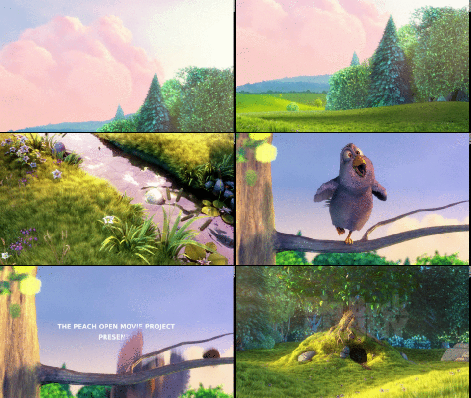
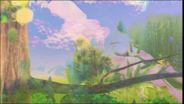
using the CLI tool gmic. The example below shows the results obtained from a sub-sequence of the
« Big Buck Bunny“ video. We have simply invoked the following commands from the Bash shell:
Fig.5.1.1: Sequence in the « Big Buck Bunny“ video, directed by the Blender foundation.
Fig.5.1.2: Result: Average image of the « Big Buck Bunny“ sequence above.
Fig.5.1.3: Result: Median image of the « Big Buck Bunny“ sequence above.
And to stay in the field of video processing, we can also mention the addition of the commands -morph_files and -morph_video that render temporal interpolations
of video sequences, taking the estimated intra-frame object motion into account, thanks to a quite smart variational and multi-scale estimation algorithm.
The video below illustrates the rendering difference obtained for the retiming of a sequence using temporal interpolation,
with (right) and without (left) motion estimation.
Fig.5.1.4: Video retiming using G’MIC temporal morphing technique.
Those who like to mistreat their images aggressively will be delighted to learn that a bunch of new image deformation and degradation effects
have appeared in G’MIC.
First of all, the filter “Deformations / Conformal maps“ allows one to distort an image using conformal maps.
These deformations have the property of preserving the angles locally, and are most often expressed as functions of complex numbers.
In addition to playing with predefined deformations, this filter allows budding mathematicians to experiment with their own complex formulas.
Fig.5.2.1: Filter “Conformal maps“ applying a angle-preserving transformation to the image of Mona Lisa.
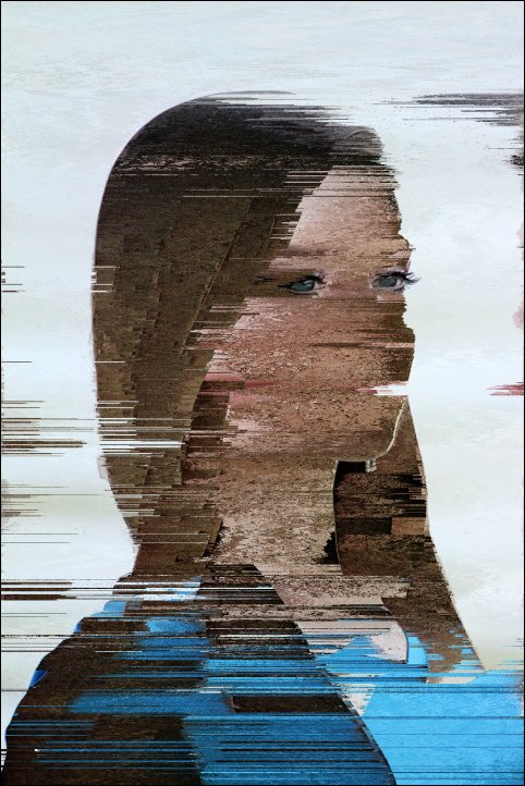
Fans of Glitch Art may also be concerned by several new filters whose rendering
look like image encoding or compression artifacts. The effect “Degradations / Pixel sort“ sorts the pixels of a picture by row or by
column according to different criteria and to possibly masked regions, as initially described on
this page.
Fig.5.2.2: Filter “Pixel sort“ for rendering a kind of “Glitch Art” effect.
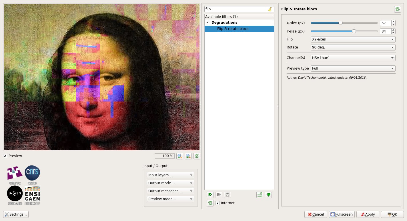
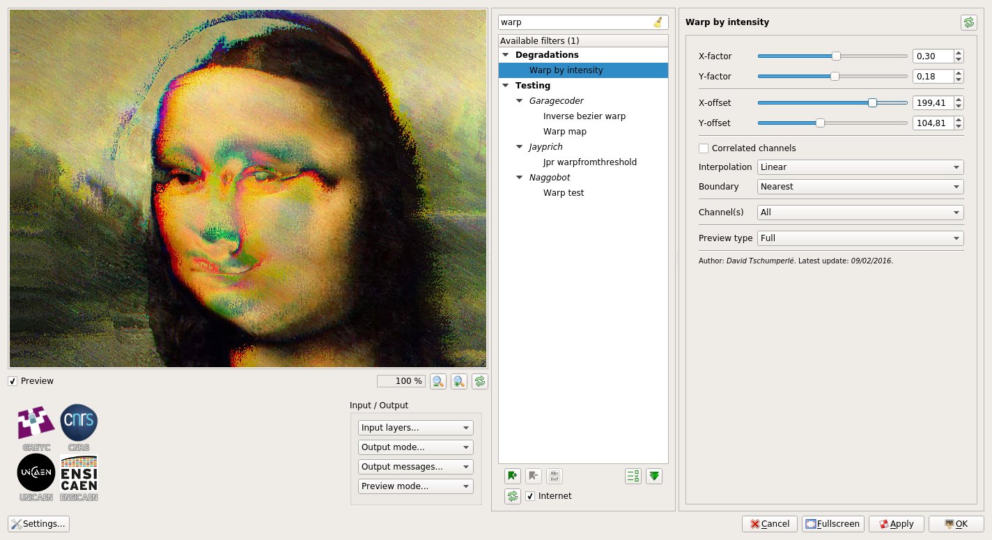
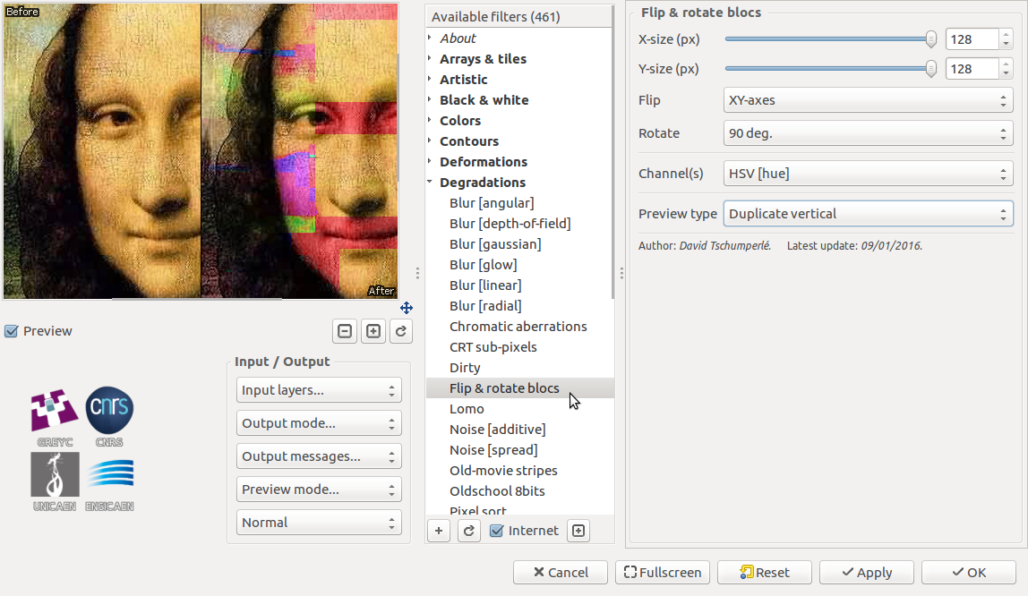
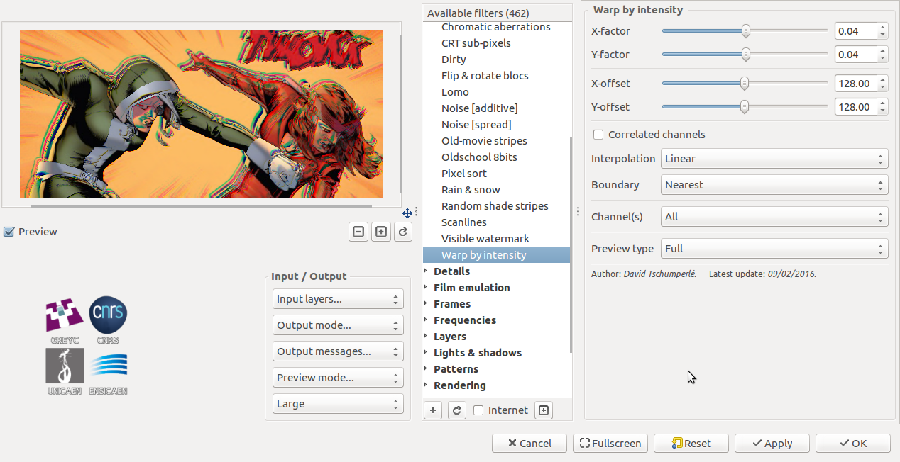
Degradations / /Pixel sort also has two little brothers, filters “Degradations / Flip & rotate blocks“ and “Degradations / Warp by intensity“.
The first divides an image into blocks and allows to rotate or mirror them, potentially only for certain color characteristics
(like hue or saturation, for instance).
Fig.5.2.3: Filter “Flip & rotate blocks“ applied to the hue only to obtain a “Glitch Art” effect.
The second locally deforms an image with more or less amplitude, according to its local geometry.
Here again, this can lead to the generation of very strange images.
Fig.5.2.4: Filter “Warp by intensity“ applied to the image of Mona Lisa (poor Mona!).
It should be noted that these filters were largely inspired by the
Polyglitch plug-in,
available for Paint.NET, and have been implemented after a suggestion from a friendly user
(yes, yes, we try to listen to our most friendly users!).
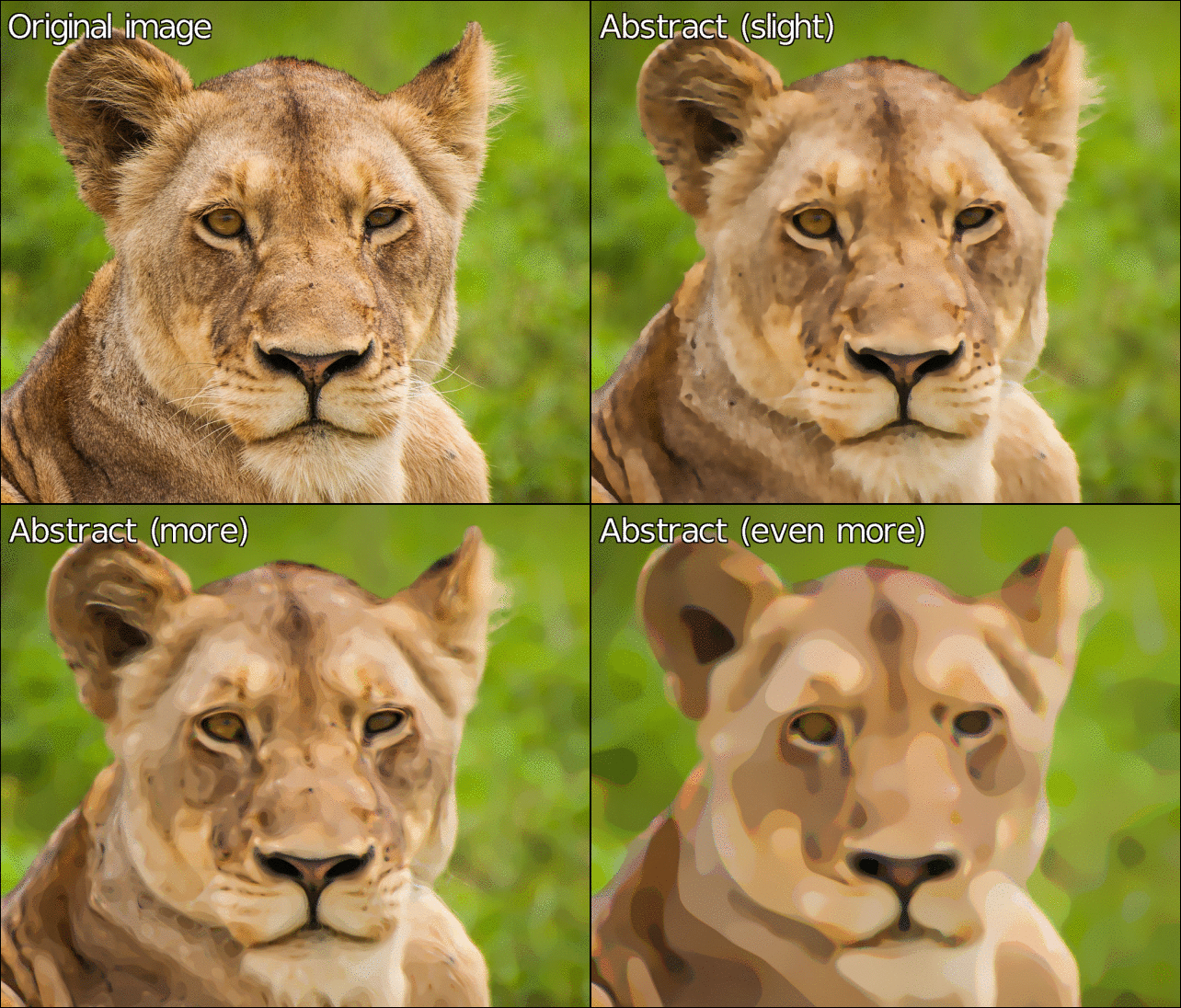
What else do we have in store? A new image abstraction filter, Artistic / Sharp abstract, based on the Rolling Guidance algorithm mentioned before.
This filter applies contour-preserving smoothing to an image, and its main consequence is to remove the texture.
The figure below illustrates its use to generate several levels of abstraction of the same input image, at different smoothing scales.
Fig.5.3.1: Creating abstractions of an image via the filter “Sharp abstract“.
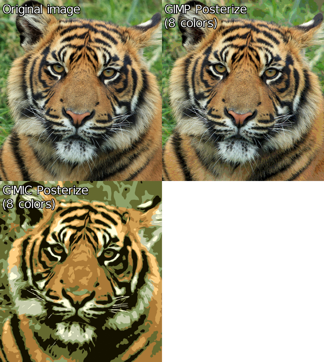
In the same vein, G’MIC also gets a filter Artistic / Posterize which degrades an image to simulate posterization.
Unlike the filter with same name available by default in GIMP (which mainly tries to reduce the number of colors, i.e. do color quantization),
our version adds spatial simplification and filtering to approach a little more the rendering of old posters.
Fig.5.3.2: Filter “Posterize“ of G’MIC, compared to the filter with same name available by default in GIMP.
If you still want more (and in this case one could say you are damn greedy!), we will end this section by discussing
some of the new, but unclassifiable filters.
We start with the filter “Artistic / Diffusion tensors“, which displays a field of diffusion tensors, calculated from the structure tensors of an image
(structure tensors are symmetric and positive definite matrices, classically used for estimating the local image geometry).
To be quite honest, this feature had not been originally developed for an artistic purpose, but users of the plug-in came across it by chance and asked
to make a GIMP filter from it. And yes, this is finally quite pretty, isn’t it?
Fig.5.4.1: Filter “Diffusion Tensors“ filter and its multitude of colored ellipses.
From a technical point of view, this filter was actually an opportunity to introduce new drawing features into the G’MIC mathematical evaluator,
and it has now become quite easy to develop G’MIC scripts for rendering custom visualizations of various image data.
This is what has been done for instance, with the command -display_quiver reimplemented from scratch, and which allows to generate this type of rendering:
Fig. 5.4.2: Rendering vector fields with the G’MIC command -display_quiver.
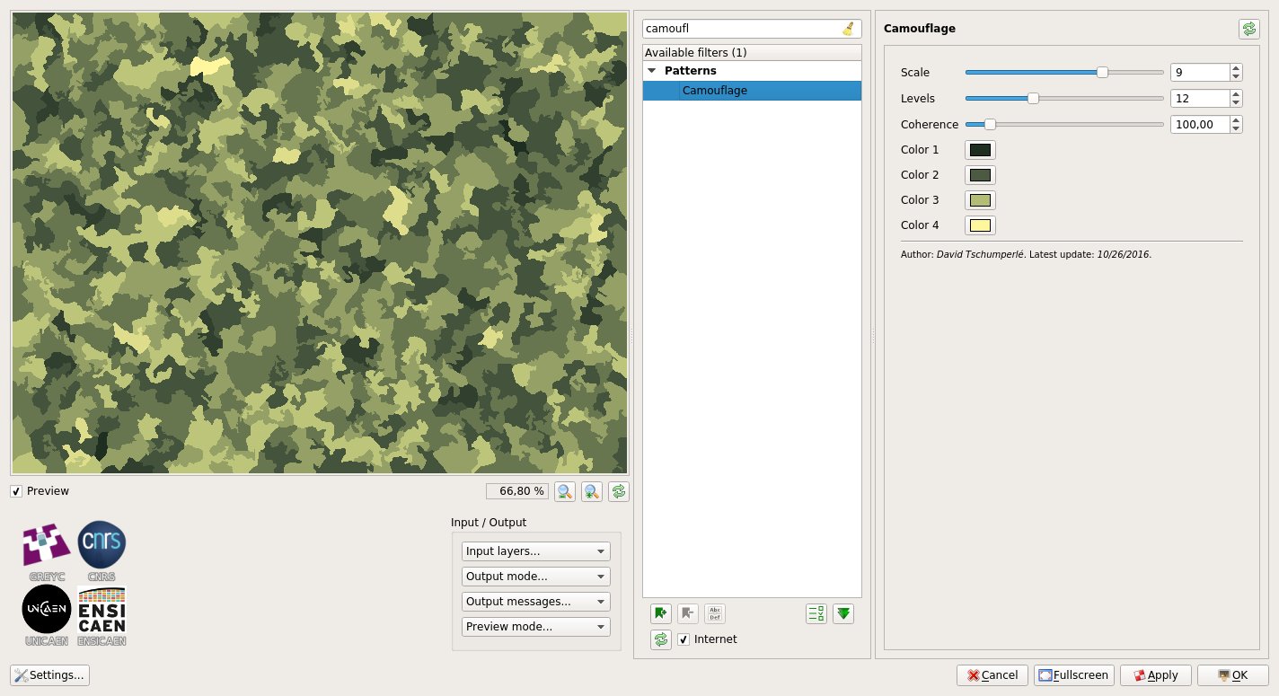
For lovers of textures, we can mention the apparition of two new fun effects: First, the “Patterns / Camouflage“ filter. As its name suggests,
this filter produces a military camouflage texture.
Fig. 5.4.3: Filter “Camouflage“, to be printed on your T-shirts to go unnoticed in parties!
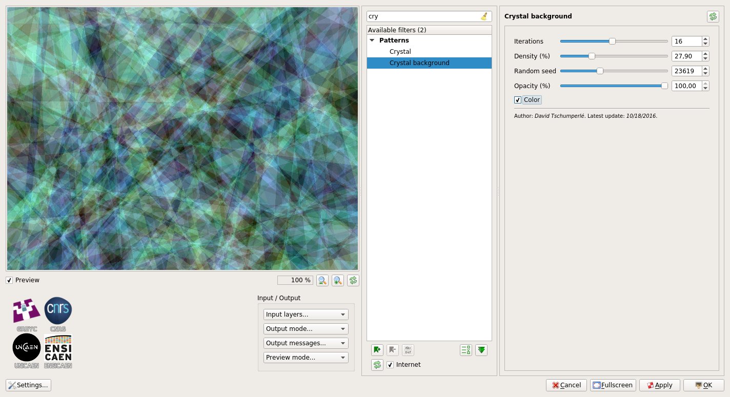
Second, the filter “Patterns / Crystal background“ overlays several randomly colored polygons in order to synthesize a texture that vaguely
looks like a crystal seen under a microscope. Pretty useful to quickly render colored image backgrounds.
Fig.5.4.4: Filter “Crystal background“ in action.
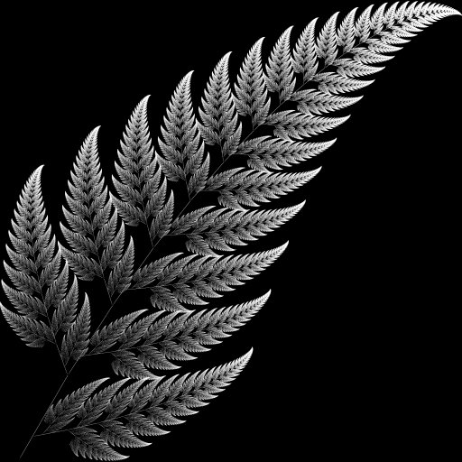
And to end this long overview of new G’MIC filters developed since last year, let us mention “Rendering / Barnsley fern“.
This filter renders the well-known Barnsley fern fractal.
For curious people, note that the related algorithm is available on Rosetta Code,
with even a code version written in the G’MIC script language, namely:
# Put this into a new file 'fern.gmic' and invoke it from the command line, like this:
# $ gmic fern.gmic -barnsley_fern
barnsley_fern :
  1024,2048
  -skip {"
      f1 = [ 0,0,0,0.16 ];           g1 = [ 0,0 ];
      f2 = [ 0.2,-0.26,0.23,0.22 ];  g2 = [ 0,1.6 ];
      f3 = [ -0.15,0.28,0.26,0.24 ]; g3 = [ 0,0.44 ];
      f4 = [ 0.85,0.04,-0.04,0.85 ]; g4 = [ 0,1.6 ];
      xy = [ 0,0 ];
      for (n = 0, n<2e6, ++n,
        r = u(100);
        xy = r<=1?((f1**xy)+=g1):
             r<=8?((f2**xy)+=g2):
             r<=15?((f3**xy)+=g3):
                   ((f4**xy)+=g4);
        uv = xy*200 + [ 480,0 ];
        uv[1] = h - uv[1];
        I(uv) = 0.7*I(uv) + 0.3*255;
      )"}
  -r 40%,40%,1,1,2
And here is the rendering generated by this function:
Fig.5.4.5: Fractal “Barnsley fern“, rendered by G’MIC.
6. Overall project improvements
All filters presented throughout this article constitute only the visible part of the G’MIC iceberg.
They are in fact the result of many developments and improvements made “under the hood”, i.e., directly on the code of the
G’MICscript language interpreter.
This interpreter defines the basic language used to write all G’MIC filters and commands available to users.
Over the past year, a lot of work has been done to improve the performances and the capabilities of this interpreter:
The mathematical expressions evaluator has been considerably enriched and optimized, with more functions available
(especially for matrix calculus), the support of strings, the introduction of const variables for faster evaluation,
the ability to write variadic macros, to allocate dynamic buffers, and so on.
New optimizations have been also introduced in the CImg library, including the parallelization of new functions
(via the use of OpenMP). This C++ library provides the implementations of the “critical” image processing
algorithms and its optimization has a direct impact on the performance of G’MIC (in this respect, note that CImg is also released with a major version 2.0).
Compiling G’MIC on Windows now uses a more recent version of g++ (6.2 rather than 4.5), with the help of Sylvie Alexandre.
This has actually a huge impact on the performances of the compiled executables: some filters run up to 60 times faster than with the previous binaries
(this is the case for example, with the Deformations / Conformal Maps filter, discussed in section 5.2).
The support of large .tiff images (format BigTIFF, with files that can be larger than 4Gb)
is now enabled (read and write), as it is for 64-bit floating-point TIFF images
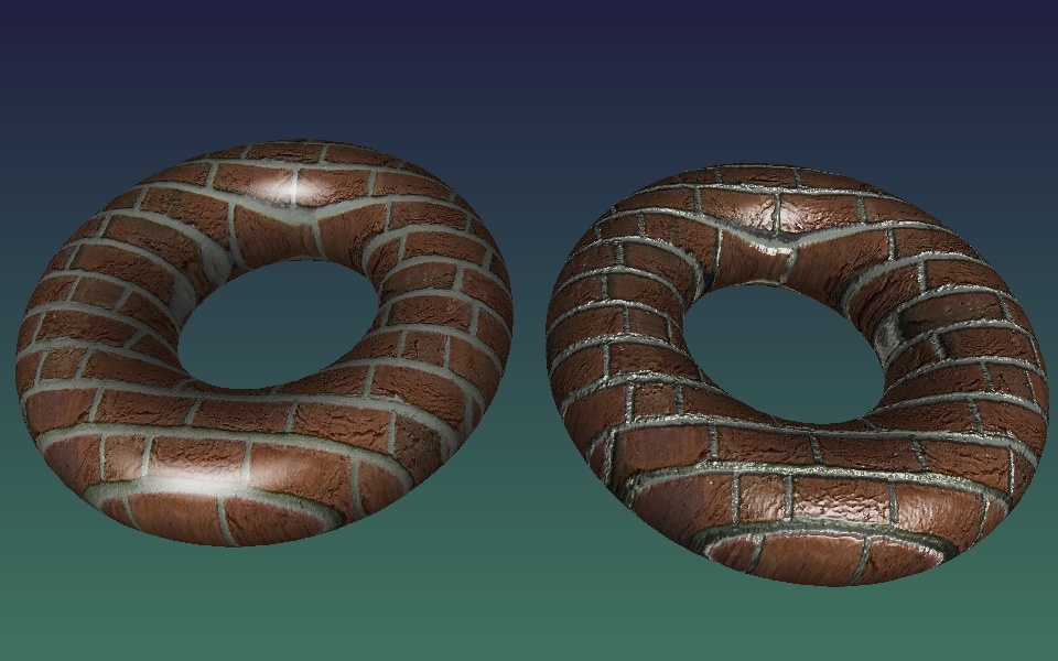
The 3D rendering engine built into G’MIC has also been slightly improved, with the support for bump mapping.
No filter currently uses this feature, but we never know, and prepare ourselves for the future!
Fig.6.1: Comparison of 3D textured rendering with (right) and without “Bump mapping” (left).
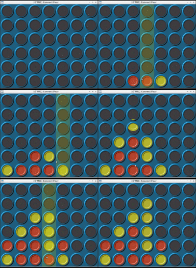
And as it is always good to relax after a hard day’s work, we added the game of Connect Four to G’MIC :).
It can be launched via the shell command $ gmic -x_connect4 or via the plug-in filter “Various / Games & demos / Connect-4“.
Note that it is even possible to play against the computer, which has a decent but not unbeatable skill
(the very simple _AI_ uses the Minimax algorithm with a two-level decision tree).
Fig.6.2: The game of “Connect Four“, as playable in G’MIC.
Finally, let us mention the undergoing redesign work of the G’MIC Online web service, with a
beta version already available for testing.
This re-development of the site, done by Christophe Couronne and Véronique Robert
(both members of the GREYC laboratory), has been designed to better adapt to mobile devices.
The first tests are more than encouraging. Feel free to experiment and share your impressions!
7. What to remember?
First, the version 2.0 of G’MIC is clearly an important step in the project life, and the recent improvements
are promising for the future developments.
It seems that the number of users are increasing (and they are apparently satisfied!), and we hope that this will encourage open-source software developers
to integrate our new G’MIC-Qt interface as a plug-in for their own software.
In particular, we are hopeful to see the new G’MIC in action under Krita soon, this would be already a great step!
Second, G’MIC continues to be an active project, and evolve through meetings and discussions with members of artists and photographers communities
(particularly those who populate the forums and IRC of pixls.us and GimpChat).
You will likely able to find us there if you need more information, or just if you want to discuss things related to (open-source) image processing.
And while waiting for a future hypothetical article about a future release of G’MIC, you can always follow the day-after-day progress of the project via
our Twitter feed.
Until then, long live open-source image processing!
Credit: Unless explicitly stated, the various non-synthetic images that illustrate this post come from Pixabay.
I was idling in our IRC chat room earlier when @Morgan_Hardwood wished us all a “Happy Discuss Anniversary”.
Wouldn’t you know it, another year slipped right by!
(Surely there’s no way it could already be a year since the last birthday post?
Where does the time go?)
We’ve had a bunch of neat things happen in the community over the past year!
Let’s look at some of the highlights.
I want to start with this topic because it’s the perfect opportunity to recognize some folks who have been supporting the community financially…
When I started all of this I decided that I definitely didn’t want ads to be on the site anywhere.
I had gotten enough donations from my old blog and GIMP tutorials that I could cover costs for a while entirely from those funds (I also re-did my personal blog recently and removed all ads from there as well).
I don’t like ads.
You don’t like ads.
We’re a big enough community that we can keep things going without having to bring those crappy things into our lives.
So to reiterate, we’re not going to run ads on the site.
We are hosting the main website on Stablehost, the forums (discuss) are on a VPS at Digital Ocean, and our file storage for discuss is out on Amazon S3(see below).
All told our costs are about $30 per month.
Not so bad!
Even so, we have had some folks who have donated to help us offset these costs and I want to take a moment to recognize their generosity and graciousness!
Dimitrios Psychogios has been a supporter of the site since the beginning.
This past year he covered (more than) our hosting costs for the entire year, and for that I am infinitely grateful (yes, I have infinite gratitude).
It also helps that based on his postings on G+ our musical tastes are very similarly aligned.
As soon as I get the supporters page up you’re going to the top of the list!
Thank you, Dimitrios, for your support of the community!
Jonas Wagner (@Jonas_Wagner) and McCap (@McCap) both donated this past year as well.
Which is doubly-awesome because they are both active in the community and have written some great content for everyone as well (@McCap is the author of the article A Masashi Wakui look with GIMP, and has been active in the community since the beginning as well).
Mica (@paperdigits) and Luka are both recurring donators which I am particularly grateful for.
It really helps for planning to know we have some recurring support like that.
I have a bunch of donations where the donators didn’t leave me a name to use for attribution and I don’t want to just assume it’s ok. If you know you donated and see your first name in the list below (and are ok with me using your full name and a link if you want) then please let me know and I’ll update this post (and for the donators page later).
These are the folks who are really making a difference by taking the time and being gracious enough to support us.
Even if you don’t want your full name out here, I know who you are and am very, very grateful and humbled by your generosity and kindness. Thank you all so much!
Marc W. (you rock!)
Ulrich P.
Luc V.
Ben E.
Keith A.
Philipp H.
Christian M.
Matthieu M.
Christian M.
Christian K.
Maria J.
Kevin P.
Maciej D.
Christian K.
Egbert G.
Michael H.
Jörn H.
Boris H.
Norman S.
David O.
Walfrido C.
Philip S.
David S.
Keith B.
Andrea V.
Stephan R.
David M.
Bastian H.
Chance J.
Luka S.
Nathanael S.
Sven K.
Pepijn V.
Benjamin W.
Jörg W.
Patrick B.
Joop K.
Alain V.
Egor S.
Samuel S.
On that note.
If anyone wanted to join the folks above in supporting what we’re up to, we have a page specifically for that:
I wasn’t able to attend LGM this year, being held down in Rio (but the GIMP team did).
That’s not to say that we didn’t have folks from the community there: Farid (@frd) from Estúdio Gunga was there!
I was able to help coordinate a presentation by Robin Mills (@clanmills) about the state (and future) of Exiv2.
They’re looking for a maintainer to join the project, as Robin will be stepping down at the end of the year for studies.
If you think you’d be interested in helping out, please get in touch with Robin on the forums and let him know!
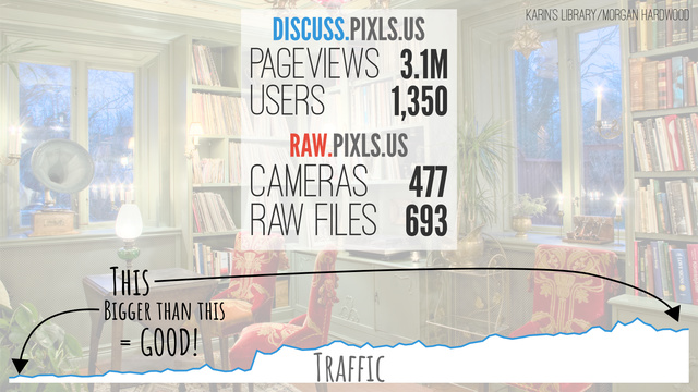
I also put together (quickly) a few slides on the community that were included in the “State of the Libre Graphics” presentation that kicks off the meeting (presented this year by GIMPer Simon Budig):
This was just a short overview of the community and I think it makes sense to include it here was well.
Since we stood the forum up two years ago we’ve seen about 3.2 million pageviews and have just under 1,400 users in the community.
Which is just awesome to me.
@LebedevRI was also going to be mad if I didn’t take the time to at least let folks know about raw.pixls.us, where we currently have 693 raw files across 477 cameras.
Please, take a moment to check raw.pixls.us and see if we are missing (or need better) files from a camera you may have, and get us samples for testing!
We set up raw.pixls.us so we can gather camera raw samples for regression testing of rawspeed as well to have a place for any other project that might need raw files to test with.
As we blogged about previously, the new site is also a replacement for the now defunct rawsamples.ch website.
Stop in and see if we’re missing a sample you can provide, or if you can provide a better (or better licensed) version for your camera.
We’re focusing specifically on CC0 contributions.
As I mentioned in my last blog post, we learned that the digiKam team was looking for a new webmaster through a post on discuss.
@Andrius posted a heads up on the digiKam 5.5.0 release in this thread.
Needless to say, less than a month or so later, @paperdigits had already finished up a nice new website for them!
This is something we’re really trying to help out the community with and are super glad to be able to help out the digiKam team with this.
The less time they have to worry about web infrastructure and security for it, the more time they can spend on awesome new features for their project and users.
Yes, we used a static site generator (Hugo in this case), and we were also able to move their commenting system to use discuss as its back-end!
This is the same way we’re doing comments for PIXLS.US right now (scroll to the bottom of this post).
They’ve got their own category on discuss for both general digiKam discussion as well as their linked comments from their website.
Speaking of using discourse as a commenting system…
We’ve been using discourse as our forum software from the beginning.
It’s a modern, open, and full-featured forum software that I think works incredibly well as a modern web application.
The ability to embed comments in a website that are part of the forum was one of the main reasons I went with it.
I didn’t want to expose users to unnecessary privacy concerns by embedding a third-party commenting system (cough, disqus, cough).
If I was going to go through the trouble of setting up a way to comment on things, I wanted to homogenize it with a full community-building effort.
This past year they (the discourse devs) added the ability to embed comments in multiple hosts (it was only one host when we first stood things up).
This means that we can now manage the comments for anyone else thay may need them!
Of course, building out a new website for digiKam meant that this was a perfect time to test things.
It all works beautifully, with one minor nitpick.
The ability to style the embedded comments was limited to a single style for all the places that they might be embedded.
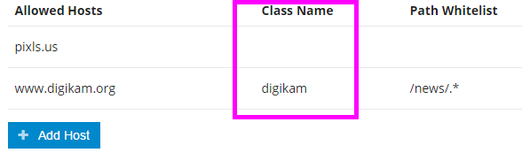
This may be fine if all of the sites look similar, but if you visit www.digikam.org and compare it to here, you can see they are a little bit different…
(we’re on white, digikam.org is on a dark background).
We needed a way to isolate the styling on a per-host basis, which after much help from @darix (yet again :)) I was able to finally hack something together that worked and get it pushed upstream (and merged finally)!
When RawTherapee migrated their official forums over to pixls they brought something really fun with them: Play Raw.
They would share a single raw file amongst the community and then have everyone process and share their results (including their processing steps and associated .pp3 settings file).
If you haven’t seen it yet, we’ve had quite a few Play Raw posts over the past year with all sorts of wonderful images to practice on and share!
There are portraits, children, dogs, cats, landscapes, HDR, and phở!
There’s over 19 different raw files being shared right now, so come try your hand at processing (or even share a file of your own)!
We are a photography forum, so it only made sense that we made it as easy as possible for community members to upload and share images (raw files, and more).
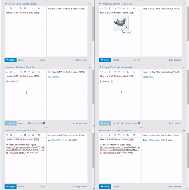
It’s one of the things I love about discourse that it’s so easy to add these things to your posts (simply drag-and-drop into the post editor) and upload them.
While this is easy to do, it does mean that we have to store all of this data.
The VPS we use from Digital Ocean only has a 40GB SSD and it has to include all of the main forum running on it.
We did have a little space for a while, but to help alleviate the local storage as a possible problem down the line, I moved our file storage out to Amazon S3.
This means that we can upload all we want and won’t really hit a wall with actual available storage space.
It costs more each month than trying to store it all on local storage for the site, but then we don’t have to worry about expansion (or migration) later.
Plus our current upload size limit per file is 100MB!
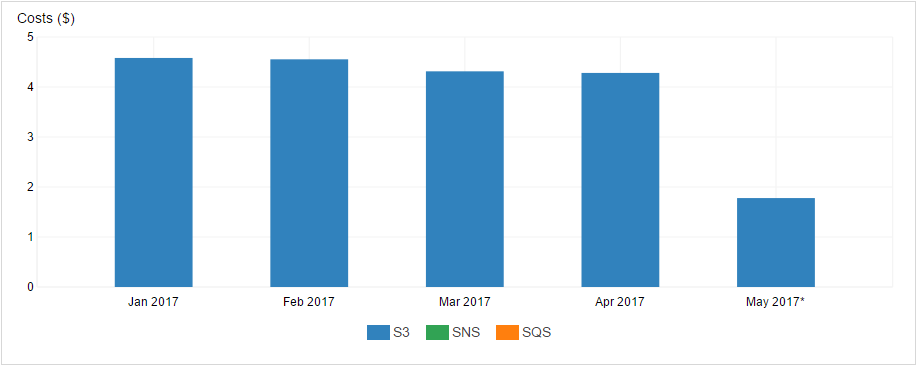
As you can see, we’re only looking at about $5USD/month on average in storage and transfer costs for the site with Amazon.
We’re also averaging about $22usd/month in hosting costs with Digital Ocean, so we’re still only about $27/month in total hosting costs.
Maybe $30 if we include the hosting for the main website which is at Stablehost.
We’ve had an IRC room for a long time (longer than discuss I think), but I only just got around to including a link on the site for folks to be able to join through a nice web client (Kiwi IRC).
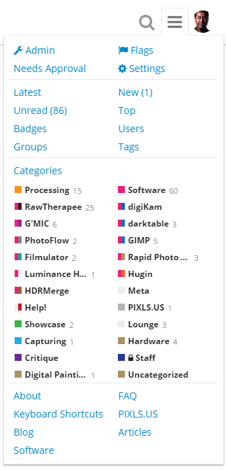
It was included as part of an oft-requested set of links to get back to various parts of the main site from the forums.
I also added these links in the menu for the site as well (the header links are hidden when on mobile, so this way you can still access the links from whatever device you’re using):
If you have your own IRC client then you can reach us on irc.freenode.net #pixls.us.
Come and join us in the chat room!
If you’re not there you are definitely missing out on a ton of stimulating conversation and enlightening discussions!
One of the goals we have here at PIXLS.US is to help Free Software projects however we can, and one of those ways is to focus on things that we can do well that might help make things easier for the projects.
It may not be much fun for project developers to deal with websites or community outreach necessarily.
This is something I think we can help with, and recently we had an opportunity to do just that with the awesome folks over at the photo management project digiKam.
As part of a post announcing the release of digiKam 5.5.0 on discuss. we learned that they were in need of a new webmaster, and they needed something soon to migrate away from Drupal 6 for security reasons.
They had a rudimentary Drupal 7 theme setup, but it was severely lacking (non-responsive and not adapted to the existing content).
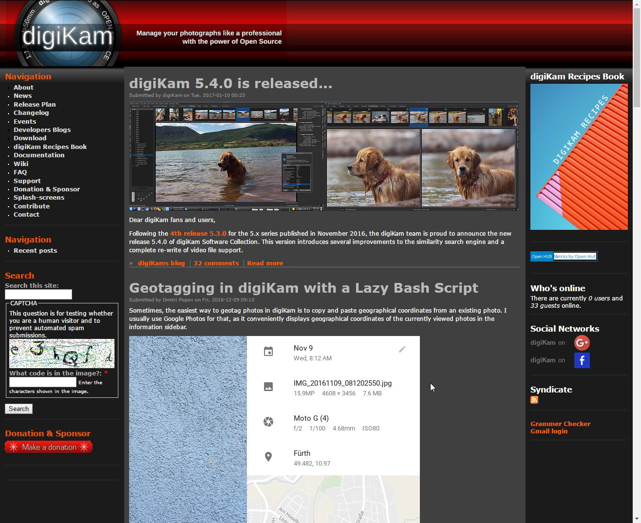
The previous digiKam website, running on Drupal 6.
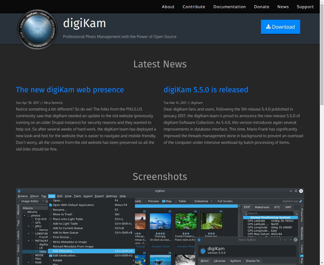
The new digiKam website! Great work Mica!
Mica (@paperdigits) reached out to Gilles Caulier and the digiKam community and offered our help, which they accepted!
At that point Mica gathered requirements from them and found in the end that a static website would be more than sufficient for their needs.
We coordinated with the KDE folks to get a git repo setup for the new website, and rolled up our sleeves to start building!
Mica chose to use the Hugo static-site generator to build the site with.
This was something new for us, but turned out to be quite fast and fun to work with (it generates the entire digiKam site in just about 5 seconds).
Coupled with a version of the Foundation 6 blog theme we were able to get a base site framework up and running fairly quickly.
We scraped all of the old site content to make sure that we could port everything as well as make sure we didn’t break any urls along the way.
We iterated some design stuff along the way, ported all of the old posts to markdown files, hacked at the theme a bit, and finally included comments that are now hosted on discuss.
What’s wild is that we managed to pull the entire thing together in about 6 weeks total (of part-time working on it).
The digiKam team seems happy with the results so far, and we’re looking forward to continue helping them by managing this infrastructure for them.
A big kudos to Mica for driving the new site and getting everything up and running.
This was really all due to his hard work and drive.
This is the same category that news posts from the website will post in, so feel free to drop in and say hello or share some neat things you may be working on with digiKam!
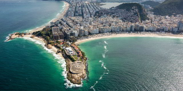
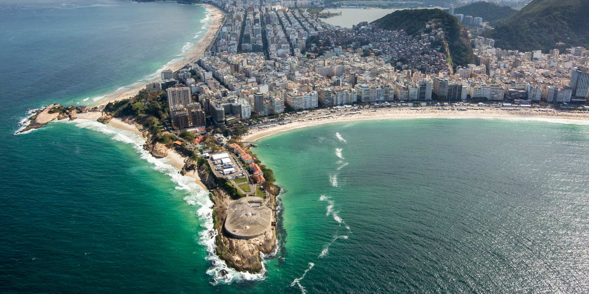
This years Libre Graphics Meeting (2017) is going to be held in the lovely city seen above, Rio de Janeiro, Brazil!
This is an important meeting for so many people in the Free/Libre art community as it’s one of the only times they have an opportunity to meet face to face.
We’ve had some folks attending the past LGM’s (Leipzig and London) and it’s a wonderful opportunity to spend some time with friends. (Also, @frd from the community will be there!)
The GIMP team will be in attendance this year. I happen to have a fondness for them so I’m asking anyone reading this to please head over and donate to the project.
That link is for the GNOME PayPal account, but there are other ways to donate as well.
This is one of the few times that the GIMP team gets a chance to meet in person.
They use the time to hack at GIMP and to manage internal business.
The time they get to spend together is invaluable to the project and by extension everyone that uses GIMP.
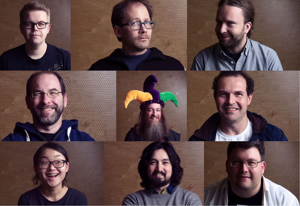
Just look at these faces!
Surely this (Brady) Bunch of folks is worth helping to get a better GIMP?
Left to right, top to bottom: Ville, Mitch, Øyvind, Simon, Liam, João, Aryeom, Jehan, Michael
Besides @frd I’m not sure who else from the community might be attending, so if I’ve missed you I apologize!
Please feel free to use this topic to communicate and coordinate if you’d like.
It appears that personally I’m on a biennial schedule with attending LGM - so I’m looking forward to next year to be able to catch up with everyone!
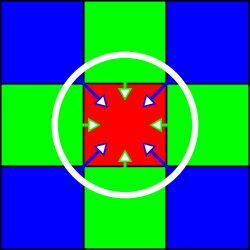
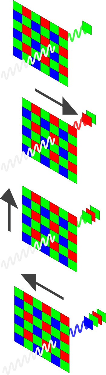
Modern digital sensors (with a few exceptions) use an arrangement of RGB filters over a square grid of photosites. For a given 2x2 square of photosites the filters are designed to allow two green, and one each red and blue colors through to the photosite. These are arranged on a grid:
The pattern is known as a Bayer pattern (after the creator Bryce Bayer of Eastman Kodak). The resulting pattern shows how each RGB is offset into the grid.
Each of the pixel sites captures a single color. In order to produce a full color representation at each pixel, the other color values need to be interpolated from the surrounding grid. This interpolation and methods for calculating it are referred to as demosaicing. The methods for accomplishing this vary across different algorithms.
The final RGB value for the initially Red pixel needs to be interpolated from the surrounding Blue and Green pixels.
Unfortunately, this can often result in problems.
There can be chromatic aliasing problems resulting in odd color fringing and roughness on edges or a loss of detail and sharpness.
Pixel Shift
Pentax‘s Pixel Shift (Available on the K-1, K-3 II, KP, K-70) attempts to alleviate some of these problems through a novel approach of capturing four images quickly in succession and by moving the entire camera sensor a single pixel for each shot. This has the effect of capturing a full RGB value at each pixel location:
Pixel Shift shifts the sensor by one pixel in each direction to be able to generate a full set of RGB values at each photosite.
This means a full RGB value for a pixel location can be created without having to interpolate from neighboring values.
Advantages
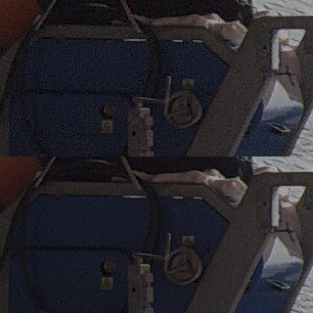
Less Noise
If you look carefully at the Bayer pattern, you’ll notice that when shifting to adjacent pixels there will always be two green values captured per pixel. The average of these green values helps to suppress noise that may have been interpolated and spread through a normal, single-shot raw file.
Top: single raw frame, Bottom: Pixel Shift
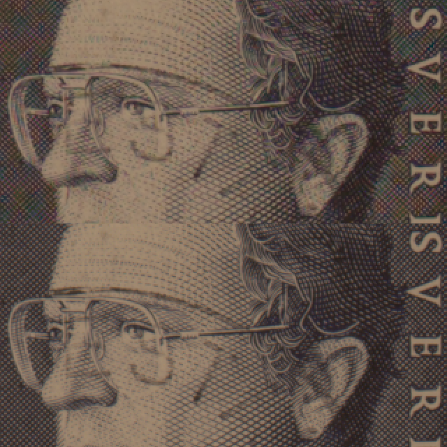
Less Moiré
Avoiding the interpolation of pixel colors from surrounding photosites helps to reduce the appearance of Moiré in the final result:
Top: single raw frame, Bottom: Pixel Shift
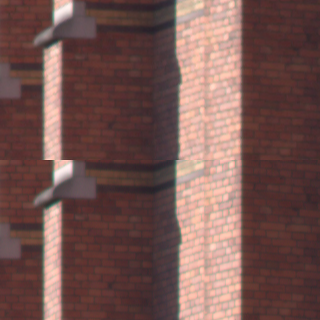
Increased Resolution
This method is similar in concept to what was previously seen when Olympus announced their “High Resolution” mode for the OMD E-M5mkII camera (or manually as we previously described in this blog post).
In that case they combine 8 frames moved by sub-pixel amounts to increase the overall resolution.
The difference here is that Olympus generates a single, combined raw file from the results, while Pixel Shift gets you access to each of the four raw files before they’re combined.
In each case, a higher resolution image can be created from the results:
Top: single raw frame, Bottom: Pixel Shift
Disadvantages
Movement
As with most approaches for capturing multiple images and combining them, a particularly problematic area is when there are objects in motion between the frames being captured.
This is a common problem when stitching panoramic photography, when creating image stacks for noise reduction, and when combining images using methods such as Pixel Shift.
Although…
The RawTherapee Approach
Simply combining four static frames together is really trivial, and is something that all the other Pixel Shift-capable software can do without issue. The real world is not often so accommodating as a studio setup, and that is where the recent work done by @Ingo and @Ilias on RawTherapee really begins to shine.
What they’ve been working on in RawTherapee is to improve the detection of movement in a scene. There are several types of movement possible:
Objects showing at different places in a scene such as fast moving cars.
Partly moving objects like foliage in the wind.
Moving objects reflecting light onto static objects in the scene
Changing illumination conditions such as long exposures at sunset.
All of these types of movement need to be detected to avoid the artifacts they may cause in the final shot.
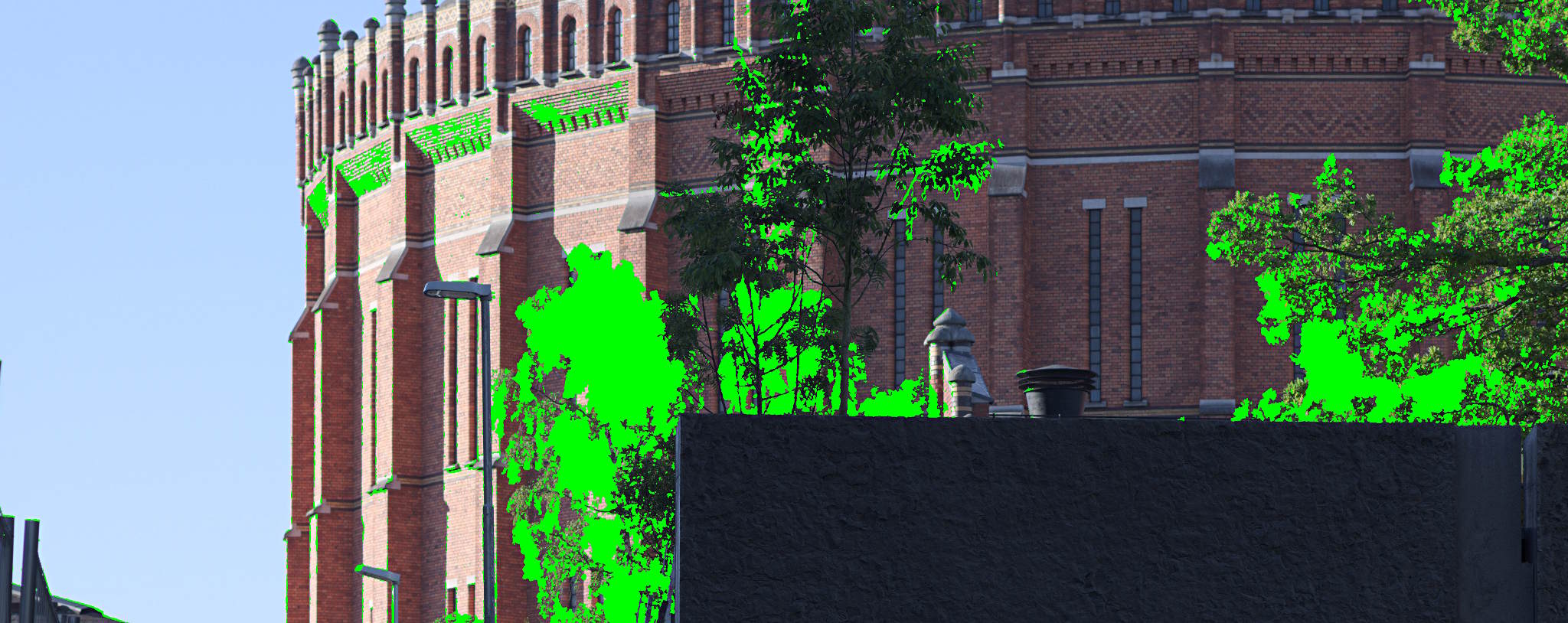
One of the key features of Pixel Shift movement detection in RawTherapee is that it allows you to show the movement mask, so you get feedback on which regions of the image are detected as movement and which are static. For the regions with movement RawTherapee will then use the demosaiced frame of your choice to fill it in, and for regions without movement it will use the Pixel Shift combined image with more detail and less noise.
Unique to RawTherapee is the option to export the resulting motion mask (for those that may want to do further blending/processing manually).
The accuracy of movement detection in RawTherapee leads to much better handling of motion artifacts that works well in places where proprietary solutions fall short.
For most cases the Automatic motion correction mode works well, but you can also fine tune the parameters in custom mode to correctly detect motion in high ISO shots.
Besides being the only option (barring dcrawps possibly) to process Pixel Shift files in Linux, RawTherapee has some other neat options that aren’t found in other solutions. One of them is the ability to export the actual movement mask separate from the image. This will let users generate separate outputs from RT, and to combine them later using the movement mask. Another option is the ability to choose which of the other frames to use for filling in the movement areas on the image.
Pixel Shift Support in Other Software
Pentax’s own Digital Camera Utility (a rebranded version of SilkyPix) naturally supports Pixel Shift, but as with most vendor-bundled software it can be slow, unwieldy, and a little buggy sometimes. Having said that, the results do look good, and at least the “Motion Correction” is able to be utilized with this software.
Adobe Camera Raw (ACR) got support for Pixel Shift files in version 9.5.1 (but doesn’t utilize the “Motion Correction”). In fact, ACR didn’t have support at the time that DPReview.com looked at the feature last year, causing them to retract the article and re-post when they had a chance to use a version of ACR with support.
We’re going to look at some 100% crops from that article and compare them to the results available using RawTherapee (the latest development version, to be released as 5.1 in April).
The RawTherapee versions were set to the most neutral settings with only an exposure adjustment to match other samples better.
Looking first at an area of foliage with motion, the places where there are issues becomes apparent.
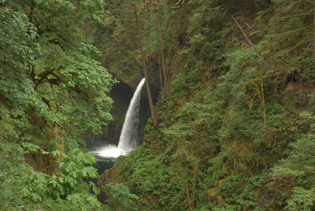
For reference, here is the Adobe Camera Raw (ACR) version of a single frame from a Pixel Shift file:
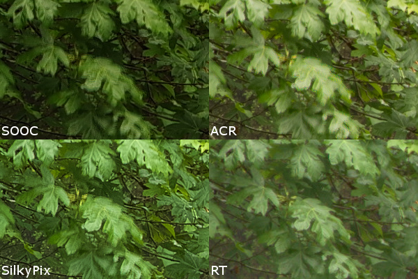
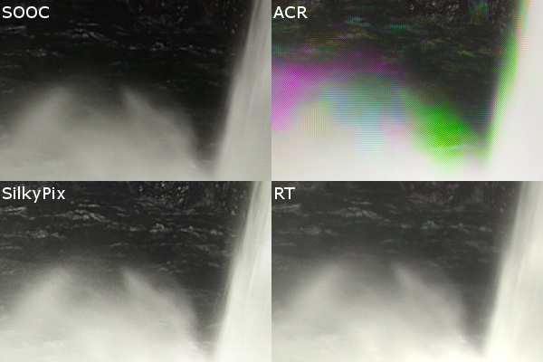
The results with Pixel Shift on, and motion correction on, from straight-out-of-camera (SOOC), Adobe Camera Raw (ACR), SilkyPix, and RawTherapee (RT) are decidedly mixed. In all but the RT version, there’s a very clear problem with effective blending and masking of the frames in areas with motion:
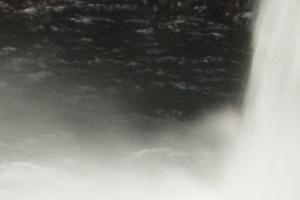
Things look much worse for Adobe Camera Raw when looking at high-motion areas like the water spray at the foot of the waterfall, though SilkyPix does a much better job here.
The ACR version of a single frame for reference:
Both the SOOC and SilkyPix versions handle all of the movement well here. RawTherapee also does a great job blending the frames despite all of the movement. Adobe Camera Raw is not doing well at all…
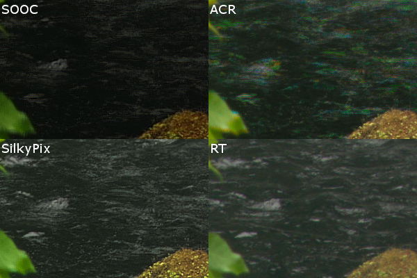
Finally, in a frame full of movement, such as the surface of the water.
The ACR version of a single frame for reference:
In a frame full of movement the SOOC, ACR, and SilkyPix processing all struggle to combine a clean set of frames. They exhibit a pixel pattern from the processing, and the ACR version begins to introduce odd colors:
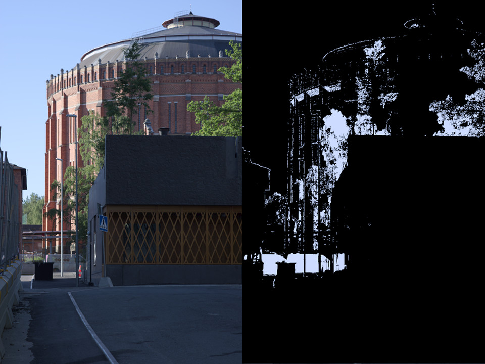
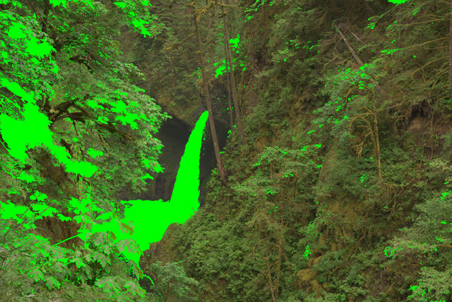
As mentioned earlier, a unique feature of RawTherapee is the ability to show the motion mask. Here is an example of the motion mask for this image
The motion mask generated by RawTherapee for the above image.
Also worth mentioning is the “Smooth Transitions” feature in RawTherapee.
When there are regions with and without motion, the regions with motion are masked and filled in with data from a demosaiced frame of your choice.
The other regions are taken from the Pixel Shift combined image.
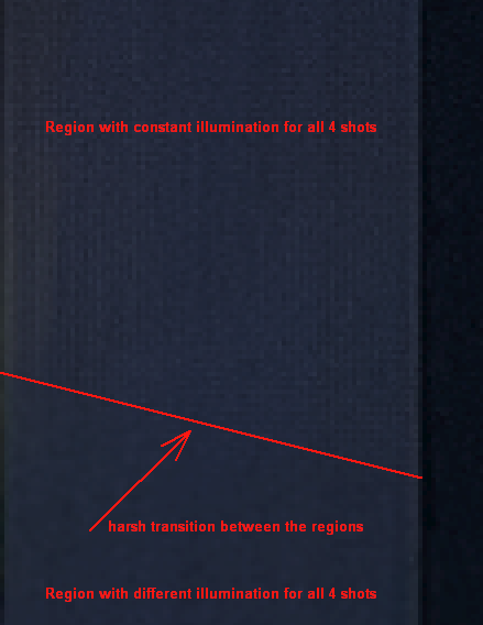
This can occasionally lead to harsh transitions between the two.
For instance, a transition as processed in SilkyPix:
RawTherapee’s “Smooth Transitions” feature does a much better job handling the transition:
In Conclusion
In another example of the power and community of Free/Libre and Open Source Software we have a great enhancement to a project based on feedback and input from the users. In this case, it all started with a post on the RawTherapee forums.
Thanks to the hard work of @Ingo and @Ilias Pentax shooters now have a Pixel Shift capable software that is not only FLOSS but also produces better results than the proprietary solutions!
Not so coincidentally, community member @nosle gave permission to use one of his PS files for everyone to try processing on the Play pixelshift thread.
If you’d like to practice consider heading over to get his file and feedback from others!
Pixel Shift is currently in the development branch of RawTherapee and is slated for release with version 5.1.
The Southern California Linux Expo (SCaLE) 15x is returning to the Pasadena Convention Center on March 2-5, 2017. SCaLE is one of the largest community-organized conferences in North America, with some 3,500 attendees last year.
If you’re attending the conference this year, find me, @paperdigits and lets talk shop or grab a meal!
Don’t judge me, it was the morning.
You can ping me on the forum, on twitter, or on Matrix/riot.im at @paperdigits:matrix.org.
If meeting isn’t enough for you, I’ll have stickers!
Welcome to the second installment of From the Community, a (hopefully) quarterly-ish blog post to highlight a few of the things our community members have been doing!
@arctic has posted some research about how to better simulate grain in our digital images and the ensuing conversation is both fascinating and way above my head! This discussion is thus far raw processor independent and more input and code is welcome!
We’ve somewhat recently welcomed the painters into the fold on the pixls’ forum and @Elle rewarded us all with a tutorial RGB color mixing. She delves into subjects such as mixing color pigments like a traditional painter and how to handle that in the digital darkroom. You can read the whole article here.
There has been a lot of on-going work to bring support for Pentax Pixel Shift files in RawTherapee; the thread has now reached 234 posts and it is inspiring to see the community and developers coming together to bring support for an interesting technology. The feature set has been evolving pretty rapidly and it will be exiting when it makes it to a stable release.
Some preliminary work has begun to bring generic midi controller support to darktable. The funding for the midi controller to spur the development of this feature is a direct result of the members of the forum directly giving to further community causes. Once the darktable developers are finished with the midi controller, it’ll be offered to other developers to use to help implement support!
Happy New Year, and I hope everyone has had a wonderful holiday!
We’ve been busy working on various things ourselves, including migrating RawPedia to a new server as well as building a replacement raw sample database/website to alleviate the problems that rawsamples.ch was having…
…provide RAW-Files of nearly all available Digitalcameras mainly to software-developers. [sic]
It was created by Jakob Rohrbach and had been running since March 2007, having amassed over 360 raw files in that time from various manufacturers and cameras. Unfortunately, back in 2016 the site was hit with a SQL-injection that ended up corrupting the database for the Joomla install that hosted the site. To compound the pain, there were no database backups… :(
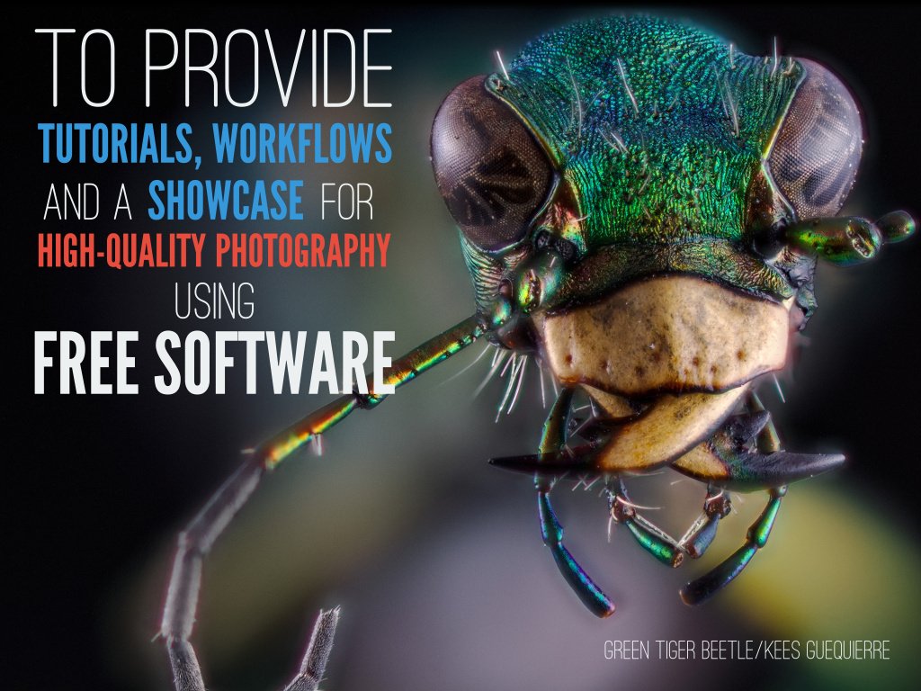
On the good side, the PIXLS.US community has some dangerous folks with idle hands. Our friendly, neighborhood @andabata (Kees Guequierre) had some time off at the end of the year and a desire to build something. You may know @andabata as the fellow responsible for the super-useful dtstyle website, which is chock full of darktable styles to peruse and download (if you haven’t heard of it before – you’re welcome!). He’s also my go-to for macro photography and is responsible for this awesome image used on a slide for the Libre Graphics Meeting:
Luckily, he decided to build a site where contributors could upload sample raw files from their cameras for everyone to use – particularly developers. We downloaded the archive of the raw files kept at rawsamples.ch to include with files that we already had. The biggest difference between the files from rawsamples.ch and raw.pixls.us is the licensing. The existing files, and the preference for any new contributions, are licensed as Creative Commons Zero - Public Domain (as opposed to CC-BY-NC-SA).
After some hacking, with input and guidance from darktable developer Roman Lebedev, the site was finally ready.
The repository for it can be found on GitHub: raw.pixls.us repo.
In addition to browsing the archive, it would be fantastic if you were able to supplement the database by uploading sample images. Many of the files from the rawsamples.ch archive are licensed CC-BY-NC-SA, but we’d rather have the files licensed Creative Commons Zero - Public Domain. CC0 is preferable because if the sample raw files are separated from the database, they can safely be redistributed without attribution. So if you have a camera that is already in the list with the more restrictive license, then please consider uploading a replacement for us!
The history and evolution of painting has undergone a similar transformation as most things adapting to a digital age. As photographers, we adapted techniques and tools commonly used in the darkroom to software, and found new ways to extend what was possible to help us achieve a vision. Just as we tried to adapt skills to a new environment, so too did traditional artists, like painters.
These artists adapted by not only emulating the results of various techniques, but by pushing forward the boundaries of what was possible through these new (Free Software) tools.
Digital painting discussions with Free Software lacks a good outlet for collaboration that can open the discussion for others to learn from and participate in. This is a similar situation the Free Software + photography world was in that prompted the creation of pixls.us.
Due to this, both Americo Gobbo and Elle Stone reached out to us to see if we could create a new category in the community about Digital Painting with a focus on promoting serious discussion around techniques, processes, and associated tools.
Both of them have been working hard on advancing the capabilities and quality of various Free Software tools for years now. Americo brings with him the interest of other painters who want to help accelerate the growth and adoption of Free Software projects for painting (and more) in a high-quality and professional capacity. A little background about them:
Americo Gobbo studied Fine Arts in Bologna, Italy. Today he lives and works in Brazil, where he continues to develop studies and create experimentation with painting and drawing mainly within the digital medium in which he tries to replicate the traditional effects and techniques from the real world to the virtual.
Elle Stone is an amateur photographer with a long-standing interest in the history of photography and print making, and in combining painting and photography. She’s been contributing to GIMP development since 2012, mostly in the areas of color management and proper color mixing and blending.
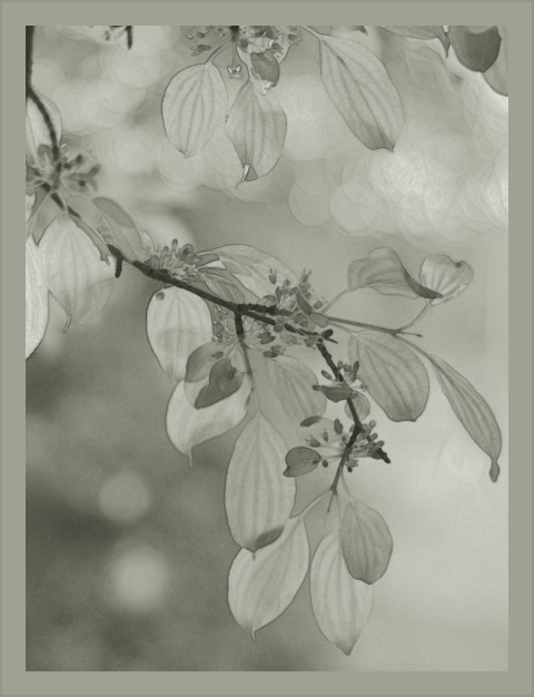
Leaves in May, GIMP-2.9 (GIMP-CCE) Elle Stone, 2016.
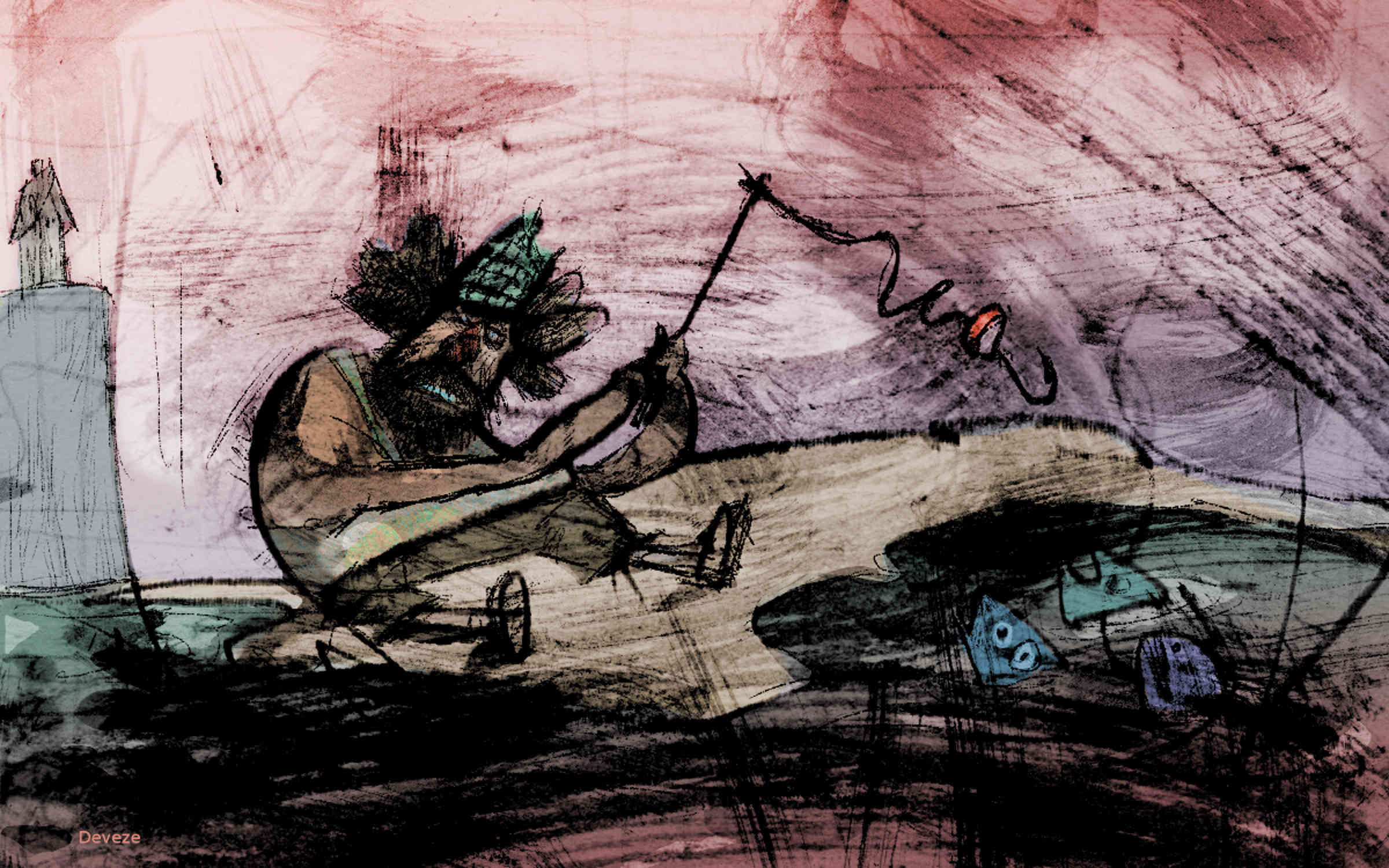
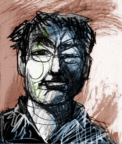
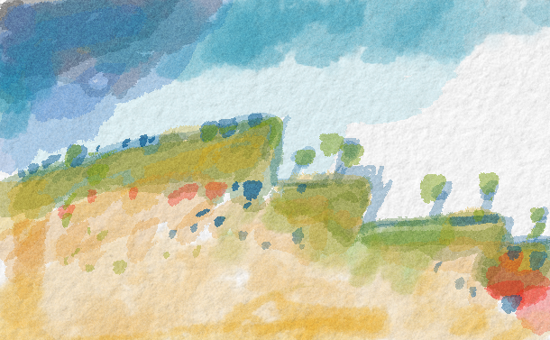
With this introductory post to the new Digital painting category forum we feature Gustavo Deveze, who is a Visual Artist using free software. Deveze’s work is characterized by mixing different medias and techniques. With future posts we want to continue featuring artists using free software.
Gustavo Deveze is a visual artist and lives in Buenos Aires. He trained as a draftsman at the National School of Fine Arts “Manuel Belgrano”, and filmmaker at IDAC - Instituto de Arte Cinematográfica in Avellaneda, Argentina.
His works utilize different materials and supports and he is published by different publishers. Although in the last years he works mainly in digital format and with free software.
He has participated in national and international shows and exhibitions of graphics and cinema with many awards. His last exposition can be seen on issuu.com:
https://issuu.com/gustavodeveze/docs/inadecuado2edicion
The new Digital Painting category is for discussing painting techniques, processes, and associated tools in a digital environment using Free/Libre software. Some relevant topics might include:
Emulating non-digital art, drawing on diverse historical and cultural genres and styles of art.
Emulating traditional “wet darkroom” photography, drawing on the rich history of photographic and printmaking techniques.
Exploring ways of making images that were difficult or impossible before the advent of new algorithms and fast computers to run them on, including averaging over large collections of images.
Discussion of topics that transcend “just photography” or “just painting”, such as composition, creating a sense of volume or distance, depicting or emphasizing light and shadow, color mixing, color management, and so forth.
Combining painting and photography: Long before digital image editing artists already used photographs as aids to and part of making paintings and illustrations, and photographers incorporated painting techniques into their photographic processing and printmaking.
An important goal is also to encourage artists to submit tutorials and videos about Digital Painting with Free Software and to also submit high-quality finished works.
Please feel free to stop into the new [Digital Painting category][dp-forum], introduce yourself, and say hello! I look forward to seeing what our fellow artists are up to.
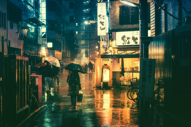
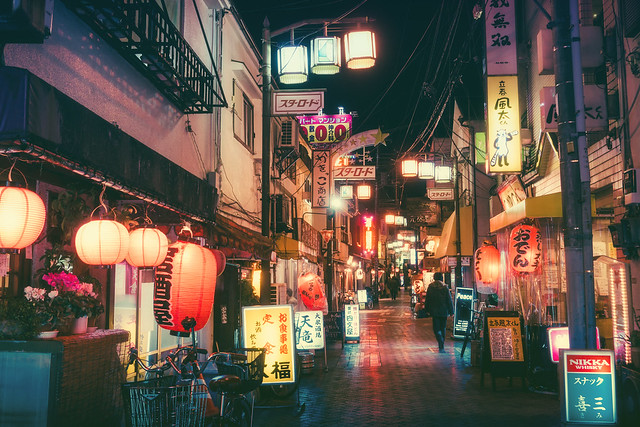
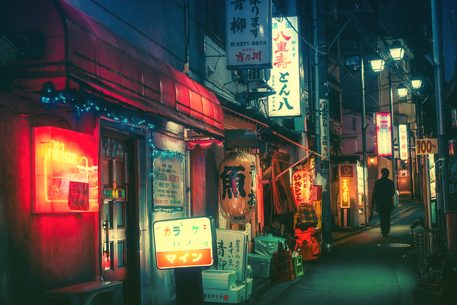
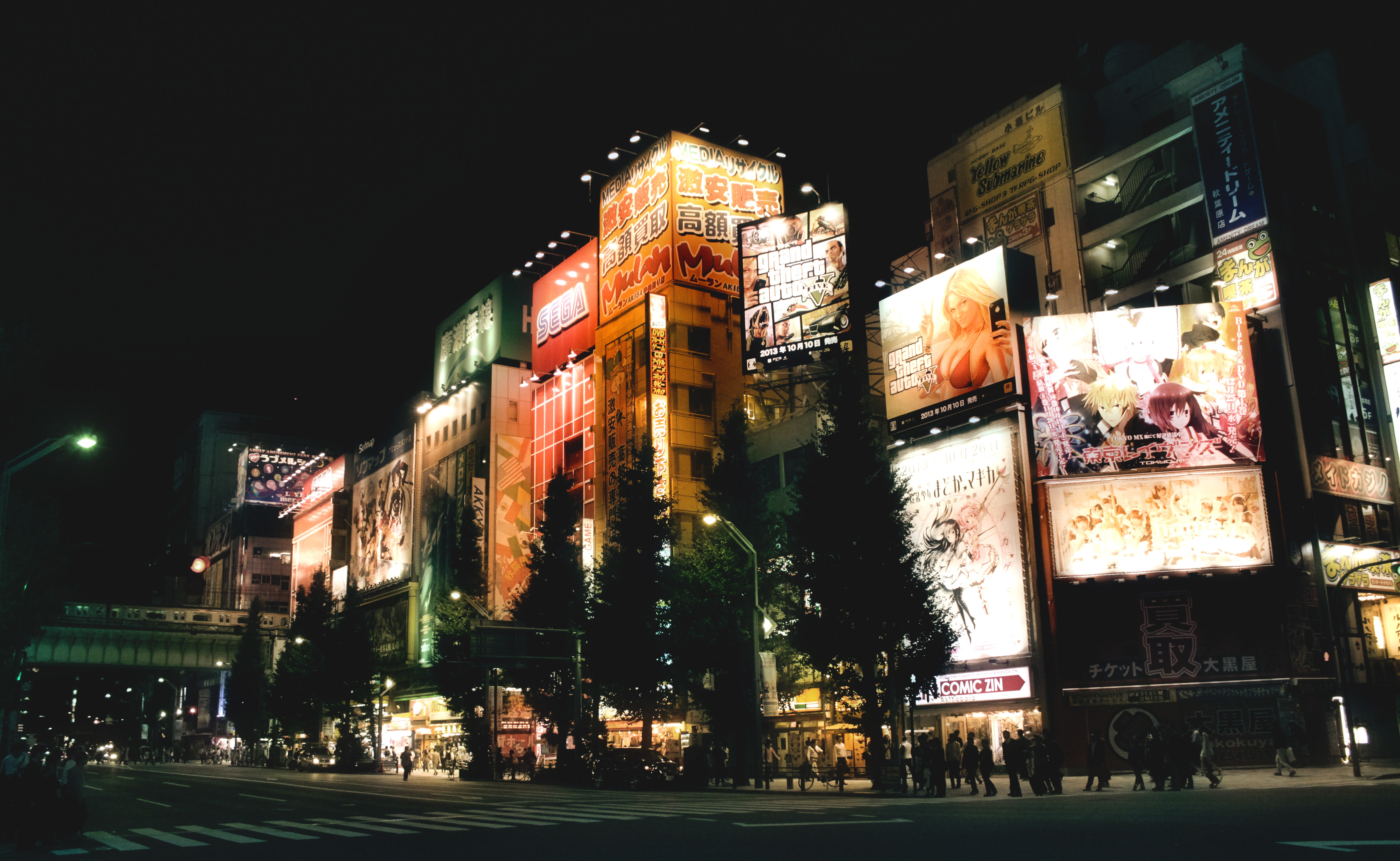
This tutorial explains how to achieve an effect based on the post processing by photographer Masashi Wakui. His primary subjects appear as urban landscape views of Japan where he uses some pretty and aggressive color toning to complement his scenes along with a soft ‘bloom’ effect on the highlights. The results evoke a strong feeling of an almost cyberpunk or futuristic aesthetic (particularly for fans of Bladerunner or Akira!).
This tutorial started its life in the pixls.us forum, which was inspired by a forum post seeking assistance on replicating the color grading and overall look/feel of Masashi’s photography.
Prerequisites
To follow along will require a couple of plugins for GIMP.
You will also need the Wavelet decompose plugin. The easiest way to get this plugin is to use the one available in G’MIC. As a bonus you’ll get access to many other incredible filters as well! Once you’ve installed G’MIC the filter can be found under Details → Split details [wavelets].
We will do some basic toning and then apply Gimp’s wavelet decompose filter to do some magic.
Two things will be used from the wavelet decompose results:
the residual
the coarsest wavelet scale (number 8 in this case)
The basic idea is to use the residual of the the wavelet decompose filter to color the image. What this does is average and blur the colors. The trick strengthens the effect of the surroundings being colored by the lights. The number of wavelet scales to use depends on the pixel size of the picture; the relative size of the coarsest wavelet scale compared to the picture is the defining parameter. The wavelet scale 8 will then produce overemphasised local contrasts, which will accentuate the lights further. This works nicely in pictures with lights as the brightest areas will be around lights. Used on daytime picture this effect will also accentuate brighter areas which will lead to a kind of “glow” effect. I tried this as well and it does look good on some pictures while on others it looks just wrong. Try it!
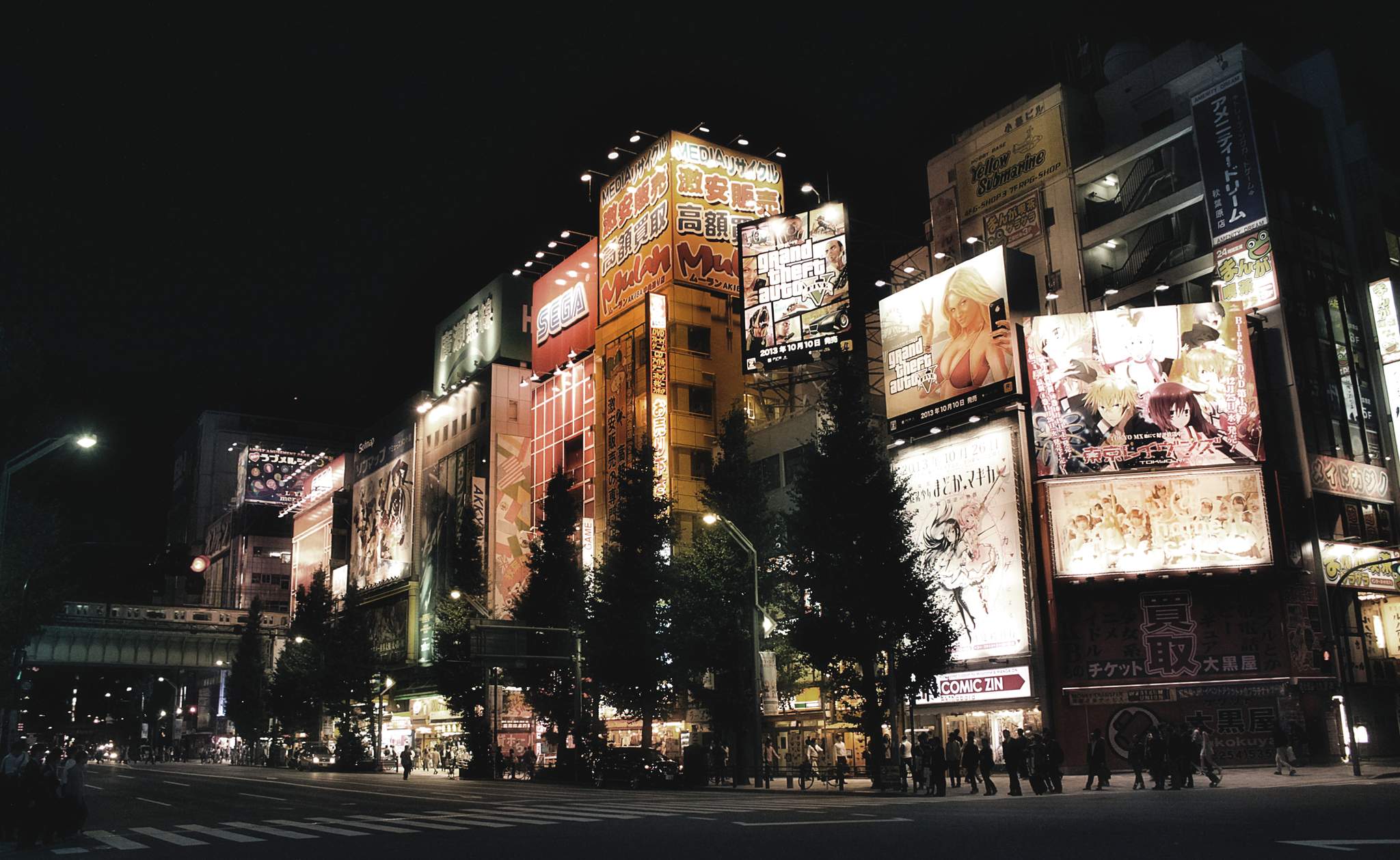
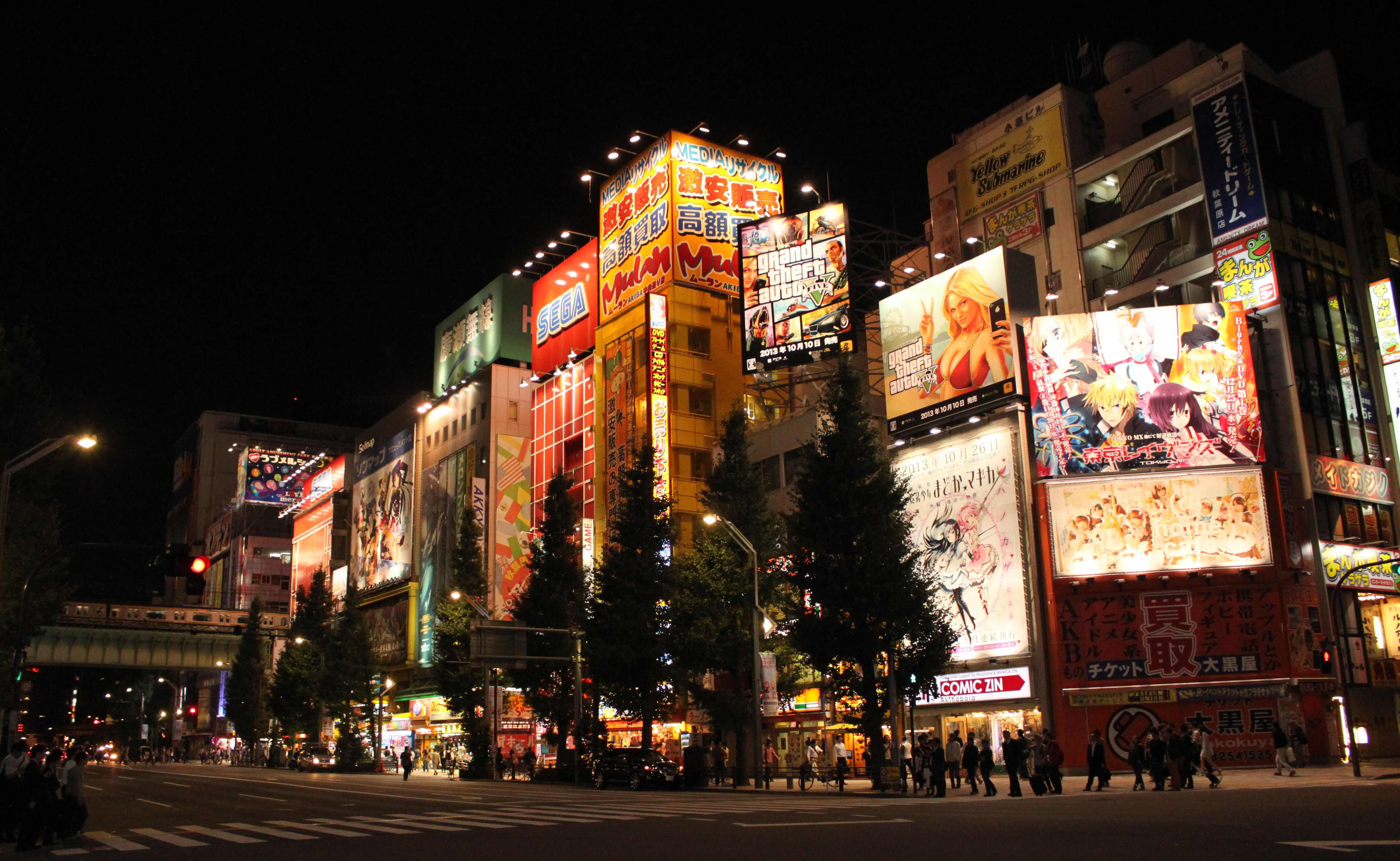
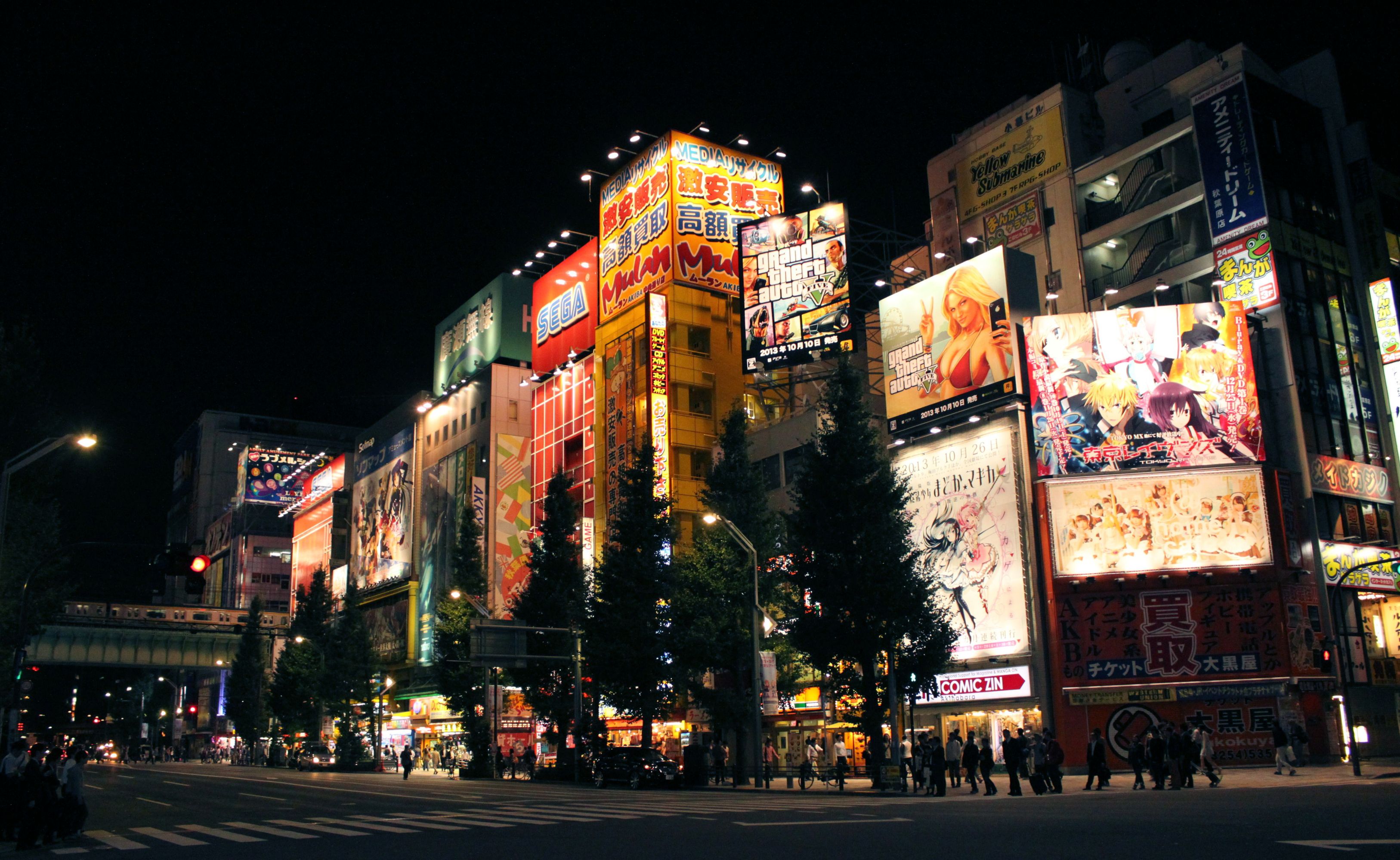
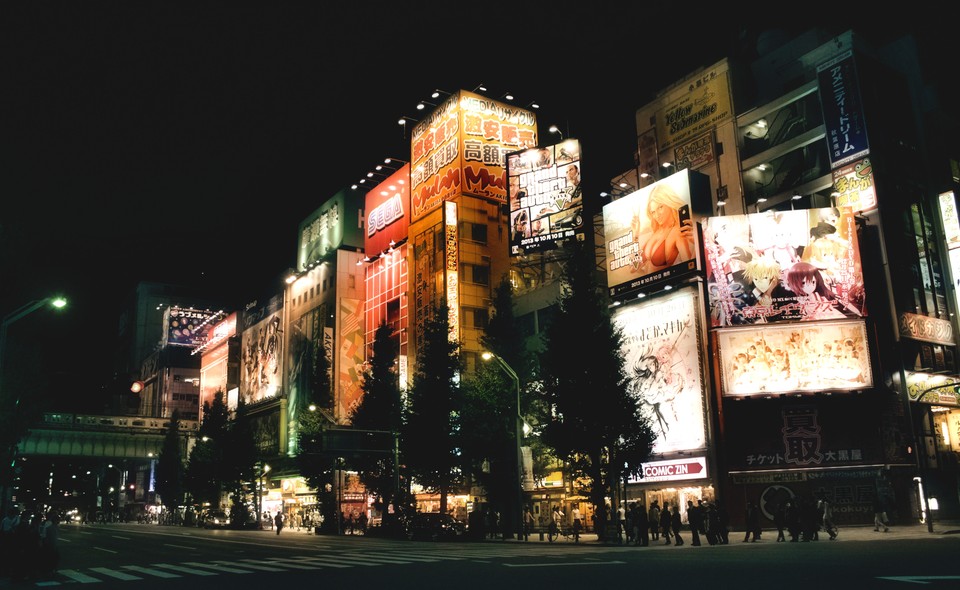
We will be applying all the following steps to this picture, taken in Akihabara, Tokyo.
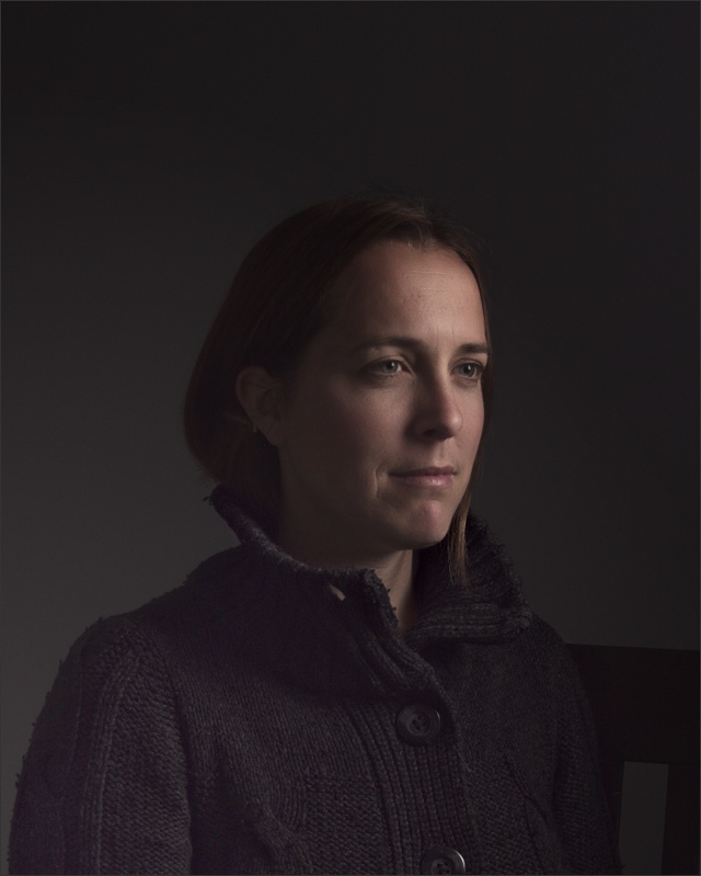
Apply the luminosity mask filter to the base picture. We will use this later.
Filters → Generic → Luminosity Masks
Duplicate the base picture (Ctrl+Shift+D).
Layer → Duplicate Layer
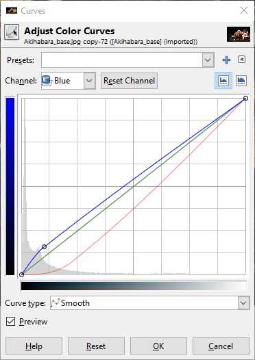
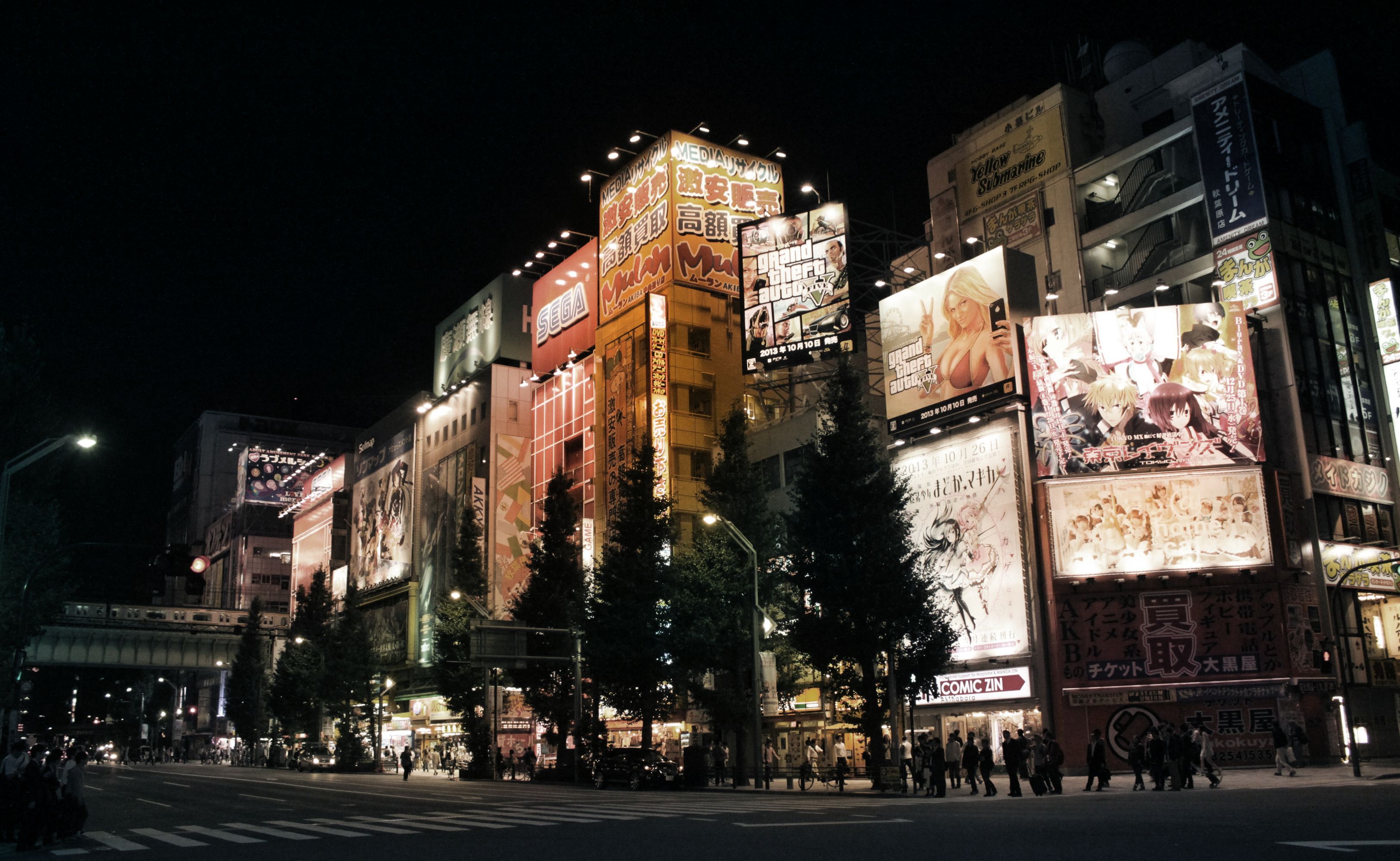
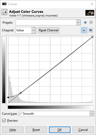
Tone the shadows of the duplicated picture using the tone curve by lowering the reds in the shadows. If you want your shadows to be less green, slightly raise the blues in the shadows.
Colors → Curves
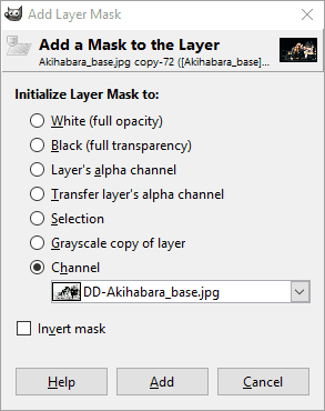
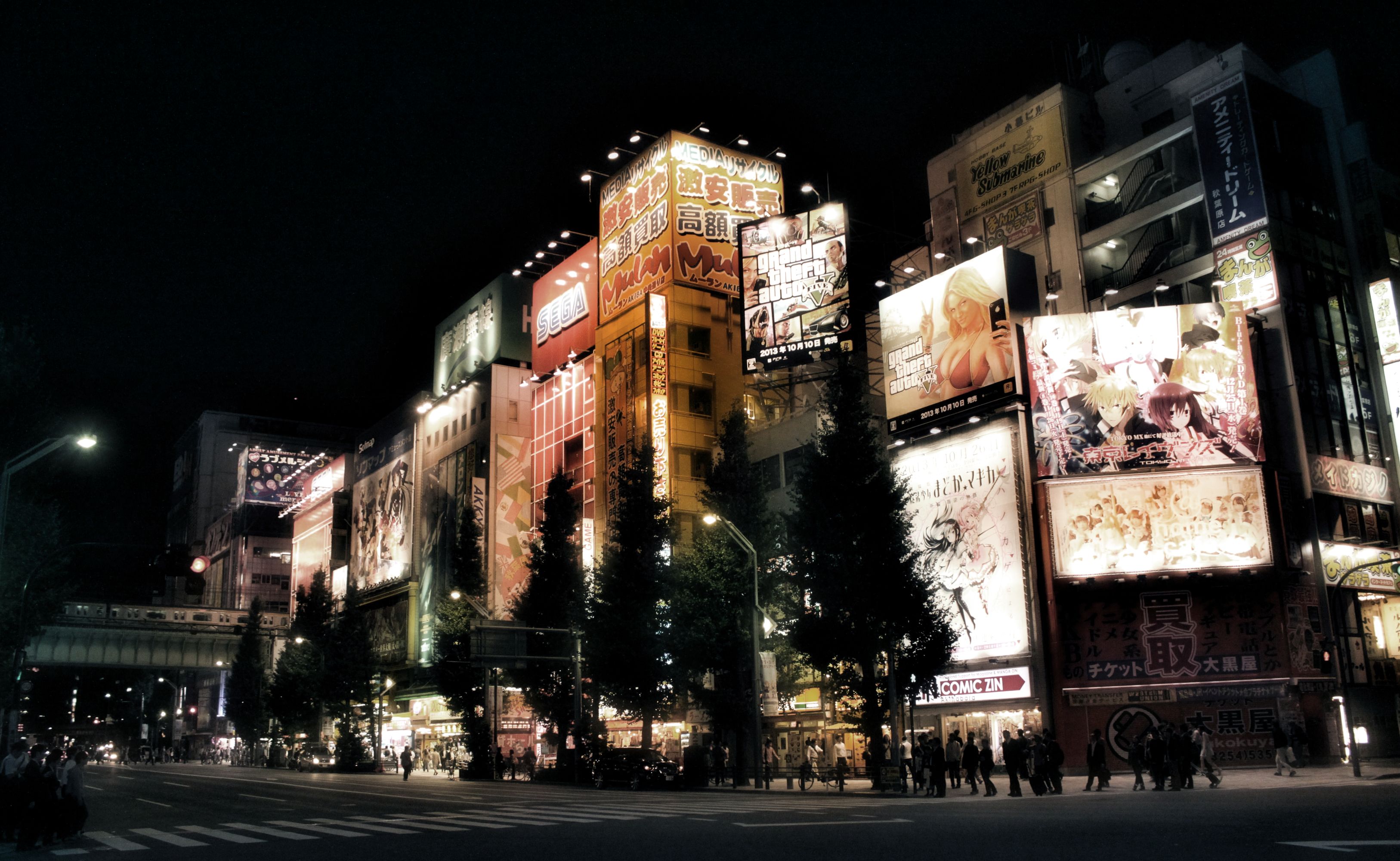
Apply a layer mask to the duplicated and toned picture. Choose the DD luminosity mask from a channel.
Layer → Mask → Add Layer Mask
With both layers visible, create a new layer from what is visible. Call this layer the “blended” layer.
Layer → New from Visible
Apply the wavelet decompose filter to the “blended” layer and choose 9 as number of detail scales. Set the G’MIC output mode to “New layer(s)” (see below).
Remember to set G’MIC to output the results on New Layer(s).
Make the blended and blended [residual] layers visible. Then set the mode of the blended [residual] layer to color. This will give you a picture with averaged, blurred colors.
Turn the opacity of the blended [residual] down to 70%, or any other value to your taste, to bring back some color detail.
Turn on the blended [scale #8] layer, set the mode to grain merge, and see how the lights start shining. Adjust opacity to taste.
Optional: Turn the wavelet scale 3 (or any other) on to sharpen the picture and blend to taste.
Make sure the following layers are visible:
blended
residual
wavelet scale 8
Any other wavelet scale you want to use for sharpening
Make a new layer from visible
Layer → New from Visible
Raise and slightly crush the shadows using the tone curve.
Optional: Adjust saturation to taste. If there are predominantly white lights and the
colors come mainly from other objects, the residual will be washed out, as is
the case with this picture.
I noticed that the reds and yellows were very dominant compared to greens and blues. So using the Hue-Saturation dialog I raised the master saturation by +70 and lowered the yellow saturation by -50 and lowered the red saturation by -40 all using an overlap of _60_.
Here in the U.S., we have a big holiday coming up this week: Thanksgiving.
Serendipitously, this holiday also happens to fall when a few neat things are happening around the community, and what better time is there to recognize some folks and to give thanks of our own? No time like the present!
I feel a special “Thank You” should first go to a photographer and fantastic supporter of the community, Dimitrios Psychogios. Last year for our trip to Libre Graphics Meeting, London he stepped up with an awesome donation to help us bring some fun folks together.
Fun folks together.
Mairi, the darktable nerds, a RawTherapee nerd, and a PhotoFlow nerd.
(and the nerd taking the photo, patdavid)
This year he was incredibly kind by offering a donation to the community (completely unsolicited) that covers our hosting and infrastructure costs for an entire year! So on behalf of the community, Thank You for your support, Dimitrios!
I’ll be creating a page soon that will list our supporters as a means of showing our gratitude. Speaking of supporters and a new page on the site…
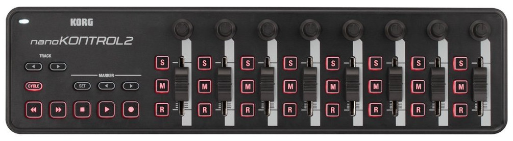
Someone had asked about the possibility of donating to the community on a post. We were talking about providing support in darktable for using a midi controller deck and the costs for some of the options weren’t too extravagant. This got us thinking that enough small donations could probably cover something like this pretty easily, and if it was community hardware we could make sure it got passed around to each of the projects that would be interested in creating support for it.
An example midi-controller that we might get support for in darktable and other projects.
That conversation had me thinking about ways to allow folks to support the community. In particular, ways to make it easy to provide support on an on-going basis if possible (in addition to simple, single donations). There are goal-oriented options out there that folks are probably already familiar with (Kickstarter, Indiegogo and others) but the model for us is less goal-oriented and more about continuous support.
Patreon was an option as well (and I already had a skeleton Patreon account set up), but the fees were just too much in the end. They wanted a flat 5% along with the regular PayPal fees. The general consensus among the staff was that we wanted to maximize the funds getting to the community.
The best option in the end was to create a merchant account on PayPal and manually set up the various payment options. I’ve set them up similar to how a service like Patreon might run with four different recurring funding levels and an option for a single one-time payment of whatever a user would like. Recurring levels are nice because they make it easier to plan with.
Our requirements for the infrastructure of the site are modest and we haven’t actively pursued support or donations for the site before. That hasn’t changed.
We’re not asking for support now. The best way that someone can help the community is by being an active part of it.
Engaging others, sharing what you’ve done or learned, and helping other users out wherever you can. This is the best way to support the community.
I purposely didn’t talk about funding before because I don’t want folks to have to worry or think about it. And before you ask: no, we are not and will not run any advertising on the site. I’d honestly rather just keep paying for things out of my pocket instead.
We’re not asking for support, but we’ll accept it.
With that being said, I understand that there’s still some folks that would like to contribute to the infrastructure or help us to get hardware to add support in projects and more. So if you do want to contribute, the page for doing so can be found here:
There are four recurring funding levels of $1, $3, $5, and $10 per month.
There is also a one-time contribution option as well.
We also have an Amazon Affiliate link option. If you’re not familiar with it, you simply click the link to go to Amazon.com. Then anything you buy for the next 24 hours will give us some small percentage of your purchase price. It doesn’t affect the price of what you’re buying at all. So if you were going to purchase something from Amazon anyway, and don’t mind - then by all means use our link first to help out!
This week we also finally hit 1,000 users registered on discuss! Which is just bananas to me. I am super thankful for each and every member of the community that has taken the time to participate, share, and generally make one of the better parts of my day catching up on what’s been going on. You all rock!
While we’re talking about a number “1” with bunch of zeros after it, we recently made some neat improvements to the forums…
We are a photography community and it seemed stupid to have to restrict users from uploading full quality images or raw files. Previously it was a concern because the server the forums are hosted on have limited disk space (40GB). Luckily, Discourse has an option for storing all uploads to the forum on Amazon S3 buckets.
I went ahead and created some S3 buckets so that any uploads to the forums will now be hosted on Amazon instead of taking up precious space on the server. The costs are quite reasonable (around $0.30/GB right now), and it also means that I’ve been able to bump the upload size to 100MB for forum posts! You can now just drag and drop full resolution raw files directly into the post editor to include the file!
70MB GIMP .xcf file? Just drag-and-drop to upload, no problem! :)
On a slightly geekier note, did you know that the code for the entire website is available on Github? It’s also licensed liberally (CC-BY-SA), so no reason not to come and fiddle with things with us! One of the features of using Github is integration with Travis CI (Continuous Integration).
What this basically means is that every commit to the Github repo for the website gets picked up by Travis and built to test that everything is working ok. You can actually see the history of the website builds there.
I’ve now got it set up so that when a build is successful on Travis, it will automatically publish the results to the main webserver and make it live. Our build system, Metalsmith, is a static site generator. This means that we build the entire website on our local computers when we make changes, and then publish all of those changes to the webserver. This change automates that process for us now by handling the building and publishing if everything is ok.
In fact, if everything is working the way I think it should, this very blog post will be the first one published using the new automated system! Hooray!
You can poke me or @paperdigits on discuss if you want more details or feel like playing with the website.
Speaking of @paperdigits, I want to close this blog post with a great big “Thank You!“ to him as well. He’s the only other person insane enough to try and make sense of all the stuff I’ve done building the site so far, and he’s been extremely helpful hacking at the website code, writing articles, make good infrastructure suggestions, taking the initiative on things (t-shirts and github repos), and generally being awesome all around.
I realize that I’m a little late to this, but photographer João Almeida has created a wonderful set of film emulation presets for darktable that he uses in his own workflow for personal and commisioned work. Even more wonderful is that he has graciously released them for everyone to use.
These film emulations started as a personal side project for João, and he adds a disclaimer to them that he did not optimize them all for each brand or model of his cameras. His end goal was for these to be as simple as possible by using a few darktable modules. He describes it best on his blog post about them:
The end goal of these presets is to be as simple as possible by using few Darktable modules, it works solely by manipulating Lab Tone Curves for color manipulation, black & white films rely heavily on Channel Mixer. Since I what I was aiming for was the color profiles of each film, other traits related with processing, lenses and others are unlikely to be implemented, this includes: grain, vignetting, light leaks, cross-processing, etc.
Some before/after samples from his blog post:
João Portra 400
(Click to compare to original)
João Kodachrome 64
(Click to compare to original)
João Velvia 50
(Click to compare to original)
If you see João around the forums stop and say hi (and maybe a thank you). Even better, if you find these useful, consider buying him a beer (donation link is on his blog post)!
Hugin is an excellent tool for for aligning and stitching images. In this article, we’ll focus on aligning a stack of images. Aligning a stack of images can be useful for achieving several results, such as:
bracketed exposures to make an HDR or fused exposure (using enfuse/enblend), or manually blending the images together in an image editor
photographs taken at different focal distances to extend the depth of field, which can be very useful when taking macros
photographs taken over a period of time to make a time-lapse movie
For the example images included with this tutorial, the focal length is 12mm and the focal length multiplier is 1. A big thank you to @isaac for providing these images.
You can download a zip file of all of the sample Beach Umbrellas images here:
We’re going to align these bracked exposures so we can blend them:
Select Interface → Expert to set the interface to Expert mode. This will expose all of the options offered by Hugin.
Select the Add images… button to load your bracketed images. Select your images from the file chooser dialog and click Open.
Set the optimal setting for aligning images:
Feature Matching Settings: Align image stack
Optimize Geometric: Custom parameters
Optimize Photometric: Low dynamic range
Select the Optimizer tab.
In the Image Orientation section, select the following variables for each image:
Roll
X (TrX) [horizontal translation]
Y (TrY) [vertical translation]
You can Ctrl + left mouse click to enable or disable the variables.
Note that you do not need to select the parameters for the anchor image:
Select Optimize now! and wait for the software to finish the calculations. Select Yes to apply the changes.
Select the Stitcher tab.
Select the Calculate Field of View button.
Select the Calculate Optimal Size button.
Select the Fit Crop to Images button.
To have the maximum number of post-processing options, select the following image outputs:
Panorama Outputs: Exposure fused from any arrangement
Format: TIFF
Compression: LZW
Panorama Outputs: High dynamic range
Format: EXR
Remapped Images: No exposure correction, low dynamic range
Select the Stitch! button and choose a place to save the files. Since Hugin generates quite a few temporary images, save the PTO file in it’s own folder.
Hugin will output the following images:
a tif file blended by enfuse/enblend
an HDR image in the EXR format
the individual images after remapping and without any exposure correction that you can import into the GIMP as layers and blend manually.
You can see the result of the image blended with enblend/enfuse:
With the output images, you can:
edit the enfuse/enblend tif file further in the GIMP or RawTherapee
tone map the EXR file in LuminanceHDR
manually blend the remapped tif files in the GIMP or PhotoFlow
So you can imagine my doubt when confronted with an email about using some material from pixls.us for their latest issue…
If the name sounds familiar to anyone it may be from a recent post by Joe McNally who is featured prominently in the September 2016 issue. He was also just inducted as a fellow into the society!
It turns out my initial doubts were completely unfounded, and they really wanted to run a page based off one of our tutorials.
The editors liked the Open Source Portrait tutorial. In particular, the section on using Wavelet Decompose to touch up the skin tones:
Yay Mairi!
How cool is that? I actually searched the archive and the only other mention I can find of GIMP (or any other F/OSS) is from a “Step By Step” article written by Peter Gawthrop (Vol. 149, February 2009). I think it’s pretty awesome that we can promote a little more exposure for Free Software alternatives. Especially in more mainstream publications and to a broader audience!
Anyone that has spent any time around me would realize that I’m particularly fond of portraits. From the wonderful works of Martin Schoeller to the sublime Dan Winters, I am simply fascinated by a well executed portrait. So I thought it would be fun to take a look at some selections from the “father” of environmental portraits - Arnold Newman.
Newman wanted to become a painter before needing to drop out of college after only two years to take a job shooting portraits in a photo studio in Philadelphia. This experience apparently taught him what he did not want to do with photography…
Luckily it may have started defining what he did want to do with his photography. Namely, his approach to capturing his subjects alongside (or within) the context of the things that made them notable in some way. This would became known as “Environmental Portraiture”. He described it best in an interview for American Photo in 2000:
I didn’t just want to make a photograph with some things in the background. The surroundings had to add to the composition and the understanding of the person. No matter who the subject was, it had to be an interesting photograph. Just to simply do a portrait of a famous person doesn’t mean a thing. 1
Though he has felt that the term might be unnecessarily restrictive (and possibly overshadows his other pursuits including abstractions and photojournalism), there’s no denying the impact of the results. Possibly his most famous portrait, of composer Igor Stravinsky, illustrates this wonderfully. The overall tones are almost monotone (flat - pun intended, and likely intentional on behalf of Newman) and are dominated by the stark duality of the white wall with the black piano.
Igor Stravinsky, New York, NY, 1946 by Arnold Newman
Newman realized that the open lid of the piano “…is like the shape of a musical flat symbol—strong, linear, and beautiful, just like Stravinsky’s work.”1 The geometric construction of the image instantly captures the eye and the aggressive crop makes the final composition even more interesting. In this case the crop was a fundamental part of the original composition as shot, but it was not uncommon for him to find new life in images with different crops.
In a similar theme his portraits of both Salador Dalí and John F. Kennedy show a willingness to allow the crop to bring in different defining characteristics of his subjects. In the case of Dalí it allows an abstraction to hang there mimicking the pose of the artist himself. Kennedy is mostly the only organic form, striking a relaxed pose, while dwarfed by the imposing architecture and hard lines surrounding him.
Salvador Dali, New York, NY, 1951 by Arnold Newman
John F. Kennedy, Washington D.C., 1953 by Arnold Newman
He manages to bring the same deft handling of placing his subjects in the context of their work with other photographers as well. His portrait of Ansel Adams shows the photographer just outside his studio with the surrounding wilderness not only visible around the frame but reflected in the glass of the doors behind him (and the photographers glasses). Perhaps an indication of the nature of Adams work being to capture natural scenes through glass?
For anyone familiar with the pioneer of another form of photography, Newman’s portrait of (the usually camera shy) Henri Cartier-Bresson will instantly evoke a sense of the artists candid street images. In it, Bresson appears to take the place of one of his subjects caught briefly on the streets in a fleeting moment. The portrait has an almost spontaneous feeling to it, (again) mirroring the style of the work of its subject.
Henri Cartier-Bresson, New York, NY, 1947 by Arnold Newman
Eight years after his portrait of surrealist painter Dali, Newman shot another famous (abstraction) artist, Pablo Picasso. This particular portrait is much more intimate and more classically composed, framing the subject as a headshot with little of the surrounding environment as before. I can’t help but think that the placement of the hand being similar in both images is intentional; a nod to the unconventional views both artists brought to the world.
Pablo Picasso,Vallauris, France, 1954 by Arnold Newman
Arnold Newman produced an amazing body of work that warrants some time and consideration for anyone interested in portraiture. These few examples simply do not do his collection of portraits justice. If you have a few moments to peruse some amazing images head over to his website and have a look (I’m particularly fond of his extremely design-oriented portrait of chinese-american architect I.M. Pei):
Of historical interest is a look at Newman’s contact sheet for the Stravinsky image showing various compositions and approaches to his subject with the piano. (I would have easily chosen the last image in the first row as my pick.) I have seen the second image in the second row cropped as indicated, which was also a very strong choice. I adore being able to investigate contact sheets from shoots like this - it helps me to humanize these amazing photographers while simultaneously allowing me an opportunity to learn a little about their thought process and how I might incorporate it into my own photography.
To close, a quote from his interview with American Photo magazine back in 2000 that will likely remain relevant to photographers for a long time:
But a lot of photographers think that if they buy a better camera they’ll be able to take better photographs. A better camera won’t do a thing for you if you don’t have anything in your head or in your heart. 1
Replicating a 'Lucisart'/Dave Hill type illustrative look
Over in the forums community member Sebastien Guyader (@sguyader) posted a neat workflow for emulating a photo-illustrative look popularized by photographers like Dave Hill where the resulting images often seem to have a sort of hyper-real feeling to them. Some of this feeling comes from a local-contrast boost and slight ‘blooming’ of the lighter tones in the image (though arguably most of the look is due to lighting and compositing of multiple elements).
To illustrate, here are a few representative samples of Dave Hill’s work that reflects this feeling:
A video of Dave presenting on how he brought together the idea and images for the series the first image above is from:
This effect is also popularized in Photoshop® filters such as LucisArt in an effort to attain what some would (erroneously) call an “HDR” effect. Really what they likely mean is a not-so-subtle tone-mapping. In particular the exaggerated local contrasts is often what garners folks attention.
We had previously posted about a method for exaggerating fine local contrasts and details using the “Freaky Details” method described by Calvin Hollywood. This workflow provides a similar idea but different results that many might find more appealing (it’s not as gritty as the Freaky Details approach).
Sebastien produced some great looking preview images to give folks a feeling for what the process would produce:
Sebastien’s approach relies only on having the always useful G’MIC plugin for GIMP. The general workflow is to do a high-pass frequency separation, and to apply some effects like local contrast enhancement and some smoothing on the residual low-pass layer. Then recombine the high+low pass layers to get the final result.
Open the image.
Duplicate the base layer. Rename it to “Lowpass”.
With the top layer (“Lowpass”) active, open G’MIC.
Use the Photocomix smoothing filter:
Testing → Photocomix → Photocomix smoothing
Set the Amplitude to 10. Apply. This is to taste, but a good startig place might be around 1% of the image dimensions (so a 2000px wide image - try using an Amplitude of 20).
Change the “Lowpass” layer blend mode to Grain extract.
Right-Click on the layer and choose New from visible. Rename this layer from “Visible“ to something more memorable like “Highpass” and set its layer mode to Grain merge. Turn off this layer visibility for now.
Activate the “Lowpass” layer and set its layer blend mode back to Normal. The rest of the filters are applied to this “Lowpass” layer.
Open G’MIC again. Apply the Simple local contrast filter:
Details → Simple local contrast
Using:
Edge Sensitivity to 25
Iterations to 1
Paint effect to 50
Post-gamma to 1.20
Open G’MIC again. Now apply the Graphic novel filter:
Artistic → Graphic novel
Using:
check the Skip this step checkbox for Apply Local Normalization
Pencil size to 1
Pencil amplitude to 100-200
Pencil smoother sharpness/edge protection/smoothness to 0
Boost merging options Mixer to Soft light
Painter’s touch sharpness to 1.26
Painter’s edge protection flow to 0.37
Painter’s smoothness to 1.05
Finally, make the “Highpass” layer visible again to bring back the fine details.
Trying It Out!
Let’s walk through the process. Sebastien got his sample images from the website https://pixabay.com, so I thought I would follow suit and find something suitable from there also. After some searching I found this neat image from Jerzy Gorecki licensed Create Commons 0/Public Domain.
The first steps (1—7) are to create a High/Low pass frequency separation of the image. If you have a different method for obtaining the separation then feel free to use it. Sebastien uses the Photocomix smoothing filter to create his low-pass layer (other options might be Gaussian blur, bi-lateral smoothing, or even wavelets).
The basic steps to do this are to duplicate the base layer, blur it, then set the layer blend mode to Grain extract and create a new layer from visible. The new layer will be the Highpass (high-frequency) details and should have its layer blend mode set to Grain merge. The original blurred layer is the Lowpass (low-frequency) information and should have its layer blend mode set back to Normal.
So, following Sebastien’s steps, duplicate the base layer and rename the layer to “lowpass”. Then open G’MIC and apply:
Testing → Photocomix → Photocomix smoothing
with an amplitude of around 20. Change this to suit your own taste, but about 1% of the image width is a decent starting point. You’ll now have the base layer and the “lowpass” layer above it that has been smoothed:
“lowpass” layer after Photocomix smoothing with Amplitude set to 20.
Setting the “lowpass” layer blend mode to Grain extract will reveal the high-frequency details:
The high-frequency details visible after setting the blurred “lowpass” layer blend mode to Grain extract.
Now create a new layer from what is currently visible. Either right-click the “lowpass” layer and choose “New from visible” or from the menus:
Layer → New from Visible
Rename this new layer from “Visible” to “highpass” and set its layer blend mode to Grain merge. Select the “lowpass” layer and set its layer blend mode back to Normal.
The visible result should be back to what your starting image looked like.
The rest of the steps for this tutorial will operate on the “lowpass” layer.
You can leave the “highpass” filter visible during the rest of the steps to see what your results will look like.
Modifying the Low-Frequency Layer
These next steps will modify the underlying low-frequency image information to smooth it out and give it a bit of a contrast boost. First the “Simple local contrast” filter will separate tones and do some preliminary smoothing, while the “Graphic novel” filter will provide a nice boost to light tones along with further smoothing.
Simple Local Contrast
On the “lowpass” layer, open G’MIC and find the “Simple local contrast” filter:
Details → Simple local contrast
Change the following settings:
Edge Sensitivity to 25
Iterations to 1
Paint effect to 50
Post-gamma to 1.20
This will smooth out overall tones while simultaneously providing a nice local contrast boost. This is the step that causes small lighting details to “pop”:
After applying the “Simple local contrast” filter. (Click to compare to the original image)
The contrast increase provides a nice visual punch to the image. The addition of the “Graphic novel” filter will push the overall image much closer to a feeling of a photo-illustration.
Graphic Novel
Still on the “lowpass” layer, re-open G’MIC and open the “Graphic Novel” filter:
Artistic → Graphic novel
Change the following settings:
check the Skip this step checkbox for Apply Local Normalization
Pencil size to 1
Pencil amplitude to 100-200
Pencil smoother sharpness/edge protection/smoothness to 0
Boost merging options Mixer to Soft light
Painter’s touch sharpness to 1.26
Painter’s edge protection flow to 0.37
Painter’s smoothness to 1.05
The intent with this filter is to further smooth the overall tones, simplify details, and to give a nice boost to the light tones of the image:
After applying the “Graphic novel” filter. (Click to compare to the local contrast result)
The effect at 100% opacity can be a little strong. If so, simply adjust the opacity of the “lowpass” layer to taste. In some cases it would probably be desirable to mask areas you don’t want the effect applied to.
I’ve included the GIMP .xcf.bz2 file of this image while I was working on it for this article. You can download the file here (34.9MB). I did each step on a new layer so if you want to see the results of each effect step-by-step, simply turn that layer on/off:
Example XCF layers
Finally, a great big Thank You! to Sebastien Guyader (@sguyader) for sharing this with everyone in the community!
A G’MIC Command
Of course, this wouldn’t be complete if someone didn’t come along with the direct G’MIC commands to get a similar result! And we can thank Iain Fergusson (@Iain) for coming up with the commands:
Welcome to the first installment of From the Community, a (hopefully) quarterly blog post to highlight a few of the things our community members have been doing!
Free Software development tends to move at a pretty good pace, so there is always something new to try out! Not all of the new things warrant a new release, but our community steps up and builds the software so that others can use and test! Instead of random links to dropboxes and such, we’ve created a Community-built Software page to help centralize and make it easy for our users to help find and download the freshest builds of software from our great community members. Keep in mind that support may be limited for these builds and they’re considered testing, so quality may vary, but if you covet the newest, shiniest things, this is the place for you!
Watermarking is ugly and takes focus away from your image. Why not try and add an attribution bar to your images? In this post, @patdavid lays out how to add a bar underneath your image with your name, the image title, and a little logo. @David_Tschumperle followed that effort up with an alternate implementation using G’MIC instead of imagemagic. Lastly, @vato rolled the imagemagick version into a bash script with the necessary parameters exposed as variables at the beginning of the script.
Finally, we’re still working on our beginner article to help new users navigate the myriad of free software photography software that is out there. If you have ideas, or better yet, want to author a bit of content with our community, please join and help out! The post is community wiki and has complete revision control, so don’t be afraid to jump in and contribute!
The term Chiaroscuro is derived from the Italian chiaro meaning ‘clear, bright’ and oscuro meaning ‘dark, obscure’. In art the term has come to refer to the use of bold contrasts between light and shadow, particularly across an entire composition, where they are a prominent feature of the work.
This interplay of shadow and light is particularly important in allowing the viewer to extrapolate volume from a flat image. The use of a single light source helps to accentuate the perception of volume as well as adding drama and dynamics to the scene.
Historically the use of chiaroscuro can often be associated with the works of old masters such as Rembrandt and Caravaggio. The use of such extreme lighting immediately evokes a sense of shape and volume, while focusing the attention of the viewer.
The aim of this tutorial will be to emulate the lighting characteristics of chiaroscuro in producing a portrait to evoke the feeling of an old master painting.
Equipment
In examining chiaroscuro portraiture, it becomes apparent that a strong characteristic of the images is the use of single light source on the scene. So this tutorial will focus on using a single source to illuminate the portrait.
Getting the keylight off the camera is essential. The closer the keylight is to the axis of the camera the larger the reduction in shadows. This is counter to the intention of this workflow. Shadows are an essential component in producing this look, and on-camera lighting simply will not work.
The reason to choose a softbox versus the myriad of other light modifiers available is simple: control. Umbrellas can soften the light, but due to their open nature have a tendency to spill light everywhere while doing so. A softbox allows the light to be softened while also retaining a higher level of spill control.
Light spill can still occur with a softbox, so the best option is to bring the light in as close as possible to the subject. Due to the inverse square nature of light attenuation, this will help to drop the background very dark (or black) when exposing properly for the subject.
Left For example, in the sample images above, a 20 inch softbox was initially located about 18 inches away from the subject (first). The rear wall was approximately 48 inches away from the subject or just over twice the distance from the softbox. Thus, on a proper exposure for the subject, the background would be around 3 stops lower in light. This is seen as the background in the first image has dropped to a dark gray.
Middle When the light distance to the subject is doubled and the light distance to the rear wall stays the same, the ratio is not as extreme between them. The light distance from the subject is now 36 inches, while the light distance to the rear wall is still 48 inches. When properly exposing for the subject, the rear wall is now only about 1 stop lower in light.
Right In the final example, the distance from the light to both the subject and the rear wall are very close. As such, a proper exposure for the subject almost brings the wall to a middle exposure.
What this example provides is a good visual guide for how to position the subject and light relative to the surroundings to create the desired look. To accentuate the ratio between dark and light in the image it would be best to move the light as close to the subject as possible.
If there is nothing to reflect light on the shadow side of the subject, then the shadows would fall to very dark or black. Usually, there are at least walls and ceilings in a space that will reflect some light, and the amount falling on the shadow side can be attenuated by either moving the subject nearer to a wall on that side, or using a bounce/reflector as desired.
Shooting
Planning
The setup for the shot would be to push the key light in very close to the model, while still allowing some bounce to slightly fill the shadows.
As noted previously, having the key light close to the model would allow the rest of the scene to become much darker. The softbox is arranged such that the face is almost completely vertical and the bottom edge is just above the models eyes. This was to feather the lower edge of the light falloff along the front of the model.
There are 2 main adjustments that can be made to fine-tune the image result with this setup.
The first is the key light distance/orientation to the subject. This will dictate the proper exposure for the subject. For this image the intention is to push the key light in as close as possible without being in frame. There is also the option of angling the key light relative to the subject. In the diagram above, the softbox is actually angled away from the subject. The intention here was to feather the edge of the light in order to control spill onto the rest of the model (putting more emphasis on her face).
The second adjustment, once the key light is in a good location, is the distance from the key light and subject together, to the surrounding walls (or a reflector if one is being used). Moving both subject and keylight closer to the side wall will increase the amount of reflected light being bounced into the shadows.
Mood Board
If possible, it can be extremely helpful to both the model and photographer to have a Mood Board available. This is usually just a collection or collage of images that help to convey the desired feeling or desired result from the session. For help in directing the model, the images do not necessarily need the same lighting setup. The intention is to help the model understand what your vision is for the pose and facial expressions.
The Shoot
The lighting is set up and the model understands what type of look is desired, so all that’s left is to shoot the image!
In the end, I favored the last image in the sequence for a combination of the models head position/body language and the slight smile she has.
Postprocessing
Having chosen the final image from the contact sheet, it’s now time to proceed with developing the image and retouching as needed.
If you’d like to follow along you can download the raw .ORF file:
This file is licensed
(Creative Commons, By-Attribution, Non-Commercial, Share-Alike), and is the same image that I shared with everyone on the forums for a PlayRaw processing practice. You can see how other folks approached processing this image in the topic on discuss. If you decide to try this out for yourself, come share your results with us!
Not surprisingly the initial image loaded without any modifications is a bit dark and rather flat looking. By default darktable should have recognized that the file is from Olympus, and attempted to apply a sane base curve to the linear raw data. If it doesn’t you can choose the preset “olympus like alternate”.
I found that the preset tended to crush the darkest tones a bit too much, and instead opted for a simple curve with a single point as seen here:
Resist the temptation to try and adjust overall exposure and contrast with the base curve. These parameters will be adjusted shortly in the appropriate modules. The base curve is only intended to transform the linear raw rgb to something that looks good on your output device. The base curve will affect how the contrasts, colors, and saturation all relate in the final output. For the purposes of this tutorial, it is enough to simply choose a preset.
The next series of steps focus on adjusting various exposure parameters for the image. Conceptually they start with the most broad adjustment, exposure, then to slightly more targeted adjustments such as contrast, brightness, and saturation, then finish with targeted tonal adjustments in tone curves.
Once the base curve is set, the next module to adjust would be the overall exposure of the image (and the black point). This is done in the “exposure” module (below the base curve).
The important area to watch while adjusting the exposure for the image is the histogram. The image was exposed a little dark, so increase the exposure overall for the image. In the histogram, avoid clipping any channels by allowing them to be pushed outside the range. In this case, the desire is to provide a nice mid-level brightness to the models face. The exposure can be raised until the channels begin to clip on the far right of the histogram, then brought back down a bit to leave some headroom.
The darkest areas of the histogram on the left are clipped a bit, so raising the black level brings the detail back in the darkest shadows. When in doubt try to let the histogram guide you with data from the image. Particularly around the highest and lowest values (avoid clipping if possible).
An easy way to think of the exposure module is that it allows the entire image exposure to be shifted along with compressing/expanding the overall range by modifying the black point.
Where the Exposure module shifts the overall image values from a global perspective, modules such as the “contrast brightness saturation” allow finer tuning of the image within the range of the exposure.
To emphasis the models face, while also strengthening the interplay of shadow and light on the image, drop the brightness down to taste. I brought the brightness levels down quite a bit (-0.31) to push almost all of the image below medium brightness.
Overall this helps to emphasis the models face over the rest of the image initially. While the rest of the image is comprised of various dark/neutral tones, the models face is not. Pushing the saturation down as well will remove much of the color from the scene and face. This is done to bring the skin tones back down to something slightly more natural looking, while also muting some of those tones.
The skin now looks a bit more natural but muted. The background tones have become more neutral as well. A very slight bump in contrast to taste finishes out this module.
A final modification to the exposure of the image is through a tone curve adjustment. This gives us the ability to make some slight changes to particular tonal ranges. In this case pushing the darker tones down a bit more while boosting the upper mid and high tones.
This is actually a type of contrast increase, but controlled to specific tones based on the curve. The darkest darks (bottom of the curve) get pushed a little bit darker, which will include most of the sweater, background, and shadow side of the models face. The very slight rolling boost to the lighter tones primarily helps to allow the face to brighten up against the background even more.
The changes are very slight and to taste. The tone curve is very sensitive to changes, and often only very small modifications are required to achieve a given result.
By default the sharpen module will apply a small amount of sharpening to the image. The module uses unsharp mask for sharpening, so the radius parameter is the blur radius into the unsharp mask. I wanted to sharpen lightly very fine details, so set the radius to ~1, with an amount around 0.9 and no threshold. This produced results that are very hard to distinguish from the default settings, but appears to sharpen smaller structures just slightly more.
I personally include a final sharpening step as a side effect of using wavelet decompose for skin retouching later in the process with GIMP. As such I am not usually as concerned about sharpening here as much. If I were, there are better modules for adjusting sharpening from wavelets using the equalizer module.
The darktable team and its users profiled many different cameras for noise profiles at various ISOs to build a statistical model with brightness across the three color channels. Using these profiles, darktable can then do a better job at efficiently denoising images. In the case of my camera (Olympus OM-D E-M5), there was a profile already captured for ISO200.
In this case, the chroma noise wasn’t too bad, and a very slight reduction in luma noise would be sufficient for the image. As such, I used a non-local means with a large patch size (to retain sharpness) and a low strength. This was all applied uniformly against the HSV lightness option.
Finally! The image tones and exposure are in a desirable state, so export the results to a new file. I tend to use either TIF or PNG at 16 bit. This is in case I want to work in a full 16 bit workflow with the latest GIMP, or may want to in the future.
GIMP
When there are still some pixel-level modifications that need to be done to the image, the go-to software is GIMP.
Skin retouching
spot healing/touchups
Background rebuild
Skin Retouching with Wavelet Decompose
This step is not always needed, but who doesn’t want their skin to look a little nicer if possible?
The ability to modify an image based on detail scales isolated on their own layers is a very powerful tool. The approach is similar to frequency separation, but has the advantage of providing multiple frequencies to modify simultaneously of progressively larger and larger detail scales. This offers a large range of flexibility and an easier workflow vs. frequency separation (you can work on any detail scale simply by switching to a different layer).
I used to use the wonderful Wavelet Decompose plugin from marcor on the GIMP plugin registry. I have since switched to using the same result from G’MIC once David Tschumperlé added it in for me. It can be found in G’MIC under:
Details → Split details [wavelets]
Running Split details [wavelets] against the image to produce 5 wavelet scales and a residual layer yields (cropped):
The plugin (or script) will produce 5 layers of isolated details plus a residual layer of low-frequency color information. Seen here in ascending size of detail scales. The finest scales (1 & 2) will be hard to discern the details as they are quite fine.
To help visualizing what the different scale levels look like here is a view of the same levels above, normalized:
The normalized view shows clearly the various types of detail scales on each layer.
There are various types of changes that can be made to the final image from these details scales. In this image, we are going to focus on evening out the skin tones overall. The scales with the biggest impact on even skin tones for this image are 4 and 5.
A good workflow when smoothing overall skin tones and using wavelet scales is to work on smoothing from the largest detail scales and working down to finer scales. Usually, a nice amount of pleasing tonal smoothing can be accomplished in the first couple of coarse detail scales.
Skin Retouching Zones
Different portions of a face will often require different levels of smoothing. Below is a rough map of facial contours to consider when retouching. Not all faces will require the exact same regions, but it is a good starting point to consider when approaching a new image.
The selections are made with the Free Select Tool with the “Feather edges” option on and set to roughly 30px.
Smoothing
A good starting point to consider is the forehead on the largest detail scale (5). The basic workflow is to select a region of interest and a layer of detail, then to suppress the features on that detail level. The method of suppressing features is a matter of personal taste but is usually done across the entire selection using a blur filter of some sort.
A good first choice would be to use a gaussian blur (or Selective Gaussian Blur) to smooth the selection. A better choice, if G’MIC is installed, is to use a bilateral blur for its edge-preserving properties. The rest of these examples will use the bilateral blur for smoothing.
Considering the forehead region:
The first image is the original. The second image is after running a bilateral blur (in G’MIC: Smooth [bilateral]), with the default parameter values:
Spatial variance: 10
Value variance: 7
Iterations: 2
These values were chosen from experience using this filter for the same purpose across many, many images. The results of running a single blur on the largest wavelet scale is immediately obvious. The unevenness of the skin and tones overall are smoothed in a pleasing way, while still retaining the finer details that allow the eye to see a realistic skin texture.
The last image is the result of working on the next detail scale layer down (Wavelet scale 4), with much softer blur parameters:
Spatial variance: 5
Value variance: 2
Iterations: 1
This pass does a good job of finishing off the skin tones globally. The overall impression of the skin is much smoother than the original, but crucial fine details are all left intact (wrinkles, pores) to keep the it looking realistic.
This same process is repeated for each of the facial regions described. In some cases the results of running the first bilateral blur on the largest scale level is enough to even out the tones (the cheeks and upper lip for example). The chin got the same treatment as the forehead. The process is entirely subjective, and will vary from person to person for the parameters. Experimentation is encouraged here.
More importantly, the key word to consider while working on skin tones is moderation. It is also important to check your results zoomed out, as this will give you an impression of the image as seen when scaled to something more web-sized. A good rule of thumb might be:
“If it looks good to you, go back and reduce the effect more”.
The original vs. results after wavelet smoothing:
Wavelet Smoothed.
Click to compare original
Original
When the work is finished on the wavelet scales, a new layer from all of the visible layers can be created to continue touching up spot areas that may need it.
Layer → New from Visible
Spot Touchups
The use of wavelets is good for a large-scale selection area smoothing but a different set of tools is required for spot touchups where needed. For example, there is a stray hair that runs across the models forehead that can be removed using the Heal tool.
For best results when using the Heal tool, use a hard edged brush. Soft edges can sometimes lead to a slight smearing in the feathered edge of a brush that is undesirable. Due to the nature of the heal algorithm sampling, it is also advisable to avoid trying to heal across hard/contrasty edges.
This is also a good tool to use for small blemishes that might have been tedious to repair across all of the wavelet scales from the previous section. This is also a good time to repair hot-spots, fly-away hairs, or other small details.
Sweater Enhancement
The model is wearing a nicely textured sweater but the details and texture are a slightly muted. A small increase in contrast and local details will help to bring some enhancement to the textures and tones. One method of enhancing local details would be to use the Unsharp Mask enhancement with a high radius and low amount (HiRaLoAm is an acronym some might use for this).
Create a duplicate of the “Spot Healing” layer that was worked on in the previous step, and apply an Unsharp Mask to the layer using HiRaLoAm values.
For example, a good starting point for parameters might be:
Radius: 200
Amount: 0.25
With these parameters the sharpen function will instead tend to increase local contrast more, providing more “presence” or “pop” to the sweater texture.
Background Rebuild
The background of the image is a little too uniformly dark and could benefit from some lightening and variation. A nice lighter background gradient will enhance the subject a little.
Normally this could be obtained through the use of a second strobe (probably gridded or with a snoot) firing at the background. In our case we will have to fake the same result through some masking.
First, a crop is chosen to focus the composition a little stronger on the subject. I placed the center of the models face along the right-side golden section vertical and tried to place things near the center of the frame:
The slight-centered crop is to emulate the type of crop that might be expected from a classical painting (thereby strengthening the overall theme of the portrait further).
Subject Isolation
There are a few different methods to approach the background modification. The method I describe here is simply one of them.
The image at this point is duplicated and the duplicate has the levels raised to brighten it up considerably. In this way, a simple layer mask can control the brightness and where it occurs in the image at this point.
This is what will give our background a gradient of light. To get our subject back to dark will require masking the subject on a layer mask again. A quick way to get a mask to work from is to add a layer mask to the “Over” layer, letting the background show through, but turning the subject opaque.
Add a layer mask to the “Over” layer as a “Grayscale copy of layer”, and check the “Invert mask” option:
With an initial mask in place, a quick use of the tool:
Colors → Threshold
will allow you to modify the mask to define the shoulder of the model as a good transition. The mask will be quite narrow. Adjust the threshold until the lighter background is speckle-free and there is a good definition of the edge of the sweater against the background.
Once the initial mask is in place it can be cleaned up further by making the subject entirely opaque (white on the mask), and the background fully transparent (black on the mask). This can be done with paint tools easily. For not much work a decent mask and result can be had:
This provides a nice contrast of the background being lighter behind the darker portions of the model and the opposite on the lighter subjects face.
Lighten Face Highlights
Speaking of the subjects face, there’s a nice simple method for applying a small accent on the highlighted portions of the models face in order to draw more attention to her.
Duplicate the lightened layer that was used to create the background gradient, move it to the top of the layer stack, and remove the layer mask from it.
Set the layer mode of the copied layer to “Lighten only.
As before, add a new layer mask to it, “Grayscale copy of layer”, but don’t check the “Invert mask” option. This time use the Levels tool:
Colors → Levels
to raise the blacks of the mask up to about mid-way or more. This will isolate the lightening mask to the brightest tones in the image that happen to correspond to the models face. You should see your adjustments modify the mask on-canvas in real-time. When you are happy with the highlights, apply.
Last Sharpening Pass + Grain
Finally, using I like to apply a last pass of sharpening to the image, and to overlay some grain from a grain field I have to help add some structure to the image as well as mask any gradient issues when rebuilding the background. For this particular image the grain step isn’t really needed as there’s already sufficient luma noise to provide its own structure.
Usually, I will use the smallest of the wavelet scales from the prior steps and sometimes the next largest scale as well (Wavelet scale 1 & 2). I’ll leave Wavelet scale 1 at 100% opacity, and scale 2 usually around 50% opacity (to taste, of course).
Minor touchups that could still be done might include darkening the chair in the bottom right corner, darkening the gradient in the bottom left corner, and possibly adding a slight white overlay to the eyes to subtly give them a small pop.
As it stands now I think the image is a decent representation of a chiaroscuro portrait that mimics the style of a classical composition and interplay between light and shadows across the subject.
While I was out at Texas Linux Fest this past weekend I got to watch a fun presentation from the one and only Brian Beck. He walked through an introduction to Blender, including an overview of creating his great The Lady in the Roses image that was a part of the 2015 Libre Calendar project.
Coincidentally, during my trip home community member @Fotonut asked about software to create an HD slideshow with images. The first answer that jumped into my mind was to consider using Blender (a very close second was OpenShot because I had just spent some time talking with Jon Thomas about it).
I figured this much Blender being talked about deserved at least a post to answer @Fotonut‘s question in greater detail. I know that many community members likely abuse Blender in various ways as well – so please let me know if I get something way off!
The reason that Blender was the first thing that popped into many folks minds when the question was posed is likely because it has been a go-to swiss-army knife of image and video creation for a long, long time. For some it was the only viable video editing application for heavy use (not that there weren’t other projects out there as well). This is partly due to to the fact that it integrates so much capability into a single project.
The part that we’re interested in for the context of Fotonut’s original question is the Video Sequence Editor (VSE). This is a very powerful (though often neglected) part of Blender that lets you arrange audio and video (and image!) assets along a timeline for rendering and some simple effects. Which is actually perfect for creating a simple HD slideshow of images, as we’ll see.
Blenders interface is likely to take some getting used to for newcomers (right-click!) but we’ll be focusing on a very small subset of the overall program—so hopefully nobody gets lost. The overall plan will be:
Setup the environment for video sequence editing
Include assets (images) and how to manipulate them on the timeline
Add effects such as cross-fades between images
Setup exporting options
There’s also an option of using a very helpful add-on for automatically resizing images to the correct size to maintain their aspect ratios. Luckily, Blender’s add-on system makes it trivially easy to set up.
On opening Blender for the first time we’re presented with the comforting view of the default cube in 3D space. Don’t get too cozy, though. We’re about to switch up to a different screen layout that’s already been created for us by default for Video Editing.
The main blender default view.
The developers were nice enough to include various default “Screen Layout” options for different tasks, and one of them happens to be for Video Editing. We can click on the screen layout option on the top menu bar and choose the one we want from the list (Video Editing):
Choosing a new Screen Layout option.
Our screen will then change to the new layout where the top left pane is the F-curve window, the top right is the video preview, the large center section is the sequencer, and the very bottom is a timeline. Blender will let you arrange, combine, and collapse all the various panes into just about any layout that you might want, including changing what each of them are showing. For our example we will mostly leave it all as-is with the exception of the F-curve pane, which we won’t be using and don’t need.
The Video Editing default layout.
What we can do now is to define what the resolution and framerate of our project should be. This is done in the Properties pane, which isn’t shown right now. So we will change the F-Curve pane into the Properties pane by clicking on the button shown in red above to change the panel type. We want to choose Properties from the options in the list:
Which will turn the old F-Curve pane into the Properties pane:
You’ll want to set the appropriate X and Y resolution for your intended output (don’t forget to set the scaling from the default 50% to 100% now as well) as well as your intended framerate. Common rates might be 23.976 (23.98), 25, 30, or even 60 frames per second. If your intended target is something like YouTube or an HD television you can probably safely use 30 or 60 (just remember that a higher frame rate means a longer render time!).
For our example I’m going to set the output resolution to 1920 × 1080 at 30fps.
Blender does need a little bit of help when it comes to using images on the sequence editor. It has a habit of scaling images to whatever the output resolution is set to (ignoring the original aspect ratios). This can be fixed by simply applying a transform to the images but normally requires us to manually compute and enter the correct scaling factors to get the images back to their original aspect ratios.
I did find a nice small add-on on this thread at blenderartists.org that binds some handy shortcuts onto the VSE for us. The author kgeogeo has the add-on hosted on Github, and you can download the Python file directly from here: VSE Transform Tool (you can Right-Click and save the link). Save the .py file somewhere easy to find.
To load the add-on manually we’re going to change the Properties panel to User Preferences:
Click on the Add-ons tab to open that window and at the bottom of the panel is an option to “Install from File…”. Click that and navigate to the VSE_Transform_Tool.py file that you downloaded previously.
Once loaded, you’ll still need to Activate the plugin by clicking on the box:
That’s it! You’re now all set up to begin adding images and creating a slideshow. You can set the User Preferences pane back to Properties if you want to.
Let’s have a look at adding images onto the sequencer.
You can add images by either choosing Add → Image from the VSE menu and navigating to your images location, choosing them:
Or by drag-and-dropping your images onto the sequencer timeline from Nautilus, Finder, Explorer, etc…
When you do, you’ll find that a strip now appears on the VSE window (purple in my case) that represents your image. You should also see a preview of your video in the top-right preview window (sorry for the subject).
At this point we can use the handy add-on we installed previously by Right-Clicking on the purple strip to make sure it’s activated and then hitting the “T” key on the keyboard. This will automatically add a transform to the image that scales it to the correct aspect ratio for you. A small green Transform strip will appear above your purple image strip now:
Your image should now also be scaled to fit at the correct aspect ratio.
If you scroll your mouse wheel in the VSE window, you will zoom in and out of time editor based on time (the x-axis in the sequencer window). You’ll notice that the time compresses or expands as you scroll the mouse wheel.
The middle-mouse button will let you pan around the sequencer.
The right-mouse button will select things. You can try this now by extending how long your image is displayed in the video. Right-Click on the small arrow on the end of the purple strip to activate it. A small number will appear above it indicating which frame it is currently on (26 in my example):
With the right handle active you can now either press “G” on the keyboard and drag the mouse to re-position the end of the strip, or Right-Click and drag to do the same thing. The timeline in seconds is shown along the bottom of the window for reference. If we wanted to let the image be visible for 5 seconds total, we could drag the end to the 5+00 mark on the sequencer window.
Since I set the framerate to 30 frames per second, I can also drag the end to frame 150 (30fps * 5s = 150 frames).
When you drag the image strip, the transform strip will automatically adjust to fit (so you don’t have to worry about it).
If you had selected the center of the image strip instead of the handle on one end and tried to move it, you would find that you can move the entire strip around instead of one end. This is how you can re-position image strips, which you may want to do when you add a second image to your sequencer.
Add a new image to your sequencer now following the same steps as above.
When I do, it adds a new strip back at the beginning of the timeline (basically where the current time is set):
I want to move this new strip so that it overlaps my first image by about half a second (or 15 frames). Then I will pull the right handle to resize the display time to about 5 seconds also.
Click on the new strip (center, not the ends), and press the “G” key to move it. Drag it right until the left side overlaps the previous image strip by a little bit:
When you click on the strip right handle to modify it’s length, notice the window on the far right of the VSE. The Edit Strip window should also show the strip “Length” parameter in case you want to change it by manually inputting a value (like 150):
I forgot to use the add-on to automatically fix the aspect ratio. With the strip selected I can press “T” at any time to invoke the add-on and fix the aspect ratio.
With the two image strips slightly overlapping, we now want to define a simple cross fade between the two images as a transition effect. This is actually something alreayd built into the Blender VSE for us, and is easy to add. We _do_ need to be careful to select the right things to get the transition working correctly, though.
Once you’ve added a transform effect to a strip, you’ll need to make sure that subsequent operations use the transform strip as opposed to the original image strip.
For instance, to add a cross fade transition between these two images, click the first image strip transform (green), then Shift-Click on the second image transform strip (green). Now they are both selected, so add a Gamma Cross by using the Add menu in the VSE (Add → Effect Strip… → Gamma Cross):
This will add a Gamma Cross effect as a new strip that is locked to the two images overlap. It will do a cross-fade between the two images for the duration of the overlap. You can Left-Click now and scrub over the cross-fade strip to see it rendered in the preview window if you’d like:
At any time you can also use the hotkey “Alt-A” to view a render preview. This may run slow if your machine is not super-fast, but it should run enough to give you a general sense of what you’ll get.
If you want to modify the transition effect by changing its length, you can just increase the overlap between the strips as desired (using the original image strip — if you try to drag the transform strip you’ll find it locked to the original image strip and won’t move).
You may notice on the VSE that there are vertical lines outside of which things will appear slightly grayed out. This is a visual indicator of the total start/end of the output. This is controlled via the Start and End frame settings on the timeline (bottom pane):
You’ll need to set the End value to match your last output frame from your video sequence. You can find this value by selecting the last strip in your sequence and pressing the “G” key: the start/end frame numbers of that last strip will be visible (you’ll want the last frame value, of course).
Current last frame of my video is 284
In my example above, my anticipated last frame should be 284, but the last render frame is currently set to 250. I would need to update that End frame to match my video to get output as expected.
Back on the Properties panel (assuming you set the top-left panel back to Properties earlier—if not do so now), if we scroll down a bit we should see a section dedicated to Output.
You can change the various output options here to do frame-by-frame dumps or to encode everything into a video container of some sort. You can set the output directory to be something different if you don’t want it rendered into /tmp here.
For my example I will encode the video with H.264:
By choosing this option, Blender will then expose a new section of the Properties panel for setting the Encoding options:
I will often use the H264 preset and will enable the Lossless Output checkbox option. If I don’t have the disk space to spare I can also set different options to shrink the resulting filesize down further. The Bitrate option will have the largest effect on final file size and image quality.
When everything is ready (or you just want to test it out), you can render your output by scrolling back to the top of the Properties window and pressing the Animation button, or by hitting Ctrl-F12.
This may seem overly complicated, but in reality much of what I covered here is the setup to get started and the settings for output. Once you’ve done this successfully it becomes pretty quick to use. One thing you can do is set up the environment the way you like it and then save the .blend file to use as a template for further work like this in the future. The next time you need to generate a slideshow you’ll have everything all ready to go and will only need to start adding images to the editor.
While looking for information on some VSE shortcuts I did run across a really interesting looking set of functions that I want to try out: the Blender Velvets. I’m going to go off and give it a good look when I get a chance as there’s quite a few interesting additions available.

 Login
Login
 unique cameras, and
 unique samples.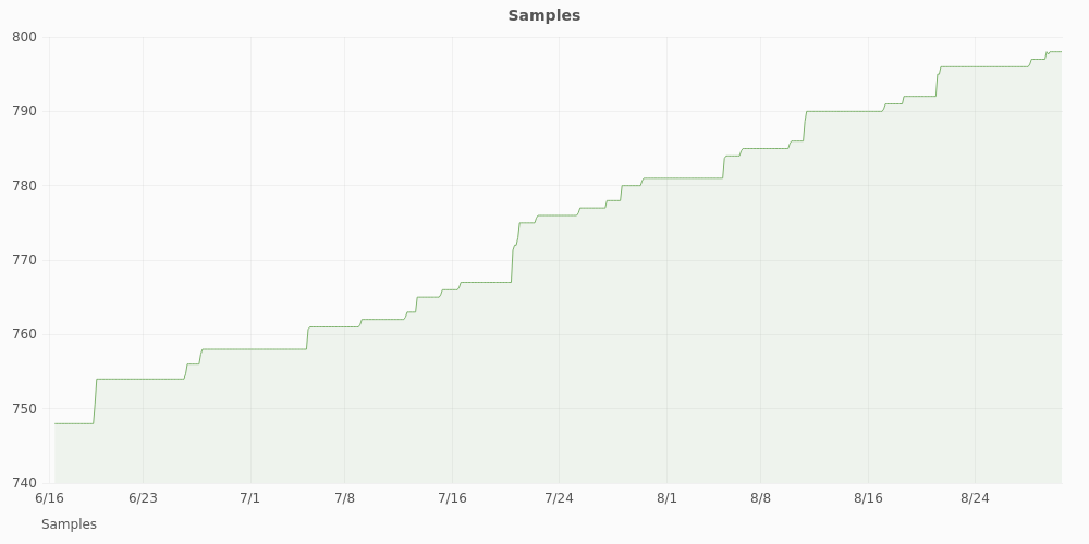
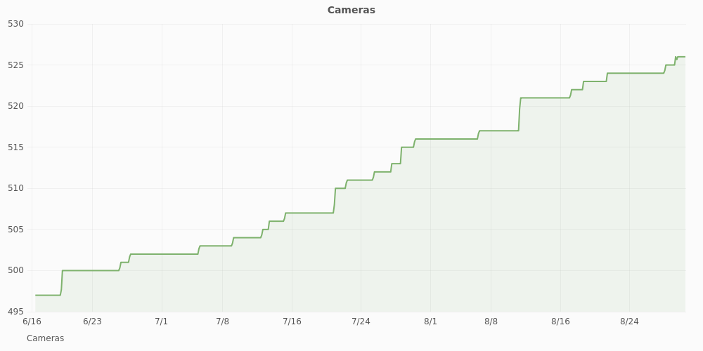

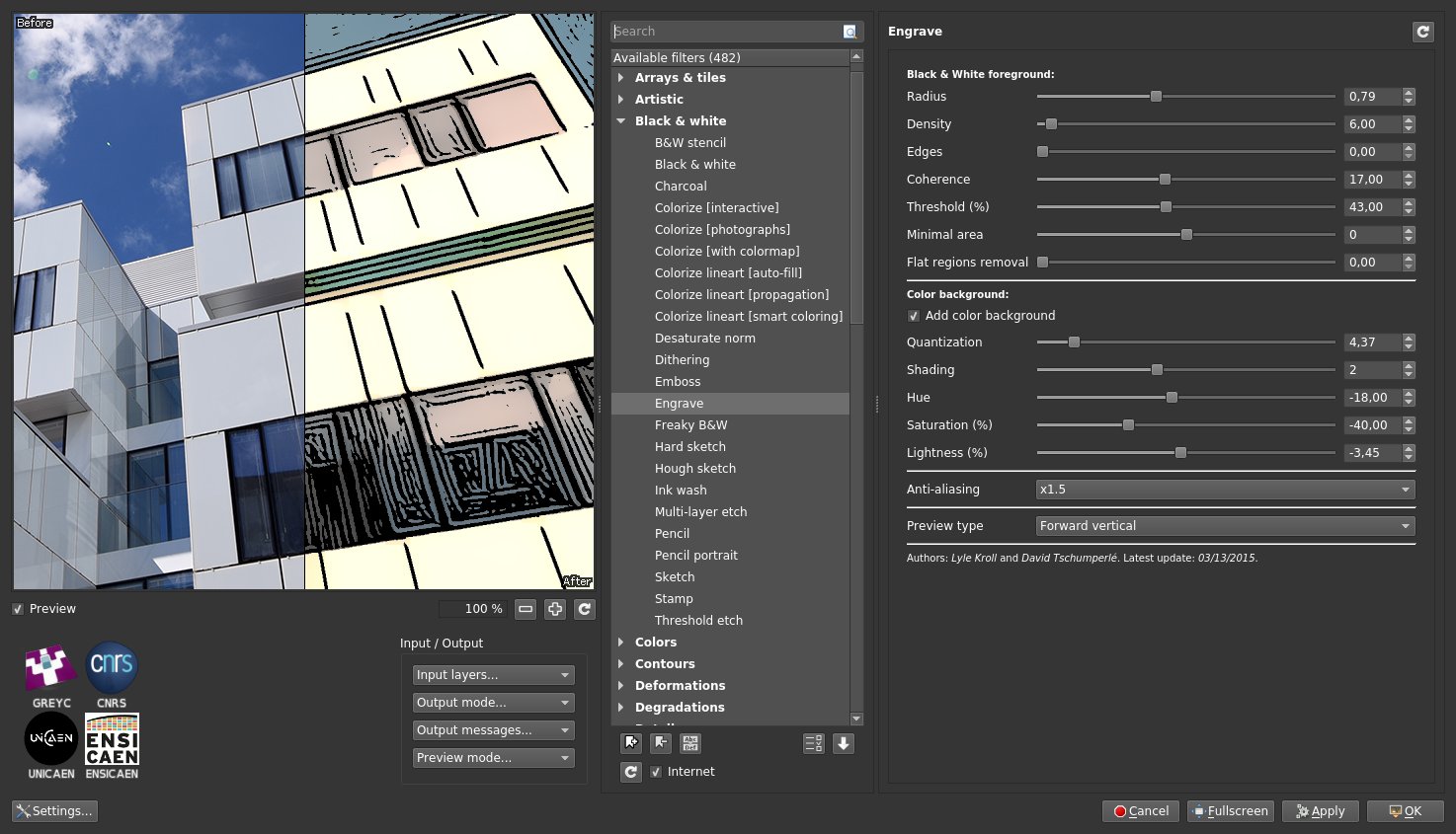
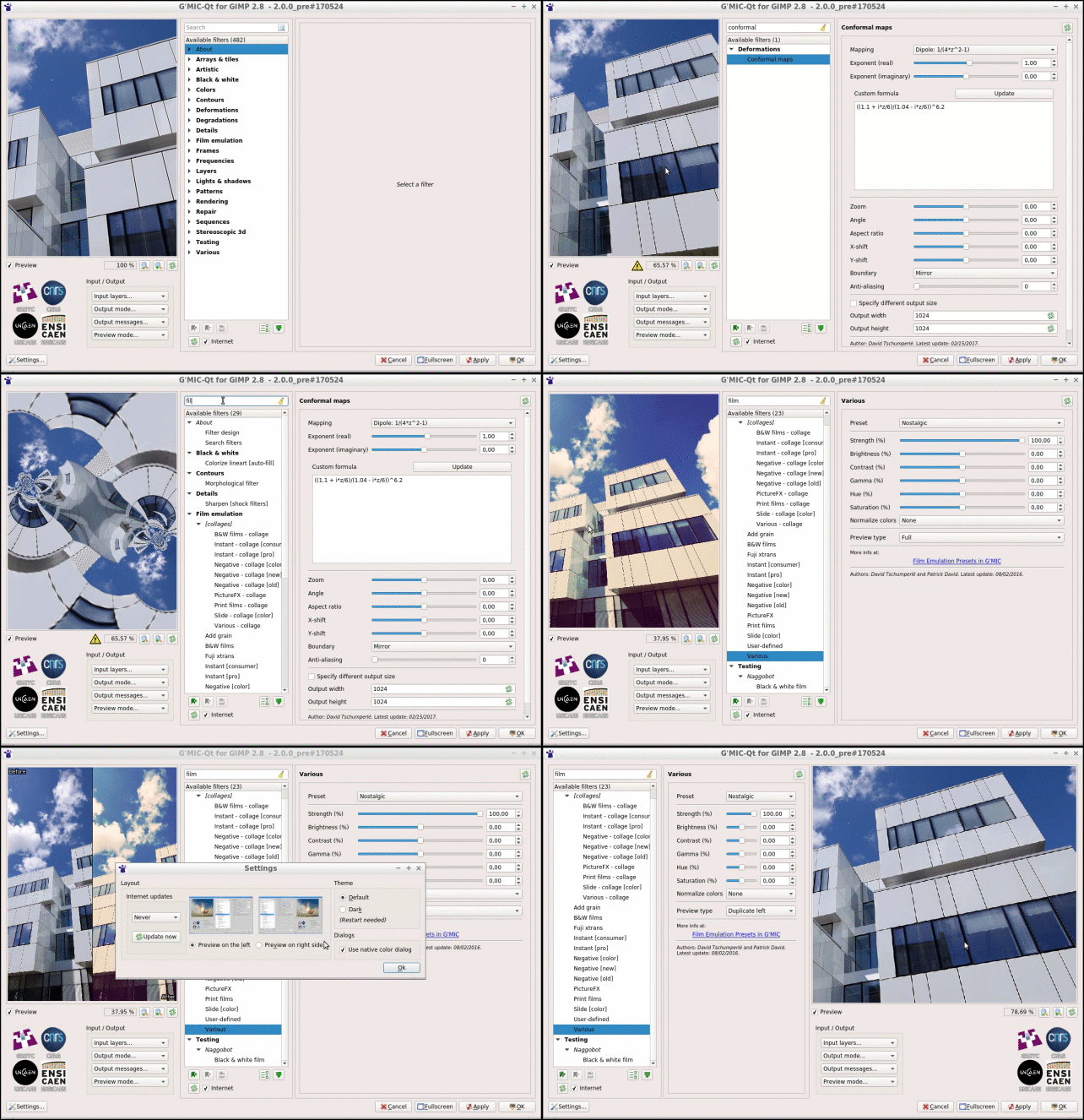
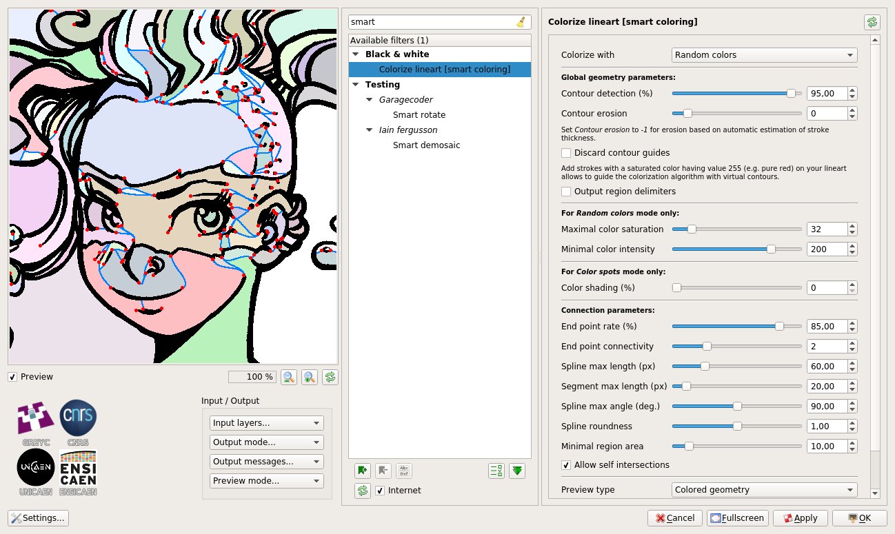
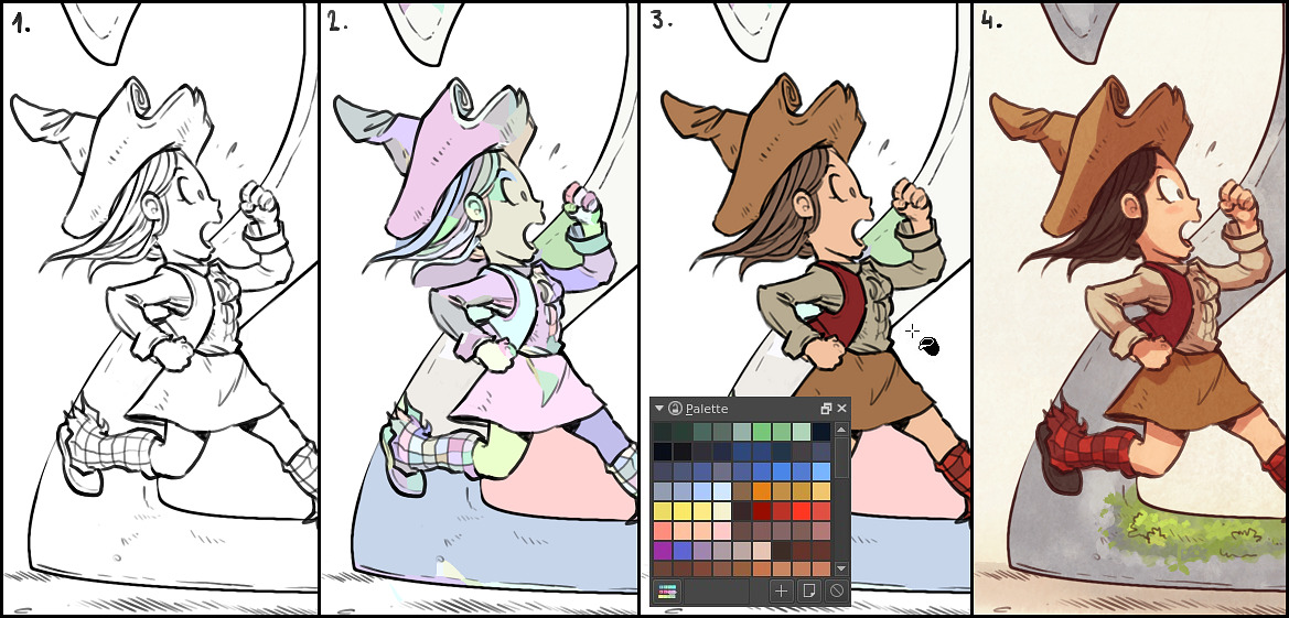
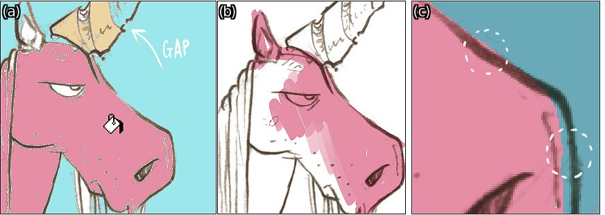
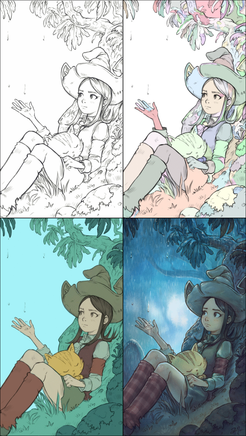
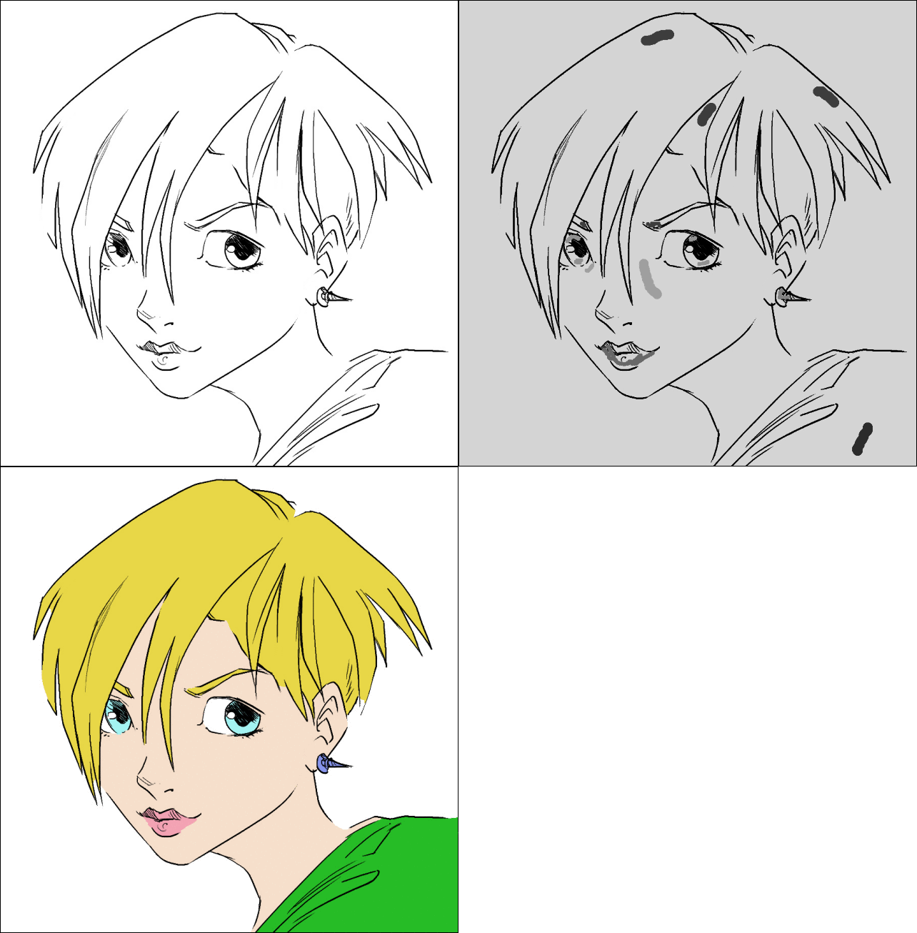
![Smooth [antialias]](https://pixls.us/blog/2017/06/g-mic-2-0/s_gmic_antialiasing.jpg)
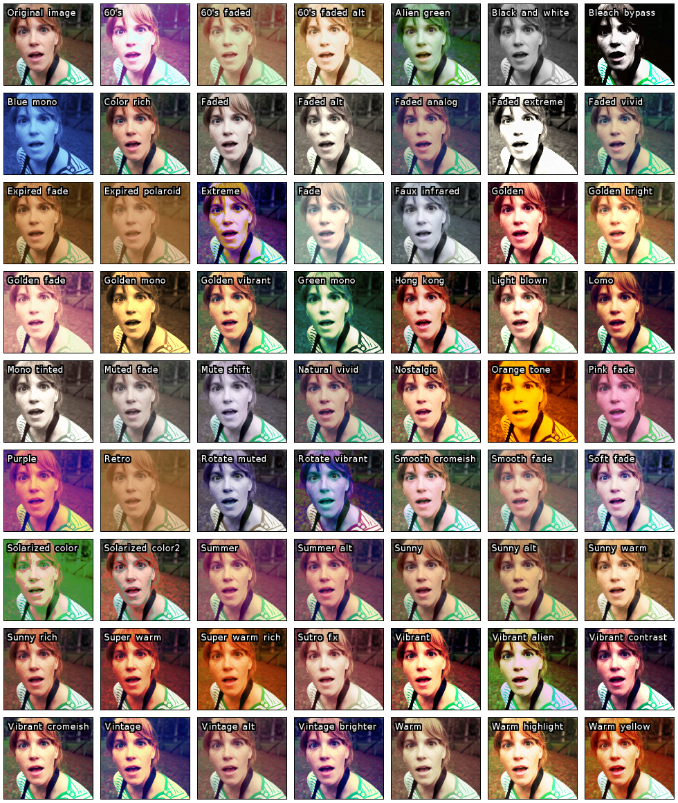
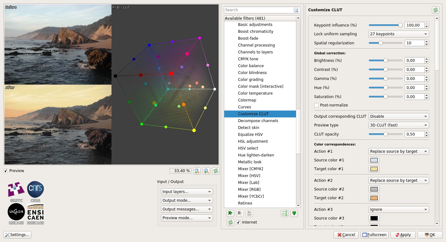
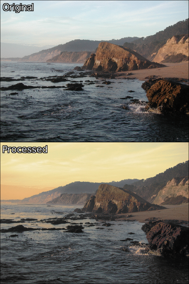
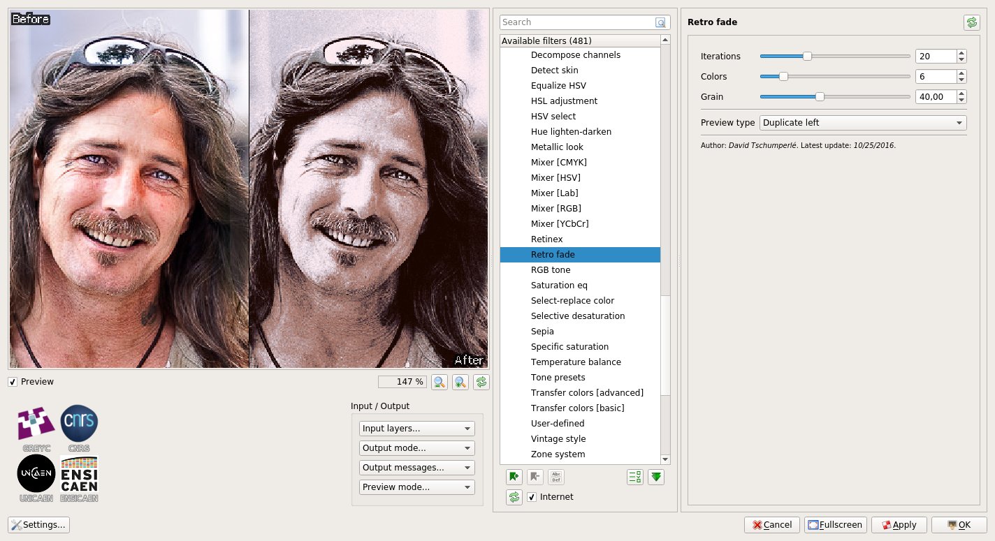
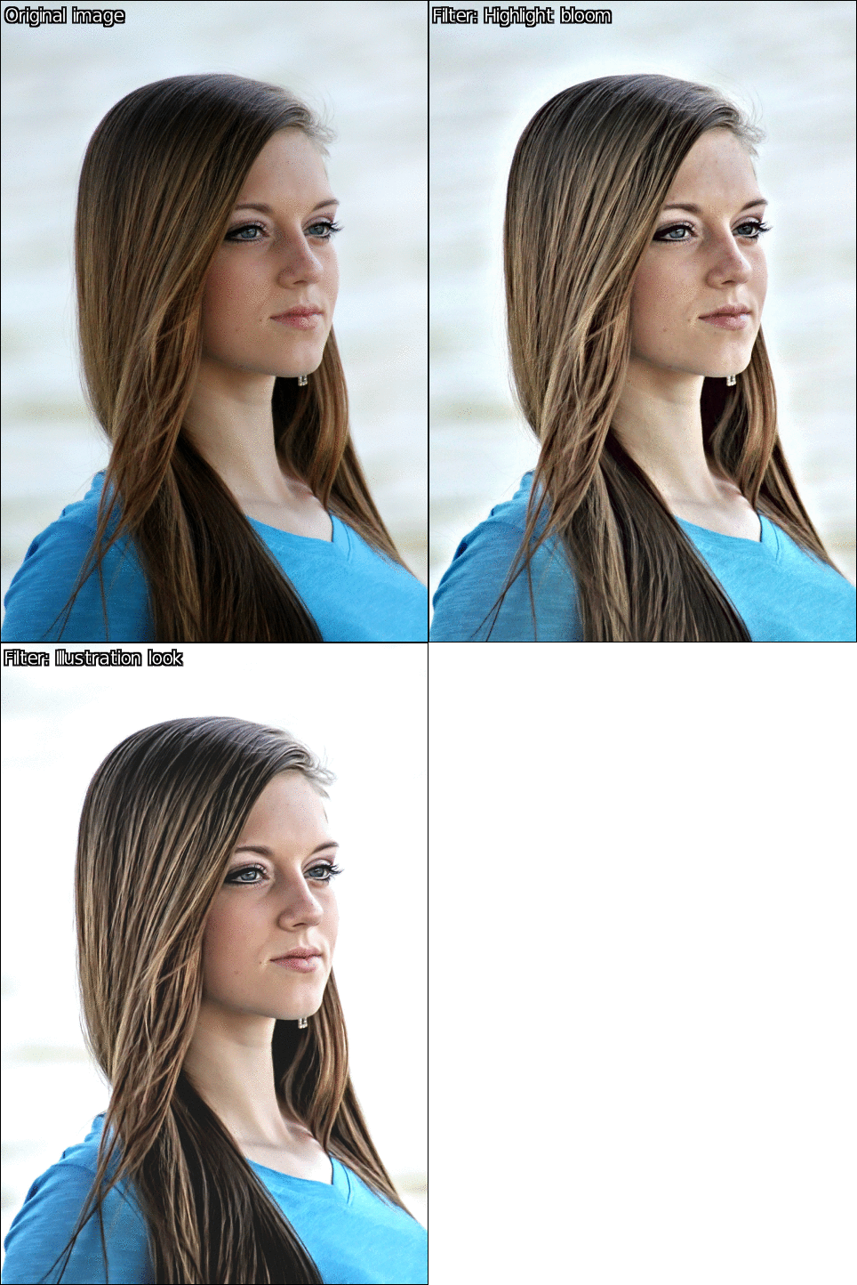

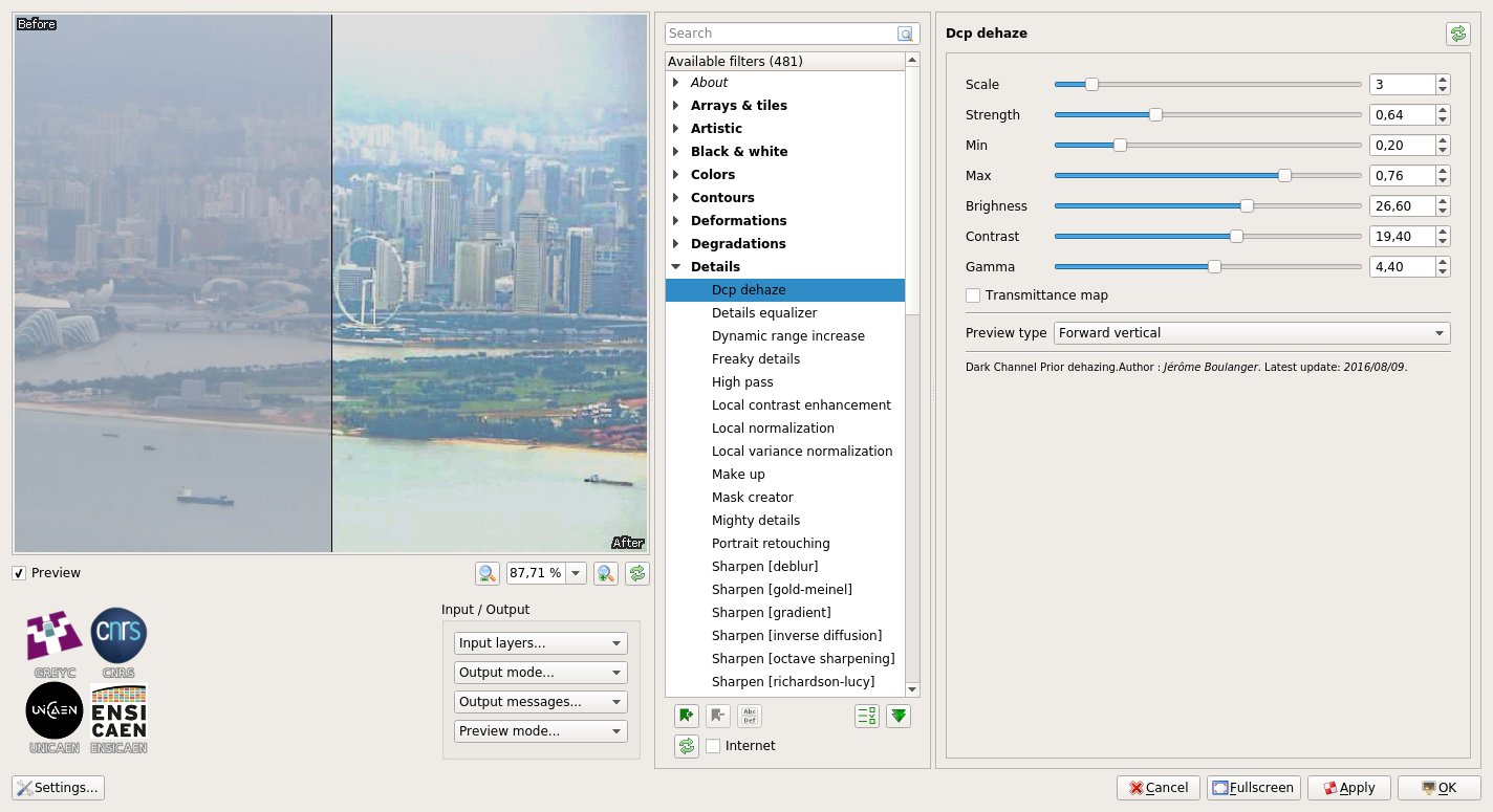
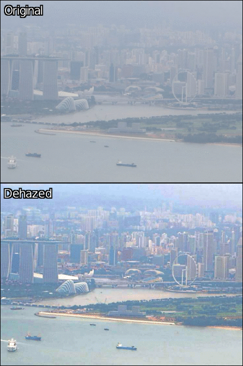
![Sharpen [texture]](https://pixls.us/blog/2017/06/g-mic-2-0/lion_sharpen.gif)
![Color mask [interactive]](https://pixls.us/blog/2017/06/g-mic-2-0/car_hue2.gif)