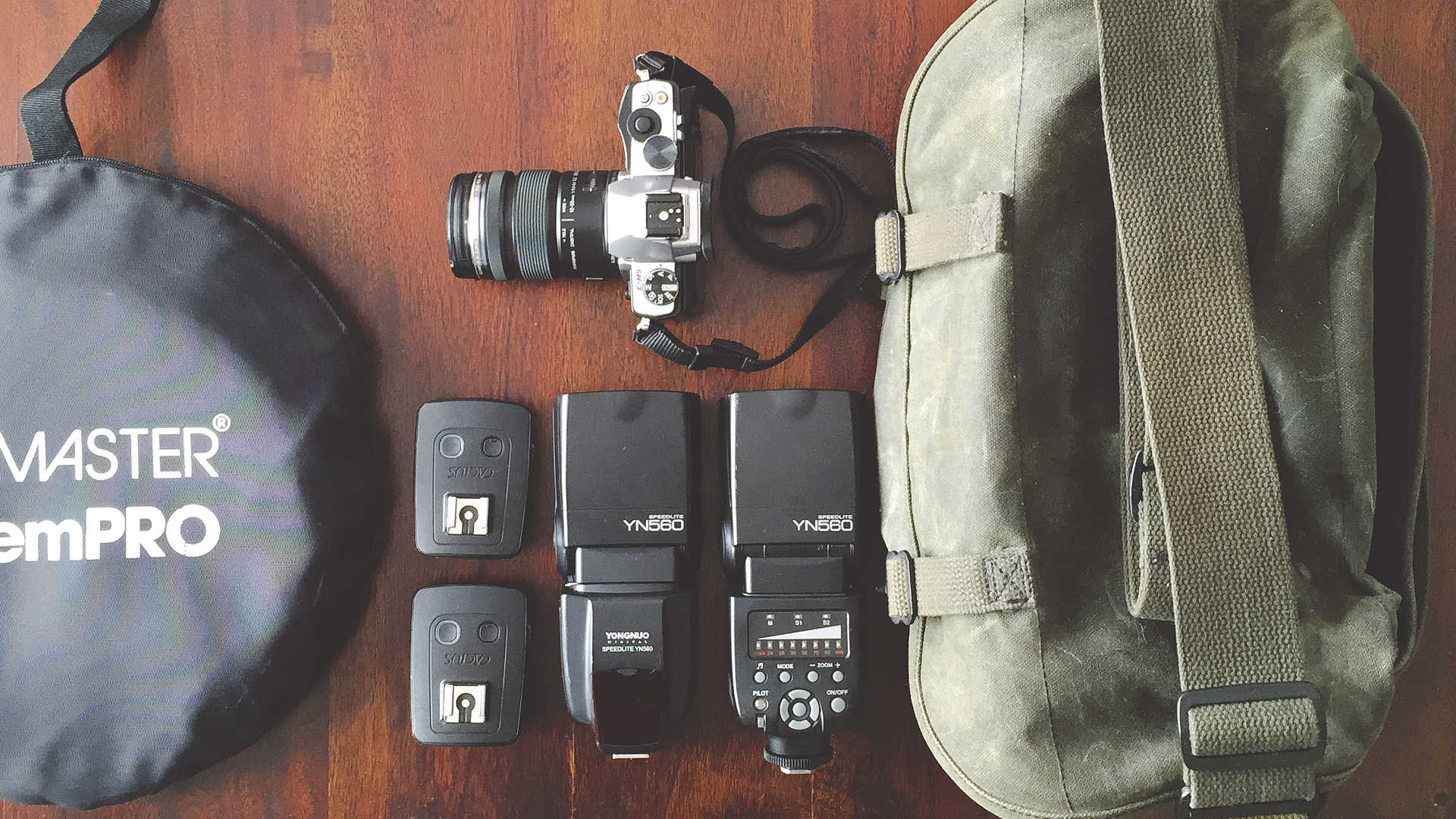
That lede image above is a quick (and dirty) snapshot of my go-to bag for running out the door.
I thought it might be fun to take a diversion and talk about gear a little bit.
Here’s the full image again:
My gear + bag. Not shown, spare battery and memory cards.
I had decided years ago on going with Micro Four Thirds (MFT) as a camera system because I like to travel light, and wanted options to adapt old lenses.
(On a side note, I’m still angry that there is not focus-peaking on the E-M5…)
My camera is the Olympus OM-D E-M5 (usually paired with the 12-50mm weatherproof lens when I’m out and about).
This is a perfect combination for me, particularly when I’m chasing around a 4 year old in who-knows-where situations.
A water and dust resistant lens/body is nice to have.
On the far left is a Promaster 5-in-1 reflector (41 inch).
These are usually relatively inexpensive and absolutely indispensable pieces of gear that can be adapted to many different situations.
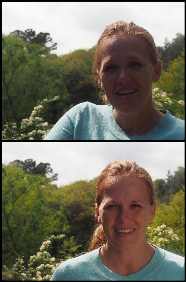
I was recently reminded of this yet again while on a walk through some gardens…
Both images straight out of the camera, with/without reflector, same settings.
The base of the reflector (without its covering) is a great translucent scrim that is handy to use with flashes if you need to soften things up a bit (and not lug around a softbox).
Speedlight shooting into the reflector scrim, ~2 feet away from model, camera left.
Speaking of flashes, you’ll also find my pair of Yongnuo YN-560 manual speedlights.
I’ve been slowly teaching myself lighting with speedlights, so rarely will I not have them with me.
To use them off-camera I also have a pair of Cactus V5 transceivers (one to transmit, one to receive).
Everything (except the reflector) packs nice and neatly into my wife’s old camera bag (a precursor to the Domke bags) that I ran off with.
(That is, the old camera bag of my wife, not the old bag, my wife).
The bag is canvas and I waxed it myself to give it some water resistance.
This basically consisted of me melting some wax and brushing it all over the bag, then using a hairdryer to further melt it into the fibers.
This was a great DIY project that was relatively inexpensive (about $8USD for more wax than you’ll need) and relatively quick to do (just a few hours total).
I’d love to see what others are using out there! Take a minute, snap a photo of your gear/bag, and share it with us.
Bonus points if you arrange it by knolling.
I was recently poked by someone on the GIMP-Web mailing list to update one of the tutorials on www.gimp.org about sharpening.
I thought about it, then decided it may be better just to write some new material from scratch.
I figured why stop there? I might as well make it a fun post here taking a look at what methods we have for sharpening, why you may (or may not) want to use them, and where in the processing pipeline it makes sense.
(While still pushing the GIMP specific sharpening thoughts to a separate tutorial there).
If anyone has thoughts around this or just wants to share what they’re doing, please let us know in the comments below.
I took a bit of a break from writing articles to work on getting the forums up and running.
We are almost back to a stable enough point that I want to turn my attention back to writing.
I say almost because there are still a few wonky things that I’d like to work out.
There is still a little bit of an issue with the comment embeds from the forum for full-blown articles.
One of the reasons for the possibly strange behavior for articles in the forums is that darix convinced me to go ahead and get SSL setup for the domains. So working on it yesterday we got it running for both the main site here, as well as at the forums.
You should notice an indicator in your browser that your connection is over https somewhere (a little green lock?) for this page right now.
I’ve set all connections to PIXLS.US to use SSL now (same thing with the forums).
The only drawback was that we uncovered some strange behavior when importing posts into the forum for embedding.
If you care, the way things work is that:
I publish an RSS feed of all of the content on the site (https://pixls.us/feed.xml if you’re curious).
Every hour the forum polls this feed.
If there’s new posts, the forum imports them and creates a new topic.
This is what you see under the “PIXLS.US” category on the forum.
Some small code on each post (on the website) references the forum topic entry to embed as comments.
There have been a couple of strange things going on with importing those posts, but darix resolved most of them.
The only thing that is still strange is the article objects themselves, which at the moment show up twice in the forum.
I should not that all of this could very well be caused by my writing the RSS feeds.
I know just enough to be dangerous and annoying to those who know better (this should probably be my epitaph).
Here Lies Pat David
He knew just enough to be dangerous and annoy those who knew better…
Fitting!
On the good side, thanks to the efforts of those smarter than I, even though we had some import hiccups, things have continued to run smoothly for the most part.
The correct comments were maintained in the correct topic threads, and those were in turn correctly associated with the posts they belonged to (well, blog posts at any rate).
Effective skin retouching can feel like a black art.
There have been various methods detailed in the past for ways to “smooth” skin in GIMP.
Those methods ranged from disappointing at best to downright ridiculous at worst.
The disappointing methods were simply a product of the best methods available at the time.
The ridiculous ones seemed to be due to a lack of subtlety.
Subtlety
Subtlety is a key requirement when approaching skin retouching.
There are certainly exceptions when required (high-fashion for instance) but it should always be approached from a minimalist perspective first.
Too often retouching skin is approached with a very heavy hand.
In an attempt to “clean” the skin many will chase every last drop of detail out of an image, resulting in a fake and overly smoothed result (making mannequins).
This is bad.
To reiterate: This is bad.
Real skin has pores, bumps, spots, color, and other interesting things going on.
The goal shouldn’t be to remove those characteristics, but rather to make some them less pronounced as needed.
A good rule of thumb is:
“Never do more than good makeup can achieve.”
Of course, some makeup artists are magicians.
In fact, it can be very helpful to go out and research how they work and what their process and reasons are.
This can help you understand better how to approach all manner of retouching, particularly when using techniques like dodging/burning and color theory (as it relates to makeup and skin).
Keep in mind the context as well.
Candid images may only require a very minimum of retouching (if at all), while a fashion shoot may desire a stronger application.
For the best results, it helps to have a clear vision of what you want to achieve.
Tools
Blurring
One method of smoothing skin that can be found in many old tutorials on the subject involves using some variation of blurring the base image and masking the blurred regions into the image.
In theory the idea may seem sound but fails quickly on closer inspection.
A combination of the broad effects of blurring coupled with the indiscriminate application across all the textures in the skin make this a less than ideal approach.
All of those pores, spots, bumps, and colors get lost when using an indiscriminate function such as blurring the image.
While there may be a desire to remove some of those details, visually our eyes are expecting for there to be some sort of texture and detail there.
Loss of those details is what pushes the results into “mannequin” territory.
Mannequin territory
“White male mannequin head in storefront window” by Horia Varlan (cb)
Overall, this method should not even be considered as an option for skin retouching.
The results are never good and are indiscriminately too destructive to the image.
High Pass/Low Pass Frequency Separation
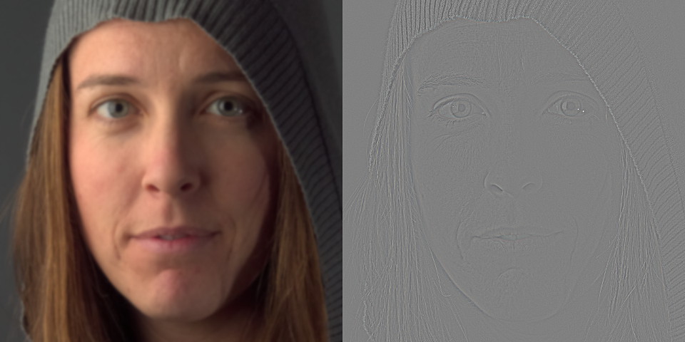
A slightly more advanced way to approach skin retouching is to use a “high pass/low pass” (or “high frequency/low frequency”, or just “frequency separation”) technique to separate the image into two layers.
One layer would contain all of the high-frequency (fine) details while the other layer would contain the low-frequency (coarse) information.
Mairi
The resulting layers can look strange to those not accustomed to seeing them.
The important thing to notice is the ability to isolate all high frequency details on a separate layer.
This allows us to independently modify the colors/tones from the details.
Low Frequency (left) and High Frequency (right)
Created with a blur radius of 15px
Create Frequency Separated Layers
Creating the frequency separated layers is relatively easy in GIMP.
Starting with the base image layer:
Duplicate base layer
[Layer → Duplicate Layer]
Name it “LF”
Apply a Gaussian Blur to the “LF” layer
[Filters → Blur → Gaussian Blur]
Choose an appropriate radius to isolate your desired high-frequency details (15px in the example)
The blur radius is ~1.5% of the width of the face
Change “LF” layer blend mode to Grain Extract
Create a new layer from visible
[Layer → New from Visible]
Name it “HF”
Change “HF” layer blend mode to Grain Merge
Change “LF” layer blend mode back to Normal
Visually, the result should look identical to the original base layer.
Technically the separated frequency layers now allow for much finer targeted editing.
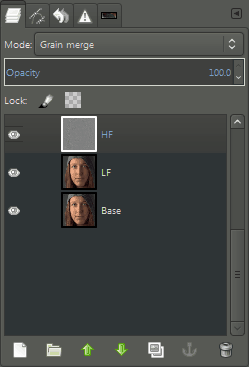
The layers for the image will now have an HF layer (in Grain Merge blend mode) over a LF layer:
Layers after going through a frequency separation.
The choice of radius for the Gaussian Blur operation will determine the level of details that get separated from the low-frequency layer. Smaller blur radii will isolate finer details (conversely larger radii include larger details).
Skin Retouching with Frequency Separation
Consider now the results from the separation. In particular notice which types of skin features occur in each layer.
Pores, light wrinkles, crows-feet, and small details are separated into the HF layer, while larger skin tones remain on the LF layer.
Overall skin tones can be evened out out by smoothing the tones in the low frequency layer.
A note on smoothing
There are various ways of softening details on the different layers.
The standard Gaussian Blur is one method that works well and quickly.
Filters → Blur → Gaussian Blur…
A better method might be using a Selective Gaussian Blur to only blur certain areas (based on the value difference between the pixel in consideration and its neighbors).
Filters → Blur → Selective Gaussian Blur…
If G’MIC is installed, there is also access to a bilateral blur filter (similar to Surface Blur in Adobe Photoshop) that is also an edge-preserving blur function.
Filters → G’MIC…
Repair → Smooth [bilateral]
When considering a face for skin retouching it’s often best to consider each general contour area of the face separately.
This is mostly due to different areas of the skin having different characteristics (ie: forehead wrinkles are often at a different scale than crows feet or smile lines).
Below is one example of a good starting point for contour consideration when smoothing.
The key is to vary the smoothing intensity for each region to obtain a good result.
There may not be a change required all the time, but it’s a good habit to get into for when it is needed.
Areas of smoothing consideration
A good place to start is often to address any “blotchiness” or uneven tones in the skin.
(Ideally this would be addressed through the use of foundation makeup.)
As seen above, those types of tones can be found on the Low Frequency layer.
Following the contour areas from above a Bilateral Blur (from G’MIC) is used to smooth the regions.
When using the Free Select Tool to select a region, remember to enable Feather edges from the tool options to make a smooth transition from the working area to the surrounding image.
Filters → G’MIC…
Repair → Smooth [bilateral]
The defaults of spatial variance: 10, value variance: 7, and iterations: 2 are used.
After smoothing the LF layer with a bilateral blur
Click to compare to original
Visually, smoothing the Low Frequency skin tones provides a marked improvement to the perceived quality.
Importantly, notice that none of the finer details have been modified (wrinkles, pores, etc…).
At this point, regular workflows could still be used such as spot healing or dodging & burning (on either LF or HF layers as needed).
HF/LF Summary
High/Low frequency separation is a great tool to approach skin retouching due to it’s ability to allow a retoucher to approach the work in discrete layers.
If one wanted to isolate a series of frequencies, then things get a little trickier.
It would require the user to generate HF/LF separately for each size they wanted to isolate.
The workflow would be along the lines of do the separation, retouch, do the separation again for a different size, retouch. Rinse and repeat.
It turns out that there is already a very handy way to isolate multiple frequencies at once and still have a visual means of combining them easily to see the edits as they are being made:
Wavelet Decompose.
Wavelet Decompose
Wavelet Decompose allows you to generate multiple High Frequency layers (and a Low Frequency “Residual” layer) all at once.
Each of the HF layers use the Grain Merge layer blending mode so that the composite image is reconstituted correctly.
This allows the retoucher to make modifications to any of the scale (frequency) layers while seeing the results immediately on the canvas.
Getting Wavelet Decompose [Plugin]
The original plugin for Wavelet Decompose by the user marcor on the GIMP registry can be found here:
Wavelet Decompose [registry.gimp.org]
Once installed the command is:
Filters → Generic → Wavelet Decompose … Getting Wavelet Decompose [Script-Fu]
There is also a Script-Fu version by Christoph A. Traxler that can be downloaded from us here:
Wavelet Decompose Script-Fu [pixls.us]
Once installed the command is:
Image → Wavelet Decompose …
The advantage to using a wavelet decomposition over a simple HF/LF separation is cases where there may be details of a different size than your HF layer that you still want to isolate.
Wavelet Decomposed to 5 levels
Click to view equalized levels and enhance details
Examining the equalized version of the previous image immediately shows the various scale features isolated through the decomposition.
In particular, the top row shows the finest details while the bottom row shows broad details with the color residual layer last.
With the various detail scales separated, the retoucher can easily make modifications on any given scale while seeing the results directly on the canvas.
This is due to the detail scale layers being set to “Grain Merge” blending mode in GIMP.
Application
Use of wavelet scales for retouching are done similarly to using a frequency separation.
The major difference is choosing which detail scale to apply the smoothing operations to, and at what intensity.
I have found that a good workflow is to generally start at the largest detail scale.
Experiment with smoothing methods and parameters until a good result is achieved without going too far.
If needed, repeat the operations with different parameters on the next smaller detail scale (with reduced parameters).
For this example, running the Bilateral Blur from G’MIC with the same values as in the Frequency Separation example above yields:
Click to compare:
OriginalLow Frequency SmoothWavelet Smooth
The smoothing of the largest detail scale produces pleasing skin tones without removing too many details.
Having the detail scales separated out also allow for spot modifications without disrupting the textures of other scale layers.
For example, there is some slight skin discoloration on the models lit cheek:
A small color tone difference to repair.
By working on the color (low-frequency) Residual layer, the color tones can be evened out using a Heal Brush and sampling from nearby skin.
After healing the area on the Residual color layer
Click to compare to original
Notice in particular that the fine details that make up the skin composition here are not modified.
Wrinkles, pores, and skin texture are kept intact while the underlying color tones for that region are blended smoothly into the surrounding area.
This same technique can come in very handy for lightening under eyes that might have dark circles under them, for instance.
Spot Healing
Once the skin tones have been smoothed as desired work can continue with spot healing discrete problems as needed.
Simple skin blemishes that are discrete are best approached with a spot healing tool after the global skin tones have been modified (to avoid having to apply the healing on all of the detail layers one at a time).
Example: Nikki
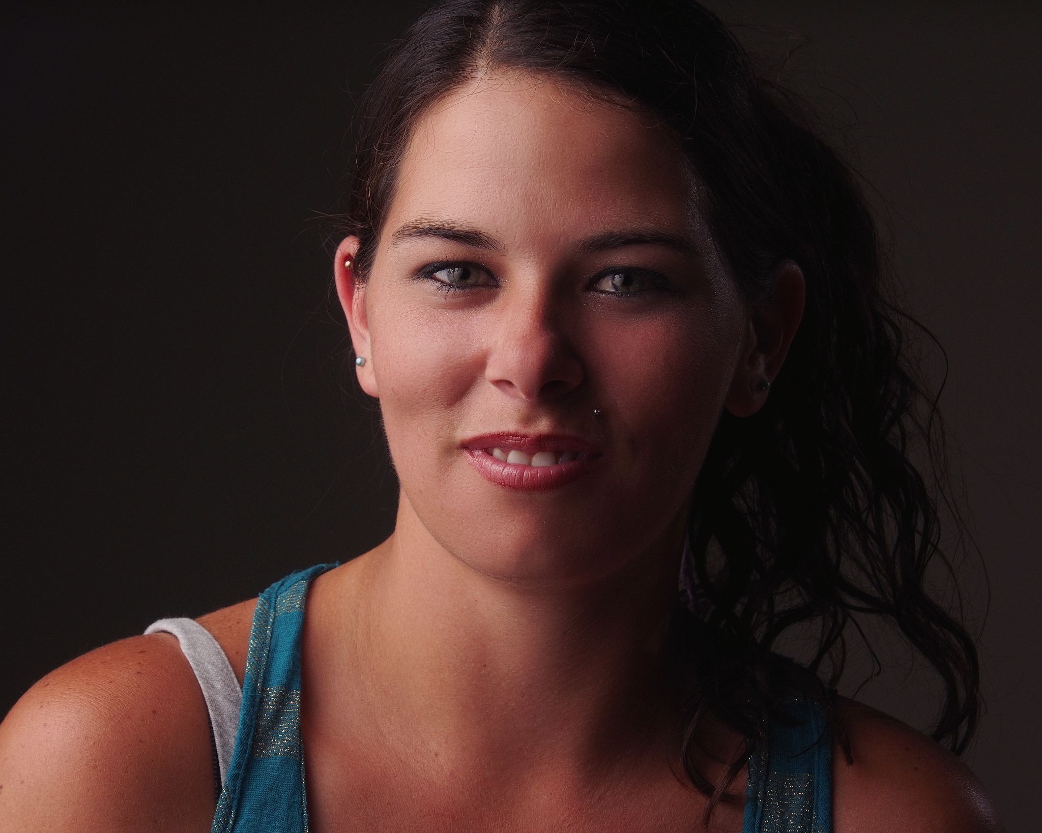
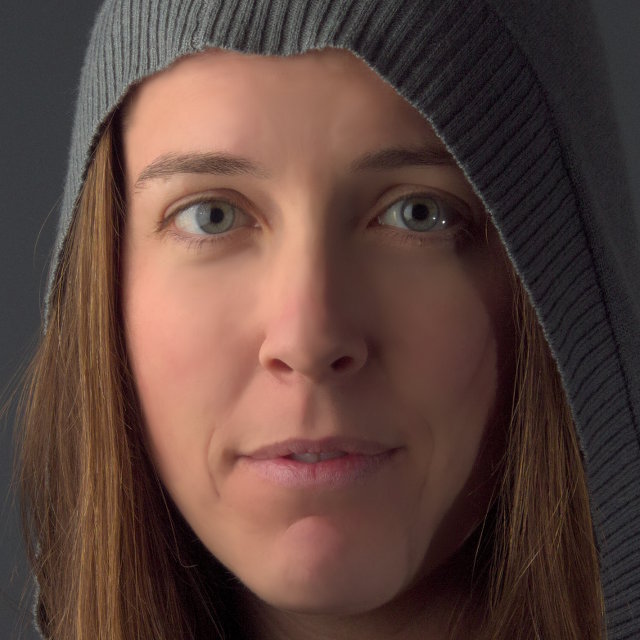
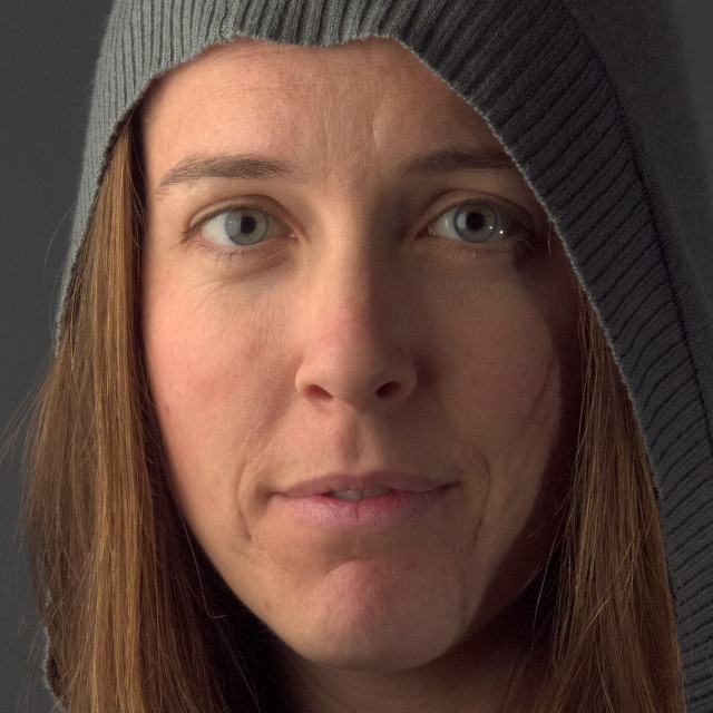
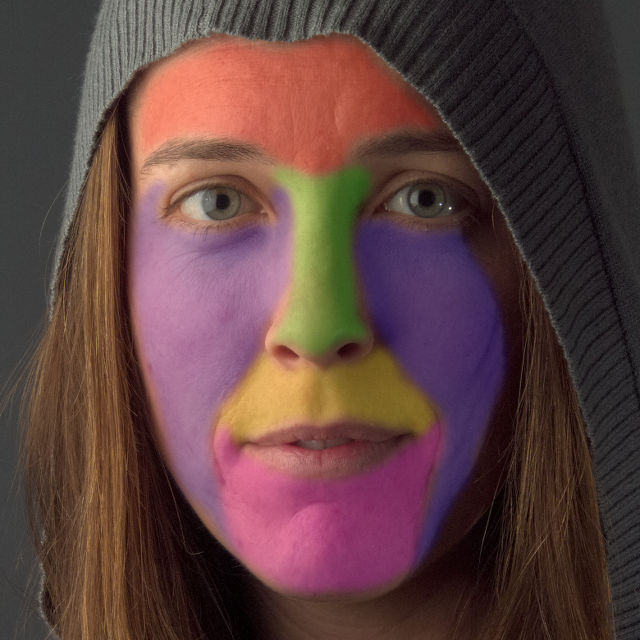
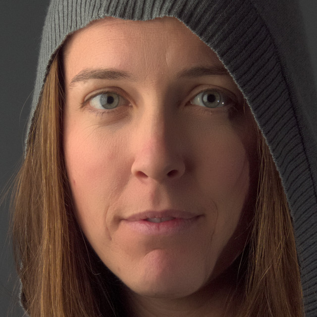
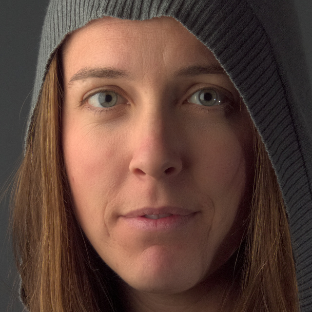
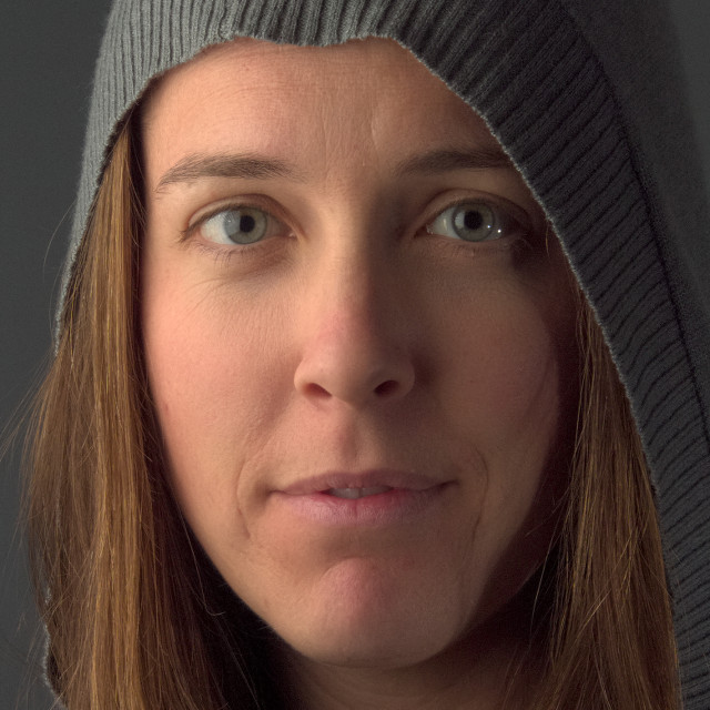
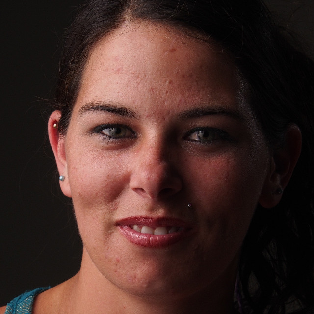
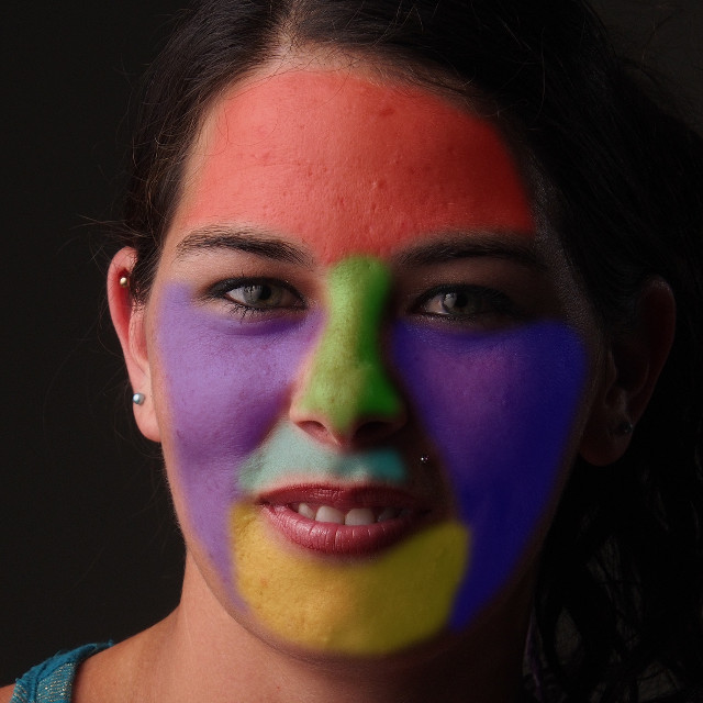
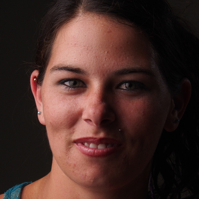
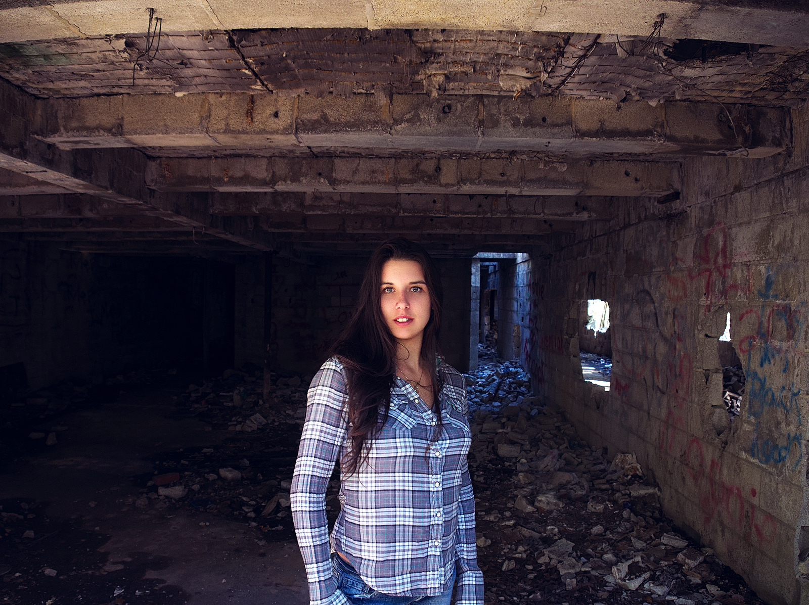
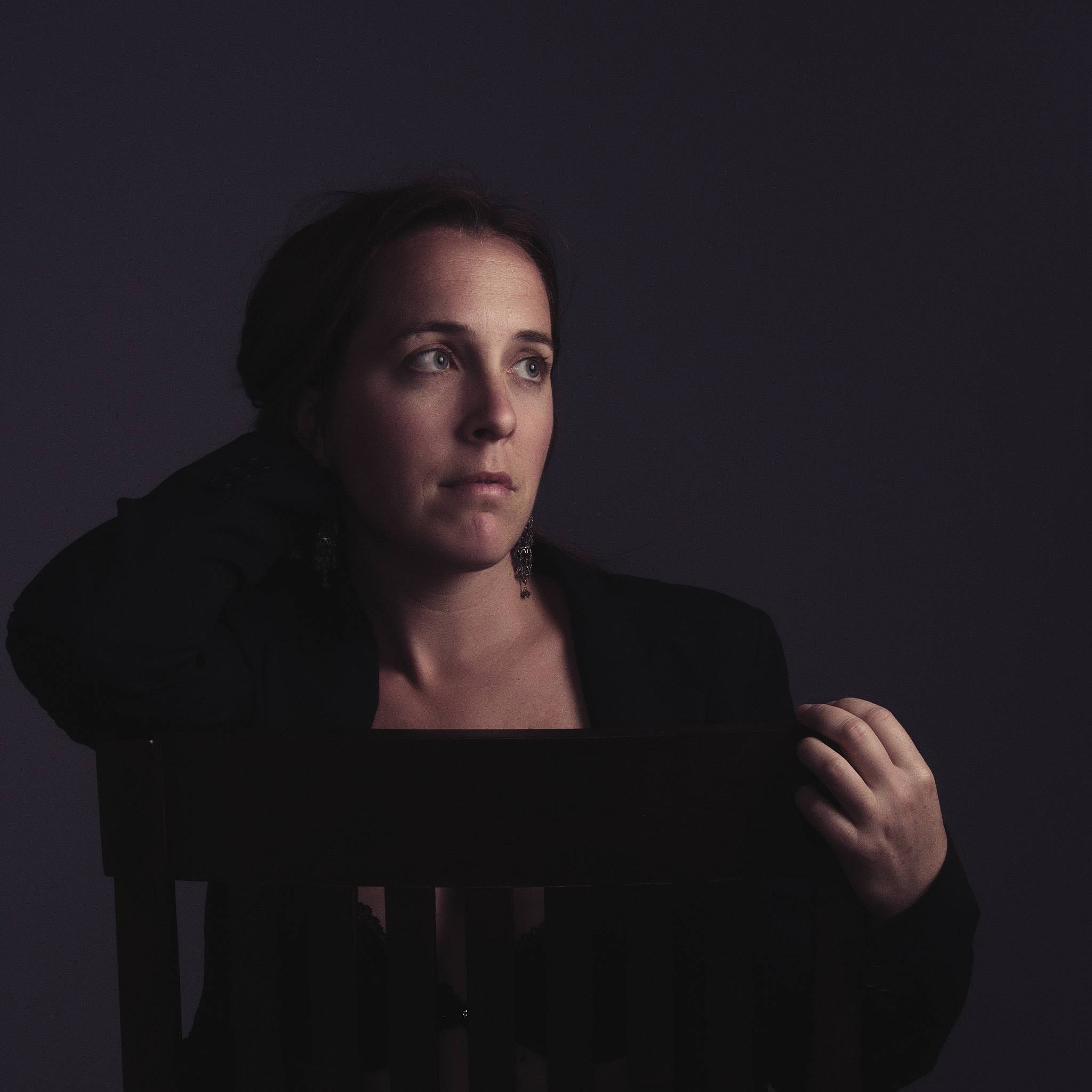
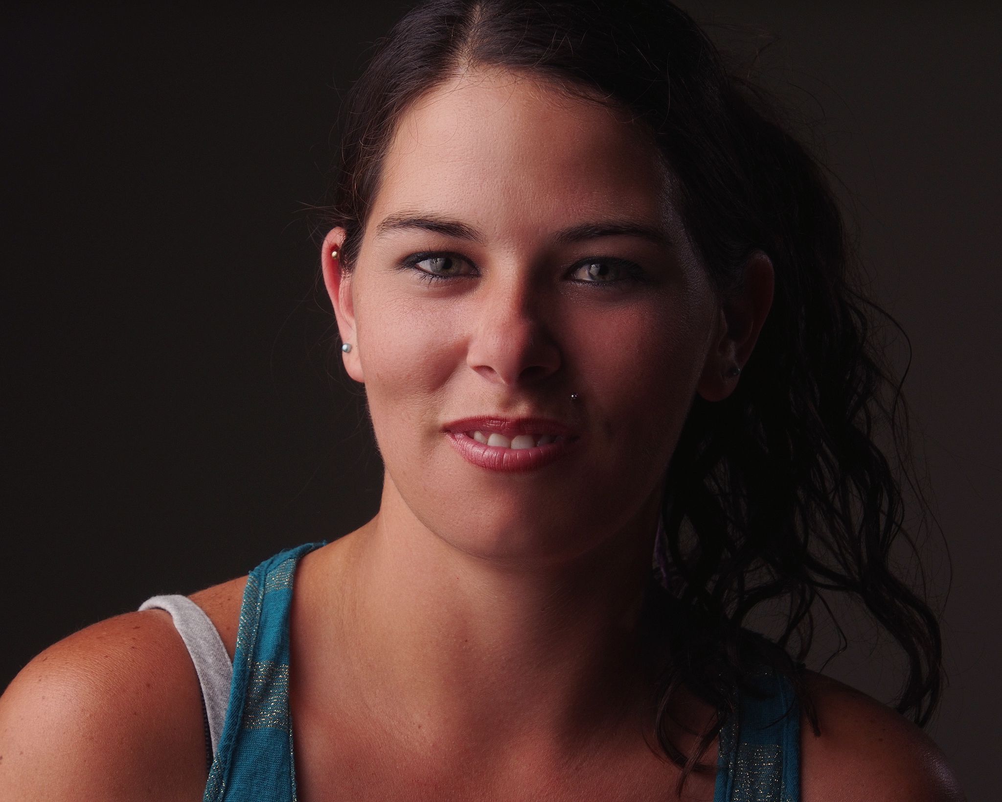
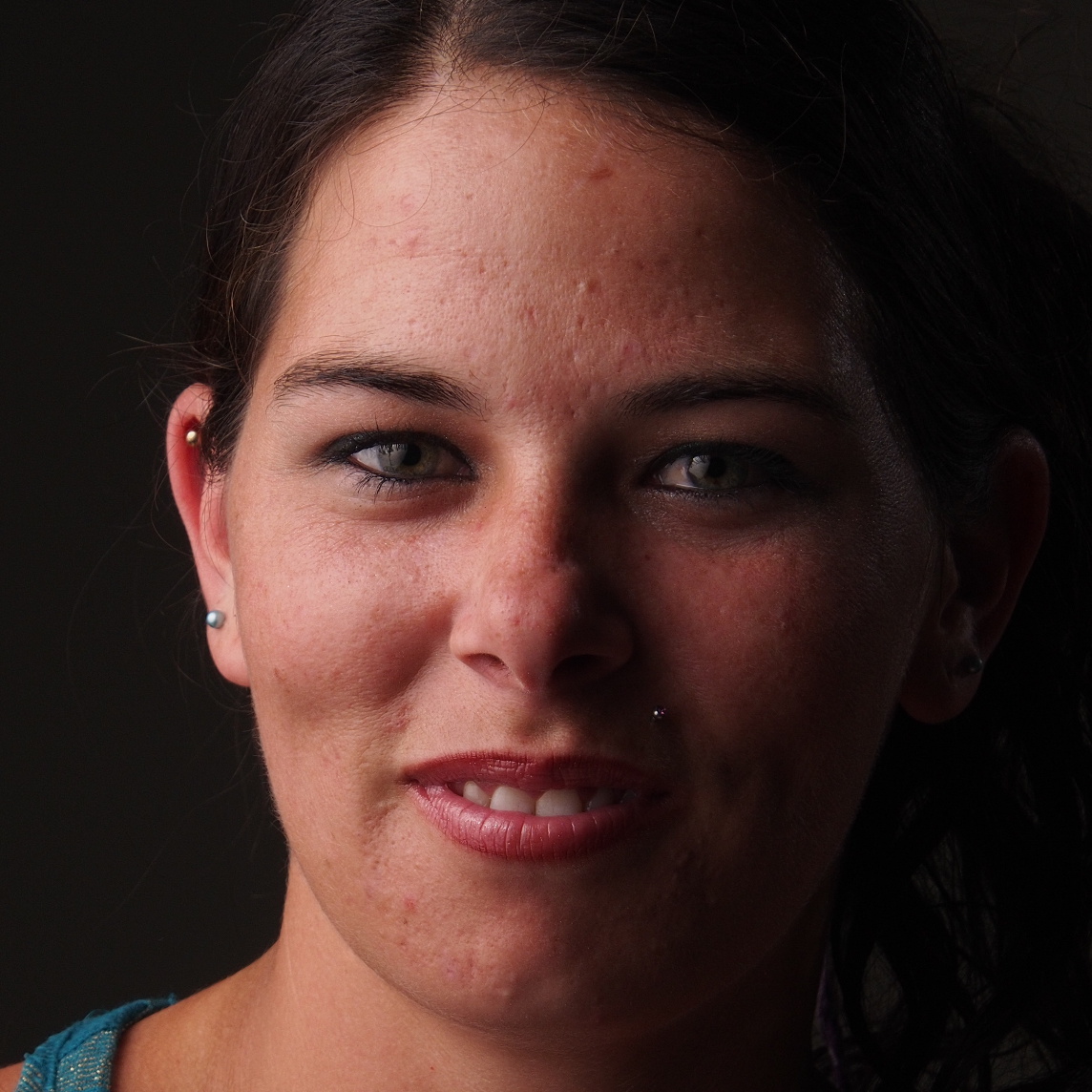
A good image to see what this approach can accomplish is the lede image to this article, Nikki.
This is a crop from the raw image untouched:
Running Wavelet decompose (plugin) against the image with the default of 5 scales,
Filters → Generic → Wavelet decompose …
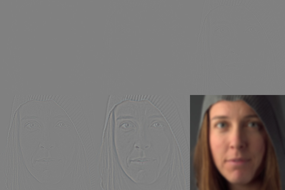
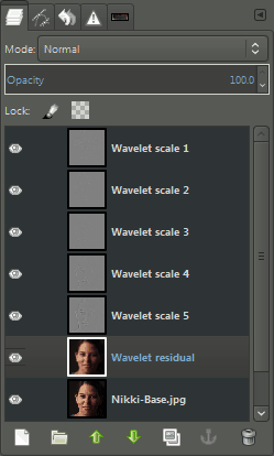
will leave the image with layers that look like this:
Detail scales and residual layers from Wavelet decompose
What We’re Targeting
After running a wavelet decompose on a layer there is a very simple method of exaggerating the details that will be targeted for smoothing the skin tones.
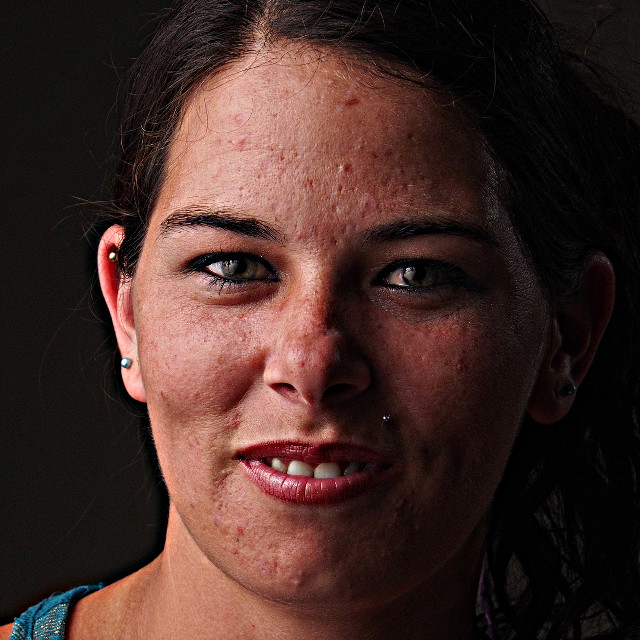
Simply toggle off the visibility of the Wavelet residual layer:
Nikki with only the detail scales visible over the base image (no residual layer).
I highly recommend that you do not do this with the subject in the room!
Nobody looks good when the residual scale is removed from the image stack…
But it does nicely exaggerate the types of tonal variations that are prime candidates for smoothing and suppression.
Regions
Similar to the regions previously shown, we will walk through the retouching process based on that type of facial contour: forehead, nose, cheeks, chin, and lip.
I’ll normally use the Free Select Tool with a feathered radius around one-half an iris length (~30px in this case).
The radius value is mostly arbitrary and serves only to smooth the transition from areas being worked on (so adjust to taste).
I will also usually select regions as I go and remember to save the selections to a channel to make it easier to come back to them later if desired:
Select → Save to Channel
Crop from Nikki, no retouching.
Wavelet Decompose is run on the layer using the default number of wavelet detail scales: 5.
Forehead
With the forehead region selected a first pass can be made to smooth out the tones.
As mentioned previously, we’ll start on the largest detail scale Wavelet scale 5.
Wavelet Scale 5
Due to the size of the blemishes in this area, a slightly more aggressive smoothing amount can be used and adjusted to taste. A Bilateral Blur can be used again, with slightly higher values than default:
Spatial variance: 15
Value variance: 12
Iterations: 2
Those parameters do a good job of initially dampening the skin tones here:
Bilateral Blur on Wavelet scale 5 results
Click to compare to original
Wavelet Scale 4
There are still some uneven tones that were not affected by the smoothing on scale 5.
These are mostly smaller tones around blemishes.
So continuing with the same region, but now working on Wavelet scale 4 should help dampen those even further.
Using the bilateral blur again with smaller parameter values than previously:
Spatial variance: 7
Value variance: 4
Iterations: 1
These values are determined through experimentation on the image. They are tuned in iterations until the result is visually pleasing, then dialed back a little bit more.
Bilateral Blur on Wavelet scale 4 results
Click to compare to original
At this point, most of the skin tones have been evened out and what is left is mostly discrete skin blemishes that can be cleaned up with a heal tool later.
Working on just two wavelet scales significantly decreased the prominence of the blemishes and the overall smoothness of the tones.
Nose
There is not as much smoothing required on the nose (vs. the forehead).
An initial pass on Wavelet scale 5 with the default bilateral blur values:
Spatial variance: 10
Value variance: 7
Iterations: 2
helps to even the underlying tones nicely.
A second pass on Wavelet scale 4 with much lower values on the blur help to smooth the slightly finer details as well:
Spatial variance: 5
Value variance: 2
Iterations: 1
These two passes result in this for the nose:
Smoothing on scales 5 & 4 results
Click to compare to original
Cheeks
Similar to the first pass on the nose, the cheeks can use an initial smoothing on Wavelet scale 5 with the default values for the bilateral blur.
Smoothing the cheeks on wavelet scale 5
Click to compare to original
To finish the cheeks a slight smoothing on scale 4 with slight values,
Spatial variance: 5
Value variance: 2
Iterations: 1
This smooths just a bit more than previously usually without being too much (if it is too much, dial it back of course).
Smoothing the cheeks on wavelet scale 4
Click to compare to previous step
When clicking to compare in the above image, notice that the result of smoothing with low values on scale 4 are subtle but they are there.
Combined with the previous step the overall result is a much visually smoother looking complexion without smearing details.
Chin & Lip
Considering both the upper lip and chin, and as before a good starting point is to try the default bilateral blur values on the largest scale (scale 5).
Spatial variance: 10
Value variance: 7
Iterations: 2
Smoothing the chin with default bilateral blur values
Click to compare to original
Similar to the previous step a further refinement of the skin tones can be achieved by smoothing on the next detail scale down, wavelet scale 4.
As before, using slight values:
Spatial variance: 5
Value variance: 2
Iterations: 2
Will produce a nice finishing to the detail tones in this area:
Further refining the chin and lip with smaller blur values on wavelet scale 4
Click to compare to previous step
Results (Wavelet Smoothing Only)
This process relied only on smoothing the tones on the largest detail scales, 4 & 5.
Without doing any targeted modifications (beyond regions) here are the final results:
End result working only on wavelet scales 4 & 5
Click to compare to original
This is a fantastic base to continue working from (particularly when compared to the starting original image).
A few areas of spot healing as needed would be enough to make a great final image from here.
The concept to keep in mind when working with Wavelet scales is to build up a series of small changes that together will produce a pleasing visual result.
At this point only a few minor spot corrections and some color toning are required to reach a pleasing final result:
Final result after spot corrections and color toning
Click to compare to Wavelet smoothing only
Moderation
As with many things in life, moderation is the key here.
Visually it can be helpful to occasionally check your image results zoomed far out.
If an image looks too smooth when zoomed out then dial it back.
Remember that this is an inherently destructive process and should be used as little as needed to get a desired result.
Resources
You can download the sample Mairi and Nikki GIMP .XCF files used to create the examples above here:
A Script-Fu version of Wavelet Decompose by Christoph A. Traxler.
Place the .scm file into your scripts folder and the menu option “Wavelet Decompose …” will be under the Image menu:
I think we are at an interesting time for digital imaging.
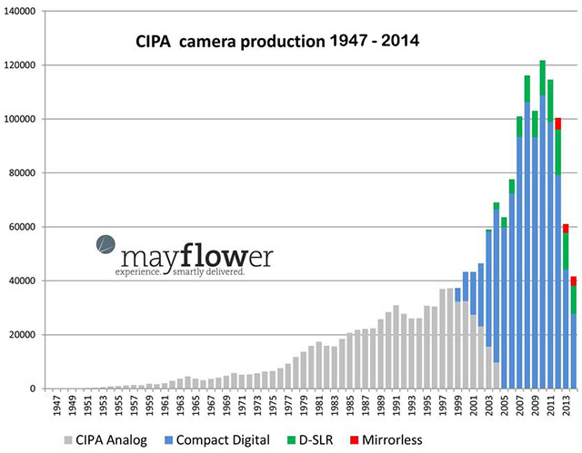
I came across this graph on Petapixel the other day that showed camera sales from 1947 - 2014:
There was explosive growth driven by the Compact Digital market right around 2000.
Likely driven by the advent of those inexpensive compact digital cameras and the ubiquity of home computers.
It was relatively cheap to get a decent digital camera and the cost per photo suddenly dropped to a previously unheard of amount (compared to shooting film).
This meant that substantially more people were now able to take and share photographs.
That precarious plummet after 2011 seems frightful for the photography industry as a whole, though.
The numbers from the graph would seem to indicate that production in 2014 dropped to below the values from 2001.
Petapixel had a follow-up article where photographer Sven Skafisk added in smartphone sales using data from Gartner Inc.:
If that graph doesn’t describe an industry in the throes of change, then I don’t know what does.
It looks like the camera industry is less in decline and more about being in a big transition phase.
So why would this matter?
Because now, more than ever, there is a large amount of people who may be interested in learning to process their photographs in some way.
As the costs and barrier to entry to photography as a hobby get lower we see more and more people finding the fun and joy of photography.
Couple that with the fact that the modern language of media consumption is primarily visual and I see a great opportunity brewing.
I feel this is important to us as free software users as it gives us an opportunity to help make people aware of free software (and its ideas).
New hobbyists will invariably look for an inexpensive way to get started processing photos and will almost always run into various free software projects at some point in the search.
It’s entirely on us as a community to make sure that there will be good resources to learn from.
If we do a good enough job, some of those folks will realize that free software more than meets their needs.
If we do a really good job, some of those people will become valuable parts of our communities.
So I have now also enabled the comments for more than just blog posts.
They should now be working just fine on full articles as well.
So feel free to head over to Ian Hex’s neat Luminosity Masking in darktable tutorial and leave a comment to let him know what you thought of it!
(Or any of the other articles, too.)
After much hard work, that basically consisted of me annoying darix as often as possible, I am glad to say that we finally have a Discourse instance set up!
Super Big thank you to darix for all the help!
What does this mean?
For starters, we now have a forum/community in place that we can start building around photography and free software.
A neat side-effect of this forum is that we now also have a way to embed forum threads as comments on posts (only blogposts at the moment - I’ll add them to articles shortly).
At the bottom of any blog post you should now either see a series of conversations happening with a Continue Discussion or a link to Start Discussion.
Either of those buttons will take you to the actual forum to continue the conversation.
Replies to topics that are tied to posts will show up as a conversation at the bottom of the post (check the bottom of this post).
The site is open and live at the moment (if a bit bare-bones).
Feel free to drop by and create an account, comment on things, start new topics, etc.
I’m testing things out at the moment to see if I need to possibly bump the server specs in order to handle the loads (most likely).
(In the course of writing this, I went ahead and bumped the server RAM to 2GB - so it should run smoothly).
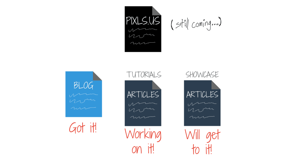
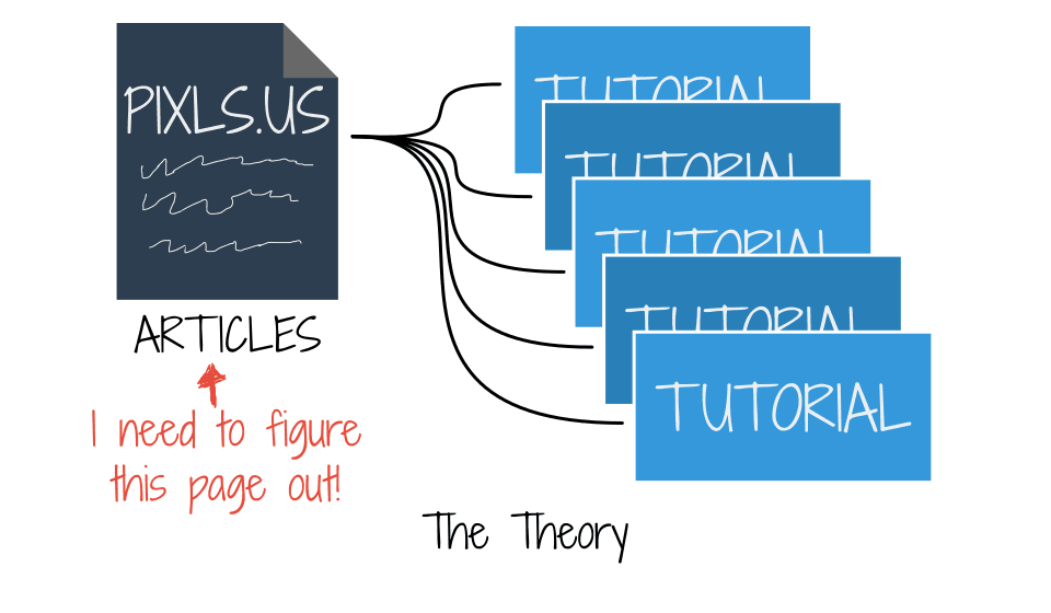
I spent a little time struggling conceptually with how I wanted to categorize the different types of content I am planning for this site.
As I had previously noted, I was already done with creating a blog post type of content, and had noted that I was working on how to show tutorials and ‘showcase’ types of posts.
Apparently, I had the answer in mind when I created that graphic last month.
If you notice the two other types of content I am working on, Tutorials and Showcase, are both listed as types Articles on the graphic.
Of course.
There will only be two distinct types of content from the viewpoint of the site, blogposts and articles.
I will then use the features of the static-site generator I use for this site, metalsmith, to manage the content presentation (tutorials, showcase, etc).
This will be handled through collections in metalsmith.
So at the end of the day, even though there will be a section of Tutorials and Showcase or whatever else I come up with (or someone else), the bottom line is that the base content object will be an Article.
I like this approach, as it leaves a large amount of flexibility while maintaining a nice sense of simplicity.
(Anything that lowers the barrier to writing and publishing material is good in my book).
This is just a note to myself in case I forget what I was on about with collections.
There are basically two ways of associating an article with a collection, through metadata on the file and through a matching pattern during compile time.
Unfortunately, as near as I can tell, you can’t do them both at the same time for the same collection type.
Doing it through metadata assocation only requires that in the front-matter of the file, the collection type is called out, like collection: tutorial.
For example, here’s a sample of the front-matter for this blog post:
---
date: 2015-03-30T17:31:36-05:00
title: "All the Articles"
sub-title: "My God, It's Full of Articles"
lede-img: "M31 - Adam Evans.jpg"
author: "Pat David"
collection: blogposts
layout: blog-posts.hbt
---
In this case, the post will be added to the collection, blogposts.
This glob pattern will simply add all the posts in a folder in the articles/ directory to the collection, articles.
In fact, this is actually how I want to collect all articles on the site for archive purposes.
I’ll want a page on the site that will list all of the articles that will be published, regardless of further classifications.
I feel that it is helpful for people searching for information to have a single page listing of all the material on the site (I did something similar with my blog by adding an archive page).
So these pieces sort of falling into place make me happy because it means that I am much closer to having a setup how I would like it to be.
I can get started writing these other article types now without worrying as much about the back end.
Rather, I only need to focus on creating the landing pages for the content type (tutorials/, showcase/, etc…).
Yay!
More time to spend on writing new stuff!
I had mentioned it previously, but darix on #darktable has been an immense help in testing out Discourse for me.
He has gotten it to a point where it mostly works so the only thing holding me back from getting it rolled out is deciding how/where to host the instance.
If anyone has any thoughts or suggestions, I’m all ears!
To use Darix’s discourse, I’ll need openSUSE 13 at least.
Otherwise, I could probably buy a droplet on Digital Ocean and host it there for now.
As well as a sort-of look for article/tutorial indexes
I tried to find a good funny reference to Jack Handey here but failed.
Which might be a good thing given how the reference likely shows my age…
I have been working on various bits of the site as well as finishing up a long-overdue article.
I’ve also been giving some thoughts in general about interesting ways to move forward with some ideas which I will bore you all with shortly.
A while back I had some thoughts around how best to format long form articles.
I finally decided to keep articles entirely on a single page as opposed to breaking them up across multiple pages.
Mostly this was because I know I personally hate having to click through too many times just to read an article, and the technique is often used as a cheap means to show more ads to readers.
The problem with single page articles is linking/referencing content at an arbitrary location in the page.
The markdown processor I’m using in metalsmithdoes add a unique heading id to each html heading element, but doesn’t expose the link easily.
So I spent some time recently writing a small metalsmith plugin to do that for me.
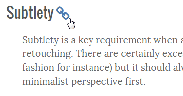
In the articles you can now get a direct link to a heading section by hovering the mouse pointer over a heading.
The link will become visible at the end of the heading (as a link icon):
The link becomes visible when hovering over a heading.
This lets you now link directly to that section.
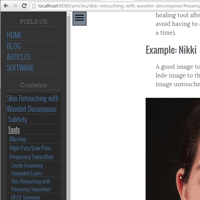
So I can now link directly to content deep into the page itself, like this link to the Nikki example for skin retouching.
These are the same heading links that are used for the Contents navigation pane on the menu:
This method of exposing a heading link is similar to what you may find on GitHub for instance.
So, at least there’s now the ability to deep-link into articles as needed! :)
This poor article has been in the queue for what feels like forever, so it’s nice to finally be able to publish it.
This particular article is a combination of many of the previous things I had written around using wavelet scales for retouching work.
If you get a chance to read it, I’d love to hear what anyone has to say about it!
I’m still experimenting with the look and feel of the articles index page.
If you follow that link you’ll see one of the ideas I currently have for laying it out.
I’m not 100% sold on this layout yet, as it may get cumbersome with many articles at once.
I may also provide links at the top of the page for particular content (tutorials, showcases, by tag/software, etc…).
Speaking of which, I’m wondering from a content management standpoint if it makes more sense to publish every item on the site as an “article”, then to handle the categorization and display as a function of tags/categories on the posts.
Not quite sure just yet.
I’ll still need to fiddle with some other layout/organizational ideas.
I finally also fixed the path problem when generating the blog post listing page.
I had a problem where locally referenced images for a post (relative to the post directory) didn’t have their paths updated when showing them on the blog index page.
So I took some time and repaired it with a small handlebars helper function.
For instance, the Deep Thoughts image at the beginning of this post wasn’t showing correctly from the blog index page before I fixed it.
100 years since its publication, Hermione Lee discusses The Voyage Out by Virginia Woolf.In discussion with Thea Lenarduzzi from the TLS.Find out more: www.the-tls.co.uk
I hate when things take me away for a little while, but won’t make any apologies just yet for having little activity here!
It’s mostly a one-man show here at the moment so I do beg for some patience as I build things out and get articles together.
I have been giving some thought to the general site structure lately.
I thought it might be fun to talk about it briefly.
My original (and still current) intention for the main piece of content for PIXLS.US is a tutorial.
It’s the main type of content I was writing on my blog as well as what I’ve been trying to update on http://www.gimp.org/tutorials.
It’s a nice, known quantity…
So I spent my early time building the site focusing on the layout and design of tutorial pages.
Fonts, sizes, weights, layout, and more.
It’s just the way I think.
Plus, if I did a decent job on this layout, I could not worry about fiddling with it later and instead focus on writing.
I finally ended up with a layout that I liked (basically what you’re reading on right now).
The problem was, I wanted a bunch of tutorials, not just one!
So with a little work and the help of some contributors (yay Ian Hex!), I was looking at a few different tutorials now for the site. Yay!
The problem now was that I needed to create a nice page to help guide users to the various tutorials.
This is still not done…
So here I am at the moment still working on how best to showcase the neat tutorials on an index page of some sort:
I need to find an attractive and usable means of listing the various tutorial articles.
So this is one of the things that has been taking up some of my time.
The main page has also been occupying some of my attention,
as I’m not 100% sure how to present all the site information (tutorials, blog posts, showcases, etc…).
There’s kind of a running theme here I guess.
I’m also going to be trying to produce some “Showcase” type of article posts that will highlight a F/OSS photographer or images.
The blog pages I’ve already finished (it’s what you’re reading now).
I’ve also mostly gotten the index pages for the blog in a workable state.
I took some time recently to paginate the blog index pages as well so as to not try to load the entire post history on a single page.
To summarize, there are a few things yet to design and code.
I’m working on getting them so we can have an actual launch.
Main Page
I still need to design and layout how best to show off the site content.
Tutorial/Articles Page
This is another page to design and layout.
I have some ideas and neat content already written, so this is just designing the page.
Showcase Pages & Index
These pages will be functionally the same as the article pages, but the content will focus more on showcasing FL/OSS artists and their works.
I’ll categorize these pages differently so I can collect them on their own index page separate from the tutorials.
So, things are moving along (albeit slower than I would like).
I’m building the scaffolding for the future, so I don’t feel so rushed.
Better to do it well than quick in my opinion.
Also, if anyone would like to immortalize themselves on the early pages of an experimental website to bring high quality tutorials and discussions to the the Free/Open Source Imaging world – well then you know where to turn: pat@patdavid.net.
Ruth Scurr talks about her unconventional approach to writing a biography of John Aubrey, the seventeenth-century biographer most famous for Brief Lives.In discussion with Mika Ross-Southall from the TLS.Find out more: www.the-tls.co.uk
Michael Caines reads a selection of verses by the seventeenth-century poet Robert Herrick, as well as a remarkable and little-known elegy by the diarist John Evelyn.Find out more: www.the-tls.co.uk
Just before the holidays Ian Hex sent me his finished tutorial to post, and I just finished editing it.
It’s a wonderful look at using Luminosity Masks in darktable for targeted adjustments. (Parametric masks in darktable-speak).
You can find the new tutorial here:
On a side note, I had previously written about doing Luminosity Masks in GIMP on my personal blog, and yes I will be porting that tutorial here a little later!
I am still working on the Wavelet article (I took a break to copyedit Ian’s article).
I am continuing my work on that article as well as taking a rudimentary first stab at an article index page (or possibly a variation for a main landing page for the site).
Just need to decide on an attractive and functional layout for presenting the list of articles we have available.
I’m also open to suggestions if any of you readers out there have seen something that you think would be appropriate or neat to consider…
I am also open to taking submissions from folks who may have the mental fortitude to write something for the site.
Just shoot me any ideas/sketches/outlines you think may be appropriate!
(pat@patdavid.net in case you didn’t already have it…)
Luminosity Masking, the ability to create selections of your image based on its specific tones for ultra-targeted editing, is a relatively recent concept favoured by landscape photographers the world over.
In this article, we will explore how to create and use Luminosity Masks in the F/OSS RAW editor darktable, so that you can make adjustments on your RAW files to isolated tones.
What is Luminosity Masking?
Luminosity Masking is a technique developed in the last 10 years or so primarily by American Southwest landscape photographer Tony Kuyper over at goodlight.us.
Tony provides extensive writing and information on Luminosity Masking and how to create Luminosity Masks; in this article I’ll be primarily focusing and creating and using the masks in darktable, but if you want to really understand the basics I highly recommend giving Tony’s guide a good read over first.
In essence, Luminosity Masking is about creating highly specific selections of your photo based on the tones of the image itself.
This enables you to have extremely fine control over what parts of the photo are selected to make adjustments on (such as contrast, saturation etc.) whilst keeping other tones of the photo completely unaffected.
Let’s quickly illustrate this with some screenshots.
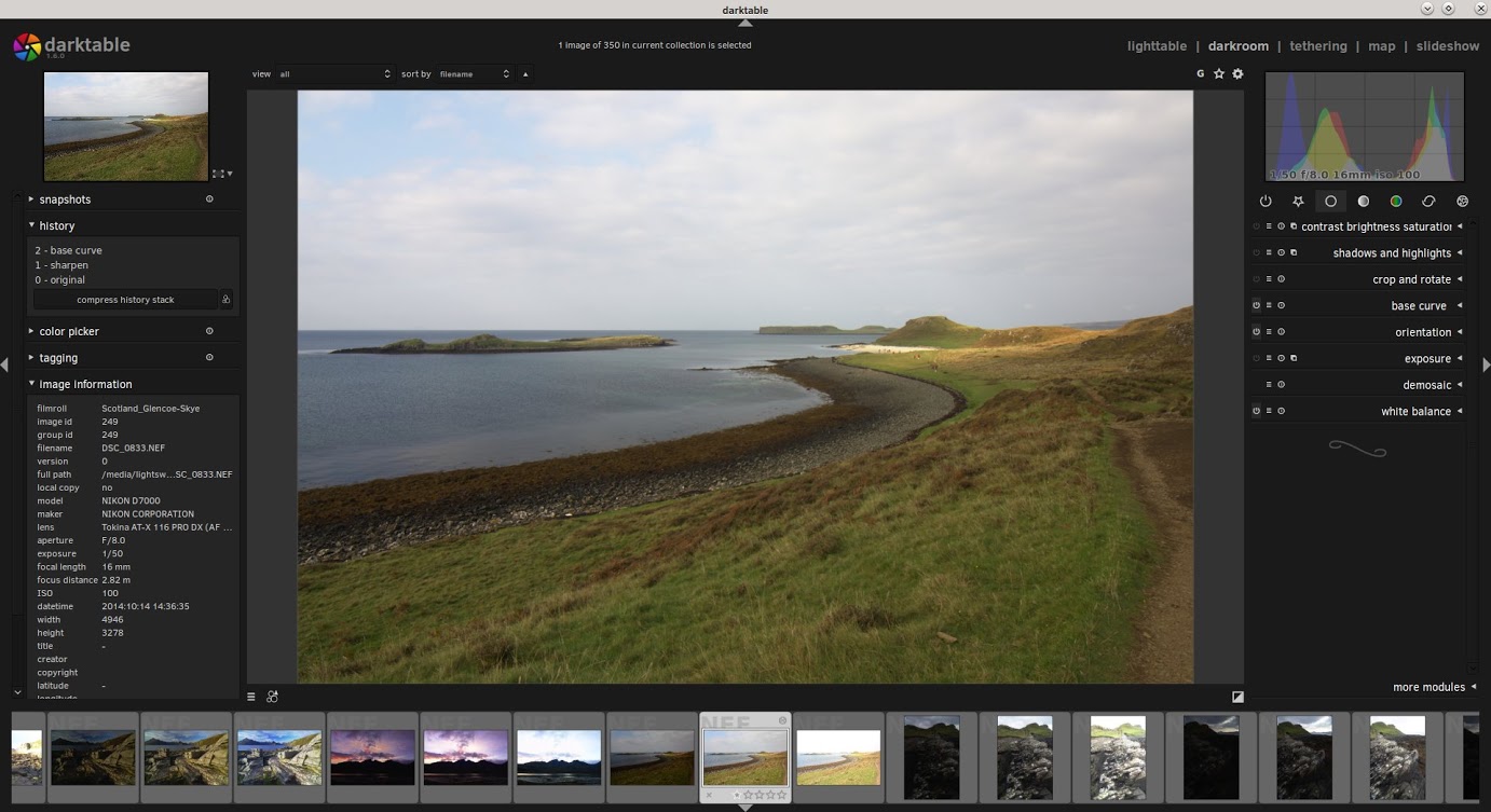
Here’s a shot I got of the Coral Beach on the Isle of Skye, Scotland, when my partner and I toured there recently in October 2014.
It’s a pretty solid exposure. Let’s have a look at the histogram.
This article assumes you already have a basic understanding of histograms and how they work but I’ll give a quick summary here: the histogram represents the tonal information of your photo.
It’s a graph of the light.
On the left-hand side of the histogram is where all the Shadow information is, all the darker tones of the image.
On the right-hand side you’ll find all the Highlight information, the brighter tones.
And therefore, towards the middle of the histogram, is where all your midtones are located.
The taller the graph is in a certain section of your histogram, the more information there is.
So for this photo, you can see that we have a lot of shadow and highlight information, but hardly any midtones.
We’re also not clipping (losing information) any shadows and highlights as well i.e. the graph isn’t flattened against either side of the histogram.
So we’ve got plenty of room to work with here.
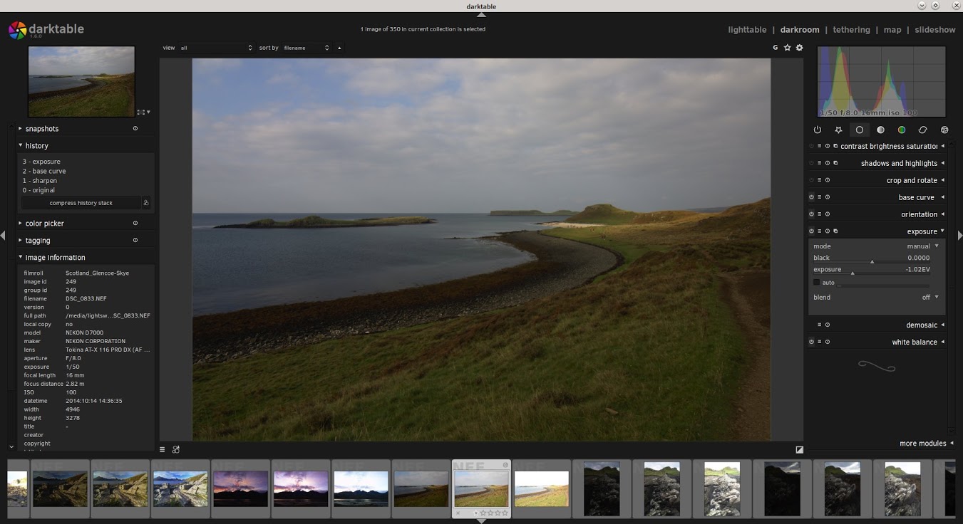
So let’s say that I feel the sky is a little too bright and I want to darken it.
The day was quite overcast at this point and the sky in this image feels too washed out.
Let’s darken it by dropping the exposure.
Now we’re starting to see some more definition in the sky but the image overall feels too dingy and dark.
Let’s look at the histogram.
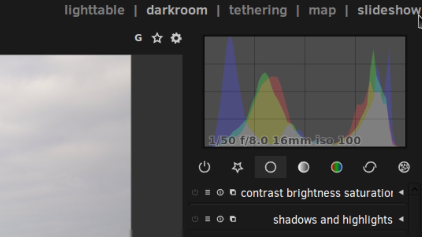
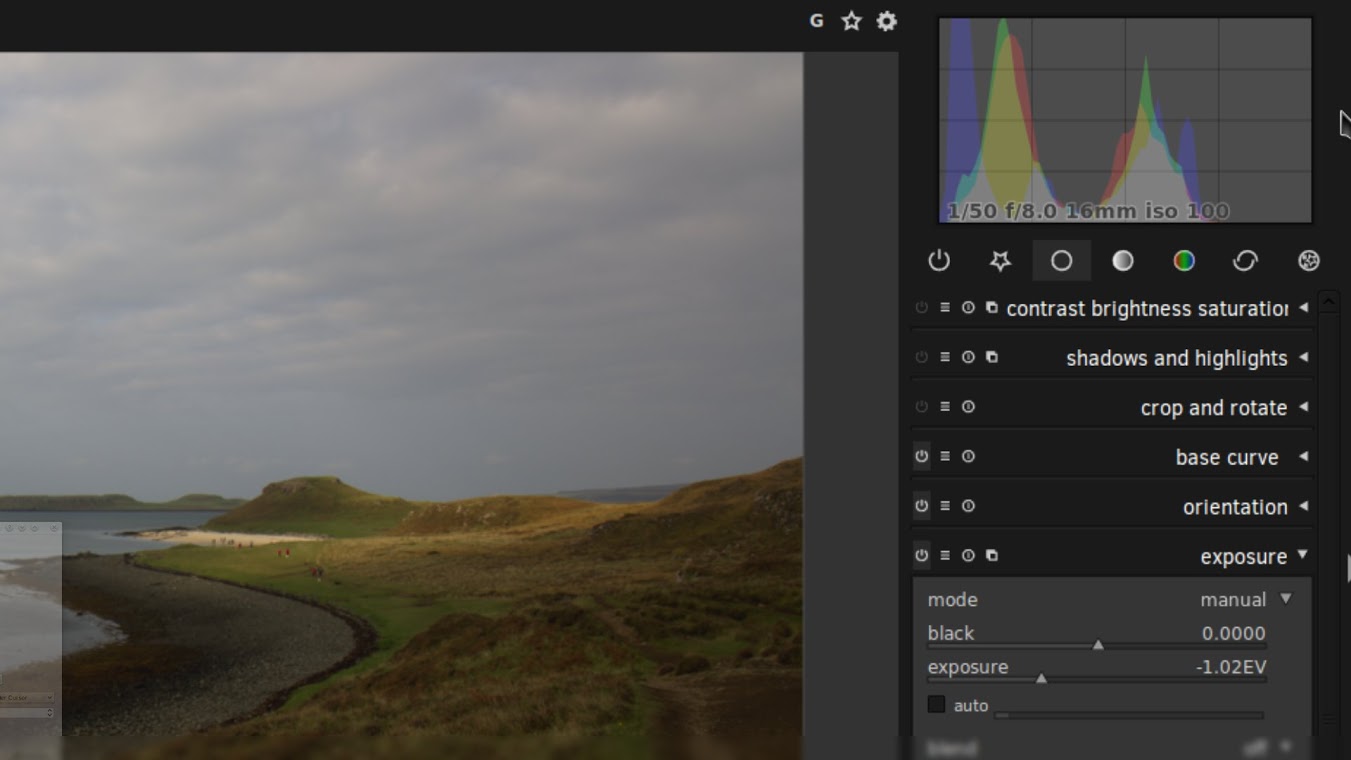
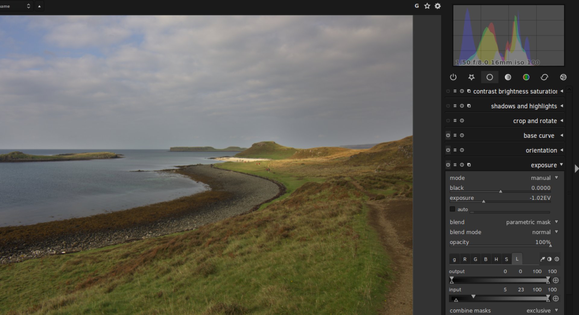
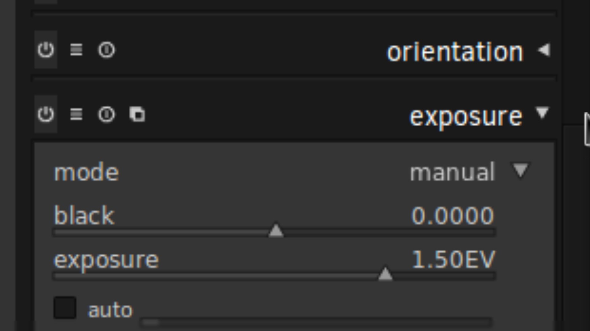
As you can see, underneath the histogram I have the Exposure module open and I’ve pulled the exposure of the photo down by -1.02EV, darkening the image.
This is reflected in the histogram.
What was previously highlight information has been brought down so that it now resides in the midtones of the photo.
This has brought back some definition and colour to the sky but now the rest of the photo is too dark; you can see on the histogram that the shadow information is bundling up on the left-hand side and we’re in danger of clipping the shadows, that is, losing information, which would result in blotches of pure black in the photo.
Not good.
How do we get around this? Well, we create and use a Luminosity Mask that selects just the highlights in the photo, mostly the sky, but leaves the rest of the photo alone, keeping the shadows where they are.
Here’s the result of using a Luminosity Mask to darken just the highlights in the photo.
Much better.
We’ve darkened the highlights, the sky, bringing back some colour and definition but have left the shadows, the beach and grass, well alone.
Let’s see how our histogram is doing.
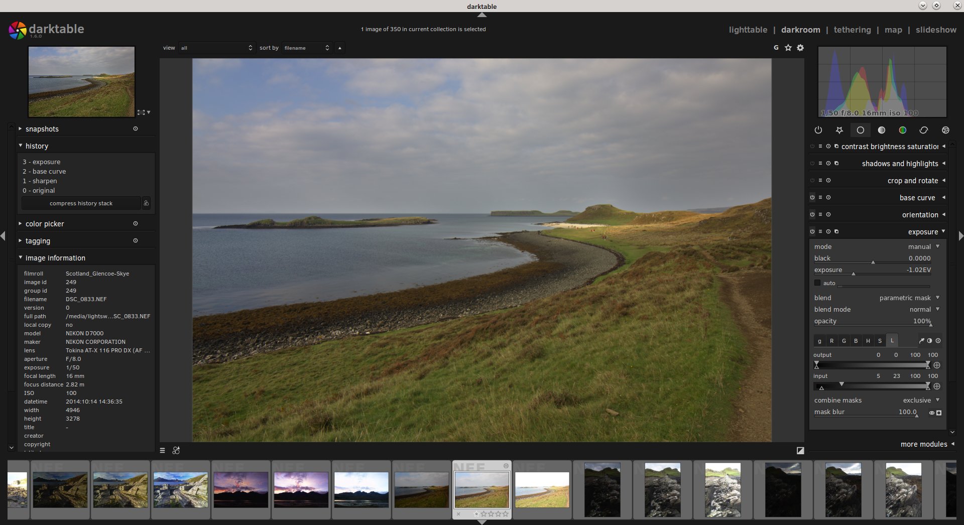
Once again, I’ve opened up the Exposure module and dropped the exposure of the photo down to -1.02EV but you can see that the module looks a little different this time.
That’s because I’ve applied a Luminosity Mask to the Exposure change.
We’ll come back to that in a bit.
Look at the histogram in the top-right.
We’ve brought the highlights down into the midtones but kept the shadows where they are.
We can make another targeted adjustment if we want.
Let’s say that I want to brighten the shadows a little bit as well.
Ah-ha!
Now we’re bringing back some clarity and interest to the foreground, that lovely sweeping curve of the grass, beach and loch, with the hill in the distance.
Check out the histogram.
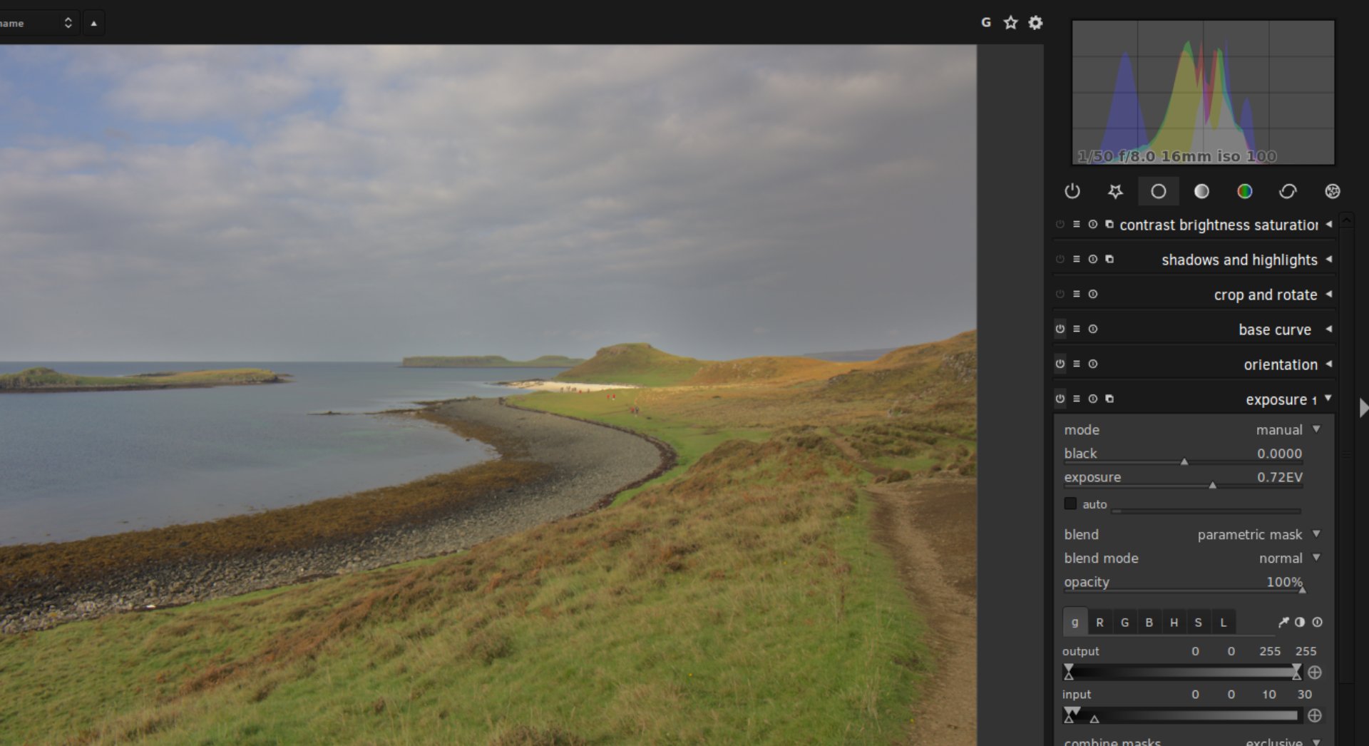
You can see at the bottom-right that I’ve made a new adjustment, known as “Exposure 1”, where I’ve increased the exposure of the image by 0.72EV.
But again, I’ve applied a Luminosity Mask to this adjustment so that the brightening effect only happens to the shadows in the photo, leaving the highlights alone.
In the histogram, you’ll note that we now have a lot of midtone information, by darkening the highlights and brightening the shadows.
Tony Kuyper talks alot about the “Magic Midtones” and for good reason: the midtones are the real meat of the photo and applying targeted adjustments to the midtones of a photo can really take your work to the next level.
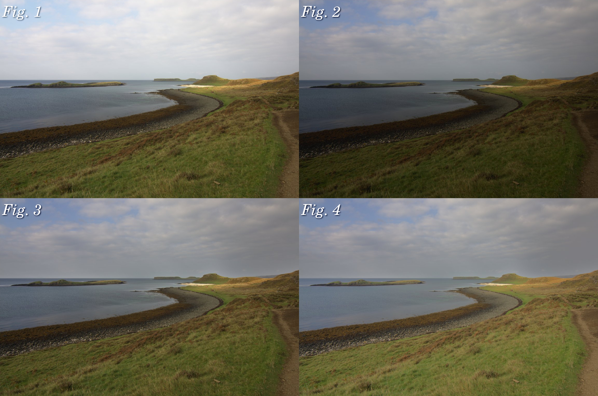
So, let’s review the changes we’ve made to this photo.
Fig. 1: Original RAW Fig. 2: Whole photo darkened Fig. 3: Highlights darkened only Fig. 4: Shadows brightened as well
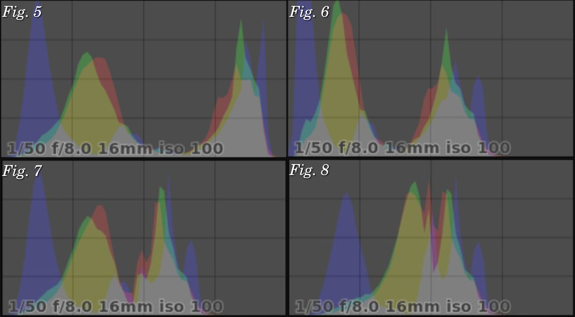
And let’s also look at how the histogram has changed.
Fig. 5: Original RAW Fig. 6: Whole photo darkened Fig. 7: Highlights darkened only Fig. 8: Shadows brightened as well
Creating Luminosity Masks in darktable
Luminosity Masking is easy to do in darktable; it’s built right in to the software since v1.4 (and now we’re on v1.6).
Every single module in darktable, whether that’s Contrast, Vibrance, Exposure etc., can have a Luminosity Mask applied to it for targeted adjustments.
Let’s demonstrate on a new image.
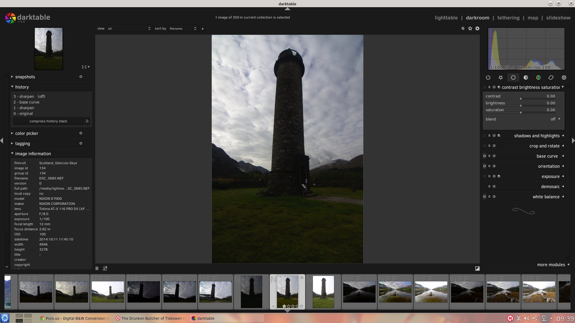
Here’s a shot I grabbed on that same tour of Scotland in October 2014, this time of the Glenfinnan Monument.
Pretty neat? If you look at the histogram at the top-right, you’ll see that I have a lot of shadow information (in fact it’s almost clipping) and I have a good range of highlight information that moves into the midtones as well.
Thankfully there’s no clipping going on but the photo is too dark, with the monument and mountains appearing almost as shadowy silhouettes against the sky.
What we want to do is to brighten up those shadows to bring back the details and colour in the monument and the mountains.
We may also do a smidgen of highlight darkening as well.
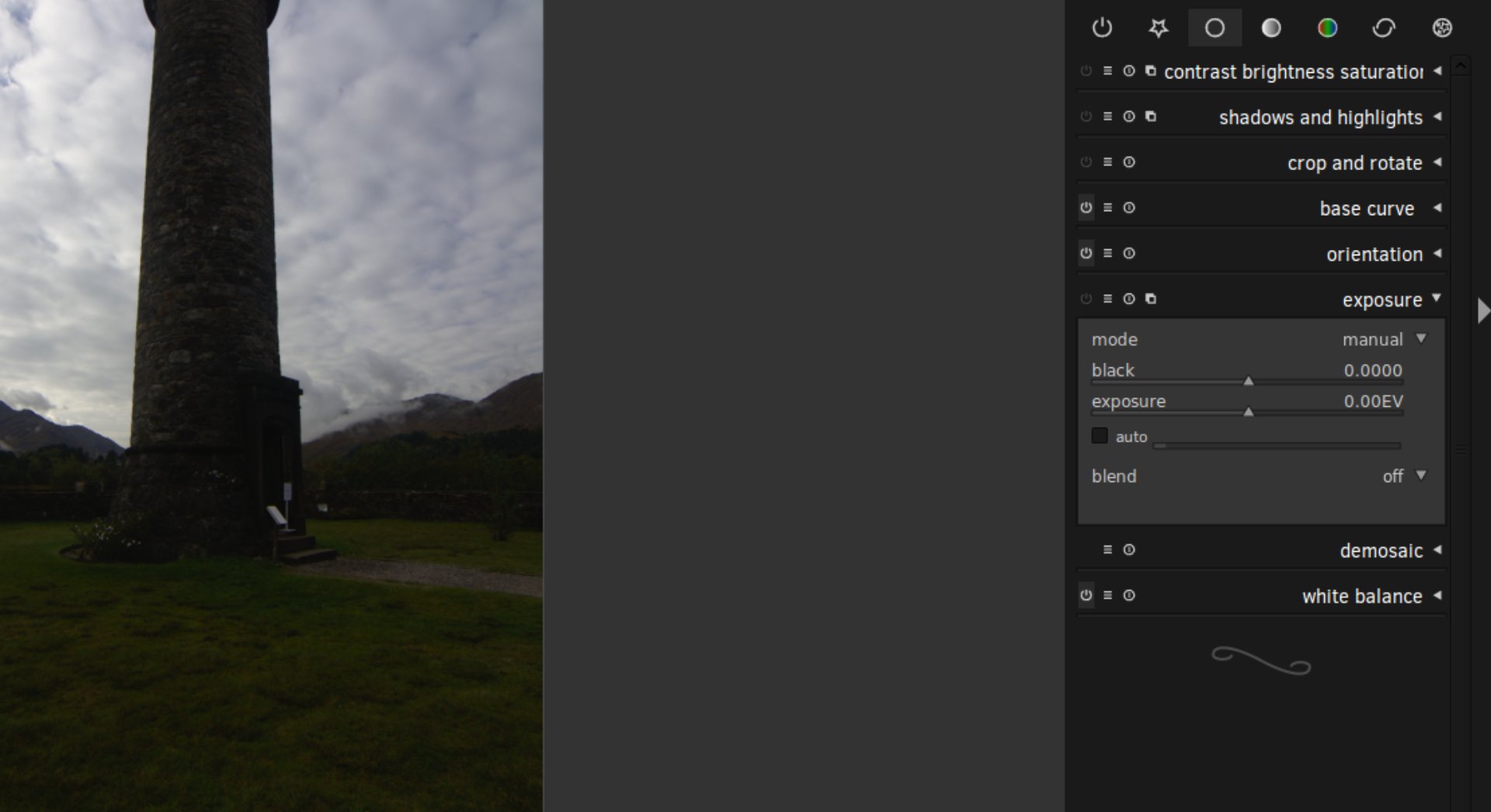
So, let’s open the Exposure module and I’ll walk us through it.
You can find the Exposure module in the Basic Group, represented by the hollow white circle icon.
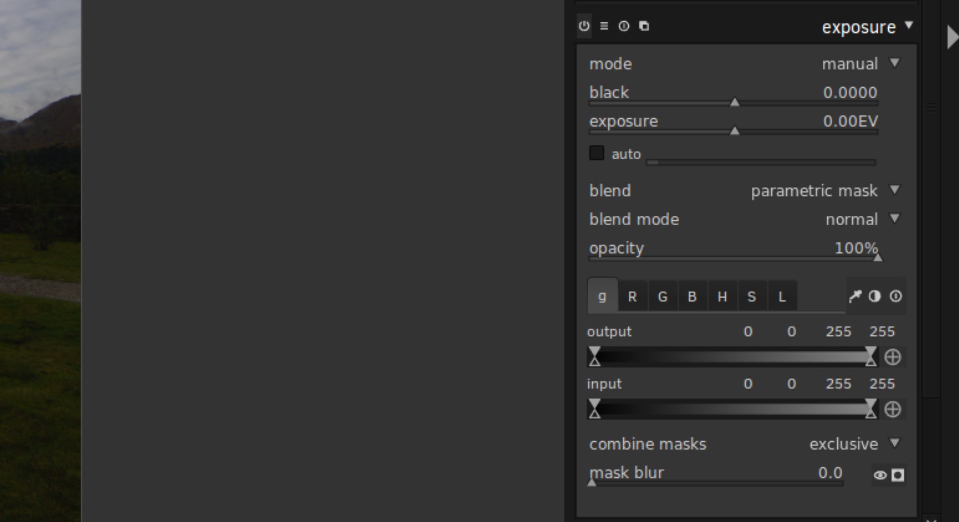
The magic we’re looking for is under the “blend” dropdown:
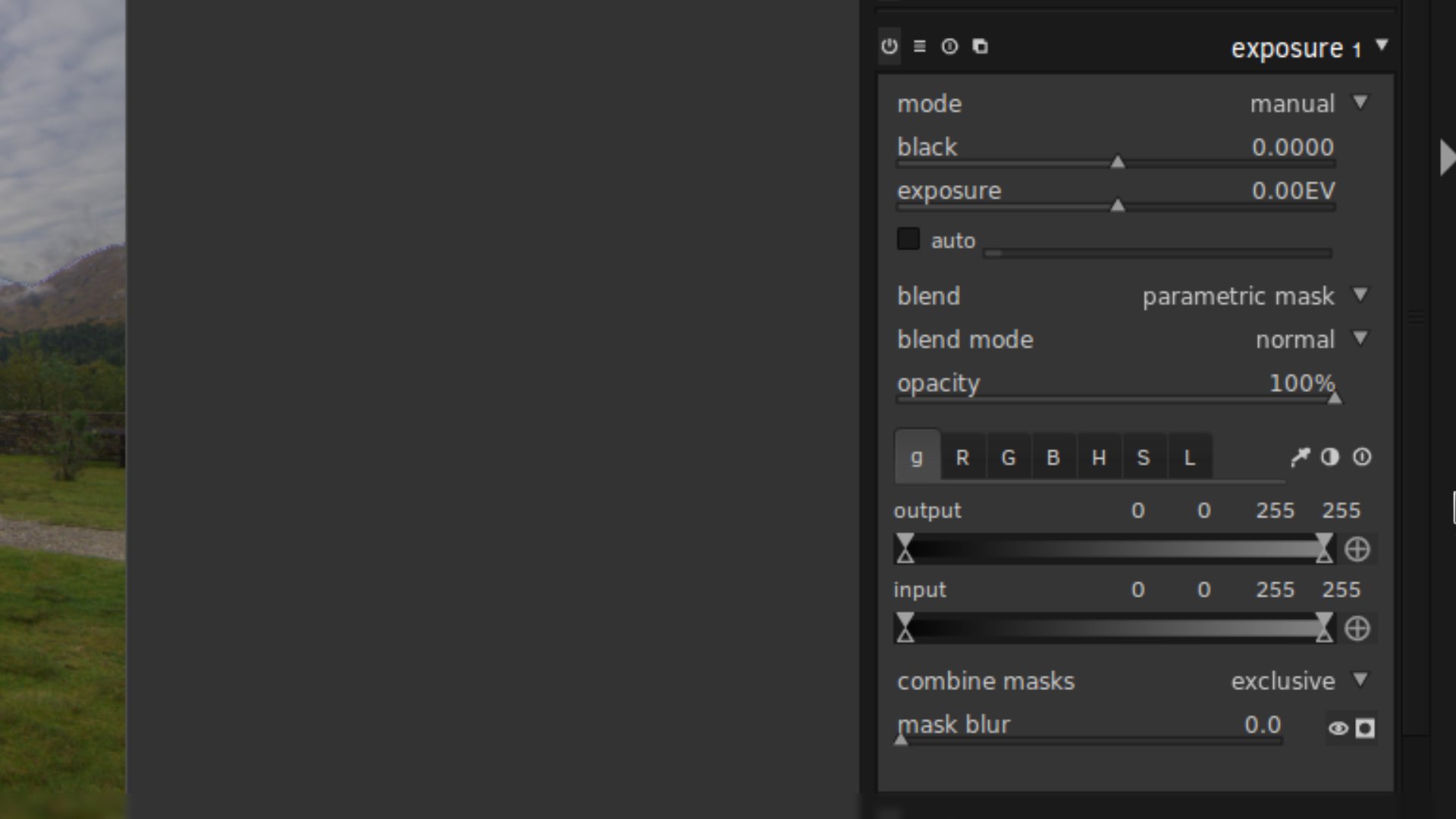
Simply select “parametric mask”.
This is where the magic is.
In my view, it should be renamed to Luminosity Mask, but that’s just me.
This is where we can create a mask of the photo by selecting just certain tonal ranges.
Now, we’re not going to go into detail on every aspect of this masking system; I’ll leave to you to experiment with.
Just note that this “parametric mask” function is available in every darktable module, so you can apply Luminosity Masks on Exposure, Saturation, Contrast, Vibrance, Local Contrast… whatever you wish.
This is neat and very powerful.
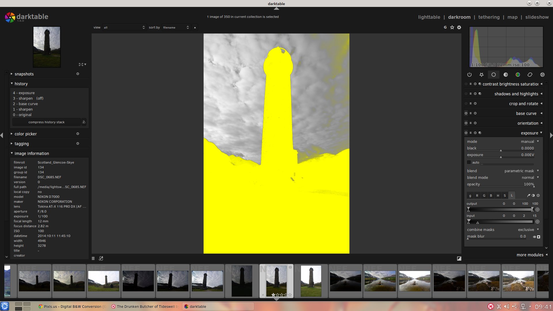
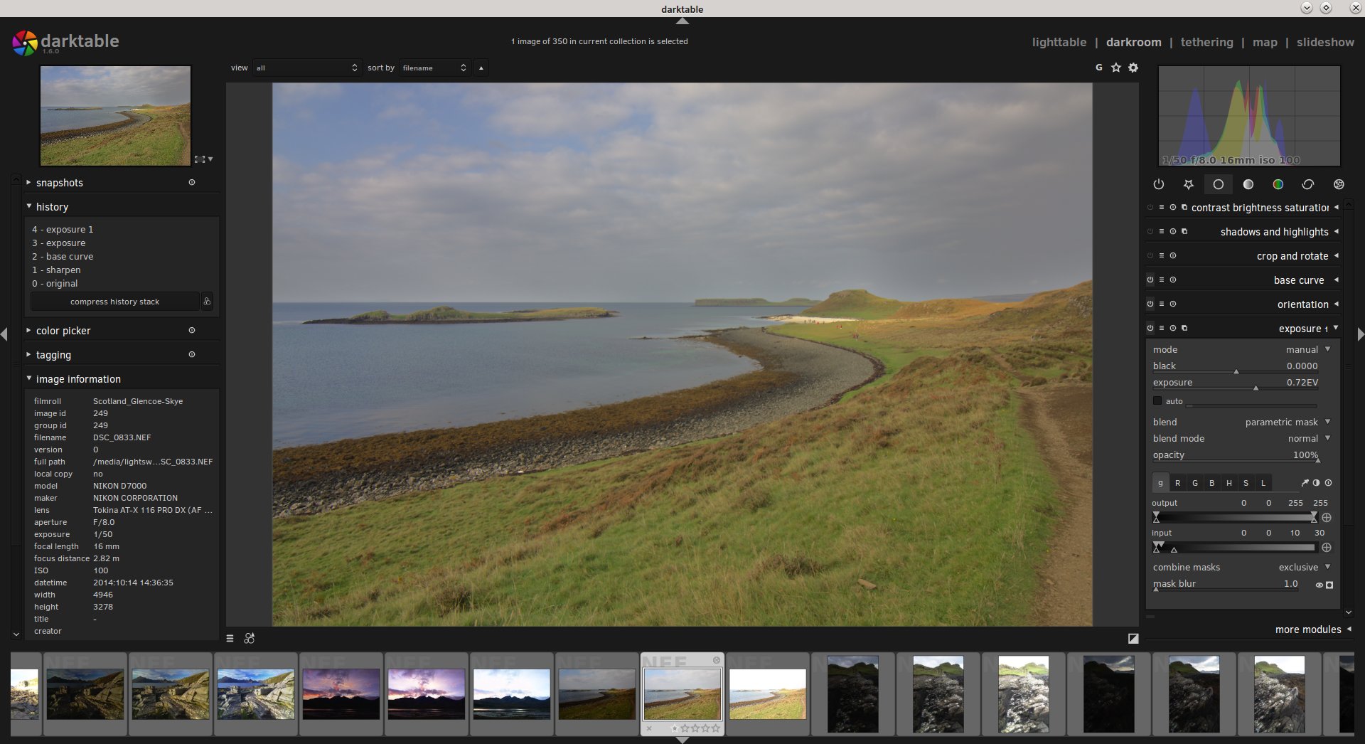
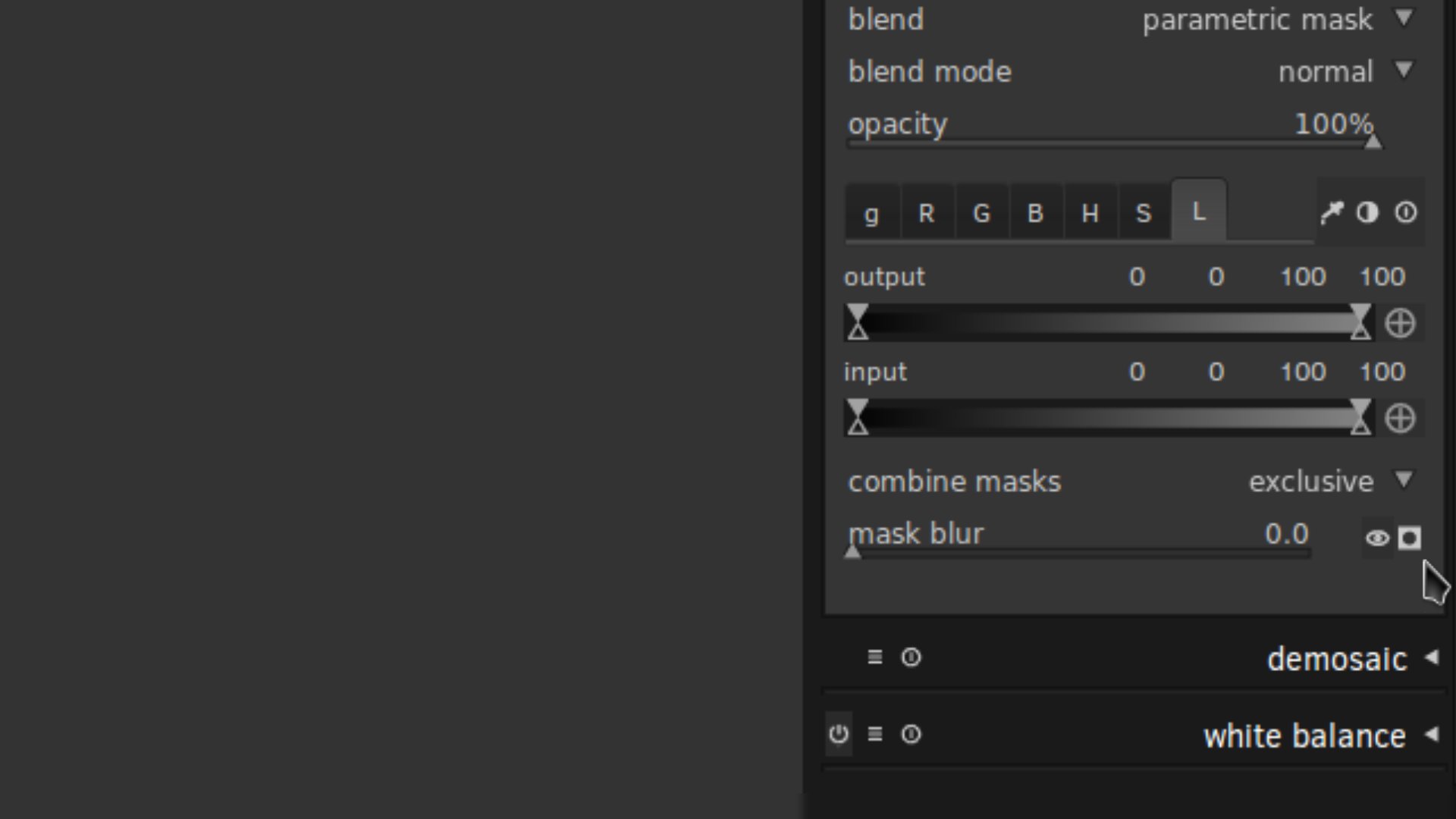
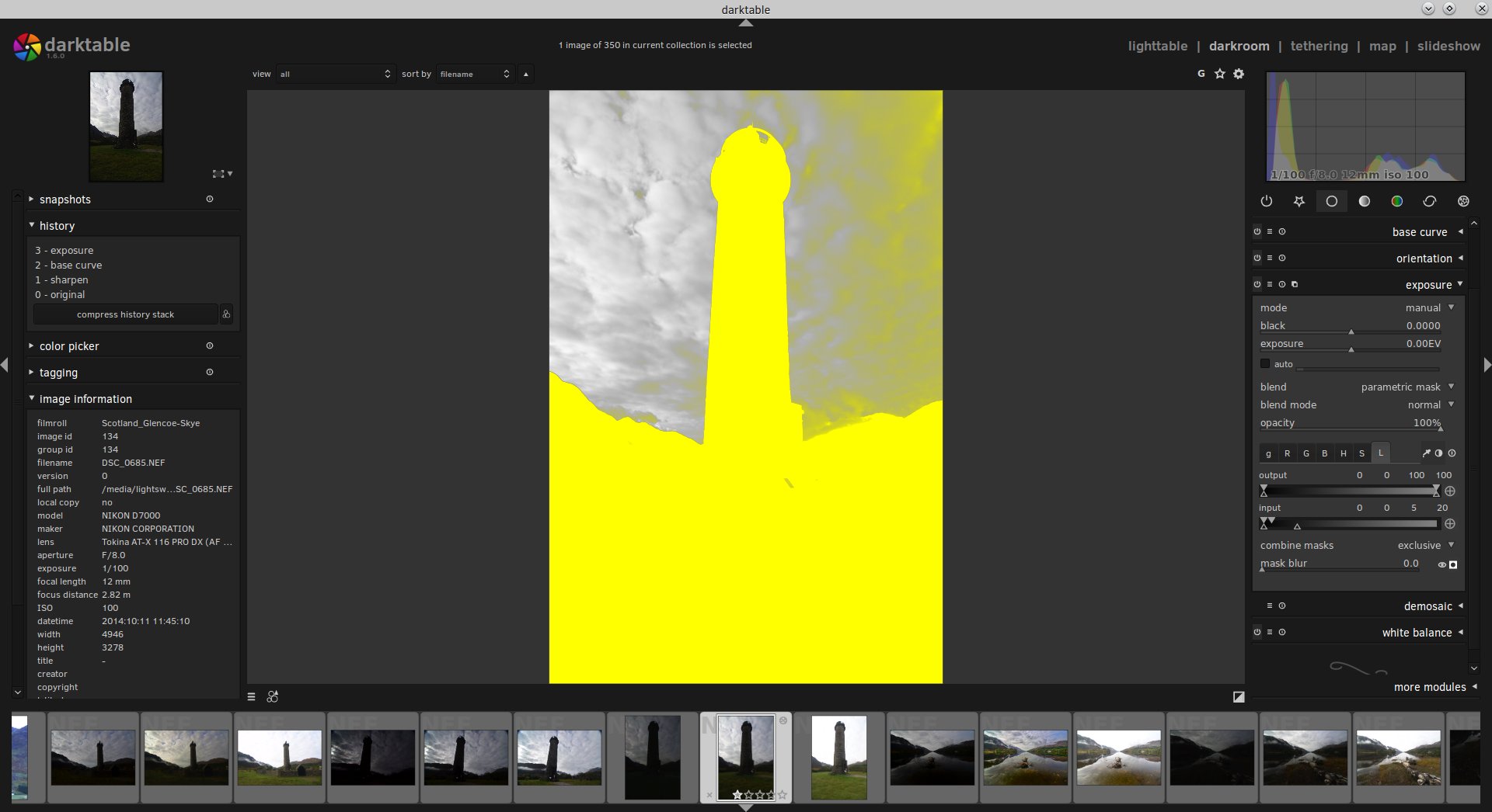
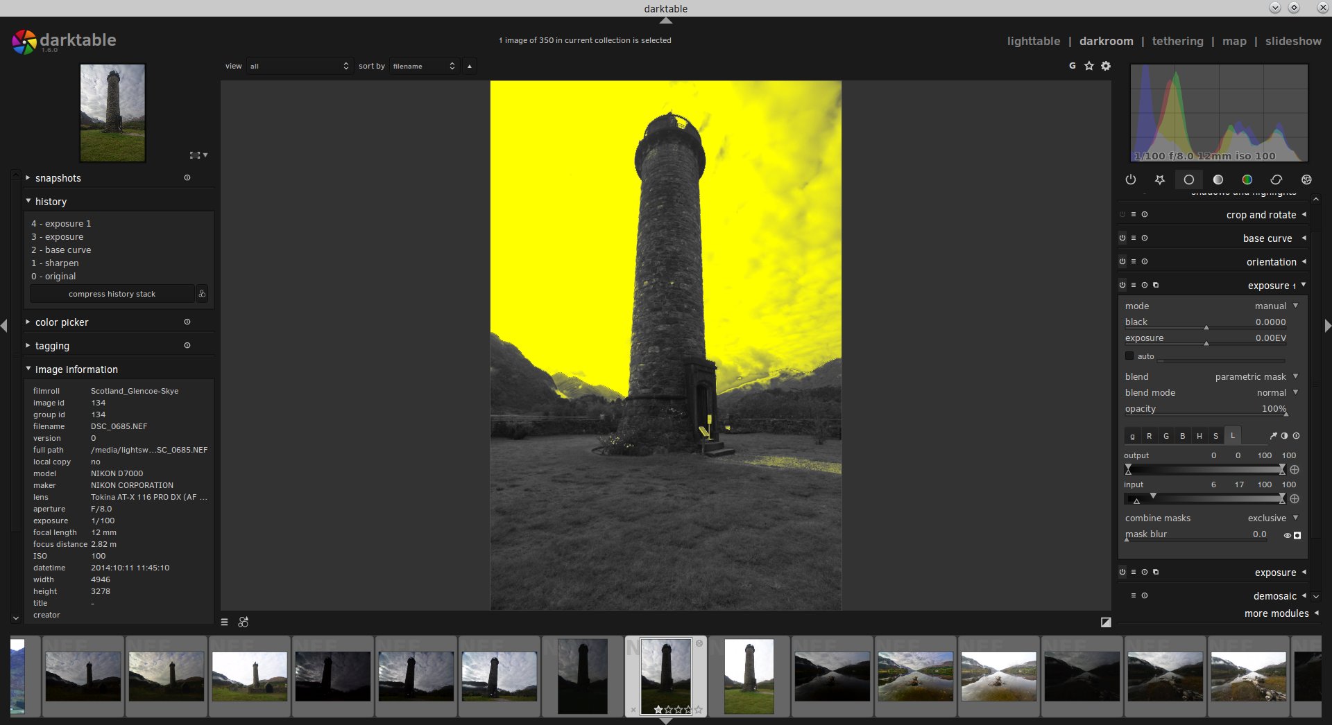
So, next step: select the “L” tab for “Luminosity” – located on the far right of the other tabs “g”, “R”, “G”, “B”, “H”, “S” — and then select the little icon that has the black circle in the white square, this will show the mask.
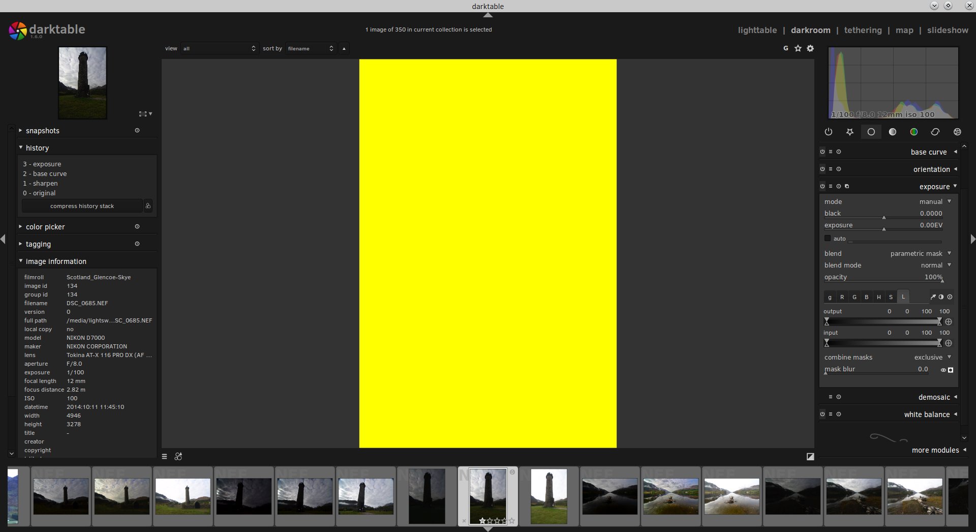
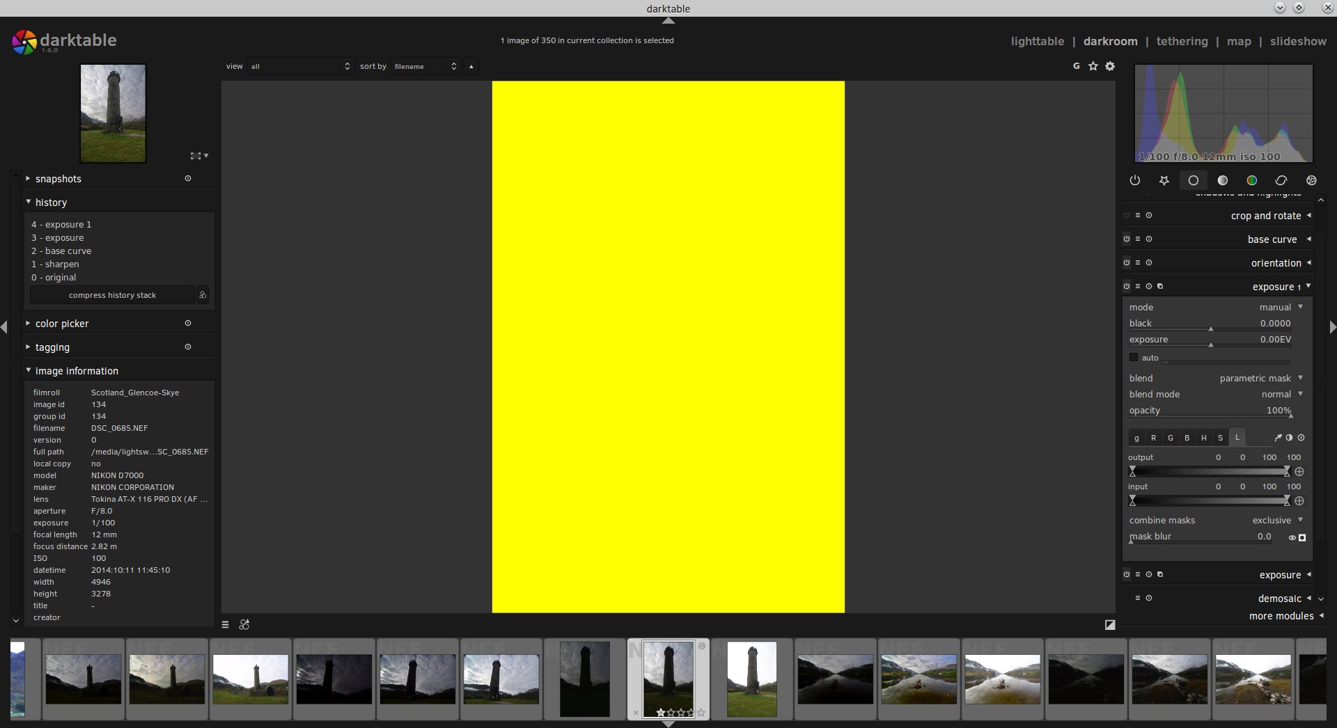
This is what your photo will now look like.
Don’t panic!
All this yellow is telling you is that, currently, any Exposure adjustment you make will take effect on the whole photo. Clearly, this isn’t what we want.
What we’re going to do is adjust the Input slider to start narrowing down our selection to just the tones we want; in this case, we’re after the shadows so we can brighten them up whilst leaving the highlights alone.
We can do this by bringing the sliders on the right-hand side of the Input slider down towards the left.
This will start deselecting the highlights of the photo as we narrow our mask further towards the shadows.
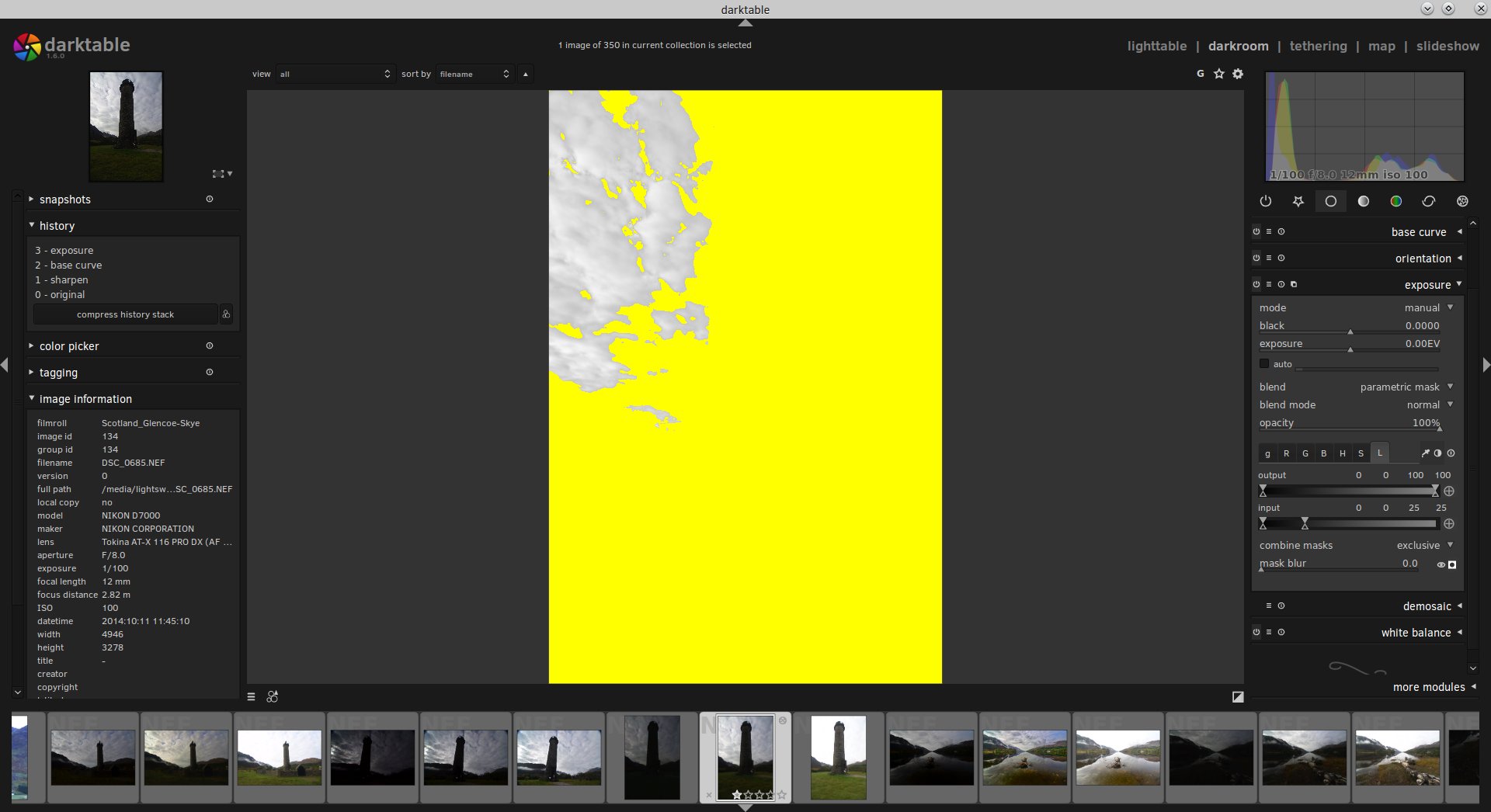
As you can see, I’ve brought the Input sliders from the right-hand side down to 25, very close to the left-hand sliders.
This is reflected in the mask, as we’re now starting to deselect some of the brighter highlights in the sky.
But we want to narrow it down further so that we’re targeting just the darkest parts of the photo: the mountains, foreground and monument.
Boom!
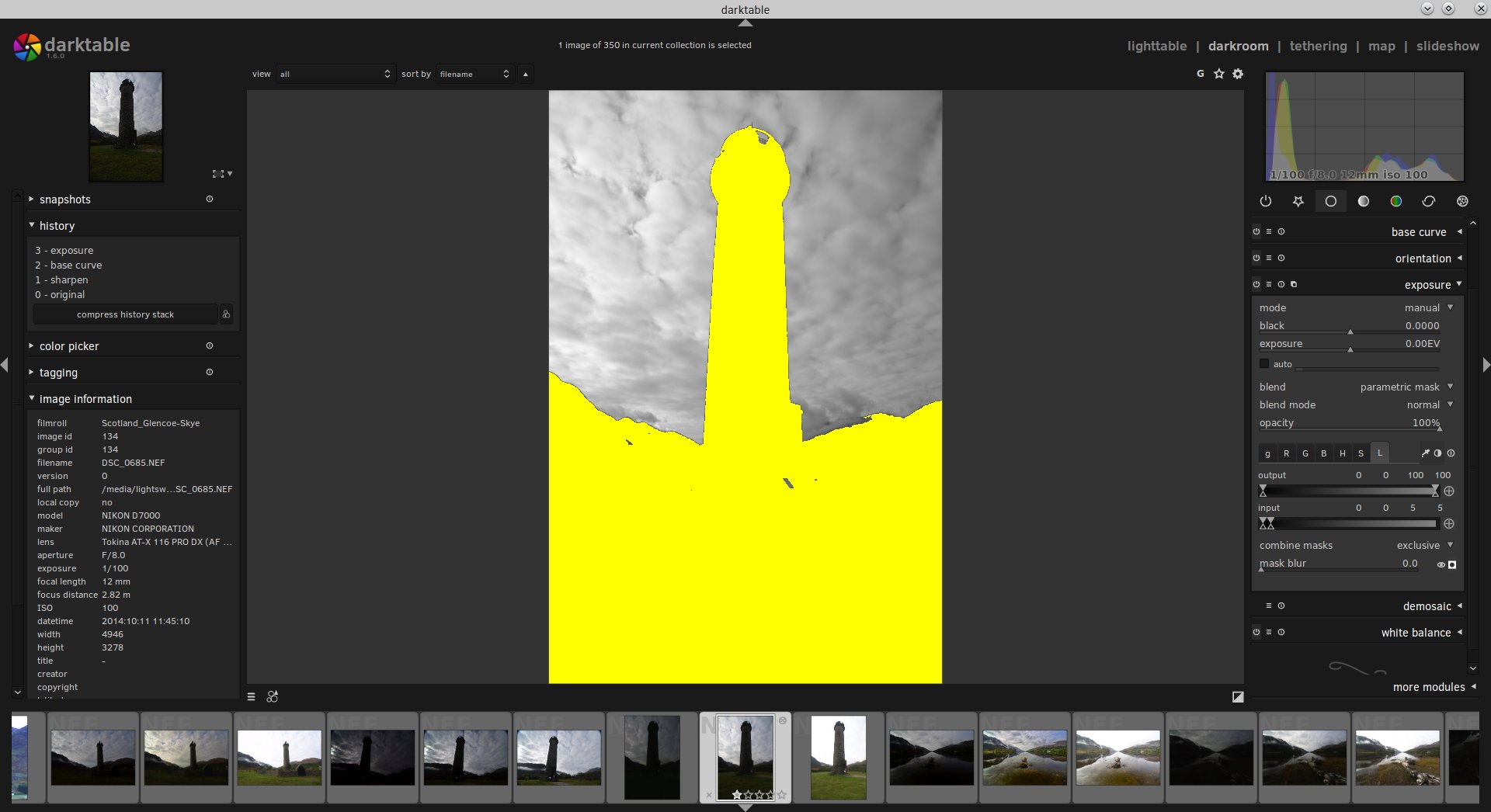
We’ve had to bring the sliders down all the way to 5 to cut off the highlights in the sky.
We’ve also managed to deselect some of the brighter highlights in the foreground as well.
Let’s just make one final adjustment to the sliders before we start brightening the Exposure.
Here, all we’ve done is move the bottom right-hand slider back up towards the highlights a little bit.
What this does is feather and soften the mask so that when we do our Exposure brightening it will look more natural and blend better.
OK, we’ve got our initial mask targeted nicely towards the shadows; hide the mask by selecting that black circle in the white square icon again.
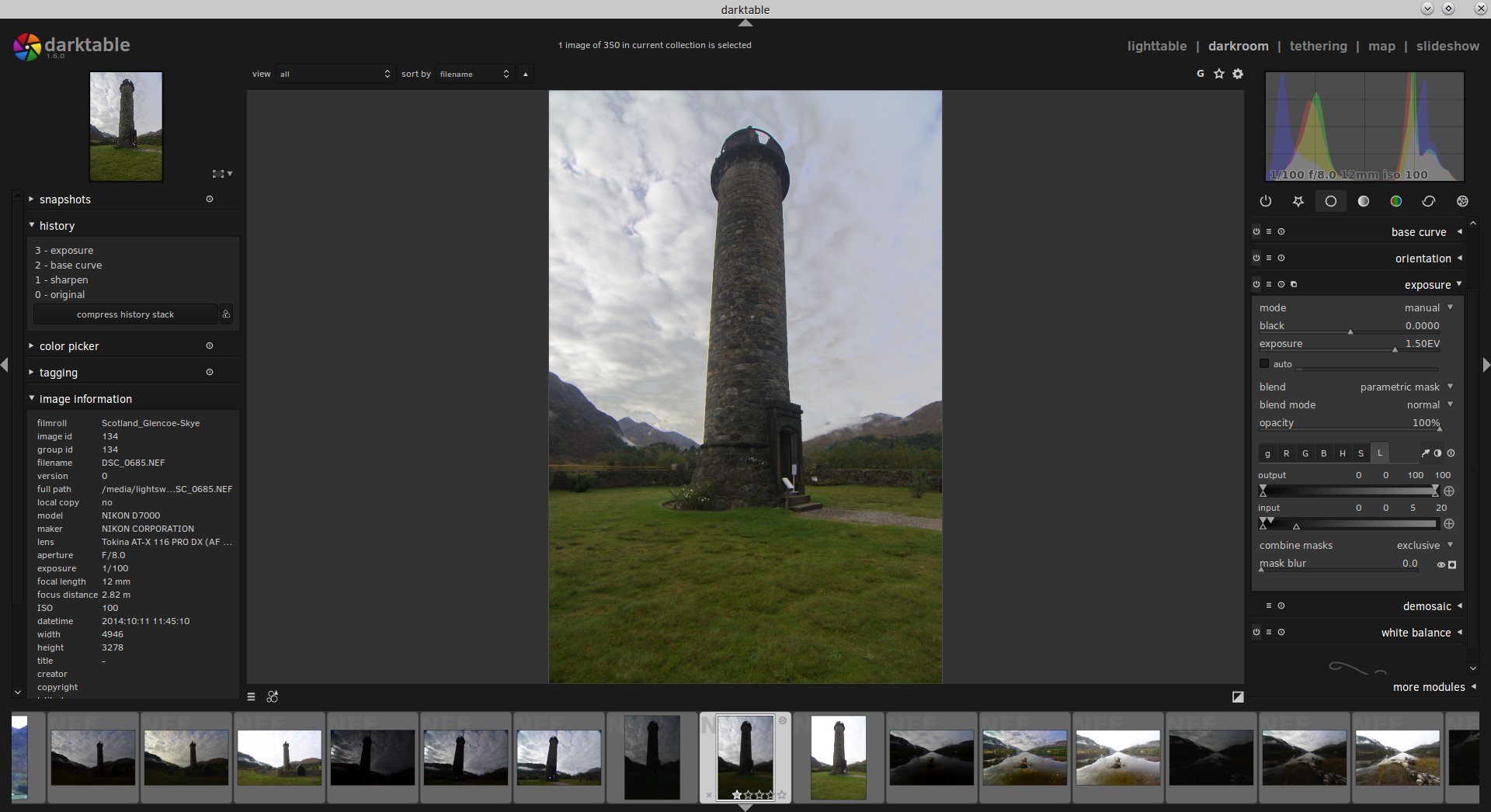
Now it’s time to start brightening up the Exposure.
Boom!
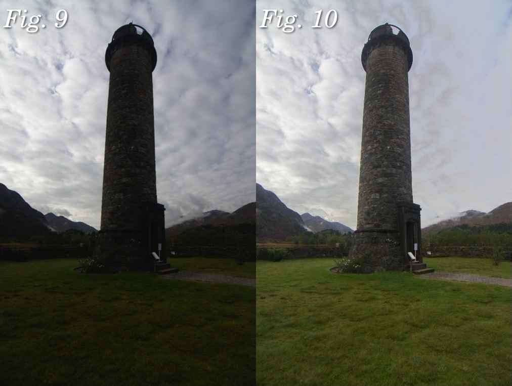
Much better. Let’s do a side-by-side comparison.
Fig. 9: Original RAW unedited Fig. 10: Foreground, monument and mountains (shadow areas) have been brightened through a Luminosity Mask, leaving the highlights in the sky alone.
Already, we’ve made a striking change to how the photo looks.
There’s now a lot more interest as our subject, the monument, is much brighter with plenty of details available.
However, we’re not quite done.
The sky to the right of the monument looks a bit… funky.
That’s because when we feathered our Luminosity Mask a bit we selected too much highlight information.
This has resulted in part of the sky getting brighter but the rest of the sky staying the same, which looks strange.
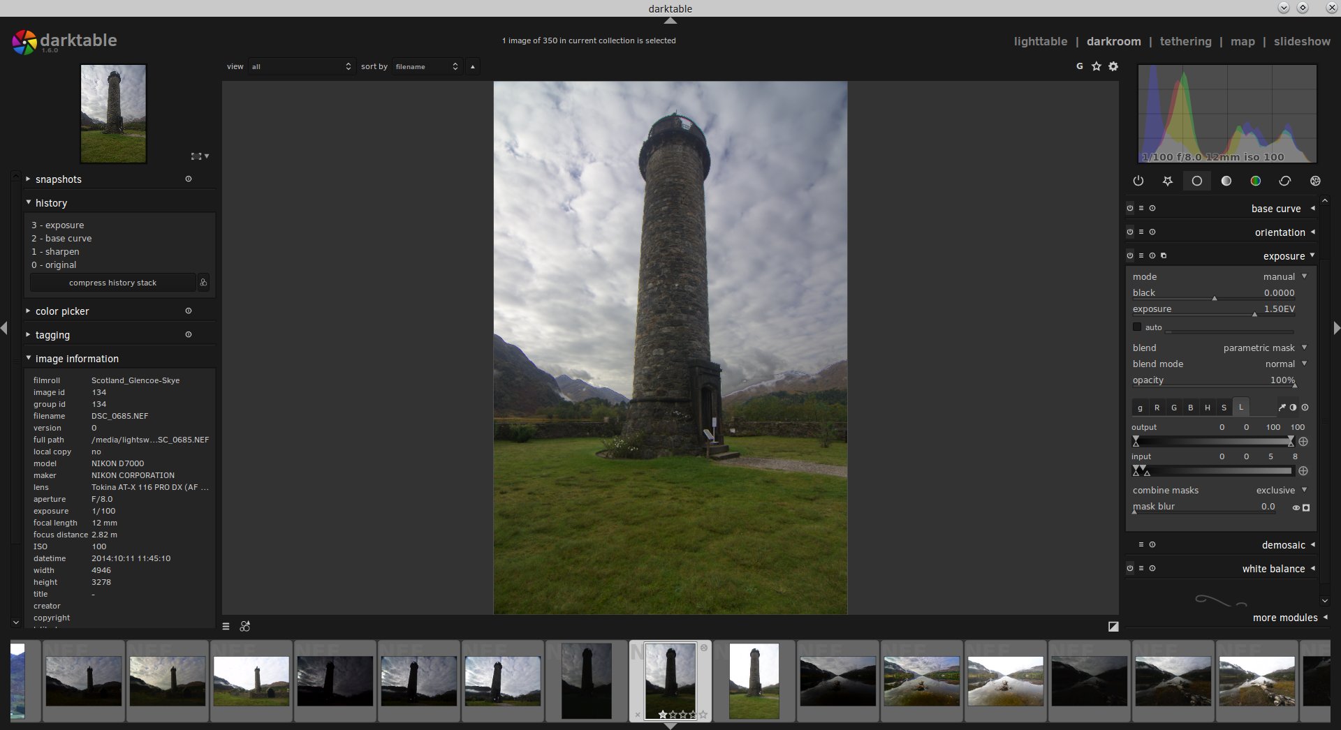
We can correct this by moving the bottom right-hand slide back to the left a bit, cutting off those highlights in the sky more.
Better.
By moving the bottom right-hand slider back down from 20 to 8 the sky looks more natural.
Already, this photo is looking a lot better.
Let’s take some of those bright highlights in the sky and darken them a bit, so that the eye isn’t distracted and focuses more on the monument.
To do this, we’re going to make another Exposure adjustment.
To the left of the Exposure module name you’ll see four little icons.
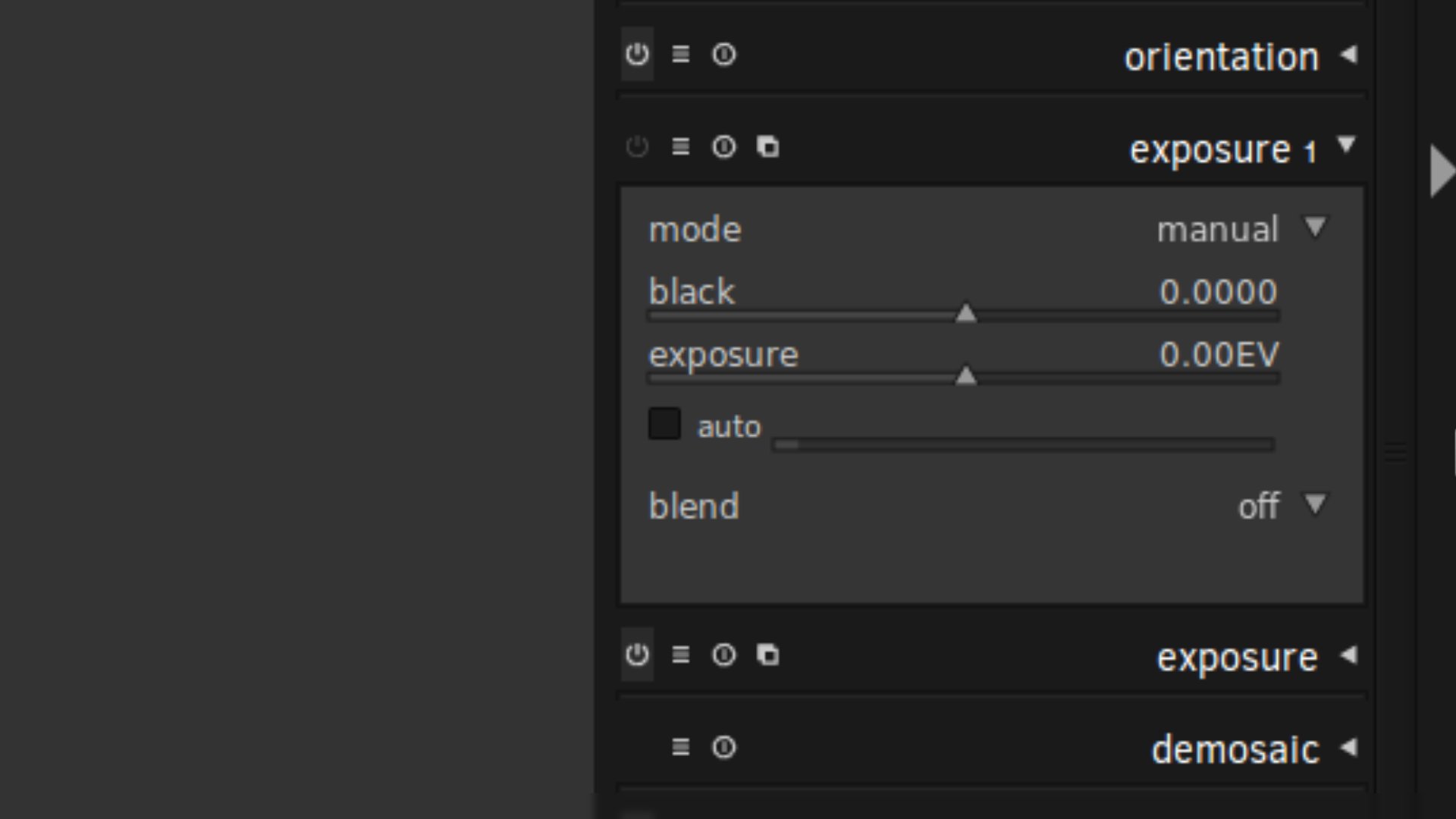
Click the rightmost one and then select “New Instance” in the dropdown that appears.
We now have a new module called “Exposure 1” that sits on top of our previous Exposure module.
With this Exposure 1, we’re going to create a Luminosity Mask targeting the highlights so that we can darken the exposure in them.
Same process as before: in “Exposure 1” select the “blend” dropdown then select “parametric mask”.
Select the “L” tab for Luminosity then make the mask visible by clicking on the black circle in the white square icon.
This time, we’re going to take the left-hand sliders and bring them to the right, slowly deselecting the shadows until we’ve targeted the highlight tones we want to darken.
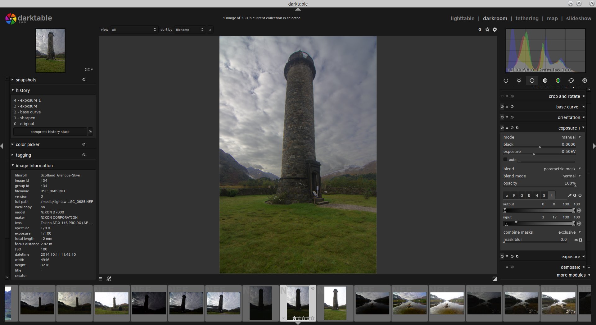
In our example, we’ve taken the left-hand sliders of Input up to 17 and then brought the bottom left-hand Input slider back down a little to 6 so that we feather the mask out for a more seamless blend.
Let’s start decreasing the exposure to see what it looks like.
Just click on the black circle in the white square icon again to hide the mask and starting decreasing the exposure slider.
Nice!
Here, we’ve brought the exposure down by -0.50EV through our Luminosity Mask, targeting the highlights and darkening them.
We’ve also tweaked the bottom left-hand slider by bringing it down to 3 for a bit more feathering.
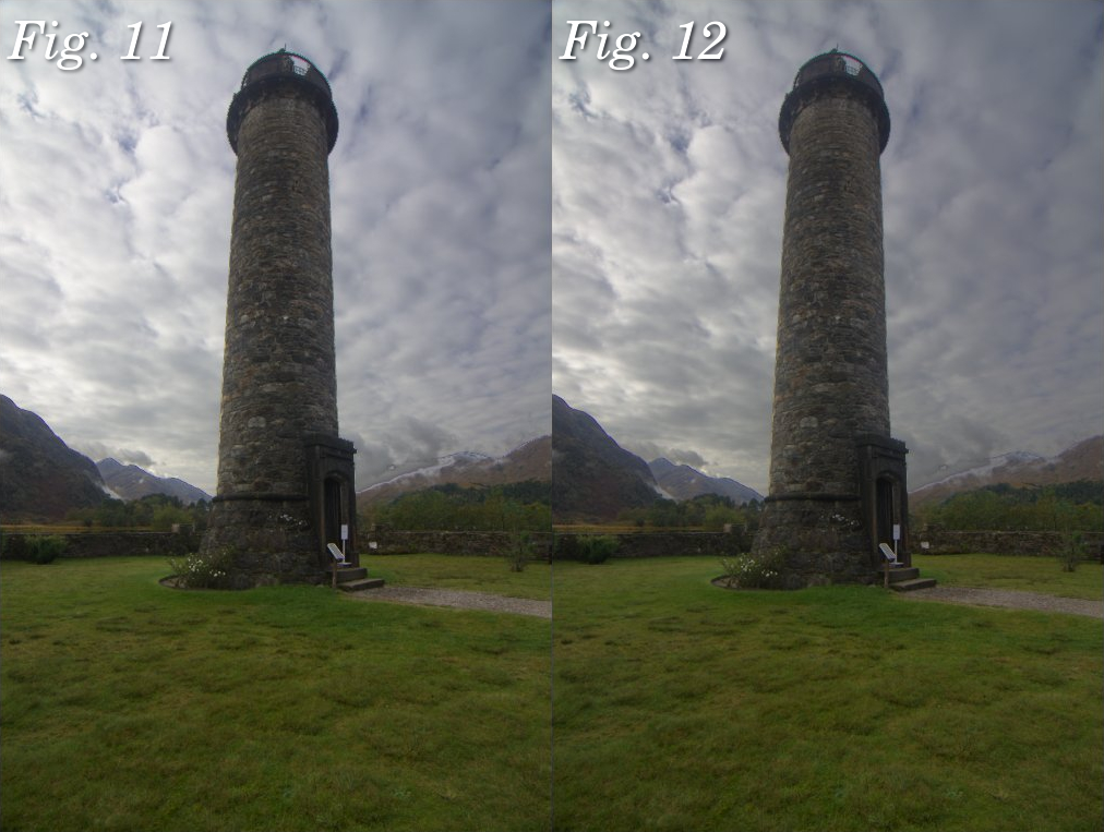
Here’s a before and after.
Fig 11: Shadows brightened only via a Luminosity Mask Fig 12: Brightest highlights darkened through a Luminosity Mask in a new exposure adjustment.
Giggedy. So this photo is starting to look pretty sweet.
Let’s just make one more adjustment, globally this time with no Luminosity Mask.
I want to generally increase the overall exposure of the photo.
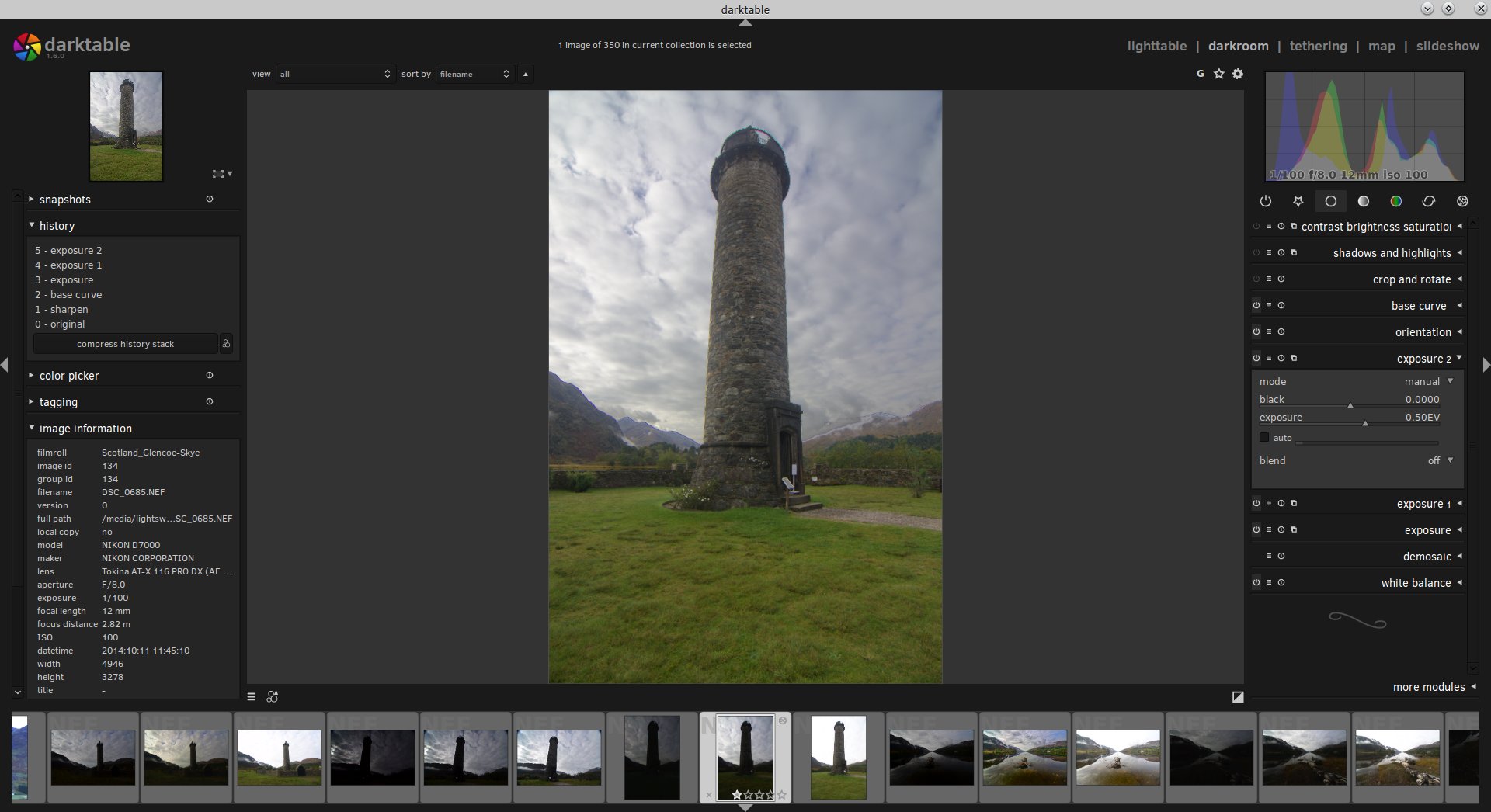
Good!
As you can see, on the right-hand side I’ve created another Exposure module, now called “exposure 2” and have increased the overall exposure of the photo by 0.50EV.
To round up this tutorial, let’s look into making one more adjustment through Luminosity Masks.
Now that we’ve brightened up the shadows and darkened down the highlights, we’ve moved a lot of the tones in the photo towards the midtones.
This is where the real meat of the image is.
We can now really give this photo some punch and pop by applying some contrast to just the midtones of the image.
Here’s how.
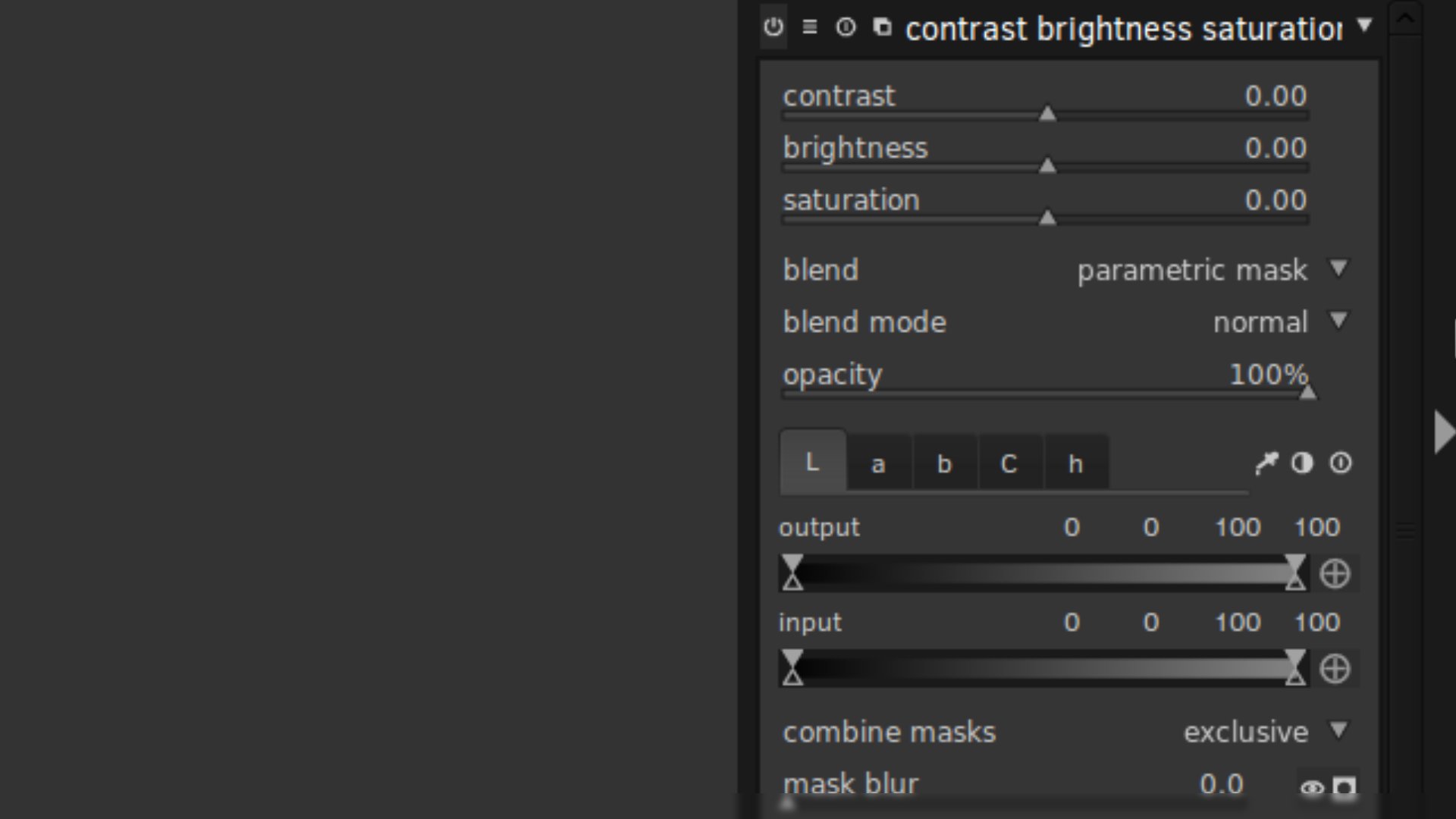
Open the Contrast, Brightness & Saturation module, select “blend” then select the “parametric mask” option in the dropdown.
You’ll note this time round that the tabs in the module—the “L”, “a”, “b”, “C” and “h”—are different to the Exposure module.
Don’t worry.
Just leave the “L” for Luminosity selected.
We’re now going to adjust the Input sliders so that we’re targeting just the midtones of the photo.
We do this by deselecting both the highlights and shadows.
This is done by moving the left-hand sliders up and the right-hand sliders down towards the middle.
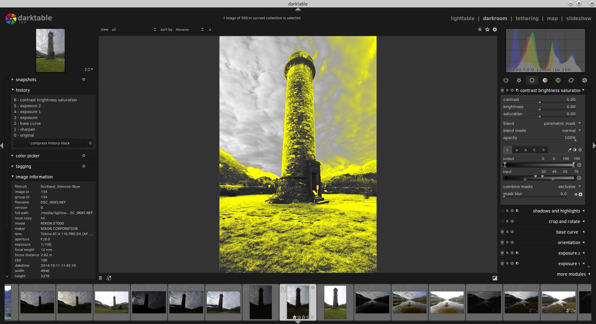
So here’s how my midtones Luminosity Mask looks.
On the right, you can see that I’ve brought the sliders towards the middle and then dropped the bottom slider of the pair away so that there’s some feathering.
This is quite a tight midtones mask but that’s OK.
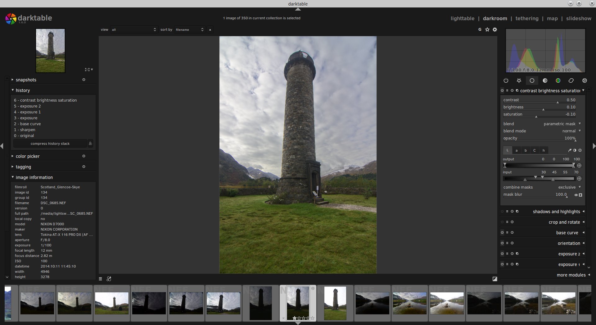
Now let’s hide the mask and start increasing the contrast.
Much better.
Because we’re only targeting a tight selection of the midtones we can make quite an aggressive contrast adjustment (I’ve brought the contrast slider way up to 50).
I’ve also increased the brightness of the midtones a little, pulled down the saturation to compensate for the contrast adjustment, and also increased the blurring of the mask to 100, feathering out the mask further for a more natural adjustment.
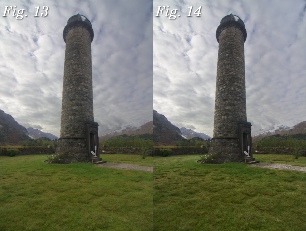
Let’s look at the before and after.
Fig. 13: Our RAW with the shadows brightened and the highlights darkened Fig. 14: Contrast increased in the midtones through a Luminosity Mask
You can see the biggest difference this contrast adjustment made was to the texture in the foreground grass and the stone detail in the monument.
You can make out the individual clumps of growth in the foreground as well as the individual tones in the stone of the monument.
Neat.
Finally, here’s an overview of the adjustments we’ve made to this photo
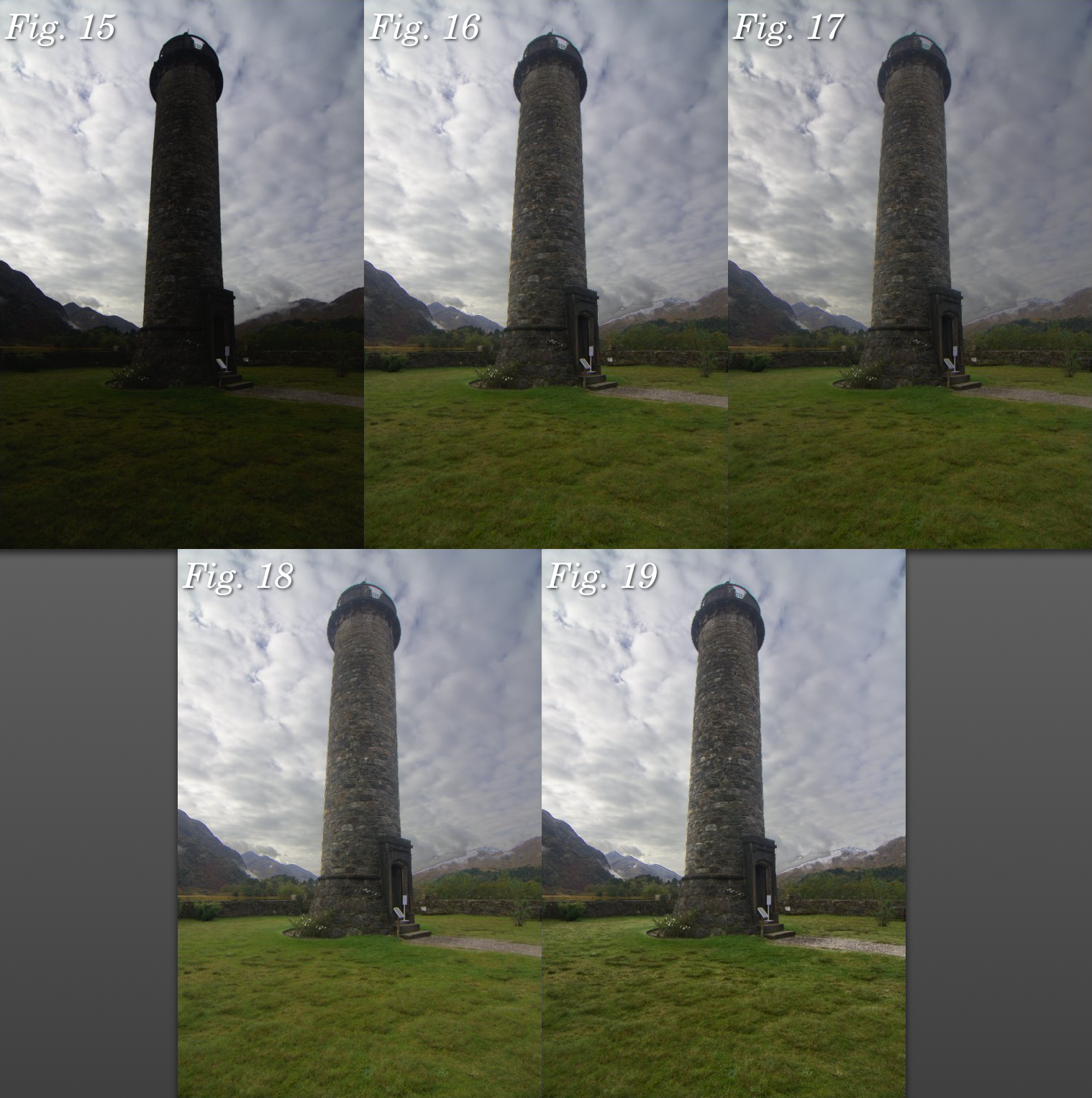
Fig. 15: Original unedited RAW Fig. 16: Shadows brightened through a Luminosity Mask Fig. 17: Highlights darkened through a Luminosity Mask Fig. 18: Overall exposure increased a little, no mask Fig. 19: Contrast in the midtones increased through a Luminosity Mask.
Conclusion
In this tutorial, I’ve only gone through the very basics of what is possible with darktable’s Luminosity Masks, so that one can make subtle adjustments to the shadows, highlights and midtones of their photo in order to balance the image better.
But Luminosity Masks can be used for so much more and so I invite you to experiment! Try out the different modules available in darktable and see how you can apply various filters through different masks to achieve highly-specific adjustments to your RAWs like never before.
Henri on Facebook: http://tinyurl.com/henrifb
Henri on Twitter: http://twitter.com//HenriLeChatNoir
Henri's store: http://store.henrilechatnoir.com/
Henri's book: http://www.henrilechatnoir.com/book/
Co-starring "Olive" as "the dog".
Music for this video is "Gone Dog", by Will Braden (the thieving filmmaker).
All new Henri videos will be uploaded here, so be sure to subscribe to this channel. Thank you for watching!
Alan Jenkins reads a selection of Ariel poems by, among others, Thomas Hardy, Walter de la Mare and T. S. Eliot, from Faber's Christmas pamphlet seriesFind out more: www.the-tls.co.uk
As I mentioned in the previous post, I’m currently working through a re-write of the various tutorials I had done about using Wavelet Decompose for skin retouching.
I’m about 2⁄3 of the way through it now and expect to have it finished shortly.
I also previously mentioned that I’ve been reaching out to a few folks to see if they might be interested in writing some articles for the site.
I’m extremely pleased to say that Ian Hex is stepping up to the plate with a neat tutorial about darktable that is being written right at this very moment!
If you haven’t had a chance to see Ian’s work I highly recommend stopping by his site at http://lightsweep.co.uk/ to get a gander at some epic images from the UK.
I desperately want to hop on a plane and visit after seeing them!
His self-professed mission is:
..to show off the beauty of British landscapes and architecture to the world
and I’d say he’s doing a bang-up job of it so far!
TLS VoicesMichael Caines considers the work of the war poet Ivor Gurney, and reads a selection from his work, including the previously unpublished poems "The Women at Work" and "The Vow of Life".Find out more: www.the-tls.co.uk

 Login
Login