With Stig Abell and Lucy Dallas.Including Ferdinand Mount on what defines England and its inhabitants;David Horspool on responses to Hitler and his ideas; and Mika Ross-Southall on Nick Cave's savagely sad album.
With Stig Abell and Lucy Dallas.Raymond Tallis on the ongoing threat to the NHS; Bee Wilson on descriptions of pregnancy and childbirth; and Marjorie Perloff on seeing O.J. Simpson as Othello.
Welcome to the first installment of From the Community, a (hopefully) quarterly blog post to highlight a few of the things our community members have been doing!
Free Software development tends to move at a pretty good pace, so there is always something new to try out! Not all of the new things warrant a new release, but our community steps up and builds the software so that others can use and test! Instead of random links to dropboxes and such, we’ve created a Community-built Software page to help centralize and make it easy for our users to help find and download the freshest builds of software from our great community members. Keep in mind that support may be limited for these builds and they’re considered testing, so quality may vary, but if you covet the newest, shiniest things, this is the place for you!
Watermarking is ugly and takes focus away from your image. Why not try and add an attribution bar to your images? In this post, @patdavid lays out how to add a bar underneath your image with your name, the image title, and a little logo. @David_Tschumperle followed that effort up with an alternate implementation using G’MIC instead of imagemagic. Lastly, @vato rolled the imagemagick version into a bash script with the necessary parameters exposed as variables at the beginning of the script.
Finally, we’re still working on our beginner article to help new users navigate the myriad of free software photography software that is out there. If you have ideas, or better yet, want to author a bit of content with our community, please join and help out! The post is community wiki and has complete revision control, so don’t be afraid to jump in and contribute!
With Stig Abell and Lucy Dallas: Clare Lowdon on Safran Foer's great big dazzling novel; Mary Beard on what makes Classics relevant; and Can Dundar on being imprisoned by the Turkish state for telling the truth.
With Thea Lenarduzzi and Toby Lichtig – Edward Luttwak on the global unravelling occasioned by the Panama Papers; Mary Beard on the enigmatic Emperor Nero, matricidal monster and lover of music; and Hermione Hoby on the difficult beauties of Hollywood, from Babra Streisand to Meryl Streep; plus, a look ahead to next week's special edition of the show.
With Stig Abell and Thea Lenarduzzi – Patrick Wilcken brings us the real Brazil, a country at breaking point; Francesca Wade considers the radical interior designs, and desires, of the Bloomsbury Group; Toby Lichtig on the failures and successes of Geoff Dyer; and Rachel Hadas reads her poem, "Raw Jute".
With Stig Abell and Thea Lenarduzzi – Thomas Meaney on death (and what to do with the remains) in the West; Professor Amy Knight on how Putin keeps getting away with murder; Edmund White reconsiders Pale Fire, Nabokov's "great gay comic novel", and reads from the novel's opening.
This week: Andrew Motion on Housman's hidden corners; Trev Broughton on rediscovering Charlotte Bronte; and DJ Taylor on the myths of the Sixties. Plus Andrew Motion reads from Housman's A Shropshire Lad.
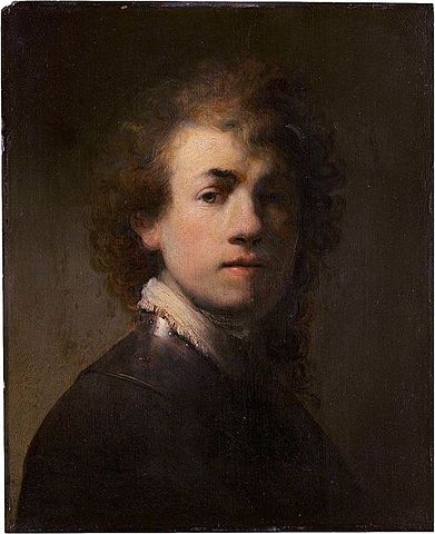
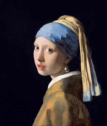
The term Chiaroscuro is derived from the Italian chiaro meaning ‘clear, bright’ and oscuro meaning ‘dark, obscure’. In art the term has come to refer to the use of bold contrasts between light and shadow, particularly across an entire composition, where they are a prominent feature of the work.
This interplay of shadow and light is particularly important in allowing the viewer to extrapolate volume from a flat image. The use of a single light source helps to accentuate the perception of volume as well as adding drama and dynamics to the scene.
Historically the use of chiaroscuro can often be associated with the works of old masters such as Rembrandt and Caravaggio. The use of such extreme lighting immediately evokes a sense of shape and volume, while focusing the attention of the viewer.
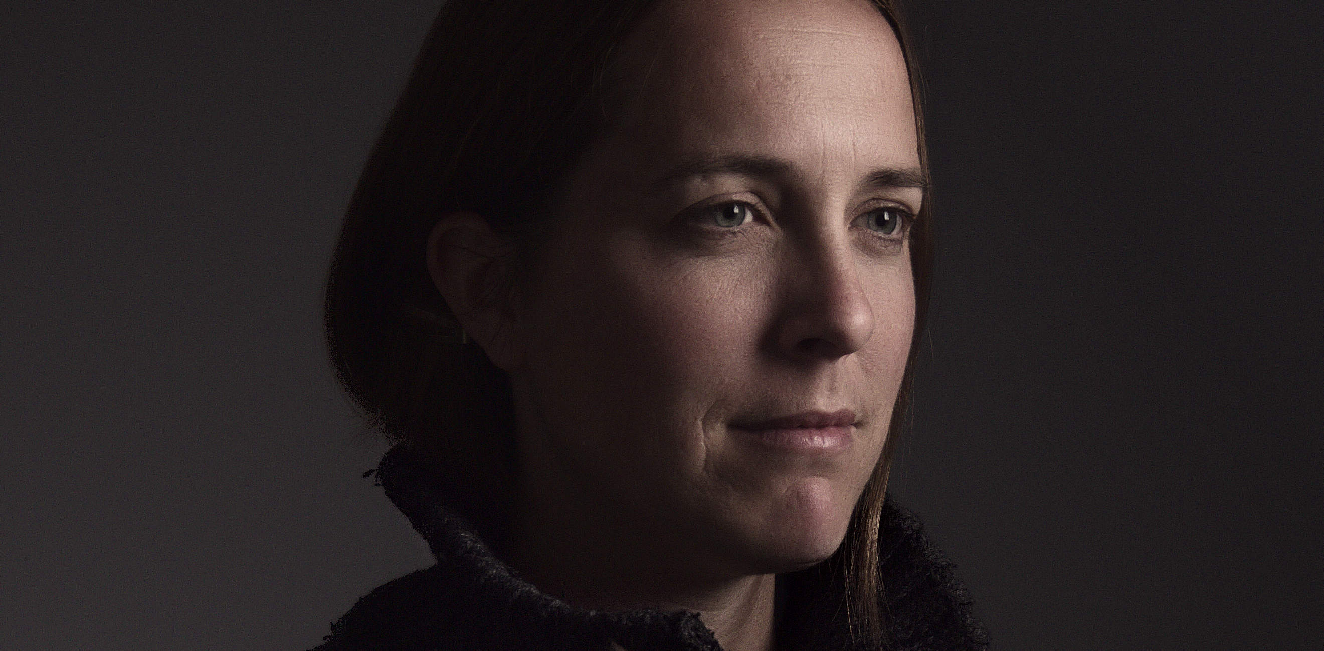
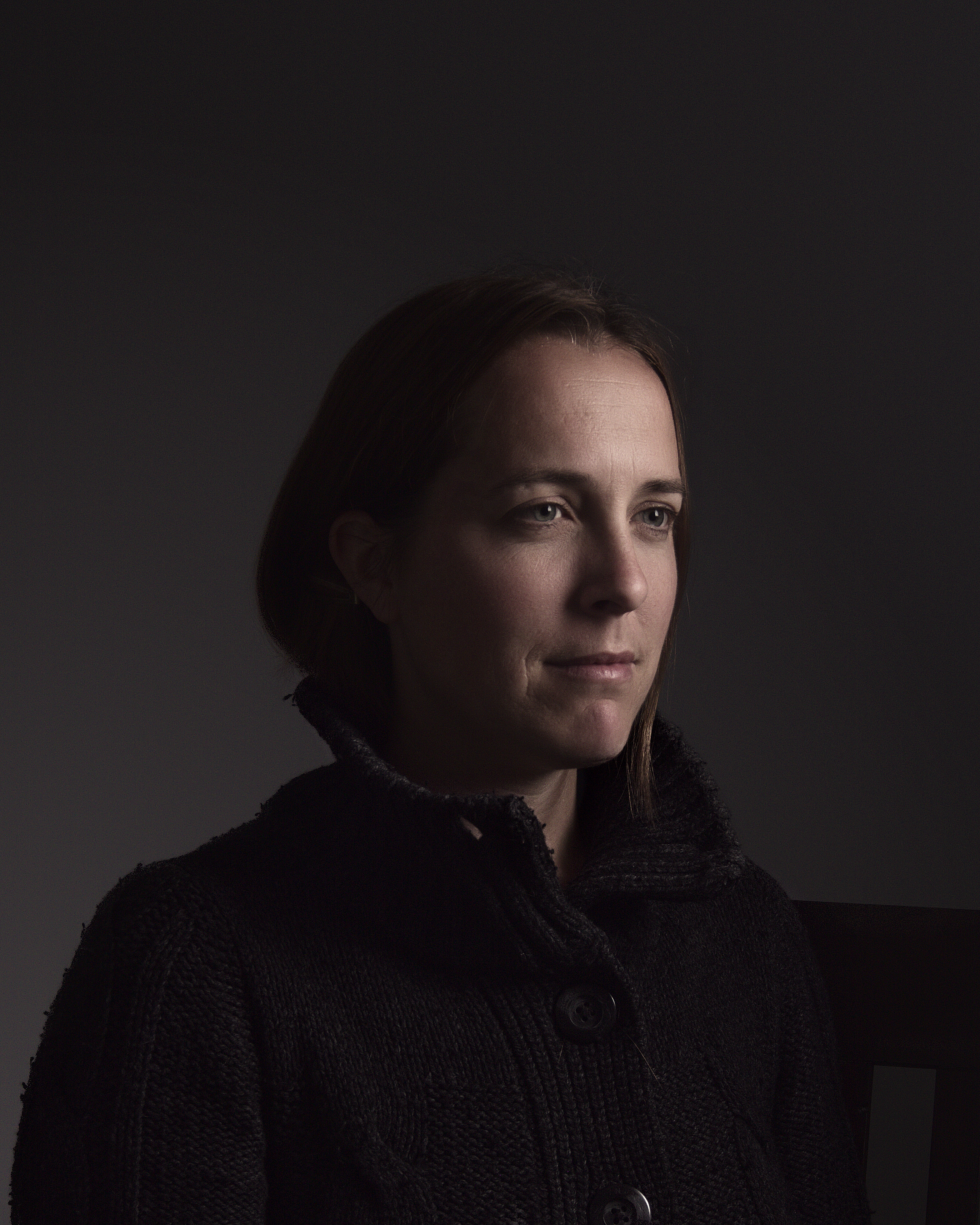
The aim of this tutorial will be to emulate the lighting characteristics of chiaroscuro in producing a portrait to evoke the feeling of an old master painting.
Equipment
In examining chiaroscuro portraiture, it becomes apparent that a strong characteristic of the images is the use of single light source on the scene. So this tutorial will focus on using a single source to illuminate the portrait.
Getting the keylight off the camera is essential. The closer the keylight is to the axis of the camera the larger the reduction in shadows. This is counter to the intention of this workflow. Shadows are an essential component in producing this look, and on-camera lighting simply will not work.
The reason to choose a softbox versus the myriad of other light modifiers available is simple: control. Umbrellas can soften the light, but due to their open nature have a tendency to spill light everywhere while doing so. A softbox allows the light to be softened while also retaining a higher level of spill control.
Light spill can still occur with a softbox, so the best option is to bring the light in as close as possible to the subject. Due to the inverse square nature of light attenuation, this will help to drop the background very dark (or black) when exposing properly for the subject.
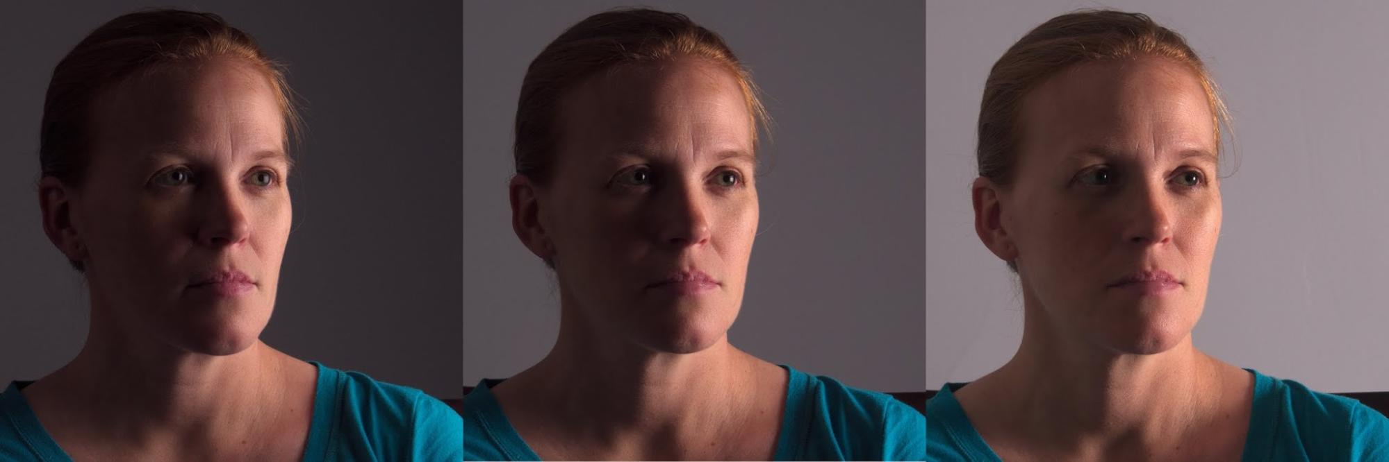
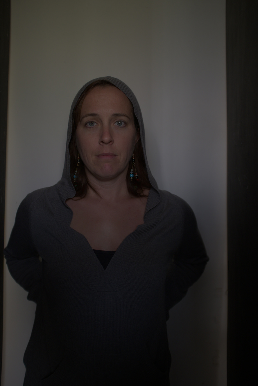
Left For example, in the sample images above, a 20 inch softbox was initially located about 18 inches away from the subject (first). The rear wall was approximately 48 inches away from the subject or just over twice the distance from the softbox. Thus, on a proper exposure for the subject, the background would be around 3 stops lower in light. This is seen as the background in the first image has dropped to a dark gray.
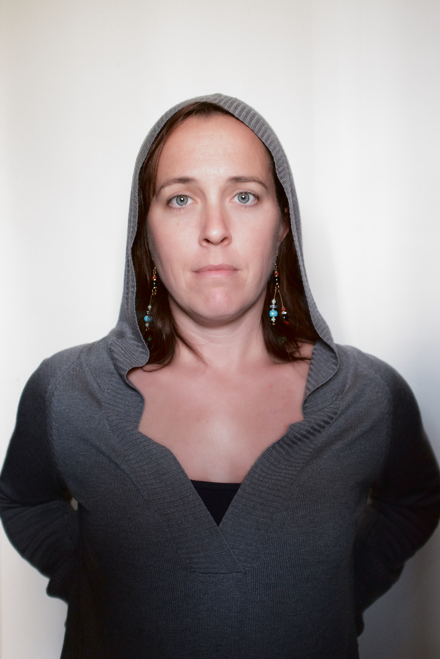
Middle When the light distance to the subject is doubled and the light distance to the rear wall stays the same, the ratio is not as extreme between them. The light distance from the subject is now 36 inches, while the light distance to the rear wall is still 48 inches. When properly exposing for the subject, the rear wall is now only about 1 stop lower in light.
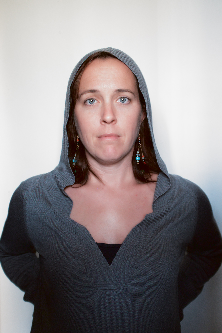
Right In the final example, the distance from the light to both the subject and the rear wall are very close. As such, a proper exposure for the subject almost brings the wall to a middle exposure.
What this example provides is a good visual guide for how to position the subject and light relative to the surroundings to create the desired look. To accentuate the ratio between dark and light in the image it would be best to move the light as close to the subject as possible.
If there is nothing to reflect light on the shadow side of the subject, then the shadows would fall to very dark or black. Usually, there are at least walls and ceilings in a space that will reflect some light, and the amount falling on the shadow side can be attenuated by either moving the subject nearer to a wall on that side, or using a bounce/reflector as desired.
Shooting
Planning
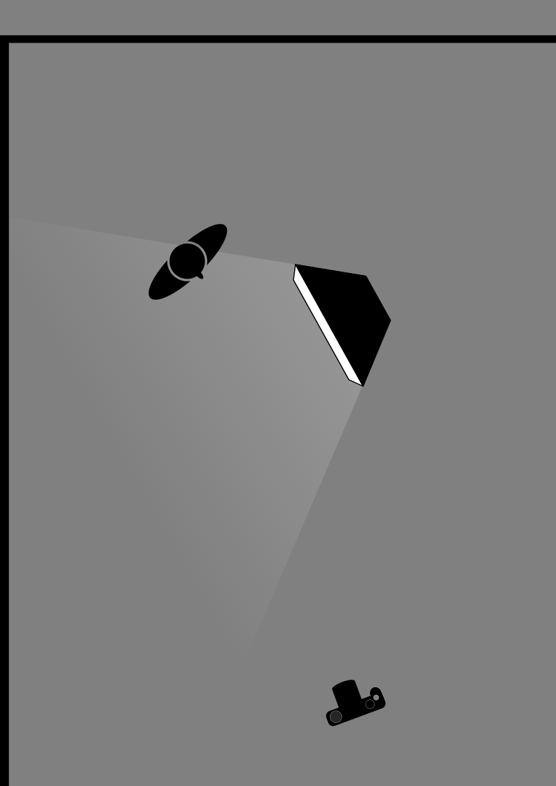
The setup for the shot would be to push the key light in very close to the model, while still allowing some bounce to slightly fill the shadows.
As noted previously, having the key light close to the model would allow the rest of the scene to become much darker. The softbox is arranged such that the face is almost completely vertical and the bottom edge is just above the models eyes. This was to feather the lower edge of the light falloff along the front of the model.
There are 2 main adjustments that can be made to fine-tune the image result with this setup.
The first is the key light distance/orientation to the subject. This will dictate the proper exposure for the subject. For this image the intention is to push the key light in as close as possible without being in frame. There is also the option of angling the key light relative to the subject. In the diagram above, the softbox is actually angled away from the subject. The intention here was to feather the edge of the light in order to control spill onto the rest of the model (putting more emphasis on her face).
The second adjustment, once the key light is in a good location, is the distance from the key light and subject together, to the surrounding walls (or a reflector if one is being used). Moving both subject and keylight closer to the side wall will increase the amount of reflected light being bounced into the shadows.
Mood Board
If possible, it can be extremely helpful to both the model and photographer to have a Mood Board available. This is usually just a collection or collage of images that help to convey the desired feeling or desired result from the session. For help in directing the model, the images do not necessarily need the same lighting setup. The intention is to help the model understand what your vision is for the pose and facial expressions.
The Shoot
The lighting is set up and the model understands what type of look is desired, so all that’s left is to shoot the image!
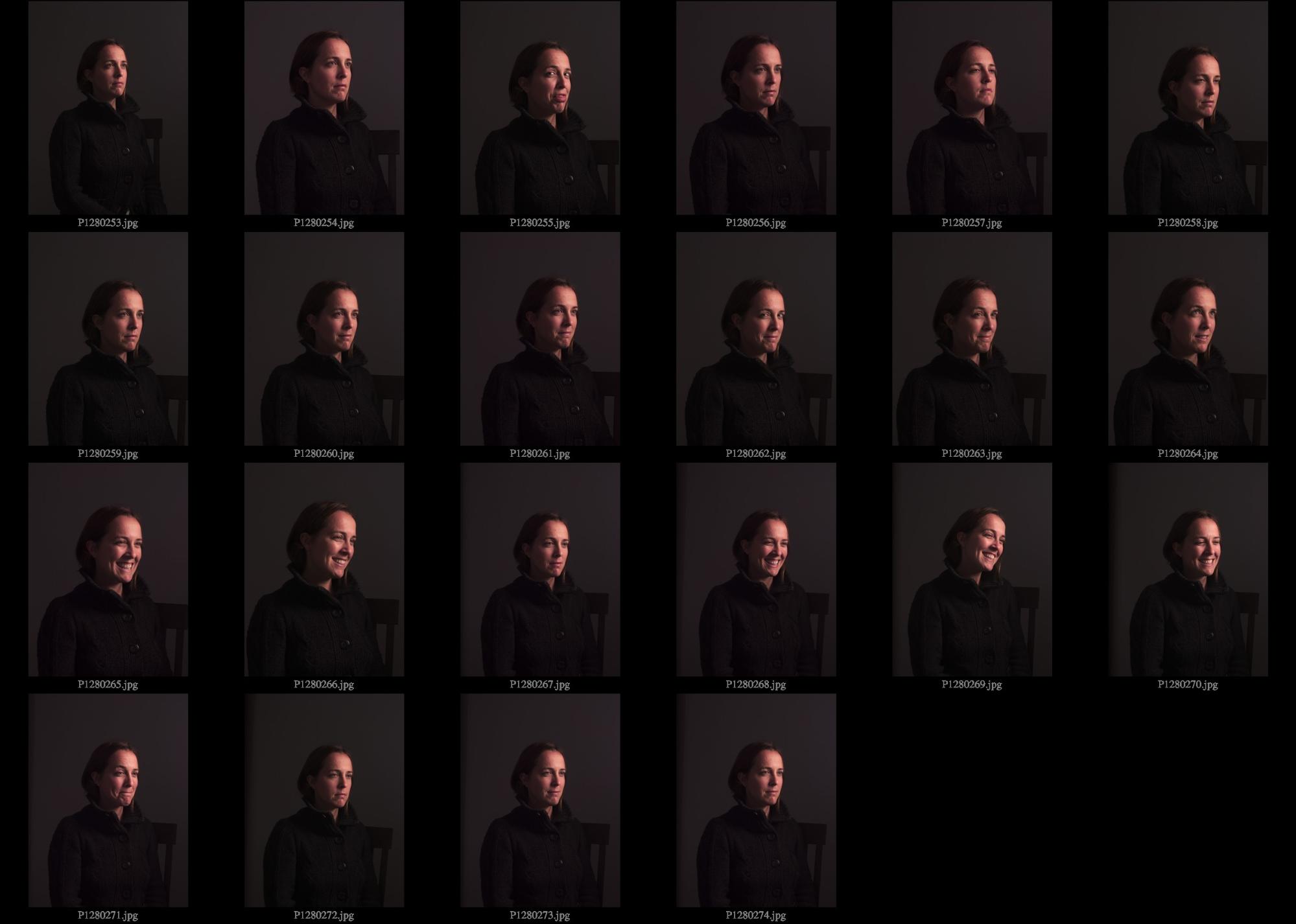
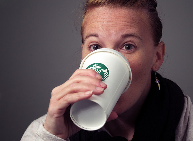
In the end, I favored the last image in the sequence for a combination of the models head position/body language and the slight smile she has.
Postprocessing
Having chosen the final image from the contact sheet, it’s now time to proceed with developing the image and retouching as needed.
If you’d like to follow along you can download the raw .ORF file:
This file is licensed
(Creative Commons, By-Attribution, Non-Commercial, Share-Alike), and is the same image that I shared with everyone on the forums for a PlayRaw processing practice. You can see how other folks approached processing this image in the topic on discuss. If you decide to try this out for yourself, come share your results with us!
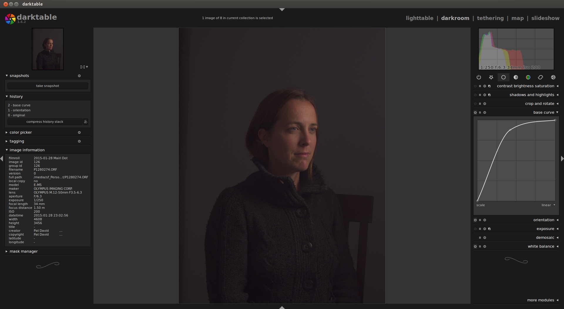
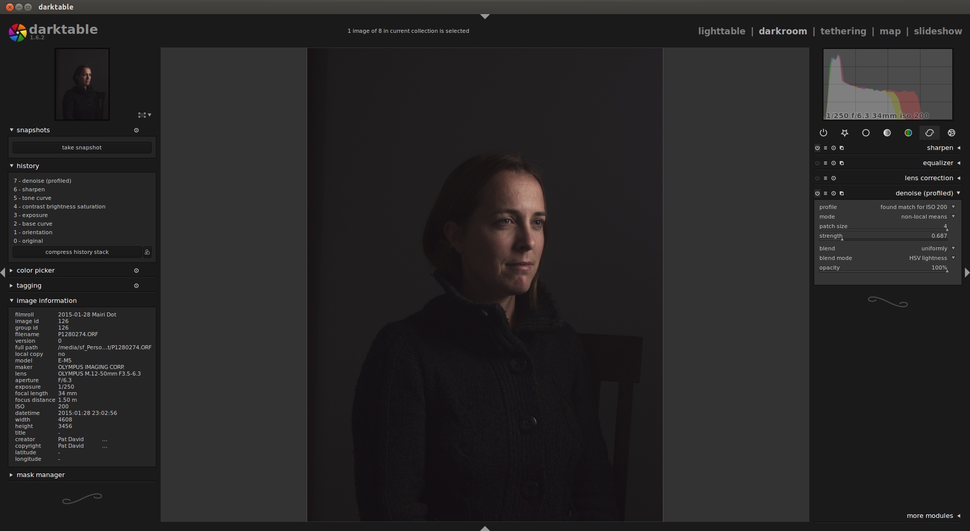
Not surprisingly the initial image loaded without any modifications is a bit dark and rather flat looking. By default darktable should have recognized that the file is from Olympus, and attempted to apply a sane base curve to the linear raw data. If it doesn’t you can choose the preset “olympus like alternate”.
I found that the preset tended to crush the darkest tones a bit too much, and instead opted for a simple curve with a single point as seen here:
Resist the temptation to try and adjust overall exposure and contrast with the base curve. These parameters will be adjusted shortly in the appropriate modules. The base curve is only intended to transform the linear raw rgb to something that looks good on your output device. The base curve will affect how the contrasts, colors, and saturation all relate in the final output. For the purposes of this tutorial, it is enough to simply choose a preset.
The next series of steps focus on adjusting various exposure parameters for the image. Conceptually they start with the most broad adjustment, exposure, then to slightly more targeted adjustments such as contrast, brightness, and saturation, then finish with targeted tonal adjustments in tone curves.
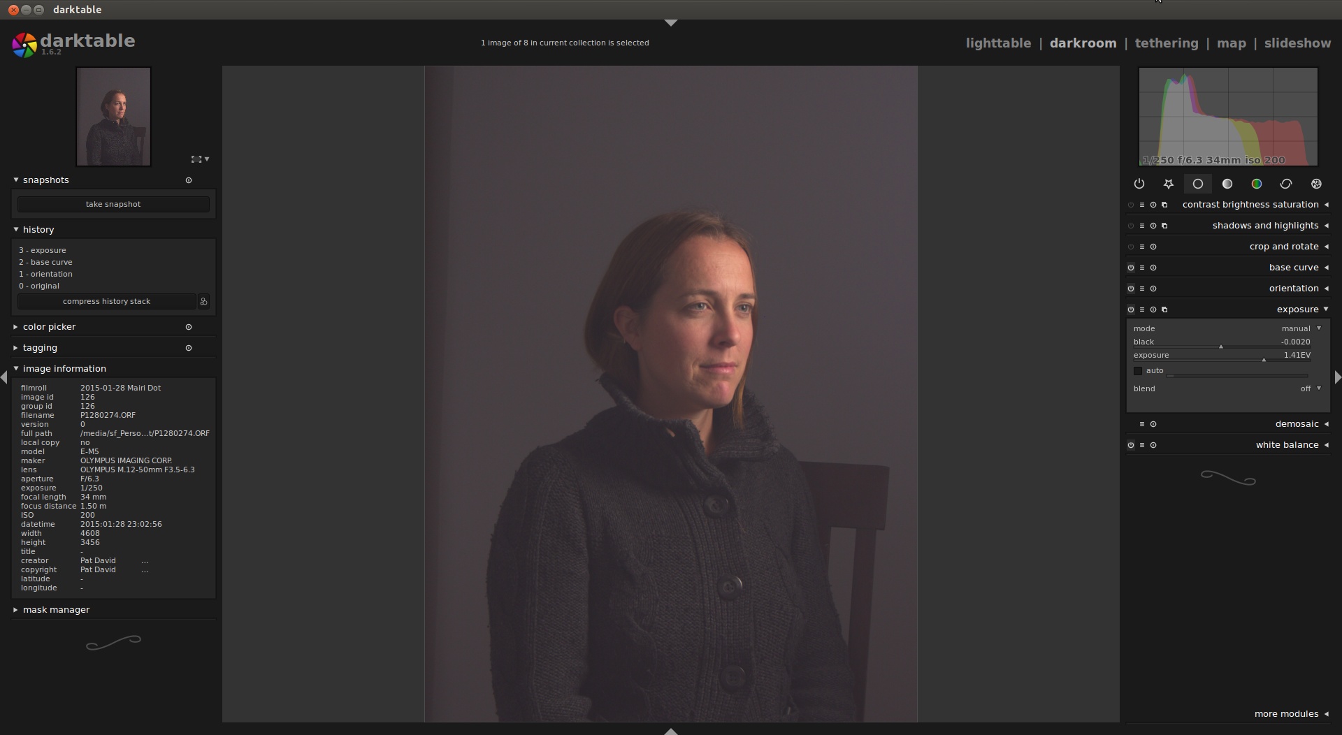
Once the base curve is set, the next module to adjust would be the overall exposure of the image (and the black point). This is done in the “exposure” module (below the base curve).
The important area to watch while adjusting the exposure for the image is the histogram. The image was exposed a little dark, so increase the exposure overall for the image. In the histogram, avoid clipping any channels by allowing them to be pushed outside the range. In this case, the desire is to provide a nice mid-level brightness to the models face. The exposure can be raised until the channels begin to clip on the far right of the histogram, then brought back down a bit to leave some headroom.
The darkest areas of the histogram on the left are clipped a bit, so raising the black level brings the detail back in the darkest shadows. When in doubt try to let the histogram guide you with data from the image. Particularly around the highest and lowest values (avoid clipping if possible).
An easy way to think of the exposure module is that it allows the entire image exposure to be shifted along with compressing/expanding the overall range by modifying the black point.
Where the Exposure module shifts the overall image values from a global perspective, modules such as the “contrast brightness saturation” allow finer tuning of the image within the range of the exposure.
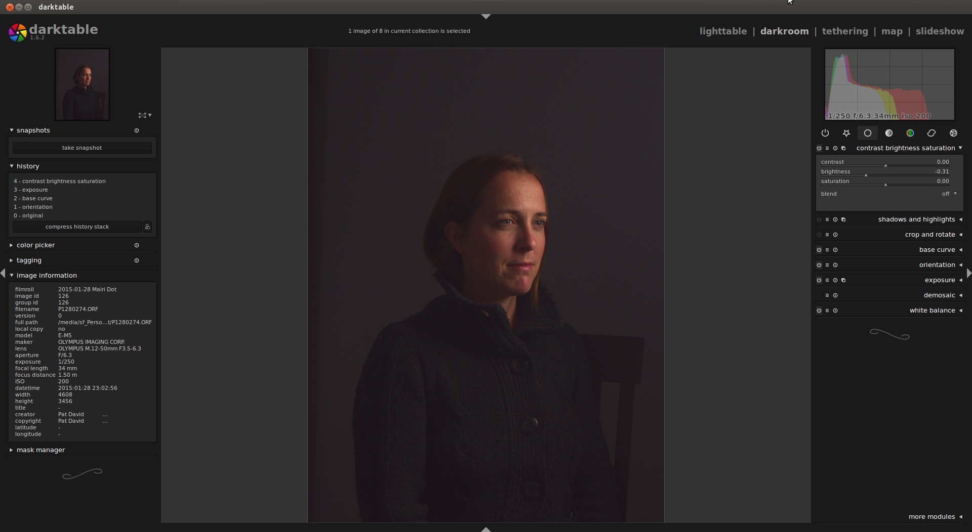
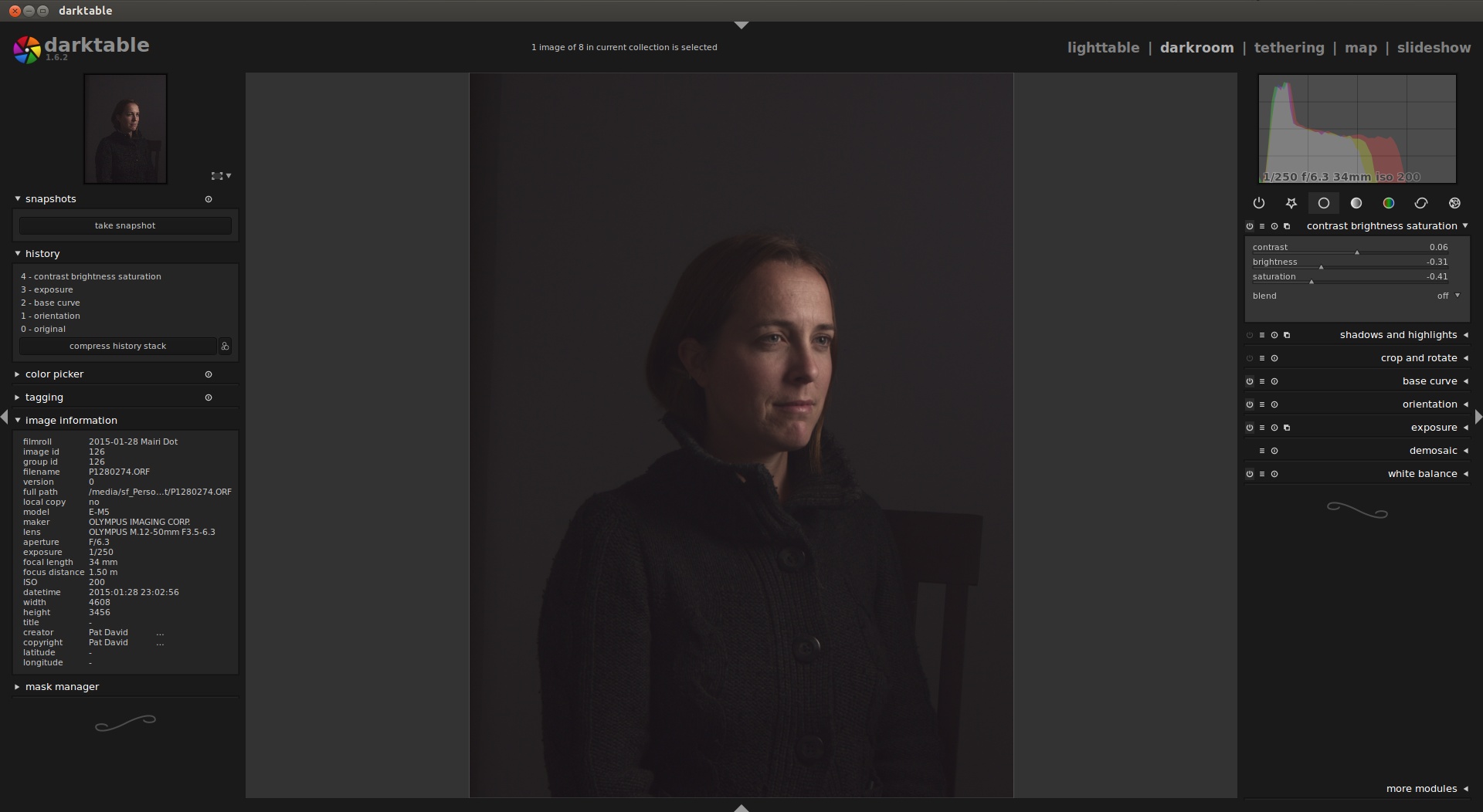
To emphasis the models face, while also strengthening the interplay of shadow and light on the image, drop the brightness down to taste. I brought the brightness levels down quite a bit (-0.31) to push almost all of the image below medium brightness.
Overall this helps to emphasis the models face over the rest of the image initially. While the rest of the image is comprised of various dark/neutral tones, the models face is not. Pushing the saturation down as well will remove much of the color from the scene and face. This is done to bring the skin tones back down to something slightly more natural looking, while also muting some of those tones.
The skin now looks a bit more natural but muted. The background tones have become more neutral as well. A very slight bump in contrast to taste finishes out this module.
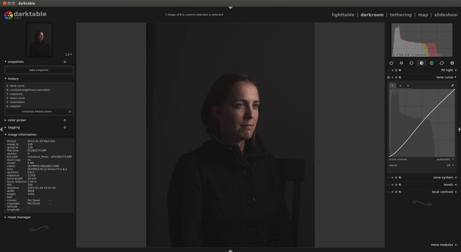
A final modification to the exposure of the image is through a tone curve adjustment. This gives us the ability to make some slight changes to particular tonal ranges. In this case pushing the darker tones down a bit more while boosting the upper mid and high tones.
This is actually a type of contrast increase, but controlled to specific tones based on the curve. The darkest darks (bottom of the curve) get pushed a little bit darker, which will include most of the sweater, background, and shadow side of the models face. The very slight rolling boost to the lighter tones primarily helps to allow the face to brighten up against the background even more.
The changes are very slight and to taste. The tone curve is very sensitive to changes, and often only very small modifications are required to achieve a given result.
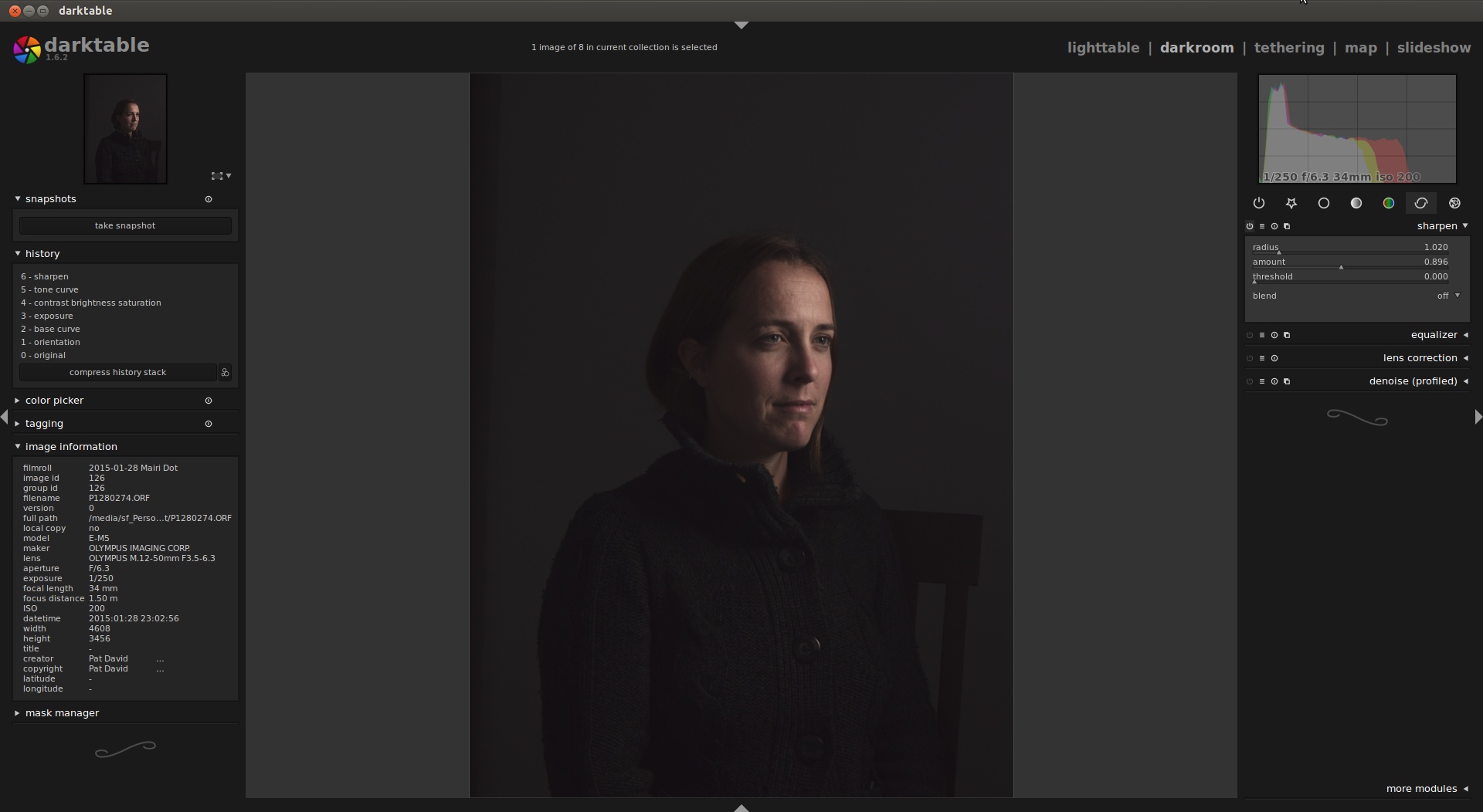
By default the sharpen module will apply a small amount of sharpening to the image. The module uses unsharp mask for sharpening, so the radius parameter is the blur radius into the unsharp mask. I wanted to sharpen lightly very fine details, so set the radius to ~1, with an amount around 0.9 and no threshold. This produced results that are very hard to distinguish from the default settings, but appears to sharpen smaller structures just slightly more.
I personally include a final sharpening step as a side effect of using wavelet decompose for skin retouching later in the process with GIMP. As such I am not usually as concerned about sharpening here as much. If I were, there are better modules for adjusting sharpening from wavelets using the equalizer module.
The darktable team and its users profiled many different cameras for noise profiles at various ISOs to build a statistical model with brightness across the three color channels. Using these profiles, darktable can then do a better job at efficiently denoising images. In the case of my camera (Olympus OM-D E-M5), there was a profile already captured for ISO200.
In this case, the chroma noise wasn’t too bad, and a very slight reduction in luma noise would be sufficient for the image. As such, I used a non-local means with a large patch size (to retain sharpness) and a low strength. This was all applied uniformly against the HSV lightness option.
Finally! The image tones and exposure are in a desirable state, so export the results to a new file. I tend to use either TIF or PNG at 16 bit. This is in case I want to work in a full 16 bit workflow with the latest GIMP, or may want to in the future.
GIMP
When there are still some pixel-level modifications that need to be done to the image, the go-to software is GIMP.
Skin retouching
spot healing/touchups
Background rebuild
Skin Retouching with Wavelet Decompose
This step is not always needed, but who doesn’t want their skin to look a little nicer if possible?
The ability to modify an image based on detail scales isolated on their own layers is a very powerful tool. The approach is similar to frequency separation, but has the advantage of providing multiple frequencies to modify simultaneously of progressively larger and larger detail scales. This offers a large range of flexibility and an easier workflow vs. frequency separation (you can work on any detail scale simply by switching to a different layer).
I used to use the wonderful Wavelet Decompose plugin from marcor on the GIMP plugin registry. I have since switched to using the same result from G’MIC once David Tschumperlé added it in for me. It can be found in G’MIC under:
Details → Split details [wavelets]
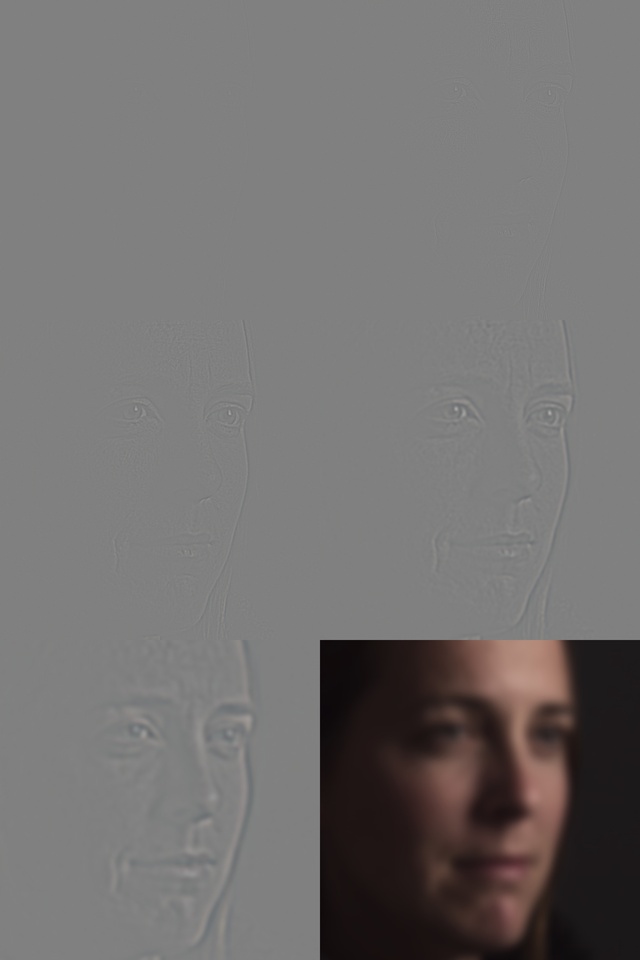
Running Split details [wavelets] against the image to produce 5 wavelet scales and a residual layer yields (cropped):
The plugin (or script) will produce 5 layers of isolated details plus a residual layer of low-frequency color information. Seen here in ascending size of detail scales. The finest scales (1 & 2) will be hard to discern the details as they are quite fine.
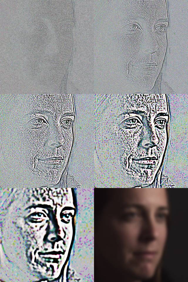
To help visualizing what the different scale levels look like here is a view of the same levels above, normalized:
The normalized view shows clearly the various types of detail scales on each layer.
There are various types of changes that can be made to the final image from these details scales. In this image, we are going to focus on evening out the skin tones overall. The scales with the biggest impact on even skin tones for this image are 4 and 5.
A good workflow when smoothing overall skin tones and using wavelet scales is to work on smoothing from the largest detail scales and working down to finer scales. Usually, a nice amount of pleasing tonal smoothing can be accomplished in the first couple of coarse detail scales.
Skin Retouching Zones
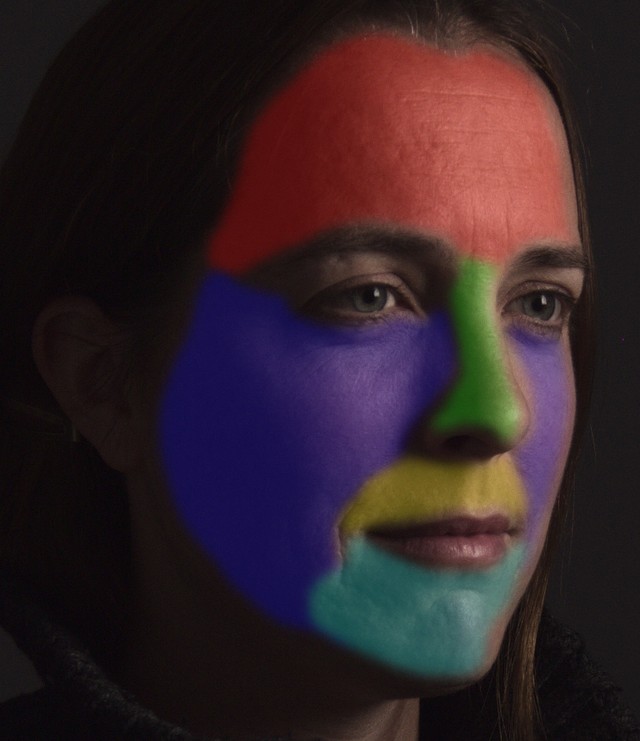
Different portions of a face will often require different levels of smoothing. Below is a rough map of facial contours to consider when retouching. Not all faces will require the exact same regions, but it is a good starting point to consider when approaching a new image.
The selections are made with the Free Select Tool with the “Feather edges” option on and set to roughly 30px.
Smoothing
A good starting point to consider is the forehead on the largest detail scale (5). The basic workflow is to select a region of interest and a layer of detail, then to suppress the features on that detail level. The method of suppressing features is a matter of personal taste but is usually done across the entire selection using a blur filter of some sort.
A good first choice would be to use a gaussian blur (or Selective Gaussian Blur) to smooth the selection. A better choice, if G’MIC is installed, is to use a bilateral blur for its edge-preserving properties. The rest of these examples will use the bilateral blur for smoothing.
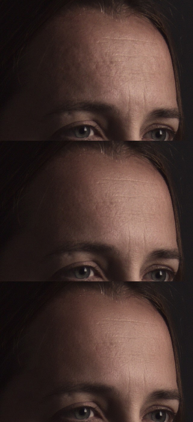
Considering the forehead region:
The first image is the original. The second image is after running a bilateral blur (in G’MIC: Smooth [bilateral]), with the default parameter values:
Spatial variance: 10
Value variance: 7
Iterations: 2
These values were chosen from experience using this filter for the same purpose across many, many images. The results of running a single blur on the largest wavelet scale is immediately obvious. The unevenness of the skin and tones overall are smoothed in a pleasing way, while still retaining the finer details that allow the eye to see a realistic skin texture.
The last image is the result of working on the next detail scale layer down (Wavelet scale 4), with much softer blur parameters:
Spatial variance: 5
Value variance: 2
Iterations: 1
This pass does a good job of finishing off the skin tones globally. The overall impression of the skin is much smoother than the original, but crucial fine details are all left intact (wrinkles, pores) to keep the it looking realistic.
This same process is repeated for each of the facial regions described. In some cases the results of running the first bilateral blur on the largest scale level is enough to even out the tones (the cheeks and upper lip for example). The chin got the same treatment as the forehead. The process is entirely subjective, and will vary from person to person for the parameters. Experimentation is encouraged here.
More importantly, the key word to consider while working on skin tones is moderation. It is also important to check your results zoomed out, as this will give you an impression of the image as seen when scaled to something more web-sized. A good rule of thumb might be:
“If it looks good to you, go back and reduce the effect more”.
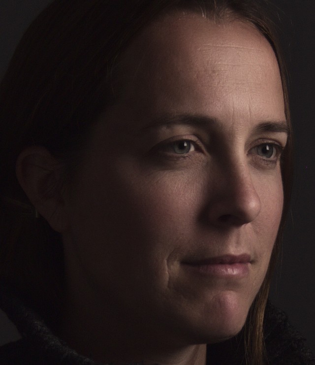
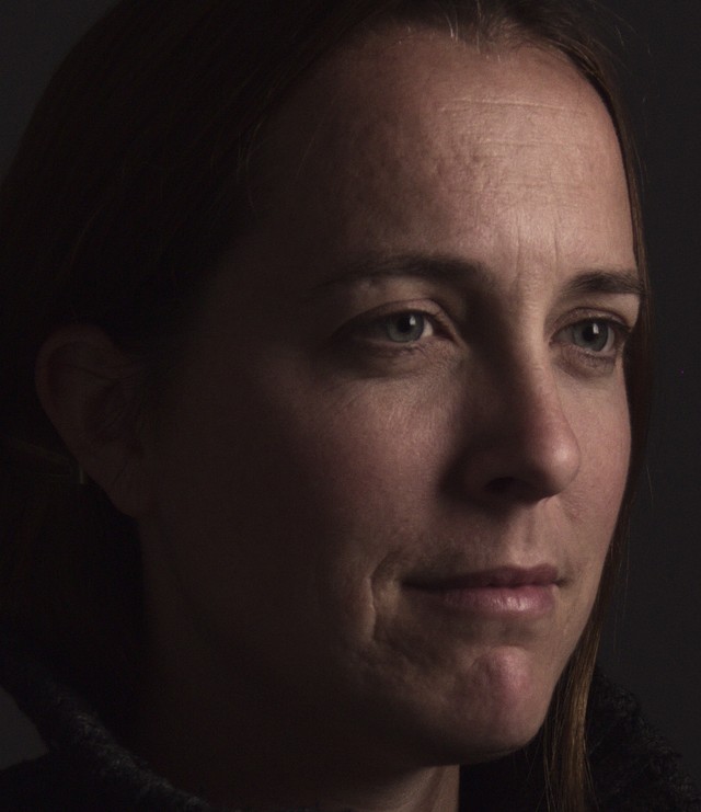
The original vs. results after wavelet smoothing:
Wavelet Smoothed.
Click to compare original
Original
When the work is finished on the wavelet scales, a new layer from all of the visible layers can be created to continue touching up spot areas that may need it.
Layer → New from Visible
Spot Touchups
The use of wavelets is good for a large-scale selection area smoothing but a different set of tools is required for spot touchups where needed. For example, there is a stray hair that runs across the models forehead that can be removed using the Heal tool.
For best results when using the Heal tool, use a hard edged brush. Soft edges can sometimes lead to a slight smearing in the feathered edge of a brush that is undesirable. Due to the nature of the heal algorithm sampling, it is also advisable to avoid trying to heal across hard/contrasty edges.
This is also a good tool to use for small blemishes that might have been tedious to repair across all of the wavelet scales from the previous section. This is also a good time to repair hot-spots, fly-away hairs, or other small details.
Sweater Enhancement
The model is wearing a nicely textured sweater but the details and texture are a slightly muted. A small increase in contrast and local details will help to bring some enhancement to the textures and tones. One method of enhancing local details would be to use the Unsharp Mask enhancement with a high radius and low amount (HiRaLoAm is an acronym some might use for this).
Create a duplicate of the “Spot Healing” layer that was worked on in the previous step, and apply an Unsharp Mask to the layer using HiRaLoAm values.
For example, a good starting point for parameters might be:
Radius: 200
Amount: 0.25
With these parameters the sharpen function will instead tend to increase local contrast more, providing more “presence” or “pop” to the sweater texture.
Background Rebuild
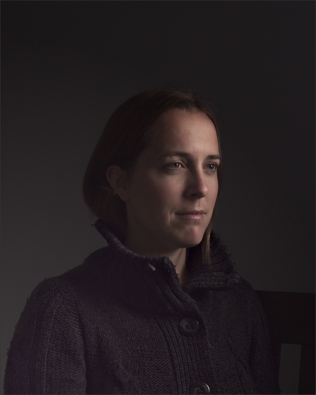
The background of the image is a little too uniformly dark and could benefit from some lightening and variation. A nice lighter background gradient will enhance the subject a little.
Normally this could be obtained through the use of a second strobe (probably gridded or with a snoot) firing at the background. In our case we will have to fake the same result through some masking.
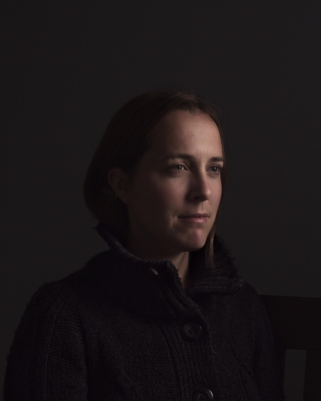
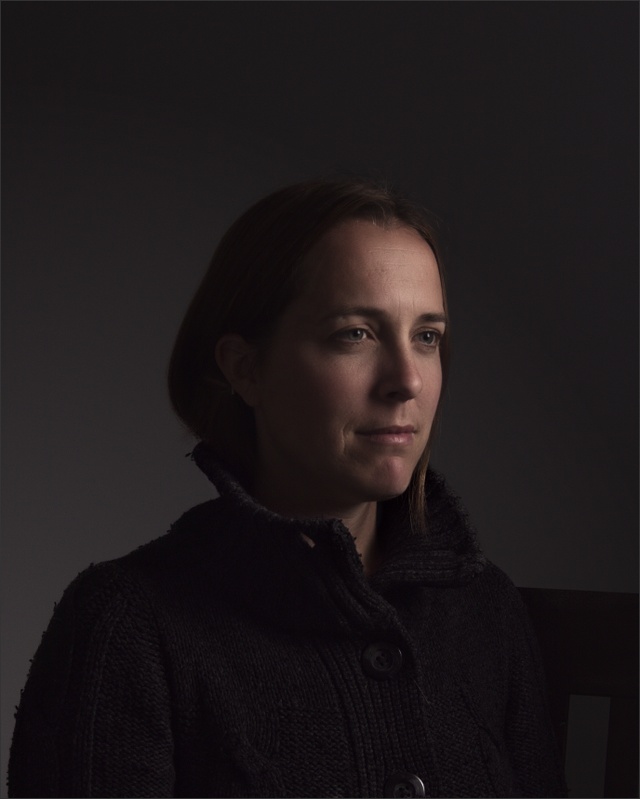
First, a crop is chosen to focus the composition a little stronger on the subject. I placed the center of the models face along the right-side golden section vertical and tried to place things near the center of the frame:
The slight-centered crop is to emulate the type of crop that might be expected from a classical painting (thereby strengthening the overall theme of the portrait further).
Subject Isolation
There are a few different methods to approach the background modification. The method I describe here is simply one of them.
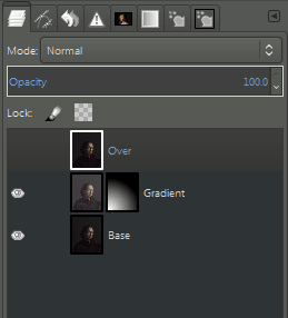
The image at this point is duplicated and the duplicate has the levels raised to brighten it up considerably. In this way, a simple layer mask can control the brightness and where it occurs in the image at this point.
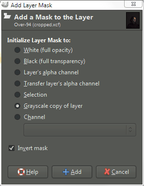
This is what will give our background a gradient of light. To get our subject back to dark will require masking the subject on a layer mask again. A quick way to get a mask to work from is to add a layer mask to the “Over” layer, letting the background show through, but turning the subject opaque.
Add a layer mask to the “Over” layer as a “Grayscale copy of layer”, and check the “Invert mask” option:
With an initial mask in place, a quick use of the tool:
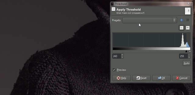
Colors → Threshold
will allow you to modify the mask to define the shoulder of the model as a good transition. The mask will be quite narrow. Adjust the threshold until the lighter background is speckle-free and there is a good definition of the edge of the sweater against the background.
Once the initial mask is in place it can be cleaned up further by making the subject entirely opaque (white on the mask), and the background fully transparent (black on the mask). This can be done with paint tools easily. For not much work a decent mask and result can be had:
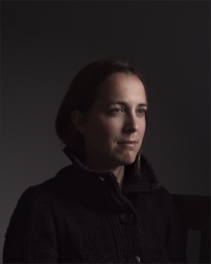
This provides a nice contrast of the background being lighter behind the darker portions of the model and the opposite on the lighter subjects face.
Lighten Face Highlights
Speaking of the subjects face, there’s a nice simple method for applying a small accent on the highlighted portions of the models face in order to draw more attention to her.
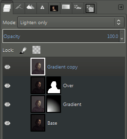
Duplicate the lightened layer that was used to create the background gradient, move it to the top of the layer stack, and remove the layer mask from it.
Set the layer mode of the copied layer to “Lighten only.
As before, add a new layer mask to it, “Grayscale copy of layer”, but don’t check the “Invert mask” option. This time use the Levels tool:
Colors → Levels
to raise the blacks of the mask up to about mid-way or more. This will isolate the lightening mask to the brightest tones in the image that happen to correspond to the models face. You should see your adjustments modify the mask on-canvas in real-time. When you are happy with the highlights, apply.
Last Sharpening Pass + Grain
Finally, using I like to apply a last pass of sharpening to the image, and to overlay some grain from a grain field I have to help add some structure to the image as well as mask any gradient issues when rebuilding the background. For this particular image the grain step isn’t really needed as there’s already sufficient luma noise to provide its own structure.
Usually, I will use the smallest of the wavelet scales from the prior steps and sometimes the next largest scale as well (Wavelet scale 1 & 2). I’ll leave Wavelet scale 1 at 100% opacity, and scale 2 usually around 50% opacity (to taste, of course).
Minor touchups that could still be done might include darkening the chair in the bottom right corner, darkening the gradient in the bottom left corner, and possibly adding a slight white overlay to the eyes to subtly give them a small pop.
As it stands now I think the image is a decent representation of a chiaroscuro portrait that mimics the style of a classical composition and interplay between light and shadows across the subject.
The TLS podcast, with Stig Abell and Thea Lenarduzzi – this week: why eat meat?; how political was Shakespeare, and does it matter?; the ethics of dust at the Houses of Parliament; a report from Taksim Square, as Turkey reels. Discover more: the-tis.co.uk
The TLS podcast, with Stig Abell and Thea Lenarduzzi – this week: the complexities of modern Irish history; the ups and downs of historical fiction; Pulitzer-Prize-winning author Richard Ford gets to know Donald Trump; finally, Robert Potts reads a poem by Seamus Heaney.
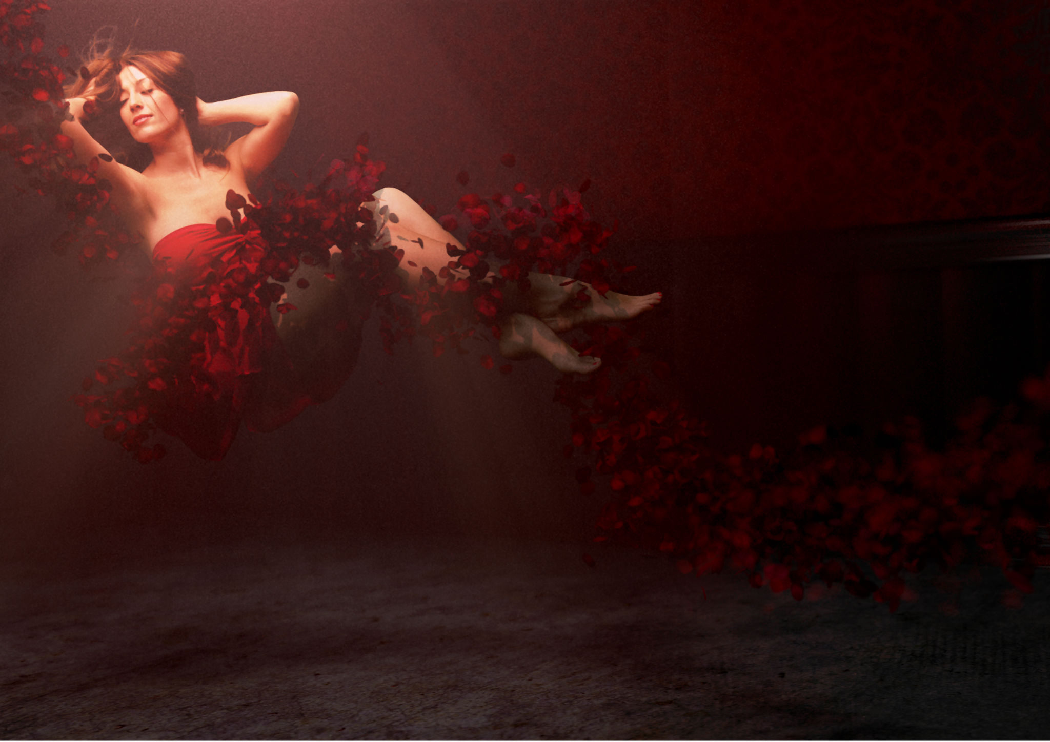
While I was out at Texas Linux Fest this past weekend I got to watch a fun presentation from the one and only Brian Beck. He walked through an introduction to Blender, including an overview of creating his great The Lady in the Roses image that was a part of the 2015 Libre Calendar project.
Coincidentally, during my trip home community member @Fotonut asked about software to create an HD slideshow with images. The first answer that jumped into my mind was to consider using Blender (a very close second was OpenShot because I had just spent some time talking with Jon Thomas about it).
I figured this much Blender being talked about deserved at least a post to answer @Fotonut‘s question in greater detail. I know that many community members likely abuse Blender in various ways as well – so please let me know if I get something way off!
The reason that Blender was the first thing that popped into many folks minds when the question was posed is likely because it has been a go-to swiss-army knife of image and video creation for a long, long time. For some it was the only viable video editing application for heavy use (not that there weren’t other projects out there as well). This is partly due to to the fact that it integrates so much capability into a single project.
The part that we’re interested in for the context of Fotonut’s original question is the Video Sequence Editor (VSE). This is a very powerful (though often neglected) part of Blender that lets you arrange audio and video (and image!) assets along a timeline for rendering and some simple effects. Which is actually perfect for creating a simple HD slideshow of images, as we’ll see.
Blenders interface is likely to take some getting used to for newcomers (right-click!) but we’ll be focusing on a very small subset of the overall program—so hopefully nobody gets lost. The overall plan will be:
Setup the environment for video sequence editing
Include assets (images) and how to manipulate them on the timeline
Add effects such as cross-fades between images
Setup exporting options
There’s also an option of using a very helpful add-on for automatically resizing images to the correct size to maintain their aspect ratios. Luckily, Blender’s add-on system makes it trivially easy to set up.
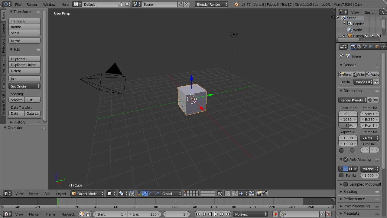
On opening Blender for the first time we’re presented with the comforting view of the default cube in 3D space. Don’t get too cozy, though. We’re about to switch up to a different screen layout that’s already been created for us by default for Video Editing.
The main blender default view.
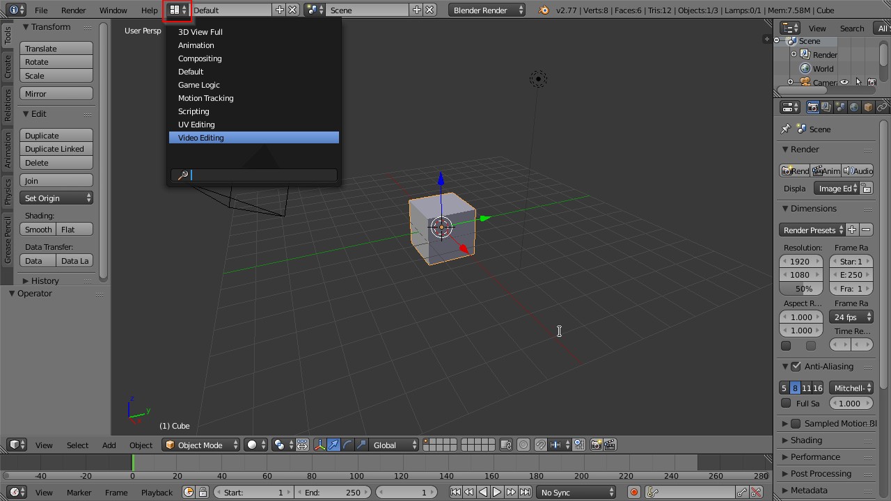
The developers were nice enough to include various default “Screen Layout” options for different tasks, and one of them happens to be for Video Editing. We can click on the screen layout option on the top menu bar and choose the one we want from the list (Video Editing):
Choosing a new Screen Layout option.
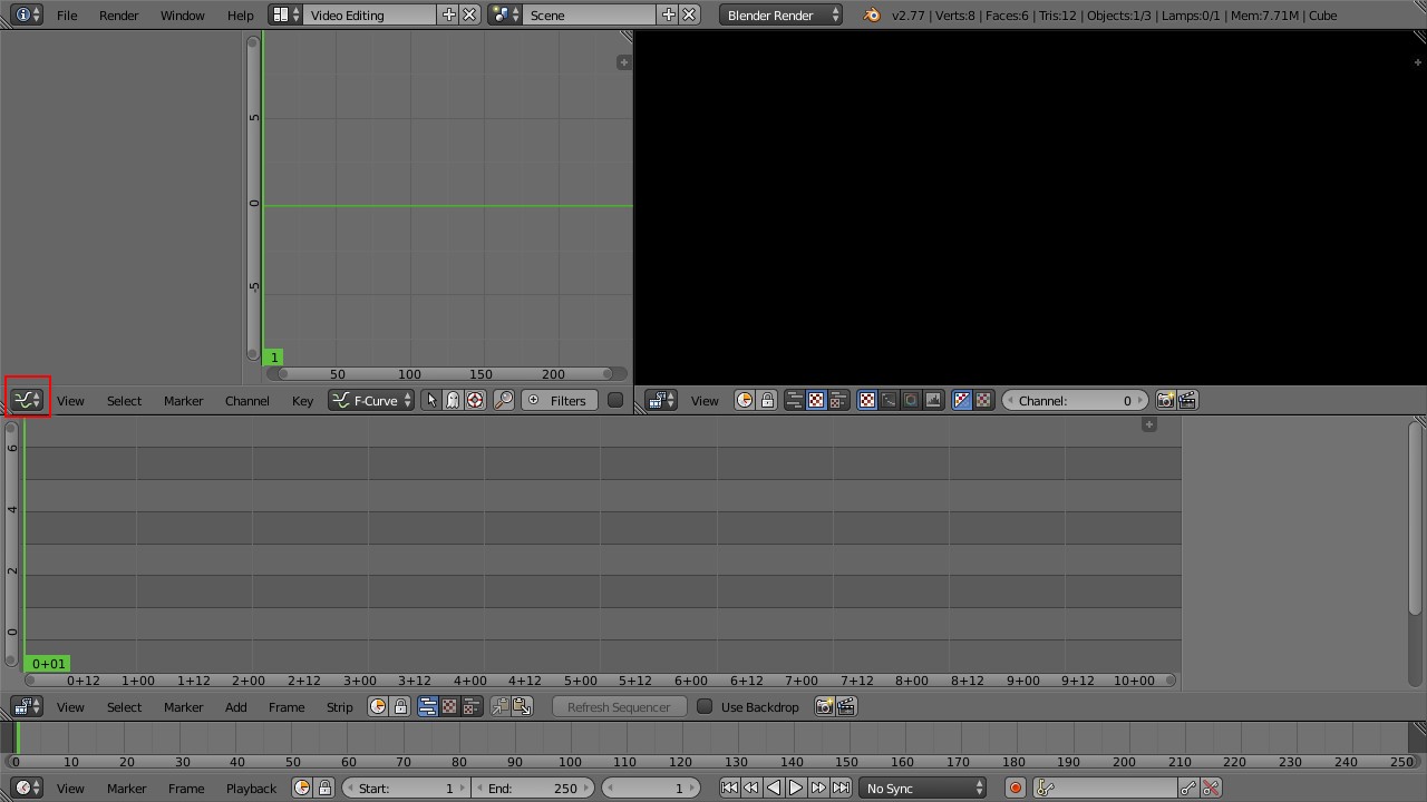
Our screen will then change to the new layout where the top left pane is the F-curve window, the top right is the video preview, the large center section is the sequencer, and the very bottom is a timeline. Blender will let you arrange, combine, and collapse all the various panes into just about any layout that you might want, including changing what each of them are showing. For our example we will mostly leave it all as-is with the exception of the F-curve pane, which we won’t be using and don’t need.
The Video Editing default layout.
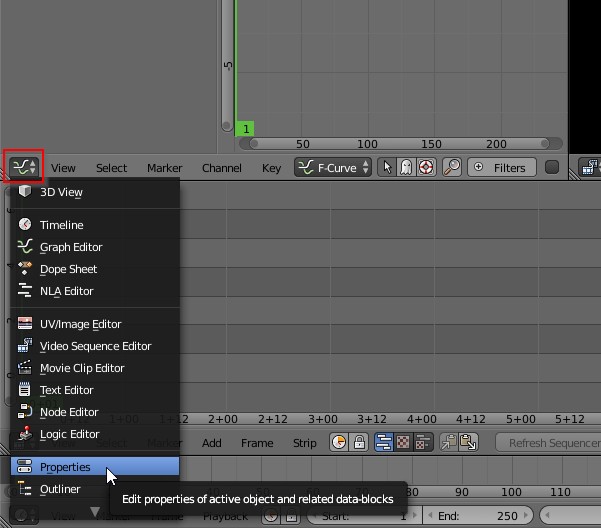
What we can do now is to define what the resolution and framerate of our project should be. This is done in the Properties pane, which isn’t shown right now. So we will change the F-Curve pane into the Properties pane by clicking on the button shown in red above to change the panel type. We want to choose Properties from the options in the list:
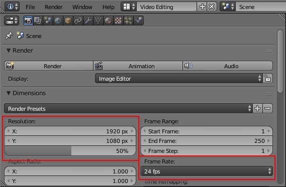
Which will turn the old F-Curve pane into the Properties pane:
You’ll want to set the appropriate X and Y resolution for your intended output (don’t forget to set the scaling from the default 50% to 100% now as well) as well as your intended framerate. Common rates might be 23.976 (23.98), 25, 30, or even 60 frames per second. If your intended target is something like YouTube or an HD television you can probably safely use 30 or 60 (just remember that a higher frame rate means a longer render time!).
For our example I’m going to set the output resolution to 1920 × 1080 at 30fps.
Blender does need a little bit of help when it comes to using images on the sequence editor. It has a habit of scaling images to whatever the output resolution is set to (ignoring the original aspect ratios). This can be fixed by simply applying a transform to the images but normally requires us to manually compute and enter the correct scaling factors to get the images back to their original aspect ratios.
I did find a nice small add-on on this thread at blenderartists.org that binds some handy shortcuts onto the VSE for us. The author kgeogeo has the add-on hosted on Github, and you can download the Python file directly from here: VSE Transform Tool (you can Right-Click and save the link). Save the .py file somewhere easy to find.
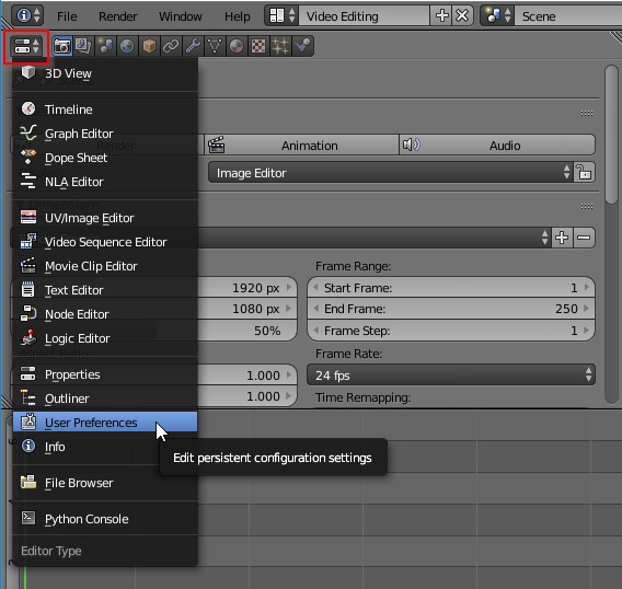
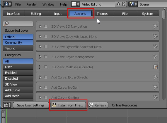
To load the add-on manually we’re going to change the Properties panel to User Preferences:
Click on the Add-ons tab to open that window and at the bottom of the panel is an option to “Install from File…”. Click that and navigate to the VSE_Transform_Tool.py file that you downloaded previously.
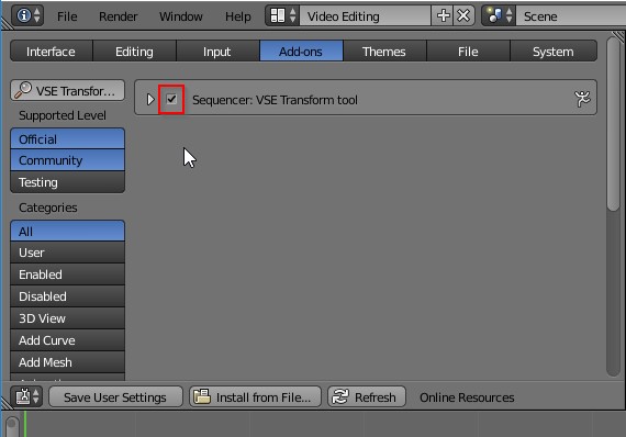
Once loaded, you’ll still need to Activate the plugin by clicking on the box:
That’s it! You’re now all set up to begin adding images and creating a slideshow. You can set the User Preferences pane back to Properties if you want to.
Let’s have a look at adding images onto the sequencer.
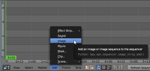
You can add images by either choosing Add → Image from the VSE menu and navigating to your images location, choosing them:
Or by drag-and-dropping your images onto the sequencer timeline from Nautilus, Finder, Explorer, etc…
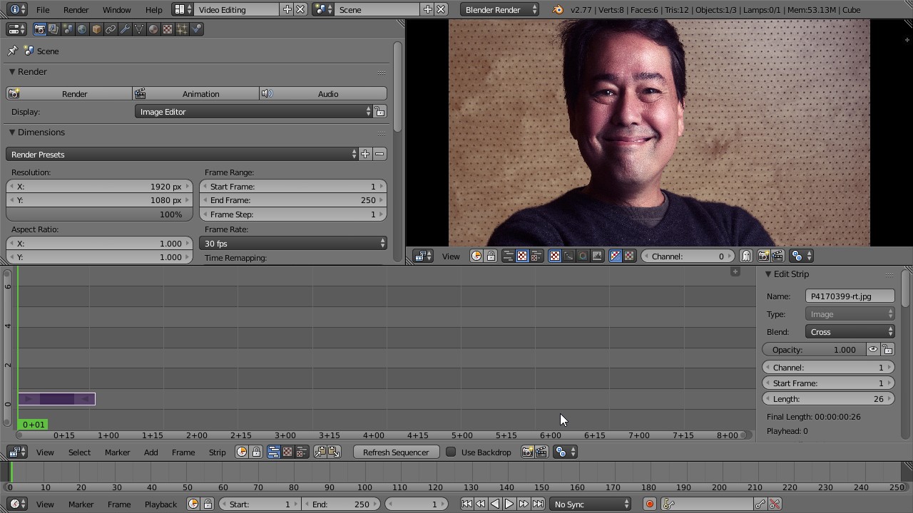
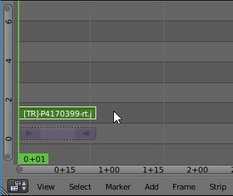
When you do, you’ll find that a strip now appears on the VSE window (purple in my case) that represents your image. You should also see a preview of your video in the top-right preview window (sorry for the subject).
At this point we can use the handy add-on we installed previously by Right-Clicking on the purple strip to make sure it’s activated and then hitting the “T” key on the keyboard. This will automatically add a transform to the image that scales it to the correct aspect ratio for you. A small green Transform strip will appear above your purple image strip now:
Your image should now also be scaled to fit at the correct aspect ratio.
If you scroll your mouse wheel in the VSE window, you will zoom in and out of time editor based on time (the x-axis in the sequencer window). You’ll notice that the time compresses or expands as you scroll the mouse wheel.
The middle-mouse button will let you pan around the sequencer.
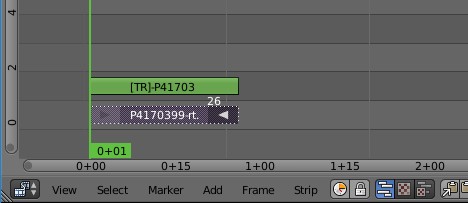
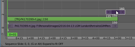
The right-mouse button will select things. You can try this now by extending how long your image is displayed in the video. Right-Click on the small arrow on the end of the purple strip to activate it. A small number will appear above it indicating which frame it is currently on (26 in my example):
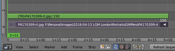
With the right handle active you can now either press “G” on the keyboard and drag the mouse to re-position the end of the strip, or Right-Click and drag to do the same thing. The timeline in seconds is shown along the bottom of the window for reference. If we wanted to let the image be visible for 5 seconds total, we could drag the end to the 5+00 mark on the sequencer window.
Since I set the framerate to 30 frames per second, I can also drag the end to frame 150 (30fps * 5s = 150 frames).
When you drag the image strip, the transform strip will automatically adjust to fit (so you don’t have to worry about it).
If you had selected the center of the image strip instead of the handle on one end and tried to move it, you would find that you can move the entire strip around instead of one end. This is how you can re-position image strips, which you may want to do when you add a second image to your sequencer.
Add a new image to your sequencer now following the same steps as above.
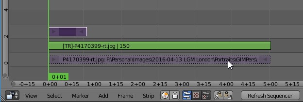
When I do, it adds a new strip back at the beginning of the timeline (basically where the current time is set):
I want to move this new strip so that it overlaps my first image by about half a second (or 15 frames). Then I will pull the right handle to resize the display time to about 5 seconds also.
Click on the new strip (center, not the ends), and press the “G” key to move it. Drag it right until the left side overlaps the previous image strip by a little bit:
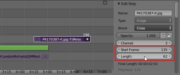
When you click on the strip right handle to modify it’s length, notice the window on the far right of the VSE. The Edit Strip window should also show the strip “Length” parameter in case you want to change it by manually inputting a value (like 150):
I forgot to use the add-on to automatically fix the aspect ratio. With the strip selected I can press “T” at any time to invoke the add-on and fix the aspect ratio.
With the two image strips slightly overlapping, we now want to define a simple cross fade between the two images as a transition effect. This is actually something alreayd built into the Blender VSE for us, and is easy to add. We _do_ need to be careful to select the right things to get the transition working correctly, though.
Once you’ve added a transform effect to a strip, you’ll need to make sure that subsequent operations use the transform strip as opposed to the original image strip.
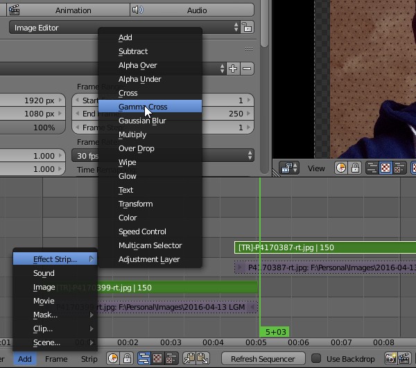
For instance, to add a cross fade transition between these two images, click the first image strip transform (green), then Shift-Click on the second image transform strip (green). Now they are both selected, so add a Gamma Cross by using the Add menu in the VSE (Add → Effect Strip… → Gamma Cross):
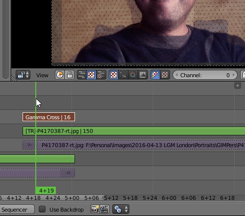
This will add a Gamma Cross effect as a new strip that is locked to the two images overlap. It will do a cross-fade between the two images for the duration of the overlap. You can Left-Click now and scrub over the cross-fade strip to see it rendered in the preview window if you’d like:
At any time you can also use the hotkey “Alt-A” to view a render preview. This may run slow if your machine is not super-fast, but it should run enough to give you a general sense of what you’ll get.
If you want to modify the transition effect by changing its length, you can just increase the overlap between the strips as desired (using the original image strip — if you try to drag the transform strip you’ll find it locked to the original image strip and won’t move).
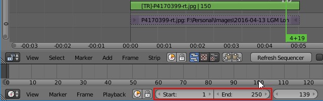
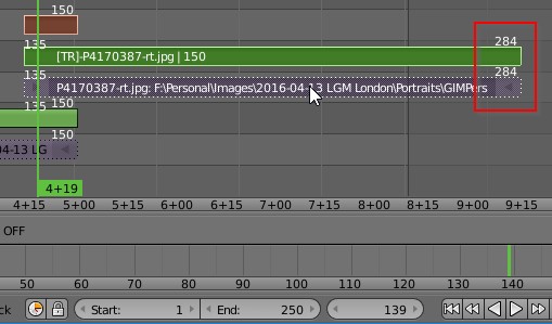
You may notice on the VSE that there are vertical lines outside of which things will appear slightly grayed out. This is a visual indicator of the total start/end of the output. This is controlled via the Start and End frame settings on the timeline (bottom pane):
You’ll need to set the End value to match your last output frame from your video sequence. You can find this value by selecting the last strip in your sequence and pressing the “G” key: the start/end frame numbers of that last strip will be visible (you’ll want the last frame value, of course).
Current last frame of my video is 284
In my example above, my anticipated last frame should be 284, but the last render frame is currently set to 250. I would need to update that End frame to match my video to get output as expected.
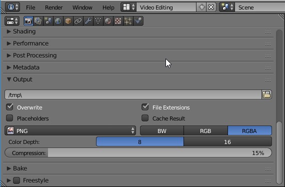
Back on the Properties panel (assuming you set the top-left panel back to Properties earlier—if not do so now), if we scroll down a bit we should see a section dedicated to Output.
You can change the various output options here to do frame-by-frame dumps or to encode everything into a video container of some sort. You can set the output directory to be something different if you don’t want it rendered into /tmp here.
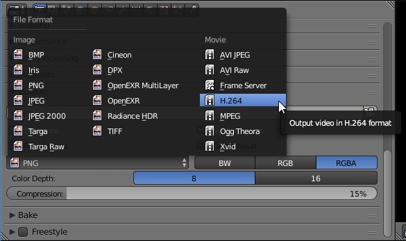
For my example I will encode the video with H.264:
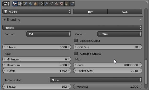
By choosing this option, Blender will then expose a new section of the Properties panel for setting the Encoding options:
I will often use the H264 preset and will enable the Lossless Output checkbox option. If I don’t have the disk space to spare I can also set different options to shrink the resulting filesize down further. The Bitrate option will have the largest effect on final file size and image quality.
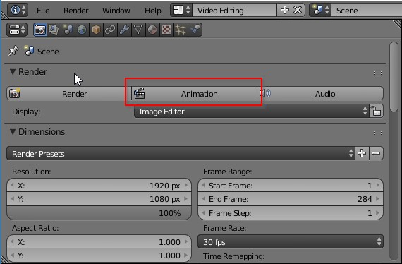
When everything is ready (or you just want to test it out), you can render your output by scrolling back to the top of the Properties window and pressing the Animation button, or by hitting Ctrl-F12.
This may seem overly complicated, but in reality much of what I covered here is the setup to get started and the settings for output. Once you’ve done this successfully it becomes pretty quick to use. One thing you can do is set up the environment the way you like it and then save the .blend file to use as a template for further work like this in the future. The next time you need to generate a slideshow you’ll have everything all ready to go and will only need to start adding images to the editor.
While looking for information on some VSE shortcuts I did run across a really interesting looking set of functions that I want to try out: the Blender Velvets. I’m going to go off and give it a good look when I get a chance as there’s quite a few interesting additions available.
The TLS podcast, with Stig Abell and Thea Lenarduzzi – this week featuring: Tim Parks on reviving and translating Giacomo Leopardi; Pamela Haag on America's surprisingly modern love affair with guns; Kate Webb on the category defying life and work of Angela Carter; finally, Alan Jenkins reads a poem by the late, great Geoffrey Hill, who died last week.
While in London this past April I got a chance to hang out a bit with LWN.net editor and fellow countryman, Nathan Willis. (It sounds like the setup for a bad joke: “An Alabamian and Texan meet in a London pub…”). Which was awesome because even though we were both at LGM2014, we never got a chance to sit down and chat.
So it was super-exciting for me to hear from Nate about possibly doing a photowalk and Free Software photo workshop at the 2016 Texas Linux Fest, and as soon as I cleared it with my boss, I agreed!
My Boss
So… mosey on down to Austin, Texas on July 8-9 for Texas Linux Fest and join Akkana Peck and myself for a photowalk first thing of the morning on Friday (July 8) to be immediately followed by workshops from both of us. I’ll be talking about Free Software photography workflows and projects and Akkana will be focusing on a GIMP workshop.
Books, culture and more from the TLS podcast, with Stig Abell and Thea Lenarduzzi – this week featuring: Athelstan – Britain's forgotten king; Mary Beard on the ancient precedent of our very modern referendum; a philosophical look at the ugly; English Country Houses, real and literary; and a poem, "Visiting Europe", by Bill Manhire
Color Manipulation with the Colour Checker LUT Module
hanatos tinkering in darktable again...
I was lucky to get to spend some time in London with the darktable crew.
Being the wonderful nerds they are, they were constantly working on something while we were there.
One of the things that Johannes was working on was the colour checker module for darktable.
Having recently acquired a Fuji camera, he was working on matching color styles from the built-in rendering on the camera.
Here he presents some of the results of what he was working on.
This was originally published on the darktable blog, and is being republished here with permission. —Pat
unfortunately these are eat-it-or-die canned styles or icc lut profiles. you
have to apply them and be happy or tweak them with other tools. but can we
extract meaning from these presets? can we have understandable and tweakable
styles like these?
in a first attempt, i used a non-linear optimiser to control the parameters of
the modules in darktable’s processing pipeline and try to match the output of
such styles. while this worked reasonably well for some of pat’s film luts, it
failed completely on canon’s picture styles. it was very hard to reproduce
generic colour-mapping styles in darktable without parametric blending.
that is, we require a generic colour to colour mapping function. this should be
equally powerful as colour look up tables, but enable us to inspect it and
change small aspects of it (for instance only the way blue tones are treated).
in git master, there is a new module to implement generic colour mappings: the
colour checker lut module (lut: look up table). the following will be a
description how it works internally, how you can use it, and what this is good
for.
in short, it is a colour lut that remains understandable and editable. that is,
it is not a black-box look up table, but you get to see what it actually does
and change the bits that you don’t like about it.
the main use cases are precise control over source colour to target colour
mapping, as well as matching in-camera styles that process raws to jpg in a
certain way to achieve a particular look. an example of this are the fuji film
emulation modes. to this end, we will fit a colour checker lut to achieve their
colour rendition, as well as a tone curve to achieve the tonal contrast.
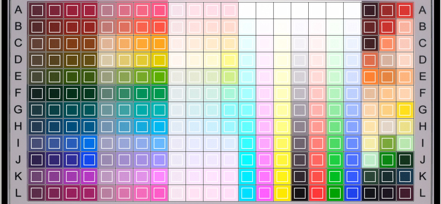
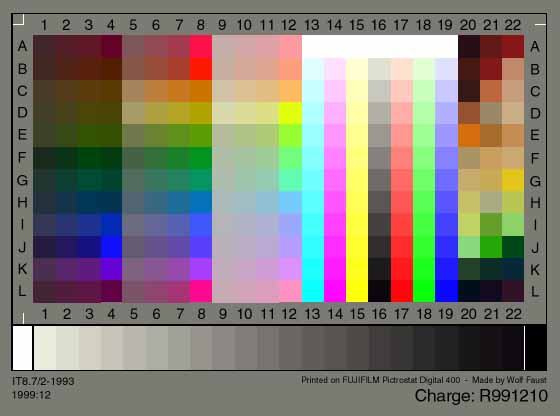
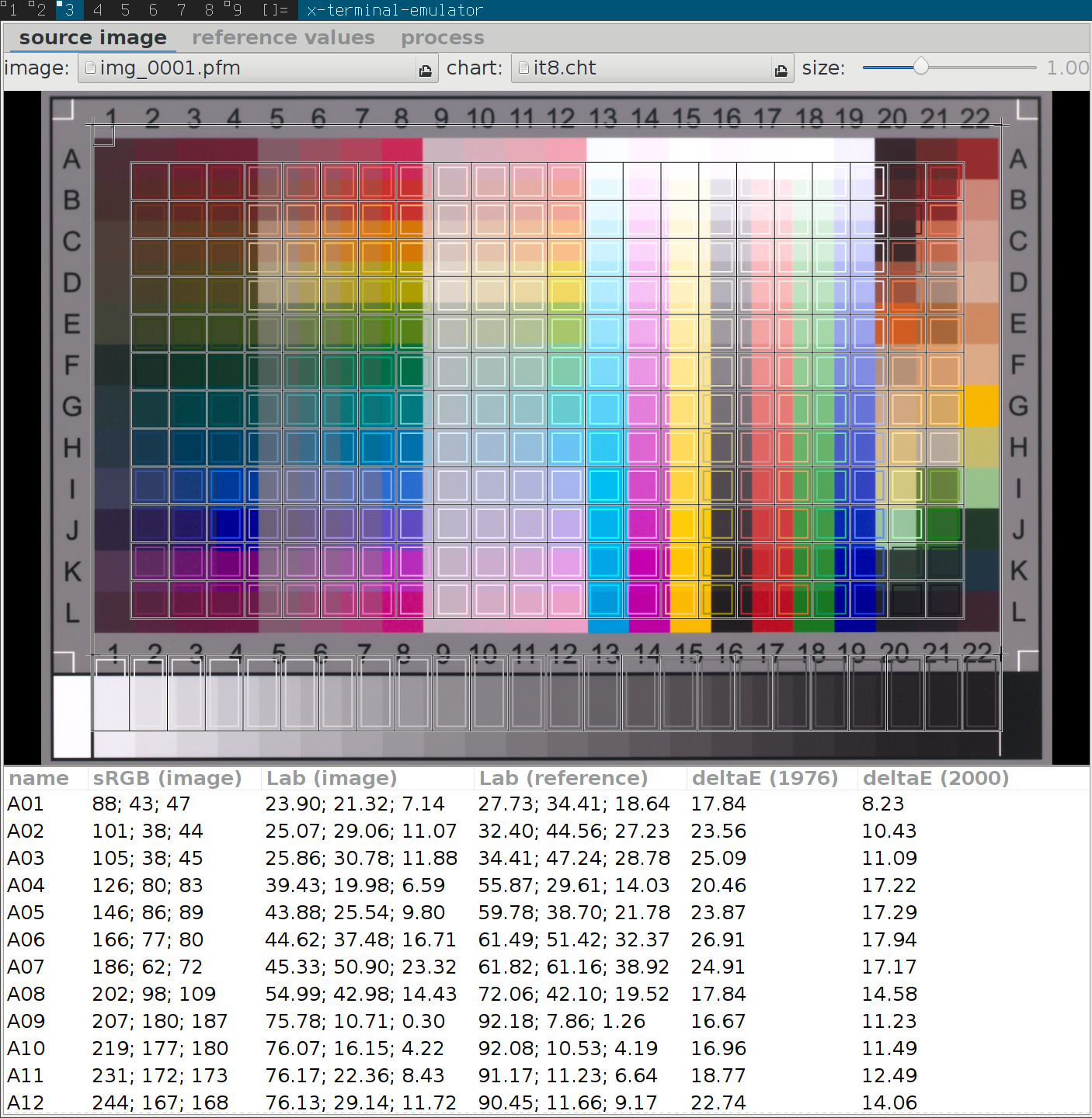
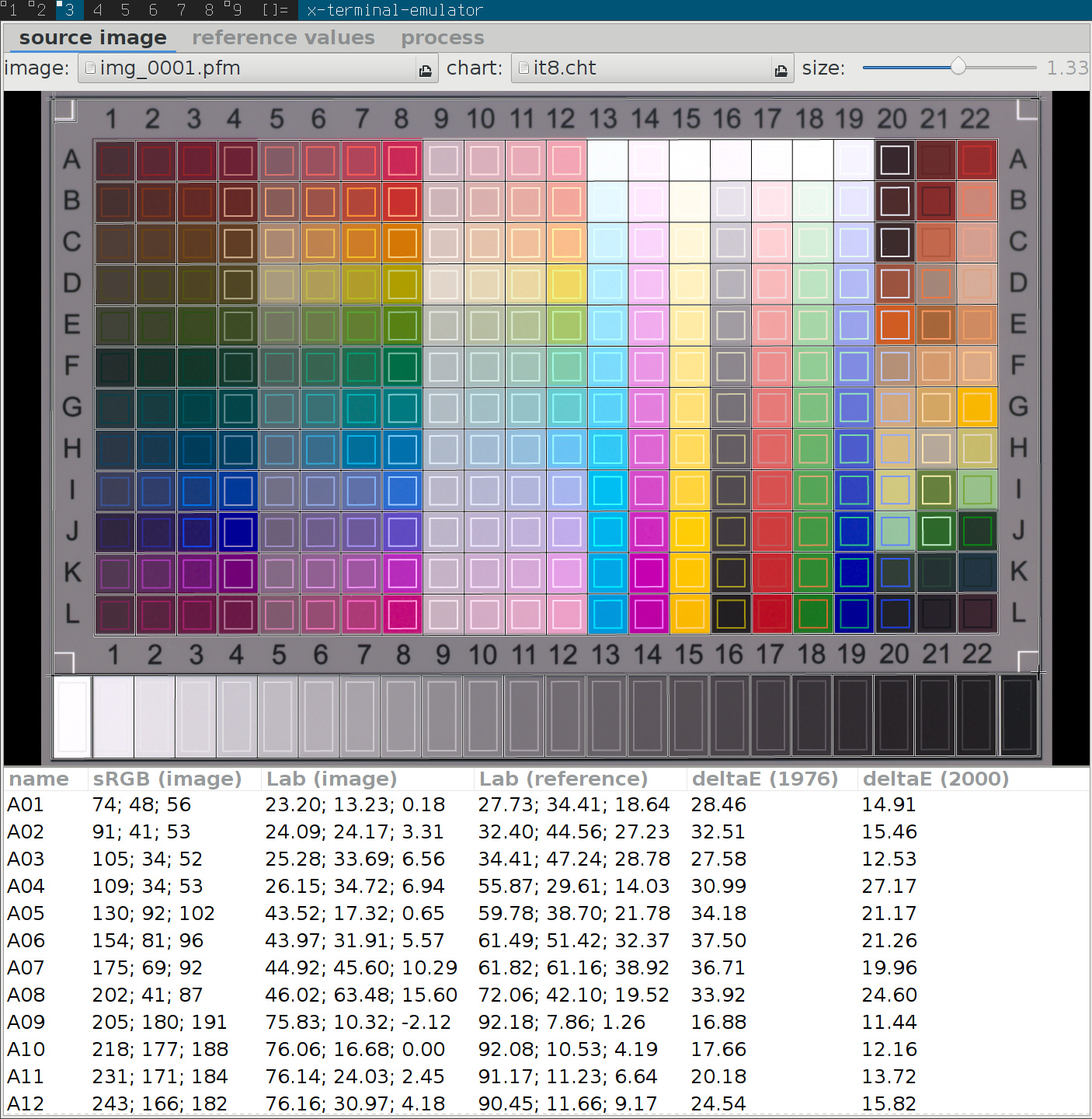
to create the colour lut, it is currently necessary to take a picture of an
it8 target (well, technically we support any similar target, but
didn’t try them yet so i won’t really comment on it). this gives us a raw
picture with colour values for a few colour patches, as well as a in-camera jpg
reference (in the raw thumbnail..), and measured reference values (what we know
it should look like).
to map all the other colours (that fell in between the patches on the chart) to
meaningful output colours, too, we will need to interpolate this measured
mapping.
we want to express a smooth mapping from input colours \(\mathbf{s}\) to target
colours \(\mathbf{t}\), defined by a couple of sample points (which will in our
case be the 288 patches of an it8 chart).
the following is a quick summary of what we implemented and much better
described in JP’s siggraph course [0].
radial basis functions are a means of interpolating between sample points
via
$$f(x) = \sum_i c_i\cdot\phi(| x - s_i|),$$
with some appropriate kernel \(\phi(r)\) (we’ll get to that later) and a set of
coefficients \(c_i\) chosen to make the mapping \(f(x)\) behave like we want it at
and in between the source colour positions \(s_i\). now to make
sure the function actually passes through the target colours, i.e. \(f(s_i) =
t_i\), we need to solve a linear system. because we want the function to take
on a simple form for simple problems, we also add a polynomial part to it. this
makes sure that black and white profiles turn out to be black and white and
don’t oscillate around zero saturation colours wildly. the system is
is the polynomial part, and \(\mathbf{d}\) are the coefficients to the polynomial
part. these are here so we can for instance easily reproduce \(t = s\) by setting
\(\mathbf{d} = (1, 1, 1, 0)\) in the respective row. we will need to solve this
system for the coefficients \(\mathbf{c}=(c_0,c_1,\cdots)^t\) and \(\mathbf{d}\).
many options will do the trick and solve the system here. we use singular value
decomposition in our implementation. one advantage is that it is robust against
singular matrices as input (accidentally map the same source colour to
different target colours for instance).
we didn’t yet define the radial basis function kernel. it turns out so-called
thin plate splines have very good behaviour in terms of low oscillation/low curvature
of the resulting function. the associated kernel is
$$\phi(r) = r^2 \log r.$$
note that there is a similar functionality in gimp as a gegl colour mapping
operation (which i believe is using a shepard-interpolation-like scheme).
we will feed this system with 288 patches of an it8 colour chart. that means,
with the added four polynomial coefficients, we have a total of 292
source/target colour pairs to manage here. apart from performance issues when
executing the interpolation, we didn’t want that to show up in the gui like
this, so we were looking to reduce this number without introducing large error.
indeed this is possible, and literature provides a nice algorithm to do so, which
is called orthogonal matching pursuit[1].
this algorithm will select the most important hand full of coefficients \(\in
\mathbf{c},\mathbf{d}\), to keep the overall error low. In practice we run it up
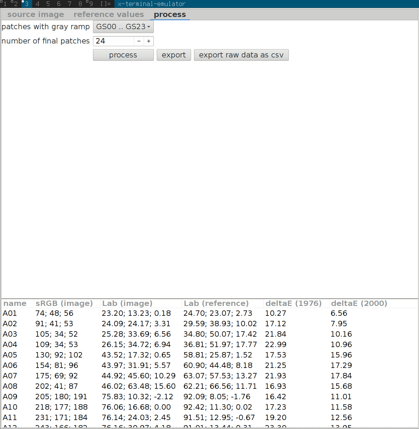
to a predefined number of patches (\(24=6\times 4\) or \(49=7\times 7\)), to make
best use of gui real estate.
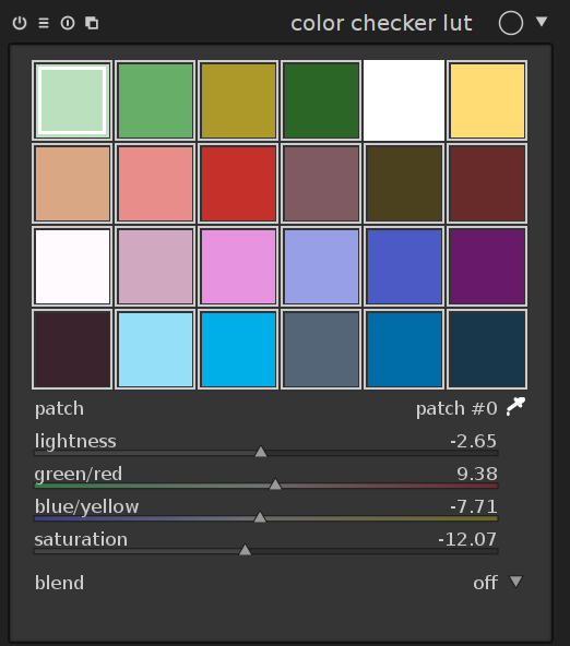
when you select the module in darkroom mode, it should look something like the
image above (configurations with more than 24 patches are shown in a 7\(\times\)7 grid
instead). by default, it will load the 24 patches of a colour checker classic
and initialise the mapping to identity (no change to the image).
the grid shows a list of coloured patches. the colours of the patches are
the source points \(\mathbf{s}\).
the target colour \(t_i\) of the selected patch \(i\) is shown as
offset controlled by sliders in the ui under the grid of patches.
an outline is drawn around patches that have been altered, i.e. the source
and target colours differ.
the selected patch is marked with a white square, and the number shows
in the combo box below.
to interact with the colour mapping, you can change both source and target
colours. the main use case is to change the target colours however, and start
with an appropriate palette (see the presets menu, or download a style
somewhere).
you can change lightness (L), green-red (a), blue-yellow (b), or saturation
(C) of the target colour via sliders.
select a patch by left clicking on it, or using the combo box, or using the
colour picker
to change source colour, select a new colour from your image by using the
colour picker, and shift-left-click on the patch you want to replace.
to reset a patch, double-click it.
right-click a patch to delete it.
shift-left-click on empty space to add a new patch (with the currently
picked colour as source colour).
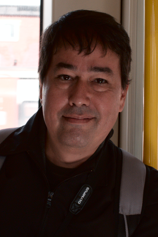
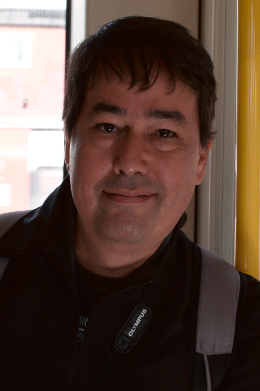
to process the following image i took of pat in the overground, i started with
the skin tones preset in the colour checker module (right click on nothing in
the gui or click on the icon with the three horizontal lines in the header and
select the preset).
then, i used the colour picker (little icon to the right of the patch# combo
box) to select two skin tones: very bright highlights and dark shadow tones.
the former i dragged the brightness down a bit, the latter i brightened up a
bit via the lightness (L) slider. this is the result:
in this image, i started with the fuji classic chrome-like style (see below for
a download link), to achieve the subdued look in the skin tones. then, i
picked the iris colour and saturated this tone via the saturation slider.
as a side note, the flash didn’t fire in this image (iso 800) so i needed to
stop it up by 2.5ev and the rest is all natural lighting..
as a starting point, i matched a colour checker lut interpolation function to
the in-camera processing of fuji cameras. these have the names of old film and
generally do a good job at creating pleasant colours. this was done using the
darktable-chart utility, by matching raw colours to the jpg output (both in Lab space in the darktable pipeline).
here is the link to the fuji styles, and how to use them.
i should be doing pat’s film emulation presets with this, too, and maybe
styles from other cameras (canon picture styles?). darktable-chart will
output a dtstyle file, with the mapping split into tone curve and colour
checker module. this allows us to tweak the contrast (tone curve) in isolation
from the colours (lut module).
these styles were created with the X100T model, and reportedly they work so/so
with different camera models. the idea is to create a Lab-space mapping which
is well configured for all cameras. but apparently there may be sufficient
differences between the output of different cameras after applying their colour
matrices (after all these matrices are just an approximation of the real camera
to XYZ mapping).
so if you’re really after maximum precision, you may have to create the styles
yourself for your camera model. here’s how:
this is to make sure we can process high-dynamic range images and not destroy
the bright spots with the lut. this is needed since the it8 does not deliver
any information out of the reflective gamut and for very bright input. to fix
wide gamut input, it may be needed to enable gamut clipping in the input colour
profile module when applying the resulting style to an image with highly
saturated colours. darktable-chart does that automatically in the style it
writes.
fix up style description in csv if you want
run darktable-chart --csv
outputs a .dtstyle with everything properly switched off, and two modules on: colour checker + tonecurve in Lab
when processing the list of colour pairs into a set of coefficients for the
thin plate spline, the program will output the approximation error, indicated
by average and maximum CIE 76 \(\Delta\)E for the input patches (the it8 in the
examples here). of course we don’t know anything about colours which aren’t
represented in the patch. the hope would be that the sampling is dense enough
for all intents and purposes (but nothing is holding us back from using a
target with even more patches).
for the fuji styles, these errors are typically in the range of mean \(\Delta
E\approx 2\) and max \(\Delta E \approx 10\) for 24 patches and a bit less for 49.
unfortunately the error does not decrease very fast in the number of patches
(and will of course drop to zero when using all the patches of the input chart).
provia 24:rank 28/24 avg DE 2.42189 max DE 7.57084
provia 49:rank 53/49 avg DE 1.44376 max DE 5.39751

astia-24:rank 27/24 avg DE 2.12006 max DE 10.0213
astia-49:rank 52/49 avg DE 1.34278 max DE 7.05165

velvia-24:rank 27/24 avg DE 2.87005 max DE 16.7967
velvia-49:rank 53/49 avg DE 1.62934 max DE 6.84697

classic chrome-24:rank 28/24 avg DE 1.99688 max DE 8.76036
classic chrome-49:rank 53/49 avg DE 1.13703 max DE 6.3298

mono-24:rank 27/24 avg DE 0.547846 max DE 3.42563
mono-49:rank 52/49 avg DE 0.339011 max DE 2.08548
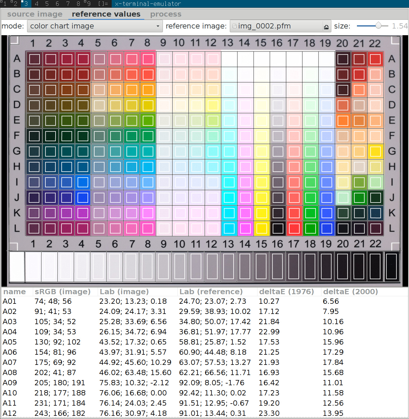
it is possible to match the reference values of the it8 instead of a reference
jpg output, to calibrate the camera more precisely than the colour matrix
would.
there is a button for this in the darktable-chart tool
needs careful shooting, to match brightness of reference value closely.
at this point it’s not clear to me how white balance should best be handled here.
need reference reflectances of the it8 (wolf faust ships some for a few illuminants).
another next step we would like to take with this is to match real film footage
(porta etc). both reference and film matching will require some global exposure
calibration though.
[0] Ken Anjyo and J. P. Lewis and Frédéric Pighin, “Scattered data interpolation for computer graphics” in Proceedings of SIGGRAPH 2014 Courses, Article No. 27, 2014. pdf
[1] J. A. Tropp and A. C. Gilbert, “Signal Recovery From Random Measurements Via Orthogonal Matching Pursuit”, in IEEE Transactions on Information Theory, vol. 53, no. 12, pp. 4655-4666, Dec. 2007.
Books, culture and more from the TLS podcast – this week featuring: responses to the refugee crisis, political and literary; the new Tate in London; Turkey's secular spaces; and a poem by Stephen Knight.
It was always my intention to make the entire PIXLS.US website available under a permissive license. The content is already all licensed Creative Commons, By Attribution, Share-Alike (unless otherwise noted). I just hadn’t gotten around to actually posting the site source.
Until now(ish). I say “ish“ because I apparently released the code back in April and am just now getting around to talking about it.
Also, we finally have a category specifically for all those darktable weenies on discuss!
I finally got around to pushing my code for this site up to Github on April 27 (I’m basing this off git logs because my memory is likely suspect). It took a while, but better late than never? I think part of the delay was a bit of minor embarrassment on my part for being so sloppy with the site code. In fact, I’m still embarrassed - so don’t laugh at me too hard (and if you do, at least don’t point while laughing too).
In fact, we’ve got a couple of other repositories under the Github Organization PIXLS.US including this website, presentation assets, lighting diagram SVG’s, and more. If you’ve got a Github account or wanted to join in with hacking at things, by all means send me a note and we’ll get you added to the organization asap.
Note: you don’t need to do anything special if you just want to grab the site code. You can do this quickly and easily with:
git clone https://github.com/pixlsus/website.git
You actually don’t even need a Github account to clone the repo, but you will need one if you want to fork it on Github itself, or to send pull-requests. You can also feel free to simply email/post patches to us as well:
Speaking of which, I wanted to give a special shout-out to community member @paperdigits (Mica), who has been active in sharing presentation materials in the Presentations repo and has been actively hacking at the website. Mica’s recommendations and pull requests are helping to make the site code cleaner and better for everyone, and I really appreciate all the help (even if I _am_ scared of change).
Yes, after member Claes asked the question on discuss about why we didn’t have a darktable category on the forums, I relented and created one. Normally I want to make sure that any category is going to have active people to maintain and monitor the topics there. I feel like having an empty forum can sometimes be detrimental to the perception of a project/community.
In this case, any topics in the darktable category will also show up in the more general Software category as well. This way the visibility and interactions are still there, but with the added benefit that we can now choose to see only darktable posts, ignore them, or let all those stinky users do what they want in there.
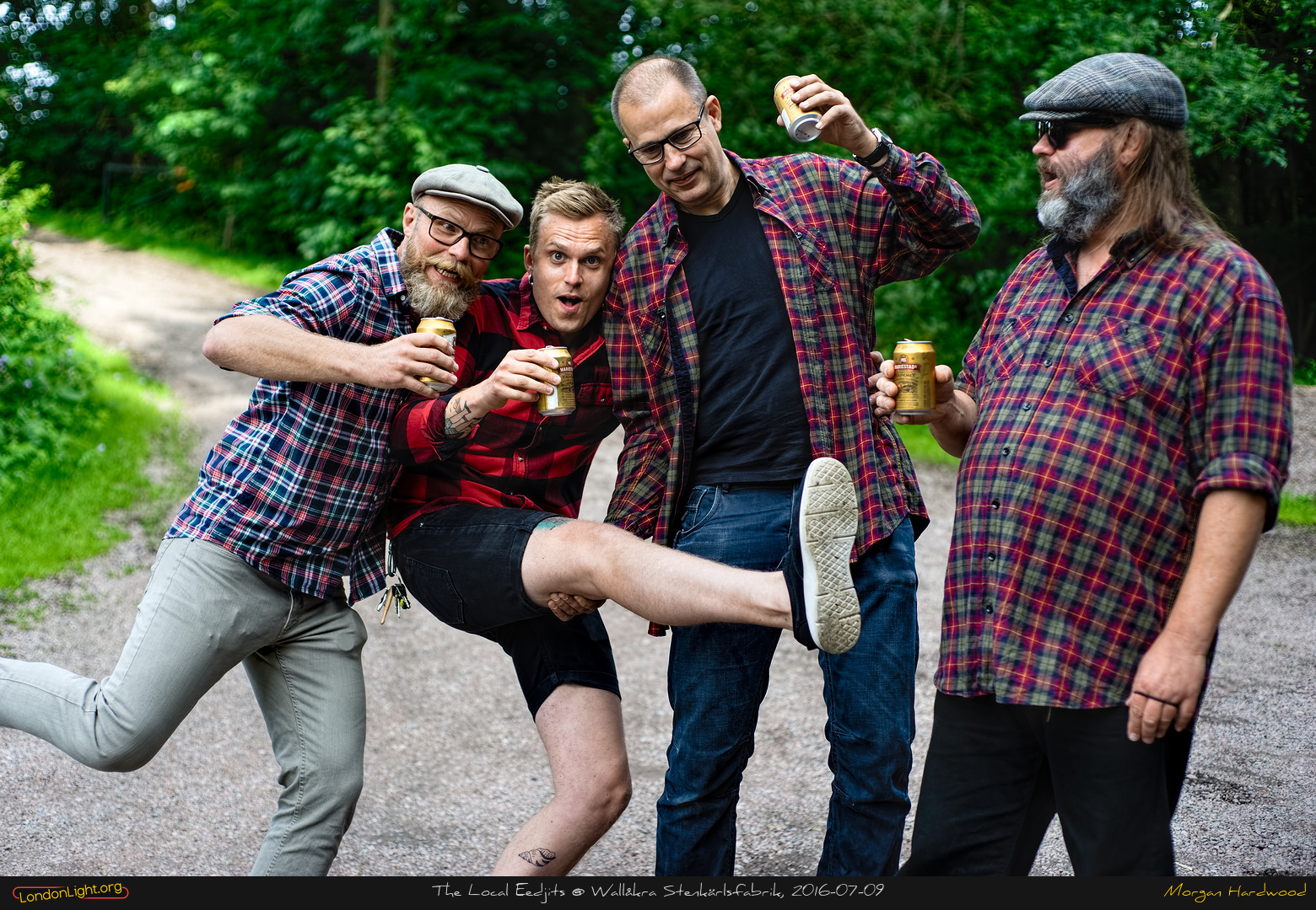
Besides, now we can say that we’ve sufficiently appeased Morgan Hardwood‘s organizational needs…

 Login
Login