❌

Reading view

Arnold Newman Portraits


Arnold Newman Portraits

The beginnings of "Environmental Portraits"

Anyone that has spent any time around me would realize that I’m particularly fond of portraits. From the wonderful works of Martin Schoeller to the sublime Dan Winters, I am simply fascinated by a well executed portrait. So I thought it would be fun to take a look at some selections from the “father” of environmental portraits - Arnold Newman.
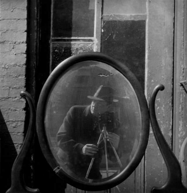
Arnold Newman, Self Portrait, Baltimore MD, 1939

Newman wanted to become a painter before needing to drop out of college after only two years to take a job shooting portraits in a photo studio in Philadelphia. This experience apparently taught him what he did not want to do with photography…

Luckily it may have started defining what he did want to do with his photography. Namely, his approach to capturing his subjects alongside (or within) the context of the things that made them notable in some way. This would became known as “Environmental Portraiture”. He described it best in an interview for American Photo in 2000:

I didn’t just want to make a photograph with some things in the background. The surroundings had to add to the composition and the understanding of the person. No matter who the subject was, it had to be an interesting photograph. Just to simply do a portrait of a famous person doesn’t mean a thing. 1

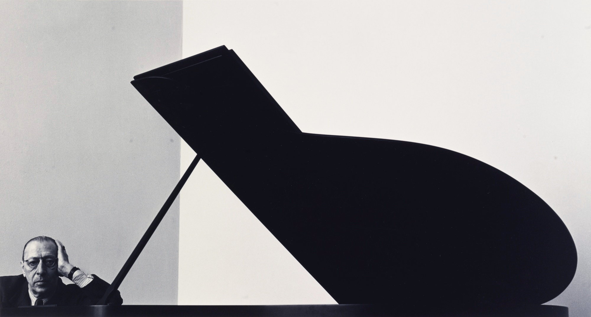
Though he has felt that the term might be unnecessarily restrictive (and possibly overshadows his other pursuits including abstractions and photojournalism), there’s no denying the impact of the results. Possibly his most famous portrait, of composer Igor Stravinsky, illustrates this wonderfully. The overall tones are almost monotone (flat - pun intended, and likely intentional on behalf of Newman) and are dominated by the stark duality of the white wall with the black piano.
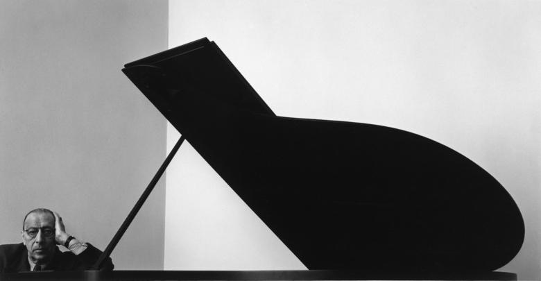
Igor Stravinsky by Arnold Newman
Igor Stravinsky, New York, NY, 1946 by Arnold Newman

Newman realized that the open lid of the piano “…is like the shape of a musical flat symbol—strong, linear, and beautiful, just like Stravinsky’s work.” 1 The geometric construction of the image instantly captures the eye and the aggressive crop makes the final composition even more interesting. In this case the crop was a fundamental part of the original composition as shot, but it was not uncommon for him to find new life in images with different crops.

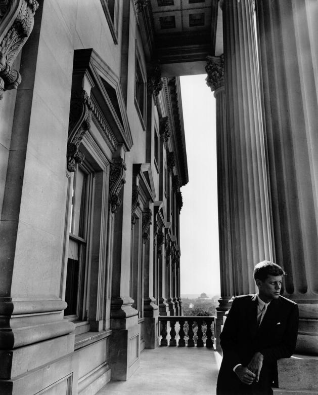
In a similar theme his portraits of both Salador Dalí and John F. Kennedy show a willingness to allow the crop to bring in different defining characteristics of his subjects. In the case of Dalí it allows an abstraction to hang there mimicking the pose of the artist himself. Kennedy is mostly the only organic form, striking a relaxed pose, while dwarfed by the imposing architecture and hard lines surrounding him.
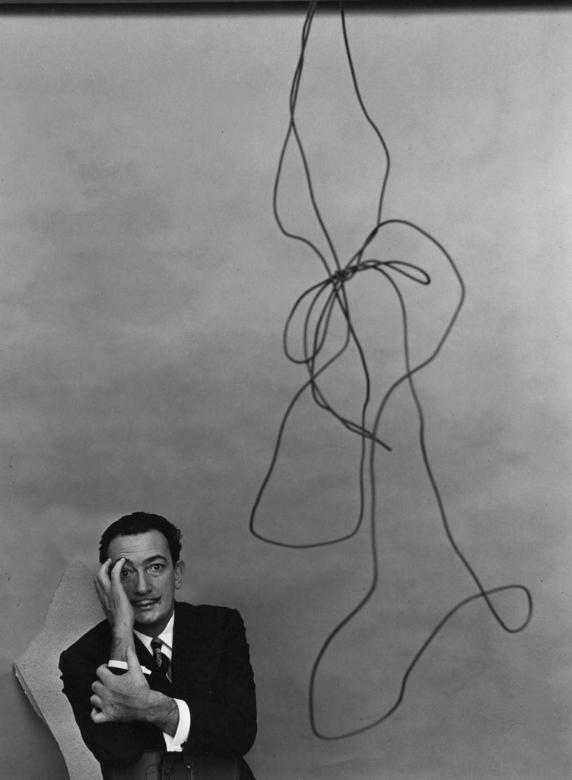
Salvador Dali, New York, NY, 1951
Salvador Dali, New York, NY, 1951 by Arnold Newman
John F. Kennedy, Washington D.C., 1953
John F. Kennedy, Washington D.C., 1953 by Arnold Newman

He manages to bring the same deft handling of placing his subjects in the context of their work with other photographers as well. His portrait of Ansel Adams shows the photographer just outside his studio with the surrounding wilderness not only visible around the frame but reflected in the glass of the doors behind him (and the photographers glasses). Perhaps an indication of the nature of Adams work being to capture natural scenes through glass?

Ansel Adams, 1975 by Arnold Newman

For anyone familiar with the pioneer of another form of photography, Newman’s portrait of (the usually camera shy) Henri Cartier-Bresson will instantly evoke a sense of the artists candid street images. In it, Bresson appears to take the place of one of his subjects caught briefly on the streets in a fleeting moment. The portrait has an almost spontaneous feeling to it, (again) mirroring the style of the work of its subject.
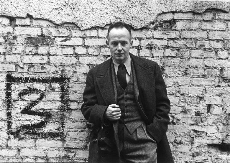
Henri Cartier-Bresson, New York, NY, 1947
Henri Cartier-Bresson, New York, NY, 1947 by Arnold Newman

Eight years after his portrait of surrealist painter Dali, Newman shot another famous (abstraction) artist, Pablo Picasso. This particular portrait is much more intimate and more classically composed, framing the subject as a headshot with little of the surrounding environment as before. I can’t help but think that the placement of the hand being similar in both images is intentional; a nod to the unconventional views both artists brought to the world.
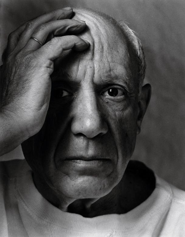
Pablo Picasso,Vallauris, France, 1954
Pablo Picasso,Vallauris, France, 1954 by Arnold Newman

The eloquent Gregory Heisler had a wonderful discussion about Newman for Atlanta Celebrates Photography at the High Musuem in 2008:

Arnold Newman produced an amazing body of work that warrants some time and consideration for anyone interested in portraiture. These few examples simply do not do his collection of portraits justice. If you have a few moments to peruse some amazing images head over to his website and have a look (I’m particularly fond of his extremely design-oriented portrait of chinese-american architect I.M. Pei):
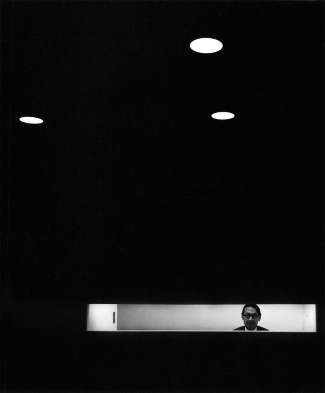
I.M. Pei, New York, NY, 1967
I.M. Pei, New York, NY, 1967 by Arnold Newman

Of historical interest is a look at Newman’s contact sheet for the Stravinsky image showing various compositions and approaches to his subject with the piano. (I would have easily chosen the last image in the first row as my pick.) I have seen the second image in the second row cropped as indicated, which was also a very strong choice. I adore being able to investigate contact sheets from shoots like this - it helps me to humanize these amazing photographers while simultaneously allowing me an opportunity to learn a little about their thought process and how I might incorporate it into my own photography.
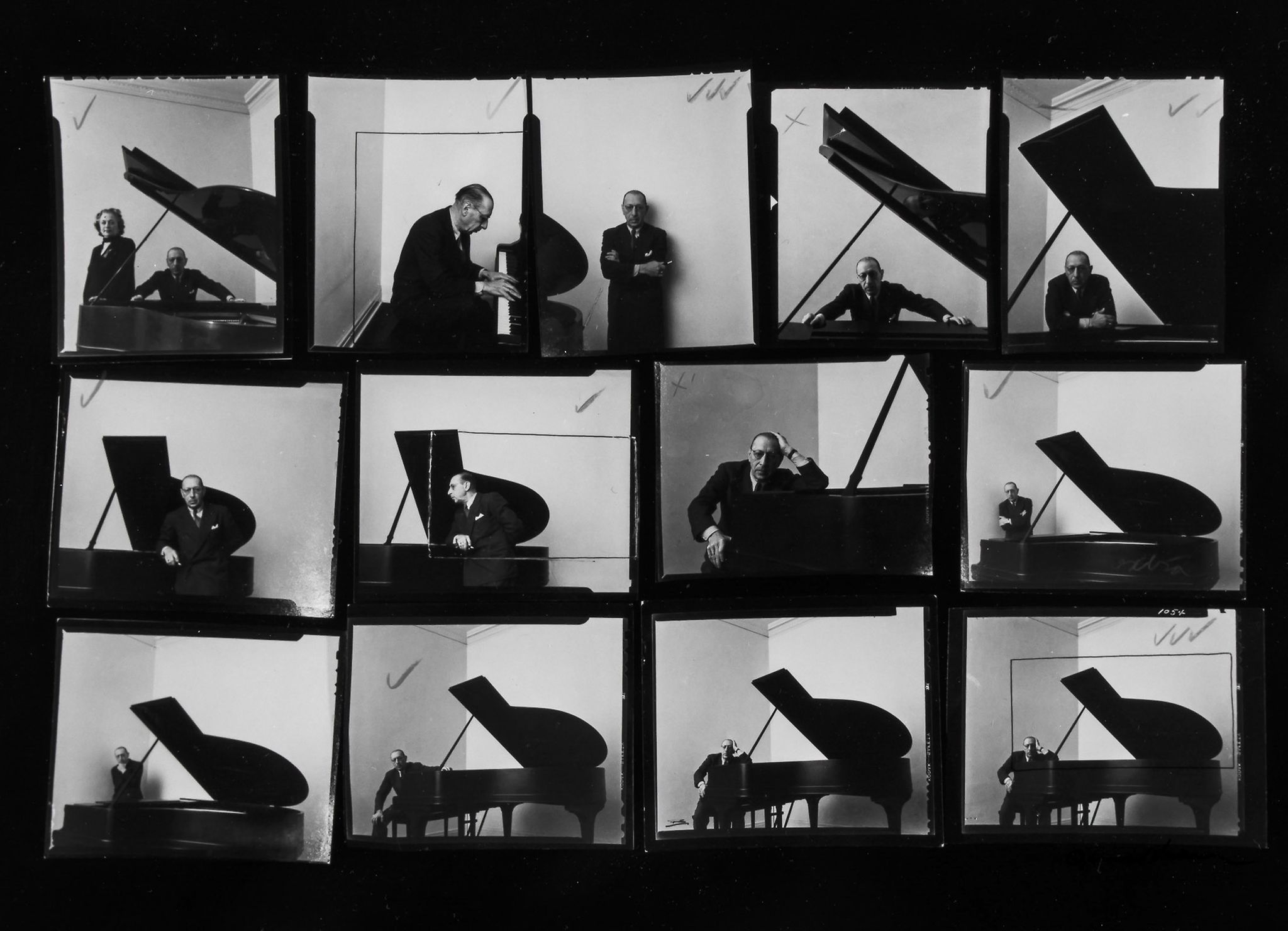
Igor Stravinsky contact sheet

To close, a quote from his interview with American Photo magazine back in 2000 that will likely remain relevant to photographers for a long time:

But a lot of photographers think that if they buy a better camera they’ll be able to take better photographs. A better camera won’t do a thing for you if you don’t have anything in your head or in your heart. 1

1 Harris, Mark. “Arnold Newman: The Stories Behind Some of the Most Famous Portraits of the 20th Century.” American Photo, March/April 2000, pp. 36-38

Halloween story special

With Stig Abell, Thea Lenarduzzi and Michael Caines.Three extracts of spooky stories for Halloween. Stig reads from Dracula by Bram Stoker; Thea from Mr Jones by Edith Wharton; and Michael from Two Doctors by MR James.Find out more at www.the-tls.co.uk

Hosted on Acast. See acast.com/privacy for more information.

💾

Shades of censorship

With Stig Abell and Thea Lenarduzzi – Elaine Showalter on how extreme misogyny turned Clinton vs Trump into woman vs man; Jonathan Barnes on the long shadow of Bram Stoker's 'Dracula'; Houman Barekat on 250 years of 'Index on Censorship' and the mutable and myriad threats to free speech; Lara Feigel on two books, by the late Sue Lloyd-Roberts and Lara Pawson, about violence and the sufferings of women around the world – how much progress is there?

Hosted on Acast. See acast.com/privacy for more information.

💾

Ali Smith on Autumn

Toby Lichtig talks to Ali Smith about her new novel, Autumn; plus, an exclusive extract read by the author. Find out more: the-tls.co.uk

Hosted on Acast. See acast.com/privacy for more information.

💾

Life, writing and life-writing

With Stig Abell and Thea Lenarduzzi – Ruth Scurr on Beryl Bainbridge's life, love and works; Jessica Loudis on two memoirs, of New York City and the Chelsea Hotel; ruthless and high-minded or likeable and good-natured? Dinah Birch on the ever-enigmatic J. M. W. Turner; and finally, we're joined by the TLS's resident Shakespearean Michael Caines to talk us through a new compendium of writing on the playwright. Just don't call him the Bard. Find out more: www.the-tls.co.uk

Hosted on Acast. See acast.com/privacy for more information.

💾

The mythical Lévi-Strauss

With Stig Abell and Thea Lenarduzzi – Adam Kuper on French structuralist and hoarder of myths Claude Lévi-Strauss; Joe Paul Kroll on what happened when a slightly belligerent group of eminent German writers visited America; Laura James on the intractable paradox of aid in Africa and different approaches to nation-building; finally, TLS Poetry Editor Alan Jenkins discusses the enigmatic poet Louis Aragon, and reads his new translation "Elsa at the Mirror".Find out more at www.the-tls.co.uk

Hosted on Acast. See acast.com/privacy for more information.

💾

Highlight Bloom and Photoillustration Look


Highlight Bloom and Photoillustration Look

Replicating a 'Lucisart'/Dave Hill type illustrative look

Over in the forums community member Sebastien Guyader (@sguyader) posted a neat workflow for emulating a photo-illustrative look popularized by photographers like Dave Hill where the resulting images often seem to have a sort of hyper-real feeling to them. Some of this feeling comes from a local-contrast boost and slight ‘blooming’ of the lighter tones in the image (though arguably most of the look is due to lighting and compositing of multiple elements).

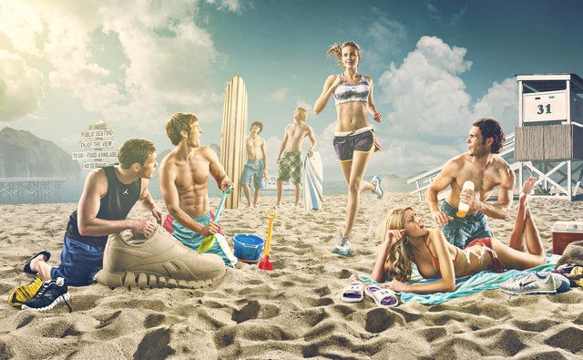
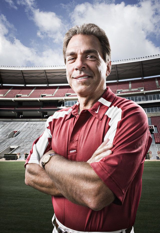
To illustrate, here are a few representative samples of Dave Hill’s work that reflects this feeling:

Dave Hill Cliff Dave Hill Finishline Lotion Dave Hill Track Dave Hill Nick Saban
A collection of example images. ©Dave Hill

A video of Dave presenting on how he brought together the idea and images for the series the first image above is from:

This effect is also popularized in Photoshop® filters such as LucisArt in an effort to attain what some would (erroneously) call an “HDR” effect. Really what they likely mean is a not-so-subtle tone-mapping. In particular the exaggerated local contrasts is often what garners folks attention.

We had previously posted about a method for exaggerating fine local contrasts and details using the “Freaky Details” method described by Calvin Hollywood. This workflow provides a similar idea but different results that many might find more appealing (it’s not as gritty as the Freaky Details approach).

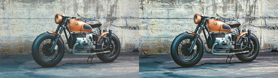
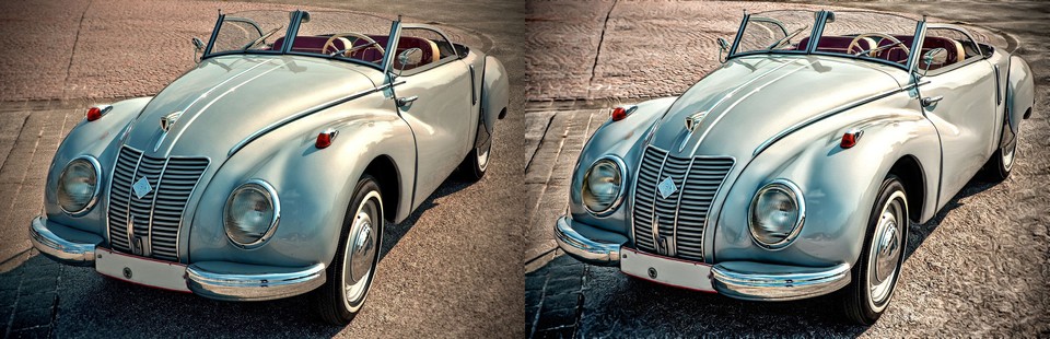
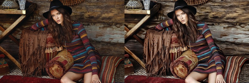
Sebastien produced some great looking preview images to give folks a feeling for what the process would produce:

BMW IFA-F9 Fashion Woman
Images from pixabay (CC0, public domain): Motorcycle, car, woman.

Replicating a “Dave Hill”/“LucasArt” effect

Sebastien’s approach relies only on having the always useful G’MIC plugin for GIMP. The general workflow is to do a high-pass frequency separation, and to apply some effects like local contrast enhancement and some smoothing on the residual low-pass layer. Then recombine the high+low pass layers to get the final result.

  1. Open the image.
  2. Duplicate the base layer.
    Rename it to “Lowpass”.
  3. With the top layer (“Lowpass”) active, open G’MIC.
  4. Use the Photocomix smoothing filter:

    Testing → Photocomix → Photocomix smoothing

    Set the Amplitude to 10. Apply.
    This is to taste, but a good startig place might be around 1% of the image dimensions (so a 2000px wide image - try using an Amplitude of 20).
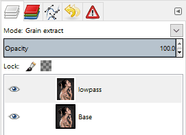
  5. Change the “Lowpass” layer blend mode to Grain extract.
  6. Right-Click on the layer and choose New from visible.
    Rename this layer from “Visible“ to something more memorable like “Highpass” and set its layer mode to Grain merge.
    Turn off this layer visibility for now.
  7. Activate the “Lowpass” layer and set its layer blend mode back to Normal.
    The rest of the filters are applied to this “Lowpass” layer.
  8. Open G’MIC again.
    Apply the Simple local contrast filter:

    Details → Simple local contrast

    Using:
    • Edge Sensitivity to 25
    • Iterations to 1
    • Paint effect to 50
    • Post-gamma to 1.20
  9. Open G’MIC again.
    Now apply the Graphic novel filter:

    Artistic → Graphic novel

    Using:
    • check the Skip this step checkbox for Apply Local Normalization
    • Pencil size to 1
    • Pencil amplitude to 100-200
    • Pencil smoother sharpness/edge protection/smoothness
      to 0
    • Boost merging options Mixer to Soft light
    • Painter’s touch sharpness to 1.26
    • Painter’s edge protection flow to 0.37
    • Painter’s smoothness to 1.05
  10. Finally, make the “Highpass” layer visible again to bring back the fine details.

Trying It Out!

Let’s walk through the process. Sebastien got his sample images from the website https://pixabay.com, so I thought I would follow suit and find something suitable from there also. After some searching I found this neat image from Jerzy Gorecki licensed Create Commons 0/Public Domain.

Model
The base image (link).
From pixabay, (CC0 - Public Domain): Jerzy Gorecki.

Frequency Separation

The first steps (1—7) are to create a High/Low pass frequency separation of the image. If you have a different method for obtaining the separation then feel free to use it. Sebastien uses the Photocomix smoothing filter to create his low-pass layer (other options might be Gaussian blur, bi-lateral smoothing, or even wavelets).

The basic steps to do this are to duplicate the base layer, blur it, then set the layer blend mode to Grain extract and create a new layer from visible. The new layer will be the Highpass (high-frequency) details and should have its layer blend mode set to Grain merge. The original blurred layer is the Lowpass (low-frequency) information and should have its layer blend mode set back to Normal.

So, following Sebastien’s steps, duplicate the base layer and rename the layer to “lowpass”. Then open G’MIC and apply:

Testing → Photocomix → Photocomix smoothing

with an amplitude of around 20. Change this to suit your own taste, but about 1% of the image width is a decent starting point. You’ll now have the base layer and the “lowpass” layer above it that has been smoothed:

Photocomix Smoothing
“lowpass” layer after Photocomix smoothing with Amplitude set to 20.

Setting the “lowpass” layer blend mode to Grain extract will reveal the high-frequency details:

Grain Extract HP
The high-frequency details visible after setting the blurred “lowpass” layer blend mode to Grain extract.

Now create a new layer from what is currently visible. Either right-click the “lowpass” layer and choose “New from visible” or from the menus:

Layer → New from Visible

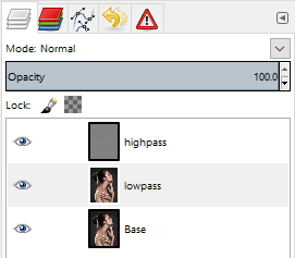
Rename this new layer from “Visible” to “highpass” and set its layer blend mode to Grain merge. Select the “lowpass” layer and set its layer blend mode back to Normal.

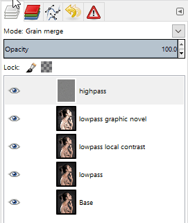
Layers

The visible result should be back to what your starting image looked like. The rest of the steps for this tutorial will operate on the “lowpass” layer. You can leave the “highpass” filter visible during the rest of the steps to see what your results will look like.

Modifying the Low-Frequency Layer

These next steps will modify the underlying low-frequency image information to smooth it out and give it a bit of a contrast boost. First the “Simple local contrast” filter will separate tones and do some preliminary smoothing, while the “Graphic novel” filter will provide a nice boost to light tones along with further smoothing.

Simple Local Contrast

On the “lowpass” layer, open G’MIC and find the “Simple local contrast” filter:

Details → Simple local contrast

Change the following settings:

  • Edge Sensitivity to 25
  • Iterations to 1
  • Paint effect to 50
  • Post-gamma to 1.20

This will smooth out overall tones while simultaneously providing a nice local contrast boost. This is the step that causes small lighting details to “pop”:

Simple Local Contrast
After applying the “Simple local contrast” filter.
(Click to compare to the original image)

The contrast increase provides a nice visual punch to the image. The addition of the “Graphic novel” filter will push the overall image much closer to a feeling of a photo-illustration.

Graphic Novel

Still on the “lowpass” layer, re-open G’MIC and open the “Graphic Novel” filter:

Artistic → Graphic novel

Change the following settings:

  • check the Skip this step checkbox for Apply Local Normalization
  • Pencil size to 1
  • Pencil amplitude to 100-200
  • Pencil smoother sharpness/edge protection/smoothness
    to 0
  • Boost merging options Mixer to Soft light
  • Painter’s touch sharpness to 1.26
  • Painter’s edge protection flow to 0.37
  • Painter’s smoothness to 1.05

The intent with this filter is to further smooth the overall tones, simplify details, and to give a nice boost to the light tones of the image:

Graphic Novel
After applying the “Graphic novel” filter.
(Click to compare to the local contrast result)

The effect at 100% opacity can be a little strong. If so, simply adjust the opacity of the “lowpass” layer to taste. In some cases it would probably be desirable to mask areas you don’t want the effect applied to.

I’ve included the GIMP .xcf.bz2 file of this image while I was working on it for this article. You can download the file here (34.9MB). I did each step on a new layer so if you want to see the results of each effect step-by-step, simply turn that layer on/off:

Sample layers
Example XCF layers

Finally, a great big Thank You! to Sebastien Guyader (@sguyader) for sharing this with everyone in the community!

A G’MIC Command

Of course, this wouldn’t be complete if someone didn’t come along with the direct G’MIC commands to get a similar result! And we can thank Iain Fergusson (@Iain) for coming up with the commands:

--gimp_anisotropic_smoothing[0] 10,0.16,0.63,0.6,2.35,0.8,30,2,0,1,1,0,1

-sub[0] [1]

-simplelocalcontrast_p[1] 25,1,50,1,1,1.2,1,1,1,1,1,1
-gimp_graphic_novelfxl[1] 1,2,6,5,20,0,1,100,0,1,0,0.78,1.92,0,0,2,1,1,1,1.26,0.37,1.05
-add
-c 0,255

A lecture by Terry Eagleton

Terry Eagleton gives the Theos annual lecture, on the not un-problematic, not un-high-stakes, and not un-incendiary twin matters of The Death of God and the War on Terror. Find our more: www.the-tls.co.uk

Hosted on Acast. See acast.com/privacy for more information.

💾

Duck or Rabbit?

With Stig Abel and Thea Lenarduzzi: Tim Crane guides us through our philosophy special edition (including on how the brain works); Lisa Hilton helps to recover the voices of Parisian wartime women; Anna Katharina Schaffner explains why the Nazis were all high. Plus Andrew Motion reflects on his freedom from the role of Poet Laureate, and reads his poem "Evening Traffic".

Hosted on Acast. See acast.com/privacy for more information.

💾

Beatrix Potter, marriage, and data

With Stig Abell and Thea Lenarduzzi – Marcia Zug on marriage in America (plus the pros and cons of mail-order brides); Laura Freeman on Beatrix Potter's naughty charm; Paul Duguid considers the implications of unrestrained information for all – is more necessarily better?; and finally, Robert Potts reads "Gift", a poem by the concrete poet Ian Hamilton Finlay, first published in the TLS in 1960.

Hosted on Acast. See acast.com/privacy for more information.

💾

Hardy's London & the modern Middle East

With Stig Abell and Thea Lenarduzzi – Mark Ford on Thomas Hardy's unlikely London romance; Hirsh Sawhney on Aravind Adiga's captivating new novel and his messy portrait of India; to tie in with a special run of features on the Middle East, TLS editors Robert Irwin and Toby Lichtig discuss the challenges, historical and present, facing the region; and finally, Mark Ford reads Thomas Hardy's poem "Coming Up Oxford Street: Evening", from 1872.

Hosted on Acast. See acast.com/privacy for more information.

💾

Ideas of Englishness

With Stig Abell and Lucy Dallas.Including Ferdinand Mount on what defines England and its inhabitants;David Horspool on responses to Hitler and his ideas; and Mika Ross-Southall on Nick Cave's savagely sad album.

Hosted on Acast. See acast.com/privacy for more information.

💾

From the Community Vol. 1


From the Community Vol. 1

Welcome to the first installment of From the Community, a (hopefully) quarterly blog post to highlight a few of the things our community members have been doing!

Rapid Photo Downloader Process Model

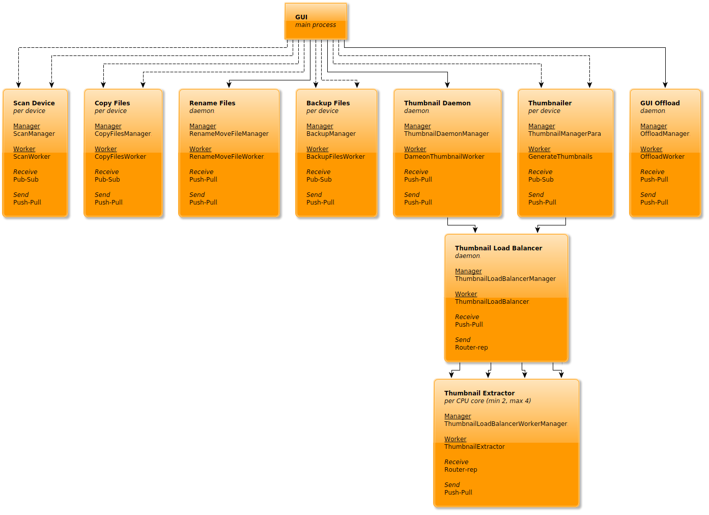
@damonlynch has a great write up of Rapid Photo Download’s process model. Rapid Photo Downloader is built using Python, so if you’re looking for a good way to add threads to your Python program, this write up has some good information for you, check it out!

rpd process model

Community-built Software downloads page

Free Software development tends to move at a pretty good pace, so there is always something new to try out! Not all of the new things warrant a new release, but our community steps up and builds the software so that others can use and test! Instead of random links to dropboxes and such, we’ve created a Community-built Software page to help centralize and make it easy for our users to help find and download the freshest builds of software from our great community members. Keep in mind that support may be limited for these builds and they’re considered testing, so quality may vary, but if you covet the newest, shiniest things, this is the place for you!

Glitch art filters coming to G’MIC

G’MIC will be getting some cool glitch art filters in 1.7.6. @thething is interested in glitch art and requested some new filters in G’MIC, and @David_Tschumperle delivered very quickly!

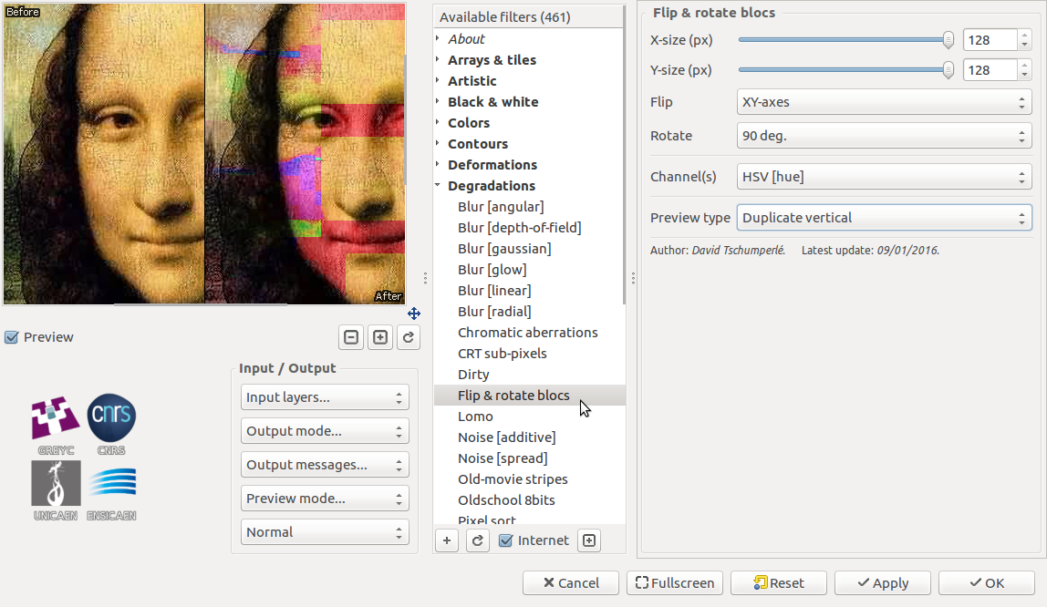
You can flip blocks:

GMIC block flipping

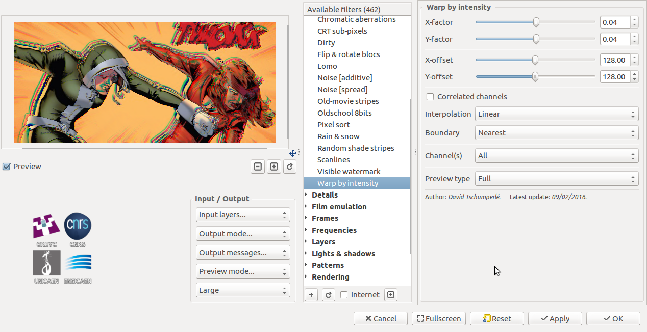
and warp your images:

GMIC image warping

An Alternative to Watermarking

Watermarking is ugly and takes focus away from your image. Why not try and add an attribution bar to your images? In this post, @patdavid lays out how to add a bar underneath your image with your name, the image title, and a little logo. @David_Tschumperle followed that effort up with an alternate implementation using G’MIC instead of imagemagic. Lastly, @vato rolled the imagemagick version into a bash script with the necessary parameters exposed as variables at the beginning of the script.

Here is an example image by @Morgan_Hardwood:

attribution bar example

Help Author a Tutorial for Beginners

Finally, we’re still working on our beginner article to help new users navigate the myriad of free software photography software that is out there. If you have ideas, or better yet, want to author a bit of content with our community, please join and help out! The post is community wiki and has complete revision control, so don’t be afraid to jump in and contribute!

❌